
Turum-burum is a UX/UI and CRO company with over 14 years of experience, primarily focused on eCommerce, SaaS, Web3, and B2B Tech projects. Turum-burum is the only Ukrainian company that has become a Google UX Partner and takes part in Google's Retail Development Programs in Ukraine.
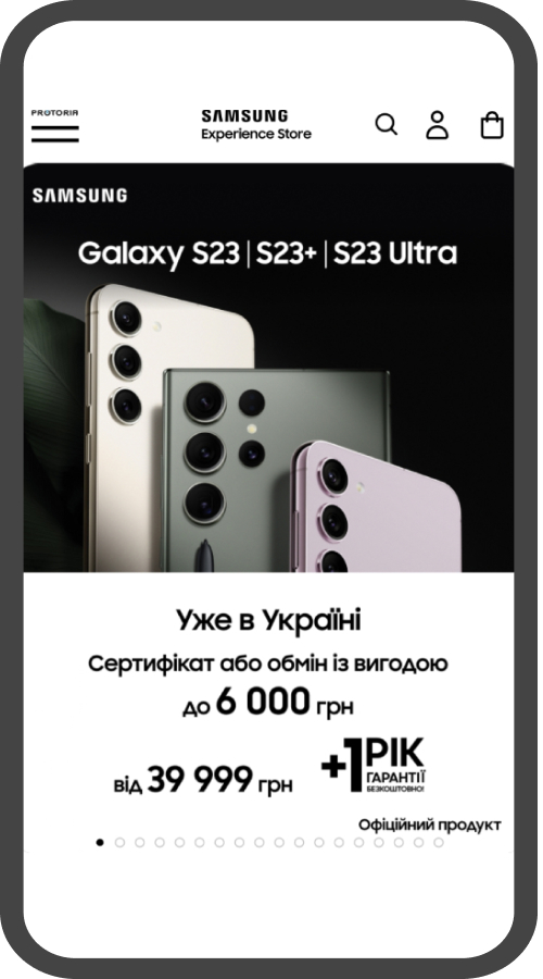
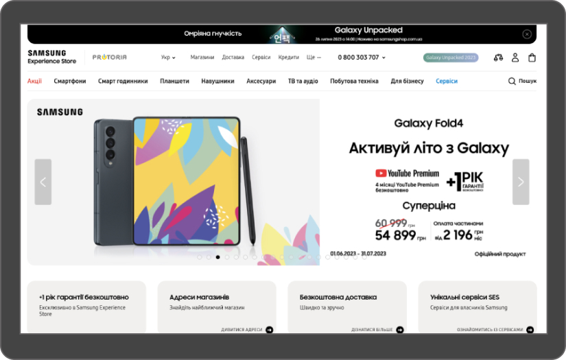
We have worked with the top 30 eCommerce brands in Ukraine, experiencing 500K - 3M traffic per month, and completed more than 400 projects from Europe, the Middle East, Canada, Australia, and the USA. These projects include Web apps and Mobile apps. We are accustomed to handling high-traffic volumes for projects such as Samsung, Pandora, and Watsons, including complex dashboards and systems for logistics companies and CRMs. We can cope with projects of any size, starting with elegant marketing sites and ending with SaaS solutions for millions of users.
We are well-known in the UX/UI and CRO industry, having been speakers at conferences in Berlin and London, with our articles published in Smashing Magazine, Muzli, Hotjar, etc. The company has been listed in the rankings of the Top 100 Conversion Optimization Services and Top 100 User Experience Agencies according to The Manifest. We were also the organizers of the Online eCommerce Conference for Conversion Growth in collaboration with CXL, Baymard Institute, Optimizely, and Hotjar.
We don’t create one-time websites, as we believe that every business needs continuous improvements based on numbers and facts. We prefer a scientific approach to conversion rate optimization, drawing on our strong usability background, rather than relying on one-time common optimization tricks. We are not looking for clients but for partners for whom interface quality matters.
What we do
With the help of design solutions, we influence key website metrics to increase our clients’ revenue.
We provide the following services:
- Usability audit
We pinpoint interface flaws crucial for conversion based on the analytics, users' behavior, and key site metrics.
- Conversion rate optimization according to the ESR approach
The Evolutionary Site Redesign (ESR) is a gradual interface enhancement process that fixes critical mistakes without dramatically redesigning the website
- UX/UI services
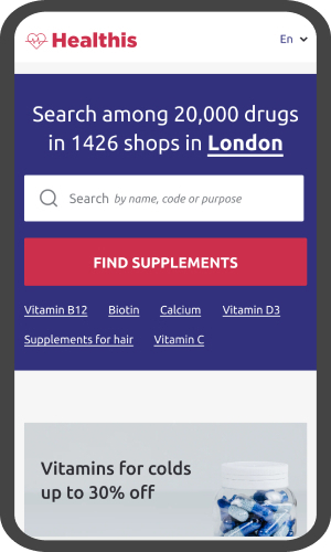
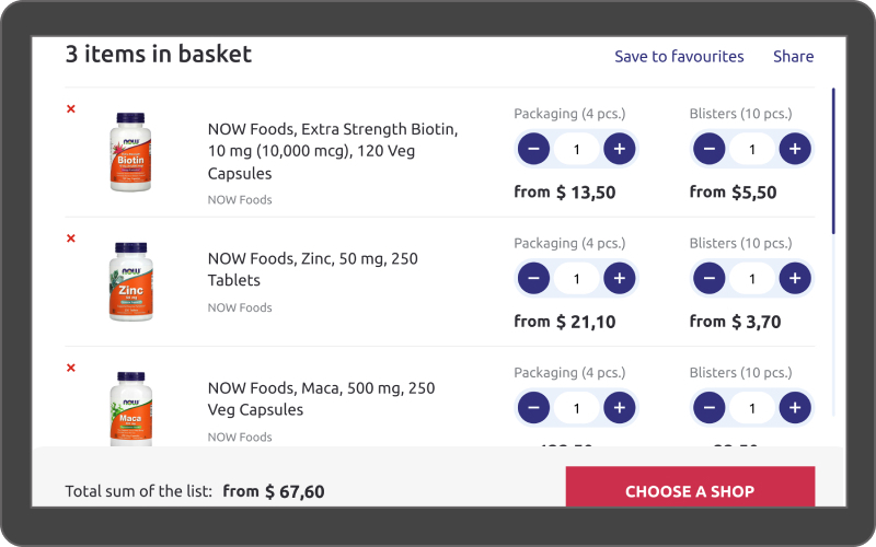
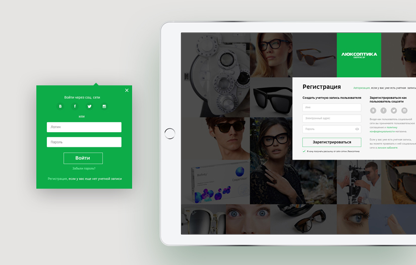
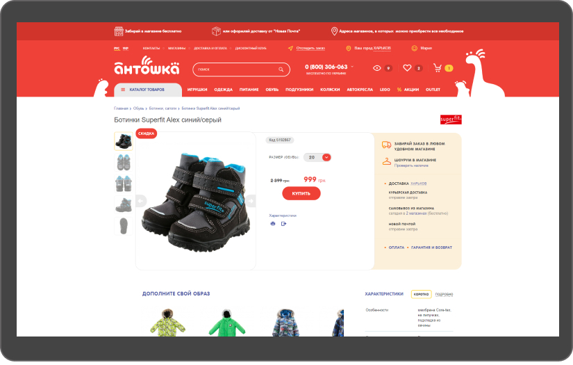
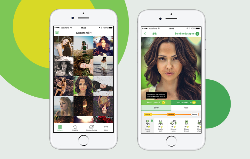
Information and navigation structure, Customer Journey Mapping (CJM), dynamic and static prototyping, and the design of all website pages with various states (mobile and desktop). We specialize in mobile-first custom design solutions for a range of websites, including eCommerce, FinTech, company websites, SaaS, etc. Our UX/UI services extend to both Mobile Apps and Web Apps.
- UX/UI for Shopify
We know all the limitations of the Shopify platform, so we can provide such services as UX/UI design for Shopify, Conversion rate optimization, and UX audit.
- Product design
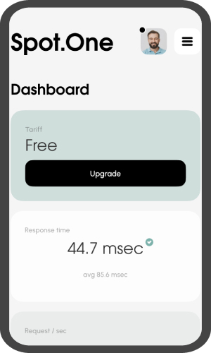
We have enough experience in creating designs from scratch for CRM systems, NFT platforms, FinTech solutions, etc. We know how to create a cost-effective MVP of uncompromised quality and invest gradually in its development.

Focus Areas
Service Focus
- Web Designing (UI/UX)
- App Designing (UI/UX)
- Mobile App Development
- Web Development
Client Focus
- Small Business
- Medium Business
- Large Business
Industry Focus
- E-commerce
- Business Services
- Financial & Payments
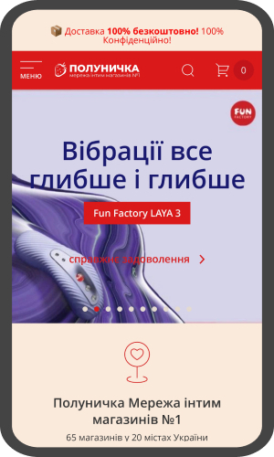
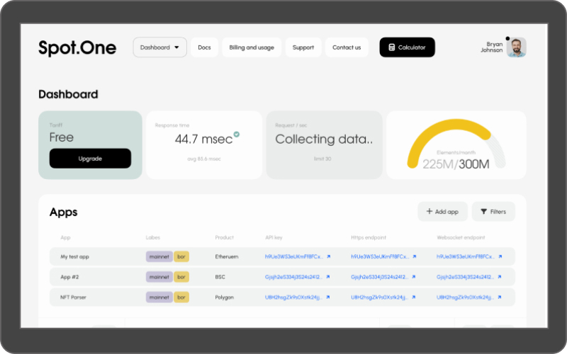
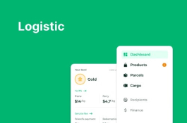
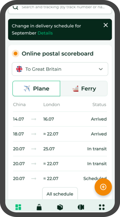
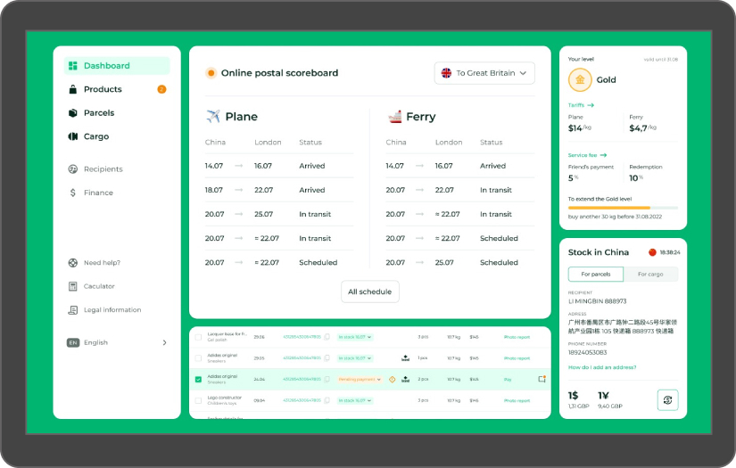
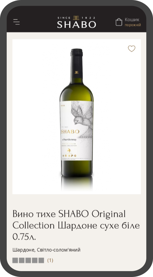
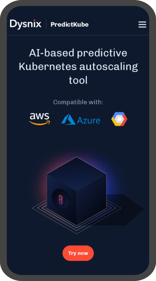
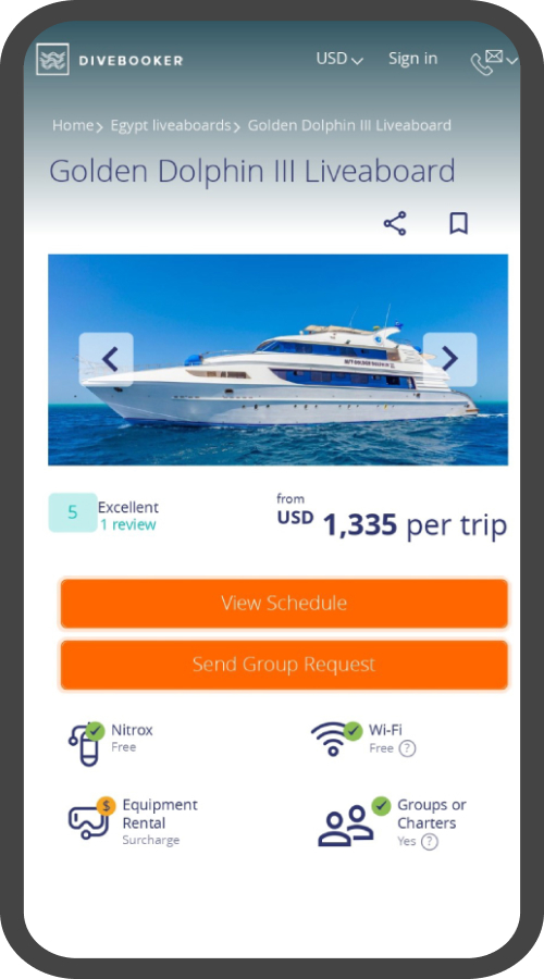
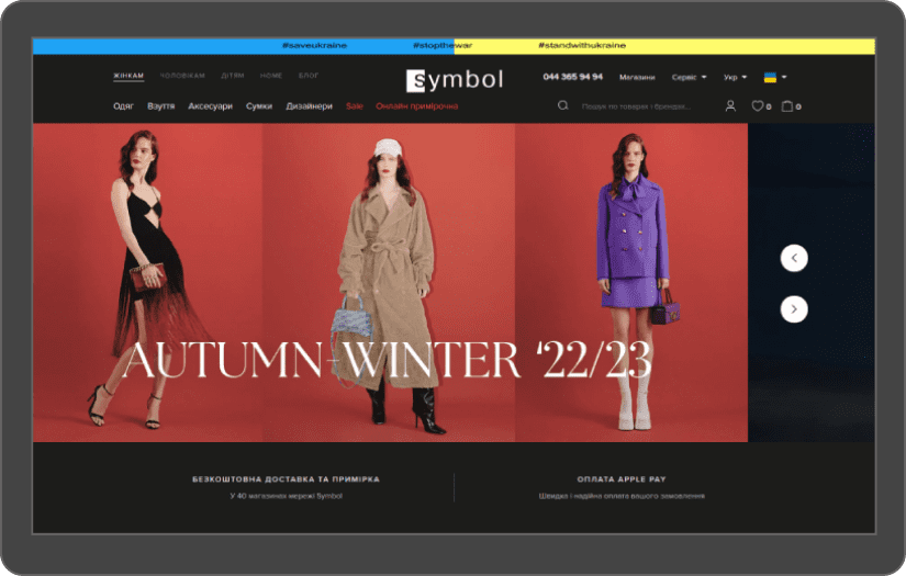
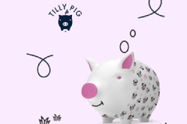
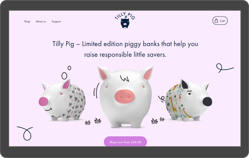
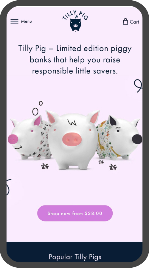
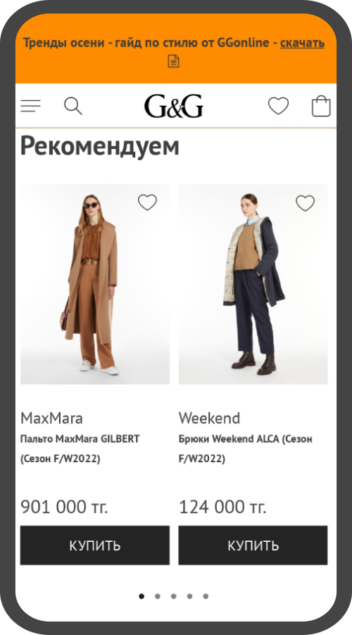
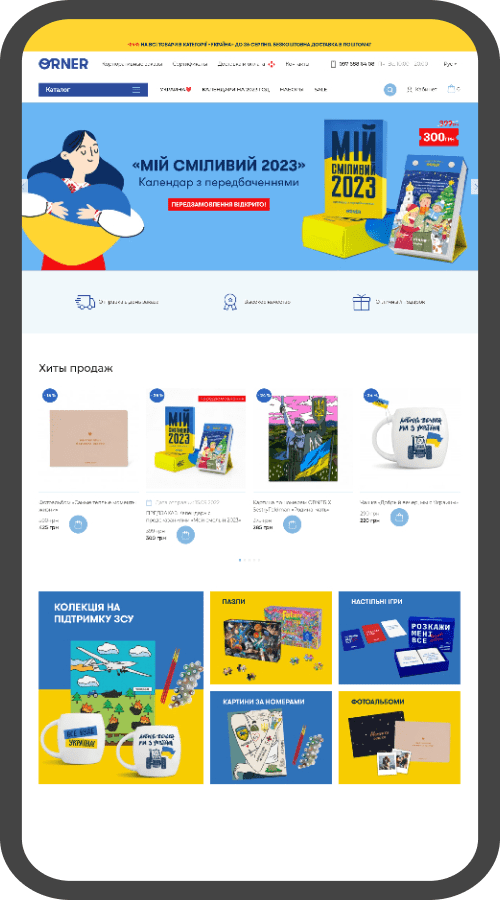
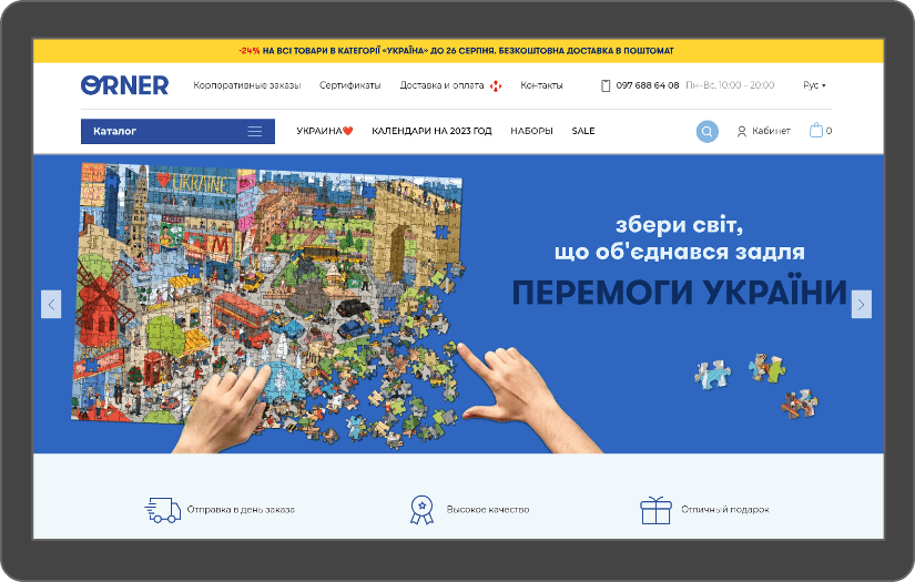
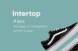
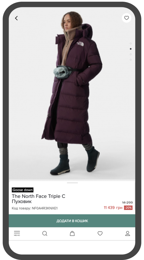
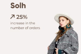
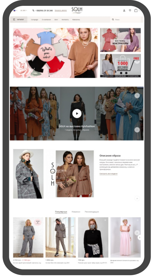
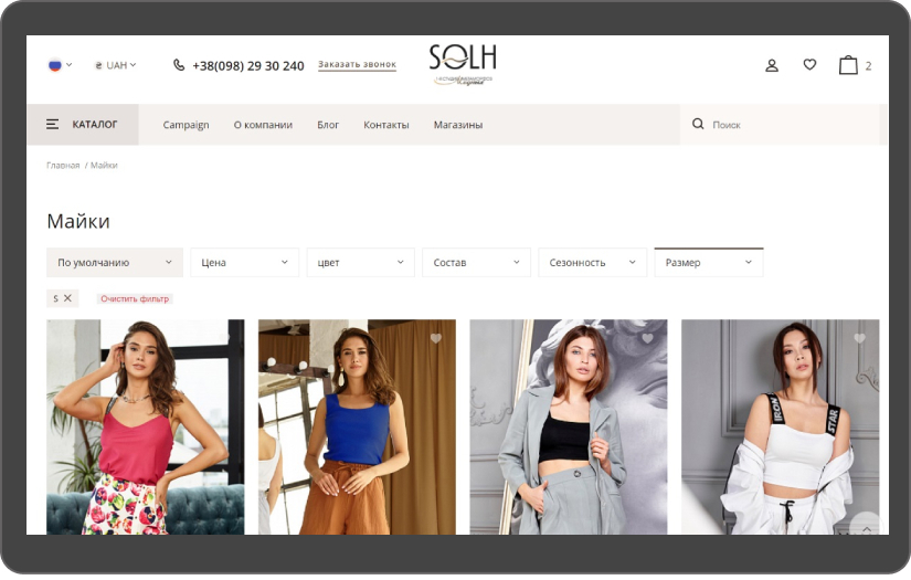
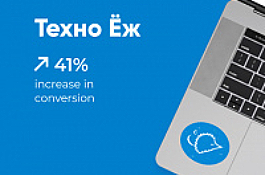
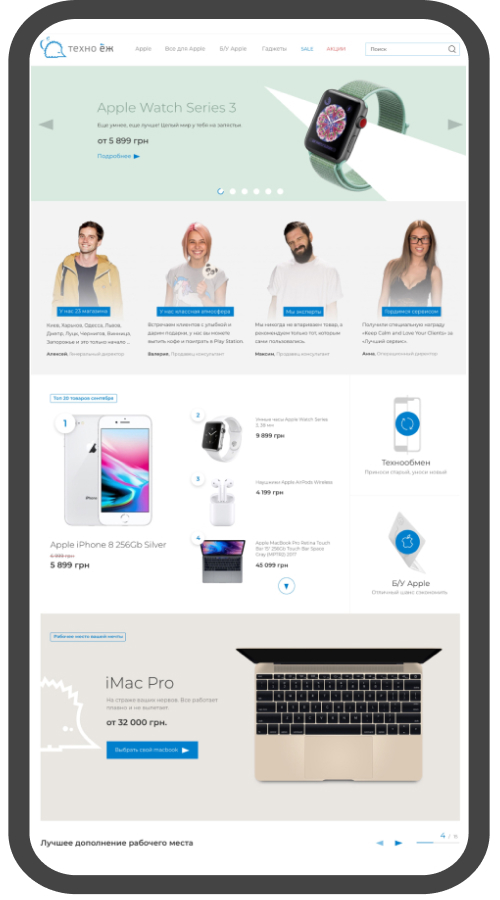
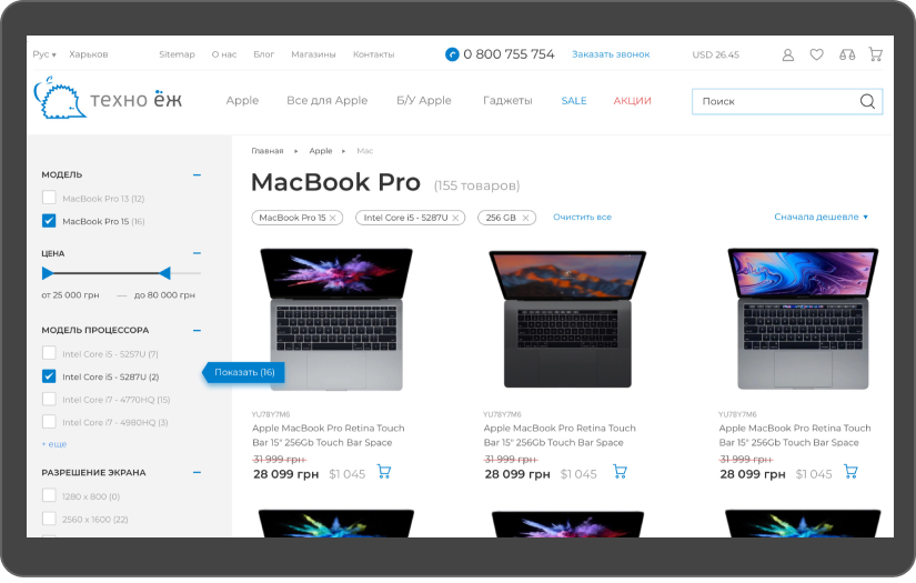
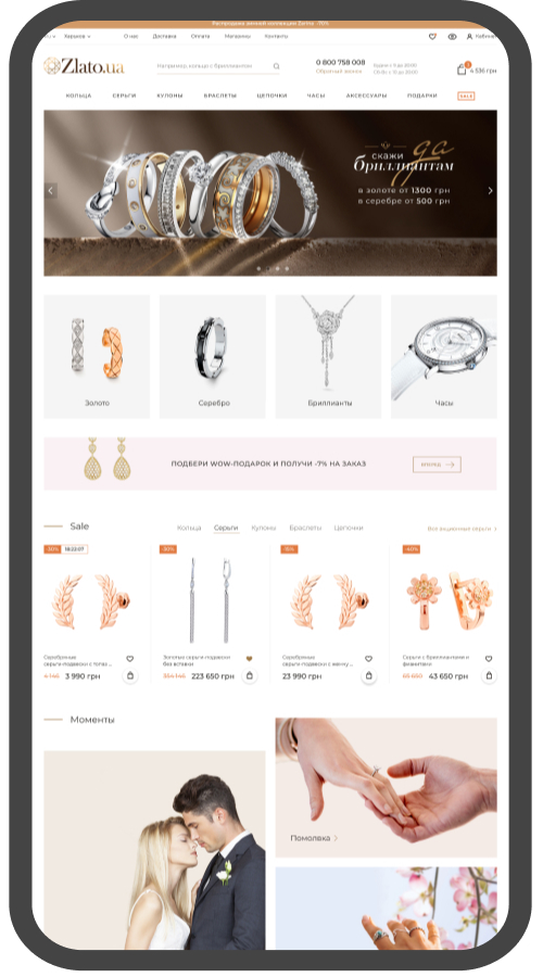
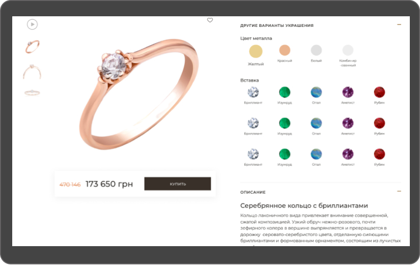
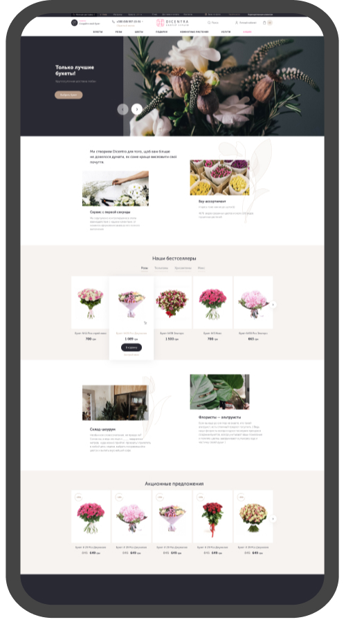
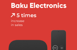
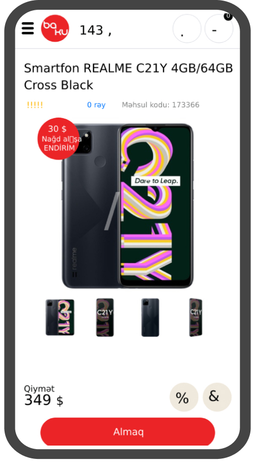
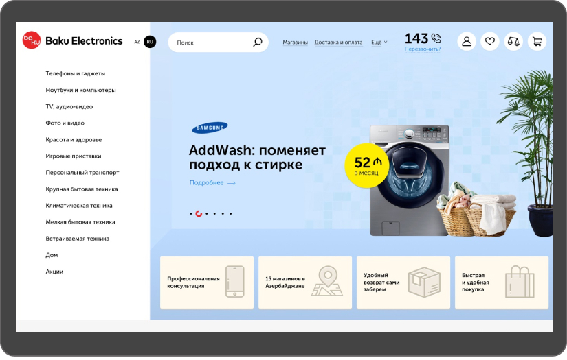
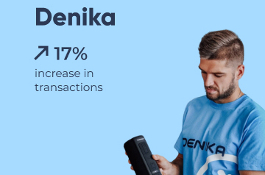
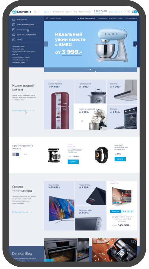
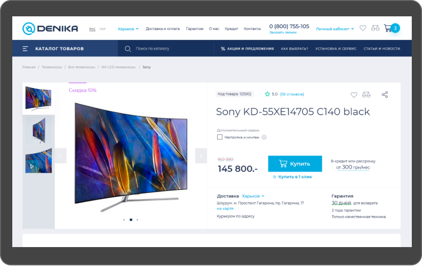
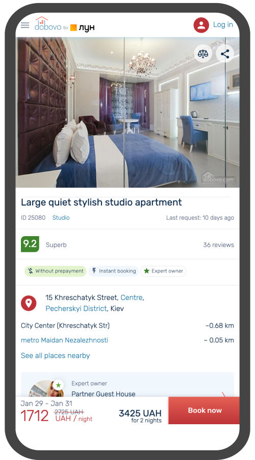
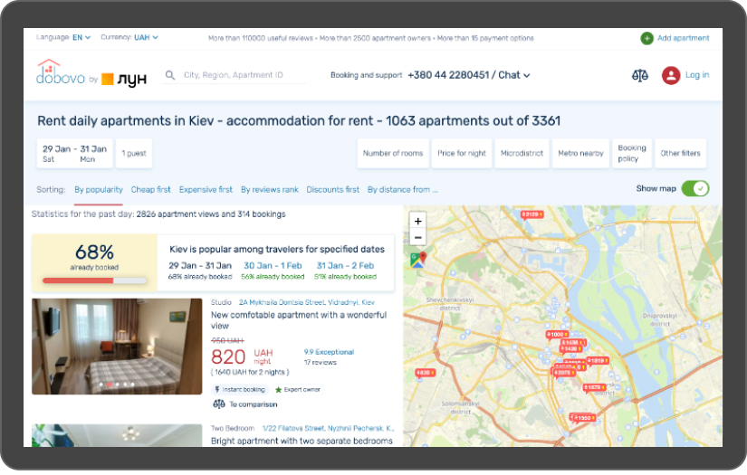
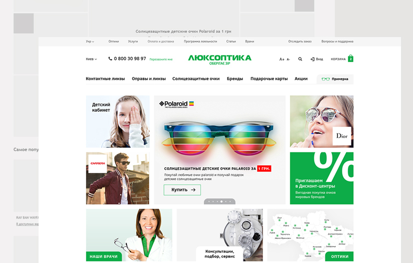
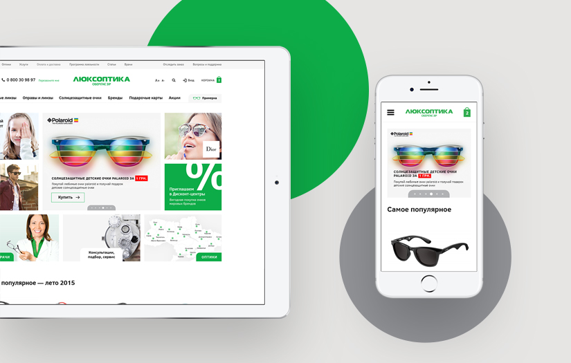
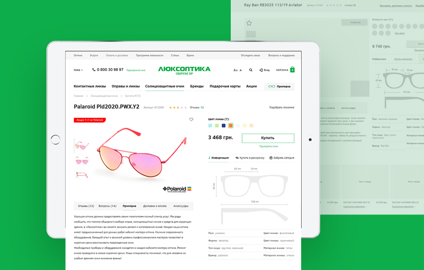
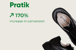
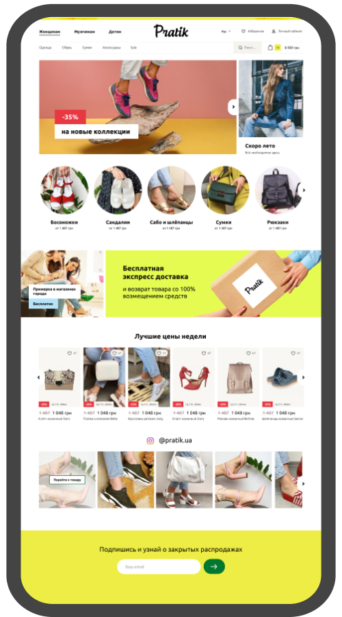
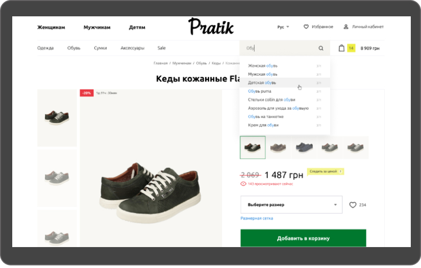
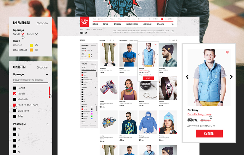
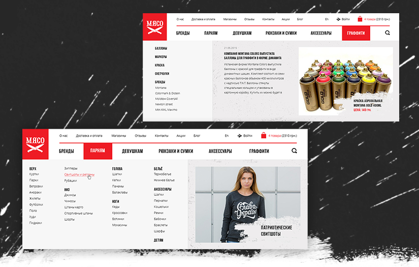
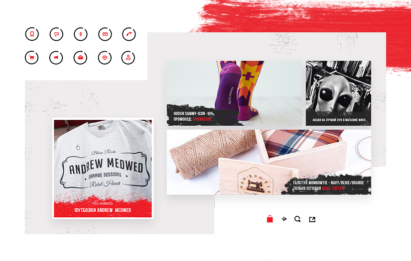
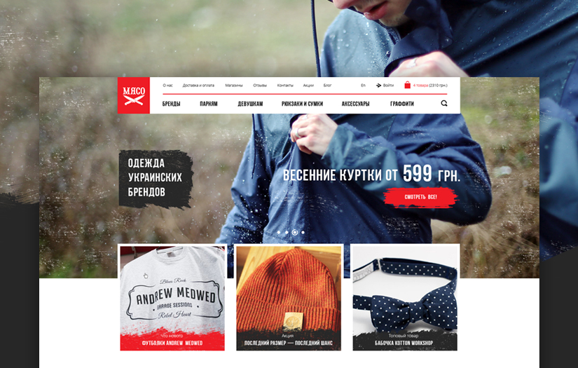
Turum-burum Clients & Portfolios
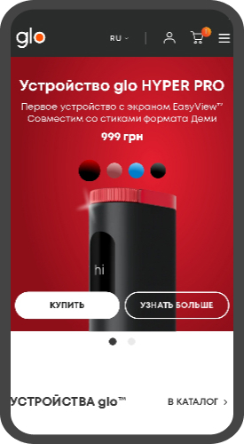
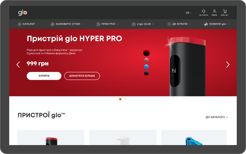
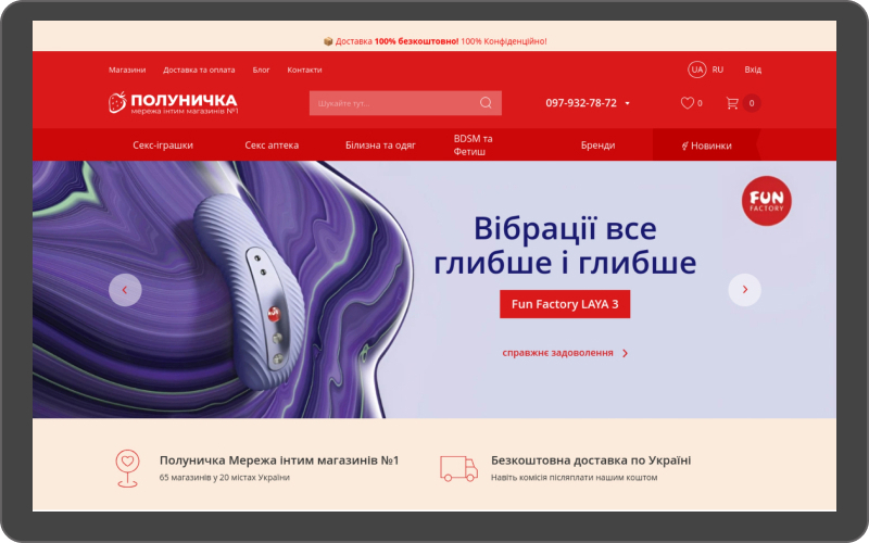
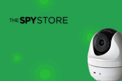

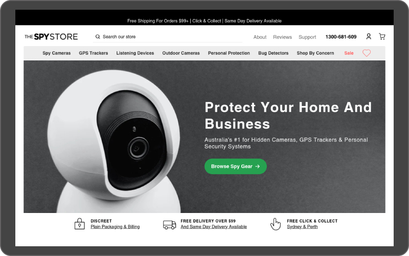
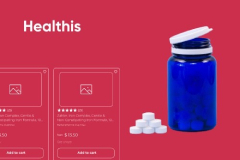
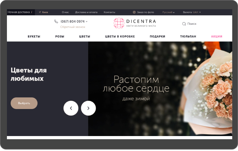
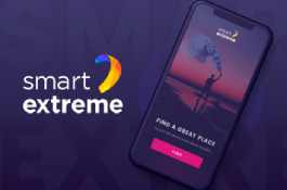
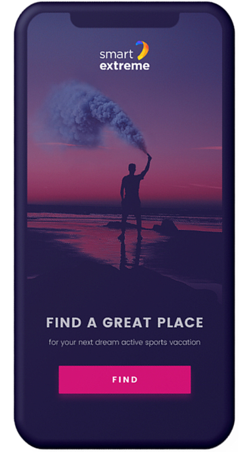
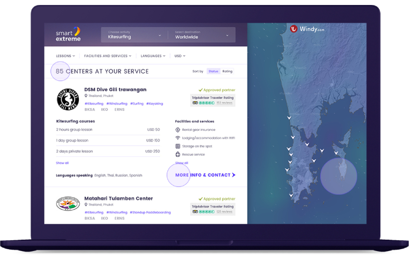
.jpg)
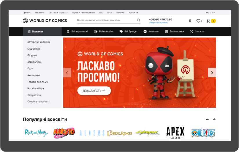
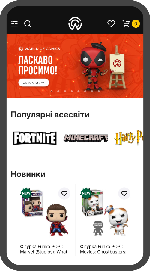
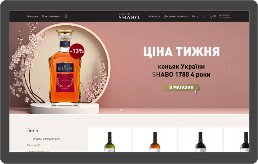
.jpg)
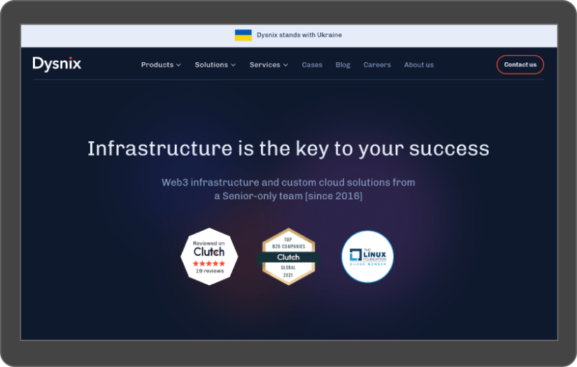

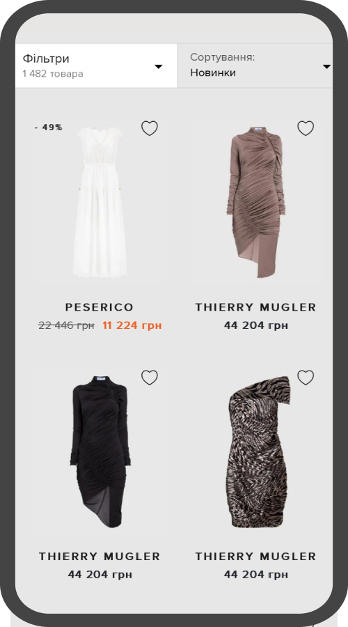

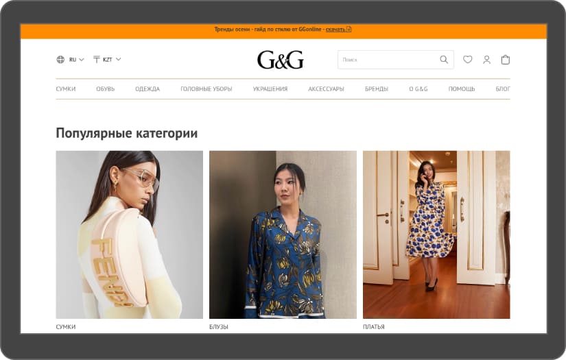
.jpg)
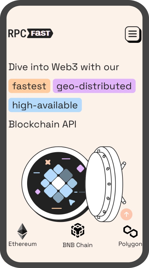
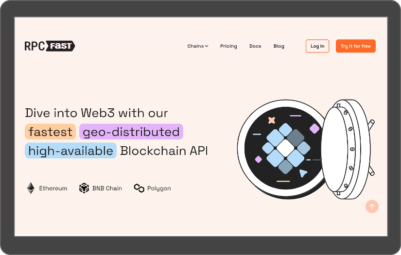
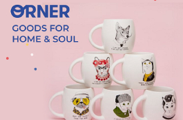
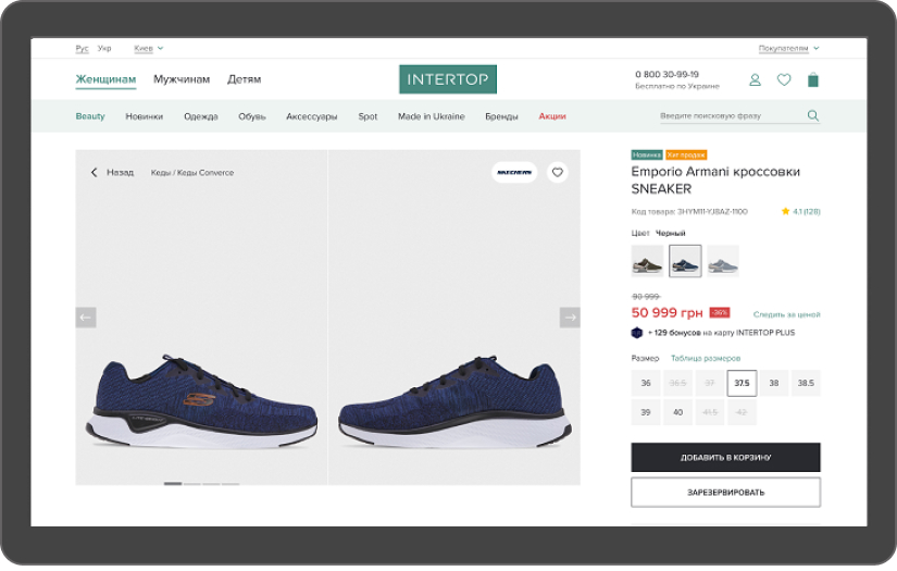
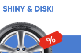
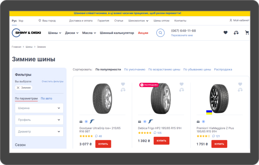
.jpg)


Turum-burum Reviews
- All Services
- Web Designing (UI/UX)
- Relevance
- Most Recent
- Rating: high to low
- Rating: low to high

We suggest their services to our customers since we checked their expertise on our own project.
Review Summary
Turum-burum helps businesses by conducting research to understand their needs, audience, and competition. They also create wireframes and prototypes to visualize the layout and functionality of the website and design the interface with color schemes, typography, graphics, and overall aesthetics.
What was the project name that you have worked with Turum-burum?
UX audit for a marketing company website
What service was provided as part of the project?
Web Designing (UI/UX)
Describe your project in brief
Inweb is a digital marketing agency with 10 years of experience. We comprehensively promote business on the Internet and make our clients market leaders.
What is it about the company that you appreciate the most?
The UX/UI team's dedication to detail is remarkable, resulting in a final product that is both visually appealing and user-friendly. Their commitment to excellence is evident in every aspect of their work.
What was it about the company that you didn't like which they should do better?
I can’t remember anything like that. I highly recommend this agency to anyone who wants to improve the user experience of their website.

Excellent partnership experience with Turum-burum agency, who has high skills in UX/UI design.
Review Summary
What was the project name that you have worked with Turum-burum?
UX/UI services for several eCommerce clients
What service was provided as part of the project?
Web Designing (UI/UX)
Describe your project in brief
Our company is engaged in digital marketing services for eCommerce projects and other industries. We have been on the market since 2006 and have 3000+ projects in our portfolio.
What is it about the company that you appreciate the most?
We are satisfied with the conditions of our cooperation and the openness of the partnership. It's a pleasure to work with such a professional team.
What was it about the company that you didn't like which they should do better?
We did not have any misunderstandings during the work. All at the highest level.