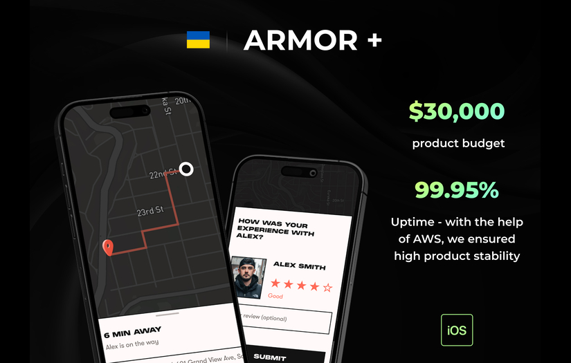
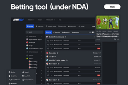
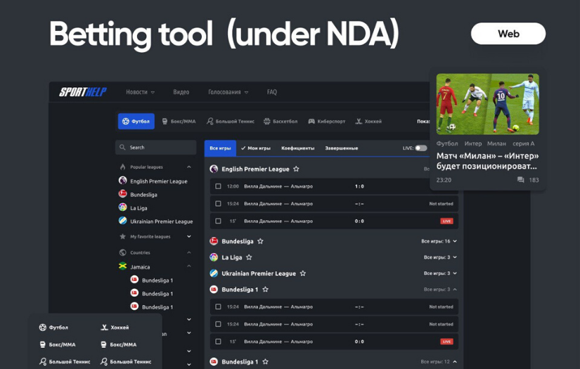
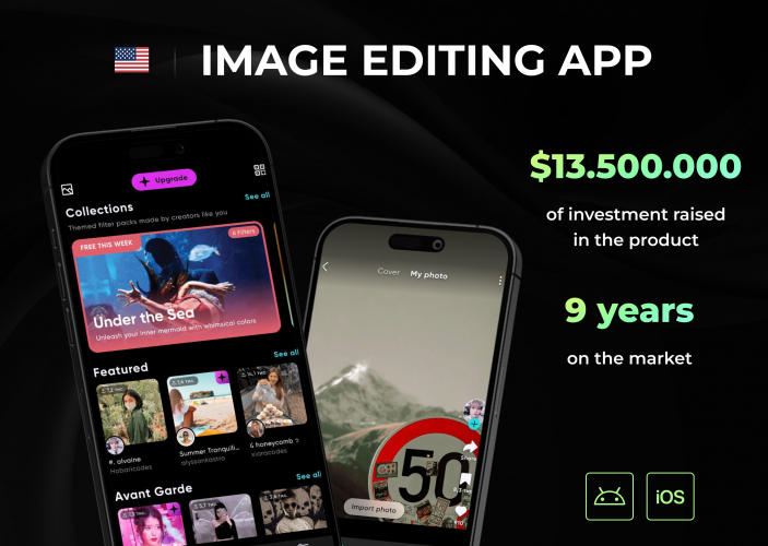
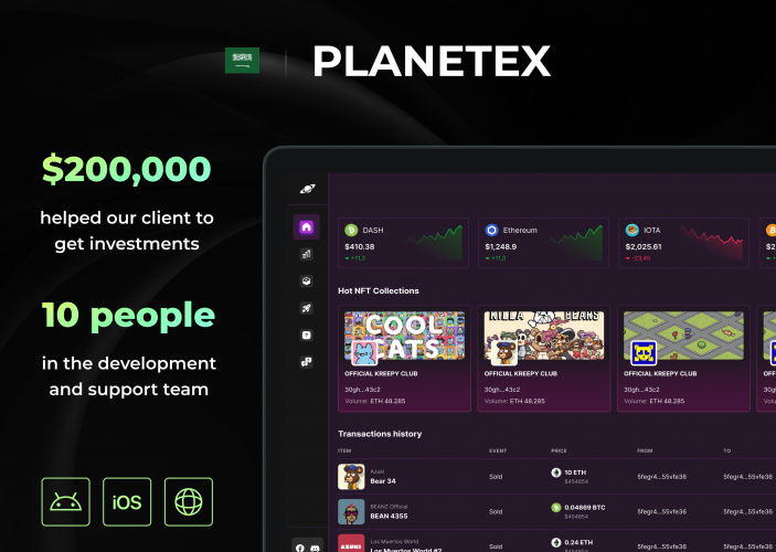
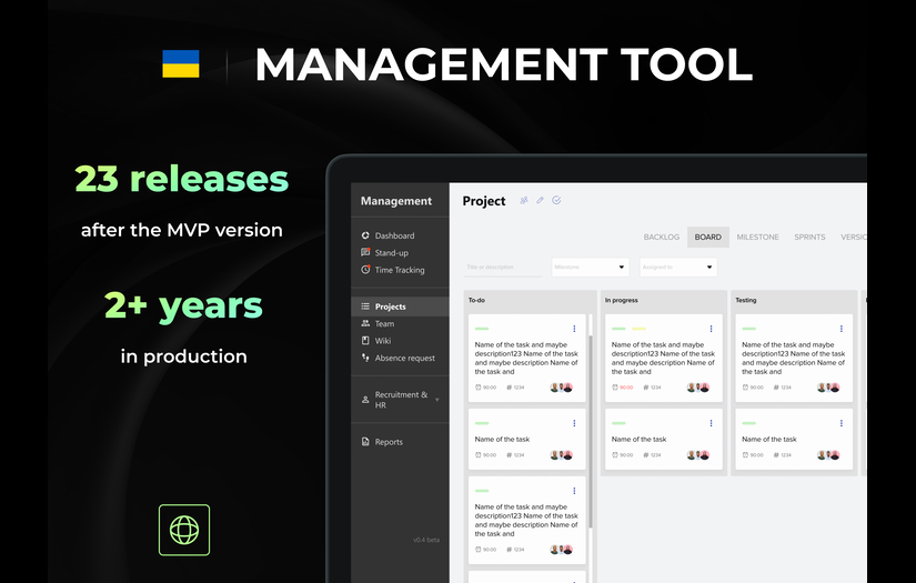
Design: When collaborating with the client on the app's design, their vision was distinctly defined and served as a guiding beacon throughout the process. The client expressed a strong preference for a visually appealing user interface (UI) that incorporated a striking yellow-green color scheme, lending the app a fresh and vibrant appearance. This choice of color not only added a sense of energy but also helped establish a cohesive brand identity.
As for the UI elements, particular attention was given to the loading animations. These animations were crafted meticulously to create a seamless and engaging user experience (UX) during moments of data retrieval or content loading. By incorporating captivating loading animations, the user's waiting time was transformed into an enjoyable interaction, reducing the likelihood of frustration or impatience.
Beyond the UI, the UX design emphasized the importance of smooth transitions between screens. The navigation flow was meticulously mapped out to ensure a user-friendly journey through the app. From accessing different features to browsing content, every action was designed to be intuitive and effortless.
Additionally, the application embraced the concept of "calls" in a minimized version, optimizing the user experience even when interacting with the app in its reduced state. This clever utilization of calls ensured that users could perform essential tasks without the need to fully maximize the application, making it more convenient and efficient for multitasking or quick interactions.
The collaborative effort between the design team and the client resulted in an app that not only captured the client's original vision but also exceeded expectations in terms of visual appeal and usability. The combination of the eye-catching yellow-green color scheme, engaging loading animations, and thoughtful UX design provided users with a delightful and satisfying experience from the moment they launched the application.


.jpg)
.jpg)

.jpg)
.jpg)
.jpg)
.jpg)
.jpg)
.jpg)


.jpg)
.jpg)
.jpg)


.jpg)
.jpg)

 (1).jpg)

 (1).jpg)
 (3).jpg)

 (2).jpg)
 (1).jpg)
.jpg)