What is Responsive Web Design (RWD)?
Responsive Web Design is a web design approach aimed at allowing desktop webpages to be viewed in response to the size of the screen or web browser one is using.
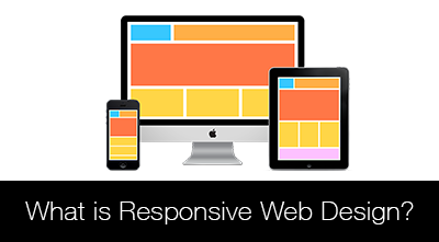
Responsive web design explains the technique of programming web pages and mobile apps in such a way that they will respond to the size and browser specifications of the screen that the consumer is viewing the content with. If a website is opened on a computer monitor, and then opened on a small mobile device screen, it should be organized and clean on both sizes.
Some older websites did not make use of responsive web design, and are not easy to read on mobile devices. Some websites may not work at all on mobile devices. Likewise, some mobile applications that were designed for an Android or iOS phone may not load as easily or with as much functionality on an iPad or Windows Surface tablet.
There are a few key elements of work that go into establishing responsive web design, and it is an approach that is being globally adopted by most web designers across the world.
All the Details
Responsive web design, above all, keeps its sole principle in mind:
- Ensuring that the design and development of a website or mobile app will easily respond to and work with the customer’s device environment and behaviors, taking into consideration common elements such as screen size and orientation as well as the type of browser platform the customer is using.
The act of doing responsive web design involves the use of grids and layouts on the front end. This typically involves client-side scripting, using elements such as CSS and images to create queries that help the web application respond to the customer’s mobile behavior. It is, quite literally, the act of creating a technology that responds to each individual user, rather than working off of a pre-programmed set of instructions and capabilities.
A web designer will use HTML and CSS to grow, shrink, hide, or move certain contents of a web page or mobile app to make it more readable and accessible on different platforms.
Things to Consider
When employing a responsive web design tactic to a mobile application or website, there are common web design components that must be taken into account when starting. A good responsive web design plan will include the following elements:
- The ability to adjust to screen resolution – There is a huge resolution difference between a standard computer monitor and a mobile device or tablet. To put things in perspective, the “landscape” orientation is typically 1024 x 768, while a “portrait” orientation is only 240 x 320.
- The ability to react to different web browsers and viewing platforms – It is impossible to predict what kind of browser or client a customer will be using to view your web page or mobile app. From Firefox to Google Chrome, a web page should be able to respond the same way and adapt to the different platforms.
- The ability to make flexible images – A basic image file is typically saved to a certain size. But it is important that these images learn how to react and scale themselves based on the viewer’s screen size. An image that measures 2” x 2” may appear small on a computer monitor, but it can take up a majority of screen space on an iPhone.
Responsive web design is still in its infancy, but as it becomes more developed, it is clear that this tactic is essential to creating a more mobile world.