Key takeaways
- People decide if a fintech website feels trustworthy within seconds, and it's almost entirely visual, not copy.
- Trust and conversions aren't two different goals. Hide a fee or bury your security info, and you lose signups even when the product itself is solid.
- Regulatory and compliance details work better near the sign-up button than tucked away in the footer.
- Real proof, named clients, specific numbers, honest testimonials, beats a generic line like "trusted by thousands" every time.
- Mobile responsiveness and accessibility aren't nice-to-haves anymore. Users expect both before they'll even look at the rest of your site.
- Check your trust signals and conversion numbers often. This isn't a launch-day checklist you finish once.
Is your fintech website actually earning trust, or just hoping it looks that way? Money makes people cautious, and that shows up the second they land on your site. They're deciding, often without realizing it, whether this platform deserves their savings, before reading a single word.
That's why fintech web design carries more weight than design does almost anywhere else. A cluttered form or a fee that only shows up at checkout is usually enough to make someone leave. Not because the product is bad, but because something about the page made them pause. Here's what actually builds trust on a fintech website, how to design for conversions without pushy tactics, and where fintech companies quietly lose people.
If a redesign's on your roadmap, take a look at this list of top fintech web design companies and decide your next move.
Here's a quick look at what actually moves the needle, before we get into the details.
|
Design Element |
Why It Matters |
Quick Fix |
|---|---|---|
|
Fee transparency |
Hidden costs are the #1 trust-killer |
Show real numbers in the hero, not the footer |
|
Regulatory info placement |
Users search for it whether you highlight it or not |
Move license/security details near the CTA |
|
Social proof |
Vague claims read as filler |
Use named clients and specific numbers |
|
Microcopy tone |
Legal-sounding text feels cold |
Write errors and confirmations like a person would |
|
Visual design (color, type, motion) |
Signals institutional seriousness |
Neutral palettes, restrained animation |
|
Form length |
Every extra field increases drop-off |
Collect data progressively, not all at once |
|
Mobile responsiveness |
Most fintech traffic is mobile-first |
Test forms and dashboards on-device, not just desktop |
|
Accessibility (WCAG) |
A trust signal, not just compliance |
Large tap targets, screen-reader-friendly forms |
Now, let's break down why fintech websites need to think about design differently in the first place.
Why Fintech Websites Need a Different Design Approach
A regular business website just needs to look professional. A fintech website has to prove, in seconds and mostly through how it looks, that it can be trusted with someone's actual money. That impression forms before anyone reads the headline, based on how organized the page feels.
Every button, form field, and color choice either builds confidence or chips away at it. Add the regulatory layer on top, KYC checks, AML compliance, data privacy laws most industries never think about, and the site still needs to feel simple instead of like government paperwork.
Top web design companies working in this space will tell you the same thing: fintech sits at the intersection of finance, psychology, and compliance. Miss any one of the three, and users notice, even if they couldn't tell you exactly what felt off.
Core Elements of Trustworthy Fintech Web Design
The elements that matter most tend to repeat across every fintech site that gets this right. Here's where they usually show up on the page:
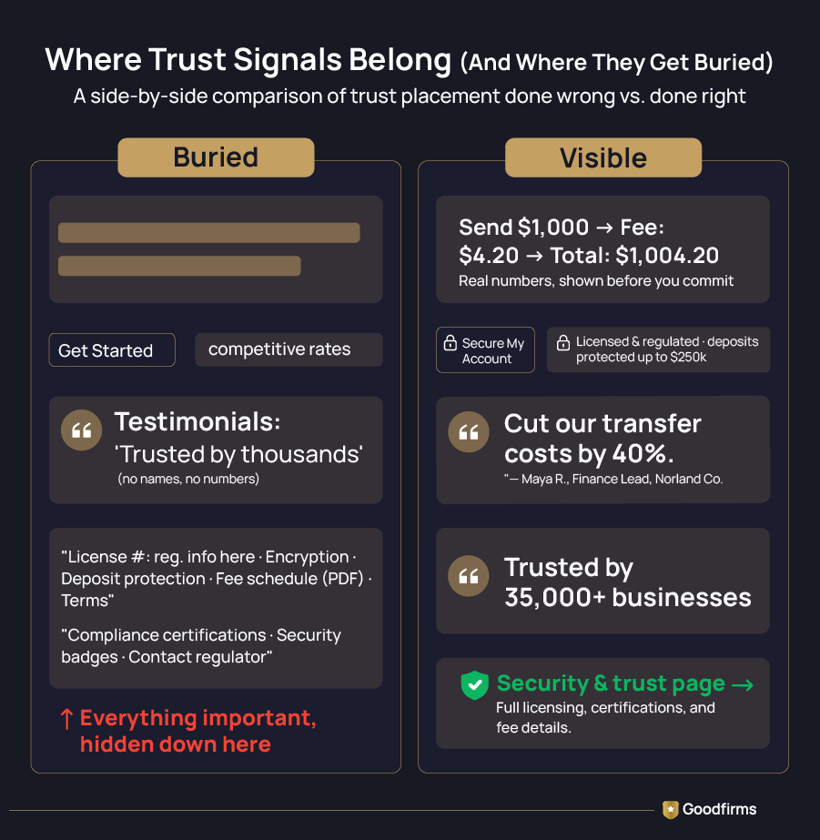
1. Lead with transparency, not fine print
Nothing kills trust faster than a hidden fee or vague terms buried in a footer link. If your platform charges something, show it before the user commits, not after. Wise built its entire homepage around this idea, real transfer fees, right up front, instead of hiding behind "competitive rates." If you're collecting sensitive data, just say why, right where you're asking for it.
2. Put regulatory and security information where users can actually see it
Encryption, licensing, compliance certifications: none of it builds trust if nobody sees it. Instead of burying your regulator info in tiny footer text, put it near the sign-up button, as actual product copy. A line like "Licensed and regulated, deposits protected up to [amount]" near the CTA does far more than the same sentence buried three scrolls down.
Security badges work the same way, but don't go overboard. Ten badges crammed into a footer look desperate, not credible. Pick the two or three that matter most, and put them where the stakes are highest, like login and payment pages.
3. Show real proof, not vague claims.
"Trusted by thousands" doesn't mean much on its own. Named client logos, real numbers, and testimonials with actual names carry a lot more weight. "Trusted by 35,000+ businesses including [names]" simply does more work than "trusted by leading companies" ever will. If your marketing team is already running a fintech digital marketing agencies campaign to drive that traffic in, make sure the landing page actually backs up what the ad promised.
4. Write copy that sounds human, not legal.
Swap "Transaction unsuccessful" for "That payment didn't go through. Here's what to try next." Monzo and Starling built a lot of their early reputation on this alone, plain, friendly copy in a category that usually sounds like a compliance document. Every label and confirmation message is a chance to either reassure someone or leave them confused. Read it out loud once. If it doesn't sound like a person wrote it, rewrite it.
5. Design the visual layer to match the stakes.
Color, typography, and motion carry meaning here; they're not just decoration. Blues and greens dominate fintech because they feel stable, while loud, high-saturation palettes work against you on screens where people are checking balances. Stick with neutral, modern typefaces over decorative ones, and keep animation light, a subtle transition, or a loading indicator, nothing more. Heavy parallax or autoplay video ends up feeling like a marketing site, not a platform someone should trust with their money.
Look at any of the best fintech websites live today, and the pattern repeats: numbers up front, jargon kept to a minimum, nothing important buried three scrolls down. It's rarely one big feature doing the work; it's small choices stacked together, the same ones that separate the best designed financial websites from the ones people abandon mid sign-up.
You don't always need to build every screen from scratch, either. Plenty of fintech website templates come with compliance-friendly layouts baked in, though they still need customization to match your fee structure and licensing details. The best financial services websites still put in the work on copy and proof that no template ships with by default.
Designing for Conversions Without Losing Trust
1. Cut down your forms
Every extra field on a sign-up form gives someone one more reason to leave. Ask only for what you genuinely need at that stage. If KYC needs more details later, collect them gradually instead of dumping everything into one long form. Camera-based uploads, autofill, and inline validation all cut down the friction that causes people to drop off during onboarding.
2. Make compliance feel like a benefit, not a barrier
KYC checks are usually where people abandon a sign-up. Frame the step as protection instead of bureaucracy, and it lands differently. Something like "We're verifying your identity to keep your account secure. This takes about 90 seconds" turns a friction point into reassurance.
A 2025 global survey of 600 financial executives found that 70% of institutions had lost prospective clients to slow or complex onboarding, up from 48% just two years earlier (Fenergo, 2025). Frame the step as protection instead of bureaucracy, and it lands differently. Something like "We're verifying your identity to keep your account secure, this takes about 90 seconds" turns a friction point into reassurance.
1. Make your CTAs specific, and show fees upfront
"Submit" doesn't tell anyone what happens next. "Secure My Account" gives users a clearer sense of what they're agreeing to. The same logic applies to pricing: people abandon transactions when costs surprise them late, so show fees clearly and let users compare them right on the page.
2. Design your error states carefully
A vague "Something went wrong" only creates doubt. Something specific, like "We couldn't verify that ID, try a clearer photo," gives people a way forward instead of a dead end.
3. Treat mobile and accessibility as conversion basics
Most people check their finances on a phone before they ever touch a laptop, so a fintech site that isn't fully responsive is losing conversions before anyone reaches a form. Large tap targets, screen-reader-friendly forms, and strong contrast on data-heavy pages aren't just about avoiding legal risk. It's basic usability, and skipping it costs signups whether you notice it or not.
Getting trust signals website design right mostly comes down to placement, not content you don't already have. Most fintech companies already have the fee sheet, the license number, and the testimonials. The problem is where it sits on the page. Move it closer to the decision point, and you've covered a good chunk of financial website design best practices without writing a single new line of copy. Teams working through our UX design for fintech breakdown will recognize a lot of this overlap between UX and plain visual trust-building.
Common Mistakes Fintech Websites Make
A few problems come up again and again, worth watching for early rather than fixing after launch.
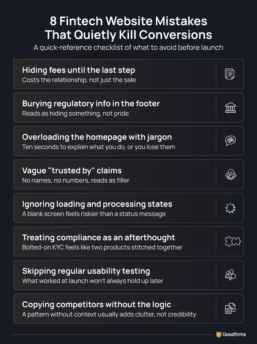
- Hiding fees until the last step. Probably the biggest trust-killer out there. A surprise fee at checkout costs the relationship, and most people won't come back to check if you've changed.
- Burying regulatory info in the footer. If someone has to hunt for your license number, it reads as something you're hiding, not something you're proud of.
- Overloading the homepage with jargon. If a first-time visitor can't figure out what you do within ten seconds, you've already lost them.
- Using vague "trusted by" claims. Lines like "trusted by leading enterprises" read as filler. Name a real client or a real number, or leave the claim out.
- Ignoring loading and processing states. A blank screen during a transaction feels riskier than a simple "Processing your payment" message.
- Treating compliance as an afterthought. Bolting KYC forms onto a finished design usually feels like two products stitched together.
- Skipping regular usability testing. What worked at launch won't necessarily work as your user base grows or competitors raise the bar.
- Copying competitors without understanding why something works. A fee comparison widget works for one platform because it fits their audience. Copy the pattern without the logic, and you just add clutter.
How to Measure If Your Fintech Website Design Is Actually Working
Design decisions should be judged by results, not by opinions in a meeting room. A few numbers worth tracking regularly:
- Onboarding completion rate. Track it step by step, not just start-to-finish, so you know exactly where people give up.
- Time to first transaction. The faster someone completes their first action, the more confident they probably feel. A long gap usually means confusion, not disinterest.
- Support ticket themes. A spike in questions about fees or "is my money safe" points to a design gap, not a support gap.
- Mobile vs desktop conversion rates. A wide gap almost always means your mobile experience needs work.
- Drop-off points inside forms. Heatmaps and session recordings show exactly which field causes hesitation.
- Repeat engagement after first use. A strong first impression with no second visit usually means the trust built at sign-up didn't carry into the product.
This isn't a one-time project you finish and forget. Revisit these numbers every quarter, and treat underperformance as a design problem worth fixing, not just a marketing one.
What This Means for Your Website
So, does your fintech website actually earn trust, or is it just hoping visitors assume the best? Looking good was never really the job. The real job is earning trust fast, then getting out of the way so people can do what they came to do.
That means being upfront about fees, putting regulatory info where people can find it, writing copy that sounds like an actual person, and treating mobile and accessibility as basics, not extras. None of this asks you to reinvent web design. It just asks you to pay attention to the small details that quietly tell someone whether a platform is safe. Get those right, and conversions tend to take care of themselves.
FAQs - Fintech Web Design Practices
1. What makes fintech web design different from other industries?
Fintech deals with sensitive financial data and regulatory requirements that most industries never think about. Every choice, from a form field to a color, has to balance usability with security and compliance, since people are trusting you with their money, not just their attention. A confusing checkout on a regular ecommerce site costs you a sale. The same confusion on a fintech site makes someone question whether their account is even safe, which is a much bigger problem to recover from.
2. How can a fintech website build trust quickly?
Show transparent pricing instead of vague phrases like "competitive rates," put regulatory info near the sign-up action instead of the footer, and write clear, human copy in place of legal-sounding text. Trust comes from small, consistent details across every page, not one big feature or a single security badge. It also helps to show real proof: named clients, specific numbers, and testimonials with actual names, since vague claims like "trusted by thousands" don't do much for a cautious visitor.
3. Do fintech websites need to sacrifice conversions for compliance?
No. Steps like KYC verification can feel like part of a smooth process instead of a roadblock, as long as they're framed and paced correctly. Framing verification as a security benefit, rather than bureaucracy, and using progressive disclosure so users aren't hit with every requirement at once, both help people move through required steps without feeling stuck. Camera-based document uploads and inline validation also cut down on the friction that usually causes drop-off during onboarding.
4. Why does mobile design matter so much for fintech?
Most people check balances, send payments, and manage accounts from their phones, often before they ever open a laptop. A site that isn't fully responsive on mobile loses a big chunk of potential conversions before anyone even reaches a form. Beyond just fitting the screen, this means large tap targets, forms that don't require zooming, and dashboards that stay readable on smaller displays. Skipping any of this quietly costs signups, whether the team notices the drop or not.
5. What's the biggest mistake fintech websites make with design?
Hiding fees until late in the process, or burying regulatory details in the footer where nobody thinks to look. Both read as things a company is hiding rather than things it's proud of. Once someone feels misled, even by accident, they rarely give a platform a second chance, no matter how good the actual product turns out to be. That first impression tends to stick, and it's hard to win back once trust is broken.
6. How often should a fintech website's design be reviewed?
Quarterly, at a minimum. Onboarding completion rates, mobile conversion gaps, and support ticket themes should all get regular check-ins, since expectations in fintech shift faster than in most other industries. What worked at launch might not hold up a year later, especially as competitors raise the bar on what "simple onboarding" looks like or as new compliance requirements come into play. Treat this as ongoing maintenance, not a one-time launch task.
7. Does a fintech website need a dedicated security or trust page?
Yes, and it should actually say something, not be a 200-word stub tucked away in the footer navigation. A real page covering data handling, certifications, licensing, and how the platform protects user funds gives cautious users somewhere to verify claims instead of just taking the company's word for it. It's also a page worth linking to directly from sign-up flows, since that's usually the moment people are most likely to want that reassurance.