Key takeaways: B2B vs B2C Website Design
- One rulebook does not fit both, as B2B takes weeks to build trust and B2C converts in seconds.
- Designing for the wrong buyer directly impacts conversion, pipeline, and revenue outcomes.
- B2B buyers need 6+ visits to decide, B2C buyers need 3 minutes. Design for that gap.
- In B2B, the website initiates a sales process. In B2C, it completes one. Your CTAs should know the difference.
- Case studies provide verifiable ROI evidence that helps close B2B deals, and real reviews on the product page help close B2C sales. Trust signals are your silent salesforce.
- The best website is not the prettiest — it's the one built for the right buyer.
B2B vs B2C website design differs in how users decide, interact, and convert. Most websites don't fail on design. They fail because the entire site was architected for the wrong buyer — and no homepage refresh fixes that.
Many businesses assume the issue lies in surface-level elements like colors, layout, and CTAs. In reality, those are rarely the root cause. The real cause: the site is not aligned with the intended audience.
B2B website targets professional buyers, procurement teams, and executives who need detailed information, trust signals, and multiple touchpoints before making a purchasing decision. B2C website targets individual shoppers driven by emotion, speed, and visual appeal, typically converting in a single session. These different buying behaviors demand fundamentally different site architecture, content strategy, and conversion design
Further, B2B buying involves multiple stakeholders, longer evaluation cycles, and higher perceived risk. B2C buying is typically individual, faster, and driven by immediate intent. These are different buying behaviors that need different design approaches.
This guide covers the key differences — with a side-by-side comparison, real-world examples from Salesforce to Nike, and a straightforward framework to help you make the right call for your business.
What Is the Difference Between B2B and B2C Website Design?
B2B and B2C website design differ primarily in how they guide users toward a decision. B2B websites are built to support a longer, research-driven journey—prioritizing clarity, depth of information, and credibility to move users toward actions like demos or inquiries. B2C websites, on the other hand, are designed for speed and immediacy—reducing friction, using persuasive visuals, and enabling quick purchases within a single session.
In short, B2B design is structured to nurture and qualify leads over time, while B2C design is optimized to convert intent into instant action.
The core differences come down to four dimensions:
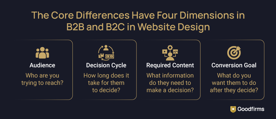
- Audience: B2B serves multiple stakeholders with different priorities — technical, financial, operational. B2C serves one person with one wallet.
- Decision cycle: B2B buyers take weeks or months. B2C buyers often decide in under 3 minutes.
- Required Content: B2B requires whitepapers, case studies, and ROI calculators. B2C requires product photos, reviews, and urgency triggers.
- Conversion Goal: B2B converts to a lead — a demo, form submission, or sales call. B2C converts to a transaction — add to cart, buy now.
This distinction directly influences conversion rates, sales cycles, and revenue outcomes.
Work With Proven B2B, B2C, and Hybrid Web Design Experts. Goodfirms has evaluated top web design companies based on verified reviews, portfolios, and industry expertise—so you can choose with confidence.
B2B vs B2C UX Design: Side-by-Side Comparison
The differences become obvious in a direct comparison:
|
Factor |
B2B Website Design |
B2C Website Design |
|---|---|---|
|
Primary Goal |
Lead generation & pipeline |
Direct sales & transactions |
|
Target Users |
Multiple stakeholders, buying committees |
Individual consumers |
|
UX Approach |
Information-rich, structured navigation |
Fast and frictionless |
|
Content Style |
Detailed, logical, evidence-led |
Visual-driven and benefit-focused |
|
Primary CTA |
Book a Demo / Contact Sales |
Buy Now / Add to Cart |
|
Average Session Length |
4–8 minutes |
Under 2 minutes |
|
Trust Signals |
Case studies, certifications, client logos |
Reviews, ratings, social proof |
|
Mobile Priority |
Important but secondary |
Absolutely mission-critical |
|
Pricing Display |
Usually gated or custom |
Transparent and upfront |
|
Purchase Cycle |
Weeks to months |
Minutes to days |
The numbers in that table explain the gap. What explains why it costs you measurable revenue is covered in the conversion strategy section below — specifically, why the wrong CTA on a B2B page can actively signal distrust to a buying committee.
Goodfirms Insight: Based on Goodfirms analysis of verified vendor performance data (2026), websites aligned with buyer type consistently show higher engagement depth, lower bounce rates, and stronger conversion quality compared to generic UX models.
A high-performing website aligns directly with how its buyers evaluate and make decisions. B2B buyers need depth and trust, and B2C buyers need speed and feeling. This table is your design brief for a perfect B2B vs B2C design concept.
B2B vs B2C Website Design: Key Differences Explained
-
B2B vs B2C UX Complexity Differences
B2B websites carry more navigational weight by necessity. A procurement manager evaluating an enterprise software platform needs to find technical documentation, integration specs, pricing tiers, security compliance information, and customer success stories, often across multiple visits and devices. The UX must accommodate non-linear research journeys without overwhelming or confusing users.
A McKinsey survey of 1,000 B2B decision makers found that lack of speed in interactions with suppliers was the number-one pain point, mentioned twice as often as price, revealing that B2B buyers don't want less information; they want faster access to it. The bestUX design companies understand this distinction and build B2B architectures that are navigable and clear.
B2C UX, by contrast, is an exercise in reduction. Every extra click is a leaking conversion. Amazon's legendary 1-Click checkout was not a clever feature — it was the logical conclusion of designing entirely around the buyer's impatience.
-
B2B vs B2C Decision-Making Differences in UX
According to Gartner, the average B2B buying process involves 6-10 stakeholders who form a buying group that decides which solution to choose. Your website must simultaneously speak to a CFO evaluating ROI, a CTO assessing integration risk, and an end-user evaluating usability. This demands layered content architecture — executive summaries at the top, technical depth available on demand.
B2C decisions are personal and fast. The buyer isn't evaluating — they're feeling. Your site's job is to confirm that feeling and get out of the way.
-
Content Depth
B2B content earns trust through expertise. Case studies with measurable outcomes, whitepapers backed by data, webinar recordings, and ROI calculators all serve one function: de-risking a large financial decision for a risk-averse buyer.
B2C content earns conversions through aspiration. High-quality product photography, user-generated content, influencer endorsements, and scarcity signals ("Only 3 left in stock") compress the consideration phase and accelerate purchase.
Common failure points differ: B2B websites often lack accessible depth, while B2C sites lose conversions through friction in the purchase path. Figure out which one your site is doing — that's your starting point.
B2B vs B2C Buyer Journey: How Decision-Making Shapes UX
Your website architecture should be a direct map for buyers that helps them make decisions. For B2B and B2C, those maps look nothing alike.
The B2B Buyer Journey is long, research-heavy, and non-linear.
HubSpot's research on B2B buying behavior puts a number on what every B2B sales team already suspects: buyers are approximately 70% through their decision before they speak to anyone. Your website is running the first 70% of your sales process.
Goodfirms Insight: B2B software buyers average 4.3 listing visits and review 2.8 vendor profiles before making first contact, a pattern consistent with multi-touchpoint research behavior that the best B2B websites are explicitly architected to accommodate.
- Awareness: Blog posts, industry reports, thought leadership
- Consideration: Product pages, comparison guides, customer case studies
- Decision:ROI calculators, security documentation, demo booking, live chat with sales
Your website must serve all three phases simultaneously, because different stakeholders enter at different stages. A first-time visitor from organic search may land on a blog post. A returning procurement lead may go straight to your pricing page. Both need a coherent path forward.
In B2B, your website is not a brochure, but it's the first 70% of your sales process.
The B2C Buyer Journey is short, visual, and emotionally triggered.
For most B2C purchases, the entire funnel collapses into a single session — and often a single page. A consumer sees a product on Instagram, clicks through to a product page, reads three reviews, and either buys or bounces. Your site has approximately 8 seconds to deliver enough emotional and rational satisfaction to prevent that bounce.
B2C buyers bounce on slow sites, scroll past cluttered pages, and abandon checkouts with unnecessary steps. Every second and every click is a decision point; you either win or lose.
B2B websites must serve three buying stages simultaneously — because different stakeholders enter at different points. B2C websites must collapse the entire funnel into a single session. Design your architecture around this reality, not around what looks good in a mockup.
Now that the structural and behavioral differences are clear, the impact becomes more visible in how each model approaches conversion.
B2B vs B2C Conversion Strategy: Lead Generation vs Direct Sales
B2B and B2C conversion strategies share a name and nothing else.
B2B Conversion Strategy: Nurture Before You Close
B2B websites convert strangers into leads, not customers. The transaction happens offline — on a call, in a proposal, through a contract. Your website's job is to generate enough trust and intent to earn that first conversation.
Effective B2B conversion tools include:
- Gated Content — digital materials such as whitepapers and reports that capture qualified leads willing to exchange contact details for genuine value
- Demo Booking Flows — high-intent CTAs that signal sales readiness
- Free Trial or Freemium Offers — lower risk and accelerate product-led growth
- Live Chat with Sales Routing — captures in-the-moment intent before it cools
- Lead Nurture Sequences — email workflows that re-engage visitors who didn't convert on their first visit
B2C Conversion Strategy: Remove Every Barrier to Purchase
B2C websites convert visitors into buyers, usually in one session. Every design decision - button color, image size, review placement, checkout flow — is a micro-conversion variable.
High-performing B2C conversion tactics include:
- Urgency and Scarcity Signals — "Flash sale ends in 2:14:09"
- One-Page or One-Click Checkout — every additional step costs real money
- Social Proof at the Point of Decision — reviews displayed directly on the product page, not buried elsewhere
- Personalization — returning visitors are shown recently viewed items and recommendations based on browsing history
- Abandoned Cart Recovery — according to the Baymard Institute, the average cart abandonment rate is 70.19% based on 50 studies.
Each additional checkout step on mobile reduces completion rates and increases drop-offs. Consider working withtop conversion rate optimization companies to audit and compress your purchase path before your next traffic campaign.
B2B conversion is a conversation starter, and B2C conversion is a transaction completer. If your CTAs don't reflect that distinction, your analytics will keep showing traffic while your pipeline stays flat.
B2B Website Design Best Practices 2026 for High-Converting UX
In 2026, the highest-converting B2B websites share these characteristics:
- Above-fold clarity:Visitors understand exactly what the product does and who it's for within 5 seconds — no jargon, no ambiguity, no clever-but-vague taglines
- Trust signals prominently placed: Client logos, Goodfirms ratings, industry certifications, and security badges appear on the homepage — not buried in a footer three scrolls down
- Case studies with measurable results: This specificity builds credibility that generic testimonials cannot match
- Resource hubs:Centralized libraries of whitepapers, webinars, and guides position the company as an industry authority and generate compounding organic search traffic
- Progressive disclosure: Complex product information is layered — summaries for executives, technical depth available on demand for IT and operations evaluators
- Multiple CTA types:Not every visitor is ready to book a demo. Offer low-commitment alternatives — download a guide, watch a 3-minute product video, join a live webinar
- Mobile research is non-negotiable: B2B buyers shortlist vendors on their phones and close deals on their desktops. A poor mobile experience does not just frustrate — it eliminates you from consideration before your sales team ever gets a call.
- Live chat with sales routing is a revenue tool: A B2B visitor who hits a dead end at 11 pm will not fill in a contact form and wait. Intelligent chat routing captures that intent in real time — or loses it permanently
In 2026, the gap between a B2B site that generates pipeline and one that just gets traffic comes down to one architectural decision: did you build for the research phase, or only for the decision phase? Most sites are built for the decision and ignore the 70% that comes before it.
B2C Website Design Best Practices 2026 for Engagement and Sales
The bar for B2C UX in 2026 is higher than it has ever been. Here's what separates converting sites from expensive ones:
- Mobile-First Architecture: Over 70% of B2C e-commerce traffic is mobile. According to Google's mobile speed research, a one-second improvement in mobile load time can increase conversions by up to 27% for retail sites — a number that makes Core Web Vitals compliance a revenue decision, not a technical one. Partner withtop eCommerce development companies who specialize in mobile-first, conversion-focused B2C builds
- Core Web Vitals Compliance: Google's Core Web Vitals directly affect both search rankings and bounce rates — a slow site doesn't just frustrate users, it disappears from search results
- Emotional Design Language: Color, typography, imagery, and copy work in concert to create a brand feeling — the experience of a brand, not just a catalog of its products
- Checkout is Where B2C Revenue is Won or Lost: Guest checkout, Buy Now, Pay Later, and address autofill are no longer features worth mentioning in a pitch — they are the minimum viable checkout in 2026. Not having them is the differentiator — in the wrong direction
- Personalization at Scale:AI-powered product recommendations, location-based offers, and dynamic content based on browsing history are now affordable for SMBs, and even enterprise retailers
- User-Generated Content Integration: Real photos from real customers convert better than studio photography — Instagram feeds, video reviews, and Q&A sections build authentic trust that no brand copy can replicate
- Wishlist and Save-For-Later are Silent Revenue Pipelines:A buyer who saves a product is a buyer who has not said no — they have said not yet. That list is one well-timed email or price drop away from a completed order
- Accessibility Compliance:WCAG 2.2 compliance is the right thing to do — and it also expands your addressable market and reduces legal exposure in the EU and US. Both reasons are good. Neither should need the other to justify the work
B2C UX is won or lost on mobile. If your checkout flow takes more than 3 taps to complete on a phone, you are losing real sales every single day to a competitor who solved that problem before you did.
The best way to see these principles in action is to look at companies that have already solved for them — and study what they do to their buyer's psychology, not just what their pages look like.
B2B vs B2C Website Design Examples (Real-World Use Cases)
B2B: Salesforce's website is a masterclass in serving multiple stakeholders simultaneously. The homepage leads with an outcome-focused headline, immediately followed by product tours, customer success stories segmented by industry, and a resource hub that addresses every buying stage. Navigation is deep but logical — a CMO, CTO, and sales director can each find relevant content within two clicks. Every page carries a consistent "Watch Demo" CTA, capturing intent without forcing premature commitment. Their ownConnected Customer research — published directly on their site — does the dual job of building authority and feeding the buyer's research process simultaneously.
B2B:HubSpot's UX earns trust through radical transparency, including a free CRM tier that converts users into advocates long before a commercial conversation begins. Their website uses progressive disclosure brilliantly: feature summaries for evaluators, detailed documentation for power users, and an extensive knowledge base for existing customers. Social proof is omnipresent — real customer ROI stats, G2 badges, and a library of case studies segmented by business size and industry vertical.
B2C: Amazon's homepage is a personalization engine disguised as a website. Every element — featured products, recommended categories, pricing, urgency signals — is dynamically generated based on your browsing and purchase history. The UX removes all possible friction from the path to purchase: one-click checkout, saved payment methods, real-time delivery estimates, and returns policies displayed at the precise moment of decision — not buried in a footer.
B2C:Nike's website sells aspiration before it sells product. High-production imagery, athlete storytelling, and emotional copy do the heavy lifting — the product specifications appear only after the feeling is already established. The Nike Membership program creates personalization at scale while collecting the first-party data that powers future targeting. Checkout is mobile-optimized, fast, and supports every major payment method, including digital wallets.
Goodfirms Insight: Both B2B and B2C leaders personalize the experience using the same underlying data infrastructure — they just do it for entirely different reasons. B2B personalizes for relevance: industry, company size, buying stage, and role. B2C personalizes for desire: browsing history, past purchases, location, and real-time behavior. Both models use the same data infrastructure. What they do with it — and why — is where every design decision branches.
Salesforce and HubSpot don't just have good B2B websites — they have websites that function as products in themselves, educating and qualifying buyers before sales ever speak to them. Amazon and Nike don't just sell products — they sell certainty and aspiration before the product ever arrives. Study what these sites do to the buyer's psychology — not just what their pages look like
B2B vs B2C Website Design: Which Approach Is Right for Your Business?
If you have spent your budget driving traffic to a homepage that explains nothing in the first five seconds, this checklist is the place to start.
You need a B2B-focused website if:
- Your customers are businesses, not individuals
- Your average deal value exceeds $1,000
- Multiple people are involved in the purchase decision
- Your sales cycle is longer than 2 weeks
- Your product requires a demo, onboarding, or implementation
- You sell on a contract, subscription, or retainer basis
You need a B2C-focused website if:
- Your customers are individual consumers
- Purchases are typically completed in a single session
- Price and emotion are the primary decision drivers
- Your product is visually demonstrable
- You operate an e-commerce, DTC, or retail model
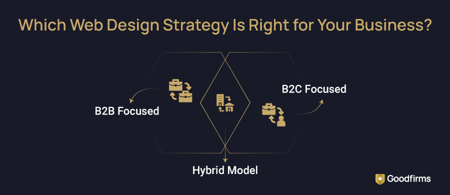
Hybrid model: Many SaaS companies, marketplaces, and professional services firms serve both audiences. If that's you, a single generic homepage trying to speak to both will convert neither. The answer is segmented entry points — separate landing pages, separate content tracks, and separate CTAs for each audience type. Small businesses navigating this challenge can explore web design companies for small businesses on Goodfirms who specialise in exactly this kind of audience-segmented architecture.
If you are running a hybrid model — serving both businesses and consumers — a single homepage trying to please both audiences will convert neither. Segmented entry points are not a nice-to-have. They are the strategy.
How to Choose the Right Web Design Strategy for B2B vs B2C
Here's a practical five-step framework for making the right call — and executing it with precision:
Step 1 — Define your primary buyer with ruthless specificity. Not "businesses" or "consumers." Get granular. Enterprise IT directors in fintech are evaluating $50,000 annual contracts. Millennial women in urban markets are buying sustainable skincare under $40. The tighter the definition, the more precisely every design decision can serve it.
Step 2 — Map the decision journey before you touch a wireframe. What does your buyer do in the 72 hours before they land on your site? What questions are they asking Google? What objections do they arrive with? What does "enough trust to act" look like for them specifically? Answer these questions in a document before a single pixel is designed.
Step 3 — Audit your current site against your buyer model. Run your homepage through one test: can your ideal buyer understand what you do, why it matters to them, and what to do next — in under 8 seconds? Time yourself with a first-time viewer. Most sites fail this test. Most redesigns fix the aesthetics without fixing the answer. Sites that fail this test aren't just confusing, they are actively losing pipeline to a competitor whose homepage answered the same question in three seconds.
Step 4 — Choose the right agency for your model. A B2B website redesign requires expertise in content architecture, lead generation flows, and CRM integration. A B2C redesign requires expertise in conversion rate optimization, e-commerce UX, and mobile performance. These are different disciplines requiring different specialists — don't hire a generalist when specialization determines your ROI. Explore and compare top web design companies in India, the USA, UK, and globally on Goodfirms, filtered by B2B or B2C specialization, verified client reviews, and pricing tiers. Once your site is live, pair your design investment with a growth strategy by working with top SEO companies who can drive the right traffic to the right pages.
Step 5 — Measure what matters for your model, not what's easy to report. B2B: track MQLs, demo requests, average session depth, and content downloads per visitor. B2C: track add-to-cart rate, checkout completion, average order value, and return visit frequency. Vanity metrics — traffic, page views, social followers — tell you your site exists. Revenue metrics tell you whether it works.
FAQ: B2B vs B2C Website Design
What is B2B vs B2C website design?
B2B website design is built to convert businesses — targeting multiple stakeholders across a long sales cycle using detailed content, lead generation flows, and trust-building assets like case studies and certifications. B2C website design is built to convert individual consumers quickly, using emotional design, fast checkout experiences, and social proof. The fundamental architectural difference is the buyer: a decision-making committee versus a single person acting on desire.
Why is B2B UX more complex than B2C?
B2B UX is more complex because it must serve multiple stakeholders with different priorities simultaneously. A technical evaluator, a financial decision-maker, and an operational end-user — all with different priorities and different information needs. The content architecture must accommodate non-linear research journeys, multiple return visits, and varying levels of product familiarity. Gartner's B2B Buying Journey research adds an important nuance: buyers struggle not because they lack information, but because the buying process itself is too complex to navigate. That is the real brief for B2B UX — not "give them more" but "make the path clearer."
Which design converts better — B2B or B2C?
Neither converts "better" in isolation — conversion is always measured against the right goal for the model. A well-designed B2B website converting 3–5% of visitors into qualified leads is performing excellently. A B2C e-commerce site converting 2–4% of visitors into purchases sits at or above the industry average. The question is never which model converts better; it's whether your design is built for the right model and optimized against the right metrics for your specific business stage.
What are real examples of B2B vs B2C websites?
Leading B2B website examples include Salesforce, HubSpot, Slack, and Zoom — all characterized by outcome-focused messaging, layered content architecture, and multiple lead capture mechanisms serving different buying stages. Leading B2C examples include Amazon, Nike, Apple, and ASOS — all built around emotional design, frictionless purchase paths, and personalization at scale. The contrast in information architecture, CTA strategy, and content depth between these two groups is the clearest real-world demonstration of how differently the two models must be designed.
How much does a B2B vs B2C website redesign cost in 2026?
B2B website redesigns typically cost more than B2C projects of equivalent size — ranging from $15,000 to $150,000+, depending on content complexity, CRM integration, and the number of audience segments served. B2C redesigns, particularly e-commerce builds, range from $5,000 for template-based SMB sites to $100,000+ for custom, conversion-optimized platforms with personalization infrastructure. The biggest cost driver in both models is not design — it is strategy. Businesses that invest in buyer research, UX architecture, and content planning before development consistently report better post-launch performance and lower redesign frequency. Businesses can also evaluate UI/UX design companies to compare expertise in B2B vs B2C experience design.
Can one website serve both B2B and B2C audiences?
Yes, but only with segmented UX. High-performing hybrid websites use separate landing pages, tailored messaging, and distinct CTAs for each audience. A single generic experience typically underperforms because it fails to address different decision behaviors effectively.
What is the best B2B website design strategy for 2026?
The best B2B website design strategy for 2026 centers on above-fold clarity, layered content architecture, and multiple lead capture entry points. Buyers need to understand what you do, who it's for, and what to do next within five seconds of landing. Case studies with measurable outcomes, demo booking flows, and resource hubs serving all buying stages are non-negotiable. Mobile research readiness and live chat with sales routing complete the conversion infrastructure.
Conclusion
B2B and B2C businesses operate with fundamentally different buyers—and require equally distinct website strategies.
High-performing B2B vs B2C website design strategies are built on a clear buyer definition , not just design execution. If that clarity is missing from your current site, it shows up in your conversion rate.
This is a solvable problem with a clear execution path. If your site has been live for 12 months and qualified leads are still thin, the problem is almost never the traffic. It's that the site was built for the wrong buyer, and no amount of paid media fixes a structural mismatch.
The best website in your category is not the most beautiful one. It's the one that was built for the right buyer from day one, and every design decision on it was made with that buyer's decision process, not a designer's portfolio, in mind.