Data Visualization Software
Looking for the best data visualization software? The below list of the top data visualization tools intricately curated by the Goodfirms’ team can assist you in shortlisting the right data visualization solutions suiting your requirements. Just go through the details of each software along with authentic users’ reviews about each data visualization platform indexed here to make an informed purchasing decision. This easy-to-use list will help you seamlessly check the features, pricing, and deployment options of the best data visualization software.
List of Best Data Visualization Software with Reviews
-
![Phocas Software]()
Adaptive, ad-hoc reporting and analysis. From high-level dashboards to underlying details, Phocas delivers self-service capabilities that scale with business growth. Get instant, focused and visual data when you need it. Phocas solves ... read more about Phocas Software
Entry Level PriceContact vendorFree TrialN/APricing TypeContact Vendor20% in Data Visualization SoftwareFeatures
- Dashboard
- Data Management
- Data Mining
- Filtered Views
- OLAP
- Visual Discovery
Key Details
Licensing & Deployment
-
Cloud Hosted
-
Web-based
-
iPhone/iPad
-
Android
-
Windows
-
Mac
Support
- Phone
Knowledge Base
-
Help Guides
-
Video Guides
-
Blogs
-
Webinars
-
Infographics
-
Case Studies
-
Whitepapers
-
On-Site Training
Packages
Pricing Type
-
Contact Vendor
Free Version
-
No
Payment Frequency
-
Quote Based
-
![Informer]()
Informer is a game changer. You’re gathering data from more sources than ever before – enterprise applications, traditional databases, cloud data, unstructured data from across the web, even spreadsheets. These information streams ... read more about Informer
Entry Level PriceContact vendorFree TrialN/APricing TypeContact Vendor25% in Data Visualization SoftwareFeatures
- Gift Card Management
- Data Management
- Data Mining
- Filtered Views
- Relational Display
- Simulation Models
- Visual Discovery
Key Details
Licensing & Deployment
-
Cloud Hosted
-
Web-based
-
Windows
-
Mac
Support
- Phone
Knowledge Base
-
Help Guides
-
Video Guides
-
Blogs
-
Webinars
-
Case Studies
-
Whitepapers
-
On-Site Training
Packages
Pricing Type
-
Contact Vendor
Free Version
-
No
Payment Frequency
-
Quote Based
-
![FactoryTalk]()
FactoryTalk software is built for supporting an ecosystem of advanced industrial applications, including IoT. It all starts at the edge where manufacturing happens and scales from on-premise to cloud. Imagine supercharging your ... read more about FactoryTalk
Entry Level PriceContact vendorFree TrialN/APricing TypeContact Vendor14% in Data Visualization SoftwareFeatures
- Data Import/Export
- Data Management
- Data Mining
- Filtered Views
- OLAP
- Relational Display
- Simulation Models
- Visual Discovery
Key Details
Licensing & Deployment
-
Cloud Hosted
-
Web-based
-
Windows
Knowledge Base
-
Help Guides
-
Video Guides
-
Blogs
-
Webinars
-
On-Site Training
Packages
Pricing Type
-
Contact Vendor
Free Version
-
No
Payment Frequency
-
Quote Based
-
![MarketSight]()
MarketSight is dedicated to providing powerful and intuitive software solutions for Market Researchers. Our mission is to provide easy-to-use tools that enable researchers and analysts to focus on finding and presenting critical ... read more about MarketSight
Entry Level Price$46 Per MonthFree TrialN/APricing TypeFlat Rate33% in Data Visualization SoftwareFeatures
- Gift Card Management
- Data Management
- Filtered Views
Key Details
Licensing & Deployment
-
Cloud Hosted
-
Web-based
Support
- Phone
Knowledge Base
-
Help Guides
-
Video Guides
-
Blogs
-
Webinars
-
On-Site Training
Packages
Pricing Type
-
Flat Rate
Free Version
-
No
Payment Frequency
-
Monthly Payment
-
Annual Subscription
Available Packages
Standard$46 Per Month -
![Qubole]()
Qubole is a simple, open, and secure Data Lake Platform for machine learning, streaming, and ad-hoc analytics. Our platform provides end-to-end services that reduce the time and effort required to run Data ... read more about Qubole
Entry Level Price$0.14 Per MonthFree Trial30 DaysPricing TypeFlat Rate50% in Data Visualization SoftwareFeatures
- Gift Card Management
- Filtered Views
- OLAP
- Relational Display
Key Details
Licensing & Deployment
-
Cloud Hosted
-
Web-based
Support
- Phone
Knowledge Base
-
Help Guides
-
Video Guides
-
Blogs
-
Webinars
Packages
Pricing Type
-
Flat Rate
Free Version
-
Yes
Free Trial
-
30 Days Trial
Payment Frequency
-
Monthly Payment
-
Quote Based
-
Free
Available Packages
Standard$0.14 Per Month -
![Tercept Unified Analytics]()
Tercept Unified Analytics automatically aggregates, normalizes & organizes all monetization data and all marketing data into a single dashboard with powerful visualization & charting capabilities. Analytics teams can setup data transformations & ... read more about Tercept Unified Analytics
Entry Level Price$499 Per MonthFree Trial15 DaysPricing TypeFlat Rate20% in Data Visualization SoftwareFeatures
- Dashboard
- Filtered Views
- OLAP
Key Details
Licensing & Deployment
-
Cloud Hosted
-
Web-based
Support
- Chat
- Phone
Knowledge Base
-
Help Guides
-
Video Guides
-
Blogs
-
Webinars
Packages
Pricing Type
-
Flat Rate
Free Version
-
No
Free Trial
-
15 Days Trial
Payment Frequency
-
Monthly Payment
-
Annual Subscription
-
Quote Based
Available Packages
Standard$499 Per Month -
![Arcadia Enterprise]()
Arcadia Data provides the first visual analytics and BI platform native to big data that delivers the scale, performance, and agility business users need to discover and productionize real-time insights. Its flagship ... read more about Arcadia Enterprise
Entry Level PriceContact vendorFree TrialN/APricing TypeContact Vendor33% in Data Visualization SoftwareFeatures
- Dashboard
- Filtered Views
- OLAP
- Relational Display
Key Details
Licensing & Deployment
-
Cloud Hosted
-
Web-based
Support
- Phone
Knowledge Base
-
Help Guides
-
Video Guides
-
Blogs
-
Webinars
-
Case Studies
-
On-Site Training
Packages
Pricing Type
-
Contact Vendor
Free Version
-
No
Payment Frequency
-
Quote Based
-
![Screenful for Agile]()
Say goodbye to manual project status update reports! We've created a set of charts and data visualisations that allow you to set up your dashboard instantly. You can slice & dice, filter, ... read more about Screenful for Agile
Entry Level Price$399 Per MonthFree TrialN/APricing TypeFlat Rate100% in Data Visualization SoftwareFeatures
- Dashboard
- Data Import/Export
- Data Mining
- Relational Display
- Simulation Models
- Visual Discovery
Key Details
Licensing & Deployment
-
Cloud Hosted
-
Windows
-
Mac
-
Linux
Support
- Phone
Knowledge Base
-
Help Guides
-
Video Guides
-
Blogs
Packages
Pricing Type
-
Flat Rate
Free Version
-
No
Payment Frequency
-
Monthly Payment
Available Packages
Standard$399 Per Month -
![Easelly]()
Easelly is ideal for educators, students, business owners, and executives who need to convey a thought, lesson plan, or concept in an easy-to-follow visual form. The AASL commended Easelly for being simple ... read more about Easelly
Entry Level Price$2 Per MonthFree TrialN/APricing TypeFlat Rate100% in Data Visualization SoftwareFeatures
- Dashboard
- Filtered Views
- Visual Discovery
Key Details
Licensing & Deployment
-
Cloud Hosted
-
Windows
-
Mac
-
Linux
Support
- Chat
- Phone
Knowledge Base
-
Help Guides
-
Video Guides
-
Blogs
Packages
Pricing Type
-
Flat Rate
Free Version
-
No
Payment Frequency
-
Monthly Payment
Available Packages
Standard$2 Per Month -
![FusionCharts]()
Started in 2002, FusionCharts has been downloaded over 1.4 million times by 750,000 developers worldwide. ‘By developers, for developers’ is our mission statement, where our teams are focused on making developers’ life ... read more about FusionCharts
Entry Level Price$497 Per MonthFree TrialN/APricing TypeFlat Rate100% in Data Visualization SoftwareFeatures
- Dashboard
- Data Management
- Data Mining
- Filtered Views
- Relational Display
- Simulation Models
Key Details
Licensing & Deployment
-
Cloud Hosted
-
Windows
-
Mac
-
Linux
Support
- Chat
- Phone
Knowledge Base
-
Help Guides
-
Video Guides
-
Blogs
Packages
Pricing Type
-
Flat Rate
Free Version
-
No
Payment Frequency
-
Monthly Payment
Available Packages
Standard$497 Per Month -
![Thortspace]()
The more components there are to a problem, the harder it is to solve. Conceptualising knowledge into chunks helps with this, but it isn’t always obvious what the chunks should be… That’s ... read more about Thortspace
Entry Level PriceFree versionFree TrialAvailablePricing TypeFree16% in Data Visualization SoftwareFeatures
- Dashboard
- Data Import/Export
- Filtered Views
- Relational Display
- Simulation Models
- Visual Discovery
Key Details
Licensing & Deployment
-
Cloud Hosted
-
Windows
-
Mac
-
Linux
Support
- Chat
- Phone
Knowledge Base
-
Help Guides
-
Video Guides
-
Blogs
Packages
Pricing Type
-
Free
Payment Frequency
-
Free
-
![CleverMaps]()
In 2013, CleverMaps was established in the heart of Europe by group of experienced technology enthusiasts. The founders all came from different backgrounds, and each having different sets of expertise, but what ... read more about CleverMaps
Entry Level PriceContact vendorFree TrialN/APricing TypeContact Vendor50% in Data Visualization SoftwareFeatures
- Dashboard
- Data Import/Export
- Relational Display
- Simulation Models
- Visual Discovery
Key Details
Licensing & Deployment
-
Cloud Hosted
-
Windows
-
Mac
-
Linux
Support
- Chat
- Phone
Knowledge Base
-
Help Guides
-
Video Guides
-
Blogs
Packages
Pricing Type
-
Contact Vendor
Free Version
-
No
Payment Frequency
-
Quote Based
-
![Highcharts]()
Highsoft is the company behind the world's most popular JavaScript charting engine, Highcharts JS, and it's sister products Highstock JS, Highmaps JS, and Highcharts Cloud. Our bootstrapped company is located in Vik ... read more about Highcharts
Entry Level Price$722 One-timeFree TrialN/APricing TypeFlat Rate100% in Data Visualization SoftwareFeatures
- Dashboard
- Data Import/Export
- Data Management
- Data Mining
- Relational Display
- Simulation Models
- Visual Discovery
Key Details
Licensing & Deployment
-
Cloud Hosted
-
Windows
-
Mac
-
Linux
Support
- Chat
- Phone
Knowledge Base
-
Help Guides
-
Video Guides
-
Blogs
Packages
Pricing Type
-
Flat Rate
Free Version
-
No
Payment Frequency
-
One-Time Payment
Available Packages
Standard$722 One-time -
![Erwin Data Modeler]()
Data is everywhere. So every day, industry and government are challenged to ride this massive data tidal wave. They have to manage both the massive risks and opportunities that come with high-volume, ... read more about Erwin Data Modeler
Entry Level PriceContact vendorFree TrialN/APricing TypeContact Vendor100% in Data Visualization SoftwareFeatures
- Data Import/Export
- Data Management
- Data Mining
- Relational Display
- Simulation Models
- Visual Discovery
Key Details
Licensing & Deployment
-
Cloud Hosted
-
Windows
-
Mac
-
Linux
Support
- Chat
- Phone
Knowledge Base
-
Help Guides
-
Video Guides
-
Blogs
Packages
Pricing Type
-
Contact Vendor
Free Version
-
No
Payment Frequency
-
Quote Based
-
![Orange]()
Perform simple data analysis with clever data visualization. Explore statistical distributions, box plots and scatter plots, or dive deeper with decision trees, hierarchical clustering, heatmaps, MDS and linear projections. Even your multidimensional ... read more about Orange
Entry Level PriceFree versionFree TrialAvailablePricing TypeFree34% in Data Visualization SoftwareFeatures
- Dashboard
- Data Import/Export
- Data Management
- Data Mining
- Relational Display
- Simulation Models
- Visual Discovery
Key Details
Industries
-
Computer-software
-
Information-technology-services
-
Program-development
Licensing & Deployment
-
Proprietary
-
Cloud Hosted
-
Web-based
-
Windows
-
Mac
-
Linux
Support
- Phone
-
24x7 Support
Knowledge Base
-
Help Guides
-
Video
-
Blog
Packages
Pricing Type
-
Free
-
![ChartBlocks]()
We made ChartBlocks to help people create charts that look great quickly and easily. We love feedback from our users so if you've got an idea for ChartBlocks get in touch. If ... read more about ChartBlocks
Entry Level PriceFree versionFree TrialAvailablePricing TypeFree100% in Data Visualization SoftwareFeatures
- Dashboard
- Data Import/Export
- Data Mining
- Simulation Models
- Visual Discovery
Key Details
Licensing & Deployment
-
Cloud Hosted
-
Windows
-
Mac
-
Linux
Support
- Phone
Knowledge Base
-
Help Guides
-
Video Guides
-
Blogs
Packages
Pricing Type
-
Free
Payment Frequency
-
Free
-
![Zebra BI]()
Zebra BI supports Dr. Rolf Hichert's International Business Communication Standards (IBCS). It “understands” Actuals, Budgets and Forecasts, calculates variances and applies the best practices automatically. Your reports, dashboards and presentations will be ... read more about Zebra BI
Entry Level PriceFree versionFree TrialAvailablePricing TypeFree100% in Data Visualization SoftwareFeatures
- Dashboard
- Data Import/Export
- Data Management
- Data Mining
- Simulation Models
- Visual Discovery
Key Details
Licensing & Deployment
-
Cloud Hosted
-
Windows
-
Mac
-
Linux
Support
- Phone
Knowledge Base
-
Help Guides
-
Video Guides
-
Blogs
Packages
Pricing Type
-
Free
Payment Frequency
-
Free
-
![List & Label]()
Providing reliable, state-of-the-art products is our utmost priority. Frequent updates add tangible value for our clients. And we continuously and rapidly correct any glitches as promised in our bug fixing policy. All ... read more about List & Label
Entry Level PriceContact vendorFree Trial30 DaysPricing TypeContact Vendor100% in Data Visualization SoftwareFeatures
- Dashboard
- Data Import/Export
- Data Management
- Data Mining
- Simulation Models
- Visual Discovery
Key Details
Licensing & Deployment
-
Cloud Hosted
-
Windows
-
Mac
-
Linux
Support
- Chat
- Phone
Knowledge Base
-
Help Guides
-
Video Guides
-
Blogs
Packages
Pricing Type
-
Contact Vendor
Free Version
-
No
Free Trial
-
30 Days Trial
Payment Frequency
-
Quote Based
-
![Omniscope]()
Building blocks for data blending Omniscope’s pluggable blocks let you explore and build your data pipeline. Extract and process big data. Transform, combine and clean. Use in Omniscope’s visualisations, or export to ... read more about Omniscope
Entry Level PriceContact vendorFree TrialN/APricing TypeContact Vendor100% in Data Visualization SoftwareFeatures
- Dashboard
- Data Import/Export
- Data Management
- Data Mining
- Filtered Views
- Relational Display
- Simulation Models
- Visual Discovery
Key Details
Licensing & Deployment
-
Cloud Hosted
-
Windows
-
Mac
-
Linux
Support
- Chat
- Phone
Knowledge Base
-
Help Guides
-
Video Guides
-
Blogs
Packages
Pricing Type
-
Contact Vendor
Free Version
-
No
Payment Frequency
-
Quote Based
-
![Datawrapper]()
Datawrapper empowers everyone to create digitally optimized charts, maps, or tables. It's as easy as following four steps. We tell you what you need to do, one thing after another, until you ... read more about Datawrapper
Entry Level PriceFree versionFree TrialAvailablePricing TypeFree100% in Data Visualization SoftwareFeatures
- Dashboard
- Data Import/Export
- Data Management
- Data Mining
- Filtered Views
- Relational Display
- Simulation Models
- Visual Discovery
Key Details
Licensing & Deployment
-
Cloud Hosted
-
Windows
-
Mac
-
Linux
Support
- Phone
Knowledge Base
-
Help Guides
-
Video Guides
-
Blogs
Packages
Pricing Type
-
Free
Payment Frequency
-
Free
-
![NodeXL]()
NodeXL Basic is a free, open-source template for Microsoft® Excel® 2007, 2010, 2013 and 2016 that makes it easy to explore network graphs. With NodeXL, you can enter a network edge list ... read more about NodeXL
Entry Level PriceFree versionFree TrialAvailablePricing TypeFree100% in Data Visualization SoftwareFeatures
- Data Import/Export
- Data Mining
- Relational Display
Key Details
Licensing & Deployment
-
Cloud Hosted
-
Windows
-
Mac
-
Linux
Support
- Phone
Knowledge Base
-
Help Guides
-
Video Guides
Packages
Pricing Type
-
Free
Payment Frequency
-
Free
-
![ActiveReports]()
This standalone app enables you to build complete design-based reports code-free and offer ad hoc report design for your end-users on desktop or web. Easily create new reports with the drag-and-drop interface ... read more about ActiveReports
Entry Level Price$849 One-timeFree TrialN/APricing TypeFlat Rate100% in Data Visualization SoftwareFeatures
- Dashboard
- Data Import/Export
- Data Management
- Data Mining
- Relational Display
- Simulation Models
- Visual Discovery
Key Details
Licensing & Deployment
-
Cloud Hosted
-
Windows
-
Mac
-
Linux
Support
- Chat
- Phone
Knowledge Base
-
Help Guides
-
Video Guides
-
Blogs
Packages
Pricing Type
-
Flat Rate
Free Version
-
No
Payment Frequency
-
One-Time Payment
Available Packages
Standard$849 One-time -
![Actif Report]()
Our main mission is to help our customers to improve their business performance and increase the cost effectiveness : define a global strategy, deliver high quality services and implement tools allowing activities ... read more about Actif Report
Entry Level PriceContact vendorFree TrialN/APricing TypeContact Vendor100% in Data Visualization SoftwareFeatures
- Dashboard
- Data Import/Export
- Data Management
- Data Mining
- Filtered Views
- Relational Display
- Simulation Models
- Visual Discovery
Key Details
Licensing & Deployment
-
Cloud Hosted
-
Windows
-
Mac
-
Linux
Support
- Phone
Knowledge Base
-
Help Guides
-
Video Guides
-
Blogs
Packages
Pricing Type
-
Contact Vendor
Free Version
-
No
Payment Frequency
-
Quote Based
-
![Analyst/X]()
Imagine having a donor data sherpa at your side who could explore and analyze all your data, across sources and spreadsheets, to help you determine how to reach the right people at ... read more about Analyst/X
Entry Level PriceContact vendorFree TrialN/APricing TypeContact Vendor100% in Data Visualization SoftwareFeatures
- Dashboard
- Data Import/Export
- Data Management
- Data Mining
- Simulation Models
- Visual Discovery
Key Details
Licensing & Deployment
-
Cloud Hosted
-
Windows
-
Mac
-
Linux
Support
- Phone
Knowledge Base
-
Help Guides
-
Video Guides
-
Blogs
Packages
Pricing Type
-
Contact Vendor
Free Version
-
No
Payment Frequency
-
Quote Based
-
![Aqua Data Studio]()
Aqua Data Studio by AquaFold empowers users with powerful, cross-platform database productivity tools. Join the more than 300,000 data professionals that use Aqua Data Studio to design, develop, model and administer their ... read more about Aqua Data Studio
Entry Level Price$499 One-timeFree TrialN/APricing TypeFlat Rate50% in Data Visualization SoftwareFeatures
- Dashboard
- Data Import/Export
- Data Management
- Data Mining
- Simulation Models
- Visual Discovery
Key Details
Licensing & Deployment
-
Cloud Hosted
-
Windows
-
Mac
-
Linux
Support
- Phone
Knowledge Base
-
Help Guides
-
Video Guides
-
Blogs
Packages
Pricing Type
-
Flat Rate
Free Version
-
No
Payment Frequency
-
One-Time Payment
Available Packages
Standard$499 One-time -
![Celonis]()
Celonis is the leader in Enterprise Performance Acceleration software, harnessing the power of Process Mining technology to help organizations remove operational friction and become a Superfluid Enterprise. Our Process Intelligence platform takes ... read more about Celonis
Entry Level PriceFree versionFree TrialAvailablePricing TypeFree34% in Data Visualization SoftwareFeatures
- Dashboard
- Data Import/Export
- Data Management
- Data Mining
- Relational Display
- Simulation Models
- Visual Discovery
Key Details
Industries
-
Accounting
-
Banking
-
Financial-services
Licensing & Deployment
-
Proprietary
-
Cloud Hosted
-
Web-based
-
Windows
-
Mac
-
Linux
Support
- Chat
- Phone
-
24x7 Support
Knowledge Base
-
Help Guides
-
Video
-
Blog
Packages
Pricing Type
-
Free
-
![Centrifuge Analytics]()
Centrifuge Analytics is a big data discovery technology that provides the power and flexibility to connect, visualize and collaborate without complex data integration, costly services or a data science degree. It combines ... read more about Centrifuge Analytics
Entry Level PriceContact vendorFree TrialN/APricing TypeContact Vendor100% in Data Visualization SoftwareFeatures
- Dashboard
- Data Import/Export
- Data Management
- Data Mining
- Relational Display
- Simulation Models
Key Details
Licensing & Deployment
-
Cloud Hosted
-
Windows
-
Mac
-
Linux
Support
- Phone
Knowledge Base
-
Help Guides
-
Video Guides
-
Blogs
Packages
Pricing Type
-
Contact Vendor
Free Version
-
No
Payment Frequency
-
Quote Based
-
![Dapresy Pro]()
Founded over 13 years ago by Tobi Andersson, Dapresy Pro has become the leading data visualization SaaS platform within the market research industry. Today, we support over 170 direct clients in 25 ... read more about Dapresy Pro
Entry Level PriceContact vendorFree TrialN/APricing TypeContact Vendor100% in Data Visualization SoftwareFeatures
- Dashboard
- Data Import/Export
- Data Management
- Data Mining
- Relational Display
- Simulation Models
- Visual Discovery
Key Details
Licensing & Deployment
-
Cloud Hosted
-
Windows
-
Mac
-
Linux
Support
- Chat
- Phone
Knowledge Base
-
Help Guides
-
Video Guides
-
Blogs
Packages
Pricing Type
-
Contact Vendor
Free Version
-
No
Payment Frequency
-
Quote Based
-
![ClarityQB]()
Tell data stories and deliver insights with machine learning and predictive analytics to improve business processes. Our BI and analytics platform enables full end-to-end data-supported decision making for technical and non-technical users ... read more about ClarityQB
Entry Level PriceContact vendorFree TrialN/APricing TypeContact Vendor50% in Data Visualization SoftwareFeatures
- Dashboard
- Data Import/Export
- Data Management
- Data Mining
- Relational Display
- Simulation Models
Key Details
Licensing & Deployment
-
Cloud Hosted
-
Windows
-
Mac
-
Linux
Support
- Phone
Knowledge Base
-
Help Guides
-
Video Guides
-
Blogs
Packages
Pricing Type
-
Contact Vendor
Free Version
-
No
Payment Frequency
-
Quote Based
-
![AnyGrids]()
AnyGrids is a free JavaScript grid library with charts integration. It has features: paging featurepaging sorting featuresorting total row featuretotal row child rows featurechild rows child rows featurefiltering charts featureintegration with charts ... read more about AnyGrids
Entry Level PriceFree versionFree TrialAvailablePricing TypeFree100% in Data Visualization SoftwareFeatures
- Data Import/Export
- Data Mining
- Simulation Models
Key Details
Licensing & Deployment
-
Cloud Hosted
-
Windows
-
Mac
-
Linux
Support
- Phone
Knowledge Base
-
Help Guides
Packages
Pricing Type
-
Free
Payment Frequency
-
Free
-
![DbFace]()
DbFace might be the fastest way to build your SQL database frontend, you do not need coding PHP or any front-end HTML, CSS, just follow the robust application builder way to create ... read more about DbFace
Entry Level Price$29 Per YearFree TrialN/APricing TypeFlat Rate100% in Data Visualization SoftwareFeatures
- Dashboard
- Data Import/Export
- Data Management
- Data Mining
- Simulation Models
- Visual Discovery
Key Details
Licensing & Deployment
-
Cloud Hosted
-
Windows
-
Mac
-
Linux
Support
- Chat
- Phone
Knowledge Base
-
Help Guides
-
Video Guides
-
Blogs
Packages
Pricing Type
-
Flat Rate
Free Version
-
No
Payment Frequency
-
Monthly Payment
Available Packages
Standard$29 Per Year -
![Data Analytics Console]()
The Evans Data Analytics Console is a revolutionary breakthrough in data delivery. Providing seamless self-service developer intelligence on hundreds of software development subjects stemming from our semi-annual Global Development Survey. This user ... read more about Data Analytics Console
Entry Level PriceContact vendorFree TrialN/APricing TypeContact Vendor100% in Data Visualization SoftwareFeatures
- Dashboard
- Data Import/Export
- Data Management
- Data Mining
- Simulation Models
- Visual Discovery
Key Details
Licensing & Deployment
-
On Premises
-
Windows
-
Mac
-
Linux
Support
- Phone
Knowledge Base
-
Help Guides
-
Video Guides
-
Blogs
Packages
Pricing Type
-
Contact Vendor
Free Version
-
No
Payment Frequency
-
Quote Based
-
![DataReprotive]()
DataReportive is a reporting tool for your SQL databases. Create and email customizable dashboards or reports to your team or customers directly from your databases.
Entry Level PriceFree versionFree TrialAvailablePricing TypeFree100% in Data Visualization SoftwareFeatures
- Dashboard
- Data Import/Export
- Data Management
- Data Mining
- Relational Display
- Simulation Models
- Visual Discovery
Key Details
Licensing & Deployment
-
Cloud Hosted
-
Windows
-
Mac
-
Linux
Support
- Chat
- Phone
Knowledge Base
-
Help Guides
-
Video Guides
-
Blogs
Packages
Pricing Type
-
Free
Payment Frequency
-
Free
-
![DataWalk]()
Do you have to log-in to a number of different systems to find the data you want? And then manually link it together to analyze it? With DataWalk, you can dramatically accelerate ... read more about DataWalk
Entry Level PriceContact vendorFree TrialN/APricing TypeContact Vendor100% in Data Visualization SoftwareFeatures
- Dashboard
- Data Import/Export
- Data Management
- Data Mining
- Relational Display
- Simulation Models
- Visual Discovery
Key Details
Licensing & Deployment
-
Cloud Hosted
-
Windows
-
Mac
-
Linux
Support
- Chat
- Phone
Knowledge Base
-
Help Guides
-
Video Guides
-
Blogs
Packages
Pricing Type
-
Contact Vendor
Free Version
-
No
Payment Frequency
-
Quote Based
-
![HappyMetrix]()
HappyMetrix let’s you create stunning online data dashboards with all your key metrics in one place simply by adding a couple of easy-to-use data widgets. You can connect with a number of ... read more about HappyMetrix
Entry Level Price$9.95 Per MonthFree TrialN/APricing TypeFlat Rate100% in Data Visualization SoftwareFeatures
- Dashboard
- Data Import/Export
- Data Management
- Data Mining
- Relational Display
- Simulation Models
- Visual Discovery
Key Details
Licensing & Deployment
-
Cloud Hosted
-
Windows
-
Mac
-
Linux
Support
- Chat
- Phone
Knowledge Base
-
Help Guides
-
Video Guides
-
Blogs
Packages
Pricing Type
-
Flat Rate
Free Version
-
No
Payment Frequency
-
Monthly Payment
Available Packages
Standard$9.95 Per Month


Why Trust Goodfirms
Goodfirms is the world’s leading reviews and ratings company featuring 110,000+ tech companies from across the globe, complete with 80,000+ humanly vetted client reviews, detailed portfolios, hourly rates, employee strength, and more to help you choose your perfect tech partner.
Humanly-Vetted Client Reviews
Our researchers have personally vouched for the authenticity of 80,000+ client reviews by speaking directly with clients, cross-checking project details, timelines, and results to ensure 100% credibility.
Data-Driven Rankings
Data powers our company listings. Every company listed is evaluated based on its expertise, experience, market presence, reviews, and client satisfaction rate, which helps buyers confidently choose the right tech partner.
Global Trust & Recognition
Goodfirms is trusted by 110,000+ businesses in 160+ countries to connect with reliable tech partners. Our reputation is built on 80,000+ verified reviews and rankings you can trust.
Transparency In Detail
From verified client reviews and portfolio highlights to service focus and pricing, Goodfirms provides a 360-degree view of every company, helping 2+ million monthly users find the perfect tech partner.
Trending insights from Goodfirms
Valuable insights from top experts accelerate decision-making.
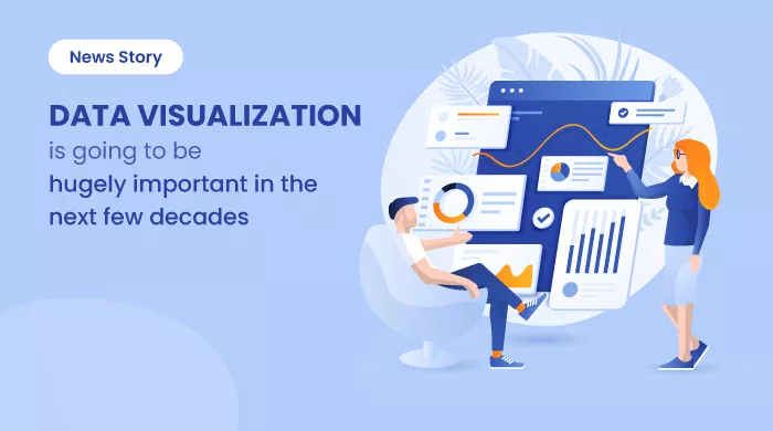
Data Visualization Is Going to Be Hugely Important in the Next Few Decades
This News Story blog article talks about the benefits of data visualization software tools for businesses. It also explains the top data visualization... ... Read research article
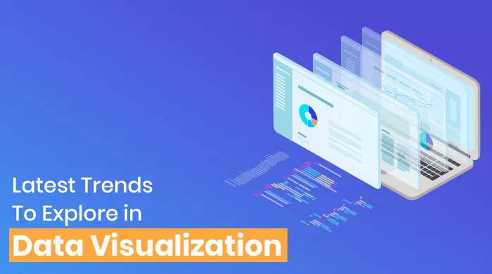
Latest Trends To Explore In Data Visualization
Data Visualization is fueled by various innovative trends such as implementing data visualization software with AI, BI, and machine learning to analyze data... ... Read research article

20 Outstanding Data Visualization Examples
Data visualization is a trending practice these days. Interestingly, some of the best data visualization software can help you sail through the challenges well... ... Read research article