Data Visualization Software
Looking for the best data visualization software? The below list of the top data visualization tools intricately curated by the Goodfirms’ team can assist you in shortlisting the right data visualization solutions suiting your requirements. Just go through the details of each software along with authentic users’ reviews about each data visualization platform indexed here to make an informed purchasing decision. This easy-to-use list will help you seamlessly check the features, pricing, and deployment options of the best data visualization software.
List of Best Data Visualization Software with Reviews
-
![DevicePilot]()
DevicePilot Service Monitoring for connected devices provides a single pane of glass for Product, Operations and Customer Support teams, driving up customer satisfaction and growth, while reducing operational costs. Service Monitoring for ... read more about DevicePilot
Entry Level PriceContact vendorFree TrialN/APricing TypeContact Vendor25% in Data Visualization SoftwareFeatures
- Dashboard
- Filtered Views
- Relational Display
- Operations Management
- Visual Discovery
Key Details
Licensing & Deployment
-
Cloud Hosted
-
Web-based
Knowledge Base
-
Help Guides
-
Video Guides
Packages
Pricing Type
-
Contact Vendor
Free Version
-
No
Payment Frequency
-
Quote Based
-
![Wersel Brand Analytics]()
Wersel Data-Hub is a powerful brand collaborative and analytics platform. It can access brands scattered data from every channel, collect and normalize it. This way, it turns the data into a system ... read more about Wersel Brand Analytics
Entry Level PriceContact vendorFree Trial30 DaysPricing TypeContact Vendor50% in Data Visualization SoftwareFeatures
- Dashboard
- Data Import/Export
- Data Management
- Data Mining
- Filtered Views
- Operations Management
- Visual Discovery
Key Details
Licensing & Deployment
-
Cloud Hosted
-
On Premises
-
Web-based
-
iPhone/iPad
-
Android
-
Windows
-
Mac
-
Linux
Support
- Phone
Knowledge Base
-
Help Guides
-
Video Guides
-
Blogs
-
Webinars
Packages
Pricing Type
-
Contact Vendor
Free Version
-
No
Free Trial
-
30 Days Trial
Payment Frequency
-
Monthly Payment
-
Annual Subscription
-
Quote Based
-
One-Time Payment
-
![DXcharts]()
DXcharts is a cross-platform customisable application for technical analysis and market data visualization of multiple asset classes both in real-time and retroactively. You can make changes in the UI or create a ... read more about DXcharts
Entry Level PriceContact vendorFree TrialN/APricing TypeFlat Rate50% in Data Visualization SoftwareFeatures
- Data Import/Export
- Data Management
- Relational Display
- Reporting & Analytics
Key Details
Industries
-
Banking
-
Financial-services
-
Investment-banking-venture
Licensing & Deployment
-
Proprietary
-
Cloud Hosted
-
On Premises
-
Web-based
-
iPhone/iPad
-
Android
-
Windows
-
Mac
-
Linux
Support
- Email
- Chat
-
24x7 Support
Training
-
Webinar
-
In-person
-
Documentation
Packages
Pricing Type
-
Flat Rate
Preferred Currency
-
USD ($)
Free Version
-
Yes
Payment Frequency
-
Monthly Payment
-
Annual Subscription
-
![Hatica]()
Hatica equips engineering teams with work visibility dashboards, actionable insights, and effective workflows to drive team productivity and engagement in remote and in-office environments alike. Free forever plans to help you get ... read more about Hatica
Entry Level PriceContact vendorFree Trial30 DaysPricing TypePer User100% in Data Visualization SoftwareFeatures
- Dashboard
- Data Import/Export
- Filtered Views
- Reporting & Analytics
Key Details
Industries
-
Computer-software
-
Information-technology-services
Licensing & Deployment
-
Proprietary
-
Cloud Hosted
-
Web-based
Support
- Email
- Chat
- Phone
-
24x7 Support
Training
-
Webinar
-
Documentation
Knowledge Base
-
Getting Started
-
Dashboards
-
Metrics
-
Goals and Alerting
-
Hatica Check-ins
-
Reports
-
Settings
-
External apps How-to
Packages
Pricing Type
-
Per User
Preferred Currency
-
USD ($)
Free Version
-
Yes
Free Trial
-
30 Days Trial
Payment Frequency
-
Monthly Payment
-
Annual Subscription
Integration
Integrated With
- Jira
- GitHub
- GitLab
- Bitbucket
- Azure Devops
- Zoom
- Google Meet
- Microsoft Teams
- Gmail
- outlook
- Google Calendar
- Asana
- Clickup
- Trello
- Shortcut
- Aha!
- Productboard
- ProductPlan
- Opsgenie
- PagerDuty
- VictorOps
- Jenkins
- Phabricator
-
![Grafieks]()
Grafieks is an easy-to-use self-service Business Intelligence platform that allows users to quickly and easily extract meaningful insights from data. Grafieks provides users with an intuitive interface, and simple setup, and offers ... read more about Grafieks
Entry Level PriceContact vendorFree TrialN/APricing TypePer User100% in Data Visualization SoftwareFeatures
- Dashboard
- Data Import/Export
- Filtered Views
- Relational Display
- Reporting & Analytics
- Visual Discovery
Key Details
Industries
-
Logistics-supply-chain
-
Medical-device
-
Package-freight-delivery
-
Pharmaceuticals
-
Transportation-trucking-railroad
-
Warehousing
Licensing & Deployment
-
Open Source
-
Cloud Hosted
-
Web-based
-
Windows
Support
- Email
- Phone
-
Weekdays
Training
-
Webinar
-
Documentation
Knowledge Base
-
Getting Started
-
Grafieks Desktop
-
Grafieks Reporting Server
-
Video Tutorial
Packages
Pricing Type
-
Per User
Preferred Currency
-
USD ($)
Free Version
-
Yes
Payment Frequency
-
Annual Subscription
-
![DataSquirrel.ai]()
DataSquirrel.ai is your reliable partner for simplified data analysis. It takes the complexity out of working with data, saving you time and effort. With easy data uploads, automated cleaning, and guided analysis ... read more about DataSquirrel.ai
Entry Level PriceContact vendorFree TrialMore than 30 daysPricing TypePer User40% in Data Visualization SoftwareFeatures
- Dashboard
- Data Import/Export
- Filtered Views
- OLAP
- Relational Display
- Reporting & Analytics
- Visual Discovery
Key Details
Industries
-
Accounting
-
Airlines-aviation
-
Apparel-fashion
-
Automotive
-
Banking
-
Business-supplies-equipment
-
Commercial-real-estate
-
Consumer-goods
-
Consumer-services
-
Cosmetics
-
Financial-services
-
Food-beverages
-
Food-production
-
Furniture
-
Hospitality
-
Human-resources
-
Import-export
-
Legal-services
-
Luxury-goods-jewelry
-
Pharmaceuticals
-
Warehousing
-
Wholesale
-
Wine-spirits
Licensing & Deployment
-
Proprietary
-
Cloud Hosted
-
Web-based
Support
- Email
-
24x7 Support
Packages
Pricing Type
-
Per User
Preferred Currency
-
USD ($)
Free Version
-
Yes
Free Trial
-
More than 30 days Trial
Payment Frequency
-
Annual Subscription
-
![Leaflet]()
Leaflet is the leading open-source JavaScript library for mobile-friendly interactive maps. Weighing just about 42 KB of JS, it has all the mapping features most developers ever need. Leaflet is designed with ... read more about Leaflet
Entry Level PriceFree versionFree TrialAvailablePricing TypeFree100% in Data Visualization SoftwareFeatures
- Dashboard
- Data Import/Export
- Data Management
- Reporting & Analytics
- Visual Discovery
Key Details
Industries
-
Banking
-
Financial-services
-
Hospital-health-care
-
Hospitality
-
Marketing-advertising
Licensing & Deployment
-
Open Source
-
Cloud Hosted
-
Web-based
Support
- Email
-
24x7 Support
Knowledge Base
-
Help Guide
-
Video
-
Blog
Packages
Pricing Type
-
Free
Preferred Currency
-
USD ($)
Payment Frequency
-
Quote Based
-
![D3]()
D3.js is a JavaScript library for manipulating documents based on data. D3 helps you bring data to life using HTML, SVG and CSS. D3’s emphasis on web standards gives you the full ... read more about D3
Entry Level PriceFree versionFree TrialAvailablePricing TypeFree100% in Data Visualization SoftwareFeatures
- Dashboard
- Filtered Views
- Relational Display
- Reporting & Analytics
- Simulation Models
- Visual Discovery
Key Details
Industries
-
Aviation-aerospace
-
Banking
-
Financial-services
-
Marketing-advertising
Licensing & Deployment
-
Proprietary
-
Cloud Hosted
-
Web-based
Support
- Email
-
24x7 Support
Knowledge Base
-
Help Guide
-
Video
-
Blog
Packages
Pricing Type
-
Free
Preferred Currency
-
USD ($)
Payment Frequency
-
Quote Based
-
![Quantum Boost]()
Quantum Boost is an advanced online platform designed to optimize the experimental process by leveraging the capabilities of artificial intelligence (AI). Unlike traditional methods, Quantum Boost aims to reach predetermined targets through ... read more about Quantum Boost
Entry Level Price$0 One-timeFree Trial14 DaysPricing TypeFlat Rate30% in Data Visualization SoftwareFeatures
- Data Import/Export
- Relational Display
- Reporting & Analytics
- Simulation Models
Key Details
Industries
-
Building-materials
-
Chemicals
-
Industrial-automation
-
Mechanical-or-industrial-engineering
-
Pharmaceuticals
Licensing & Deployment
-
Proprietary
-
Cloud Hosted
-
Web-based
Support
- Email
- Chat
- Phone
-
24x7 Support
Training
-
Webinar
-
In-person
Packages
Pricing Type
-
Flat Rate
Preferred Currency
-
USD ($)
Free Version
-
Yes
Free Trial
-
14 Days Trial
Payment Frequency
-
Monthly Payment
Available Packages
Starter$95 Per MonthEnterprise$1250 Per Year -
![Seaborn]()
Seaborn is a Python data visualization library based on matplotlib. It provides a high-level interface for drawing attractive and informative statistical graphics. For a brief introduction to the ideas behind the library, ... read more about Seaborn
Entry Level PriceFree versionFree TrialAvailablePricing TypeFree100% in Data Visualization SoftwareFeatures
- Dashboard
- Data Management
- Filtered Views
- Reporting & Analytics
- Visual Discovery
Key Details
Industries
-
Computer-software
Licensing & Deployment
-
Open Source
-
Cloud Hosted
-
Web-based
Support
- Email
-
24x7 Support
Knowledge Base
-
Help Guide
Packages
Pricing Type
-
Free
-
![SAS Visual Analytics]()
Quickly spot important relationships in your data using suggestions and clearly identified related measures. Use machine learning and natural language explanations to find, visualize and narrate stories and insights that are easy ... read more about SAS Visual Analytics
Entry Level PriceContact vendorFree Trial14 DaysPricing TypeContact Vendor100% in Data Visualization SoftwareFeatures
- Dashboard
- Data Management
- Filtered Views
- Relational Display
- Reporting & Analytics
- Visual Discovery
Key Details
Industries
-
Computer-software
Licensing & Deployment
-
Proprietary
-
Cloud Hosted
-
Web-based
-
Windows
Support
- Email
- Chat
- Phone
-
24x7 Support
Knowledge Base
-
Help Guide
Packages
Pricing Type
-
Contact Vendor
Preferred Currency
-
USD ($)
Free Version
-
No
Free Trial
-
14 Days Trial
Payment Frequency
-
Quote Based
-
![Chart.js]()
Simple yet flexible JavaScript charting library for the modern web. Simple, clean, and engaging charts for designers and developers. Chart.js is a community maintained project, contributions welcome! Visualize your data in 8 ... read more about Chart.js
Entry Level PriceFree versionFree TrialAvailablePricing TypeFree50% in Data Visualization SoftwareFeatures
- Dashboard
- Data Import/Export
- Filtered Views
- Relational Display
- Reporting & Analytics
Key Details
Industries
-
Computer-software
Licensing & Deployment
-
Open Source
-
Cloud Hosted
-
Web-based
-
Windows
Support
- Email
-
24x7 Support
Knowledge Base
-
Help Guide
Packages
Pricing Type
-
Free
-
![Trackingplan]()
Trackingplan provides you with an always-updated single source of truth with the real picture of your digital analytics. Moreover, since our backend understands what each piece of data means, we can identify ... read more about Trackingplan
Entry Level Price$0 Per MonthFree Trial30 DaysPricing TypeContact Vendor34% in Data Visualization SoftwareFeatures
- Dashboard
- Data Import/Export
- Data Management
- Filtered Views
- Reporting & Analytics
- Visual Discovery
Key Details
Industries
-
Apparel-fashion
-
Automotive
-
Banking
-
Broadcast-media
-
Computer-games
-
Cosmetics
-
E-learning
-
Hospitality
-
Marketing-advertising
-
Retail
-
Sporting-goods
-
Supermarkets
Licensing & Deployment
-
Open Source
-
Cloud Hosted
-
Web-based
Support
- Email
- Chat
- Phone
-
24x7 Support
Training
-
Webinar
-
In-person
-
Documentation
Knowledge Base
-
Documentation
-
Youtube
-
Blog
-
FAQs
Packages
Pricing Type
-
Contact Vendor
Preferred Currency
-
USD ($)
Free Version
-
Yes
Free Trial
-
30 Days Trial
Payment Frequency
-
Monthly Payment
Available Packages
Startup$299 Per MonthEnterprise$1999 Per MonthIntegration
Integrated With
- Google Analytics
- Segment
- Adobe Analytics
- Amplitude
- Mixpanel
- HubSpot Marketing Hub
- Intercom
-
![Vitaminise Data Analytics]()
Vitaminise Data Analytics, developed by DICEUS, is a BI solution for insurance companies to collect and visualize data coming from other Vitaminise products (Mobile App, Chatbot, Web Portal, and Customer Feedback Tool). ... read more about Vitaminise Data Analytics
Entry Level PriceContact vendorFree TrialN/APricing TypeContact Vendor100% in Data Visualization SoftwareFeatures
- Dashboard
- Reporting & Analytics
Key Details
Industries
-
Insurance
Licensing & Deployment
-
Proprietary
-
Cloud Hosted
-
Web-based
-
iPhone/iPad
-
Android
Support
- Email
-
24x7 Support
Training
-
In-person
-
Documentation
Packages
Pricing Type
-
Contact Vendor
Preferred Currency
-
USD ($)
Free Version
-
No
Payment Frequency
-
Quote Based
-
![Two Minute Reports]()
Two Minute Reports gets all your analytics using Google Sheets and Looker Studio for the type of data categories like PPC, social media, web analytics, search engine, and much more. The data ... read more about Two Minute Reports
Entry Level Price$8 Per MonthFree TrialN/APricing TypeUsage Based50% in Data Visualization SoftwareFeatures
- Dashboard
- Data Management
- Filtered Views
Key Details
Industries
-
Marketing-advertising
Licensing & Deployment
-
Proprietary
-
Cloud Hosted
-
Web-based
Support
- Email
- Chat
-
24x7 Support
Training
-
In-person
-
Documentation
Knowledge Base
-
About Two Minute Reports
-
How to install
-
How to use Templates for Google Sheets
Packages
Pricing Type
-
Usage Based
Preferred Currency
-
USD ($)
Free Version
-
Yes
Payment Frequency
-
Monthly Payment
Available Packages
Lite$8 Per MonthBasic$41 Per MonthPro$83 Per MonthBusiness$291 Per Month -
![Typo]()
- Gain visibility of your developers' work & well-being by getting insights from multiple developer tools like Git, Jira & Circle CI. - DORA & SPACE Metrics - Investment Distribution - Sprint ... read more about Typo
Entry Level Price$0 Per UserFree TrialAvailablePricing TypePer User30% in Data Visualization SoftwareFeatures
- Dashboard
- Data Management
- Reporting & Analytics
- Visual Discovery
Key Details
Industries
-
Computer-software
-
Information-technology-services
Licensing & Deployment
-
Proprietary
-
Cloud Hosted
-
Web-based
-
Windows
-
Mac
-
Linux
Support
- Email
- Chat
- Phone
-
Everyday
Training
-
Webinar
-
Documentation
Knowledge Base
-
Signup for FREE
-
Book a Demo
-
Help Docs
-
Pricing
-
Blog
-
Community
Packages
Pricing Type
-
Per User
Preferred Currency
-
USD ($)
Free Version
-
Yes
Payment Frequency
-
Monthly Payment
-
Annual Subscription
-
Quote Based
-
One-Time Payment
Available Packages
Starter$16 Per UserPro$24 Per UserIntegration
Integrated With
- GitHub
- GitLab
- Bitbucket
- Jira
- Slack
- CircleCI
- Linear
- Jenkins
-
![nventr AI]()
Unlock AI excellence with Nventr's cutting-edge platform. Our AI-driven solutions simplify complex data, delivering actionable insights with unmatched speed and precision. From predictive analytics to intelligent automation, we transform unstructured data into ... read more about nventr AI
Entry Level PriceContact vendorFree Trial14 DaysPricing TypeContact Vendor30% in Data Visualization SoftwareFeatures
- Dashboard
- Data Import/Export
- Data Management
- Filtered Views
- Reporting & Analytics
- Visual Discovery
Key Details
Industries
-
Computer-software
-
Information-technology-services
Licensing & Deployment
-
Proprietary
-
Cloud Hosted
-
On Premises
-
Web-based
Support
- Email
-
24x7 Support
Training
-
In-person
-
Documentation
Knowledge Base
-
Help Guide
-
Video
-
Blog
Packages
Pricing Type
-
Contact Vendor
Preferred Currency
-
USD ($)
Free Version
-
Yes
Free Trial
-
14 Days Trial
Payment Frequency
-
Annual Subscription
-
![Athena]()
At Athena, we put data to work for everyone, empowering businesses to unlock their full potential. Our AI-powered business intelligence platform integrates data, people, and systems into a unified environment. With the ... read more about Athena
Entry Level PriceContact vendorFree TrialAvailablePricing TypePer User50% in Data Visualization SoftwareFeatures
- Dashboard
- Data Import/Export
- Data Management
- Data Mining
- Filtered Views
- Reporting & Analytics
- Visual Discovery
Key Details
Industries
-
Accounting
-
Banking
-
Computer-software
-
Financial-services
-
Health-wellness-fitness
-
Information-technology-services
-
Pharmaceuticals
Licensing & Deployment
-
Proprietary
-
Cloud Hosted
-
On Premises
-
Web-based
-
Android
Support
- Email
-
24x7 Support
Training
-
In-person
Knowledge Base
-
Help Guide
-
Blog
Packages
Pricing Type
-
Per User
Preferred Currency
-
USD ($)
Free Version
-
Yes
Free Trial
-
Available Trial
Payment Frequency
-
Monthly Payment
-
Annual Subscription
-
![Flightmapper.io]()
Flightmapper.io is an innovative online tool that transforms your flight data into visually stunning maps and animations. Designed for both aviation enthusiasts and frequent travelers, it allows you to track, analyze, and ... read more about Flightmapper.io
Entry Level Price$8.99 Per MonthFree TrialN/APricing TypePer User50% in Data Visualization SoftwareFeatures
- Dashboard
- Data Import/Export
- Filtered Views
- Relational Display
- Reporting & Analytics
- Visual Discovery
Key Details
Industries
-
Airlines-aviation
-
Aviation-aerospace
-
Design
Licensing & Deployment
-
Proprietary
-
Cloud Hosted
-
Web-based
Support
- Email
-
24x7 Support
Training
-
Documentation
Knowledge Base
-
Video Flight Maps
-
Map Images
Packages
Pricing Type
-
Per User
Preferred Currency
-
USD ($)
Free Version
-
Yes
Payment Frequency
-
Monthly Payment
-
Annual Subscription
Available Packages
Standard$8.99 Per Month -
![Dflux AI]()
Key Features: Unified Interface: It integrates various data science tasks into a single, cohesive interface, eliminating the need for multiple tools. No-Code/Low-Code Functionality: Users can perform data extraction, transformation, and analysis using ... read more about Dflux AI
Entry Level PriceContact vendorFree Trial7 DaysPricing TypeContact Vendor30% in Data Visualization SoftwareFeatures
- Dashboard
- Data Import/Export
- Data Management
- Filtered Views
- Reporting & Analytics
Key Details
Industries
-
Automotive
-
Aviation-aerospace
-
Banking
-
Biotechnology
-
Capital-markets
-
Consumer-goods
-
Consumer-services
-
Defense-space
-
Financial-services
-
Government-administration
-
Government-relations
-
Hospital-health-care
-
Information-technology-services
-
Pharmaceuticals
-
Telecommunications
Licensing & Deployment
-
Proprietary
-
Cloud Hosted
-
On Premises
-
Web-based
Support
- Email
- Chat
- Phone
-
24x7 Support
Training
-
Webinar
-
In-person
-
Documentation
Knowledge Base
-
Help Guide
-
Video
-
Blog
Packages
Pricing Type
-
Contact Vendor
Preferred Currency
-
USD ($)
Free Version
-
No
Free Trial
-
7 Days Trial
Payment Frequency
-
Monthly Payment
-
Annual Subscription
-
Quote Based
-
One-Time Payment
-
![ViewMetrics]()
ViewMetrics is an advanced automated reporting tool designed to simplify the creation of marketing reports. By seamlessly connecting to various marketing platforms like Google Analytics, Facebook Ads, and email marketing software, ViewMetrics ... read more about ViewMetrics
Entry Level PriceFree versionFree TrialAvailablePricing TypeFree25% in Data Visualization SoftwareFeatures
- Dashboard
- Data Import/Export
- Data Management
- Reporting & Analytics
Key Details
Industries
-
Marketing-advertising
Licensing & Deployment
-
Proprietary
-
Cloud Hosted
-
Web-based
-
Windows
-
Mac
-
Linux
Support
- Email
-
24x7 Support
Training
-
Documentation
Knowledge Base
-
Help Guide
-
Video
-
Blog
Packages
Pricing Type
-
Free
Preferred Currency
-
USD ($)
Payment Frequency
-
Monthly Payment
-
Annual Subscription
-
![Outstrip]()
Outstrip offers the most affordable and efficient analytics tool for boosting your social media growth. Monitor your brand presence, plan your content calendar in advance, and stay ahead with weekly insights that ... read more about Outstrip
Entry Level Price$5 Per MonthFree TrialN/APricing TypeUsage Based50% in Data Visualization SoftwareFeatures
- Dashboard
- Data Import/Export
- Reporting & Analytics
Key Details
Industries
-
Apparel-fashion
-
Business-supplies-equipment
-
Information-technology-services
Licensing & Deployment
-
Proprietary
-
Cloud Hosted
-
Windows
-
Mac
-
Linux
Support
- Email
- Chat
-
24x7 Support
Training
-
In-person
Knowledge Base
-
Helo Guide
Packages
Pricing Type
-
Usage Based
Preferred Currency
-
INR (₹)
Free Version
-
Yes
Payment Frequency
-
Monthly Payment
Available Packages
Standard$5 Per Month -
![Listo]()
Listo is a cloud-based workforce communication and task management platform designed to streamline service requests and staff coordination across industries like hospitality, healthcare, and corporate environments. It enables staff to handle requests ... read more about Listo
Entry Level Price$24.99 Per MonthFree TrialN/APricing TypePer User15% in Data Visualization SoftwareFeatures
- Dashboard
- Data Import/Export
- Data Management
- Filtered Views
- Reporting & Analytics
Key Details
Industries
-
Hospitality
Licensing & Deployment
-
Proprietary
-
Cloud Hosted
-
On Premises
-
Web-based
-
Windows
-
Mac
-
Linux
Support
- Email
- Phone
-
Weekdays
Training
-
In-person
-
Documentation
Knowledge Base
-
Help Guide
-
Video
-
Blog
Packages
Pricing Type
-
Per User
Preferred Currency
-
USD ($)
Free Version
-
No
Payment Frequency
-
Monthly Payment
Available Packages
Standard$24.99 Per Month -
![flyline]()
Flyline is an Excel plug-in designed to simplify how your team accesses and analyzes cloud-stored data. With flyline, your team can query data directly from cloud storage sources like AWS, Google Cloud, ... read more about flyline
Entry Level PriceContact vendorFree Trial30 DaysPricing TypePer User5% in Data Visualization SoftwareFeatures
- Dashboard
- Data Import/Export
- Data Management
- Data Mining
- Filtered Views
- Reporting & Analytics
Key Details
Industries
-
Banking
-
Capital-markets
-
Commercial-real-estate
-
Consumer-goods
-
Financial-services
-
Investment-banking-venture
-
Investment-management
-
Market-research
-
Real-estate
-
Retail
-
Venture-capital
-
Wholesale
Licensing & Deployment
-
Proprietary
-
Cloud Hosted
-
Web-based
Support
- Email
- Chat
- Phone
-
24x7 Support
Packages
Pricing Type
-
Per User
Preferred Currency
-
USD ($)
Free Version
-
No
Free Trial
-
30 Days Trial
Payment Frequency
-
Monthly Payment
-
Annual Subscription
-
![AdSights]()
AdSights is a leading performance creative analytics platform for advertisers. Our innovative platform empowers businesses to enhance their marketing strategies, transforming advertising from a subjective art into a precise, data-driven discipline—without losing ... read more about AdSights
Entry Level PriceContact vendorFree Trial30 DaysPricing TypePer User25% in Data Visualization SoftwareFeatures
- Dashboard
- Data Management
- Filtered Views
- Reporting & Analytics
- Visual Discovery
- AI Features
Key Details
Industries
-
Apparel-fashion
-
Consumer-electronics
-
Consumer-goods
-
Consumer-services
-
Cosmetics
-
Design
-
Food-beverages
-
Graphic-design
-
Health-wellness-fitness
-
Internet
-
Luxury-goods-jewelry
-
Marketing-advertising
-
Market-research
-
Media-production
-
Retail
-
Sporting-goods
Licensing & Deployment
-
Proprietary
-
Cloud Hosted
-
Web-based
Support
- Email
-
Weekdays
Training
-
Webinar
-
Documentation
Packages
Pricing Type
-
Per User
Preferred Currency
-
USD ($)
Free Version
-
No
Free Trial
-
30 Days Trial(Credit card required)
Payment Frequency
-
Monthly Payment
-
Annual Subscription
Integration
Integrated With
- Google Analytics
-
![Data Mocha]()
Data Mocha redefines data visualization, turning complex datasets into interactive and intuitive visuals. The platform's customizable dashboards allow users to tailor visualizations to their unique needs, ensuring clarity and relevance across departments. ... read more about Data Mocha
Entry Level Price$249 Per MonthFree Trial14 DaysPricing TypeUsage Based33% in Data Visualization SoftwareFeatures
- Dashboard
- Data Import/Export
- Data Management
- Data Mining
- Filtered Views
- Reporting & Analytics
- Visual Discovery
- AI Features
Key Details
Industries
-
Banking
-
Computer-network-security
-
Computer-software
-
Consumer-goods
-
Defense-space
-
Education-management
-
E-learning
-
Financial-services
-
Food-beverages
-
Government-administration
-
Hospital-health-care
-
Human-resources
-
Information-technology-services
-
Insurance
-
Logistics-supply-chain
-
Package-freight-delivery
-
Real-estate
-
Restaurants
-
Retail
-
Telecommunications
-
Textiles
-
Transportation-trucking-railroad
-
Warehousing
Licensing & Deployment
-
Proprietary
-
Cloud Hosted
-
Web-based
-
iPhone/iPad
-
Android
-
Windows
Support
- Email
- Chat
- Phone
-
24x7 Support
Training
-
Webinar
-
Documentation
Packages
Pricing Type
-
Usage Based
Preferred Currency
-
USD ($)
Free Version
-
Yes
Free Trial
-
14 Days Trial(Credit card required)
Payment Frequency
-
Monthly Payment
-
Annual Subscription
Available Packages
PRO$249 Per MonthEnterprise$389 Per Month -
![Power BI Solutions]()
At Power BI Solutions, we specialize in transforming data into opportunities. Our mission is to empower businesses with the tools and expertise needed to unlock the true potential of their data. By ... read more about Power BI Solutions
Entry Level PriceFree versionFree TrialAvailablePricing TypeFree50% in Data Visualization SoftwareFeatures
- Dashboard
- Data Import/Export
- Data Management
- Data Mining
- Reporting & Analytics
- AI Features
Key Details
Industries
-
Accounting
-
Banking
-
Food-beverages
-
Human-resources
Licensing & Deployment
-
Open Source
-
Cloud Hosted
-
Web-based
Support
- Email
- Chat
- Phone
-
24x7 Support
Training
-
In-person
-
Documentation
Knowledge Base
-
Power BI Solutions Blogs
-
Power BI Solutions Podcast
Packages
Pricing Type
-
Free
Preferred Currency
-
USD ($)
-
![Grower Platform]()
Grower is an advanced AI-powered marketing platform that revolutionizes how businesses manage digital campaigns. By centralizing multi-channel campaigns and offering AI-driven insights, Grower empowers marketers to make smarter, data-backed decisions. Its robust ... read more about Grower Platform
Entry Level PriceContact vendorFree TrialN/APricing TypeFlat Rate10% in Data Visualization SoftwareFeatures
- Dashboard
- Data Management
- Data Mining
- Reporting & Analytics
- AI Features
Key Details
Industries
-
Marketing-advertising
Licensing & Deployment
-
Proprietary
-
Cloud Hosted
-
Web-based
Support
- Email
- Chat
-
Weekdays
Packages
Pricing Type
-
Flat Rate
Preferred Currency
-
USD ($)
Free Version
-
No
Payment Frequency
-
Monthly Payment
-
Annual Subscription
-
![Qwestify]()
"Qwestify transforms how you work with Google Analytics 4 by turning complex data into simple answers. With just a question, Qwestify delivers instant insights on your website’s performance, helping you uncover trends, ... read more about Qwestify
Entry Level PriceFree versionFree TrialAvailablePricing TypeFree10% in Data Visualization SoftwareFeatures
- Dashboard
- Reporting & Analytics
- AI Features
Key Details
Industries
-
Capital-markets
-
Consumer-goods
-
Consumer-services
-
Cosmetics
-
Information-technology-services
-
Logistics-supply-chain
-
Marketing-advertising
-
Market-research
Licensing & Deployment
-
Proprietary
-
Cloud Hosted
-
Web-based
-
Windows
-
Mac
Support
- Email
- Chat
-
24x7 Support
Training
-
Webinar
Packages
Pricing Type
-
Free
Preferred Currency
-
USD ($)
Payment Frequency
-
Monthly Payment
Integration
Integrated With
- Google Analytics
-
![TradeTrax]()
TradeTrax captures and distributes the real-time, actionable job site intelligence production Builders need to optimize their construction processes, boost their efficiency, and increase profitability. TradeTrax does not replace existing solutions. It seamlessly ... read more about TradeTrax
Entry Level PriceContact vendorFree TrialN/APricing TypeContact Vendor20% in Data Visualization SoftwareFeatures
- Dashboard
- Data Import/Export
- Data Management
- Filtered Views
- Reporting & Analytics
Key Details
Industries
-
Construction
Licensing & Deployment
-
Proprietary
-
Cloud Hosted
-
Web-based
-
iPhone/iPad
-
Android
-
Windows
-
Mac
Support
- Email
- Chat
- Phone
-
Weekdays
Training
-
Webinar
-
In-person
-
Documentation
Packages
Pricing Type
-
Contact Vendor
Preferred Currency
-
USD ($)
Free Version
-
No
Payment Frequency
-
Annual Subscription
-
![AI Dashboard Design]()
Dashboard Design is a powerful platform that allows you to easily build custom dashboards or databoards using AI-driven tools and a robust graph maker. Whether you need to design pie charts, bar ... read more about AI Dashboard Design
Entry Level PriceFree versionFree TrialAvailablePricing TypeFree55% in Data Visualization SoftwareFeatures
- Dashboard
- Filtered Views
- Relational Display
- Reporting & Analytics
- Visual Discovery
- AI Features
Key Details
Industries
-
Computer-software
-
Education-management
Licensing & Deployment
-
Open Source
-
Cloud Hosted
-
iPhone/iPad
-
Android
-
Windows
-
Mac
-
Linux
Support
- Email
-
Weekdays
Packages
Pricing Type
-
Free
Preferred Currency
-
USD ($)
Payment Frequency
-
Monthly Payment
-
Annual Subscription
-
Quote Based
-
One-Time Payment
-
![AI Graph Maker]()
AI Graph Maker is a versatile and user-friendly online tool that allows you to quickly create a variety of professional charts for different purposes, such as data analysis, project management, and presentations—completely ... read more about AI Graph Maker
Entry Level PriceFree versionFree TrialAvailablePricing TypeFree25% in Data Visualization SoftwareFeatures
- Dashboard
- Data Management
- Data Mining
- Filtered Views
- OLAP
- Relational Display
- Reporting & Analytics
- Visual Discovery
- AI Features
Key Details
Industries
-
Consumer-services
-
Information-technology-services
-
Internet
Licensing & Deployment
-
Proprietary
-
Cloud Hosted
-
Windows
Support
- Email
-
Weekdays
Packages
Pricing Type
-
Free
-
![ShipTown]()
Shiptown helps automate inventory and warehouse operations for businesses. Its features include real-time tracking of inventory across vessels, automated replenishment systems for remote locations, and compliance with maritime regulations. This approach makes ... read more about ShipTown
Entry Level PriceContact vendorFree Trial7 DaysPricing TypeContact Vendor12% in Data Visualization SoftwareFeatures
- Data Import/Export
- Data Management
- Reporting & Analytics
Key Details
Industries
-
Primary-secondary
Licensing & Deployment
-
Open Source
-
Cloud Hosted
-
Web-based
-
iPhone/iPad
-
Android
-
Windows
-
Mac
-
Linux
Support
- Email
-
24x7 Support
Packages
Pricing Type
-
Contact Vendor
Preferred Currency
-
EUR (€)
Free Version
-
No
Free Trial
-
7 Days Trial
Payment Frequency
-
Quote Based
-
![AI Infographic Generator]()
The AI Infographic Generator is a powerful online tool that uses AI to quickly create professional infographics. Simply input your data, and the tool generates customizable templates, making it easy to design ... read more about AI Infographic Generator
Entry Level PriceFree versionFree TrialAvailablePricing TypeFree80% in Data Visualization SoftwareFeatures
- Dashboard
- Data Management
- Filtered Views
- Reporting & Analytics
- Visual Discovery
- AI Features
Key Details
Industries
-
Consumer-services
Licensing & Deployment
-
Open Source
-
Cloud Hosted
-
Windows
Support
- Email
-
Weekdays
Packages
Pricing Type
-
Free
-
![Reef]()
Reef takes your data and turns it into interactive, visual representations that make sense. With auto-generated charts, graphs, and tables, you no longer need to manually design them. But it doesn’t stop ... read more about Reef
Entry Level PriceContact vendorFree TrialN/APricing TypeContact Vendor20% in Data Visualization SoftwareFeatures
- Dashboard
- Data Import/Export
- Data Management
- Reporting & Analytics
- Visual Discovery
- AI Features
Key Details
Industries
-
Computer-games
-
Education-management
-
E-learning
-
Financial-services
-
Higher-education
Licensing & Deployment
-
Proprietary
-
Cloud Hosted
-
Web-based
Support
- Email
-
24x7 Support
Packages
Pricing Type
-
Contact Vendor
Preferred Currency
-
USD ($)
Free Version
-
Yes
Payment Frequency
-
Monthly Payment
-
Annual Subscription
-
One-Time Payment


Why Trust Goodfirms
Goodfirms is the world’s leading reviews and ratings company featuring 110,000+ tech companies from across the globe, complete with 80,000+ humanly vetted client reviews, detailed portfolios, hourly rates, employee strength, and more to help you choose your perfect tech partner.
Humanly-Vetted Client Reviews
Our researchers have personally vouched for the authenticity of 80,000+ client reviews by speaking directly with clients, cross-checking project details, timelines, and results to ensure 100% credibility.
Data-Driven Rankings
Data powers our company listings. Every company listed is evaluated based on its expertise, experience, market presence, reviews, and client satisfaction rate, which helps buyers confidently choose the right tech partner.
Global Trust & Recognition
Goodfirms is trusted by 110,000+ businesses in 160+ countries to connect with reliable tech partners. Our reputation is built on 80,000+ verified reviews and rankings you can trust.
Transparency In Detail
From verified client reviews and portfolio highlights to service focus and pricing, Goodfirms provides a 360-degree view of every company, helping 2+ million monthly users find the perfect tech partner.
Trending insights from Goodfirms
Valuable insights from top experts accelerate decision-making.
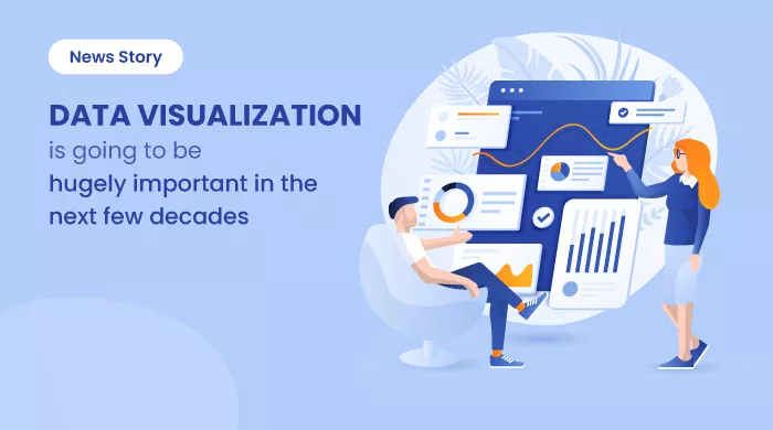
Data Visualization Is Going to Be Hugely Important in the Next Few Decades
This News Story blog article talks about the benefits of data visualization software tools for businesses. It also explains the top data visualization... ... Read research article
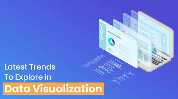
Latest Trends To Explore In Data Visualization
Data Visualization is fueled by various innovative trends such as implementing data visualization software with AI, BI, and machine learning to analyze data... ... Read research article

20 Outstanding Data Visualization Examples
Data visualization is a trending practice these days. Interestingly, some of the best data visualization software can help you sail through the challenges well... ... Read research article