Data Visualization Software
Looking for the best data visualization software? The below list of the top data visualization tools intricately curated by the Goodfirms’ team can assist you in shortlisting the right data visualization solutions suiting your requirements. Just go through the details of each software along with authentic users’ reviews about each data visualization platform indexed here to make an informed purchasing decision. This easy-to-use list will help you seamlessly check the features, pricing, and deployment options of the best data visualization software.
List of Best Data Visualization Software with Reviews
-
![InstantAtlas]()
We help people present data about areas in effective and efficient ways to provide a context for decision making. We do this by creating and delivering innovative services and software to simplify ... read more about InstantAtlas
Entry Level PriceContact vendorFree Trial30 DaysPricing TypeContact Vendor100% in Data Visualization SoftwareFeatures
- Dashboard
- Data Import/Export
- Data Management
- Data Mining
- Relational Display
- Simulation Models
- Visual Discovery
Key Details
Licensing & Deployment
-
Cloud Hosted
-
Windows
-
Mac
-
Linux
Support
- Chat
- Phone
Knowledge Base
-
Help Guides
-
Video Guides
-
Blogs
Packages
Pricing Type
-
Contact Vendor
Free Version
-
No
Free Trial
-
30 Days Trial
Payment Frequency
-
Quote Based
-
![iPoint]()
The iPoint suite enables co-visualization of all wellbore data types making it a valuable tool for geologists, geophysicists, petrophysicists, reservoir engineers, drillers and data managers alike. Displaying multiple datasets and types in ... read more about iPoint
Entry Level PriceContact vendorFree TrialN/APricing TypeContact Vendor100% in Data Visualization SoftwareFeatures
- Dashboard
- Data Import/Export
- Data Management
- Data Mining
- Relational Display
- Simulation Models
- Visual Discovery
Key Details
Licensing & Deployment
-
Cloud Hosted
-
Windows
-
Mac
-
Linux
Support
- Chat
- Phone
Knowledge Base
-
Help Guides
-
Video Guides
-
Blogs
Packages
Pricing Type
-
Contact Vendor
Free Version
-
No
Payment Frequency
-
Quote Based
-
![ITONICS Innovation]()
The more complex and strategically relevant decisions in companies are, the less structured the decision making process and methodology is. We believe that now is the time to provide software solutions addressing ... read more about ITONICS Innovation
Entry Level Price$49 Per YearFree TrialN/APricing TypeFlat Rate33% in Data Visualization SoftwareFeatures
- Dashboard
- Data Import/Export
- Data Management
- Data Mining
- Relational Display
- Simulation Models
- Visual Discovery
Key Details
Licensing & Deployment
-
Cloud Hosted
-
Windows
-
Mac
-
Linux
Support
- Phone
Knowledge Base
-
Help Guides
-
Video Guides
-
Blogs
Packages
Pricing Type
-
Flat Rate
Free Version
-
No
Payment Frequency
-
Quote Based
Available Packages
Standard$49 Per Year -
![JSCharting]()
Every JSCharting license includes the full suite of 150+ advanced chart types plus interactive stock charts, seamless grid and calendar support, JavaScript maps, Gantt charts, JavaScript Org Charts and micro charts at ... read more about JSCharting
Entry Level Price$2000 One-timeFree TrialN/APricing TypeFlat Rate100% in Data Visualization SoftwareFeatures
- Data Import/Export
- Simulation Models
- Visual Discovery
Key Details
Licensing & Deployment
-
Cloud Hosted
-
Windows
-
Mac
-
Linux
Support
- Phone
Knowledge Base
-
Help Guides
-
Video Guides
-
Blogs
Packages
Pricing Type
-
Flat Rate
Free Version
-
No
Payment Frequency
-
One-Time Payment
Available Packages
Standard$2000 One-time -
![KeyLines]()
Build game-changing network visualization products that turn connected data into insight. Harness JavaScript’s power and flexibility to quickly and easily build network visualization applications that can be deployed anywhere, to anyone. It’s ... read more about KeyLines
Entry Level PriceContact vendorFree TrialN/APricing TypeContact Vendor100% in Data Visualization SoftwareFeatures
- Dashboard
- Data Import/Export
- Data Management
- Relational Display
- Simulation Models
- Visual Discovery
Key Details
Licensing & Deployment
-
Cloud Hosted
-
Windows
-
Mac
-
Linux
Support
- Phone
Knowledge Base
-
Help Guides
-
Video Guides
-
Blogs
Packages
Pricing Type
-
Contact Vendor
Free Version
-
No
Payment Frequency
-
Quote Based
-
![KnowledgeHound]()
Go from data-juggler to decision-influencer in a matter of seconds. KnowledgeHound lets you dive deeper into your data than you ever have before, revealing connections and insights that your company needs to ... read more about KnowledgeHound
Entry Level PriceContact vendorFree TrialN/APricing TypeContact Vendor100% in Data Visualization SoftwareFeatures
- Dashboard
- Data Import/Export
- Data Management
- Data Mining
- Relational Display
- Simulation Models
- Visual Discovery
Key Details
Licensing & Deployment
-
Cloud Hosted
-
Windows
-
Mac
-
Linux
Support
- Phone
Knowledge Base
-
Help Guides
-
Video Guides
-
Blogs
Packages
Pricing Type
-
Contact Vendor
Free Version
-
No
Payment Frequency
-
Quote Based
-
![Linkurious]()
Criminal networks hide easily in large volumes of data. At Linkurious, we help companies and governments detect sophisticated threats by making a software that augments human intelligence. Analysts and investigators worldwide can ... read more about Linkurious
Entry Level PriceContact vendorFree TrialN/APricing TypeContact Vendor100% in Data Visualization SoftwareFeatures
- Dashboard
- Data Import/Export
- Data Management
- Simulation Models
Key Details
Licensing & Deployment
-
Cloud Hosted
-
Windows
-
Mac
-
Linux
Support
- Phone
Knowledge Base
-
Help Guides
-
Video Guides
-
Blogs
Packages
Pricing Type
-
Contact Vendor
Free Version
-
No
Payment Frequency
-
Quote Based
-
![OpenViz]()
Join our growing list of ISVs, Enterprises, and Institutional Clients that were able to transform their mountains of data into actionable insights, providing excellent user experience (UX), and creating consistent branding across ... read more about OpenViz
Entry Level PriceContact vendorFree TrialN/APricing TypeContact Vendor50% in Data Visualization SoftwareFeatures
- Dashboard
- Data Import/Export
- Data Management
- Data Mining
- Relational Display
- Simulation Models
Key Details
Licensing & Deployment
-
Cloud Hosted
-
Windows
-
Mac
-
Linux
Support
- Phone
Knowledge Base
-
Help Guides
-
Video Guides
-
Blogs
Packages
Pricing Type
-
Contact Vendor
Free Version
-
No
Payment Frequency
-
Quote Based
-
![Panopticon]()
Delays in decision-making are costly in real-time businesses like electronic trading of equities, fixed income, FX, futures, or commodities, as well as other time-critical industries like telecommunications, energy, manufacturing, and logistics. Waiting ... read more about Panopticon
Entry Level PriceContact vendorFree TrialN/APricing TypeContact Vendor100% in Data Visualization SoftwareFeatures
- Dashboard
- Data Import/Export
- Data Management
- Data Mining
- Simulation Models
- Visual Discovery
Key Details
Licensing & Deployment
-
Cloud Hosted
-
Windows
-
Mac
-
Linux
Support
- Phone
Knowledge Base
-
Help Guides
-
Video Guides
-
Blogs
Packages
Pricing Type
-
Contact Vendor
Free Version
-
No
Payment Frequency
-
Quote Based
-
![Quadrigram]()
Quadrigram allows you to engage people by sharing stories that matter.
Entry Level PriceContact vendorFree TrialN/APricing TypeContact Vendor100% in Data Visualization SoftwareFeatures
- Dashboard
- Data Import/Export
- Data Management
- Data Mining
- Relational Display
- Simulation Models
- Visual Discovery
Key Details
Licensing & Deployment
-
Cloud Hosted
-
Windows
-
Mac
-
Linux
Support
- Phone
Knowledge Base
-
Help Guides
-
Video Guides
-
Blogs
Packages
Pricing Type
-
Contact Vendor
Free Version
-
No
Payment Frequency
-
Quote Based
-
![Longview]()
Make more strategic decisions based on the latest and greatest information available. By simplifying your data warehouse, your organization can finally deploy agile decision-making to identify and correct errors and react quickly ... read more about Longview
Entry Level PriceContact vendorFree TrialN/APricing TypeContact Vendor100% in Data Visualization SoftwareFeatures
- Dashboard
- Data Import/Export
- Data Management
- Data Mining
- Simulation Models
Key Details
Licensing & Deployment
-
Cloud Hosted
-
Windows
-
Mac
-
Linux
Support
- Phone
Knowledge Base
-
Help Guides
-
Video Guides
-
Blogs
Packages
Pricing Type
-
Contact Vendor
Free Version
-
No
Payment Frequency
-
Quote Based
-
![Visualr]()
A Self-Service Data Visualization Software & Analytics Platform Do your Analytics on your own. Data-driven decision-making. Minimize dependencies on IT/MIS Team. Do instant analysis and deep dive into your data.
Entry Level Price$80 Per YearFree TrialN/APricing TypeFlat Rate100% in Data Visualization SoftwareFeatures
- Dashboard
- Data Import/Export
- Data Management
- Data Mining
- Relational Display
- Simulation Models
Key Details
Licensing & Deployment
-
Cloud Hosted
-
Windows
-
Mac
-
Linux
Support
- Phone
Knowledge Base
-
Help Guides
-
Video Guides
-
Blogs
Packages
Pricing Type
-
Flat Rate
Free Version
-
No
Payment Frequency
-
Quote Based
Available Packages
Standard$80 Per Year -
![Web Data Rocks]()
With a few lines of code, you are ready to start analyzing data on your website. Yes, it's that simple! In less than five minutes you will get all off-the-shelf reporting features ... read more about Web Data Rocks
Entry Level PriceFree versionFree TrialAvailablePricing TypeFree100% in Data Visualization SoftwareFeatures
- Dashboard
- Data Import/Export
- Data Management
- Data Mining
- Relational Display
- Simulation Models
Key Details
Licensing & Deployment
-
Cloud Hosted
-
Windows
-
Mac
-
Linux
Support
- Phone
Knowledge Base
-
Help Guides
-
Video Guides
-
Blogs
Packages
Pricing Type
-
Free
Payment Frequency
-
Free
-
![Reportz]()
Reportz is an intuitive, white-label, client-reporting and data tracking tool created for marketers by marketers with the purpose of reducing the stressful and time-consuming client reporting process to mere minutes and clicks. ... read more about Reportz
Entry Level Price$9.98 Per MonthFree Trial15 DaysPricing TypeFlat Rate33% in Data Visualization SoftwareFeatures
- Dashboard
- Data Import/Export
- Filtered Views
Key Details
Licensing & Deployment
-
Cloud Hosted
-
Web-based
Support
- Chat
Knowledge Base
-
Help Guides
-
Video Guides
-
Blogs
-
On-Site Training
Packages
Pricing Type
-
Flat Rate
Free Version
-
No
Free Trial
-
15 Days Trial
Payment Frequency
-
Monthly Payment
-
Annual Subscription
Available Packages
Standard$9.98 Per Month -
![Plotly]()
The first step to making any Chart Studio Enterprise graph is adding data to the grid. Whether you prefer to type your data directly into the grid, import it from a file ... read more about Plotly
Entry Level PriceFree versionFree TrialAvailablePricing TypeFree50% in Data Visualization SoftwareFeatures
- Dashboard
- Data Management
- Filtered Views
- Reporting & Analytics
- Visual Discovery
Key Details
Industries
-
Financial-services
-
Hospital-health-care
-
Marketing-advertising
-
Oil-energy
-
Program-development
Licensing & Deployment
-
Proprietary
-
Cloud Hosted
-
Web-based
Support
- Email
-
24x7 Support
Knowledge Base
-
Help Guides
-
Video
-
Blog
-
Infographics
Packages
Pricing Type
-
Free
Payment Frequency
-
Monthly Payment
-
Annual Subscription
-
![Knowi]()
Knowi is the only full stack analytics platform that natively integrates to all the popular NoSQL data stores, as well as relational and Cloud APIs sources. Our data layer eliminates the need ... read more about Knowi
Entry Level PriceContact vendorFree TrialAvailablePricing TypeContact Vendor25% in Data Visualization SoftwareFeatures
- Dashboard
- Filtered Views
- OLAP
- Relational Display
- Simulation Models
- Visual Discovery
Key Details
Licensing & Deployment
-
Cloud Hosted
-
Web-based
Knowledge Base
-
Help Guides
-
Video Guides
-
Blogs
-
Webinars
-
Infographics
Packages
Pricing Type
-
Contact Vendor
Free Version
-
No
Free Trial
-
Available Trial
Payment Frequency
-
Quote Based
-
![Sherlock]()
In the course of digitization and the increasingly complex products and services, the requirements for product and service communication are changing. Good for those who can offer their customers precise use of ... read more about Sherlock
Entry Level PriceContact vendorFree TrialN/APricing TypeContact Vendor20% in Data Visualization SoftwareFeatures
- Dashboard
- Filtered Views
Key Details
Licensing & Deployment
-
Cloud Hosted
-
Web-based
Knowledge Base
-
Help Guides
-
Video Guides
-
Blogs
-
Webinars
-
Infographics
Packages
Pricing Type
-
Contact Vendor
Free Version
-
No
Payment Frequency
-
Monthly Payment
-
Annual Subscription
-
![Beagle]()
Beagle enables companies to drive adoption of data analytics by taking data to workspaces such as Microsoft teams, Whatsapp, Workplace@facebook through a virtual analyst. Beagle integrates all your data sources, be it ... read more about Beagle
Entry Level PriceContact vendorFree TrialN/APricing TypeContact Vendor33% in Data Visualization SoftwareFeatures
- Dashboard
- Filtered Views
- OLAP
- Relational Display
- Visual Discovery
Key Details
Licensing & Deployment
-
Cloud Hosted
-
Web-based
Knowledge Base
-
Help Guides
-
Video Guides
-
Blogs
-
Infographics
Packages
Pricing Type
-
Contact Vendor
Free Version
-
Yes
Payment Frequency
-
Monthly Payment
-
Annual Subscription
-
Quote Based
-
One-Time Payment
-
Free
-
![IVAAP]()
IVAAP™ – The Next-Generation Upstream Data Visualization Platform. IVAAP™ is built to empower product owners, developers, and architects to accelerate the development of subsurface digital solutions for oil and gas. Rather than ... read more about IVAAP
Entry Level PriceContact vendorFree TrialN/APricing TypeContact Vendor50% in Data Visualization SoftwareFeatures
- Dashboard
- Data Management
- Filtered Views
- Visual Discovery
Key Details
Licensing & Deployment
-
Cloud Hosted
-
Web-based
Knowledge Base
-
Help Guides
-
Video Guides
-
Blogs
-
Webinars
-
Infographics
-
Case Studies
-
Whitepapers
-
On-Site Training
Packages
Pricing Type
-
Contact Vendor
Free Version
-
Yes
Payment Frequency
-
Monthly Payment
-
Annual Subscription
-
Quote Based
-
One-Time Payment
-
Free
-
![valQ]()
ValQ is a server less, lightweight, multi-purpose application running on Power BI supporting use cases such as planning, forecasting, budgeting, time series forecasting, and value driver planning. It helps enterprises run simulations, ... read more about valQ
Entry Level PriceFree versionFree TrialAvailablePricing TypeFree20% in Data Visualization SoftwareFeatures
- Dashboard
- Data Import/Export
- Data Management
- Filtered Views
- OLAP
- Operations Management
- Simulation Models
- Visual Discovery
Key Details
Industries
-
Commercial-real-estate
-
Electrical-electronic-manufacturing
-
Food-beverages
-
Food-production
-
Hospital-health-care
-
Hospitality
-
Logistics-supply-chain
-
Mining-metals
-
Pharmaceuticals
-
Real-estate
-
Restaurants
-
Retail
-
Warehousing
Licensing & Deployment
-
Proprietary
-
Cloud Hosted
-
On Premises
-
Web-based
Support
- Chat
- Phone
Knowledge Base
-
Help Guides
-
Video Guides
-
Blogs
-
Webinars
-
Case Studies
-
Whitepapers
-
On-Site Training
Packages
Pricing Type
-
Free
Payment Frequency
-
Monthly Payment
-
Annual Subscription
-
Free
-
![CentriQS]()
A single integrated business management software that centralizes your company data, resources, operations and core business functions into all-in-one solution. Start using CentriQS with a complete solution for effective managing of tasks ... read more about CentriQS
Entry Level Price$4.99 Per MonthFree TrialN/APricing TypeFlat Rate50% in Data Visualization SoftwareFeatures
- Dashboard
- Data Import/Export
- Data Management
- Filtered Views
- OLAP
- Reporting & Analytics
- Visual Discovery
Key Details
Licensing & Deployment
-
Cloud Hosted
-
Windows
Knowledge Base
-
Help Guides
-
Video Guides
Packages
Pricing Type
-
Flat Rate
Free Version
-
No
Payment Frequency
-
Monthly Payment
-
Annual Subscription
-
Quote Based
Available Packages
Standard$4.99 Per Month -
![Upsolver]()
Upsolver allows you to combine the economics and openness of data lakes with the performance and ease-of-use of databases.
Entry Level PriceContact vendorFree Trial14 DaysPricing TypeContact Vendor33% in Data Visualization SoftwareFeatures
- Data Import/Export
- Data Management
- Visual Discovery
Key Details
Licensing & Deployment
-
Cloud Hosted
-
Web-based
Support
- Chat
Knowledge Base
-
Help Guides
-
Blogs
-
Webinars
-
Case Studies
-
Whitepapers
-
On-Site Training
Packages
Pricing Type
-
Contact Vendor
Free Version
-
No
Free Trial
-
14 Days Trial
Payment Frequency
-
Annual Subscription
-
![Count]()
Count is a new type of data analytics application, where everything is based around notebooks. Notebooks contain all of your analytics queries, alongside rich text, images, videos, and interactive controls. A notebook ... read more about Count
Entry Level PriceContact vendorFree Trial14 DaysPricing TypeContact Vendor33% in Data Visualization SoftwareFeatures
- Data Management
- Visual Discovery
Key Details
Licensing & Deployment
-
Cloud Hosted
-
Web-based
Support
- Chat
Knowledge Base
-
Help Guides
-
Video Guides
-
Blogs
Packages
Pricing Type
-
Contact Vendor
Free Version
-
No
Free Trial
-
14 Days Trial
Payment Frequency
-
Monthly Payment
-
![WalkLists]()
Walk lists is the tool that gives you the power that you are in charge to select and build your own custom-driven voter lists. No more delegating and going in circles just ... read more about WalkLists
Entry Level PriceContact vendorFree TrialN/APricing TypeContact Vendor100% in Data Visualization SoftwareFeatures
- Dashboard
- Data Import/Export
- Data Management
- Filtered Views
Key Details
Licensing & Deployment
-
Cloud Hosted
-
Web-based
-
iPhone/iPad
-
Android
-
Windows
-
Mac
-
Linux
Support
- Chat
- Phone
Knowledge Base
-
Help Guides
-
Video Guides
-
Blogs
-
On-Site Training
Packages
Pricing Type
-
Contact Vendor
Free Version
-
No
Payment Frequency
-
Annual Subscription
-
Quote Based
-
One-Time Payment
-
![xViz]()
xViz is advanced enterprise-grade visuals for Microsoft Power BI. It enables you to visualize your business data efficiently and gather insights that promote data-driven decision-making in Power BI. xViz visuals provide advanced ... read more about xViz
Entry Level PriceFree versionFree TrialAvailablePricing TypeFree100% in Data Visualization SoftwareFeatures
- Dashboard
- Data Import/Export
- Data Management
- Filtered Views
- Relational Display
- Simulation Models
- Visual Discovery
Key Details
Licensing & Deployment
-
Cloud Hosted
-
Windows
Support
- Chat
Knowledge Base
-
Help Guides
-
Video Guides
-
Blogs
-
Webinars
-
Infographics
-
Case Studies
-
Whitepapers
Packages
Pricing Type
-
Free
Payment Frequency
-
Annual Subscription
-
Free
-
![Deepnote]()
Deepnote is a new kind of data science notebook. Jupyter-compatible with real-time collaboration and running in the cloud.
Entry Level PriceContact vendorFree TrialMore than 30 daysPricing TypeContact Vendor50% in Data Visualization SoftwareFeatures
- Dashboard
- Data Import/Export
- Data Mining
- Filtered Views
- OLAP
- Simulation Models
- Visual Discovery
Key Details
Licensing & Deployment
-
Cloud Hosted
-
On Premises
-
Web-based
-
Windows
-
Mac
-
Linux
Support
- Chat
Knowledge Base
-
Help Guides
-
Video Guides
-
Blogs
-
Webinars
-
Infographics
-
Case Studies
Packages
Pricing Type
-
Contact Vendor
Free Version
-
Yes
Free Trial
-
More than 30 days Trial
Payment Frequency
-
Monthly Payment
-
Annual Subscription
-
Free
-
![MODS Reality]()
MODS Reality brings critical knowledge to life to maximizing your performance and increasing profitability. MODS Reality is a cloud-based application that hosts a digital twin of your facility using a point cloud ... read more about MODS Reality
Entry Level PriceContact vendorFree TrialN/APricing TypeContact Vendor100% in Data Visualization SoftwareFeatures
- Dashboard
- Data Management
- Filtered Views
- Relational Display
- Operations Management
- Simulation Models
- Visual Discovery
Key Details
Licensing & Deployment
-
Cloud Hosted
-
Android
-
Windows
Knowledge Base
-
Help Guides
-
Blogs
Packages
Pricing Type
-
Contact Vendor
Free Version
-
No
Payment Frequency
-
Quote Based
-
![Auctm]()
Auctm is an analytics platform for brokers, team leaders, managers, and coaches. High-performing broker teams use Auctm’s dashboards and actionable insights to improve conversions, coach and retain agents, drive accountability, and make ... read more about Auctm
Entry Level PriceContact vendorFree TrialMore than 30 daysPricing TypeContact Vendor50% in Data Visualization SoftwareFeatures
- Dashboard
- Data Management
- Data Mining
- Filtered Views
- Visual Discovery
Key Details
Licensing & Deployment
-
Cloud Hosted
-
Web-based
Knowledge Base
-
Video Guides
-
Blogs
-
Webinars
-
Infographics
Packages
Pricing Type
-
Contact Vendor
Free Version
-
Yes
Free Trial
-
More than 30 days Trial
Payment Frequency
-
One-Time Payment
-
Free
-
![Zuar Portal]()
Provide secure, global access to your organization’s analytics. Zuar Portal is the easy way to create unique analytics hubs for executives, employees, partners, vendors, customers, and more. Employ drag and drop simplicity ... read more about Zuar Portal
Entry Level PriceContact vendorFree Trial14 DaysPricing TypeContact Vendor50% in Data Visualization SoftwareFeatures
- Dashboard
- Data Import/Export
- Filtered Views
- Visual Discovery
Key Details
Industries
-
Information-technology-services
Licensing & Deployment
-
Proprietary
-
Cloud Hosted
-
Web-based
Support
- Chat
- Phone
-
Weekdays
Knowledge Base
-
Help Guides
-
Video Guides
-
Blogs
-
Webinars
-
Case Studies
Packages
Pricing Type
-
Contact Vendor
Preferred Currency
-
USD ($)
Free Version
-
No
Free Trial
-
14 Days Trial
Payment Frequency
-
Monthly Payment
-
![Dashboard Builder]()
Dashboard Builder is a browser based, open source data visualization tool that represents information and data using visual elements such as charts, graphs, and maps for open source community without requiring IT ... read more about Dashboard Builder
Entry Level PriceFree versionFree TrialAvailablePricing TypeFree50% in Data Visualization SoftwareFeatures
- Dashboard
- Data Import/Export
- Data Management
- Data Mining
- Filtered Views
- OLAP
- Relational Display
- Simulation Models
- Visual Discovery
Key Details
Licensing & Deployment
-
Cloud Hosted
-
On Premises
-
Web-based
-
Windows
-
Linux
Knowledge Base
-
Help Guides
-
Video Guides
-
Blogs
Packages
Pricing Type
-
Free
Payment Frequency
-
Free
-
![Powerslide]()
Simplify the analysis and communication of your data, with a simple, interactive and efficient platform. Both intuitive and design, thanks to Powerslide, you can create your KPIs and data visualization in just ... read more about Powerslide
Entry Level PriceContact vendorFree Trial30 DaysPricing TypeContact Vendor100% in Data Visualization SoftwareFeatures
- Dashboard
- Data Import/Export
- Data Mining
- Filtered Views
- Operations Management
Key Details
Licensing & Deployment
-
Cloud Hosted
-
On Premises
-
Web-based
-
Windows
-
Mac
Support
- Phone
Knowledge Base
-
Help Guides
-
Video Guides
-
Blogs
-
Webinars
-
Infographics
Packages
Pricing Type
-
Contact Vendor
Free Version
-
Yes
Free Trial
-
30 Days Trial
Payment Frequency
-
Monthly Payment
-
Annual Subscription
-
Free
-
![Matidor]()
Matidor’s live project map gives you a better picture than any spreadsheet ever could. Plan, execute, and manage site work more intelligently using Matidor’s GIS visualization tools. Manage and share your entire ... read more about Matidor
Entry Level PriceContact vendorFree TrialN/APricing TypeContact Vendor15% in Data Visualization SoftwareFeatures
- Dashboard
- Data Import/Export
- Data Management
- Data Mining
- Filtered Views
- OLAP
- Relational Display
- Simulation Models
- Visual Discovery
Key Details
Industries
-
Construction
-
Facilities-services
-
Hospital-health-care
-
Transportation-trucking-railroad
Licensing & Deployment
-
Proprietary
-
Cloud Hosted
-
Web-based
-
iPhone/iPad
-
Android
Support
- Email
- Chat
-
24x7 Support
Knowledge Base
-
Help Guides
-
Video
-
Blogs
Packages
Pricing Type
-
Contact Vendor
Preferred Currency
-
USD ($)
Free Version
-
No
Payment Frequency
-
Quote Based
Integration
Integrated With
- Zapier
- ArcGIS
- DeltekVision
- ESdat
- Geotab
- Geotab
- Oracle Cloud HCM
- QuickBooks Online
- Samsara
- Slack
- Xero
-
![OpenSistemas]()
OpenSistemas is a company specialized in the development of highly innovative solutions related to data management, transformation, analysis, storage and visualization in Business Analytics, Big Data, Data Science and Data Engineering environments ... read more about OpenSistemas
Entry Level PriceContact vendorFree TrialMore than 30 daysPricing TypeContact Vendor50% in Data Visualization SoftwareFeatures
- Data Management
- Operations Management
- Simulation Models
- Visual Discovery
Key Details
Licensing & Deployment
-
Cloud Hosted
-
Web-based
Support
- Phone
Knowledge Base
-
Help Guides
-
Video Guides
Packages
Pricing Type
-
Contact Vendor
Free Version
-
No
Free Trial
-
More than 30 days Trial
Payment Frequency
-
Quote Based
-
![y42]()
y42 is a no-code data management platform for loading, cleaning, connecting and sharing data. The end-to-end platform runs a BigQuery data warehouse "under the hood" and empowers users to build scalable data ... read more about y42
Entry Level PriceContact vendorFree TrialN/APricing TypeContact Vendor25% in Data Visualization SoftwareFeatures
- Dashboard
- Data Management
- Relational Display
- Operations Management
- Visual Discovery
Key Details
Licensing & Deployment
-
Cloud Hosted
-
Web-based
Support
- Chat
- Phone
Knowledge Base
-
Help Guides
-
Video Guides
Packages
Pricing Type
-
Contact Vendor
Free Version
-
No
Payment Frequency
-
Quote Based
-
![ZEMA]()
ZE is the developer of ZEMA, a market data management platform for data aggregation, validation, modeling, automation, and integration. By providing unrivaled data collection, analytics, curve management, and integration capabilities, ZEMA offers ... read more about ZEMA
Entry Level PriceContact vendorFree TrialN/APricing TypeContact Vendor20% in Data Visualization SoftwareFeatures
- Dashboard
- Data Management
- OLAP
- Relational Display
- Operations Management
- Simulation Models
- Visual Discovery
Key Details
Licensing & Deployment
-
Cloud Hosted
-
Web-based
-
Windows
Support
- Chat
Knowledge Base
-
Help Guides
-
Video Guides
-
Infographics
Packages
Pricing Type
-
Contact Vendor
Free Version
-
No
Payment Frequency
-
Quote Based


Why Trust Goodfirms
Goodfirms is the world’s leading reviews and ratings company featuring 110,000+ tech companies from across the globe, complete with 80,000+ humanly vetted client reviews, detailed portfolios, hourly rates, employee strength, and more to help you choose your perfect tech partner.
Humanly-Vetted Client Reviews
Our researchers have personally vouched for the authenticity of 80,000+ client reviews by speaking directly with clients, cross-checking project details, timelines, and results to ensure 100% credibility.
Data-Driven Rankings
Data powers our company listings. Every company listed is evaluated based on its expertise, experience, market presence, reviews, and client satisfaction rate, which helps buyers confidently choose the right tech partner.
Global Trust & Recognition
Goodfirms is trusted by 110,000+ businesses in 160+ countries to connect with reliable tech partners. Our reputation is built on 80,000+ verified reviews and rankings you can trust.
Transparency In Detail
From verified client reviews and portfolio highlights to service focus and pricing, Goodfirms provides a 360-degree view of every company, helping 2+ million monthly users find the perfect tech partner.
Trending insights from Goodfirms
Valuable insights from top experts accelerate decision-making.
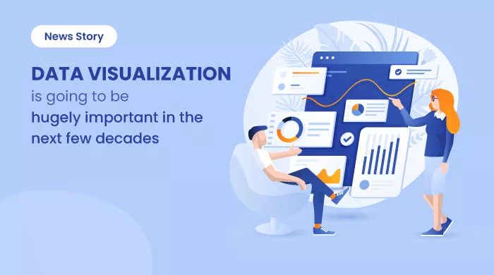
Data Visualization Is Going to Be Hugely Important in the Next Few Decades
This News Story blog article talks about the benefits of data visualization software tools for businesses. It also explains the top data visualization... ... Read research article
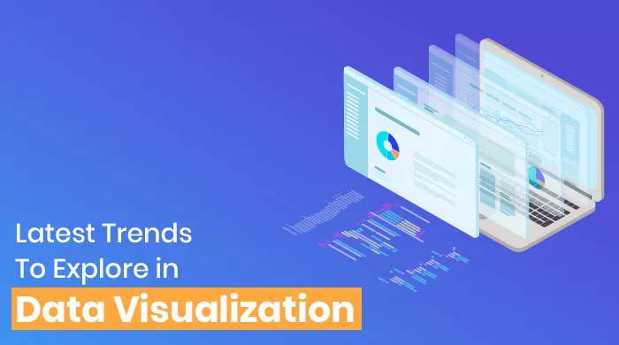
Latest Trends To Explore In Data Visualization
Data Visualization is fueled by various innovative trends such as implementing data visualization software with AI, BI, and machine learning to analyze data... ... Read research article

20 Outstanding Data Visualization Examples
Data visualization is a trending practice these days. Interestingly, some of the best data visualization software can help you sail through the challenges well... ... Read research article