Digitization isn't an option anymore, but it has become a basic necessity. It has paved the way for businesses to enhance their reach and better understand the latest market trends. It has increased the scope for employment generation, aiming to improve economic development. It focuses on a route that leads to world progress.
But data extraction is one of the most significant advantages that businesses have unleashed due to digitization. It has enabled enterprises to streamline the massive data and manage it efficiently. Another transcending technology that has simplified data management is data visualization.
Data visualization is nowadays the trendiest concept leveraging all business sectors. The visualization of data may sound complicated, but it's pretty simple. If you know about data analysis, then it is easier for you to understand this new trend. Data analysis is an element of data visualization.
The idea of using images to assimilate data has been there over the centuries. It began with maps and diagrams in the 17th century to the innovation of pie charts in the 19th century. Today, it can effectively create clear business visionaries and make improved data-driven decisions. Credit must-go-to data visualization software that has ensured providing accurate data and timely forecasting. The tools have become increasingly popular in recent years.
Before delving into the latest data visualization trends, let’s discuss the fundamentals of data visualization first.
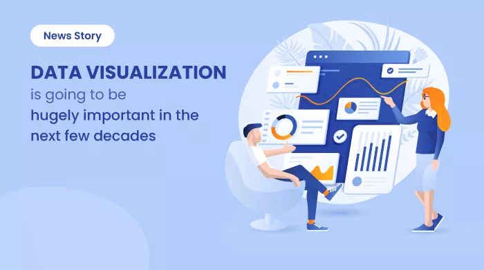
What is Data Visualization?
Data visualization is the process where data is presented into a visual form such as a map, chart, or graph. It facilitates the understanding of data and draws insights from the human brain. It allows decision-makers to view big data in a pictorial form, allowing them to understand complex questions or identify new structures.
Data visualization is relevant and extensively used in various fields. For example, the sales or marketing managers may use it to depict the previous year’s sales, marketing trends and present a future prediction. Similarly, project managers can easily exchange information with their clients, while it helps healthcare professionals to monitor vital patient parameters.
Why is Data Visualization Important?
The immediate response to the importance of data visualization is that the human brain can outstandingly remember pictures. This trend helps many firms to classify the factors that influence the client's behavior and address the issues that need to be solved. Data visualization is an easy and the fastest way to transmit concepts in a global pattern. With small-scale adjustments, you can explore various scenarios.
Data Visualization Helps Identify Trends in Different Ways
- Classify the factors that influence the client's behavior.
- Reflect areas that need enhancement or recognition.
- Instructs the specific location of the required product.
- Predicts the future sales volume.
When to use data visualization?
Data visualization works in different ways. The different case scenarios when it proves its best efficiency. These include-
Frequency determination - Frequency is a relatively simple utilization of data visualization since it also concerns time-consuming data. When time is in concern, it is helpful to analyze how the relevant events are changing over time.
Value and threats assessment - Various factors are considered in defining complex measurements like value and threat. It becomes pretty difficult to analyze a spreadsheet virtually. Data visualization is used by adding color codes to the formula that highlights the valuable and challenging prospects.
Organization - While planning a routine for leading projects, things can be complex and confusing. A digital chart can give an idea about the timings of each task in the project.
Network screening -Market research can provide an example of a screening of a network with data visualization. The marketing manager needs to understand what types of audience they will target. So they have to analyze the whole market to identify public clusters. After categorizing, they can influence them about their product.
Relationship determination - Data visualization is used to recognize correlation. The relationship between the two variants is hard to determine but it is crucial to be mindful of the relation. Here data visualization plays a pivotal role in analyzing the data.
Modifications in time - This may be the most common and easy way to use data visualization as most data involves a part of the time. The first phase in many data analyses is to examine how the data patterns change over time.
The Latest Data Visualization Trends
Data over visuals- Data visualization does not only relate to visuals. Under the cap, there are many more things. Many people are stuck in graphs because that is the standard part of any platform. In addition to these basic visuals, data should inform and enable teams to derive meaningful knowledge. This helps to evolve the data viewing trends.
The new data visualization can visually improve by adopting advanced technologies and equipment, such as charts, maps. Also, by implementing the data visualization tools, you can use 3D maps and computer-aided information to design creative data viewing dashboards without coding knowledge.
Data over social media -Another latest craze in data visualization is utilizing social platforms to navigate better commitments. This trend has also been identified by data researchers and makes social media networks user-friendly. The attention span of social media users is relatively short. Hence, to grab the attention span, businesses must display data in a visually appealing manner, such as using looping animation, short videos, and GIFs. These social and communicating channels contribute exceptionally well to the successful transmission of information among team members of an organization.
Data in storytelling - No wonder people love stories. And the idea of imaginative storytelling in data visualization has become more widespread. To distinguish and convey high experience, data is used in storytelling. It emotionally involves the audience, and they tend to remember them than to remember dry facts. There are important stories that data and numbers have to say but, they depend on how you speak to them. The data visualization is now more of an account where the content is customized with a good beginning and a better end.
Data in color trends - It is the colors that attract users to data visualization. Freshness, agricultural development, environment, and nature are marked by color. Color adds beauty to the picture and makes it eye-catching for the viewers.
Data in mobile devices-User interface and user experience have always been the focal points for designing a visually appealing mobile application. Cross-platform mobile app development is a viable choice for enhanced data visualization through mobile apps. Data visualization helps monitor operations, optimize processes, and make wise choices from stock markets, athletics sensors, and even track price performance. Workflows with user-friendly views, proposals, and predictions are features of user experience and data visualization patterns. Mobile data has become one of the hotbed trends in data visualization because most app data is controlled by mobile users.
Data in artificial intelligence and machine learning - Both artificial intelligence and machine learning have been the next-generation technologies that have enabled business enterprises to experiment in new ways. They gather and analyze massive amounts of data in real-time. Artificial intelligence, for example, has disrupted almost all industries and become a trend-setter in business intelligence for the coming years. Visualization of AI-based data enables companies to find which data is crucial to search to make a fundamental decision. AI analyzes data according to specific users. Data visualization and AI tools incorporate fully automatic and visual analysis techniques with user interaction to obtain information.
Data in Journalism - Data visualization is playing an essential role in the journalism field. Collecting worldwide information has become much simpler with appropriate tools to interpret it. Also, this advanced technology is helping media organizations to deliver accurate weather and climate information with colorful displays of various temperature records. Data in journalism takes up less space to demonstrate and sum up data in a way that gives the reader more time.
Data in Democratization - One of the popular trends of data visualization is democratization. Anyone can make decisions without any access or understanding limit at any time. It helps to democratize information & predictive analysis creates data-driven observations, accessible to users. It also enables users to access and see data with a few clicks and create dynamic, customized dashboards. Democratization contributes to the market opportunities and problems and builds on the ideas and concepts of the whole company.
Popular Terms Associated With Data Visualization
There are a few popular terminologies related to data visualization. It is important to understand them to have a better understanding of data visualization.
Line graph
A line graph represents time changes. Usually, the x-axis indicates a time frame, whereas the y-axis is the volume. It might show the number of units a factory produces daily in the last week or the number of units it generates for the year split by month.
Bar graph
A bar diagram also shows time changes. But if more than one variable exists, the comparison data for every variable may be made simpler at any time by a bar chart. For example, from the current to the previous year, a bar chart might compare the company's revenue.
Bubble graph
A bubble diagram is the modification of a scatter diagram in which each spot is shown as a bubble. It always has significance according to its position on the axis. There is a limit on the sizes of bubbles, owing to the restricted axis space.
Heat map
A heat map is just a matrix with color-coding. An algorithm is used for coloring the perceived value of each cell in the matrix.
This sort of display is beneficial since colors can interpret more quickly than numbers.
Treemaps
This technique displays hierarchical information in a nested form. For each category, the size of the rectangles utilized is proportionate to their percentage. Treemaps work best when there are several categories and the objective is to compare different portions of the entire system.
Scatter plot
The connection between two variables appears in this approach. An x and y-axis with points represent data points in a scattered image.
There is a link between the points if the trend is somehow upward or downward. The variables do not impact each other if the plot is genuinely dispersed with no trend at all.
Gauge
The distance between intervals can be shown with a gauge. It can be displayed as a circular clock gauge or a liquid thermometer-like tube gauge. The difference between multiple periods is shown next to each other.
Core Benefits of Data Visualization
Big data and other digital technologies have increased the relevance of data visualization. Data visualization offers several crucial advantages that help businesses streamline their operations. Let’s take a look at some of the core benefits below-
- Data visualization enables swift decision-making that eliminates all the inefficiencies and nullifies the outright losses. It allows firms to respond to trends quickly, outstrike competitors regularly, and take advantage of unforeseen market situations.
- Enterprises gather and store large volumes of data which are known as big data. Analysis of these data can pose challenges. Once data is generated, it is collected, and processed into reports, in which managers and policymakers need hours of excellent work. Data visualization can overcome these shortfalls. Visualization enables users to capture large quantities of data displayed immediately in certain forms.
- For nearly any business, data visualization is necessary because it can readily illustrate links between processes and results. Data visualization enables managers and policymakers to establish critical indicators and absorb them immediately. . It permits quick analysis and takes action on concerns.
- Data visualization is a rapid communication tool that may bring knowledge and data to the workforce, decision-makers, and other stakeholders much quicker and safer than prior techniques such as reports and tablets.
- Clear communication in the workplace may improve productivity, team collaboration, and job satisfaction, decrease absenteeism and increase the turnover of employees.
- With the help of data visualization, information can be recovered instantly and effortlessly, while the employee can utilize it in other efficient works.
- The revolutionary element of data visualization allows the user to dig in-depth and turn data into various representations, unlike conventional data visualization approaches such as Spreadsheets, PowerPoint, etc. They are also more accessible allowing users to modify data rapidly into desired combinations.
- Data visualization allows companies to harness and effectively capture the actual value of their data. This, in turn, leads to better quality, speed, and gains in productive and efficient decision-making processes.
- The introduction of data visualization has simplified lives. It has helped to remove the necessity of data researchers since data extraction has been automated and accessible from anywhere, anytime.
- Data visualization has enhanced the capacity to sustain the public interest.
Key Industries Unleashing the Benefits of Data Visualization
Data visualization has benefited almost all industries and businesses, regardless of size and type. It has helped enterprises in remote sensing, surveying, creating dashboards, designing graphic layouts, and data analysis.
Healthcare
Healthcare is the dominant sector that needs data visualization to track all aspects related to patients, doctors, hospitals, medical staff, drugs, equipment, etc. Also, in the current situation when Covid 19 has gripped the world, data visualization can effectively manage and control the crisis. Data visualization in conjunction with data analysis tools can save lives and respond to this challenge by examining urban activities in the middle of quarantine and analyzing demographic trends for medical research. It can also help monitor medical treatments, map viruses, and look at drug accessibility to the areas of risk and location of aid centers. Anyone can access these data visualization reports to evaluate and implement measures to ensure that everyone receives the treatment.
Banking and Finance
Data visualization can help public sector professionals to find an insightful way to highlight data links that can help shut down terrible actions. Organizations can visualize and detect suspicious activity and financial disruptions by data visualizations software. It can reduce the future risk of fraud. Total financial visibility enables leaders to improve transparency, increase accountability, bring accuracy in transactions, and ensure the productivity of the programmers.
Sales and Marketing
Business enterprises can use data visualization to reduce operating expenses. It can analyze the growth of your business. You can address the retail challenges, such as exploring a new site for your company, organizing and optimizing your supply chain, and enhancing sales performance. These platforms can also provide market studies and reviews based on income databases.
Transportation and Shipping
Routing a vehicle is a challenging task. Highways and roads require careful surveillance, ongoing maintenance, and efficient optimization to avoid blockades and accidents. Modern cities cannot live without proper public transportation planning. Geospatial data helps in the setting up of large cities covering parking spaces, playgrounds, etc. Every company relies on automobile fleets. Data visualization can help you maintain timely information and maps that add automated features like video tracking and workload solutions.
Politics
Data Visualization can be included in political analysis. Especially during election procedure, it can highlight the votes received by each political party.
Conclusion
Data visualization has become an essential element of the corporate world and an ever-growing aspect of everyday life in this intelligent digital age. It is expected that businesses of all sizes and types will implement data visualization to remain competitive in the upcoming years. Data visualization software helps communicate findings and critical insights efficiently and enables the business to make quick, accurate decisions. Also, you must note that the better you understand data and the more knowledge you acquire about visualization, the better you can analyze information. Adopt the latest trends of data visualization to stay ahead of the game.
Do check out the best free and open source data visualization software to select an optimal tool based on your business needs. The popular choices include RAWGraph, TimelineJS, DYgraph, Gephi, PathVisio, and many more. If you are interested in gaining more knowledge about the software, visit the buyer’s guide section.