Crafting Digital Experiences

A trusted digital partner to businesses for over a decade.

From handcrafted websites to mobile apps, our team of expert engineers and designers is dedicated to delivering digital solutions tailored to your unique needs.

We believe that every brand deserves an authentic and engaging digital presence that reflects their values and goals. That's why we take a personalized approach to every project, working closely with our clients to understand their vision and bring it to life.

Macedonia Macedonia
Boulevard Ilinden 67 Skopje 1000 - Macedonia, Skopje, Skopje 1000
(+389) 2 3154 001
$50 - $99/hr
10 - 49
2011

Service Focus

Focus of Web Development
  • Wordpress - 25%
  • HTML - 15%
  • HTML5 - 15%
  • CSS - 15%
  • Bootstrap - 15%
  • CSS3 - 15%
Focus of Web Designing (UI/UX)
  • Website - 20%
  • Landing Page - 10%
  • Launch Page - 5%
  • Ecommerce - 15%
  • Corporate - 5%
  • Logo Design - 5%
  • Usability - 5%
  • User Experience - 5%
  • Digital Design - 5%
  • Graphic Design - 5%
  • Product Design - 5%
  • Packaging Design - 5%
  • Print Design - 5%
  • Motion Graphics Design - 5%
Focus of E-commerce Development
  • Shopify - 30%
  • WooCommerce - 30%
  • Custom E-commerce - 40%

Industry Focus

  • E-commerce - 35%
  • Advertising & Marketing - 20%
  • Travel & Lifestyle - 15%
  • Information Technology - 10%
  • Food & Beverages - 10%
  • Other Industries - 5%
  • Social - 5%

Client Focus

55% Small Business
5% Large Business
40% Medium Business

Detailed Reviews of Codeart

No Review
No reviews submitted yet.
Be the first one to review

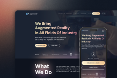
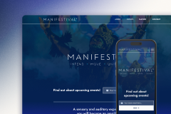
Client Portfolio of Codeart

Project Industry

  • Productivity - 9.1%
  • E-commerce - 27.3%
  • Business Services - 9.1%
  • Other Industries - 18.2%
  • Consumer Products - 18.2%
  • Art, Entertainment & Music - 9.1%
  • Media - 9.1%

Major Industry Focus

E-commerce

Project Cost

  • Not Disclosed - 100.0%

Common Project Cost

Not Disclosed

Project Timeline

  • Not Disclosed - 100.0%

Project Timeline

Not Disclosed

Portfolios: 11

Fun and eccentric interface for a HR solution

Fun and eccentric interface for a HR solution

  • Fun and eccentric interface for a HR solution screenshot 1
  • Fun and eccentric interface for a HR solution screenshot 2
  • Fun and eccentric interface for a HR solution screenshot 3
  • Fun and eccentric interface for a HR solution screenshot 4
Not Disclosed
Not Disclosed
Productivity
  • The Client 

An employee recognition software solution for workplaces, devoted to enhancing culture of recognition and rewarding.

  • The Challenge

With elaborate but colorful brand guidelines and copywriting provided by the client, we were tasked with constructing an informational web experience for their platform. Deceivingly simple, we were facing a unique challenge of reconciling the highly vibrant brand with the elaborate content architecture necessitated by significant business, user and content requirements.

  • The Solution

Iterating on the balance between vibrancy and user-friendly design helped us hone in on the final design direction. From there, it was a matter of cleverly putting together the missing pieces. Following the foundation of the design system, we created themes and elements that complemented the web experience and marketing communication. Putting everything together led us to a captivating website designed to promote the role of a powerful employee recognition platform.

  • The Results 

The procedural creative work we did on this project, would not have met the success it did without the deep understanding of the brand, business and user audience. The web solution we arrived at, did not only meet but exceed the client's expectations. It reflected the vibrancy of the brand while also establishing a cohesive and compelling digital presence for our client in the HR tech landscape.

Bone health shop website with a modern twist

Bone health shop website with a modern twist

  • Bone health shop website with a modern twist screenshot 1
  • Bone health shop website with a modern twist screenshot 2
  • Bone health shop website with a modern twist screenshot 3
  • Bone health shop website with a modern twist screenshot 4
Not Disclosed
Not Disclosed
E-commerce
  • The Client

A company that provides high-quality,  smarter supplementation for better health, stronger bones, and active futures.

  • The Challenge 

A bone supplement company tasked us to design their entire front-facing experience including the logo, various marketing and product collaterals and finally their website. The success of each of these outcomes required for us to take multiple aspects of the business into consideration with the goal of achieving effective communication and driving conversion.

  • The Solution 

Stakeholder and user research allowed us to make each design decision with the primary consumers in mind while also remaining in line with business objectives. With each carefully crafted brand identity component, we managed to create a brand presence that invites consumer trust both online and in direct interaction with the product offering. This proved crucial in ensuring Healthy Bones Co’s solid footing in the competitive supplement industry.

  • The Results

Through the meticulous process of learning and addressing the client’s branding and business needs, we arrived at a brand and product communication that establishes Healthy Bones Co as a trusted leader in the competitive supplements industry. The resulting collaterals and website successfully communicate the brand essence, attracting loyal customers and resulting in tangible growth and success in a competitive supplements market.

Data-rich interface for Google Maps analytics

Data-rich interface for Google Maps analytics

  • Data-rich interface for Google Maps analytics screenshot 1
  • Data-rich interface for Google Maps analytics screenshot 2
  • Data-rich interface for Google Maps analytics screenshot 3
  • Data-rich interface for Google Maps analytics screenshot 4
Not Disclosed
Not Disclosed
Business Services
  • The Client

Map Labs specializes in assisting businesses in optimizing their Google Business Profile. Their primary objective is to empower businesses, particularly those with multiple locations, to master Google Maps marketing strategies.

  • The Challenge 

MapLabs faced the challenge creating a more intuitive informational website for their full-stack Google Maps marketing tool. Their existing platform is quite robust and powerful but struggled with user engagement and adoption due to its complexity. The goal was to redesign the web experience to enhance usability as well as to provide extensive information on their marketing and data analytics capabilities.

  • The Solution 

Our team undertook a comprehensive redesign, focusing on creating a strong user experience for MapLabs. Through our research on the target audience and industry best practices, we were able to streamline the user journey from customer education to customer conversion. Leveraging the enhanced visual appeal and precise responsive design, we created a seamless performance across all devices that ensures increased customer satisfaction.

  • The Results

Post-implementation, MapLabs saw a significant increase in user engagement and a 20% rise in platform adoption rates. Customers reported a more enjoyable and efficient user experience, which translated into higher customer retention and satisfaction. Additionally, the enhanced interface facilitated quicker onboarding for new users, contributing to an expanded user base and stronger market presence.

Rejuvenating design for an ageless experience

Rejuvenating design for an ageless experience

  • Rejuvenating design for an ageless experience screenshot 1
  • Rejuvenating design for an ageless experience screenshot 2
  • Rejuvenating design for an ageless experience screenshot 3
  • Rejuvenating design for an ageless experience screenshot 4
Not Disclosed
Not Disclosed
E-commerce
  • The Client

A supplement company with a mission to help women change how they age from the inside, by offering a revolutionary approach to achieving health and beauty goals.

  • The challenge

Ageless LX needed a quality revamp to their e-commerce website in an effort to improve their customer experience and conversion. The primary challenge was to create an integrated solution that could attract and retain customers while efficiently managing the logistics of an online store. Subsequently, the company wanted an isolated creative solution for one of their new supplement formulas, where we we were tasked with creating a strong standalone product packaging.

  • The Solution

A comprehensive strategy was utilized to, first, comprehend and then augment the existing customer experience through purposeful UI/UX interventions. The resulting design provides easy navigation, engaging content, and seamless shopping journey. Shopify was chosen for its scalable and flexible e-commerce capabilities, to address the business needs in both the short- and long-run.

  • The Results 

The integrated approach yielded impressive results for Ageless. The optimized website significantly improved user engagement and satisfaction, leading to increased site traffic and longer browsing times. With the robust Shopify platform, Ageless experienced a streamlined and efficient e-commerce operation, allowing for easy management of sales, inventory, and customer relationships. As a result, the company saw a notable increase in online sales, customer retention, and overall brand growth.

Vibrant and fresh look for organic supplements

Vibrant and fresh look for organic supplements

  • Vibrant and fresh look for organic supplements screenshot 1
  • Vibrant and fresh look for organic supplements screenshot 2
  • Vibrant and fresh look for organic supplements screenshot 3
  • Vibrant and fresh look for organic supplements screenshot 4
Not Disclosed
Not Disclosed
E-commerce
  • The Client

A paleo supplements company, whose products are made from real, wholesome foods, with the motto: "Be good to your body. Get back to your rootz".  

  • The Challenge 

In a world filled with artificial supplements and processed foods, Rootz takes up the challenge of redefining wellness. Joining in on that challenge, we set out to help the brand communicate their product value more loudly and more authentically. We had to think carefully about how to communicate high-quality paleo supplements made from real food, without taking away from the youthfulness and honesty with which Rootz identifies.

  • The Solution 

Our design approach focused on creating a playful yet intuitive user interface that provides information on the plethora of ingredients and benefits in the product offering. Weaving educational content into the customer journey to healthier nutrition, helped foster the brand’s reputation as an empowering community with a mission beyond that of a mere business.

  • The Results 

Our comprehensive approach to uplifting Rootz's branding and online presence yielded significant results. The new website saw a substantial increase in traffic, with a 45% boost in unique visitors within the first year. The enhanced user experience led to a 35% increase in conversion rates, reflecting the ease with which customers could find and purchase products. Overall, Rootz solidified its position in the market and built a loyal customer base while staying true to its holistic approach to wellness.

Website to communicate AR innovation and ingenuity

Website to communicate AR innovation and ingenuity

  • Website to communicate AR innovation and ingenuity screenshot 1
  • Website to communicate AR innovation and ingenuity screenshot 2
  • Website to communicate AR innovation and ingenuity screenshot 3
  • Website to communicate AR innovation and ingenuity screenshot 4
Not Disclosed
Not Disclosed
Other Industries
  • The Client

A leading Swiss software company specializing in mixed and augmented reality enterprise solutions for process optimization and experience innovation.

  • The Challenge

Augment IT and its comprehensive mixed/VR reality offering were in grave need of a web design solution. They required a space that would allow for complex yet meaningful content to be shared. The challenge that we faced involved designing a website that communicates both the capabilities and opportunities that stem from implementing such cutting-edge technologies into enterprise processes.

  • The Solution

With the content received from Augment IT’s copywriting team, our task encompassed the web design and development of the site. This also required more fundamental decision-making and procedural creativity to achieve a more elevated web experience. The end solution does not only communicate all the complex information in a clear and comprehensible way, but it also uses a visual language suggestive of possibility and innovation.

  • The Results

The website successfully showcases the company’s potential while educating and engaging visitors. Augment IT now stands poised to drive AR innovation across diverse industries, bridging the gap between reality and imagination, and leading the charge in shaping the future of augmented experiences.

Cohesive packaging design that communicates wellness

Cohesive packaging design that communicates wellness

  • Cohesive packaging design that communicates wellness screenshot 1
  • Cohesive packaging design that communicates wellness screenshot 2
  • Cohesive packaging design that communicates wellness screenshot 3
  • Cohesive packaging design that communicates wellness screenshot 4
Not Disclosed
Not Disclosed
Consumer Products
  • The Client

A supplement company that offers nutrient-dense superfood products to help customers reach their ultimate health.

  • The Challenge

Based on an initial concept developed in-house, we were tasked to revitalize and expand Earth Echo’s product catalog, such that it still feels authentic, memorable, and inviting both in e-commerce and retail customer journeys. The challenge was to do so while maintaining consistency, strengthening brand awareness, and providing clear and transparent messaging in line with Earth Echo’s philosophy.

  • The Solution 

Deconstructing the provided concept design, we were able to better understand the underlying components so that we could confidently put them back together. Working with different packaging types and materials, we were pushed to mold the recognizable brand motifs to fit various functional constraints. Over the course of a couple of years, we were able to redesign and expand Earth Echo’s entire product catalog in a way that feels very much Earth Echo while also ensuring ease of use and convenience.

  • The Results

The fresh and vibrant design, coupled with clear messaging resonated with target audiences, leading to increased consumer engagement and enhanced brand perception. As Earth Echo continues to thrive in the health and wellness industry, our packaging redesign remains a testament to our dedication to clarity in visual communication as well as quality in design execution.

Visual identity for a spiritual health and wellness festival

Visual identity for a spiritual health and wellness festival

  • Visual identity for a spiritual health and wellness festival screenshot 1
  • Visual identity for a spiritual health and wellness festival screenshot 2
  • Visual identity for a spiritual health and wellness festival screenshot 3
  • Visual identity for a spiritual health and wellness festival screenshot 4
Not Disclosed
Not Disclosed
Art, Entertainment & Music
  • The Client

A groundbreaking sensory and auditory experience where participants come together to dance, transform, and heal. This event was created by the founder of Earth Echo Foods.

  • The Challenge

The goal was to create a memorable brand identity that would encapsulate the essence of unity and celebration. The festival needed a unique logo, eye-catching brand collaterals, and event merchandise, as well as a dynamic website used for promotion, conversion, and upselling of the main or adjacent Manifestival programming.

  • The Solution

To address the challenges we created eye-catching brand collaterals and a seamless web experience that brings the branding and the information together. The website serves as a platform for festival-goers to learn about Manifestival’s program and events.

  • The Results

Our collaboration with Manifestival resulted in a triumphant celebration of unity, creativity, and artistic expression in the form of a brand identity and a website. The implementation of our solution led to a user-friendly onboarding experience for Manifestival’s attendees and a thriving festival with a cohesive and captivating brand presence.

Recognizable packaging for a smart home device catalog

Recognizable packaging for a smart home device catalog

  • Recognizable packaging for a smart home device catalog screenshot 1
  • Recognizable packaging for a smart home device catalog screenshot 2
  • Recognizable packaging for a smart home device catalog screenshot 3
  • Recognizable packaging for a smart home device catalog screenshot 4
Not Disclosed
Not Disclosed
Consumer Products
  • The Client

Smart home electronic products range from indoor and outdoor lights all the way to air quality solutions. The company has recently transitioned to white-label product supply.

  • The Challenge

From quite early on in the product line, our team was tasked with creating a design style for what would turn into an expansive line of smart home lights and devices. We had to consider the competition and gain a deeper understanding of the industry as a whole to be able to translate the existing brand into effective packaging collaterals.

  • The Solution

The aesthetic we settled on was heavily inspired by the existing logo and in a sense elevated it. The solution involved a super dark cyan background with a product (hero) shot placed front and center. The rest of the packaging was carefully designed to provide the most essential information via iconography and illustrated specs. Additional, product-specific, visual motifs helped create variation and visual delight.

  • The Results

The strategic design effort we put into Lexi’s product line over the years resulted in a competitive product offering that accounted for quality sales, in retail and online.

Digital presence for a new dog probiotic

Digital presence for a new dog probiotic

  • Digital presence for a new dog probiotic screenshot 1
  • Digital presence for a new dog probiotic screenshot 2
  • Digital presence for a new dog probiotic screenshot 3
  • Digital presence for a new dog probiotic screenshot 4
Not Disclosed
Not Disclosed
Other Industries
  • The Client

TrueCanine is a nutritional pet supplement brand that offers a proven supplement formula created by experts and veterinarians with well over 50 years of experience.

  • The Challenge

TrueCanine, a pet supplements brand, approached our agency seeking a comprehensive branding solution that included a logo, packaging design, and a user-friendly website. The challenge was to craft a brand identity that resonated with pet owners, instilling trust and confidence in the quality and effectiveness of their product.

  • The Solution

We devised a holistic visual solution that most of all communicates playfulness and pet joy. With our procedural creativity, once we set up the brand fundaments, the remaining tasks felt like puzzle pieces that kept coming together.

  • The Results

Through thoughtful design and a user-centric web experience, we helped True Canine successfully carve its spot in the pet supplements market. As it continues to grow, we are confident in the holistic branding solution’s ability to remain scalable and relevant, as well as accommodating and attractive.

Straight-to-the-point visuals for a podcast

Straight-to-the-point visuals for a podcast

  • Straight-to-the-point visuals for a podcast screenshot 1
  • Straight-to-the-point visuals for a podcast screenshot 2
  • Straight-to-the-point visuals for a podcast screenshot 3
  • Straight-to-the-point visuals for a podcast screenshot 4
Not Disclosed
Not Disclosed
Media
  • The Client

A podcast that looks to dissect themes around self-growth and the challenges that may arise along the way.​

  • The challenge

The challenge was to create a fresh and captivating logo and branding design that would resonate with the target audience, accurately represent the podcast's content, and establish a strong brand presence in the podcasting community.

  • The solution

We conducted in-depth research to understand the podcast's unique content, themes, and target audience. Gaining a better understanding of the program and approach of the podcast, it guided our creative process and led us to a logo and an initial brand identity that are straightforward and earnest. More importantly, we created a design system that is capable of expanding along with the podcast itself.

  • The Results 

The cohesive branding elements added a touch of professionalism to the podcast's online and offline presence, reinforcing the podcast's credibility and authority in its niche. What we wanted to achieve is a design that resonates with the podcast's target audience and offers opportunities for community building and scalability. We managed to deliver a branding that ensures consistency across various platforms, enhancing the podcast's overall brand image and fostering brand loyalty.