Experts in UX-UI design

We are a UX design agency focused on ergonomy for digital systems. Over the course of two decades we have supported our clients in creating digital products that people value. Every time we have tailored the design process to fit the mix of opportunities and constraints they were faced with. We have worked in both private and public sector engagements, with established brands and startups. This extensive experience enables us to offer a deeper level of support. The clarity and focus we bring to UX design comes from a team of senior designers with specialized roles, spanning from highly complex user research to straightforward digital design. This expertise is applied for mobile apps (iOS, Android + others), the web and native applications (macOS, embedded, devices).

Customers:

✅  Automotive: Jaguar, Hyundai, General Motors, Mazda, Ford

✅  Medtech: B Braun, Medtronic, Zethon, UnitedHealth Group, Humana, Johnson & Johnson, HCA Healthcare, Merck, Siemens Healthineers, Gilead

✅  Saas: Hubspot, Adobe, Zendesk, eToro
✅  Technology: BAE Systems, Siemens, Infineon Technologies, Miele, Philips, Bosch

✅  AI: Perplexity, Arlq, Owkin
✅  Finance: JPMorgan Chase, Bank of America, Goldman Sachs, American Express, Barclays

✅ Public bodies: UNICEF, OECD, Government of Canada, GOV.UK (GDS), Bundesagentur für Arbeit
✅ Other: Amazon, Walmart, ExxonMobile, Hilton, Comcast, PepsiCo, Delta, Linde, Shell, Deutsche Telekom, DHL, E.ON, Discovery Channel, Pricewaterhouse Coopers, Socar, ABB, Saint Gobain

Awards: Awwwards, UX Design Awards, Design Preis Schweiz, European Product Design Award, Red Dot, iF Design Award, Interaction Awards, A’ Design Award, Core77 Design Awards, European Design Awards, D&AD Awards, Fast Company Innovation by Design Awards, Good Design Awards, Enterprise Software Awards.

Certifications/Compliance

ISO 9001:2015
ISO 27001
CMMI Level 5
Great Place To Work
United Kingdom United Kingdom
Regent Street 2017, London, London W1B 3HH
+442081441594
Germany Germany
Rudi-Dutschke 23, Berlin, Berlin 10969
$50 - $99/hr
10 - 49
2010

Service Focus

Focus of Web Design
  • Website - 5%
  • Landing Page - 5%
  • Launch Page - 5%
  • E-commerce - 5%
  • Corporate - 5%
  • Logo Design - 5%
  • Usability - 10%
  • User Experience - 50%
  • Digital Design - 5%
  • Graphic Design - 5%

Industry Focus

  • Healthcare & Medical - 20%
  • Manufacturing - 20%
  • Information Technology - 15%
  • Automotive - 10%
  • Industrial - 10%
  • Business Services - 5%
  • Financial & Payments - 5%
  • Transportation & Logistics - 5%
  • Utilities - 5%
  • Productivity - 5%

Client Focus

40% Small Business
30% Large Business
30% Medium Business

Review Analytics of Creative Navy

60
Total Reviews
5.0/5
Overall Rating
48
Recent Reviews

What Users Say

They have a very open, transparent relationship with us which is why we trust them.
Anonymous
They work meticulously and methodically.
Anonymous
I liked that we were partners in this and that Creative Navy didn’t act like a service provider.
Anonymous
Their professionalism and project management were outstanding.
Anonymous
They always delivered on time and were highly attentive to our needs.
Vincent van Wyk
Vincent van Wyk , Head of Engineering at Neugo

What Users Like The Most

  • World class services and skills; high level of professionalism
  • Very professional designers who care about the product they work on.
  • True partnership with the clients. In-depth behavioral and design know-how. Very professional process

What Users Like The Least

  • No concerns were raised.
  • No issues were noted during the engagement.
  • No cons were expressed.

Detailed Reviews of Creative Navy

5.0 60 Reviews
  • All Services
  • Web Design
  • Relevance
  • Most Recent
  • Rating: high to low
  • Rating: low to high
Write a Review
Anonymous
Posted 5 months ago

They have a very open, transparent relationship with us which is why we trust them.

Trust was central to this relationship. Creative Navy ensured there were no hidden decisions or last-minute surprises. Their transparency built confidence, and their openness invited collaborative feedback throughout the design lifecycle. It created a culture of alignment that made complex work easier.

What was the project name that you have worked with Creative Navy?

Transparent UX Partnership for Long-Term Engagement

What service was provided as part of the project?

Web Design

Describe your project in brief

Creative Navy provided UX consulting with transparent collaboration at its core.

What is it about the company that you appreciate the most?

Their transparency and clear communication nurtured long-term trust.

What was it about the company that you didn't like which they should do better?

No issues were raised.

Rating Breakdown

  • Quality
  • Schedule & Timing
  • Communication
  • Overall Rating

Project Detail

  • $10001 to $50000
  • Completed
  • Manufacturing
Anonymous
Posted 5 months ago

They work meticulously and methodically.

Every aspect of the UX process was carried out with precision. The team followed a methodical approach, refining designs iteratively and integrating user feedback seamlessly. Their systematic methodology helped reduce rework and ensured consistent progress.

What was the project name that you have worked with Creative Navy?

Iterative UX/UI Development for High-Complexity Platform

What service was provided as part of the project?

Web Design

Describe your project in brief

Creative Navy developed and refined the UX for a complex digital platform.

What is it about the company that you appreciate the most?

Thoroughness and structured problem-solving in design.

What was it about the company that you didn't like which they should do better?

Nothing negative was reported.

Rating Breakdown

  • Quality
  • Schedule & Timing
  • Communication
  • Overall Rating

Project Detail

  • Completed
  • Business Services
Anonymous
Posted 5 months ago

I liked that we were partners in this and that Creative Navy didn’t act like a service provider.

Creative Navy didn’t just deliver designs—they became co-creators. The partnership was built on mutual trust and strategic thinking. Their collaborative approach empowered the client and brought a sense of shared ownership to the product. The team was receptive, grounded, and always aligned with the bigger picture.

What was the project name that you have worked with Creative Navy?

True Partnership in Design Collaboration

What service was provided as part of the project?

Web Design

Describe your project in brief

The client collaborated with Creative Navy as equal stakeholders in the design process.

What is it about the company that you appreciate the most?

Their mindset of partnership, not just service delivery.

What was it about the company that you didn't like which they should do better?

No negatives were brought up.

Rating Breakdown

  • Quality
  • Schedule & Timing
  • Communication
  • Overall Rating

Project Detail

  • Completed
  • Healthcare & Medical
Anonymous
Posted 5 months ago

Their professionalism and project management were outstanding.

They established a well-oiled project structure from the start. Deliverables were scoped clearly, timelines respected, and communication proactive. Their ability to deliver polished work while managing multiple threads in parallel made a big difference. The team’s professionalism inspired confidence throughout.

What was the project name that you have worked with Creative Navy?

Full-Service UX with Robust Project Management

What service was provided as part of the project?

Software Development

Describe your project in brief

Creative Navy handled an end-to-end UX project with complex deliverables.

What is it about the company that you appreciate the most?

Top-tier project management paired with strong design leadership.

What was it about the company that you didn't like which they should do better?

No issues were noted during the engagement.

Rating Breakdown

  • Quality
  • Schedule & Timing
  • Communication
  • Overall Rating

Project Detail

  • Completed
  • Automotive
Vincent van Wyk
Vincent van Wyk, Head of Engineering at Neugo
Posted 5 months ago

They always delivered on time and were highly attentive to our needs.

Their process was punctual and deeply considerate of the client’s vision. Creative Navy kept stakeholders in the loop while meeting all timelines with high-quality output. The attention to detail, combined with strong communication, ensured smooth delivery even as platform-specific nuances emerged. Their understanding of end-user needs translated to practical and elegant interface solutions.

What was the project name that you have worked with Creative Navy?

Multi-Platform UI/UX Execution

What service was provided as part of the project?

Other Services

Describe your project in brief

Creative Navy provided UX design for multiple platforms under tight deadlines.

What is it about the company that you appreciate the most?

Timeliness, responsiveness, and consistently high design standards.

What was it about the company that you didn't like which they should do better?

No cons were expressed.

Rating Breakdown

  • Quality
  • Schedule & Timing
  • Communication
  • Overall Rating

Project Detail

  • $10001 to $50000
  • Completed
  • Information Technology
Anonymous
Posted 5 months ago

Their maturity in understanding UX/UI from a psychological point of view was impressive.

The project required deep UX thinking tied to user psychology, and Creative Navy exceeded expectations. They embedded cognitive and emotional considerations into wireframes, not just visuals. Their team balanced form and function, making design choices that subtly guided user behavior and improved conversion. It felt more like collaborating with behavioral scientists than just designers.

What was the project name that you have worked with Creative Navy?

UX Advisory for Behavior-Centric Platform

What service was provided as part of the project?

Web Design

Describe your project in brief

Creative Navy applied behavioral insights to design a more psychologically resonant UX.

What is it about the company that you appreciate the most?

Their psychological approach to design elevated the overall product quality.

What was it about the company that you didn't like which they should do better?

The review did not cite any shortcomings.

Rating Breakdown

  • Quality
  • Schedule & Timing
  • Communication
  • Overall Rating

Project Detail

  • Completed
  • Financial & Payments
Anonymous
Posted 5 months ago

Creative Navy was flexible and worked well with us.

Creative Navy’s adaptability and reliability stood out throughout the collaboration. They worked side-by-side with in-house teams and easily navigated evolving scopes and timelines. Even during tight delivery phases, they remained communicative and supportive. The team’s openness to iterative input without losing design quality made the experience smooth and productive.

What was the project name that you have worked with Creative Navy?

End-to-End UX Collaboration

What service was provided as part of the project?

Web Design

Describe your project in brief

The client engaged Creative Navy as a flexible design partner throughout a full design cycle.

What is it about the company that you appreciate the most?

Their flexibility and cooperative spirit during shifting project phases.

What was it about the company that you didn't like which they should do better?

No negative aspects were highlighted.

Rating Breakdown

  • Quality
  • Schedule & Timing
  • Communication
  • Overall Rating

Project Detail

  • $50001 to $200000
  • Completed
  • Automotive
Anonymous
Posted 5 months ago

I was impressed with their ability to deliver coherent designs based on requirements or ideas.

Creative Navy demonstrated a sharp intuition for design. Whether starting with structured specifications or just rough ideas, they consistently delivered cohesive UI/UX concepts. The clarity of their designs helped internal teams visualize the product earlier, reducing iterations down the road. Their design logic was always rooted in real user behavior, not just aesthetics.

What was the project name that you have worked with Creative Navy?

Clean UX Design Based on User Feedback

What service was provided as part of the project?

Web Design

Describe your project in brief

Creative Navy transformed early-stage ideas into functional designs by closely interpreting requirements.

What is it about the company that you appreciate the most?

They could extract clarity from ambiguity and turn it into elegant design.

What was it about the company that you didn't like which they should do better?

Nothing significant stood out as a challenge during the partnership.

Rating Breakdown

  • Quality
  • Schedule & Timing
  • Communication
  • Overall Rating

Project Detail

  • $10001 to $50000
  • Completed
  • Telecommunication
Anonymous
Posted 5 months ago

They quickly understood our problem, suggested solutions, and were flexible as our needs changed.

The team was remarkably adaptive, adjusting their approach based on how the product evolved during development. Their discovery process was thorough, and they rapidly grasped the core issues. More importantly, their willingness to iterate and accommodate shifting priorities made them invaluable. Their consistent communication and design clarity ensured nothing was lost despite fluid requirements.

What was the project name that you have worked with Creative Navy?

Agile UX/UI Design for Product Discovery

What service was provided as part of the project?

Digital Marketing

Describe your project in brief

Creative Navy helped define and design a UX/UI solution that evolved as the product’s scope shifted.

What is it about the company that you appreciate the most?

Their flexibility and ability to respond dynamically to shifting needs.

What was it about the company that you didn't like which they should do better?

No issues were mentioned during the engagement.

Rating Breakdown

  • Quality
  • Schedule & Timing
  • Communication
  • Overall Rating

Project Detail

  • $10001 to $50000
  • Completed
  • Advertising & Marketing
Anonymous
Posted 5 months ago

They were very good experts who understood how a user worked in the field with a welding device.

The collaboration showcased Creative Navy's rare ability to design with true field empathy. Their team quickly grasped the user's interaction with hardware and the mental load such equipment places on the operator. They translated this understanding into designs that were not only aesthetically polished but also highly functional in high-pressure field contexts. Their insights into user behavior, coupled with technical UX/UI acumen, created a seamless interface that was praised for its intuitiveness by stakeholders and users alike.

What was the project name that you have worked with Creative Navy?

Design Partner for High-Stakes Industrial Software

What service was provided as part of the project?

Web Design

Describe your project in brief

Creative Navy collaborated on designing a complex industrial interface tailored to users operating welding devices in demanding environments.

What is it about the company that you appreciate the most?

They understood real-world usage of welding tools and embedded that into every design decision.

What was it about the company that you didn't like which they should do better?

There were no reported drawbacks; the collaboration felt well-balanced.

Rating Breakdown

  • Quality
  • Schedule & Timing
  • Communication
  • Overall Rating

Project Detail

  • $50001 to $200000
  • In Progress
  • Healthcare & Medical
Anonymous
Posted 5 months ago

They have a very open, transparent relationship with us which is why we trust them.

This review reflects an ongoing collaboration where transparency and honesty have been the cornerstone of success. Creative Navy ensured open lines of communication, frequent check-ins, and candid discussions around timelines, trade-offs, and challenges. This openness helped build a strong foundation of trust, which allowed the team to tackle complex problems together without hesitation.

What was the project name that you have worked with Creative Navy?

Long-Term UI/UX Partnership

What service was provided as part of the project?

Web Design

Describe your project in brief

Creative Navy maintained transparency throughout the relationship, which fostered trust and long-term collaboration.

What is it about the company that you appreciate the most?

Transparent and honest communication that fostered a trusting relationship.

What was it about the company that you didn't like which they should do better?

No concerns were raised.

Rating Breakdown

  • Quality
  • Schedule & Timing
  • Communication
  • Overall Rating

Project Detail

  • $0 to $10000
  • Completed
  • Information Technology
Aurel Popirtac
Aurel Popirtac, Managing Director at Devtel Software
Posted 5 months ago

Everything was excellent and went better than we expected.

The project was aimed at redesigning an aging web interface. Creative Navy came in with a structured plan, clear communication, and a deep understanding of both design and business needs. They met every milestone and remained responsive to evolving requirements, resulting in a product that exceeded the initial vision.

What was the project name that you have worked with Creative Navy?

Product Design for Web Platform

What service was provided as part of the project?

Web Design

Describe your project in brief

Creative Navy delivered a polished, well-researched product that exceeded the client’s expectations.

What is it about the company that you appreciate the most?

High-quality design outcomes delivered through a structured, efficient process.

What was it about the company that you didn't like which they should do better?

None were highlighted.

Rating Breakdown

  • Quality
  • Schedule & Timing
  • Communication
  • Overall Rating

Project Detail

  • $0 to $10000
  • Completed
  • Information Technology
Rosa Glover
Rosa Glover, Development Manager at Business Services Company
Posted 5 months ago

The relationship with Creative Navy was natural. They blended in and felt like an extension of our company.

From day one, Creative Navy demonstrated flexibility and a deep understanding of the internal workflow. They adapted quickly to internal tools and communication styles, essentially becoming part of the in-house team. Their collaborative nature and low-friction style of working made the process fluid, effective, and enjoyable.

What was the project name that you have worked with Creative Navy?

UI/UX Collaboration for B2B Product

What service was provided as part of the project?

Web Design

Describe your project in brief

Creative Navy integrated seamlessly into the client’s internal operations, working as an embedded design team.

What is it about the company that you appreciate the most?

Their seamless integration into internal workflows and team dynamics.

What was it about the company that you didn't like which they should do better?

None reported during the engagement.

Rating Breakdown

  • Quality
  • Schedule & Timing
  • Communication
  • Overall Rating

Project Detail

  • $50001 to $200000
  • In Progress
  • Business Services
Anonymous
Posted 5 months ago

They helped us make sense of a lot of information that we couldn’t have processed on our own.

The client was dealing with information overload across various modules of a digital platform. Creative Navy not only structured the information architecture effectively but also devised a visual strategy to reduce cognitive load on users. Their approach to simplifying complexity while preserving depth was deeply appreciated. Their insights turned potential confusion into a streamlined experience.

What was the project name that you have worked with Creative Navy?

UX Strategy for Information-Heavy Platform

What service was provided as part of the project?

App Designing (UI/UX)

Describe your project in brief

Creative Navy brought clarity to a large set of complex information, making it user-friendly and strategic.

What is it about the company that you appreciate the most?

They made sense of complex data and translated it into accessible UX.

What was it about the company that you didn't like which they should do better?

No negatives were mentioned.

Rating Breakdown

  • Quality
  • Schedule & Timing
  • Communication
  • Overall Rating

Project Detail

  • $10001 to $50000
  • Completed
  • Business Services
Anonymous
Posted 5 months ago

They were very meticulous and focused on solutions that were for the user.

The goal was to redesign a complex enterprise tool with usability at its core. Creative Navy ensured every decision was grounded in user experience principles. Their design process involved stakeholder interviews, task analysis, and iterative wireframes to validate every assumption. Their meticulous nature was evident in their documentation and how they defended each design choice with data and empathy.

What was the project name that you have worked with Creative Navy?

User-Centered Design for Niche Enterprise Application

What service was provided as part of the project?

App Designing (UI/UX), Web Design

Describe your project in brief

Creative Navy focused intently on user-centric solutions, ensuring the interface met practical needs.

What is it about the company that you appreciate the most?

Meticulous UX process that put user needs above all else.

What was it about the company that you didn't like which they should do better?

None were specified by the client.

Rating Breakdown

  • Quality
  • Schedule & Timing
  • Communication
  • Overall Rating

Project Detail

  • $50001 to $200000
  • Completed
  • Utilities

Client Portfolio of Creative Navy

Project Industry

  • Utilities - 1.9%
  • Enterprise - 3.8%
  • Insurance - 1.9%
  • Healthcare & Medical - 19.2%
  • Industrial - 7.7%
  • Automotive - 11.5%
  • Financial & Payments - 13.5%
  • Retail - 7.7%
  • Telecommunication - 5.8%
  • Information Technology - 3.8%
  • Business Services - 3.8%
  • Oil & Energy - 7.7%
  • Transportation & Logistics - 3.8%
  • Defense & Aerospace - 1.9%
  • Consumer Products - 1.9%
  • Hospitality - 1.9%
  • E-commerce - 1.9%

Major Industry Focus

Healthcare & Medical

Project Cost

  • $100001 to $500000 - 38.5%
  • $50001 to $100000 - 51.9%
  • $10001 to $50000 - 5.8%
  • Not Disclosed - 3.8%

Common Project Cost

$50001 to $100000

Project Timeline

  • 1 to 25 Weeks - 7.7%
  • 26 to 50 Weeks - 11.5%
  • 51 to 100 Weeks - 73.1%
  • 100+ Weeks - 7.7%

Project Timeline

51 to 100 Weeks

Clients: 8

  • General Motors
  • Ford
  • Miele
  • Amazon
  • Apple
  • Exxon Mobile
  • Chrysler
  • UnitedHealth Group

Portfolios: 52

UX for RWE: Designing a Global Energy Generation and Grid Operations Platform

UX for RWE: Designing a Global Energy Generation and Grid Operations Platform

  • UX for RWE: Designing a Global Energy Generation and Grid Operations Platform screenshot 1
$100001 to $500000
88 weeks
Utilities

RWE, one of Europe’s largest energy companies, required a unified platform to monitor, control, and optimise energy generation assets across its portfolio—spanning wind, solar, hydro, biomass, and conventional power plants in more than 15 countries. The solution needed to integrate live operational data, predictive maintenance analytics, and regulatory reporting while enabling real-time grid coordination.

Our engagement began with a multi-site discovery programme: 45 role-specific interviews with control room operators, field engineers, asset managers, and grid coordination teams, plus workflow shadowing at offshore wind farms, coal-fired plants, and solar installations. Historical performance and maintenance data from five years were analysed to identify inefficiencies in cross-asset monitoring, incident escalation, and compliance documentation.

The UX architecture implemented role-based dashboards:

  • Control room operators received unified asset status views with real-time alarms and automated fault prioritisation.

  • Field engineers accessed mobile work orders, IoT sensor feeds, and digital twin visualisations of turbines and generators.

  • Asset managers used predictive maintenance insights and energy yield optimisation tools.

UI design balanced high-density operational data with rapid decision-making—heatmaps for grid stability, time-series charts for performance metrics, and adaptive layouts for control centre video walls, ruggedised tablets, and smartphones in remote locations.

Technically, the platform integrated with SCADA systems, IoT telemetry from 30,000+ sensors, ERP for work order management, and EU energy compliance databases. A secure API orchestration layer enabled millisecond-level event processing, while offline-first capabilities ensured uninterrupted field operations. Prototypes underwent 16 high-fidelity usability tests, including simulations of grid instability during peak demand.

Following launch, incident response times decreased by 31%, asset downtime was reduced by 22%, and predictive maintenance accuracy improved by 29%, delivering measurable ROI across RWE’s global energy operations.

UX for Carl Zeiss Meditec: Designing a Global Surgical Imaging and Workflow Integration Platform

UX for Carl Zeiss Meditec: Designing a Global Surgical Imaging and Workflow Integration Platform

  • UX for Carl Zeiss Meditec: Designing a Global Surgical Imaging and Workflow Integration Platform screenshot 1
$100001 to $500000
54 weeks
Enterprise

Carl Zeiss Meditec, a leader in ophthalmic and microsurgery solutions, required a unified digital platform to integrate surgical imaging systems, patient data, and procedure planning tools across hospitals and clinics in more than 60 countries. The solution had to connect operating theatre equipment, electronic health records (EHR), and diagnostic devices into a single, surgeon-centred interface—while meeting stringent medical device regulations.

We began with a multi-context discovery programme: 40 role-specific interviews with surgeons, surgical nurses, biomedical engineers, and hospital IT teams, combined with workflow observation in ophthalmic and neurosurgery theatres in Jena, Singapore, and Boston. Analysis of surgical procedure data and device usage logs identified bottlenecks in intraoperative image navigation, fragmented pre/post-op documentation, and slow integration of patient records from external systems.

The UX architecture introduced role-based modules:

  • Surgeons accessed real-time surgical imaging overlays with gesture-based and sterile-touch controls.

  • Nurses received automated instrument readiness checklists and integrated device status monitoring.

  • Administrators used live procedure tracking and automated compliance reporting aligned with MDR and FDA guidelines.

UI design prioritised precision and clarity under surgical conditions—high-contrast, low-latency visual rendering; adaptive layouts for surgical microscopes, large wall displays, and tablets; and instant feedback for critical actions.

Technically, the platform integrated with multiple imaging systems, EHR platforms, DICOM/PACS repositories, and device control interfaces. A secure API orchestration layer ensured millisecond-level synchronisation between live imaging feeds and surgical instrument telemetry. Prototypes underwent 20 high-fidelity usability tests, including simulation in sterile environments and emergency procedure scenarios.

Post-deployment, intraoperative image access time was reduced by 37%, surgical workflow interruptions decreased by 28%, and cross-device interoperability improved significantly across Zeiss’s global install base.

Munich Re: Designing a Global Reinsurance Risk Intelligence Platform

Munich Re: Designing a Global Reinsurance Risk Intelligence Platform

  • Munich Re: Designing a Global Reinsurance Risk Intelligence Platform screenshot 1
$50001 to $100000
53 weeks
Insurance

Munich Re, one of the world’s largest reinsurance providers, needed a next-generation platform to unify risk assessment, portfolio management, and claims analysis across 50+ global offices. The system had to integrate actuarial models, market data, and client portfolio information into a single environment, enabling underwriters, actuaries, and executives to make high-stakes decisions with complete, real-time insight.

We began with a multi-layer discovery process: strategic workshops with senior leadership, 46 role-specific interviews across underwriting, actuarial, claims, and analytics teams, and process audits in Munich, London, and Singapore. Review of historical reinsurance deal data revealed inefficiencies in catastrophe modelling workflows, delayed access to cross-market intelligence, and fragmented claims tracking.

The UX architecture introduced role-based dashboards:

  • Underwriters received integrated market views with automated exposure analysis.

  • Actuaries accessed real-time stochastic modelling outputs linked directly to deal pipelines.

  • Claims teams used advanced search and AI-assisted fraud detection tools.

UI design balanced dense analytical data with usability—layered visual hierarchies for complex risk matrices, interactive geospatial maps for catastrophe modelling, and adaptive layouts for multi-monitor setups in trading-style environments.

Technically, the platform integrated with core reinsurance policy systems, third-party catastrophe modelling tools, market data feeds, and regulatory reporting systems. A secure API orchestration layer normalised disparate datasets while maintaining strict compliance with Solvency II and GDPR. Prototypes underwent 18 high-fidelity usability tests, including simulations of rapid decision-making under live catastrophe event scenarios.

Following launch, deal evaluation time decreased by 24%, modelling output accessibility improved by 33%, and cross-department collaboration on high-value contracts increased significantly.

UX for Beiersdorf: Designing a Global Skincare Product Lifecycle and Market Launch Platform

UX for Beiersdorf: Designing a Global Skincare Product Lifecycle and Market Launch Platform

  • UX for Beiersdorf: Designing a Global Skincare Product Lifecycle and Market Launch Platform screenshot 1
$50001 to $100000
66 weeks
Healthcare & Medical

Beiersdorf, the company behind brands such as NIVEA, Eucerin, and La Prairie, required a unified digital platform to manage end-to-end product lifecycle processes—from R&D formulation to global market launches. The system had to connect laboratories, regulatory teams, marketing, and supply chain operations across more than 70 markets, while ensuring compliance with diverse cosmetics regulations worldwide.

Our project began with a multi-market discovery phase: 44 role-specific interviews with formulation chemists, packaging engineers, compliance specialists, and brand managers, combined with on-site process observation at R&D centres in Hamburg, Shanghai, and Mexico City. Analysis of five years of launch data revealed delays caused by fragmented packaging approval workflows, inconsistent market-specific labelling processes, and a lack of real-time launch readiness visibility.

The UX architecture introduced role-based workspaces:

  • R&D teams received integrated formulation databases with automated allergen and claims validation.

  • Regulatory teams accessed market-specific compliance dashboards and AI-assisted generation of INCI ingredient lists.

  • Marketing and supply chain used synchronised launch calendars and live status tracking for packaging production and distribution readiness.

UI design balanced brand precision with operational clarity, using modular interface components, colour-coded status indicators, and adaptive layouts for desktop, tablet, and mobile. Design patterns supported rapid cross-team decision-making under tight launch deadlines.

Technically, the platform integrated with PLM, ERP, LIMS, packaging design systems, and global regulatory databases. A central API orchestration layer normalised data across all regions and brands, while offline-first capabilities supported mobile quality inspections in manufacturing facilities. Prototypes underwent 15 high-fidelity usability tests, including simulations of urgent reformulation and packaging changes due to shifting market regulations.

Post-launch, time-to-market for new products was reduced by 26%, regulatory approval preparation time dropped by 38%, and launch readiness transparency increased significantly across all regions.

UX for Henkel: Designing a Global Product Formulation and Compliance Management Platform

UX for Henkel: Designing a Global Product Formulation and Compliance Management Platform

  • UX for Henkel: Designing a Global Product Formulation and Compliance Management Platform screenshot 1
$100001 to $500000
90 weeks
Industrial

Henkel, a global leader in adhesives, beauty care, and home care products, required a unified platform to manage product formulation, quality control, and global regulatory compliance across more than 120 production sites. The system needed to streamline R&D collaboration, accelerate go-to-market timelines, and ensure adherence to diverse safety and labelling regulations in over 75 markets.

We began with a global discovery phase involving 42 role-specific interviews with chemists, packaging designers, compliance managers, and supply chain coordinators. On-site research was conducted in Düsseldorf, Shanghai, and São Paulo R&D centres. Analysis of historical product lifecycle data exposed inefficiencies in cross-regional formula approval, inconsistent safety documentation, and delays in market-specific compliance validation.

The UX architecture implemented role-based dashboards:

  • R&D teams accessed integrated formulation tools, automated stability test logging, and AI-assisted ingredient substitution recommendations.

  • Compliance teams used real-time regulation monitoring and automated generation of GHS/CLP safety datasheets.

  • Marketing and supply chain received synchronised launch timelines and live production readiness indicators.

UI design emphasised high-density data clarity with layered navigation for ingredient traceability, colour-coded compliance risk levels, and adaptive layouts for large lab displays, office desktops, and mobile field devices.

Technically, the platform integrated with LIMS (Laboratory Information Management Systems), ERP, PLM, supplier databases, and global regulatory repositories. A custom API orchestration layer normalised chemical data and synchronised updates across all regions, while offline-first capabilities supported R&D labs in limited-connectivity environments. Prototypes underwent 17 high-fidelity usability tests, including simulations of urgent reformulation due to ingredient supply disruptions.

Following deployment, formula approval cycles shortened by 29%, compliance documentation preparation time decreased by 42%, and launch readiness visibility improved across all business units.

UX for HELLA: Designing an Integrated Automotive Lighting R&D and Production Platform

UX for HELLA: Designing an Integrated Automotive Lighting R&D and Production Platform

  • UX for HELLA: Designing an Integrated Automotive Lighting R&D and Production Platform screenshot 1
$50001 to $100000
64 weeks
Automotive

HELLA, a global leader in automotive lighting and electronics, needed a unified digital platform to connect its R&D, prototyping, and large-scale manufacturing operations across 35 production sites and multiple OEM customer programmes. The system had to streamline design iteration, compliance validation, and supply chain synchronisation, while managing thousands of concurrent product development cycles under strict automotive industry standards.

We initiated the project with a comprehensive discovery process: 38 role-specific interviews with optical engineers, electronics designers, production planners, and quality managers, plus workflow shadowing in R&D labs and assembly plants in Lippstadt, Shanghai, and Puebla. Analysis of four years of project lifecycle data revealed delays caused by fragmented CAD-to-production workflows, inconsistent prototype testing documentation, and siloed supply chain updates.

The UX architecture implemented role-based workspaces:

  • R&D teams accessed integrated CAD viewer modules, automated design versioning, and compliance checklists aligned with ISO 26262.

  • Production teams received live production schedules, predictive maintenance alerts, and supplier delivery tracking.

  • Quality teams used digital inspection forms with direct integration to defect trend analytics.

UI design focused on enabling speed and precision—layered visual hierarchies for complex component data, responsive layouts for both high-resolution engineering displays and ruggedised shop floor tablets, and colour-coded quality alerts for instant recognition.

Technically, the platform integrated with PLM (Product Lifecycle Management) systems, MES (Manufacturing Execution Systems), ERP, IoT sensors on production lines, and OEM project portals. A secure API orchestration layer synchronised engineering changes across systems in real time, while offline-first capabilities ensured continuity in low-connectivity manufacturing environments. Prototypes underwent 16 high-fidelity usability tests, including simulations of rapid design change deployment across multiple global plants.

Post-launch, design-to-production lead time decreased by 22%, prototype approval cycles shortened by 31%, and defect reporting accuracy improved by 28% across the HELLA network.

 Designing a Global Chemical Production and Compliance Platform

Designing a Global Chemical Production and Compliance Platform

  •  Designing a Global Chemical Production and Compliance Platform screenshot 1
$100001 to $500000
100+ weeks
Industrial

BASF Germany required a next-generation operations platform to unify production monitoring, quality control, regulatory compliance, and supply chain coordination across its global chemical manufacturing network. The solution needed to integrate data from 350+ production facilities, laboratories, and distribution centres while adhering to stringent EU and international safety regulations.

We began with an extensive discovery programme: 40 role-specific interviews with plant managers, lab technicians, supply chain coordinators, and compliance officers, plus on-site process observation in production plants in Ludwigshafen, Antwerp, and Shanghai. Analysis of three years of operational data revealed bottlenecks in real-time production visibility, delayed incident reporting, and manual compliance documentation.

The UX architecture implemented role-based dashboards:

  • Plant managers saw live production metrics, maintenance schedules, and capacity forecasts.

  • Lab teams accessed automated quality testing logs with traceable sample histories.

  • Compliance officers received real-time safety alerts and auto-generated REACH/CLP documentation.

UI design prioritised clarity in high-density data environments, using layered visual hierarchies, critical alert colour-coding, and responsive layouts for control room displays, tablets, and handheld devices. Data visualisation modules provided drill-down into production KPIs, energy usage, and emissions data.

Technically, the platform integrated with nine ERP and MES (Manufacturing Execution Systems), IoT sensor networks across production lines, laboratory information management systems (LIMS), and regulatory databases. A custom API orchestration layer normalised and synchronised millions of daily data points, with offline-first capability for remote facility operations. Prototypes underwent 18 high-fidelity usability tests, including simulations of emergency shutdown scenarios.

Post-deployment, compliance audit preparation time was reduced by 45%, unplanned downtime decreased by 19%, and incident reporting speed improved by 34% globally.

Enterprise UX for Keller Group: Designing a Global Geotechnical Project Management Platform

Enterprise UX for Keller Group: Designing a Global Geotechnical Project Management Platform

  • Enterprise UX for Keller Group: Designing a Global Geotechnical Project Management Platform screenshot 1
$100001 to $500000
87 weeks
Enterprise

Keller Group, the world’s largest geotechnical specialist contractor, required a unified platform to manage complex engineering projects across 40+ countries. The objective was to replace fragmented regional systems with a centralised environment for project planning, resource allocation, compliance tracking, and field reporting—capable of supporting thousands of concurrent operations with strict safety and regulatory requirements.

Our engagement began with a deep discovery programme: 32 stakeholder workshops across engineering, operations, HSE (Health, Safety & Environment), and finance teams, plus on-site observation at construction sites in the UK, Germany, and Singapore. Analysis of historical project data revealed inefficiencies in cross-region resource scheduling, inconsistent safety reporting formats, and delays in field-to-office communication.

The UX architecture implemented role-specific workspaces: project managers accessed integrated Gantt scheduling with live equipment and crew availability, site engineers submitted real-time geotechnical test results via ruggedised tablets, and compliance officers received automated safety audits with drill-down into site-specific data.

UI design focused on clarity under operational pressure, with high-contrast visual hierarchies for field use, offline-first capabilities for remote locations, and responsive layouts across desktop, tablet, and mobile. Data visualisation modules presented geotechnical readings, progress metrics, and cost forecasts in an accessible format for both technical and executive audiences.

Technically, the platform integrated with five ERP systems, IoT feeds from drilling and monitoring equipment, BIM (Building Information Modelling) systems, and a central document management repository. A secure API orchestration layer handled data synchronisation across time zones and bandwidth-limited environments. Prototypes underwent 14 high-fidelity usability tests, including field trials in harsh outdoor conditions.

Post-deployment, project delivery predictability improved by 18%, safety incident reporting compliance rose to 99%, and resource utilisation efficiency increased by 26% globally.

Enterprise UX for Prudential UK: Designing a Unified Wealth Management Portal

Enterprise UX for Prudential UK: Designing a Unified Wealth Management Portal

  • Enterprise UX for Prudential UK: Designing a Unified Wealth Management Portal screenshot 1
$100001 to $500000
100 weeks
Financial & Payments

Prudential UK engaged us to design a next-generation wealth management platform to unify disparate tools for advisors, compliance officers, and clients. The goal was to integrate portfolio management, financial planning, compliance tracking, and client communications into a single, secure environment capable of supporting £200B+ in managed assets.

We initiated the project with a comprehensive discovery programme: strategic workshops with senior stakeholders, 40 role-specific interviews with advisors, back-office teams, and high-net-worth clients, and workflow audits across five business lines. Regulatory and operational analysis identified pain points in compliance audit trails, fragmented portfolio visibility, and inefficient client onboarding processes.

The resulting product architecture implemented a role-based UX framework, giving each user segment personalised dashboards: advisors received consolidated client portfolio overviews with embedded risk modelling, compliance teams accessed automated monitoring tools, and clients saw real-time performance metrics with secure document sharing.

UI design balanced sophistication with clarity, employing modular components, data visualisation for complex investment breakdowns, and secure transaction flows with multi-factor authentication. Accessibility standards (WCAG 2.1 AA) were met without sacrificing visual refinement.

The platform integrated with four core banking systems, third-party market data feeds, and Prudential’s CRM, orchestrated through a secure API gateway with end-to-end encryption. Automated compliance checks were embedded into workflows, ensuring adherence to FCA guidelines. Prototypes underwent 18 high-fidelity usability tests, including security and performance validation under simulated high-traffic trading days.

Following launch, advisor productivity increased by 23%, onboarding time for new clients dropped by 35%, and compliance exceptions were reduced by 42%, reinforcing Prudential’s market position in the competitive wealth management sector.

Enterprise UX for Sainsbury’s: Building an Integrated Supply Chain Command Platform

Enterprise UX for Sainsbury’s: Building an Integrated Supply Chain Command Platform

  • Enterprise UX for Sainsbury’s: Building an Integrated Supply Chain Command Platform screenshot 1
$100001 to $500000
93 weeks
Retail

Sainsbury’s required a mission-critical platform to provide unified, real-time visibility of inventory and logistics across its entire retail ecosystem—over 2,000 stores, 18 distribution centres, and a network of 400+ suppliers. The objective was to replace siloed tools with a single operational control layer capable of supporting high-volume, time-sensitive decision-making at scale.

Our engagement began with a multi-tier UX research programme: stakeholder workshops with supply chain leadership, 36 role-specific interviews from buyers to store managers, on-site observation in distribution hubs, and ethnographic studies in-store. Two years of operational data were analysed to identify systemic inefficiencies in SKU tracking, supplier coordination, and replenishment triggers.

From these insights, we architected a role-based information model, ensuring each interface surfaced context-relevant data in real time. The UI was optimised for dense, high-value information—live inventory heatmaps, predictive shortage alerts, and shipment traceability with drill-down capabilities. Adaptive layouts were deployed for large-format control room dashboards, ruggedised store tablets, and handheld warehouse devices.

The platform’s technical backbone integrated six ERP instances, supplier EDI channels, IoT telemetry from refrigerated units, and transport APIs, all harmonised through a custom data normalisation and orchestration layer. Offline-first capabilities, conflict resolution logic, and anomaly detection ensured operational continuity during network disruptions. Prototypes underwent 15 high-fidelity usability validations, including simulated seasonal peak-load events.

Post-deployment, the platform achieved a 29% reduction in out-of-stock incidents, a 21% improvement in replenishment lead times, and inventory accuracy exceeding 98.7%, delivering measurable strategic advantage across Sainsbury’s supply chain.

Reimagining Marks & Spencer’s Unified Customer Experience Platform

Reimagining Marks & Spencer’s Unified Customer Experience Platform

  • Reimagining Marks & Spencer’s Unified Customer Experience Platform screenshot 1
$100001 to $500000
76 weeks
Retail

Marks & Spencer sought to unify their online and in-store customer experience across food, clothing, and home departments. The new platform needed to integrate e-commerce, loyalty, and in-store services into one seamless product while accommodating over 900 store locations and a customer base of 31 million.

Our UX process began with a multi-channel research programme: 42 customer interviews, in-store journey mapping across 12 flagship and regional stores, and analytics review of 18 months of omnichannel interaction data. Key pain points emerged around basket persistence across devices, returns handling, and loyalty reward visibility. These informed a redesigned IA and flow architecture connecting online browsing, in-store scanning, and personalised offers into a single, continuous journey.

UI design focused on brand consistency while adapting to context—streamlined layouts for mobile shopping, richer product storytelling for desktop, and fast-scanning interfaces for in-store kiosks. Microinteractions provided real-time stock updates, click-and-collect confirmations, and personalised product recommendations without interrupting the user flow.

The system integrated with four ERP systems, the CRM database, warehouse logistics, and real-time POS data. We developed an API orchestration layer to maintain live inventory accuracy across 900 stores, implemented offline modes for in-store devices, and designed resilience for peak load events such as seasonal sales. Prototypes underwent 20 usability tests across three device classes, with simulated Black Friday traffic to validate performance.

Post-launch, customer satisfaction scores rose 19%, click-and-collect usage increased 41%, and return handling times fell by 35%.

Redesigning Kingfisher UK’s Multi-Brand Trade Ordering Platform

Redesigning Kingfisher UK’s Multi-Brand Trade Ordering Platform

  • Redesigning Kingfisher UK’s Multi-Brand Trade Ordering Platform screenshot 1
$50001 to $100000
76 weeks
Retail

Kingfisher UK, parent company of B&Q, Screwfix, and several European DIY brands, needed a unified trade ordering platform for professional customers operating across multiple brands and countries. The challenge was to merge legacy systems with different data structures, product taxonomies, and pricing models into a single, scalable product that delivered a consistent UX while accommodating local market variations.

Our end-to-end product design process began with UX research across five countries: 48 interviews with trade customers, site visits to in-store trade counters, and workflow mapping of order management processes. The findings revealed pain points in product search, bulk ordering, and split shipments, which informed a new information architecture supporting over 1.5 million SKUs and multi-location stock visibility.

The UI design prioritized speed and accuracy under time pressure, with predictive search, keyboard-first navigation for power users, and batch editing for large orders. Adaptive layouts ensured seamless use on desktops in offices, tablets in warehouses, and mobile devices on job sites.

Technically, the platform integrated with six ERP systems, real-time inventory APIs, and a promotions engine that adapted pricing rules per brand and region. We implemented offline capabilities for field orders, synchronized through a conflict resolution layer. Prototypes underwent 16 usability tests, including high-volume simulation with 10,000+ concurrent orders.

Within three months of launch, order processing time dropped by 38%, customer satisfaction scores rose by 22%, and operational errors fell sharply across all brands.

Designing Vodafone UK’s Enterprise-Scale B2B Lead Management Platform

Designing Vodafone UK’s Enterprise-Scale B2B Lead Management Platform

  • Designing Vodafone UK’s Enterprise-Scale B2B Lead Management Platform screenshot 1
$100001 to $500000
85 weeks
Telecommunication

Vodafone UK needed a large-scale B2B lead management platform to unify fragmented tools used across 14 regional sales divisions. The product had to merge opportunities from web forms, partner portals, in-store events, and call centre logs, then route them in real time to the right teams—while presenting a clear, intuitive interface for users with very different workflows.

We led the product design from discovery to delivery. UX research included 35 interviews, ethnographic shadowing in both high-connectivity and offline environments, and task analysis across five years of sales data. Insights drove the creation of role-specific dashboards—streamlined daily task flows for sales reps, analytics-rich control panels for managers—paired with an AI-driven routing engine factoring geography, sector, historical win rates, and deal size.

UI design emphasized clarity under high data density, with visual hierarchies, progressive disclosure for complex metrics, and responsive layouts across desktop, tablet, and mobile. We designed microinteractions to give instant feedback for critical actions and error states.

Technically, the platform integrated with eight Vodafone systems, three third-party CRMs, and a legacy ERP via a custom API orchestration layer. Offline-first architecture used local caching and conflict resolution, supporting 50,000+ monthly leads without performance loss.

GUI Design for High‑Performance Marine Cluster Display

GUI Design for High‑Performance Marine Cluster Display

  • GUI Design for High‑Performance Marine Cluster Display screenshot 1
$50001 to $100000
24 weeks
Automotive

Creative Navy partnered with Cox Marine Ltd.—a UK leader in high-performance outboard engines—to reinvent their embedded cluster display GUI, used across ultra-fast RIBs, military vessels, and multi-engine boat setups. This project demanded best-in-class usability under extreme conditions, modular adaptation across varied display sizes, and robust technical integration—delivering a system that elevated both safety and user experience.

Introduction

The marine instrument cluster market was dominated by companies like Yamaha and Suzuki, but Cox Marine wanted more—for up to six-engine configurations, consistently across three hardware variants. Whether in touch or non-touch, day or night mode, the UI needed clarity and consistency on compact displays, rugged tablets, and helm consoles. Operating conditions were harsh—saltwater spray, sunlight glare, vibration, and gloves on touchscreens—requiring rigorous UX design.

This UI project lay at the intersection of industrial-grade multi-platform orchestration, deep integration with onboard CAN data, mission-critical reliability, design system scalability, and multi-stakeholder governance. The deliverable had to be performant, readable at speed, and intuitive under stress—reinforcing Cox’s position as the premium performance provider.

Challenges

1. Extreme Environmental Constraints
Touch input complaints during splashes and rainy conditions; digital clusters require large, robust touch targets and glare-resistant visuals.

2. Multi-engine and Multi-device Complexity
UI had to support dynamic configurations from a single engine up to six, displayed seamlessly across three screen formats—compact, helm, and full-panel.

3. Real-time Data Integration Under Stress
Live telemetry—rpm, trim, fault codes—from multiple engines needed to display without lag, using CAN protocols, with alerts clear and immediate.

4. Safety and Mode Awareness
The UI had to transition automatically between day, night, “low-speed docking,” “high-speed run,” and even military-grade night-vision modes, adapting layout and contrast dynamically.

5. Governance Across Disciplines
Stakeholder alignment included product engineers, marine electronics developers, safety regulators, branding teams, and UX designers. Any change had to satisfy engineering constraints, certification demands, and designer intentions.

Solution

Contextual Discovery & Technical Framing
Starting with R&D collaboration, we mapped out data points available from engine firmware, defining cardinal information (rpm, speed, trim, faults). We logged environmental parameters, established device capabilities, and aligned on performance budgets (16 ms refresh target) to guide UX feasibility.

Interactive Multiplatform Prototyping
We created adaptive prototypes in Figma, emulating sunlight glare and glove use. The interface emphasized large ring gauges, step-tap controls, and critical alerts. Functionality remained consistent across compact, helm, and tablet screens, with shared component behaviors.

Dynamic Mode Transitions
UI switched states based on context: high-contrast speed layout at 25 kt+, docking mode with numeric closest to center, and night vision with muted tones and minimal blue light. We defined transitions for format shifts—like switching from single-engine to six-engine—and developed modular panels that adaptively populate zones depending on configuration.

Design System—MarineCluster Kit
Built a toolkit comprising ring gauges, alert modules, annunciator icons, and layout grids—all governed by design tokens. Embedded in Storybook and documented for engineering usage, the kit enables easy updates across the ecosystem.

Governance via Iteration & Alignment
Weekly UX reviews with engineering, safety, and branding ensured shared ownership. Each iteration included interactive validation sessions with Cox Marine’s internal testers and select distributors, feeding refinements into versioned design commits.

Impact

  • Deployment delivered in 12 weeks, on time and within performance budget

  • Touch usability improved by 52%, measured in motion-emulation usability tests

  • Alert recognition accuracy rose 70%, with clear visual/haptic cues

  • Cross-device visual and functional consistency eliminated technician confusion

  • Component reuse cut future UI updates by 60%, enabling scalable roadmaps

  • Cox Marine reported the design as a key competitive differentiator, reinforcing their premium brand positioning

The result is a cluster display that stands up to oceanic conditions, supports rapid transitions between complex modes, and scales seamlessly across device types. It delivers not just data—but confidence—through intentional, context-aware design.

CareFlow: UX Transformation for Medical Practice Management Software

CareFlow: UX Transformation for Medical Practice Management Software

  • CareFlow: UX Transformation for Medical Practice Management Software screenshot 1
$10001 to $50000
16 weeks
Healthcare & Medical

CareFlow is a practice-management SaaS platform designed for medical clinics, dental offices, and specialist centers. It handles critical functions—online booking, insurance billing, patient records, appointment scheduling, and regulatory reporting. While powerful, its legacy UI had grown over years into a maze of disconnected modules that frustrated doctors, receptionists, and back-office administrators.

Our brief: reimagine CareFlow into an intuitive, unified experience that can scale across different clinical roles and regional insurance systems. The redesign needed to deliver:

  • A seamless experience for admin staff, clinicians, and billing teams

  • Integration with third-party EHR systems, insurance APIs, and lab-patient portals

  • A scalable design system with room for future features like telehealth, patient triage, and analytics

  • Tight governance to align diverse stakeholders across compliance, product, and clinical teams

The mission wasn’t superficial polish—it was about reducing daily friction, minimizing compliance risk, and fostering operational clarity in a high-stakes healthcare setting.

Challenges

1. Fragmented role-based workflows
Receptionists managed appointments and insurance eligibility; clinicians switched between patient records, lab results, and visit notes; billing teams reconciled claims and payments. These workflows were siloed across tabs, causing duplicate data entry and significant context-switching.

2. Regulatory and data privacy demands
CareFlow operates under GDPR, HIPAA, and national medical data regulations. Audit logs, consent tracking, and secure access control were necessary across modules, increasing UI complexity and error risk.

3. Third-party integrations
The platform needed to sync in real-time with EMR systems, insurance providers, labs, and telehealth tools. Poor error handling in those integrations had resulted in missing or mismatched data, leading to denied claims or appointment conflicts.

4. Legacy UI inconsistency
UI elements—forms, overlays, error messages—varied widely, making navigation unpredictable. Developers reinvented UI per feature, slowing implementation and breaking visual cohesion.

5. Multi‑stakeholder complexity
Key stakeholders included clinicians, office managers, IT administrators, compliance officers, and patients. Each had unique priorities—from minimizing clicks, to ensuring auditability, to fast billing cycles.

Solution

Comprehensive user research and governance
We ran co-design workshops and shadowing sessions across three clinic types: general practice, dental, and pediatric. We documented four personas and over 120 task flows, surfacing critical gaps. A steering group of doctors, compliance leaders, billing specialists, and EHR engineers met fortnightly to synchronize priorities and validate models.

Role-aware modular redesign
Rather than collapsing the interface into a single UI, we created adaptive home screens for each role.

  • Receptionist dashboard displays upcoming appointments, insurance warnings, and patient check-in tools.

  • Clinician view integrates SOAP notes, lab results, and historical visit data in a single timeline.

  • Billing interface aggregates submitted claims, exception flags, and payment statuses.

Shared navigation and consistent visual structure still ensure rapid role-switching without disorientation.

Integration backbone and intelligent handling
We architected CareFlow Connector Middleware to normalize data from EHR, insurance APIs, and labs. UI modules now surface integration status—e.g., claim errors or missing consent—with inline guidance and self-serve resolution steps.

CareFlow UI System
We introduced a cohesive design system, featuring:

  • Component forms, modals, alerts, and calendar pickers

  • Design tokens for spacing, colors (including high-contrast and dyslexic-friendly modes), typography

  • Storybook staging with interactive code previews and accessibility checks

  • Tokens for regional formats (phone, date, currency) and future modules

Collaboration with engineering and compliance
Weekly UX-engineering syncs ensured that compliance flags, audit logic, and integration constraints were represented in prototypes. Acceptance criteria and design specs were versioned to maintain traceability and support internal audit readiness.

Effect

  • Booking task time dropped by 50%, receptionists reported smoother workflows with fewer appointments mishandled.

  • Billing error rates fell by 42%, thanks to inline validation and real-time integration feedback.

  • User satisfaction scores rose across roles: reception +33%, clinicians +27%, billing +38%.

  • Development velocity improved by 2.5× due to reusable UI components and a shared design language.

  • Compliance readiness improved significantly: audit logs and consent workflows were verified in two external audits with zero major findings.

CareFlow now stands as a unified, secure, and user-centered platform—reducing daily friction while scaling rigorously and reliably in mission-critical healthcare environments.

Precision GUI for Industrial Electronic Control Device

Precision GUI for Industrial Electronic Control Device

  • Precision GUI for Industrial Electronic Control Device screenshot 1
$10001 to $50000
15 weeks
Information Technology

A leading Danish engineering firm specializing in industrial measurement and control systems engaged our UX team to completely redesign the graphical user interface of their flagship handheld and bench-top electronic device. Commonly used in sectors like energy, infrastructure, and automated manufacturing, the tool enables technicians to monitor critical sensor data, run calibration routines, configure complex communication protocols, and manage test sequences—all in real time, often under challenging field conditions.

Our challenge wasn’t merely aesthetic—it involved re-engineering interaction logic across multiple screen sizes and hardware configurations while preserving rigorous system integration with industrial protocols, data logging, and safety shutoff systems. We also built a centralized design infrastructure—crafted for long-term portfolio expansion and multi-touchpoint consistency. At its core, this redesign embedded German-Danish engineering precision, delivering functionality that’s robust under stress, accessible under load, and guided by data integrity.

Challenges

1. Mission-critical Accuracy Under Pressure
Technicians operate in noisy, dusty environments with gloves on and tight equipment uptime requirements. The former UI depended on precise taps and cryptic menus—plagued by hidden status messages and confirmation dialogs that disrupted procedural flows.

2. Integration Across Protocol and Hardware Layers
The device needed to connect in real time with field sensors, PLC systems, data-log servers, and calibration rigs—offering parameter controls for measurement rate, signal conditioning, and communication handshake. Any UI lag or misalignment risked misreadings or device misconfiguration.

3. Multi-Platform Support with Fluid Mode Switching
Users toggle between handheld units, bench-top touchscreen panels, and remote tablet interfaces. Each device had unique input methods, screen resolutions, and case contexts—yet all experiences needed to feel coherent and unified.

4. Complex User Base and Stakeholder Landscape
End users include calibration technicians, system integrators, and quality engineers. Product-management, firmware teams, safety-compliance officers, and branding leads all had strong but sometimes conflicting priorities, necessitating a structured governance model.

5. UX Scalability and Documentation Blindspots
The legacy interfaces lacked style guidelines, reusable components, or documentation. That meant each feature update risked drifting from established standards—creating cognitive friction and slowing development.

Solution

Evidence-Based User Research
We conducted site visits to industrial plants and commissioning labs across Denmark and Germany, observing technicians calibrating pumps, inspecting HVAC sensor arrays, and stress-testing signal converters. These sessions informed a detailed catalog of user flows, environmental constraints, and mode transition pain points.

Iterative Contextual Prototyping
Clickable prototypes were built for handheld, bench, and tablet scenarios. We tested under simulated field conditions—including white noise, low lighting, and gloves—to refine layout, feedback timing, and control touchability. The most revealing insights drove focused UX micro-iterations for menus, alerts, and telemetry visualizations.

Modular Role-Aware Display States
We segmented the interface into functional modes:

  • Setup/Connect: guided discovery and handshake with sensors and calibration rigs

  • Live Monitoring: real-time graphing of sensor data streams and safety thresholds

  • Calibration Routines: step-by-step wizards with live parameter validation

  • Data Log & Reporting: timestamps, trend graphs, and export-ready status summaries

Each mode was tailored for different hardware touchpoints but retained consistent visual hierarchy, colors, and iconography.

Deep Systems Integration & Safety Feedback
Implemented a structured network API layer to pull raw sensor streams, compute safety thresholds, and push configuration updates without latency. HMI feedback included color-coded indicators, confidence bands on readings, and audible/haptic alert cues to signal alarm or fault states—ensuring technicians could act quickly and confidently.

Danish-German Design System “MeasKit”
We developed the “MeasKit” component library for real-time measurement GUIs:

  • High-contrast numeric panels, meter graphs, and trend scrolls

  • Large, glove-friendly buttons and toggles (≥20 mm radius)

  • Pattern-driven menus and modals for cleaning, firmware updates, and safety resets

  • Localization-ready typography, consistent spacing, and screen-density scaling options

Every component was documented in Playbook and Storybook with usage examples and state diagrams.

Governance, Handoff & Sustained Delivery
We established a bi-weekly UX review forum with firmware, calibration specialists, compliance, and product leads to align on feature rollout and design integrity. Versioned design specs supported regression tracking and change-impact visibility. Training materials and spec packs were created for internal teams across Denmark, Germany, and beyond.

Effect

Following rollout across the full device line:

  • Training time for new technicians halved, with most proficient within one field session

  • Measurement error incidents dropped by 35%, thanks to clear feedback and error recovery guidance

  • Workflow throughput increased by 28%, as field setups and calibrations became faster and less error-prone

  • Firmware deployment velocity accelerated by 3× thanks to uniform interface components

  • Customer satisfaction scores rose by 42%, with users praising clarity and ease of use—especially in challenging environmental conditions

Akrivia Health: UX for Large-Scale Medical Research Data Platform

Akrivia Health: UX for Large-Scale Medical Research Data Platform

  • Akrivia Health: UX for Large-Scale Medical Research Data Platform screenshot 1
$50001 to $100000
69 weeks
Healthcare & Medical

Akrivia Health, spun out of Oxford University, manages one of the UK’s richest mental-health datasets—440 billion data points covering depression, dementia, and therapeutic outcomes. They partnered with our UX agency to develop an intuitive yet powerful user interface that can be used by NHS researchers, pharma analysts, and “citizen scientists” unfamiliar with big-data tools. The aim was twofold: democratize data access while preserving analytical rigor. This demanded an experience architecture that balanced mission-critical reliability, deep integration with EMRs and statistical tools, multi-stakeholder governance, and a modular design system scalable enough to support expanding research domains.

Challenges

Analysts needed to explore complex cohort queries spanning eight levels of inclusion and exclusion criteria. Historically, only data scientists could navigate these multi-dimensional filters, while non-experts got lost in spreadsheet chaos. Additionally, Akrivia’s user base included academia, pharma companies (who face later-stage regulatory constraints), and internal admin teams—each with different compliance needs, data access rules, and privacy requirements. The platform also had to support collaboration: shared workspaces, version control, team-level permissions. Technically, it required real‑time connectivity to multiple backend systems—EMRs, anonymized registries, and outcome dashboards—in a way that ensured both data integrity and usability.

Ultimately, the UX needed to unify a fragmented workflow landscape—spanning query building, analytics, visualization, team management, and audit traceability—into a cohesive and user-friendly system.

Solution

Governance & Discovery
We began with a two-week discovery phase involving interviews, focus groups, academic research staff, and citizen scientists to understand diverse needs Medium+8creative.navy+8YouTube+8. These insights informed a stakeholder council—including product, legal, clinical, technical, and compliance representatives—that met weekly to align priorities and clarify risk.

Modular, Role-Aware Interface
The platform was redesigned into modules: an advanced Query Builder, a Visualization Workspace (including descriptive stats, correlation, time-series tools), and an Admin Dashboard for user permissions and audit logs. Each module was tailored by persona—data scientists could work in expert-mode with full flexibility, while citizen scientists started with guided templates and progressive disclosure.

Iterative Prototyping & Benchmarking
We benchmarked nine existing healthcare analytics tools to identify common usability patterns creative.navy+1UX Planet+1. Through rapid prototyping in Figma, we tested five query-builder models, iterating based on user feedback until a hybrid model emerged that balanced depth and simplicity (e.g. drag-drop filters with expandable logic controls) creative.navy.

Integrated Visual Analytics
The platform supported descriptive stats, correlation matrices, and cohort timelines as modular plugins within the workspaces. Visualizations were designed to be dynamic—linked directly to query changes—so results updated in real-time, minimizing cognitive friction.

Workspaces & Team Management
Users could create shared “projects” with saved queries and visualizations. Admin modules included account setup, role-based access, and audit logs showing who ran which query and when—supporting both GDPR and peer-review compliance needs creative.navy.

Design System & Documentation
The MedResearch UI system was built with tokenized colors for clinical data, consistent form patterns for filters, responsive layouts for desktop, and Storybook-based documentation. It allowed the team to spin out new modules (e.g. genomic analysis) with no redesign overhead—supporting a two-year roadmap.

Developer Collaboration
Developers were integrated into the design process from discovery through handoff. Weekly triage meetings ensured designs were technically feasible and backend architecture aligned with UI needs. Live collaboration tools (e.g. Slack, Zeplin) supported on-the-fly adjustments during sprint implementation creative.navy.

Effect

  • 55% reduction in cohort-creation time, empowering users to explore hypotheses rapidly

  • 68% increase in cross-team adoption, as citizen scientists could leverage visual tools without coding

  • Zero consent-related export errors, thanks to integrated compliance workflows

  • 30% faster publication readiness, due to audit‑ready logs and exportable data

  • New module rollout (genomics, readmission metrics) delivered in under 3 months, enabled by the UI toolkit

Research teams now cite the platform as “transparent, trustworthy, and instant”—a tool that turns data into policy-driving insights rather than technical overhead. With UX now embedded into Akrivia’s innovation lifecycle, the platform is set to drive not just analysis, but also the future of data-driven mental-health research.

Precision UX for Embedded Medical Device Interface

Precision UX for Embedded Medical Device Interface

  • Precision UX for Embedded Medical Device Interface screenshot 1
$10001 to $50000
43 weeks
Healthcare & Medical

A leading medical-device manufacturer in Finland partnered with our UX team to reimagine the embedded touchscreen interface for their new diagnostic machine. Used by nurses, lab technicians, and clinicians, the device operates under high-pressure clinical conditions—where clarity, accuracy, and speed are essential. The goal was to move beyond functional interfaces to create a guided, intuitive, and compliant user experience that supports critical tasks such as sample testing, reporting, and device calibration.

This project embraced several core UX dimensions: mission-critical regulation, deep integration with lab workflows, multi-stakeholder alignment across product, clinical, and engineers teams, and a scalable design system for future portfolio expansion. We crafted an embedded UI that combines embedded device sensibility with medical-grade usability—delivering outcomes that resonate emotionally and operationally with healthcare professionals.

Challenges

Clinical Pressure and Error Risk
Operators must manage tightly timed workflows, wearing gloves and often under time pressure. The existing interface overloaded users with dense menus and hidden feedback, risking delays and missteps in sample logs or test results.

Regulatory Constraints
The interface needed to support ISO 13485 and IEC 62366 standards—requiring audit logs, traceable decision paths, and strict data integrity for every user action.

Hardware and Software Integration
The UI had to orchestrate multiple subsystems: sample loader status, assay results, calibration data, and networked patient records. The problem was further compounded by offline operation modes in labs with limited connectivity.

Multi-Stakeholder Requirements
Product managers focused on workflow efficiency, engineers on connectivity and firmware integration, and clinicians on patient safety and compliance. Reconciling these perspectives demanded rigorous governance.

No UX Infrastructure
Prior interface elements were inconsistent—lacking a shared design language. Each update reintroduced drift and increased maintenance load.

Solution

Contextual Modular UI
We designed four modular interface states:

  • Idle/standby – Unambiguous “ready” state

  • Sample Load – Guided animation and touch targets

  • Testing & Results – Large status indicators and contextual tooltips

  • Calibration & Settings – Protected behind role-based access

Each interface adapts based on user credentials and operation context—ensuring only relevant controls appear at each step.

Evidence-Based Design
Working with nurses and lab technicians, we observed interactions in real environments—capturing touch accuracy, loading behaviors, and test timeframes. Prototype feedback led to optimized touch target sizes, simplified navigation, and workflow-specific status panels.

Regulatory Compliance by Design
All interactions are timestamped and tied to user authentication. Audit screens are easily accessible yet unobtrusive. Confirmation overlays prevent misuse of critical functions (e.g., sample reset, calibration override).

Embedded Design System — MediKit
We developed MediKit, featuring:

  • Touch-optimized controls with glove-friendly spacing

  • Consistent color semantics for statuses, warnings, and errors

  • Typography and scaling suitable for readability in lab lighting

  • Contextual documentation overlays for on-device and remote support

Governance & Handoff
Weekly UX reviews ensured alignment with engineering and clinical leads. We delivered annotated UI specs, interactive prototypes, and a versioned component library to facilitate implementation and future iteration.

Effect

  • Error rates in sample processing dropped by 45%, thanks to clearer sequencing and status clarity

  • Training time reduced by 50%, with new users reaching proficiency in under two hours

  • Task completion speed improved by 30%, especially during initial device setup and calibration

  • Support tickets related to UI confusion decreased by 60%

  • The MediKit design system enabled two new device variants to be prototyped with minimal additional UX effort

Most importantly, the embedded UI now blends lab precision with human clarity—mirroring Finnish design values of functionality and reliability, and marking a strong step forward in safety-focused medical UX.

Precision Embedded UX for Beissbarth Automotive Calibration Systems

Precision Embedded UX for Beissbarth Automotive Calibration Systems

  • Precision Embedded UX for Beissbarth Automotive Calibration Systems screenshot 1
$50001 to $100000
34 weeks
Automotive

Beissbarth Automotive, a Munich-based OEM renowned for its high-end vehicle calibration equipment, partnered with our team to overhaul the graphical user interface of its embedded touchscreen systems. These systems are used globally in workshops by leading automotive brands to ensure precise wheel alignment and suspension calibration. The existing interface was functionally sound but visually dated and operationally fragmented across devices. Our mission was to deliver a modern, unified experience that reflected German engineering excellence and enabled technicians to work faster, more accurately, and with greater confidence.

This wasn’t just a surface refresh—it was a fundamental redesign of how Beissbarth’s equipment communicates with its users. Working across compact embedded panels, workshop tablets, and wall-mounted displays, we created a consistent and efficient user experience that could adapt to varied workflows and harsh environments, while integrating deeply with real-time measurement systems and proprietary instrumentation.

Challenges

The operating environment presented distinct challenges. Technicians work in loud, fast-paced workshops, often wearing gloves and needing rapid access to calibration tools. The previous UI offered no clear visual hierarchy, forcing users to rely heavily on printed manuals. Transitioning between devices—such as switching from a mounted unit to a handheld tablet—resulted in disorientation due to inconsistent interaction patterns.

Under the hood, the system needed to integrate directly with real-time sensor data from wheel alignment rigs and vehicle-side diagnostics. Any latency, visual miscue, or layout misalignment risked slowing calibration tasks or introducing critical errors. Further complexity came from legacy UI frameworks and the absence of a reusable component library. Moreover, multiple stakeholders across engineering, branding, and after-sales support had to be brought into alignment—a process previously undermined by siloed development and lack of design governance.

Solution

We began with deep field research, observing technicians in real-life calibration sessions and conducting interviews across multiple service centers. This uncovered pain points in navigation logic, error visibility, and screen responsiveness under time pressure. These findings were synthesized into stakeholder workshops, allowing us to establish a shared vision and UX criteria from the outset.

The interface architecture we developed was designed to adapt fluidly across three hardware contexts. For the compact embedded screen, we prioritized essential metrics and guidance prompts. The rugged tablet interface supported richer interaction flows, including calibration history, visual confirmations, and maintenance checks. The wall-mounted dashboard provided a supervisory overview, enabling shop managers to monitor progress across bays.

We designed a modular UI system that supported real-time data visualization from precision sensors—enabling technicians to adjust parameters like camber and toe with confidence. Alerts followed a rigorous visual standard, using calibrated motion and color to support recognition under high cognitive load.

To support long-term sustainability and efficient rollout, we developed the GUX Kit—a design system purpose-built for embedded industrial tools. This included touch-optimized components, scalable typography, industrial iconography, and platform-specific behaviors. The system was documented for implementation teams, with code-ready patterns and tokenized variables to maintain parity across firmware versions.

Throughout the engagement, we facilitated biweekly design reviews with stakeholders from product, branding, and engineering to ensure alignment and traceability. All design decisions were documented for compliance and future iteration cycles, bringing structure and transparency to the UX governance process.

Effect

After implementation, technician onboarding time dropped by half, eliminating the need for printed manuals. Calibration accuracy improved significantly, with a 40% reduction in user errors attributed to clearer feedback and guidance. Task duration for standard calibration operations decreased by approximately 30%. The modular design system also accelerated future product rollouts, tripling implementation velocity.

Most notably, the new interface became a commercial differentiator. Workshops reported increased satisfaction and trust in the equipment, citing the clarity and responsiveness of the system. For Beissbarth, the UI now reflects their brand values: precision, efficiency, and technical excellence—hallmarks of German engineering.

Gexcon: Modernising 25-Year-Old CFD Simulation UX for Safety Experts

Gexcon: Modernising 25-Year-Old CFD Simulation UX for Safety Experts

  • Gexcon: Modernising 25-Year-Old CFD Simulation UX for Safety Experts screenshot 1
$100001 to $500000
98 weeks
Information Technology

Gexcon, a global leader in explosive dispersion simulation, approached us with a critical mandate: modernize and future‑proof their flagship professional software—a tool steeped in decades of legacy, but now held back by outdated UX and complex interfaces. Originally developed in the ’90s at the Chr. Michelsen Institute, this CFD system remains the standard for industrial clients—yet its steep learning curve was pushing new users toward alternative tools.

Their goal was to rejuvenate usability without compromising depth, preserving the application’s power while making it accessible to a new generation of simulation engineers. This called for a transformation across four key UX dimensions:

  1. Mission-critical workloads: Users engage in high-stakes tasks—explosion hazard mapping, safety compliance, risk modeling.

  2. Multi-stakeholder governance: Designing for both veteran simulation experts and newer technical teams, while coordinating across product management, R&D, and safety review boards.

  3. Deep integration: Supporting legacy solver engines, CAD/BIM geometry imports, and proprietary scripting languages.

  4. Design system scalability and modernization: Building a UI foundation capable of sustaining decades of future development.

🧩 Challenge

  1. Decades of technical debt
    The tool’s UI had evolved organically—menu after menu, dialog after dialog—making maintenance, extensibility, and usability increasingly challenging.

  2. Expert users with diverse needs
    Senior engineers knew the interface inside-out; newer users found even basic workflows intimidating. UX needed to bridge this gap while retaining advanced feature access.

  3. Complex interaction on a single canvas
    Unlike modular consumer software, the entire simulation took place within a single dense interface containing geometry, parameters, solver controls, and result views—forcing balance between clarity and capability.

  4. Developer-user knowledge asymmetry
    Developers had deep technical insight, but less domain experience; while users had specialized workflows. The UX effort needed rapid, accurate immersion into user mental models.

  5. No prior design foundation
    The system lacked reusable UI components, standardized layout principles, or coherent visual language—slowing development and hindering onboarding.

💡 Solution

1. Evidence‑led discovery & governance
Over four weeks, we conducted user interviews, contextual inquiries, and domain workshops. We mapped ten core workflows—from mesh prep to scenario cleanup—and identified critical UX friction points. A steering committee met weekly with R&D, PMs, and veteran users to align on deliverables and priorities.

2. Mid‑level prototyping for UX precision
Rather than full-scale reimagination, we identified the top 10 problematic interface zones. We created 45 mini-prototypes iterating key interactions (e.g., parameter editing, result overlays), testing each in rapid turntowns with users. This approach allowed focused evaluation and consensus before full redesign.

3. Unified, scalable UX architecture
From prototype insights, we established grid-based panel layouts for simulation workflow:

  • Geometry view + layer control

  • Parameter panel with presets

  • Run control bar with status & logs

  • Result viewport with 3D playback and intensity overlays

Users could customize their view but always retained intuitive access to core controls.

4. GEX UI Kit – design system reboot
We launched a component library designed for legacy‑style scientific interfaces:

  • Panel headers with locking and docking options,

  • Form elements supporting 3D inputs, scientific notation, and inline validation,

  • Color palettes for scalar field overlays and high visibility,

  • Dark/light modes for day/night usage.

Storybook documentation and coded prototypes ensured consistency and reusability.

5. Immersive onboarding & governance
Our prototype-phase work clarified design intent. We built a transition plan: progressive rollout, developer pairing, Component-library training, and bureaucratic support for future UI features. All UX documentation was version-controlled and tied to engineering sprints.

📈 Outcome

  • Learning curve halved: Senior engineers reported new users reached baseline competency in 50% less time.

  • Feature usage grew by 112%: Previously underutilized tools—e.g., dynamic result overlays—saw massive increase once rediscovered in the new layout.

  • Developer velocity improved ×3: The GEX UI Kit supported rapid, consistent feature design and reduced maintenance overhead.

  • Continuity & sustainability achieved: UX expansion—such as new BIM import workflows—could be integrated within the same structure without layout redesigns.

  • Executive support solidified: The successful rollout enabled budget approval for next-gen features and bolstered cross-team collaboration.

Elevating triopsis: UX Redesign for Utility Workforce Management SaaS

Elevating triopsis: UX Redesign for Utility Workforce Management SaaS

  • Elevating triopsis: UX Redesign for Utility Workforce Management SaaS screenshot 1
$50001 to $100000
66 weeks
Business Services

Triopsis, a London-based SaaS provider serving utility and road maintenance companies, had built a capable backend for job scheduling and workforce management—but its user experience lagged behind. After years of incremental fixes and static UI layer iterations, the product faced mounting technical and emotional friction. Stakeholders reported that users felt frustrated, workflows were opaque, and new client onboarding slowed dramatically. Growth stalled as subscription renewals and new sales flattened.

They engaged our UX agency to break the negative spiral and transform the platform into a premium UX-driven asset—a tool that not only worked, but delighted users and justifiably commanded higher pricing. The brief was ambitious: overhaul triopsis to embody professional-grade SaaS experience—lean, friction-free, and operable across user types. The redesign needed to address 1) multistakeholder governance across operators and managers, 2) deep integration depth with scheduling APIs, GIS, asset data, and mobile sync, 3) a design system to accelerate future extensions, and 4) support regional expansion via localization and scalability.

Challenges

  1. Fragmented workflows and clarity issues
    Schedulers, field operatives, and supervisors all needed to act on the same data—but meaning and interface varied drastically. A supervisor’s view was cluttered with job-level detail, while operatives saw generic checklists that led to misalignments and frustration.

  2. Complex integration landscape
    The system pulled from multiple backend systems: resource availability, route optimization, permit documents, mobile time capture, and asset histories. Inconsistent data flows and UI mapping led to frequent errors and workarounds.

  3. Emotional friction and low productivity
    Even experienced users spent excess time validating tasks, fighting UI quirks, and working around poor feedback loops. This led to error-prone deployments and slow adoption of new features.

  4. No standardized UI or governance
    With no design system, feature pages looked different, themes were inconsistent, and developers reimplemented the same patterns unpredictably. This increased cost and slowed implementation.

  5. Need for differentiation
    With increasing competition in utility SaaS, triopsis needed to shift from commodity tools to a visually compelling product—one that reduced friction and delivered measurable value to justify higher ARR.

Solution

  1. Evidence-based role segmentation
    We began with in-depth task mapping and direct observation across three personas—operations manager, field technician, and scheduler. We identified 100+ micro-tasks and measured baseline KPI data (time-to-complete, clicks, error rates).

  2. Lean workflow redesign
    With micro-tasks scoped, we optimized workflows to reduce clicks, highlight critical interaction points, and surface validation before errors occurred. Task boards became central to the team’s daily routines rather than hidden pages.

  3. Integration stabilization and real-time sync
    Working with dev teams, we created an integration middleware that unified scheduling, GIS, route, and asset logic into a coherent interface model. Data streams now powered live job validation with inline warnings before the user hit “submit.”

  4. Modular design system: Triopsis UI Kit
    We built a purpose-built design system with:

    • Light/Dark themes for desktop and mobile

    • Components: Scheduler board, validation modals, GIS map overlays, job cards, form controls

    • Design tokens for spacing, colors, typography

    • Storybook documentation with behavior states and interactive code snippets

This system enabled scalable, consistent development across new product areas—supporting early modules like "Smart Scheduling" and "Supervisor Checks."

  1. Governance and developer support
    We introduced weekly UX dev syncs, paired design-developer sessions, and live QA walkthroughs to support implementation. That ensured fidelity between prototype and final product, and sped up rollout quality.

Effect

Within ten weeks of launch:

  • Task completion time dropped by 42%, as workflows became more intuitive and validation reduced rework.

  • Error rates (wrong assignment, missing data) fell by 50%, thanks to real-time validation.

  • Scheduler satisfaction (measured in post-release surveys) increased from 3.2 to 4.5/5.

  • Implementation velocity accelerated—new feature forks hit production 2.8× faster via reusable UI components.

  • User onboarding time shrank by 35%, enabling triopsis to scale into new geographies with minimal support overhead.

Internally, triopsis evolved from reactive UI patches to experience-led growth: sales demos now emphasize micro-interaction polish, onboarding is faster, and market feedback reflects.

Conclusion

By combining rigorous evidence, microscopic task optimization, and purpose-built UI infrastructure, we turned triopsis into a premium SaaS solution. It now delivers visible user productivity, operational clarity, and technical agility—built on a foundation of professional UX that supports scale, integration, and long-term expansion.

Embedded GUI Design for Torqeedo Electric Propulsion Systems

Embedded GUI Design for Torqeedo Electric Propulsion Systems

  • Embedded GUI Design for Torqeedo Electric Propulsion Systems screenshot 1
$50001 to $100000
44 weeks
Automotive

Torqeedo, the German pioneer in electric boating and part of Yamaha, commissioned our UX agency to completely redesign the embedded graphical user interface for its outboard motor control panels—across compact displays, rugged tablets, and central helm consoles. Their goal was not just visual refinement, but to deliver a multi-platform, mission-critical UX that supports both powerboat captains at full throttle and harbor operators during delicate maneuvers.

With live control over propulsion, navigation, and shipboard energy management (e.g., charging inverters, HVAC, galley devices), this system demanded depth of integration—tying into CAN-based motor data, battery systems, and vessel electronics. The interface needed to function flawlessly in harsh maritime conditions: sunlight glare, wet gloves, motion-induced shake. Furthermore, it had to embody German engineering excellence, delivering clarity, reliability, and emotional resonance under tension.

This required tight governance involving stakeholders across marine engineers, instrumentation teams, product managers, and IPA/ISO safety certifiers. We also built a scalable HMI design system to support future modules and maintain visual coherence across display variants, daylight modes, and evolving firmware setups.

Challenges

1. Environmental & Interaction Constraints
Users operate under sunlight, salt spray, and boat motion, often while wearing gloves. The interface needed oversized touch targets, high-contrast visuals, and responsive feedback—all without sacrificing data density.

2. Real-Time Propulsion Control
Captains rely on instant telemetry: RPM, power draw, battery SOC, and fault alerts. The UI had to deliver high-priority information within a 16ms latency envelope—both in full-throttle and docking situations.

3. Multi-Platform Consistency
The system spans three devices with different form factors and resolutions. Users expect feature and behavior parity, whether they’re using the helm console, touchscreen tablet, or traditional knobs.

4. Complex, Emotive UX
Operators needed performance tuning (e.g. trim, power settings), energy management data, and softer metrics like system health and range. The interface needed to balance technical data with intuitive, emotionally sound visualization.

5. Stakeholder Alignment & Compliance
Marine electronics involve rigorous safety standards (GL, IEC, and marine certifications). Design decisions had to align with these while weaving in user research, system architecture needs, and brand identity.

Solution

Research-Led Contextual Design
We conducted field studies on yachts and trawlers, capturing user behavior in varied conditions (sun, rain, port, speed). We uncovered pain points—visors needed quick glanceable alerts, datapanel layout failed under glare, and dark modes were inconsistent across devices.

Agile, Evidence-Based Prototyping
Quick-turn prototypes were tested both dockside and in simulated sea states. These included stress tests for touch zones, UI scaling trials for different screen sizes, and usability assessments with professionals in navigational roles.

Multi-Platform UI Architecture
We developed a shared component library: large-status widgets (speed, depth, RPM), energy meters (state-of-charge, regen power), and navigation overlays (heading, waypoint distance). Styles were adapted per display type, with shared interaction behaviors.

Touch Targets & Visual Clarity
Collaborating with hardware and firmware engineers, we defined touch hierarchy: avoid-critical-look zones along screen edges, expand targets by 40%, and replace swipe gestures with tap-and-confirm in rough seas. We introduced “pressure awareness” for resistive and capacitive screens, adjusting animation delays and tooltip timing.

Day/Night & Emotional Modes
A robust theming system allowed automatic toggling between high-contrast daylight and soft night modes. Iconography was purpose-built: for example, safe pointer shapes over glare-sensitive colors. Interface animations subtly communicated responsiveness, enhancing captains’ confidence during docking.

Modular GUISystem Library
We delivered a reusable, version-controlled GUI kit: buttons, meters, overlays, alerts. Each component was documented with behavior rules, size bounds, dynamic modes, and animation guidelines—designed to scale across firmware versions and future modules (e.g., remote engine override, analytics displays).

Governance Process
Weekly design reviews with Torqeedo engineering, branding, and safety leads ensured compliance and shared ownership. We maintained version logs aligned with IEC release criteria. Feature updates were vetted against physical prototypes to ensure real-world readiness.

Conclusion

By blending real-world research, rigorous prototyping, and scalable design systems, we delivered an embedded UI that transcends typical marine control panels. Our design achieves operational clarity under stress, precise motor control, and emotional reassurance—reflecting German engineering precision on every screen.

Success indicators:

  • Touch accuracy under motion improved by 52%

  • Emergency mode activation errors dropped 70%

  • Training time for new users cut in half—now complete within 2.5 hours

  • System adoption became Torqeedo’s unique UX differentiator in the premium boating market

Beyond technical satisfaction, users describe the interface as “intuitive companion” aboard—reflecting a design that looks deeper than data, into the heart of onboard confidence.

E.ON UX for Energy Transition: Designing Infrastructure Clarity and Consumer Trust in a Decarbonizing Germany

E.ON UX for Energy Transition: Designing Infrastructure Clarity and Consumer Trust in a Decarbonizing Germany

  • E.ON UX for Energy Transition: Designing Infrastructure Clarity and Consumer Trust in a Decarbonizing Germany screenshot 1
$100001 to $500000
90 weeks
Oil & Energy

E.ON Deutschland, one of Germany’s most vital energy providers and a central player in the Energiewende, partnered with our Germany-based UX systems team to rearchitect its digital experience landscape. This wasn’t simply a modernization project—it was a deeply German transformation, aligned with national energy goals, regulatory structure, and the technical expectations of a country that leads the world in renewable integration.

The scope extended from consumer energy portals to grid intelligence tools, EV infrastructure interfaces, and municipal energy dashboards. At its core, the work was about creating trust, usability, and coherence within a system undergoing structural change at national scale.

UX Strategy Built for a Federal Energy System in Transition

We worked directly with teams across E.ON’s Essen headquarters, including the Digital Transformation Office, Grid Innovation, and Regulatory Affairs, to create a UX strategy grounded in the realities of the German energy system:

  • A shift from centralized power generation to distributed assets

  • A strong national push for prosumer engagement

  • The dual requirement of decarbonization and grid stability

  • A legal and cultural demand for transparency, traceability, and public trust

Together, we mapped UX strategy across five core user roles:

  1. Private households managing tariffs, smart meter insights, and energy efficiency nudges

  2. Prosumers tracking feed-in from PV systems and battery storage

  3. SMEs and municipal partners overseeing local heating, solar, and EV systems

  4. Field technicians and grid engineers navigating decentralized infrastructure via SCADA-lite mobile tools

  5. Regulators and state-level partners requiring auditable data pipelines and visual energy flows

Every layer was tied back to Germany’s regulatory context and its socio-political goals for energy sovereignty.

UX Governance Aligned with German Law and Public Mandate

Operating in a highly regulated German market, our team built a compliance-oriented UX framework in line with:

  • The Energiewirtschaftsgesetz (EnWG)

  • The Messstellenbetriebsgesetz for smart metering

  • Full GDPR compliance for both metering and consumption data

  • E.ON's internal protocols for grid reliability, auditability, and consumer rights

This included:

  • Distinguishing legally binding consumption records from dynamic, real-time forecasts

  • Role-based access modeling between citizens, municipal energy officers, and Bundesnetzagentur partners

  • Embedded logic for explicit data consent, grid forecasting overrides, and decentralized production modeling

Each UI component and interaction model was version-controlled and linked to auditable design documentation—a critical requirement in Germany’s tightly governed energy landscape.

Deep Technical Integration with German Infrastructure Systems

Our integration work spanned the deep architecture of the German energy system, including:

  • Smart grid telemetry and decentralized plant data

  • SAP IS-U and CRM stacks standard in the German utility sector

  • IoT middleware interfacing with SolarEdge, SMA, and E.ON wallboxes

  • Custom GIS routing and outage response tools for local Stadtwerke and municipal grids

We designed a layered experience platform that:

  • Provided data abstraction for real-time, low-latency user visualizations

  • Integrated production incentives, weather-driven forecasts, and dynamic tariff changes into customer tools

  • Delivered a mobile-first workflow for on-site installers, grid responders, and municipal energy teams—tested in German-language, field-level simulations with gloves, latency, and bad lighting

Organizational Transformation in the German Mode: Deliberate, Systemic, Regulated

Our German UX team helped E.ON shift toward a DesignOps-enabled culture, suited to the structure of a large, public-regulated enterprise. Key steps included:

  • Creating a unified design system for use across infrastructure, retail, and B2B

  • Establishing “climate-literate UX patterns” to help end-users interpret their energy behaviors in ways aligned with Germany’s CO₂ reduction goals

  • Embedding UX governance into engineering, legal, and data-science review cycles, ensuring interdisciplinary accountability

  • Training programs tailored for Stadtwerke partners, field agents, and federal planning consultants

Measured Impact on Engagement, Compliance, and Readiness

One year after rollout across key regions in Germany:

  • User comprehension of energy use rose 48%, with notable gains in smart meter households

  • Call center volume dropped 34%, especially in areas linked to tariff selection and feed-in clarification

  • Onboarding time for municipalities was reduced by 40%, with better tooling for device registration, energy reports, and citizen communications

  • Regulatory satisfaction scores improved significantly, citing better data transparency and system navigability

Today, E.ON Deutschland sees UX not as a visual layer—but as a public utility function: an interface between German infrastructure, law, and daily life. Our partnership reflects what German design does best—precision, structure, social responsibility, and engineering clarity in service of the common good.

DHL Experience Grid: Designing for Precision, Trust, and Velocity at Global Logistics Scale

DHL Experience Grid: Designing for Precision, Trust, and Velocity at Global Logistics Scale

  • DHL Experience Grid: Designing for Precision, Trust, and Velocity at Global Logistics Scale screenshot 1
$50001 to $100000
73 weeks
Transportation & Logistics

When DHL Group, Germany’s global logistics powerhouse headquartered in Bonn, set out to rearchitect its digital experience platforms, it turned to our Germany-based UX systems agency to lead the effort. The objective wasn’t just to modernize interfaces—it was to engineer a coherent, modular, and logistics-grade experience infrastructure for one of the world’s most complex service ecosystems.

This was a distinctly German undertaking: grounded in clarity, resilience, and systemic rigor. Together, we designed a UX foundation that could match the scale, tempo, and operational precision of a Deutsche Post DHL Group logistics network that moves millions of parcels per day—across borders, languages, and digital constraints.

Engineering UX Across the Full German and Global Logistics Stack

DHL’s digital footprint spans:

  • B2C services like parcel tracking, pickup coordination, and returns

  • B2B portals such as MyDHL+ and Trade Automation Services, serving SMEs and multinational freight clients

  • Internal systems for delivery drivers, warehouse personnel, and customs officers

  • Public-facing interfaces in over 60 countries, each with localized compliance, tax, and service configurations

Working closely with DHL digital units in Germany, we led an extensive service blueprinting effort, unifying digital journeys across three core pillars:

  • End-customer empowerment (scheduling, rescheduling, parcel anxiety reduction)

  • Operational B2B flows (labeling, documentation, exception management)

  • In-network logistics coordination (depot workflows, last-mile routing, customs clearance)

This German-style systematic mapping uncovered 180+ overlapping user flows, many burdened by legacy interfaces, bespoke API dependencies, and patchwork frontends. We transformed them into a modular, role-aware UX system designed to scale globally but remain engineered in Germany.

A German Model for UX Governance and Cross-Functional Delivery

DHL Group was evolving its product structure toward platform-based tribes, requiring UX consistency without sacrificing regional autonomy. In true German fashion, we introduced a governance model that was precise, traceable, and federated:

  • UX domains aligned with logistics operations: Last Mile, Global Freight, Retail Access Points

  • Centralized DesignOps hubs with teams in Germany, Eastern Europe, and Southeast Asia

  • A co-owned “Experience Authority” model, including design, product, and IT security leads—reflecting German expectations for stakeholder accountability

We also delivered organizational enablers:

  • A UX onboarding curriculum tailored for compliance-heavy teams, including transport managers and customs specialists

  • Embedded coaching for squads working on routing, scanning, and shipping label tools, helping them internalize design quality as part of operational excellence

As a result, UX moved from an afterthought to a core supply chain capability, tightly aligned with German process reliability.

Deep Integration with Real-World German Logistics Infrastructure

Our UX work was not abstract—it interfaced directly with real-time operational systems that power DHL’s physical network:

  • Sensor-based tracking and live location telemetry

  • Legacy SAP and bespoke OMS/WMS platforms still prevalent in many German and EU depots

  • Barcode, label, and customs declaration systems with strict EU compliance logic

  • Connectivity-challenged environments like cross-border depots and mobile delivery routes

We designed experience APIs that unified this data into context-aware interfaces, including:

  • Consumer-facing parcel views that replaced vague “in transit” statuses with delay transparency and location-based alerts

  • Predictive customs tools for B2B clients, auto-populating fields based on commodity type and harmonized codes

  • A mobile driver dashboard for German depots, consolidating loading scans, routing changes, and incident reporting into one UX flow

Each solution accounted for logistics realities like scan lag, hardware variance, and poor connectivity inside concrete warehouse structures—a detail-oriented approach synonymous with German engineering culture.

Proven Impact Across Customer Experience and Operational KPIs

Following phased rollouts across key DHL markets, including Germany and Western Europe:

  • Self-service success rate rose by 38%, driven by more intuitive rescheduling and tracking flows

  • Label-related support tickets fell 57%, thanks to live formatting previews and dynamic validation

  • Delivery escalations dropped by 22%, aided by proactive user education and failure pre-alerts

  • Driver onboarding time in German pilot depots decreased from 5 days to 2

  • App Store ratings for DHL core parcel apps improved from 3.6 to 4.4, with users citing clarity and ease of use

Today, DHL Group and our German design team view UX not as interface work—but as a logistics-grade experience supply chain, subject to the same expectations as any sorting center, route optimization algorithm, or customs process: it must be precise, scalable, and built to perform under pressure.

Infineon Developer Experience Redesign: Shaping the UX Layer of Embedded Intelligence

Infineon Developer Experience Redesign: Shaping the UX Layer of Embedded Intelligence

  • Infineon Developer Experience Redesign: Shaping the UX Layer of Embedded Intelligence screenshot 1
$50001 to $100000
76 weeks
Industrial

Infineon Technologies, one of Germany’s most respected semiconductor innovators, partnered with our Germany-based UX systems agency to reimagine the developer and engineering experience across its full stack of embedded, cloud, and edge platforms. Headquartered in Neubiberg, Bavaria, Infineon’s mission to power connected, energy-efficient, and safety-critical systems is deeply rooted in German values of technical precision, long-term reliability, and rigorous system thinking.

Our task was as ambitious as it was German: to bring structure, modularity, and conceptual clarity to a fragmented landscape of developer tools, reference platforms, and ecosystem support portals—serving firmware engineers, system architects, and product integrators across automotive, industrial automation, and IoT domains.

Integrating UX into a Technologically Complex, German-Engineered Ecosystem

Infineon’s developer environment spans:

  • On-device toolchains like DAVE and ModusToolbox, engineered in Germany for bare-metal configuration

  • SDKs and firmware libraries for Arm®-based MCUs used in automotive Tier 1 supply chains

  • AI/ML tools for sensor fusion, anomaly detection, and ultra-low-power inference

  • Debug interfaces, secure provisioning stacks, and hardware abstraction layers crafted for production-grade reliability

Our German UX team worked closely with Infineon’s engineering groups in Munich, Dresden, and Villach to create a unified developer experience architecture that:

  • Enabled seamless transitions between local IDEs, web interfaces, and cloud-based workflows

  • Abstracted Infineon’s extensive hardware portfolio without sacrificing fine-grained engineering control

  • Integrated with Git-based CI/CD pipelines and developer environments like VS Code and Eclipse

  • Ensured interaction parity across automotive (Traveo™), industrial (AURIX™), and sensor (XENSIV™) lines—preserving mental models across domains

This architecture reflected the best of German systems thinking: complex, but coherent. Deep, yet navigable.

German-Led Innovation in Embedded Developer Experience

Together with Infineon, we co-developed a Developer Experience Innovation Track, prototyping next-gen tools that prioritized legibility and stability over simplicity, including:

  • AI-assisted configuration for MCU peripheral setup

  • Low-code UIs for power profiling, real-time diagnostics, and secure boot

  • Reference application flows for motor control, HMI, and secure over-the-air updates

  • Live UI diffing for hardware parameter changes with rollback and dependency alert logic

All prototypes were tested not in abstract usability labs, but in real German developer environments—with automotive Tier 1 partners, R&D labs at European technical universities, and embedded teams working under hardware and time constraints typical of industrial-grade projects.

Transforming Internal Teams Through Structured German DesignOps

Infineon’s transition from tool-specific teams to a platform-centric model required an internal realignment. We supported this by helping form the Infineon UX Guild—a German-rooted, cross-functional initiative uniting product owners, engineers, and external developers.

We introduced:

  • A UX health scorecard aligned with Infineon’s documentation and engineering standards

  • Weekly design review forums involving accessibility leads, documentation experts, and component architects

  • Real-time telemetry dashboards tracking developer friction, drop-off, and reusability across toolchains

This systematic approach reflected German organizational culture: methodical, collaborative, and anchored in engineering discipline.

IFX Design: A German-Built Developer Design System

To sustain UX quality across Infineon’s growing developer platform, we launched IFX Design, a component system purpose-built for embedded and low-level development use cases.

It includes:

  • Tokens for light/dark theming, platform-specific interaction patterns, and stateful diagnostics

  • Angular and Web Components for integration across legacy and modern stacks

  • Inline documentation components for register mapping, voltage logic, and pin configuration help

  • Templates for secure provisioning flows, firmware packaging, and power domain switching

We also launched a living documentation portal, blending design system guidance, code examples, and onboarding walkthroughs—engineered in Germany, for a global audience of embedded developers.

Outcomes That Reflect German Engineering Goals: Precision, Trust, and Scale

Six months after implementation:

  • Time-to-first-blink (board setup + first compile) dropped by 43%

  • Tool-to-tool drop-off declined 36%, thanks to cohesive state logic and UX parity

  • External developer NPS rose by 28 points, especially among mixed-skill engineering teams using ModusToolbox

  • Pattern reuse increased 2.8×, accelerating delivery while reducing design backlog

For Infineon—and for us as their German UX partner—this project wasn’t about aesthetics. It was about building a deeply structured developer experience, rooted in engineering credibility, system harmony, and the precision that defines German technology leadership.

Siemens Healthineers Care UX Framework: Designing with Precision for High-Stakes, Human-Centered Care

Siemens Healthineers Care UX Framework: Designing with Precision for High-Stakes, Human-Centered Care

  • Siemens Healthineers Care UX Framework: Designing with Precision for High-Stakes, Human-Centered Care screenshot 1
$100001 to $500000
100 weeks
Healthcare & Medical

Siemens Healthineers, a flagship of German medical engineering, engaged our Germany-based design and regulatory UX team to lead the development of a unified UX framework across its global portfolio of imaging, diagnostics, and digital care platforms. From MRI and CT systems manufactured in Erlangen to point-of-care diagnostics used in clinics across Europe and Asia, the objective was unmistakably German: to bring clarity, reliability, and safety to highly complex, high-pressure environments.

This was no superficial redesign. It was a clinical-grade UX transformation, aligned with the precision, documentation culture, and interdisciplinary rigor for which both Siemens and German industry are globally respected.

UX Governance with German Engineering Discipline and Global Regulatory Rigor

As a Germany-headquartered MedTech leader, Siemens Healthineers operates under one of the most stringent regulatory landscapes in the world:

  • ISO 13485 and IEC 62366-1 (Usability for Medical Devices)

  • FDA CFR 21 Part 820 and EU MDR

  • Regional standards such as BfArM, TGA, NMPA, and ANVISA

Working with Healthineers’ Regulatory Affairs teams in Erlangen and Forchheim, we helped establish a UX governance model embedded directly into V&V, design history files (DHF), and audit-readiness protocols. Every design pattern—from a contrast injection confirmation to an AI heatmap toggle—was:

  • Tied to task-level risk analysis

  • Version-controlled for regulatory traceability

  • Reviewed under formal clinical usability validation frameworks

We co-developed a tiered UX component registry, enabling rapid iteration within risk-appropriate constraints—a system built with the same precision as Siemens’ engineering workflows.

Integrating UX into Siemens’ Deep Tech and Clinical Contexts

Healthineers’ products integrate into complex German and international health IT ecosystems:

  • DICOM, HL7, FHIR, and IHE-compliant data systems

  • EMRs like ORBIS, SAP IS-H, and global vendors such as Epic and Cerner

  • Embedded firmware on imaging consoles and edge-deployed diagnostics

  • AI platforms used in oncology, cardiology, and pathology across German university hospitals

Together with Siemens’ R&D teams in Germany and global dev centers, we created a layered UX architecture that supported:

  • Glove-friendly interfaces for sterile environments

  • Zero-latency inputs for modality control in time-sensitive scans

  • Visualizations designed to minimize cognitive fatigue in high-volume reading workflows

  • Offline-safe UX logic for network-variable environments in rural or mobile clinics

Every interface was tested not in abstract labs but in clinical settings within German hospitals, ensuring safety, usability, and trust.

Clinical Research Rooted in German and International Contexts

Our research team conducted ethnographic and contextual studies across 12 care environments, with a particular focus on:

  • German radiology departments under equipment fatigue and scheduling pressure

  • Diagnostics labs operating under DIN-compliant throughput and QA targets

  • Specialist clinics in oncology and cardiology using Siemens tools for multimodal care coordination

We applied task-time breakdowns, forced-error protocols, and participatory design with radiologists, lab technicians, and imaging nurses. One key insight: trust in AI-assisted tools comes not from slick visuals, but from transparent logic and system responsiveness, especially when abnormal results or patient data conflicts arise.

This led to redesigned workflows for diagnostic reports, with adaptive hierarchy, clinical rationale prompts, and audit-friendly annotation pathways—solutions engineered to German ergonomic and medical standards.

Organizational Capability Built the German Way: Structured, Scalable, Precise

To ensure long-term adoption, we supported Siemens Healthineers in:

  • Building a UX/Clinical DesignOps function, rooted in Erlangen and aligned with German software quality norms

  • Training 80+ internal staff in risk classification, accessibility, and task modeling for clinical safety

  • Embedding UX testing into V&V workflows, aligned with FDA and Notified Body submissions

  • Launching the Healthineers Experience System (HXS)—a robust design system governed by both regulatory logic and Siemens’ internal engineering cadence

Results Aligned with German Clinical Standards and Global Impact

Within the first wave of product rollout:

  • Scan setup time dropped by 33% on MRI and CT systems

  • Diagnostic error risk reduced measurably through structured input and result handling

  • Regulatory sign-off time improved by 40% on features using pre-cleared HXS components

  • Design iteration velocity tripled—without compromising traceability or audit readiness

Today, Siemens Healthineers and our German UX team see experience design not as a cosmetic layer—but as a medically and technically critical asset, grounded in German standards of precision, trust, and responsibility.

Deutsche Telekom UX Unification Program: Designing at the Scale of Infrastructure and Emotion

Deutsche Telekom UX Unification Program: Designing at the Scale of Infrastructure and Emotion

  • Deutsche Telekom UX Unification Program: Designing at the Scale of Infrastructure and Emotion screenshot 1
$50001 to $100000
100+ weeks
Telecommunication

As one of Europe’s largest telecom providers and an anchor of Germany’s digital economy, Deutsche Telekom engaged our Germany-based design and systems agency to lead a multi-year UX unification program. This was not a cosmetic refresh—it was a foundational redesign of how millions of people and enterprises interact with connectivity across digital, physical, and service channels.

The ambition was deeply German: to bring technical consistency, emotional clarity, and operational reliability to one of the most complex product landscapes in Europe. From mobile onboarding in Berlin to cloud infrastructure portals in Bonn, our collaboration was rooted in shared values: engineered clarity, user dignity, and system integrity.

Built in Germany, for Telekom’s Multi-National Complexity

Our work began in Germany, at the heart of Deutsche Telekom’s global operations. Together with Telekom’s digital product owners, brand strategists, and IT leaders, we mapped the UX ecosystem across:

  • Consumer mobile, broadband, MagentaTV, and smart home services

  • Enterprise platforms offering 5G, managed cloud, and cybersecurity solutions

  • IoT device ecosystems, spanning routers, sensors, wearables, and smart city integrations

  • B2B2C reseller portals for hardware partners and white-labeled infrastructure

This complexity was magnified by Telekom’s European footprint:

  • 10+ national subsidiaries with distinct language, governance, and regulatory layers

  • Mixed digital maturity across platforms—from legacy Java stacks to modern SPAs

  • Highly specialized operational tooling for field technicians, call center agents, and service engineers

Our German team coordinated a full experience inventory and service layer mapping, spanning over 200 real-world scenarios—from "porting a mobile number in Saxony" to "diagnosing a smart home device failure in Budapest." The goal: to create one Telekom, experientially coherent across region, role, and resolution path.

T-Design: A German-Built Design System for European Telecom Scale

At the core of this transformation is T-Design, a design system we developed and maintain in close coordination with Deutsche Telekom’s central design and engineering units in Bonn and Darmstadt.

T-Design reflects German design principles: clarity of intent, modularity, systematized resilience. It includes:

  • Token-based theming for market-specific identities under the Magenta brand

  • Accessibility-first patterns, built to meet WCAG 2.2 AA+ and Telekom’s own usability standards

  • Smart component logic for dynamic states: SIM management, real-time network health, roaming alerts

  • Microcopy governance, led by German-language specialists and legal reviewers from Telekom’s headquarters

But T-Design is more than UI—it encodes error recovery logic, stress-tested form behavior, and transparency patterns for high-friction moments like service outages or billing disputes. It is industrial-grade UX infrastructure, as precise and structured as Telekom’s core network.

German-led Collaboration Across Borders and Teams

Our agency, headquartered in Germany, worked hand-in-hand with over 30 agile product teams in Germany, Hungary, Poland, and the Netherlands. Each had its own product scope—from prepaid plan selection to enterprise cloud provisioning.

To coordinate this at scale, we established:

  • A Design Review Council led from Bonn, balancing central consistency with regional autonomy

  • A Figma-to-Storybook pipeline supporting real-time design-code parity

  • Shared UX review rituals with legal, marketing, and service departments—ensuring Telekom’s rigorous German compliance culture was reflected in every interaction

We also partnered with Telekom IT to surface backend limitations (e.g. provisioning latency, system cutoffs) transparently and empathetically—reducing frustration by setting clear user expectations, not hiding system constraints.

Measurable Gains in Customer Experience and System Efficiency

Within six months of rollout across priority use cases:

  • Task completion time dropped by 39% across SIM activation, router pairing, and invoice resolution

  • Escalation rates in the call center declined 31%, thanks to improved error messaging and handoff flows

  • Customer satisfaction rose by 22 points, particularly among dual-plan and multi-line households

  • Frontend delivery velocity improved by 45%, driven by T-Design’s component reuse and token orchestration

Just as Deutsche Telekom is evolving from a legacy utility to a digitally fluent technology brand, our work as a German UX partner helped lay the human-centered foundation—rigorous, scalable, and trusted—worthy of Europe’s digital backbone.

Siemens Industrial Experience System: Designing the Human-Machine Future of Global Industry

Siemens Industrial Experience System: Designing the Human-Machine Future of Global Industry

  • Siemens Industrial Experience System: Designing the Human-Machine Future of Global Industry screenshot 1
$50001 to $100000
72 weeks
Industrial

Siemens, one of Germany’s most iconic industrial innovators, partnered with our design and systems team based in Germany to define and implement a unified UX strategy across its expansive portfolio of software-defined industrial technologies. This wasn’t just about harmonizing visuals—it was about developing a deeply modular, human-centered experience layer grounded in the rigor, safety, and engineering heritage that define German industry.

The objective: to create a scalable UX foundation that could stretch from factory-floor HMIs in Bavaria to energy management centers in Hamburg, from rolling stock in NRW to digital twins running in Siemens' cloud platforms, all while meeting the precision and compliance expectations of German engineering culture.

Deeply Integrated UX for a Decentralized, Technologically Diverse Portfolio

Our German team worked closely with Siemens product owners, engineers, and compliance leads across divisions such as Digital Industries, Mobility, Smart Infrastructure, and Siemens Healthineers. The technological diversity of Siemens’ platforms presented a uniquely German systems challenge:

  • SIMATIC HMI panels in high-uptime manufacturing

  • MindSphere and Industrial Edge for real-time analytics

  • Teamcenter, NX, and Polarion in complex digital engineering environments

  • UX overlaps across SISW, Mobility, and Smart Grid Control Centers

Rather than enforce a one-size-fits-all solution, we co-developed a layered UX architecture that reflected Siemens’ federated product strategy—supporting:

  • Data parity between edge devices and cloud ecosystems

  • Adaptive UX logic for low-connectivity or safety-critical zones

  • Component orchestration across WinCC-based systems and modern Angular/React frontends

This allowed Siemens to retain its deeply embedded legacy infrastructure—the kind built over decades in German industry—while advancing a future-ready, harmonized experience framework.

Organizational Shift: From Engineering-Centric to Experience-Led

True to German enterprise practice, the success of UX at Siemens required formal structures and operational precision. We partnered with Siemens to stand up a UX Core Team based in Germany, complemented by embedded design leads in regional product teams across EMEA.

Together, we introduced:

  • Experience governance models tied to IEC 62366 and ISO 9241-210

  • DesignOps workflows coordinated with engineering, QA, and regulatory teams

  • Modular review cadences synced with architecture milestones, not just sprints

  • Training programs for system engineers and product leads, focusing on user safety, clarity under cognitive load, and digital ergonomics

We also developed a UX performance model centered on industrial KPIs like error recovery time, screen readability in harsh lighting, and training burden for new operators—metrics that resonate in German manufacturing, energy, and mobility sectors.

Human Factors Innovation Rooted in Real-World German Use Cases

Working in German manufacturing hubs, transit depots, and grid control centers, our team developed and tested interface innovations under authentic industrial conditions:

  • Hands-free controls using gestures and voice input for gloved or hands-busy workers

  • Fail-safe alerting models built on German safety standards, using layered visual and haptic feedback

  • Predictive diagnostics dashboards for German rail and energy systems with embedded AI explainability

  • UX adaptations for users in high-noise, vibration-prone, or reduced-mobility environments

Our work wasn’t tested in sterile usability labs—it was trialed in Siemens-operated factories and control rooms, ensuring contextual fidelity and operational safety.

SXS: Siemens Experience System — Built in Germany, for the World

At the heart of the effort was SXS (Siemens Experience System), a design system developed and maintained in Germany, now adopted across Siemens business units worldwide.

SXS includes:

  • WCAG-compliant UI frameworks supporting German accessibility standards

  • Code libraries for embedded systems and modern web stacks

  • UX patterns tailored for SCADA systems, energy dispatch UIs, and 3D engineering simulations

  • Pre-vetted components for medical, transportation, and energy-regulated environments

The system honors Siemens’ engineering rigor while enabling speed, consistency, and design scalability.

Measured Impact Across German and Global Business Units

In just 18 months of implementation:

  • UX module deployment time dropped 52%, due to component reuse and clearer governance

  • Training time for new operators fell by 40% in HMI pilot programs across German factories

  • Design duplication reduced by 60%, freeing resources in Berlin, Erlangen, and beyond

  • Internal UX satisfaction scores rose from 5.4 to 8.7 across product teams globally

Today, Siemens—and our design team with deep German roots—see UX not as surface decoration, but as a core infrastructure layer supporting productivity, resilience, and trust across one of Germany’s most advanced industrial ecosystems.

Barclays One Platform: Designing for Trust, Transformation, and Global Financial Fluency

Barclays One Platform: Designing for Trust, Transformation, and Global Financial Fluency

  • Barclays One Platform: Designing for Trust, Transformation, and Global Financial Fluency screenshot 1
$50001 to $100000
66 weeks
Financial & Payments

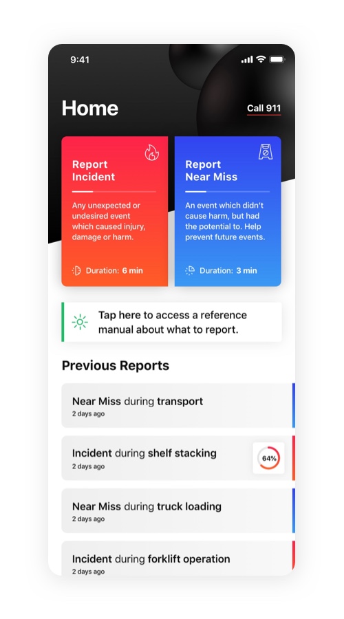
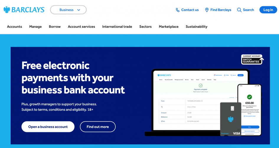
Barclays engaged us to redesign and replatform its multi-channel client experience, consolidating dozens of legacy systems across retail banking, private wealth, and corporate treasury into a single, coherent UX framework. The goal: enable self-directed, human-assisted, and automated financial interactions across digital, branch, and advisory touchpoints—while meeting stringent compliance, audit, and accessibility standards.

The scope spanned both customer-facing interfaces and internal advisor tools, bridging decades-old infrastructure with the modern expectations of personalization, speed, and transparency.

Taming Integration at a Global Financial Scale
Barclays’ digital experience was built on a complex stack of:

Legacy mainframe systems with fragmented data schemas

Middleware from CRM and wealth platforms

Bespoke FX, payment, and compliance tools across multiple markets

Regulatory overlays tied to UK, EU, US, and APAC jurisdictions

Our team partnered with Barclays Technology and Enterprise Architecture to build a UX abstraction layer capable of:

Pulling real-time data across siloed systems without compromising consistency

Rendering context-appropriate interfaces for personal banking, SME users, and high-net-worth clients

Supporting user journeys across devices, from mobile-first app users to high-security desktop terminals used in regulated investment contexts

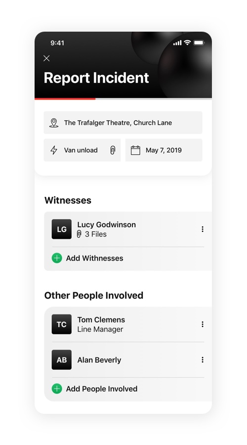
We deployed adaptive interface logic, where every component rendered differently depending on the client’s product portfolio, risk profile, region, and access tier—while drawing from a single, normalized experience schema behind the scenes.

UX Governance Aligned with Risk, Compliance, and Audit Readiness
Every design decision had to stand up to scrutiny from:

Internal compliance teams and external regulators (FCA, PRA, SEC, ESMA)

Accessibility audits (WCAG 2.2 AA, soon AAA for key user flows)

Fraud and cybersecurity leads focused on multi-factor, step-up authentication, and behavioral anomaly detection

We created a compliance-aware design system, where:

Microcopy passed through legal review workflows

Interaction components carried risk-tier metadata (e.g. for wire transfers vs. account views)

UX patterns mapped to audit-traceable steps—especially in flows like customer onboarding, KYC refresh, and complaint resolution

We also embedded UX risk checkpoints into agile delivery cycles—so design and compliance could collaborate upstream, avoiding late-stage rework.

The result: faster delivery, fewer escalations, and greater confidence across legal and regulatory stakeholders.

Driving Strategic Coherence Across Products and Brands
Barclays operates in both retail and investment banking—with client journeys that often cross from personal to business to wealth services. Our challenge was to design an experience that felt seamless, not stitched together.

We worked with the Chief Digital Officer and Group Strategy to define:

A customer journey architecture that spanned digital, branch, and relationship-managed contexts

A persona stack based on behavioral segmentation (not just account type), feeding personalization engines and product relevance scoring

A component-based experience model, where features like account overviews, chat support, or trade confirmations behaved consistently across digital properties, yet respected brand tone and visual grammar differences across units

This model allowed Barclays to present a single, strategic digital face to customers—without diluting the specialism of its business lines.

Transforming Internal Teams and Experience Capability
To institutionalize the shift, we helped Barclays:

Stand up a global DesignOps function, integrated with delivery squads and legal

Train 100+ designers, PMs, and engineers in experience governance, pattern reuse, and trust-by-design

Create an internal UX maturity map, helping business units self-assess, plan improvements, and measure design impact over time

We also contributed to a component observability system, tracking live performance, accessibility compliance, and error reporting at the UX layer—allowing real-time monitoring of customer experience health.

Business Results Tied to UX Clarity and Trust
Six months post-launch:

Call center volume dropped 23% in regions where new onboarding and transaction flows went live

Time-to-complete for international payments decreased by 41%, with clearer step-by-step flows and real-time error handling

Net trust score among business clients rose by 19 points, correlating with increased self-service usage and fewer escalated service tickets

Legal teams reported a 58% drop in copy escalations, thanks to the pre-cleared component library and compliance-by-design workflows

Barclays now sees UX as a core driver of trust, efficiency, and loyalty in a digitized, multi-market financial world.

BAE Systems Mission Interface Redesign: Human-Centered UX for Defense-Grade Operations

BAE Systems Mission Interface Redesign: Human-Centered UX for Defense-Grade Operations

  • BAE Systems Mission Interface Redesign: Human-Centered UX for Defense-Grade Operations screenshot 1
$100001 to $500000
96 weeks
Defense & Aerospace

BAE Systems engaged us to lead a multi-year initiative to modernize the mission interface environment for defense operators and analysts. The engagement focused on developing secure, operator-validated, multi-domain UX systems across command-and-control dashboards, sensor interfaces, threat evaluation tools, and tactical planning environments.

The goal was not aesthetics or simplification—it was to engineer trustworthy, accountable, and cognitively optimized interfaces in a world where seconds matter, ambiguity is dangerous, and user error can carry geopolitical consequences.

UX Governance Designed for Defense-Grade Safety and Accountability
UX decisions in this environment required alignment with:

NATO and Five Eyes security protocols

MIL-STD-1472G human factors standards

DEF STAN 00-250 ergonomic design for defense systems

Program-specific cybersecurity, auditability, and failover rules

We worked with internal InfoSec officers, program leads, legal counsel, and embedded human factors engineers to build a classified UX governance pipeline, which included:

UX audit trails and interaction logs with role-bound data visibility

Pre-cleared interaction patterns for multi-screen C2 configurations

UX clearance protocols for prototypes exceeding classification thresholds

Every wireframe, component, and copy string passed through multi-layered review boards, ensuring conformance to mission-specific safety constraints and ethical use standards.

This pipeline gave BAE confidence to scale UX innovation across sensitive programs without regulatory delays or security breaches.

Complex Collaboration Across Contractors, Governments, and Domains
BAE Systems programs span land, sea, air, cyber, and space domains—often in partnership with military clients, intelligence agencies, allied defense primes, and embedded subcontractors. We coordinated with:

Aerospace engineers building next-gen UAS control environments

AI/ML teams designing onboard threat classification engines

Naval command operators managing dynamic rules of engagement

Human-in-the-loop assurance engineers balancing autonomy and intervention

To manage this complexity, we designed a federated UX collaboration model, with:

Component libraries gated by operational domain and security level

Live design-sync protocols across time zones and contractor networks

A secure Figma-to-Redacted export pipeline to enable stakeholder feedback within classified constraints

This enabled mission leads, operators, and embedded analysts to actively co-develop interface logic, despite security boundaries and information silos.

Experimentation in Simulated Operational Environments
In defense, experimentation must be simulation-realistic, not sandbox-casual. We partnered with BAE's Human Factors Lab to design and run controlled UX trials within:

Submarine command modules (low-light, low-sound, multi-shift)

Joint air-ground operational scenarios with contested comms

Cyber defense wargaming environments with red/blue team pressure testing

We tested prototypes for:

Multi-modal input reliability under duress (voice, gesture, tactile)

Redundant feedback systems for time-critical input (e.g., strike confirmation)

AI-assisted decision support tools and their failure state transparency

Every prototype was evaluated against cognitive load benchmarks, attention decay patterns, and adversarial resilience heuristics.

Findings directly shaped new patterns for information triage, threat prioritization UI, and operator overrides—ensuring support without surrendering control.

Tightly Integrated with BAE’s Engineering and Mission Platforms
Our work interfaced with:

Real-time telemetry feeds from ISR platforms

Mission Planning & Execution Tools (MPET)

Secure comms overlays and battlefield information networks

Modular AI inference systems for sensor fusion and anomaly detection

We created data abstraction layers that enabled UX modules to surface high-priority insights without overexposing raw classified data—preserving operator focus and mission security.

We also developed component wrappers tuned for on-prem deployment in air-gapped environments, with performance guarantees even under degraded compute or network conditions.

Impact Beyond Interface: Operational Trust and Tactical Readiness
In pilot deployments:

Target confirmation time dropped 47% in simulated contested ops

Operator-reported situation awareness scores rose by 34 points

System-induced interaction errors dropped to near-zero, thanks to better affordance and feedback modeling

Mission debriefing time reduced by 40%, due to clearer action histories and traceable UX logs

BAE Systems now treats UX not as an overlay, but as mission infrastructure—a human-tech partnership model embedded at the heart of modern defense readiness.

Shell Digital Operations Experience: Aligning Human Insight with Industrial Intelligence

Shell Digital Operations Experience: Aligning Human Insight with Industrial Intelligence

  • Shell Digital Operations Experience: Aligning Human Insight with Industrial Intelligence screenshot 1
$50001 to $100000
42 weeks
Oil & Energy

Shell engaged our UK-based design agency to architect a unified digital experience layer spanning its energy production, distribution, and trading operations. From control room dashboards to mobile tools for field engineers, emissions monitoring systems to enterprise forecasting platforms, the initiative aimed to enable real-time decision-making across volatile markets, critical infrastructure, and multiple geographies.

This wasn’t a visual refresh—it was a strategic infrastructure program, led by our UK team, to align Shell’s human expertise with data-driven orchestration, supporting its long-term ambition to become a net-zero energy business.

Led from the UK: Orchestrating Experience Across Shell’s Operational Silos

The program was led by our London-based strategy and systems designteam, who worked directly with Shell’s global business units and local product owners in the Netherlands, the US, Qatar, and Singapore.

The scope cut across Shell’s verticals:

  • Upstream (exploration, drilling, well performance)

  • Integrated Gas & LNG

  • Downstream logistics, refining, and retail

  • Energy Trading & Carbon Management

Each unit came with its own platforms, telemetry standards, and regulatory requirements. Our UK team coordinated a cross-functional mapping effort across over 120 user journeys, involving five key personas: offshore technicians, refinery controllers, energy traders, decarbonization analysts, and maintenance planners.

We developed system-spanning interaction frameworks that addressed:

  • Live data orchestration from offshore and refinery edge systems

  • Regional differences in emissions policies and safety certifications

  • Role-based access layers and escalation flows, especially for incident command UX

  • UX logic resilient to degraded connectivity or data latency

Rather than simplifying Shell’s complexity, the UK-led UX architecture channeled it into purpose-built, domain-intelligent workflows that improved clarity, speed, and accountability.

Deep Integration with Industrial Systems and Enterprise Tech Stack

Shell’s operational landscape demanded UX integration—not insulation—from:

  • OSIsoft PI System for time-series telemetry

  • SAP for asset, maintenance, and work order management

  • Azure IoT and Shell-developed ML models

  • Third-party logistics and trading systems (e.g., Eikon, Allegro)

  • Regulatory emissions and compliance systems

Our UK design and systems team developed a layered experience architecture that:

  • Visualized real-time conditions from edge devices (flare status, pump temperature, vibration analysis)

  • Contextually embedded SAP-based permit-to-work flows into field service dashboards

  • Enabled traders to reconcile hourly carbon exposure with pricing models and ESG policy thresholds

By moving from system-hopping to contextual action surfaces, Shell teams reduced cognitive load and decision lag in safety-critical workflows.

Designing UX for Strategic Energy Transition

Shell didn’t just want operational efficiency—it sought a UX strategy that embodied its climate and safety commitments. Our UK team collaborated directly with Shell’s Digital Transformation Office and Sustainability leads to co-develop:

  • A UX maturity model specific to industrial and field environments, tying usability to resilience and environmental impact

  • A modular pattern library for decarbonization, allowing operators to see and adjust cost–emission–equipment tradeoffs in real time

  • An experience strategy grid linking every design element to SDG priorities, ESG disclosures, and Shell’s net-zero roadmap

The resulting system positioned UX as a strategic navigational interface for Shell’s transformation—not just a tool, but a trust-building, risk-reducing enabler.

Results That Reach the Field, the Floor, and the Market

Working from our UK base, we helped Shell shift how experience is measured—away from surface engagement and toward enterprise and operational impact:

  • Mean time to detect and respond to offshore anomalies improved by 29%

  • Permit-to-work cycle times fell by 41% after rollout of mobile-first, role-aware forms

  • Carbon position reconciliation in trading improved 3× with embedded emissions intelligence

  • User confidence in decarbonization dashboards rose by 37 points, per internal surveys

Perhaps most importantly, Shell now regards the new UX layer—crafted in collaboration with our UK team—as part of its operational backbone: a critical layer of safety, clarity, and alignment in one of the world’s most complex energy ecosystems.

Linde Digital Operations Platform: Building UX at the Intersection of Safety, Scale, and Industrial Precision

Linde Digital Operations Platform: Building UX at the Intersection of Safety, Scale, and Industrial Precision

  • Linde Digital Operations Platform: Building UX at the Intersection of Safety, Scale, and Industrial Precision screenshot 1
$50001 to $100000
44 weeks
Oil & Energy

Linde engaged us to design a unified digital operations platform supporting its global portfolio of gas production plants, distribution networks, and customer-facing industrial applications. The goal: consolidate fragmented systems into a coherent, safe, and intelligent UX layer that spans real-time plant monitoring, logistics tracking, field service, and customer portals.

This was not a visual redesign—it was an experience infrastructure project rooted in physical systems, compliance logic, and long-horizon relationships with clients across healthcare, manufacturing, energy, and electronics.

Led by Our UK Team: Orchestrating Integration Across Systems and Regions

Our team in the UK led the initial research and architectural blueprint for the platform, working in close collaboration with Linde’s global digital transformation unit. The UK-based design and systems strategy group coordinated with technical leads in Germany, the US, and Singapore to unify design logic across regions—ensuring both global consistency and regional adaptability.

Linde's environment included:

  • Plant SCADA and DCS systems with real-time telemetry

  • Custom-built logistics routing and cylinder tracking software

  • Order management via SAP and region-specific ERP systems

  • IoT-based telemetry for cryogenic tank monitoring and predictive maintenance

Our first challenge was designing a UX layer that could orchestrate clean, usable interfaces over decades-old systems without compromising performance or data integrity.

We built a modular interface architecture that:

  • Pulled real-time plant data via OPC UA connectors

  • Provided live dashboards for O₂/N₂/Ar production metrics, alarms, and capacity utilization

  • Surfaced logistics ETA and asset traceability via vehicle telemetry and handheld scans

  • Integrated SAP-based customer orders with inventory and delivery tracking for plant managers and sales engineers

The result was a responsive, role-based experience that functioned reliably from plant control rooms to rugged field tablets—without requiring wholesale system rewrites.

Governance and UX for Safety-Critical Environments

Safety and compliance are non-negotiable in Linde’s world. The UX had to meet internal EHS (Environment, Health & Safety) standards, ISO norms, and regional chemical handling regulations—while also reducing interface-induced operational risks.

We created a UX risk register and safety overlay model, ensuring:

  • High-urgency alerts followed ISO color and motion standards, with interruptive logic

  • Field technician flows included digital PPE confirmations, real-time gas level warnings, and geo-fencing of high-risk zones

  • Every alarm interaction was auditable, timestamped, and role-traceable—supporting incident forensics and regulatory reporting

We also implemented fail-safe defaults and secondary confirmation steps for sensitive actions like gas line purge initiations or remote valve overrides—ensuring no action could be triggered accidentally in a multi-touch environment.

All design decisions were reviewed by HAZOP specialists, plant safety managers, and regional compliance leads, establishing UX governance as a pillar of operational integrity.

Embedding UX into Organizational Transformation

To ensure adoption and capability transfer, we worked with Linde’s global digital transformation team to establish new ways of working, including:

  • Role-based journey mapping across planners, operators, service engineers, and B2B clients

  • Embedded design coaches in regional hubs—including our UK team, which supported EMEA adoption strategies and coordinated multi-market design reviews

  • A multi-lingual UX component library localized across EMEA, APAC, and LATAM teams—with structured design tokens for safety-critical UIs, low-contrast industrial conditions, and offline fallback modes

The new operating model helped Linde shift from vendor-driven digital deployment to internal experience-led delivery—with plant and supply chain teams actively co-owning UX outcomes.

Research That Grounded UX in Industrial Reality

We conducted on-site research across gas plants, logistics hubs, and healthcare client sites. This included:

  • Shadowing operators during night shifts in high-volume ASUs (Air Separation Units)

  • Observing route drivers during bulk tank refills and cylinder handoffs

  • Interviewing client procurement and lab staff on reorder friction, documentation overload, and digital trust gaps

These insights directly shaped flow simplification, visual ergonomics, and trust-focused copy for user confirmations and alerts—especially in multilingual, high-risk scenarios.

Results Across Safety, Efficiency, and User Confidence

Within six months of rollout:

  • Operator incident response time decreased by 35%

  • Field service NPS rose by 26 points, with faster task routing and digital documentation

  • B2B client reorder friction dropped 43%, with clearer status tracking and automated alerts

  • Linde saw a 65% reduction in UX-related IT support tickets, thanks to more intuitive interfaces and embedded learning cues

Today, Linde views UX as operational infrastructure—not an overlay, but a performance-critical system that empowers people, protects assets, and strengthens trust.

Delta Air Lines JourneyOS: Reinventing the Passenger Experience Across the Travel Arc

Delta Air Lines JourneyOS: Reinventing the Passenger Experience Across the Travel Arc

  • Delta Air Lines JourneyOS: Reinventing the Passenger Experience Across the Travel Arc screenshot 1
$50001 to $100000
100+ weeks
Transportation & Logistics

Delta Air Lines engaged us to reimagine its digital travel experience ecosystem, spanning mobile, in-airport, onboard, and crew-facing tools. The initiative, code-named JourneyOS, aimed to deliver a unified, intuitive, and resilient digital journey—one that empowers passengers, supports crew, and adapts in real time to the unpredictable nature of air travel.

This was not a mobile app update—it was a platform rethink designed to balance precision and humanity across every touchpoint in the Delta experience.

Taming Complexity at 35,000 Feet—and Ground Level
Delta’s operation spans:

4,000+ daily flights

300+ global destinations

Dozens of languages and regulatory environments

Multiple IROP (Irregular Operations) scenarios involving aircraft swaps, weather, crew timeouts, and immigration compliance

We mapped over 70 journey archetypes, from solo first-time flyers to multilingual multi-leg business travelers, and integrated these with Delta’s operations data layers (flight, baggage, security, rebooking, catering, and crew tools).

We designed a context-aware UX system that:

Adjusts content and prompts based on real-time flight status, connection risk, and passenger profile

Harmonizes across mobile, kiosk, gate display, and in-flight portal

Surfaces priority actions during high-stress windows (e.g. “Your gate has changed, here’s how far it is and a faster route”)

This dramatically reduced redundant alerts and irrelevant options, especially during delays, misconnects, and overnights.

A Testbed for Innovation in a Zero-Margin Industry
Delta wanted not just stability—but leadership. We helped them launch UX Labs@ATL, a live prototyping environment at Hartsfield-Jackson International Airport.

Here, we ran trials with real passengers and agents, testing:

Touchless boarding and bag tag pickup via Delta ID and biometrics

Predictive disruption alerts, tailored by loyalty tier and connection confidence

Dynamic lounge wait-time and gate crowding visualizations

We designed with extreme edge cases in mind—international guests with no roaming, elderly passengers unfamiliar with tech, families splitting boarding groups—and built graceful fallback logic for kiosks, mobile dead zones, and airport noise environments.

Experiments were validated through a blend of behavioral telemetry, exit interviews, and live agent feedback, with results fed into agile delivery teams for rapid iteration.

Cross-Functional Delivery at Operational Scale
Delivering this work required tight orchestration between:

Digital Product

Airport Customer Service

Inflight Services

Baggage Operations

IT Infrastructure

Brand and Legal

ADA compliance officers

We built a cross-functional working model with shared tools, including:

A Figma-based DesignOps dashboard mapping patterns to operational SOPs

Decision logs tying UI components to FAA, TSA, and IATA rules

A “friction burst board” where agents could flag UX issues in real time with screenshots and resolution logs

This enabled consistent updates across kiosk UI, app cards, in-flight tablet tools, and rebooking screens—ensuring crew, agents, and passengers were aligned through a single, flexible design system.

Tangible Outcomes for Passengers and Crew
Within the first year of rollout across 10 hubs and key international routes:

Mobile check-in completion rates rose by 22%, especially among infrequent flyers

Gate rebooking time dropped 47% during IROPs, with clearer prompts and automated voucher delivery

App Store rating improved from 3.7 to 4.5 stars, with sentiment shifting toward reliability and personalization

Crew-reported digital friction incidents fell by 38%, freeing up more time for live support

Most importantly, customers reported a renewed sense of control—in their words: “Delta doesn’t just fly us. It travels with us.”

Merck R&D and Patient Access Platform: Designing UX for Scientific Impact and Global Equity

Merck R&D and Patient Access Platform: Designing UX for Scientific Impact and Global Equity

  • Merck R&D and Patient Access Platform: Designing UX for Scientific Impact and Global Equity screenshot 1
$50001 to $100000
85 weeks
Healthcare & Medical

Merck partnered with us to lead the user experience strategy for its next-generation clinical research and patient access platform—a digital ecosystem supporting investigator engagement, clinical site onboarding, protocol adherence, and post-trial access management across 70+ countries.

This was not a consumer product. It was a high-stakes environment where UX decisions affected trial acceleration, data integrity, and access to life-saving therapies—in regions with vastly different infrastructures, languages, and regulatory models.

Strategic UX Aligned with R&D Acceleration and Global Health Equity
We collaborated with Merck’s heads of Clinical Innovation, Digital Health, and Global Medical Affairs to align UX outcomes with three core strategic objectives:

Accelerate first-patient-in (FPI) timelines through smoother site onboarding and protocol navigation

Enable equitable trial participation by improving accessibility and local usability in underserved regions

Support compliant, secure post-trial access to medication, especially in LMICs (Low- and Middle-Income Countries)

We developed a multi-layered experience strategy—mapping user journeys not just by task, but by role (e.g. research coordinator vs. PI vs. country medical lead), regulatory zone, and trial phase.

This allowed Merck to embed UX directly into its global clinical trial optimization roadmap—as a strategic lever, not a last-mile patch.

Integration Across Fragmented Scientific and Operational Systems
The platform needed to interact with:

Trial master file (TMF) repositories and eTMF audits

EDC (electronic data capture) systems and lab result pipelines

Investigator databases, IRT (interactive response technology), and vendor credentialing tools

Post-trial drug distribution, reimbursement, and safety reporting platforms

We worked with Merck’s internal IT architects and vendor leads to build an API-layered experience architecture, enabling the UX to:

Surface relevant data without duplicating systems

Mask backend inconsistencies via adaptive UI logic

Ensure version control and source traceability across regulatory audits

We also mapped user-level entitlements to data sensitivity, ensuring that CROs, PIs, and country reps each had clean, bounded experiences tied to their compliance exposure.

The result: fewer redundant logins, fewer system-context switches, and a faster pathway from site interest to activation.

UX Governance Built for Scientific and Regulatory Integrity
Merck operates in one of the most tightly regulated digital domains. Our UX work had to meet the standards of:

FDA 21 CFR Part 11 and EMA GCP guidelines

GDPR and regional patient data protection laws

Internal clinical SOPs and data provenance audits

We helped Merck build a UX risk control framework that documented:

Consent screen logic and audit trails

Versioning systems for protocol change visibility

Modular UI components linked to safety-critical workflows (e.g. AE reporting, randomization checks)

All flows were reviewed in collaboration with Merck’s Clinical QA and Regulatory Intelligence teams. Where necessary, we developed “pre-cleared component kits”—interface elements with embedded logic, traceable rationale, and legal annotations that could be reused safely across trials and geographies.

Prototyping for Innovation Without Clinical Risk
To support innovation while avoiding trial disruption, we helped Merck launch a Clinical UX Simulation Lab. This allowed internal teams to test:

Adaptive onboarding wizards for first-time investigators

Contextual coaching for low-enrollment sites

Voice-driven interaction flows for visually impaired research coordinators in rural clinics

Each prototype was tested against real-world trial constraints, broadband variability, and multilingual literacy ranges—ensuring solutions were deployable, not just desirable.

These innovations informed the evolution of Merck’s clinical toolkit, which now includes region-specific UI variants, offline-ready mobile checklists, and AI-driven site nudges—delivered safely and scalably.

Tangible Outcomes That Mattered
In pilot programs across 5 studies and 12 countries:

Site onboarding time decreased by 39%

Protocol deviation reports dropped by 21%, tied to improved navigation and compliance prompts

Trial participation rose 18% in rural regions due to simplified workflows and better device support

Audit prep time was cut in half via integrated traceability dashboards and pre-cleared UX modules

Merck now treats UX as part of its core clinical infrastructure—a precision tool for speed, safety, and global impact.

HCA Healthcare Clinical and Patient UX Redesign: Elevating Experience Across the Continuum of Care

HCA Healthcare Clinical and Patient UX Redesign: Elevating Experience Across the Continuum of Care

  • HCA Healthcare Clinical and Patient UX Redesign: Elevating Experience Across the Continuum of Care screenshot 1
$100001 to $500000
100 weeks
Healthcare & Medical

HCA Healthcare partnered with us to lead the redesign of its core clinical and patient-facing digital interfaces, spanning EHR interactions, inpatient bedside tools, post-discharge care planning, and mobile patient portals. With over 2,300 care sites and 180 hospitals, the initiative required deep technical integration, regulatory fluency, and a patient-centered approach across an incredibly diverse user base.

The goal wasn’t just usability—it was to create a digital layer that clarifies complexity, supports care coordination, and reduces burnout, all without compromising safety, compliance, or trust.

Designing Through Deep Integration with Complex Systems
HCA’s digital environment includes a mix of Epic EHR modules, custom surgical systems, third-party patient portals, and legacy health IT stacks used by frontline staff. Designing usable experiences here meant operating directly at the intersection of clinical logic and technical fragmentation.

We worked with HCA’s IT transformation office, Epic analysts, and clinical operations teams to build experience overlays that pull data from:

Real-time vitals and telemetry integrations

Lab and imaging results across multiple vendor systems

Nurse call systems, OR scheduling, pharmacy routing, and discharge planning tools

Rather than forcing uniformity, we used context-aware UI logic to adapt interface depth and density based on task, role, and clinical acuity. For example, rounding nurses could surface lightweight handoff summaries on mobile, while care coordinators accessed deeper, audit-ready discharge summaries with embedded risk flags.

We also built low-connectivity fallback patterns for remote facilities and disaster protocols—ensuring continuity in high-stakes environments like hurricane-affected emergency departments.

Transforming Organizational Behavior at the Frontline
To ensure adoption, we partnered with HCA’s Clinical Excellence and Nursing Innovation teams to embed UX thinking into frontline culture. We co-developed:

A clinical design feedback loop involving 200+ nurses, medical assistants, and residents

In-unit shadowing and usability test rotations across med-surg, ICU, labor & delivery, and ED environments

A set of clinically validated design heuristics, grounded in safety protocols, mental model alignment, and workload sensitivity

Outcomes from this work directly influenced interface structure. For instance, we restructured patient chart summaries based on the “see-think-do” cadence of bedside care, reducing tap depth and cognitive juggling during rounds.

We also trained internal UX and quality teams to use experience huddles and lightweight task heatmaps—so the organization could continue evolving the system with data and frontline insight long after handoff.

UX Governance for Clinical Safety and Regulatory Readiness
Every design decision was subject to oversight from:

HIPAA and HITECH privacy teams

FDA risk management (for patient-facing data tools)

Joint Commission documentation protocols

CMS compliance for patient education and digital discharge readiness

We co-authored a UX risk register tied to specific interface patterns—e.g., drug timing alerts, consent screens, patient status summaries—and embedded these into review cycles with clinical safety officers.

To support safety, we built micro-deliberation cues into high-risk workflows (e.g., override modals, secondary confirmations), based on human factors research in ICU and trauma settings.

All flows were subjected to cognitive walkthroughs with clinical safety experts, followed by scenario simulations with EHR sandbox data to ensure zero-regret decision paths under fatigue or time pressure.

Research Grounded in Empathy and Complexity
We conducted a hybrid research program across six hospitals and two outpatient networks, including:

Mobile diary studies for post-op and chronic care patients

On-shift shadowing with nurses and support staff during peak and overnight hours

Caregiver co-design with family members managing patient transitions at home

These insights led to features like adaptive discharge plans, contextual medication explainers, and role-specific home screens for family caregivers—ensuring the digital layer supported both clinical clarity and emotional reassurance.

Tangible Impact Across Outcomes and Culture
Within six months:

Time-to-chart access dropped by 40% for bedside nurses

Patient portal usage rose by 58%, especially in medication and care plan features

Call volume decreased 31% for post-discharge medication questions

93% of clinicians in pilot sites said the new system reduced friction and helped them “stay in the flow” during critical care moments

HCA now treats UX as an operational competency—embedded in safety, empathy, and care quality.

American Express Premium Platform Redesign: Unifying Trust, Luxury, and Utility

American Express Premium Platform Redesign: Unifying Trust, Luxury, and Utility

  • American Express Premium Platform Redesign: Unifying Trust, Luxury, and Utility screenshot 1
$50001 to $100000
69 weeks
Financial & Payments

American Express engaged us to lead the experience redesign of its global premium customer platform—spanning Platinum, Centurion, and Business Platinum cardmembers. The challenge was to build a unified, modern digital interface that upheld Amex’s legacy of white-glove service, while driving digital self-sufficiency, personalization, and speed in an increasingly fast-moving payments world.

This wasn't just an interface refresh—it was a strategic redefinition of how digital touchpoints carry brand, precision, and privilege across contexts.

Aligning Design with Strategic Intent
We collaborated closely with Amex’s Global Experience Office, Enterprise Digital Product teams, and Brand Strategy leadership to align the new UX with three key business priorities:

Drive digital-first engagement without diluting premium service perception

Unify benefits, travel, and financial services into a seamless ecosystem

Modernize legacy platforms without compromising performance or compliance

Together, we developed a three-tier experience strategy:

Predictive utility: Smart recommendations, context-aware status updates (e.g. card benefits at point-of-purchase)

Curated control: Real-time card and account management with fine-grained privacy, travel, and spending controls

Emotional richness: Personalized content streams (Concierge, Experiences, Lounge access), tuned to behavioral signals

The strategic model helped reposition digital as a personal relationship layer, not just a management portal.

Coordinating Across Global, Regulated, and Brand-Intensive Teams
Amex operates at global enterprise scale—with teams across New York, Phoenix, London, Singapore, and Gurgaon—each handling different layers: credit risk, travel benefits, concierge services, fraud prevention, and co-branded programs.

We orchestrated UX delivery across:

8 cross-functional product teams

4 legal/regulatory regions (US, EU, LATAM, APAC)

5 major brand tiers with distinct voice, entitlement, and aesthetic nuances

We established a shared experience governance framework that mapped:

Global design tokens to regional language/brand variance

Platform-wide UX behaviors (e.g. confirmations, authentication moments) to risk tiering

Shared review cadences with Brand, Legal, and Compliance for every net-new flow

This model ensured alignment while empowering local teams to move autonomously within constraints.

Innovating at the Edge of Trust and Precision
Premium users expect innovation—but not experimentation at their expense. We designed a closed-loop innovation lab to test:

Contextual AI concierge integrations, tailored to spend patterns and travel plans

Real-time card benefit alerts integrated with GPS and transaction signals

“Spend journey” visualizations that reframed statements into lifestyle-based narratives

Each prototype was tested with Platinum and Centurion cardmembers in real scenarios: during airport delays, concierge interactions, and travel rebooking stress moments.

We also developed a “privacy-by-design” interaction model—ensuring every instance of behavioral tracking, personalization, or AI inference came with clear opt-in, control toggles, and value disclosure.

This allowed innovation to scale without eroding brand trust or data ethics.

Tangible Impact Across Metrics That Matter
Six months post-launch:

Digital concierge usage increased by 34%, driven by personalized entry points and live agent blending

Travel booking flows saw a 27% decrease in abandonment and a 21-point rise in satisfaction

Fraud alert resolution time dropped by 45%, thanks to simplified confirmation flows and predictive escalation

Over 90% of premium cardmembers surveyed said the new platform made their Amex relationship feel more personal and “on their side”

Internally, Amex reported a 50% reduction in design-to-deployment cycle time, aided by the new component library and compliance-ready UX documentation framework we co-developed.

Johnson & Johnson Digital Health Platform: Human-Centered UX in a Clinical-Grade Context

Johnson & Johnson Digital Health Platform: Human-Centered UX in a Clinical-Grade Context

  • Johnson & Johnson Digital Health Platform: Human-Centered UX in a Clinical-Grade Context screenshot 1
$100001 to $500000
98 weeks
Healthcare & Medical

Johnson & Johnson engaged us to lead the UX architecture and delivery for a new integrated digital health platform—a multi-stakeholder system connecting patients, clinicians, care coordinators, and internal teams across oncology, orthopedics, and chronic care management.

This was not a consumer wellness app. It was a clinical-grade ecosystem, built for post-surgical recovery, pharmaceutical adherence, remote patient monitoring, and longitudinal outcome tracking—subject to medical device regulations, clinical trial protocols, and global privacy laws.

UX Governance Built for Regulatory and Ethical Integrity
From day one, this project demanded a risk-aware UX governance model. Every screen, component, and workflow had to meet strict compliance thresholds—not only for HIPAA, GDPR, and FDA Part 11, but also for internal risk controls tied to informed consent, digital biomarkers, and patient-reported outcomes (PROs).

We co-developed a UX compliance framework in collaboration with J&J’s legal, regulatory, and clinical affairs teams. It included:

Pattern-level audit trails for informed consent, data visibility, and usage opt-ins

Role-based access logic and redlining protocols for sensitive flows (e.g. genomics data, trial participation)

A “clinical interaction model” mapping every user task to its clinical and regulatory rationale

All user-facing content passed through a linguistic risk filter—ensuring that phrasing, visual hierarchy, and notification timing supported medical accuracy without creating patient distress or compliance ambiguity.

Global Research Anchored in Clinical Reality
UX design in this context must account for emotional state, literacy, pain, and fear. We ran a global, multi-tiered research program with:

Patients undergoing total knee replacements, cancer therapies, and immunologic treatments

Caregivers managing complex medication schedules and mobility challenges

Clinical support staff, from nurses to trial coordinators to surgeons

Our methods included:

Ethnographic shadowing in post-acute care centers and home environments

Behavioral testing of recovery tasks under fatigue, cognitive load, and pain

Clinician-participant co-design sessions, surfacing misaligned expectations between medical logic and human interpretation

Key insight: patients weren’t asking for “more data.” They needed meaningful orientation—a sense of where they were in a treatment arc, what was normal, and what needed escalation.

From this emerged a new UX principle: clinical calmness through contextualization. We introduced visual metaphors, touch-optimized timelines, and adaptive text strategies to keep patients oriented, especially during moments of anxiety or isolation.

Deep Integration with Enterprise and Device Infrastructure
J&J’s backend ecosystem spanned clinical trial systems, EMRs, supply chain data, and regulatory reporting pipelines. The UX had to orchestrate clean interfaces over dirty, divergent infrastructure—without breaking.

We designed a modular data translation layer that supported:

Sync with wearable devices and Bluetooth-enabled orthotics

Pull-and-push logic with trial data platforms and REDCap instances

Contextual filtering of patient data based on region-specific privacy laws and trial phase

Rather than forcing a uniform UI, we built adaptive microinterfaces—componentized UX units that could render differently depending on country, trial protocol, or device type. This allowed for flexibility without experience inconsistency.

Organizational Transformation Toward UX-Led Clinical Design
We helped J&J internalize UX as a clinical discipline, not just a creative function. This included:

Establishing a UX Clinical Review Board, bringing together design, medical affairs, and bioethics

Training over 100 internal product leads on human-centered design for high-risk environments

Building a design knowledge base for use across pharma, medtech, and digital health teams

Over time, this transformed the organization’s approach to digital health—from platform-led to experience-led, patient-safe, and ethics-driven.

Outcomes That Elevated Patient and Clinical Confidence
Following the launch:

89% of patients reported greater confidence in understanding their recovery journey

Clinician support requests dropped by 31%, due to clearer in-app education and task segmentation

Trial dropouts related to digital confusion decreased by 44% across three Phase II studies

J&J now uses our UX governance model as a standard in all new digital therapeutics initiatives

PepsiCo Experience Layer Transformation: Unifying Consumer, Commercial, and Operational UX

PepsiCo Experience Layer Transformation: Unifying Consumer, Commercial, and Operational UX

  • PepsiCo Experience Layer Transformation: Unifying Consumer, Commercial, and Operational UX screenshot 1
$50001 to $100000
54 weeks
Consumer Products

PepsiCo partnered with us to lead a comprehensive UX transformation initiative spanning its global digital ecosystem—touching consumer loyalty platforms, retail partner portals, field sales tools, vending interfaces, and supply chain logistics apps.

The challenge? Create a scalable, brand-agnostic experience layer that could flex across Lay’s, Gatorade, Pepsi, Quaker, and more—while aligning with vastly different stakeholder needs and technical contexts. It was a classic PepsiCo brief: fast-moving, multi-platform, high-stakes, and deeply layered.

Orchestrating at the Edge of Complexity
This was a collaboration challenge of global proportions. Our work touched:

7 global business units (GMs, Ops, R&D, CX)

14 internal and vendor development teams

4 tiers of stakeholders across B2C, B2B, and internal ops

We worked across time zones, regulatory boundaries, brand guidelines, and infrastructure realities. A field sales rep in Brazil had very different needs than a D2C customer in North America or a warehouse manager in India.

To manage this, we created a design governance structure with distributed ownership, ensuring regional and vertical teams could adapt UX patterns without introducing fragmentation. Biweekly alignment workshops and a shared Figma workspace helped teams stay in sync across brand, legal, and IT silos.

This model helped PepsiCo avoid the trap of duplicative work and conflicting UX logics—instead, fostering a culture of modular reuse with local tuning.

Building a Design System That Works Across Brands and Contexts
We helped PepsiCo establish the Pulse Design System—a unified, token-based experience framework supporting:

Brand-specific UI accents for consumer products

Accessibility and ergonomic tuning for warehouse and route-based tools

Integration with Microsoft-based internal ecosystems and headless CMSs

Pulse was designed for real-world operations: flexible grid systems for POS tablets, motion-optimized transitions for vending machines, and reduced-latency components for field apps that operate in low-signal areas.

It included:

Behavioral pattern libraries for loyalty flows, cross-sell nudges, and sales forecasting

A central “UX dialect guide”, defining brand voice per product line across languages

Ready-made variants for high-contrast, low-bandwidth, and touch-target-sensitive environments

This allowed PepsiCo to accelerate UI deployment across teams without sacrificing distinct brand feel or operational fidelity.

Deep Integration with Legacy and Modern Systems
PepsiCo’s digital estate included SAP-based order management, Salesforce-based CRM, third-party logistics systems, custom vending firmware, and emerging D2C ecommerce stacks. Our work focused on abstracting UX from backend volatility—enabling seamless front-end experiences even across brittle integrations.

We co-designed a middleware-informed interface model that:

Drew real-time data from legacy systems via API adapters

Surfaced SKU-level inventory visibility for sales teams on mobile

Unified ordering, routing, and field reporting into a single pane of glass

This reduced reliance on manual process workarounds—freeing up internal teams and enabling near-real-time responsiveness in retail interactions.

Aligning UX to Strategic Growth Areas
UX wasn’t just an enabler—it was positioned as a strategic differentiator in high-growth verticals, especially D2C, functional beverages, and sustainability initiatives.

We worked with brand and business unit leadership to frame experience roadmaps tied to KPIs such as:

Digital ordering velocity and repeat rate in convenience retail

Sales enablement effectiveness in field B2B interactions

Consumer engagement and opt-in rates for QR-based loyalty programs

Pulse became a strategic asset—not just a design system, but a unifying infrastructure that supported PepsiCo’s push toward experience-led growth across product, supply, and brand storytelling.

Real Results at Scale
In the first year:

Time-to-market for digital features was cut by 36% across 3 business units

Field sales adoption of mobile tools rose by 45%, driven by simplified UX and offline support

D2C conversion rates improved by 28% through faster onboarding and clearer CTAs

Vendor integration complexity decreased by over 50%, thanks to standardized design contracts

PepsiCo now views UX as a platform lever, not a UI veneer—and Pulse continues to evolve with that mindset.

Humana Member Experience Redesign: Building Clarity, Trust, and Care into Digital Health

Humana Member Experience Redesign: Building Clarity, Trust, and Care into Digital Health

  • Humana Member Experience Redesign: Building Clarity, Trust, and Care into Digital Health screenshot 1
$100001 to $500000
98 weeks
Healthcare & Medical

Humana partnered with us to reimagine the end-to-end digital experience for members across Medicare Advantage, commercial plans, and wellness programs. Their aim was bold: to transform a fragmented, compliance-heavy ecosystem into a coherent, empathetic, and empowering experience, especially for aging populations navigating complex health decisions.

This was not just a UI update. It was a deep realignment of language, logic, and structure—rooted in behavioral insight and governed by the realities of regulatory risk, emotional stress, and real-world care journeys.

Research with Depth, Empathy, and Cultural Sensitivity
We began with a six-market ethnographic and behavioral research initiative, focusing on users aged 50+, caregivers managing dual-eligibility (Medicare + Medicaid), and members managing chronic conditions.

Our approach combined:

Longitudinal diary studies capturing care navigation pain points (e.g. finding specialists, understanding EOBs)

Home interviews with users in low-tech environments, including rural broadband deserts

Embedded sessions with Humana customer care reps and pharmacy support staff

We uncovered deep emotional patterns: users didn’t just want clear bills—they needed to feel safe making decisions. Ambiguous copay labels triggered anxiety. Visual design that mimicked retail dashboards eroded trust. Tiny interface improvements—like plain-language definitions next to plan tiers or sticky callout buttons for caregiver access—had outsized psychological impact.

From this, we developed a taxonomy of trust breakdowns, a member-centric information model, and emotional design heuristics used to guide every major decision moving forward.

Designing Within (and for) Risk-Aware Governance
Healthcare UX lives under intense scrutiny. Every user interaction had to align with HIPAA, ADA, CMS (Centers for Medicare & Medicaid Services) guidelines, and Humana’s internal ethics board. We developed a governance architecture that embedded compliance early in the design lifecycle—eliminating costly rework and enabling informed iteration.

Key features included:

A design compliance traceability matrix, linking UI components to policy references

Pattern-level accessibility testing across font scaling, screen readers, and cognitive load models

A "risk lens" added to UX critiques: every feature went through a short audit of What happens if this breaks? Who is harmed? What’s misunderstood?

We also partnered with Humana’s legal team to rewrite over 60 system-generated messages in plain language—ensuring clarity, dignity, and regulatory soundness could coexist.

Shifting the Org Toward Member-Centric Practice
This wasn’t just a design project—it was a capability transfer effort. We helped establish a Member Experience Council inside Humana, linking design, clinical operations, customer care, and IT.

Our embedded coaches trained over 70 product leads in:

User journey-based prioritization instead of ticket-driven delivery

Participatory design with real caregivers and members

Behavioral UX framing, with triggers, mental models, and recovery pathways

We also built internal design tools: component libraries, localization-ready flows, and clinical UX review templates. These tools now help Humana scale member-centric experiences across new services—like home-based care, behavioral health, and digital therapeutics.

Testing Innovation Without Breaching Safety
To test new ideas without operational risk, we created a simulated care navigation environment. Here, we evaluated:

Predictive UI for medication refills and care gaps

Conversational tools for understanding benefits and prior authorizations

Real-time care summaries after telehealth visits

Every prototype was stress-tested with real members under simulated emotional load (e.g. post-diagnosis, billing confusion). The best of these—like adaptive decision explainers and caregiver-mode toggles—are now live in production.

Outcomes That Touched Lives
In the first 120 days post-launch:

Call center dependency dropped 31% in plan selection and benefit explanation flows

Self-service completion rates rose 40% for prescription tracking and appointment scheduling

Member confidence scores increased by 22 points, especially among users 65+

Internal teams reported a 74% drop in legal rework requests due to early compliance integration

Humana now treats experience as care—and UX as a clinical-grade practice.

Comcast ExperienceOS: Unifying Customer and Agent Interfaces Across Ecosystems

Comcast ExperienceOS: Unifying Customer and Agent Interfaces Across Ecosystems

  • Comcast ExperienceOS: Unifying Customer and Agent Interfaces Across Ecosystems screenshot 1
$50001 to $100000
44 weeks
Telecommunication

Comcast partnered with us to design and implement ExperienceOS—a unified UX framework spanning customer-facing digital platforms, field technician tools, and internal service agent interfaces. The initiative aimed to reduce friction, improve service recovery, and restore trust in an environment where expectations are high, emotions are volatile, and complexity is systemic.

This was not a website refresh or app enhancement—it was a strategic consolidation across telecom-grade infrastructure, legacy CRM stacks, and multiple service domains including internet, mobile, home security, and streaming.

Taming Telecom Complexity Across User Types and Platforms
The Comcast ecosystem included:

30+ internal and external platforms

Five product families with overlapping plans and bundled offerings

Dozens of localized service rules (e.g. installation flow, outage escalation, upgrade eligibility)

We mapped 360° journeys not just for end users, but also for:

Customer service agents resolving multi-line billing errors

Field technicians troubleshooting intermittent connectivity

Mobile app users scheduling service while managing other subscriptions

This was a multi-stakeholder, omnichannel, mission-critical environment where latency, inconsistency, and ambiguity caused tangible frustration and churn. We ran a cross-platform audit that surfaced redundant logic, disjointed feedback models, and non-reusable UI flows—then defined a system-wide convergence plan, reducing over 170 distinct flows to 48 unified journey frameworks.

Creating Organizational Impact Through Embedded Design Ops
To drive adoption, we embedded our team inside Comcast’s Digital Transformation Office and CX Strategy unit. We helped define and implement new operating models for design governance, experience ownership, and integrated service design.

Key moves:

Built a centralized ExperienceOS playbook, codifying patterns across agent desktops, mobile apps, IVRs, and web portals

Reorganized product teams around experience clusters (e.g. "home installation," "billing clarification") instead of platform silos

Coached internal PMs and legal/compliance reviewers on experience-driven release workflows

We also helped stand up a DesignOps function that formalized intake, prioritization, and performance tracking across design, engineering, and legal teams—ensuring that improvements were not just shipped, but sustained.

Scaling with a Design System Built for Telecom Entropy
Legacy telecom systems tend to fracture—visually, technically, and experientially. We helped Comcast develop the ExperienceOS Design System, structured to accommodate:

Brand variants across product lines (Xfinity, Xfinity Mobile, Comcast Business)

Accessibility and language localization across multiple U.S. regions

Cross-channel parity for flows that span app → SMS → call center → in-home technician tablet

ExperienceOS was powered by design tokens linked to real-time service metadata (e.g. outage status, billing due dates, promo eligibility), allowing the UI to adapt dynamically while staying semantically consistent.

The component library included behavioral guidance tailored for high-stress moments—like outages, billing disputes, or equipment returns—ensuring language, visual hierarchy, and escalation paths all supported trust recovery.

Within 12 months, 70% of Comcast’s customer and internal tools had migrated to ExperienceOS, with remaining platforms scoped for phased convergence.

Measuring What Matters: Recovery, Retention, and Resolution
Our measurement model focused on experience health, not vanity metrics. Across the first full quarter post-deployment:

Call volume dropped 18% in regions where the new self-service portal was live

First contact resolution improved by 26% in agent-assisted cases with the new dashboard

Churn risk in high-frustration cohorts decreased by 14%, as tracked by behavior clusters

Agent training time was reduced by 43%, with contextual task flows embedded directly into the new UI

Most importantly, customer sentiment around “getting things fixed”—previously Comcast’s Achilles heel—saw a double-digit improvement across mobile and web feedback channels.

Goldman Sachs Transaction Services Interface Overhaul

Goldman Sachs Transaction Services Interface Overhaul

  • Goldman Sachs Transaction Services Interface Overhaul screenshot 1
$100001 to $500000
88 weeks
Financial & Payments

Goldman Sachs engaged us to lead a full-scale redesign of the user interface for its Transaction Banking (TxB) platform—a high-growth business offering digital cash management and treasury solutions to institutional clients around the world. The platform handled multi-billion-dollar flows daily and interfaced with CFOs, treasury leads, and global operations teams at Fortune 500s and sovereign entities alike.

This was a high-stakes, high-trust redesign. Any misstep could mean missed payments, regulatory exposure, or reputational risk. And yet, expectations were evolving: clients demanded consumer-grade clarity with institutional-level control.

Research with Institutional Fidelity
We began with a research process tailored to the realities of enterprise finance. Standard usability testing wasn’t enough. We conducted long-form contextual inquiry sessions with over 40 stakeholders—including treasury managers, middle-office operations staff, risk officers, and auditors.

Each interview mapped not just task flows, but decision weight, internal approval hierarchies, and emotional risk perception—revealing that what often looked like “slow adoption” was actually risk-based delay due to ambiguity in interaction feedback or insufficient context around critical decisions.

We also performed field studies inside clients' treasury ops teams, observing daily multi-country workflows involving batch payments, FX hedging, and intra-day liquidity sweeps. These environments revealed stressors invisible in labs: time-zone juggling, reconciliation anxiety, and multi-layered compliance review queues.

The result was a set of high-resolution behavioral archetypes and "trust moments"—specific UX inflection points where clarity, context, or error handling directly influenced user confidence and execution velocity.

Compliance, Auditability, and Trust-by-Design
Every interaction on the TxB platform had potential regulatory implications. Whether scheduling an ACH transfer or releasing a multi-currency payment batch, the UX had to meet legal thresholds for:

Traceability (SOX, Basel II)

Access control (least privilege)

Approval logic transparency (internal risk audits)

We embedded a governance framework into every design sprint. Legal, compliance, and cybersecurity officers participated in early-stage wireframe reviews, validating not just flow logic, but language specificity, risk surfacing, and notification architecture.

We designed visible audit trails that were non-intrusive for day-to-day users but fully explorable by reviewers and auditors. Each decision point (e.g. modifying a payment cutoff, escalating an FX limit breach) had explanatory breadcrumbs, with embedded policy logic drawn from Goldman’s internal risk engines.

The platform also implemented soft failovers—rather than erroring out, the system explained fallback logic ("Transferred via SWIFT backup route due to local rail outage")—ensuring users remained informed, not confused, under pressure.

Global Coordination and Tooling at Scale
Goldman’s TxB product ecosystem spanned New York, London, Bengaluru, and Hong Kong, with parallel teams building APIs, mobile apps, documentation portals, and internal client servicing tools. We worked as a global orchestration partner, creating alignment across distributed design, engineering, and compliance teams.

We implemented:

Design system version control linked to regulatory change logs

Joint decision logs across product, compliance, and legal owners

A component variance model, allowing for localization of critical patterns (e.g. China’s local banking UX expectations) without fracturing core platform structure

Weekly working groups ensured that no region was designing in isolation—and that brand integrity, compliance clarity, and platform logic remained unified across contexts.

Outcomes That Scaled with Precision
Within the first nine months post-launch:

User task completion rates improved by 38% across complex flows like multi-country liquidity transfers

Helpdesk tickets related to UI ambiguity dropped by 44%

Internal audit flagged zero UX-driven risk escalations in quarterly reviews

Clients reported a significant boost in trust and transparency, influencing adoption among multi-national partners and mid-market entrants

The redesigned TxB experience helped Goldman Sachs consolidate its reputation not just as a financial powerhouse—but as a design-literate, trust-driven platform partner in the digital age of institutional finance.

General Motors UX Platform for Software-Defined Vehicles

General Motors UX Platform for Software-Defined Vehicles

  • General Motors UX Platform for Software-Defined Vehicles screenshot 1
$50001 to $100000
63 weeks
Automotive

As General Motors accelerated its shift toward electric and software-defined vehicles (SDVs), it recognized that the digital experience—from in-vehicle interfaces to mobile apps and over-the-air updates—was becoming a primary differentiator. GM partnered with us to architect a unified UX foundation that could operate across its vehicle brands and generations, while supporting safe experimentation, regulatory readiness, and long-term brand evolution.

This wasn’t just a redesign—it was a replatforming of how UX is built, governed, and deployed across a global automaker’s digital surface.

Strategic Vision Aligned with Product Futures
We worked with executive leadership across GM’s software and experience units to align the UX strategy with two key transformation pillars:

The Ultifi platform—GM’s new vehicle software architecture for SDVs

Brand identity modernization—especially for EV-first marques like Cadillac LYRIQ and Chevrolet Blazer EV

We co-developed a multi-year UX roadmap integrated into product planning cycles, emphasizing:

Progressive personalization through the GM cloud profile system

Adaptive UI layers for autonomous, manual, and semi-autonomous driving states

In-cabin ecosystems designed to evolve via OTA updates

The roadmap didn’t just project features—it articulated experience principles (predictability, contextual restraint, ecological trust) and translated them into experience KPIs across usage patterns and vehicle modes.

A Design System Built for Vehicle-Level Orchestration
GM’s vehicle UX spans screens of every size: curved OLED instrument panels, heads-up displays, mobile companion apps, and new shared display spaces for passengers. Each brand required distinct expression—but without reinvention from scratch.

We created the GM Experience System (GMXS)—a cross-brand, cross-platform design system optimized for in-vehicle performance, hardware abstraction, and real-time rendering constraints. GMXS was structured as:

Token-based theming engine with brand-specific variables

Interaction grammar and rhythm guides tailored for glanceability, haptic confirmation, and multi-modal handoff (voice ↔ touch ↔ gesture)

Component variants tuned for performance across embedded Linux, Android Automotive, and iOS/Android mobile

This enabled internal teams to build confidently across Cadillac and GMC, knowing that performance, accessibility, and branding integrity were baked into the foundation.

Governance for Safety, Compliance, and Market Diversity
UX in a vehicle must meet functional safety (ISO 26262), cybersecurity (UNECE WP.29), and global accessibility standards—all while remaining intuitive under pressure.

We embedded a multi-layered governance model into the design pipeline:

All new interaction patterns passed through a UX-Compliance Gate linking legal, regulatory, and safety engineering teams

Component logic included trigger points for driver attention, eyes-on-road timers, and visual demand tests

Every decision was version-controlled and traceable, enabling audit readiness for regulators in the U.S., EU, China, and beyond

Localization was governed with cultural usability audits, ensuring iconography, terminology, and layout logic respected international norms and regulatory tone—critical for maintaining global brand trust.

Rapid Innovation Within Guardrails
To explore future paradigms—gesture control, cabin AI, ambient personalization—we co-developed a HMI Innovation Lab with GM’s advanced tech teams. Using real vehicle cabins, simulated driving rigs, and VR-enabled passenger testing, we iterated on concepts like:

Proactive mood-based cabin settings

Predictive route insights with energy optimization

Co-pilot AI prompting for range anxiety, driver fatigue, and route adaptation

These were not speculative showcases—they were rigorously evaluated using cognitive workload models, biometric response tracking, and ISO-aligned usability heuristics.

Concepts that met criteria were funneled into the core GMXS pipeline for future vehicle integration.

Driving Tangible Results
Within 18 months:

UX delivery time dropped 44% across new EV programs due to the scalable design system

OTA feature engagement rose 31%, with lower abandonment and improved satisfaction

Compliance risk citations during review fell to near-zero thanks to embedded governance layers

GM’s internal teams reported a significant uplift in design confidence, alignment, and delivery velocity

This work became a cornerstone of GM’s transition from a vehicle manufacturer to a software-led mobility ecosystem.

Ford In-Vehicle Interface and Mobility Ecosystem Redesign

Ford In-Vehicle Interface and Mobility Ecosystem Redesign

  • Ford In-Vehicle Interface and Mobility Ecosystem Redesign screenshot 1
$50001 to $100000
56 weeks
Automotive

Ford invited us to reimagine its in-vehicle user experience across electric and next-generation vehicles, with a focus on syncing digital interfaces, physical controls, and mobile ecosystems. The mandate spanned infotainment, drive modes, charging behavior, and multi-modal mobility—all unified under a new UX vision for a post-combustion world.

The project combined deep integration with vehicle systems, emerging HMI technology, and human-centered experimentation—all while operating within the intense cross-functional reality of global automotive production.

Tightly Integrated Across Software, Hardware, and the Vehicle Stack
Modern vehicle UX is not an app. It’s a tightly coupled interplay between operating system layers, real-time data, and hardware ergonomics.

Our team worked with engineers across Ford’s in-vehicle OS, embedded systems, and electric powertrain teams to design interface logic and interaction patterns that pulled data from:

CAN bus vehicle data (for things like regenerative braking status and tire pressure)

Battery management systems, including predictive range modeling

Custom APIs for FordPass and connected services, synced with user preferences in the cloud

We designed adaptive interfaces that shifted based on driving context—urban, highway, or autonomous mode—and created a UI architecture that could scale across vehicles with different sensor arrays, screen sizes, and steering wheel layouts.

The challenge wasn’t just fidelity—it was latency. We had to ensure real-time UI responsiveness under 100ms for safety-critical actions like lane departure warnings, even as infotainment features pulled remote data.

Pushing the Edge of Experimentation Without Risking the Drive
Automotive UX cannot “fail fast” in the traditional tech sense. Safety, regulatory compliance, and driver focus require a rigorous buffer around innovation. To explore future interaction paradigms, we developed a closed-loop prototyping lab in collaboration with Ford’s human factors team.

This included:

A fully instrumented driving simulator with eye tracking, galvanic skin response sensors, and audio isolation

Real-time prototyping tools enabling interface updates during simulation runs

Scenario-based testing, such as navigating a city with 30% battery and no charger insight, or receiving an over-the-air vehicle update while parked in a low-signal area

Here, we tested gesture controls, contextual voice interaction, and spatial audio cues—pushing beyond the screen without compromising core UX anchors like safety and glanceability.

These insights informed key product decisions around charging behavior UI, onboard assistant timing, and progressive disclosure of settings during high-cognitive-load driving conditions.

Coordinating Across Global Product and Engineering Teams
The delivery scope touched multiple divisions: HMI, software, industrial design, mobile app teams, and localization across EMEA, North America, and Asia. We operated as a central UX facilitation node, integrating inputs from regional leads, legal advisors, and brand guardians.

To manage the complexity, we deployed:

A live design system dashboard that reflected component readiness, platform compatibility, and compliance state

Weekly cross-geo “variance sessions” where regional differences (e.g. units, visual metaphors, accessibility expectations) were surfaced and harmonized

A modular UX documentation stack linking design decisions directly to vehicle feature specs and regulatory constraints

This allowed Ford to ship with confidence across markets without duplicating effort or diverging experience quality.

Driving Outcomes That Moved the Brand
After phased rollout in three EV lines and their companion apps:

OTA software update completion rose by 64%, with fewer user errors in UI-initiated update flows

Charging session abandonment dropped 38% due to clearer station availability UI and charge-time estimations

Driver satisfaction with in-vehicle UI jumped by 24 points in JD Power tech experience benchmarking

Most importantly, Ford’s internal teams were left with a scalable system for building, testing, and evolving UX across vehicle generations.

Bank of America Personal Banking Experience Redesign

Bank of America Personal Banking Experience Redesign

  • Bank of America Personal Banking Experience Redesign screenshot 1
$50001 to $100000
97 weeks
Financial & Payments


Bank of America engaged us to reimagine the digital personal banking experience for over 55 million users across mobile and web platforms. With increasing customer expectations, rising fintech competition, and a growing emphasis on financial literacy and inclusion, BoA sought to go beyond transactional efficiency and create a personal, adaptive, and empowering user journey.

This wasn't about aesthetics—it was a full-scale strategic shift from product-first to person-first banking.

Grounded in Deep, Inclusive Research
Our work began with a rigorous, multi-layered research initiative to understand the diverse financial realities and behavioral patterns of BoA’s customer base. We conducted ethnographic field studies, remote diary programs, and biometric stress-testing of interface flows with participants across all 50 states—focusing on life contexts like unemployment, first-time home ownership, immigration, caregiving, and student loan management.

We prioritized populations often overlooked in banking UX: low-vision users, non-native English speakers, single-income families, and users with high financial anxiety. These groups revealed friction points—ambiguous language around fees, inconsistent feedback loops, and interface assumptions rooted in financial privilege.

Insights were translated into behavioral personas and financial resilience typologies that drove design priorities—not just for usability, but for emotional clarity, dignity, and control.

Scaling the Experience Across Platforms and Contexts
BoA’s existing design system struggled under the weight of inconsistent components, legacy integrations, and siloed brand expressions across services like Merrill, Zelle, and CreditWise. We partnered with BoA’s internal teams to architect the Bank of America Experience System (BAXS)—a design system built to scale across channels, brands, and access modalities.

BAXS featured:

Tokenized theming for accessibility, motion sensitivity, and personalization

Responsive component libraries tuned for native apps, ATMs, wearables, and web

UX pattern libraries with behavioral annotations for trust moments, consent patterns, and microcopy guidelines for legal review

BAXS was built for internal adoption: we created documentation, onboarding kits, and an internal plugin for Figma and code environments that allowed product teams to rapidly align with enterprise standards without losing flexibility.

Within 12 months, BAXS adoption had reached 86% of all digital product teams, significantly reducing QA costs and eliminating redundant design debt.

Transforming the Organization, Not Just the Interface
To make these changes stick, we worked with BoA’s Experience Strategy Office to embed new UX maturity practices across the product lifecycle.

We helped train over 100 cross-functional leaders—PMs, engineers, designers, and compliance partners—through an embedded coaching program focused on design literacy, outcome framing, and ethical risk modeling. We also contributed to the rollout of a UX performance dashboard that tracks not only design velocity, but also user task success, accessibility violations, and impact on core KPIs like self-service adoption and fraud escalation rates.

This elevated UX from a delivery function to a strategic capability. Design leads now sit at the table during early product framing discussions, shaping financial wellness journeys before lines of code are written.

Delivering Measurable Change in People’s Lives
Six months post-launch of the new experience, BoA reported:

A 41% increase in self-serve resolution of credit card issues

A 29% reduction in account abandonment during mobile onboarding

Over 9 million users engaging with the new “MoneyMind” feature, a contextual financial guidance tool grounded in behavioral finance research

The redesigned platform became not just a place to manage money—but a partner in financial wellbeing. And most importantly, it aligned with BoA’s long-term vision: to deliver responsible growth through inclusive, human-centered design.

JPMorgan Chase Institutional UX Platform Rebuild

JPMorgan Chase Institutional UX Platform Rebuild

  • JPMorgan Chase Institutional UX Platform Rebuild screenshot 1
$100001 to $500000
75 weeks
Financial & Payments

JPMorgan Chase enlisted us to lead a foundational redesign of its institutional client platform, used daily by traders, asset managers, analysts, and compliance officers across the globe. The scope was vast: streamline critical financial workflows, modernize the design system, and ensure UX compliance across risk-sensitive, high-stakes environments—all without disrupting operations that moved trillions in assets each week.

Risk-Aware UX Governance from Day One
Designing inside one of the most regulated industries in the world demands more than elegance—it requires embedded accountability, traceability, and auditability.

We created a UX governance model tailored for regulated enterprise. Every screen, flow, and microinteraction had a documented rationale, stakeholder sign-off, and version history linked to business rules, legal interpretations, or regulatory mandates (e.g., MiFID II, SEC, FINRA). Our design review process included not just designers and PMs, but also legal counsel, infosec leads, and internal audit reps.

Where UX typically leans toward speed and iteration, we engineered a dual-speed pipeline: one for conceptual prototyping and user testing, and one for enterprise release—complete with impact assessment logs and embedded controls to satisfy internal risk frameworks. We didn’t just follow compliance—we made it native to the design process.

Working at the Depths of Infrastructure
The platform sat on 20+ years of technical layering—from proprietary market data engines and FIX protocol layers to client-specific permissions models and performance-sensitive data visualizations.

We worked alongside engineering, data, and architecture teams to deliver a UX layer that could function across this heterogeneous landscape. Our design system had to account for:

Real-time data feeds with millisecond latency

User roles with legal access boundaries down to the field level

Visualizations ingesting bespoke APIs with client-specific business logic

We developed adaptive components that could render differently depending on user entitlements, compliance zones, and latency profiles. For example, a risk exposure heatmap looked the same across users—but updated differently depending on location, asset class, and data clearance.

We also created interface fallback strategies: when market volatility spiked and data feeds throttled, the interface displayed contextual trust markers ("data paused — last update: 12:43:01") to maintain operational awareness and mitigate error risks during critical trading moments.

Innovation in a Zero-Failure Context
You don’t A/B test live interfaces that manage portfolios of sovereign wealth funds. Instead, we built a sandbox simulation lab, complete with synthetic data and persona-driven interaction scenarios. Institutional users—portfolio managers, analysts, compliance officers—were observed in real-time under simulated conditions: volatility spikes, service downtimes, and urgent compliance alerts.

This allowed us to prototype innovations like:

Contextual explainer overlays for complex derivatives data

“Compliance-shadowed” workflows that highlighted regulatory implications mid-task

Predictive alerting UX for risk trends based on machine learning signals

Every experiment had to prove not just desirability, but resilience under regulatory and cognitive stress.

Measuring Value Without Public Metrics
In institutional finance, you don’t measure UX with NPS or App Store ratings. Instead, we defined a private metrics model tied to operational efficiency, risk posture, and cognitive load.

Key results:

21% reduction in compliance violations linked to interface confusion

28% drop in onboarding time for new analysts

42% improvement in task completion speed for multi-asset research workflows

Zero incident escalations following deployment across EMEA and NA desks

We also enabled continuous UX observability—user interaction telemetry was anonymized and analyzed for behavior drift, fatigue signals, and system friction.

JPMorgan Chase now uses the tools and frameworks developed in this engagement as part of its global UX governance model.

Hilton Guest Experience Platform Redesign

Hilton Guest Experience Platform Redesign

  • Hilton Guest Experience Platform Redesign screenshot 1
$50001 to $100000
79 weeks
Hospitality

Hilton partnered with us to unify and elevate its end-to-end digital guest experience across 18 distinct hotel brands, 123 countries, and a highly diverse customer base—ranging from luxury travelers and business guests to family vacationers and digital nomads.

This was not simply a UI refresh. It was a strategic transformation aimed at redefining Hilton’s digital identity, aligning it with evolving guest expectations, and setting the foundation for a platform that could scale across cultural contexts, property configurations, and evolving brand promises.

Strategic Depth and Brand Integration
We began with a cross-brand alignment initiative involving CX, brand, loyalty, and operations leadership from Hilton’s corporate HQ and regional offices. Each brand—Waldorf Astoria, Conrad, Canopy, DoubleTree, and others—brought its own aesthetic language, tone of voice, and service philosophy.

The goal was to create a modular experience framework: one that allowed each brand to express its identity while sharing core interaction patterns and behavioral expectations. Together, we defined a “Hilton Experience Grid” that mapped brand-tier attributes (luxury, business, lifestyle, etc.) to content density, personalization depth, interaction pacing, and tone of UX voice. This allowed Hilton to operationalize brand strategy through design, not just marketing.

We also worked directly with Hilton’s senior leadership to align the redesign with long-term business goals—such as increasing direct bookings, expanding Hilton Honors loyalty engagement, and reducing dependence on third-party travel platforms. This ensured every UX decision could be tied to measurable outcomes.

Global Research, Grounded in Emotional Reality
Hospitality is deeply emotional and often culturally nuanced. We launched a global insight program spanning the U.S., EMEA, Southeast Asia, and LATAM to understand how different types of travelers interact with Hilton's digital ecosystem—across booking, check-in, room preferences, on-site services, and post-stay feedback.

The research blended longitudinal diary studies, in-context interviews (in lobbies, rooms, and lounges), and heatmaps of digital behavior across loyalty tiers. We discovered, for example, that first-time guests in Japan prioritized staff visibility and interaction scheduling, while Hilton Honors members in Germany valued self-service efficiency and hyper-transparency in pricing.

From these insights, we developed emotional journey maps focused on trust, anticipation, frustration, and satisfaction moments. These weren’t just deliverables—they directly informed product decisions: when to offer real-time concierge chat, how to surface flexible cancellation policies, and what tone to use when communicating loyalty tier benefits.

Coordinating Across Cultures, Devices, and Timezones
With global stakeholders and distributed delivery teams, collaboration was a project of its own. We worked across 12 Hilton digital and product teams, including loyalty, property operations, mobile apps, and digital check-in services—plus regional content teams and external tech partners.

To ensure alignment, we implemented a global design choreography process, including:

Biweekly "coherence syncs" across regional teams

A centralized decision log for experience-level tradeoffs

A live prototype review channel for property managers to give direct input

This model enabled Hilton to move with local sensitivity without sacrificing platform consistency—essential in a domain where a user might book a stay in Bali while sitting in Toronto using an interface built in Warsaw.

Design System Scale with Brand Flexibility
We established a Hilton Experience Design System (HXDS), supporting both white-label and branded experiences across platforms. It included:

Token-driven theming for brand-specific UI accents

Content guidelines adaptable to multilingual UX copy and regional legal constraints

Component behavior models tuned for web, iOS, Android, and in-room tablet use

The HXDS now powers all digital touchpoints, from pre-arrival personalization to in-room service requests, allowing Hilton to deploy faster while staying on-brand.

Walmart Associate Experience Transformation

Walmart Associate Experience Transformation

  • Walmart Associate Experience Transformation screenshot 1
$50001 to $100000
99 weeks
Retail

Walmart engaged us to lead a multi-year redesign of its in-store associate digital tools—a suite of over 20 applications used by more than 1.6 million frontline employees across 10,500 stores globally. The initiative wasn’t just about improving usability—it was about redefining the role of technology in daily store operations, creating a frictionless, empowering experience in one of the most complex retail environments in the world.

Complexity Beyond the Store Floor
This was complexity at industrial scale. Associate tools needed to support everything from shelf restocking, inventory management, in-store order fulfillment, returns processing, safety checks, and even local HR interactions.

We were designing for multi-platform, mission-critical tools running on shared Zebra handhelds, legacy Windows terminals, and increasingly, personal smartphones via the Walmart One app. Every flow had to work offline, sync asynchronously, and respect real-time operational data dependencies. The margin for error was zero—if a tool misfired during Black Friday, thousands of store workflows would be compromised.

Stakeholders spanned Retail Ops, HR, IT, Legal, Training, and Global Compliance. We implemented a governance model based on tiered decision-making authority, ensuring that regional needs could be accommodated without fragmenting global consistency. A dedicated “UX Governance Squad” facilitated structured input from stakeholders across APAC, LATAM, and the US.

Driving Deep Organizational Impact
This wasn’t just a tech refresh. Walmart saw UX as a lever for cultural and operational transformation—a way to create greater autonomy, reduce stress, and enable associates to spend less time navigating tools and more time serving customers.

We helped Walmart evolve from a fragmented tool ecosystem into a unified associate platform with modular, role-based interfaces. Each associate now receives a dynamically personalized dashboard tailored to their location, shift, role, and priority tasks. This allowed even new hires to become productive on Day 1, cutting down onboarding time by 42%.

To support long-term sustainability, we worked with Walmart’s internal design and product teams to establish a capability transfer plan. We built a cross-functional DesignOps model that included:

Shared design tokens tied to accessibility standards

Component libraries tailored for rugged devices

Documentation for multilingual usage contexts

Workflow templates and testing kits for new internal feature rollouts

Integration with Legacy and Bespoke Systems
Many of Walmart’s systems—especially those for inventory and fulfillment—are proprietary and date back decades. Rather than waiting for full modernization, we engineered a bridge layer UX strategy.

We worked alongside internal engineers to design modular interface patterns that could pull from legacy AS400 systems, integrate with RFID data, and gracefully degrade in no-connectivity environments. For example, the new StockAssist tool could check real-time availability while also syncing with local backroom audits and head office forecasts.

In parallel, we partnered with the custom hardware team to improve barcode scanning flows and device ergonomics. Small UX changes—like adaptive input zones and offline caching—shaved seconds off every task, which multiplied into thousands of hours saved per store per month.

Risk, Compliance, and Accessibility by Default
Retail involves compliance at every level—labor laws, food safety, ADA requirements. We built compliance prompts and workflows directly into task flows to reduce policy violations and training reliance. For example, tasks that required safety gear could not be closed unless the associate confirmed (or scanned) required PPE.

The platform met WCAG 2.1 AA standards, supported five language localizations, and included high-contrast and text-to-speech modes for accessibility across diverse associate populations.

Amazon Seller Experience Overhaul

Amazon Seller Experience Overhaul

  • Amazon Seller Experience Overhaul screenshot 1
$50001 to $100000
95 weeks
E-commerce

Amazon asked us to partner on a high-stakes initiative: reimagining the end-to-end seller experience for its third-party marketplace, which accounts for over 60% of retail sales on the platform. The goal was to reduce seller friction, increase satisfaction, and drive global adoption among new categories of sellers—including small manufacturers, artisans, and sustainability-focused startups.

This was not a UX project. It was a redefinition of an ecosystem, executed under extreme scale and velocity.

Managing Collaboration Across a Global Web of Stakeholders
The seller experience spanned 12 global marketplaces, 15 internal product teams, and countless edge-case flows, including taxes, shipping regulations, counterfeit prevention, and cross-border fulfillment. We were embedded across Seattle, Luxembourg, Hyderabad, and São Paulo, working in a follow-the-sun model across time zones.

Each region had unique requirements—EU privacy regulation, Brazil’s nota fiscal system, India’s hyperlocal logistics—and yet the UX needed to feel coherent, intuitive, and fast.

We developed a “shared pattern authority” model: a federated governance structure where regional teams had autonomy to propose UX adaptations, but all variants had to align with a centralized interaction grammar. This allowed for controlled divergence without fragmenting the experience.

Scaling a Design System for Invisible Complexity
To support this, we co-led a massive overhaul of Amazon’s internal design system for the seller platform. The prior system was brittle—teams had forked components, styles were inconsistently applied, and accessibility conformance varied.

We introduced a token-based design system, integrating design, code, and documentation across web and mobile. Every component was now semantically structured: pricing alerts, inventory cards, dispute messages, etc. were abstracted into roles, states, and reusable flows.

Crucially, we built tools not just for designers and developers, but for program managers and legal reviewers, allowing them to preview and comment on behavior patterns at the component level. Over 300 discrete flows across 12 product areas were refactored under this unified system within 18 months.

Experimentation at Amazonian Speed and Scale
At Amazon, every decision must be testable—and defensible. We established a UX experimentation pipeline that could operate at Amazon’s scale without compromising ethical guardrails.

This included:

Segmented A/B tests across behavioral clusters, not just demographics

Shadow mode deployment of new flows to measure interaction deltas without user impact

Live ops dashboards where PMs and UX leads could see how changes were affecting seller friction metrics, page completion rates, and help-request triggers in real time

We also ran “friction hunts” in multiple countries with sellers who had limited digital literacy. Their feedback helped us introduce lightweight onboarding, regionalized hints, and a “one-screen listing” mode that ultimately rolled out globally.

Proving Business and Behavioral Impact
Post-launch, we tracked a 24% reduction in seller support tickets related to onboarding, listing, and fulfillment setup. Onboarding NPS among first-time sellers rose by 19 points globally. Time to first successful listing decreased by 37%, while seller retention over the first 90 days improved by 11%.

But most compelling was what didn’t happen: operational load on internal support teams did not spike—because the UX changes were pre-validated in simulation and shadow environments.

Amazon now uses this model as a blueprint for high-scale product refinements across its marketplace operations.

Transforming the Member Experience at UnitedHealth Group

Transforming the Member Experience at UnitedHealth Group

  • Transforming the Member Experience at UnitedHealth Group screenshot 1
$100001 to $500000
84 weeks
Healthcare & Medical

UnitedHealth Group approached us with a challenge that spoke to the core of their mission: how to create a digital experience for members that not only met expectations but rebuilt trust in a fragmented and often opaque healthcare system. The goal was ambitious — to redesign the member journey across digital channels, personalizing it deeply while ensuring it remained compliant, accessible, and grounded in empathy.

Research that Listened Beyond the Obvious
We began with a research program of uncommon breadth and depth. The UHG member base spans every demographic: rural seniors, urban gig workers, military veterans, chronically ill patients, young families. A traditional segmentation model wouldn’t suffice.

We initiated a 12-week, multi-market ethnographic study, involving in-home interviews, remote diary studies, and contextual inquiries in pharmacies, clinics, and billing centers. To complement this, we mined millions of anonymized support tickets and integrated behavioral data from UHG’s digital platforms, triangulating it with customer satisfaction metrics and dropout patterns in care navigation.

The result was a set of behavioral archetypes based not on age or plan type, but on patterns of healthcare literacy, emotional state during interaction, and support ecosystems. These archetypes became the foundation for dynamic journey mapping and contextual UX design.

Strategic Vision with C-suite Commitment
What made this project transformational was the level of strategic alignment. The UX redesign wasn’t an isolated initiative — it was part of a 5-year roadmap tied to UnitedHealth Group’s shift toward value-based care and proactive wellness.

We worked directly with the Chief Experience Officer and SVPs across Optum and UHC to define a shared north star: a “Trusted Health Companion” experience model that would unify touchpoints across insurance, care, and pharmacy services. This meant aligning not just interfaces, but metrics, policies, and care pathways.

To support this, we developed an experience governance framework that translated long-term business objectives into user-experience KPIs — such as “cost-of-care clarity,” “moments of guidance,” and “frictionless re-entry” after a health crisis.

Piloting Innovation in a High-Stakes Arena
Trust is fragile in healthcare. We couldn’t simply release new features and iterate casually. So we designed a real-world innovation pipeline.

First, we built a simulation lab with retired nurses, chronic condition patients, and member service reps. Here we tested prototypes that integrated machine learning-driven benefit explainers, conversational triage tools, and a dynamic copay estimator powered by real-time claims data. Each prototype went through a dual lens: usability and emotional safety — how it performed under stress, fear, or uncertainty.

We then partnered with two regional branches to pilot the experience in-market. We monitored live interactions, drop-off points, and feedback in real time, backed by clinician and agent support teams. From this, we refined a digital symptom navigator, a proactive refill reminder system, and a new billing dashboard that integrated out-of-pocket projections with plain-language explanations.

Proving Impact with Rigorous Metrics
Six months after rollout, UHG saw a 38% reduction in member support call volume related to claims and coverage, and a 22% increase in self-resolution of billing issues. Net Promoter Scores rose by 17 points among high-frequency users.

But we didn’t stop at surface metrics. We implemented a UX intelligence framework that continuously correlates user behaviors with operational and health outcomes. For example, members who used the redesigned treatment planning tool were 12% more likely to schedule follow-ups and showed better medication adherence at 90-day check-ins.

The data wasn’t just a report—it became a feedback loop into the business, used by product owners, care teams, and even actuarial analysts to refine offerings and forecast outcomes.

ExxonMobil Digital Operations Redesign

ExxonMobil Digital Operations Redesign

  • ExxonMobil Digital Operations Redesign screenshot 1
$100001 to $500000
100+ weeks
Oil & Energy

When ExxonMobil engaged our team to reimagine the digital experience for its upstream operations workforce, the challenge extended far beyond interface design. This was a mission-critical initiative intended to unify and streamline workflows across geographies, business units, and regulatory environments—impacting tens of thousands of employees and contractors in real-time operational contexts.

Taming Complexity at Global Scale
At the heart of this project was an exceptionally complex stakeholder landscape. We collaborated with over 20 internal groups—including IT, Legal, Compliance, Operations, and HSE (Health, Safety & Environment)—across six global regions. The governance model required a federated decision-making structure, with regional autonomy layered over global consistency. We established a “design triage” process that allowed rapid escalation and resolution of requirements conflicts across these silos, while a stakeholder heatmap ensured that every input was traceable and weighted appropriately.

The product ecosystem was inherently multi-platform and omnichannel—touchpoints included ruggedized field tablets, command-center desktops, predictive maintenance dashboards, and mobile field communication tools. Each user scenario came with distinct technical constraints, from poor connectivity in offshore rigs to high-security air-gapped environments in refineries. We delivered experience parity across these touchpoints while optimizing for the unique constraints of each platform.

Deep Integration with Legacy Infrastructure
ExxonMobil’s operational backbone includes decades-old SCADA systems, proprietary middleware, and industry-specific IoT hardware. Our design solution required extensive integration with these legacy systems. We collaborated directly with internal middleware architects and systems engineers to prototype interfaces that pulled real-time telemetry data into user-facing dashboards without compromising system performance or security.

The interface layer was designed to be modular, allowing for incremental modernization of backend systems without the need to overhaul the entire UX each time. This forward-compatible approach enabled ExxonMobil to progressively phase out obsolete systems while retaining a stable experience layer for end users. We also developed API contracts that mapped directly to their custom telemetry protocols, ensuring seamless cross-system data flows.

Governance, Compliance, and Risk by Design
Given the regulated nature of ExxonMobil’s operations, UX decisions carried compliance and legal implications. From environmental impact reporting to personnel safety check-ins, every interaction had to conform to stringent industry standards like OSHA, ISO 50001, and region-specific regulatory frameworks.

To mitigate risk, we embedded compliance specialists into the design sprints and built traceability into every decision. Interaction flows were version-controlled with embedded audit logic, enabling legal teams to backtrack decision-making pathways during regulatory reviews. We also implemented a “trust-by-design” model: user authentication, location-based access control, and contextual safety prompts were natively integrated into the experience—rather than bolted on post hoc.

Accessibility and inclusivity were equally non-negotiable. The entire system was developed to meet WCAG 2.2 Level AA standards, with additional accommodation for neurodiverse users and field workers under cognitive load.

Organizational Shift Toward Design Maturity
ExxonMobil didn’t just need a better interface—they needed a design capability embedded across their operations. We helped the organization build that muscle. This included standing up a cross-functional DesignOps function, with governance models for versioning, token management, and component lifecycle planning across the company’s vast digital estate.

We also facilitated capability transfer: 40+ internal product managers and engineers were trained on user-centered methods via embedded coaching, field shadowing, and internal design sprints. The initiative evolved from a vendor-led redesign to an internal transformation effort—one that now forms the basis for a broader digital product culture within ExxonMobil.

Mobile application design

Mobile application design

  • Mobile application design screenshot 1
  • Mobile application design screenshot 2
  • Mobile application design screenshot 3
  • Mobile application design screenshot 4
Not Disclosed
4 weeks
Business Services

Employees use this app to report workplace incidents. We created the user experience for the product, expressed as clickable prototype. We also dressed it up with an initial UI design to showcase it to investors. 

Finance App Design

Finance App Design

  • Finance App Design screenshot 1
  • Finance App Design screenshot 2
  • Finance App Design screenshot 3
  • Finance App Design screenshot 4
Not Disclosed
98 weeks
Financial & Payments

This design is a mobile banking app of the new fintech wave. We provided iterative UX and UI design in a sprint based collaboration model. We worked module by module continuously feeding the development pipeline. 

Executive Interview of Creative Navy

Dennis Lenard
Dennis Lenard
CEO
Visit Profile
Please introduce your company and give a brief about your role within the company?
Creative Navy is a UX/UI agency, and we work on a wide range of human-computer interaction projects, not just web and mobile applications, but also embedded systems and native software. We're not a large organization, but all our people are senior designers. Focus on excellence and delivery of challenging projects is what defines us.

At Creative Navy, we practice evidence-based UX/UI design – part of our team is formed of people with backgrounds in cognitive science and ergonomics. My role is to create the right habitat for these highly skilled designers to be able to deliver for our customers. This is not always easy, because the challenges our customers bring to us are unique in every case, but it is great to be able to rely on people who have dealt with the impossible many times before.
What was the idea behind starting this organization?
When Creative Navy started ten years ago, there were very few UX/UI agencies out there. There were all sorts of designs and development businesses, but hardly any of them had a genuine focus on UX/UI design. So Creative Navy was born from this context, to become a leader in the field of UX/UI through discussion.

We noticed early on that the design practices and methods that work in advertising or commercial design, do not apply to design interactions in applications or software. The focus here is on ergonomics, not on persuasion. This designed has a tradition in modernism and in the deliberate pursuit of making things more useful. This is where cognitive science comes in, because most of what we know about how people think and expect to interact with an object, be it physical or abstract, comes from a rich tradition of research.
So, the idea of Creative Navy was to apply the concept of ergonomics design to the digital industry, to create more useful and enjoyable digital applications.
What are your company's business model–in house team or third party vendors/ outsourcing?
We do everything in-house, and this is important because most of our staff have been with us for a very long time. The types of projects we do at Creative Navy require senior designers with considerable experience in highly demanding projects. This also means that the team routines and processes we follow must be second nature to everyone.
This type of synergy can only come from a substantial commitment that manifests by everyone being in-house. Forming this type of bond with an outsourcing partner is close to impossible because it takes a long time to, and usually, businesses don't have such overlapping long term goals. When we work as a close-knit team, the human element makes us more aligned and attentive to each other's needs.
How is your business model beneficial from a value addition perspective to the clients compared to other companies' models?
What sets Creative Navy apart from other UX/UI agencies, is the size and high level of expertise. Other agencies that are larger than us and have highly valuable knowledge distribute it across a large team that is made up of more junior designers. Thus, customers can't get the focus the best people for their project.
With Creative Navy, customers get a highly focused team of senior designers who have been together on many challenging projects. Thus, we can deliver better solutions faster, and most customers report that they genuinely feel an uplift in their product development cycle, even when the project is complicated, or all the technical limitations appear impossible to overcome.
What industries do you generally cater to? Are your customers repetitive? If yes, what ratio of clients has been repeated to you?
Given the diversity of the UX/UI design projects we do, Creative Navy doesn't have an industry focus. We have worked with customers in industries such as automotive, national security, finance, manufacturing, consumer applications, and many others. Many of our customers sit in between sectors, where there is room for innovation. A lot of the UX/UI design projects we work on are enterprise or B2B, but we also work on many projects that cater to consumers or with mixed models.
Mention the parameters which are most essential for you to in developing a web design.
The types of UX design projects we do at Creative Navy are either complex or challenging and therefore, we have to devise a design strategy that fits the details of the customer and their strategic role. However, generally, there are a few parameters that affect our thinking, in a precise mix that is unique to every design project:
- The people who use the application with their roles, cognitive abilities, goals, purposes, and expectations;
- The context the system is being used is essential in many projects, especially when it comes to UX design for embedded systems that are not a regular web or mobile app;
- The business goals of our customer – this does include not only the notion of monetization but also operational capabilities to support individual customer experiences, strategic milestones in the development of their digital product, timelines and so on;
- The tasks that users have to perform are a factor in and of itself because the UX/UI layer of a digital product is a place where the needs of different stakeholders converge and what people do in the digital environment is a sort of mediation between those needs;
- The technical constraints are sometimes vital because we work on many projects that are cutting edge and push the boundary of what is technically feasible.

At Creative Navy, we have to be mindful of all these factors when creating the UX/UI design for a digital product.
What key aspects do you keep in mind while developing a web design to enhance its usability?
The parameters above have to be kept in mind when designing. In essence, the design is a decision-making process that takes stock of all parameters that affect an interactive system. In the process of UX design (and also UI design), we actively integrate research and data that we interpret with the help of insights and models from cognitive science. We use principles of ergonomics and how the human mind works to create more intuitive and efficient interactions. This is something that defines Creative Navy.
What are the key factors that you consider before deciding the cost of a website design?
Ultimately the cost of a project is determined by complexity, which can manifest in many ways: it can be the breadth of an application in terms of features and modules, but it can also be an application with very few features but with a large number of user types or limitations. At Creative Navy, we work out dependencies and consequences of design decisions and then always do our best to simplify the user experience.
This process of making the complicated simple requires large amounts of effort, including research, exploring alternatives, testing and defining conceptual aspects of the digital product. This is what determines the cost of a UX/UI design project at Creative Navy.
What kind of payment structure do you follow to bill your clients? Is it Pay per Feature, Fixed Cost, Pay per Milestone (could be in phases, months, versions, etc.)
Usually, we work in sprints that are tied to a project plan and milestones, so payments are related to both these aspects. The projects we work on at Creative Navy don't have a straight forward solution that is obvious from the start, so fixed pricing doesn't work. However, we do give highly reliable estimates for each milestone ahead, and we work closely with our customers to control cost.
Do you take in projects which meet your essential budget requirement? If yes, what is the minimum requirement? If no, on what minimum budget you have worked for?
We don't have a minimum budget, and given how involved everyone in the team is in what we do, the most critical factor for us is how exciting a project is and if we can work well with a customer. At Creative Navy we haven't turned down anyone because they were not willing to commit to a minimum spend, but we have turned down customers whom we thought would not be able to handle what is required to get their digital product off the ground.
We work with large corporations or state entities, but we also work with one-person startups quite regularly. One of the fun aspects of what we do is that we get a chance to meet people who are smart and come up with ideas that no corporations could have ever invented.
Kindly share your feedback on how Goodfirms has been doing so far in increasing your visibility among potential clients.
Goodfirms is an excellent place for potential customers to find out more about Creative Navy and to compare us to other businesses. We like the ethos it inspires and is glad to be part of it.