Creative Solutions, Brilliant Results

Expert User Experience Design Agency. 

Interface and dashboard design is what sets Fuselab Creative apart from our competition, and is the kind of skill set that requires the unique ability to combine art and science, in much the same way an architect can take a house that may seem cramped and dark and turn it into a useful and beautiful space to live for years to come.

United States United States
1751 Pinnacle Dr., Suite 600 #7, Mclean, Virginia 22102
+15403601024
$100 - $149/hr
10 - 49
2017

Service Focus

Focus of Web Design
  • Website - 40%
  • Landing Page - 10%
  • E-commerce - 20%
  • Logo Design - 10%
  • Usability - 20%
Focus of Digital Marketing
  • Email Marketing - 20%
  • Local Marketing - 20%
  • Branding - 60%

Industry Focus

  • Government - 20%
  • Healthcare & Medical - 20%
  • Information Technology - 20%
  • Designing - 20%
  • Real Estate - 20%

Client Focus

50% Small Business
30% Medium Business
20% Large Business

Detailed Reviews of Fuselab Creative

5.0 2 Reviews
  • All Services
  • Relevance
  • Most Recent
  • Rating: high to low
  • Rating: low to high
Write a Review
Mohammed Habib
Mohammed Habib, Associate Product Manager at GEOTAB
Posted on Dec 22, 2021

Great and reliable team with passionate designers and solid delivery.

We met with Fuselab Creative to discuss working on our UI refresh for our public website. Designers were quick to iterate with minimal requirements, allowing quick turnaround time on development.

What service was provided as part of the project?

App Designing (UI/UX), Web Design

What is it about the company that you appreciate the most?

Fuselabs is timely, efficient and provides top of the line designs.

What was it about the company that you didn't like which they should do better?

Fuselabs has no major downsides, except for one of the designers residing in a European time zone, limiting cadences.

Rating Breakdown

  • Quality
  • Schedule & Timing
  • Communication
  • Overall Rating

Project Detail

  • $0 to $10000
Oleksandr Chaban
Oleksandr Chaban, Full Stack Developer at Technoformers.com
Posted on Sep 22, 2017

Amazing Service

The most reliable web design company meeting all requirements of a project in the same time respeting deadlines and offering a great final product!

What service was provided as part of the project?

Web Development, App Designing (UI/UX), Web Design

Rating Breakdown

  • Quality
  • Schedule & Timing
  • Communication
  • Overall Rating

Client Portfolio of Fuselab Creative

Project Industry

  • Information Technology - 21.4%
  • Manufacturing - 7.1%
  • Healthcare & Medical - 21.4%
  • Transportation & Logistics - 14.3%
  • Financial & Payments - 7.1%
  • Government - 7.1%
  • Retail - 7.1%
  • Travel & Lifestyle - 7.1%
  • Education - 7.1%

Major Industry Focus

Information Technology

Project Cost

  • $50001 to $100000 - 35.7%
  • $10001 to $50000 - 50.0%
  • $100001 to $500000 - 7.1%
  • $500000+ - 7.1%

Common Project Cost

$10001 to $50000

Project Timeline

  • 1 to 25 Weeks - 92.9%
  • 26 to 50 Weeks - 7.1%

Project Timeline

1 to 25 Weeks

Portfolios: 14

Digital Management Framework (DMF)

Digital Management Framework (DMF)

  • Digital Management Framework (DMF) screenshot 1
  • Digital Management Framework (DMF) screenshot 2
  • Digital Management Framework (DMF) screenshot 3
$50001 to $100000
15 weeks
Information Technology

Problem
Traditional Building Management Systems weren’t built for scale. In the context of the Digital Management Framework (DMF), facility managers needed a smarter way to oversee hundreds of buildings - monitoring occupancy, energy usage, and structural health in real-time. Existing tools offered fragmented data, no spatial context, and little to no predictive capability.

Solution
Fuselab Creative designed a fully integrated BMS module inside DMF - one that combines real-time data visualization with an interactive 3D interface. Users can view building health at a glance, detect anomalies instantly, and access live metrics on air quality, energy consumption, and occupancy. AI-driven insights flag inefficiencies and maintenance needs before they escalate, all from a single, intuitive dashboard.

Outcome
The DMF BMS module now allows decision-makers to manage infrastructure with unmatched precision and clarity.
Key results:
- 30% faster detection of maintenance issues
- Live visibility into over 1,000 buildings
- Stronger interdepartmental coordination through centralized data

With DMF, building oversight becomes proactive, not reactive - designed for scale, speed, and resilience.

Robodog AGV system

Robodog AGV system

  • Robodog AGV system screenshot 1
  • Robodog AGV system screenshot 2
  • Robodog AGV system screenshot 3
  • Robodog AGV system screenshot 4
$10001 to $50000
17 weeks
Manufacturing

Problem
Managing large fleets of AGV robots across dynamic warehouse environments presents major challenges in visibility, coordination, and responsiveness. Existing systems are often fragmented, offering limited insight into mission flow, robot health, route congestion, or safety incidents. Operators struggle to manage real-time distribution tasks, prioritize alerts, or synchronize AGVs with fixed automation systems like robotic arms. For the Robodog AGV system, the core challenge was to create an intelligent, centralized interface that bridges physical automation with operational clarity - without disrupting workflow.

Solution
Fuselab Creative designed a modular, distribution-focused control platform tailored to high-volume logistics. The interface enables users to:
Track each AGV’s real-time location, automation mode, battery level, and usage rates. Assign and visualize pickup, delivery, and sorting missions across mapped production zones. Coordinate task blocks between mobile robots and robotic arms using intuitive timelines. View path layouts, avoid congestion, and make rapid mission adjustments directly from the site map. Monitor alerts tied to safety violations, low battery, or task delays - linked directly to each robot and its location. Access the system from tablet devices, with integrated video feeds and manual control for on-the-go supervision. Each module is designed for precision, responsiveness, and ease of use - transforming complex robotic workflows into a seamless operational ecosystem.

Outcome
The result is a unified AGV management experience that empowers logistics teams to:
- Accelerate mission reassignment by 40%
- Cut incident response times by up to 50%
- Improve traffic efficiency, task accuracy, and cross-system coordination
- Scale across multi-floor and multi-zone facilities with confidence

With Robodog, automation becomes more than movement - it becomes orchestrated intelligence.

The Qgen Health Lab Program

The Qgen Health Lab Program

  • The Qgen Health Lab Program screenshot 1
  • The Qgen Health Lab Program screenshot 2
  • The Qgen Health Lab Program screenshot 3
  • The Qgen Health Lab Program screenshot 4
$50001 to $100000
16 weeks
Healthcare & Medical

Problem
In the field of precision medicine and pharmaceutical research, scientists often face fragmented digital ecosystems when studying drug compounds, molecular structures, and therapeutic targets. Switching between molecular visualization tools, simulation engines, and clinical databases slows discovery, increases cognitive load, and risks missing critical insights. When working across various cancer types or complex protein interactions, the lack of a unified, interactive system makes it difficult to navigate compound behavior, simulate target binding, or align treatments with FDA-approved therapies. The challenge for Qgen Health Lab Program was to design a platform that transforms scattered biomedical data into a seamless, intuitive experience for researchers and clinical teams alike.

Solution
Fuselab Creative developed a next-generation molecular research platform under the Qgen Health Lab Program. Our solution was designed to unify simulation, analysis, and therapeutic exploration into a single, visual interface. The system enables users to:
- Visualize complex 3D structures (e.g., kinases, proteins, antibodies) and simulate interactions in real-time
- Explore targeted therapies for 14+ cancer types via an intuitive organ-based navigation system
- Access detailed compound profiles - mechanism of action, structure, FDA status, trial phase, and mutation alignment
- Simulate ligand-receptor binding with adjustable parameters like IC50, affinity, and molecular class
- Navigate drug interaction networks via orb-style molecular maps that reveal hidden connections and pathway targets
- Seamlessly bridge lab experimentation with digital exploration through live tagging, compound comparison, and real-time feedback

The interface supports researchers from initial hypothesis to treatment selection - bringing together visual clarity and scientific depth.

Outcome
With Qgen, biotech researchers, pharmacologists, and oncologists gain:
- A 40% reduction in simulation time for compound behavior and interaction
- Enhanced collaboration between data scientists and wet-lab teams through a shared, visual platform
- Faster identification of viable therapeutic candidates based on molecular fit and clinical status
- A fully integrated experience that turns static databases into dynamic research environments

The Qgen Health Lab Program redefines how science interacts with data - turning complexity into discovery, and potential into precision.

Aircraft Bluebook platform

Aircraft Bluebook platform

  • Aircraft Bluebook platform screenshot 1
  • Aircraft Bluebook platform screenshot 2
  • Aircraft Bluebook platform screenshot 3
  • Aircraft Bluebook platform screenshot 4
$10001 to $50000
21 weeks
Transportation & Logistics

Problem
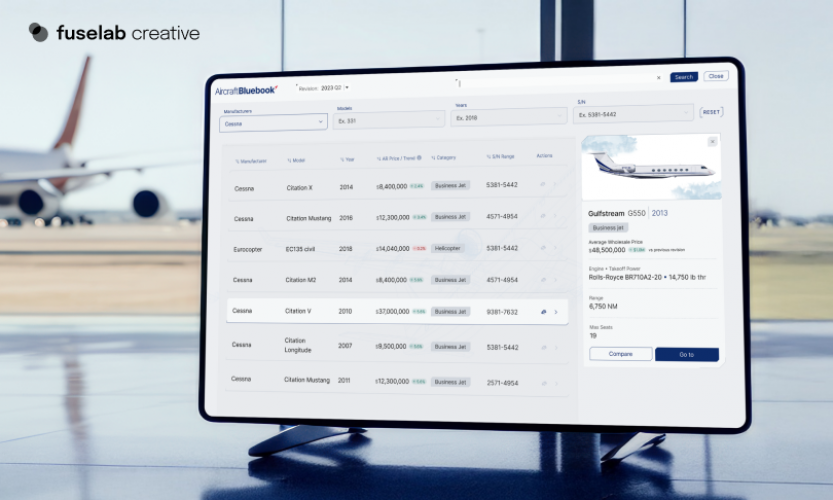
Valuing private aircraft is a complex, high-stakes process that demands accuracy, transparency, and speed. Yet, most existing platforms for aircraft appraisal are clunky, outdated, and fragmented - forcing users to jump between spreadsheets, comparison tools, and valuation databases that offer little to no visual clarity. For brokers, aviation consultants, and finance teams, the inability to instantly compare models, adjust valuations, or generate market-aligned insights results in missed opportunities and financial risk. In an industry where every price tags can reach into the hundreds of millions, outdated tools simply can’t keep up.

Solution
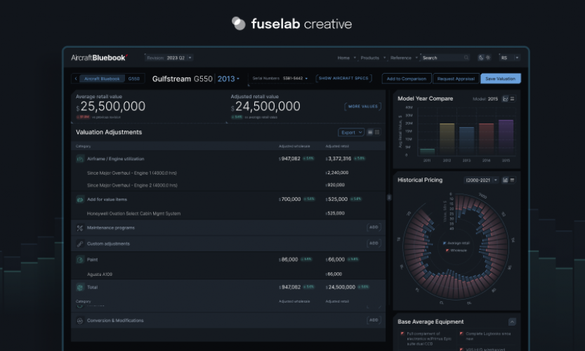
Fuselab Creative redesigned the Aircraft Bluebook platform into a modern, data-rich valuation ecosystem - built specifically for aviation professionals. This sleek, modular interface allows users to:
- Compare aircraft side-by-side with real-time pricing, hours, equipment, and engine data
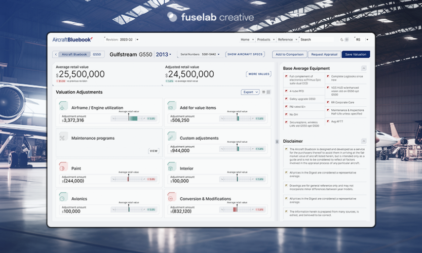
- Apply granular valuation adjustments (paint, interior, engine cycles, avionics, mods) in a transparent, editable format
- Access a clear breakdown of market value vs. adjusted value across timeline-based insights
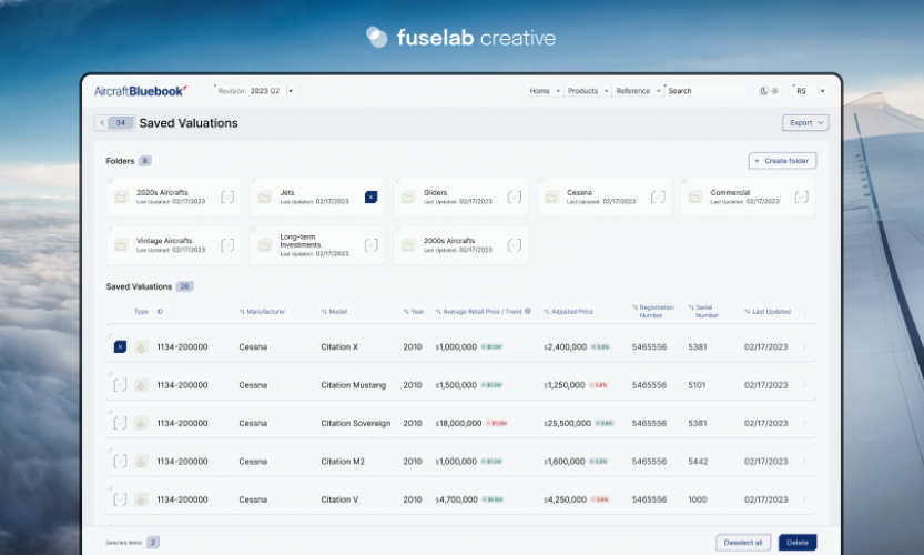
- View saved valuations, historical pricing trends, and base equipment standards with just a few clicks
- Navigate between dark and light UI modes based on user environment (field vs. office)
- Perform fast, filter-based searches across manufacturers, model years, serial numbers, and conditions
The result is a digital tool that feels built by aircraft professionals - for aircraft professionals. Everything is designed for ease of use, decision-making clarity, and industry-standard precision.

Outcome
With the new Aircraft Bluebook platform, users experience:
- Faster, more accurate aircraft valuations with real-time context
- Confidence in negotiation and reporting, thanks to visual breakdowns and editable assumptions
- Seamless team workflows across sales, leasing, and finance operations
- A scalable tool that simplifies the complexity of aircraft pricing across global markets

This is more than a valuation app - it's an aviation intelligence platform that brings trust, clarity, and speed to the skies.

Hyperfab

Hyperfab

  • Hyperfab screenshot 1
  • Hyperfab screenshot 2
  • Hyperfab screenshot 3
  • Hyperfab screenshot 4
$50001 to $100000
22 weeks
Information Technology

Problem
Manufacturing floors have evolved. Machines are faster, smarter, and more connected than ever before. Yet ironically, the systems meant to manage them often lag behind. Production managers are stuck navigating disjointed dashboards, partial data, and outdated controls - leaving them to react instead of lead. In fast-paced industrial environments, where every second and millimeter matters, this disconnect can cost efficiency, money, and momentum. Hyperfab needed more than visibility - they needed complete control.

Solution
Fuselab Creative partnered with Hyperfab to build a powerful orchestration interface that transforms chaos into clarity. The platform acts like a mission control system for the entire factory floor, offering:
- A live, interactive map of all devices, color-coded by performance and alert status
- Timeline-based workflow control for load balancing, sequencing, and task management
- Detailed robot calibration tools, complete with 3D motion previews and fine-tuned axis adjustment
- Side-by-side views of production line efficiency, energy consumption, and output flow
- Seamless zooming between global layout views and granular device-level diagnostics
- Predictive indicators that flag delays or failures before they interrupt output

Every pixel is built with purpose - empowering operators to not just see what's happening, but to act on it instantly and intelligently.

Outcome
With the new Hyperfab platform, production teams now operate with confidence and control:
- Downtime has been cut by up to 45% thanks to real-time alerts and predictive analytics
- Workflows are adjusted on the fly, reducing bottlenecks and optimizing capacity
- Operators manage entire factory ecosystems from a single, intuitive interface
- What was once just automation is now orchestration - smart, visual, and deeply efficient

Hyperfab doesn’t just track production. It shapes it.

EffiTrack

EffiTrack

  • EffiTrack screenshot 1
  • EffiTrack screenshot 2
  • EffiTrack screenshot 3
  • EffiTrack screenshot 4
$10001 to $50000
20 weeks
Information Technology

Problem
Managing national-scale energy infrastructure is a high-stakes, data-heavy challenge. From hydroelectric stations to wind farms and smart buildings, decision-makers are forced to operate across disconnected dashboards, siloed data streams, and static reports. The result? Delayed reactions to outages, missed optimization opportunities, and massive inefficiencies. In an era where sustainability, grid resilience, and cost-efficiency are paramount, energy leaders need more than monitoring - they need intelligence in motion. This is where EffiTrack came in.

Solution
Fuselab Creative designed EffiTrack as a next-gen operational command platform - built to unify every aspect of modern energy oversight. Our interface delivers:
- Live geographic visualizations of production vs. consumption across national regions, zip codes, and power grids
- Real-time analysis of energy mix by source (solar, battery, hydro, fossil) with automated anomaly detection
- Scalable dashboards for hydro turbine flow, turbine speed, pressure, and environmental variables
- Facility-level drilldowns for consumption patterns, performance deviations, and floor-by-floor optimization
- A mission control-ready interface with multi-screen display support for enterprise energy command centers
- Weather integration, predictive forecasting, and load balancing recommendations in a visually dynamic format

EffiTrack transforms static reports into living data - designed for clarity, context, and immediate decision-making.

Outcome
With EffiTrack, energy operators and infrastructure managers gain:
- Full-spectrum visibility across production, usage, and asset performance
- Faster response times to grid fluctuations and infrastructure anomalies
- Improved sustainability KPIs, thanks to source tracking and predictive modeling
- A modular, future-proof platform that scales from city-wide grids to individual facilities

EffiTrack reimagines what energy monitoring can be: not just a system of record, but a system of control.

The Fiserv Small Business Index

The Fiserv Small Business Index

  • The Fiserv Small Business Index screenshot 1
  • The Fiserv Small Business Index screenshot 2
$50001 to $100000
15 weeks
Financial & Payments

Problem
When tracking small business performance across the U.S., most platforms make you feel like you're piecing together a puzzle in the dark. Economic data may be abundant, but context is often missing. You get numbers - lots of them - but no intuitive path through them. Fiserv needed more than just a dashboard. They needed a lens: one that could zoom into local insights without losing the national picture, one that felt made for both economists and everyday decision-makers.

Solution
Fuselab Creative approached the redesign not as a cosmetic refresh, but as an exercise in cognitive ergonomics. We crafted a system where interaction feels natural and data speaks visually.
Users can:
- Glide between national and state views with map-driven logic
- Instantly detect economic momentum through subtle color shifts and index animations
- Drill into sector performance (transportation, health, services, etc.) with minimal clicks
- Compare month-over-month and year-over-year deltas without touching a spreadsheet
Everything is built with clarity in mind - from typography to tooltips, from legend behavior to adaptive zoom. The interface is not just attractive; it’s informationally elegant.

Outcome
The result? A tool that doesn’t just show what’s happening - it teaches you how to interpret it.
- Policy analysts discover regional shifts faster
- Business owners spot sector trends with confidence
- Internal teams collaborate around one coherent visual source of truth

The Fiserv Small Business Index is no longer just a dataset. It’s an ecosystem of insights - transformed into a visual language anyone can understand.

The Health Monitor Application

The Health Monitor Application

  • The Health Monitor Application screenshot 1
  • The Health Monitor Application screenshot 2
  • The Health Monitor Application screenshot 3
  • The Health Monitor Application screenshot 4
$10001 to $50000
18 weeks
Healthcare & Medical

The Health Monitor Application is a clinical command center built to think like a physician and act like an AI.
- Imagine seeing a patient’s condition mapped anatomically in real time, with red flags blinking where they hurt.
- Imagine moving through vitals, labs, medications, and progress notes without scrolling, without searching - just knowing.
- Imagine department-level clarity: heatmaps of overcrowding, predictive trends on readmissions, and a visual timeline of every procedure ever performed.
- From high-level ops to bedside reality, this app collapses complexity into intuition.
- Built for speed. Built for scale. Built for saving lives, not just storing records.
This isn’t just health tech. It’s clinical intelligence, visualized.

Outcome
- Doctors act faster.
- Departments run smarter.
- Patients are treated like humans, not files.
- Hospitals using the Health Monitor Application report a radical reduction in cognitive overload, increased diagnostic precision, and decision-making that feels like instinct - because the data is finally on their side.

Welcome to healthcare without the noise.

Automatize Platform

Automatize Platform

  • Automatize Platform screenshot 1
  • Automatize Platform screenshot 2
  • Automatize Platform screenshot 3
$10001 to $50000
22 weeks
Transportation & Logistics

Problem
Fleet managers lack real-time clarity and contextual insight when overseeing large-scale supply chain operations. Legacy dashboards rarely deliver a unified experience - forcing users to juggle maps, reports, and status logs manually. With vehicle delays, routing inefficiencies, and trip anomalies, decision-makers can’t act quickly enough. The core challenge: transforming telematics data into meaningful control.

Solution
Fuselab Creative redesigned the Automatize Platform into a cohesive, map-first dashboard experience - where every data point is actionable and every vehicle is visible. The interface enables:
- Fully interactive live fleet mapping with vehicle locations, routes, and travel timelines, allowing managers to zoom in or view all trips at once 
- On-hover information for each vehicle (fuel and maintenance indicators, trip performance, anomalies), enabling task-specific optimization 
- Dedicated analytics module with KPIs such as fuel efficiency, maintenance costs, driver performance, and resource utilization, ensuring data drives decisions 
- Project and task-level views tracking journey stages - pickup, fueling, unloading, billing - providing end-to-end visibility and profitability insight 
- Adaptive UI across devices, including tablet-mode for on-the-go management and full desktop map views for dispatch centers
Every UI component - from map overlays to module cards - is purpose-built for clarity, efficiency, and intuitive action.

Outcome
The revamped Automatize platform transforms complexity into clarity.
- Fleet managers gain laser-focused oversight over every vehicle and trip
- Critical inefficiencies are identified and resolved in real time
- Onboarding becomes seamless as teams use a unified interface for routing, billing, and analytics
- Profitability improves through visualized cost vs. “should cost” comparisons

Automatize doesn’t just track the fleet - it empowers teams to manage, optimize, and act with strategic precision.

DHCS

DHCS

  • DHCS screenshot 1
  • DHCS screenshot 2
  • DHCS screenshot 3
  • DHCS screenshot 4
  • DHCS screenshot 5
$100001 to $500000
24 weeks
Government

Problem

The Department of Health Care Services (DHCS) manages one of the most complex and essential public healthcare systems in the U.S. - serving millions of patients, providers, and administrators daily. Yet its digital tools were anything but user-friendly. Outdated layouts, buried content, and inconsistent experiences created unnecessary friction for users trying to access critical healthcare resources. Whether patients were applying for benefits or providers were managing compliance, the digital experience felt like a barrier - not a bridge.

Solution
Fuselab Creative reimagined the DHCS experience from the ground up, designing a system that could scale across agencies while staying deeply personal for users. Built with human-centered UX and accessibility-first thinking, the new interface offers:
- A persona-based structure tailored to the real needs of three distinct audiences: members, providers, and partners
- Smart, collapsible mega-navigation that simplifies access to high-value actions like eligibility, benefits, and forms
- A fully WCAG-compliant design system - clean, modular, intuitive, and optimized for all devices
- Strategic content mapping to streamline 4,000+ pages into coherent, discoverable journeys
- A powerful search experience that respects urgency, especially for underserved or non-technical users
The goal was radical clarity—not just making information easier to find, but making it impossible to miss.

Outcome
The redesigned DHCS platform isn’t just more beautiful. It’s more human.
- People now find what they need in seconds, not minutes
- Navigation is persona-driven, task-oriented, and emotionally intuitive
- Accessibility is no longer an afterthought—it’s the foundation
- Trust is rebuilt through clarity, structure, and visual calm
What was once a bureaucratic maze is now a welcoming front door to healthcare access for millions.
DHCS doesn’t just deliver services—it delivers dignity, at scale.

Online Tires Shop

Online Tires Shop

  • Online Tires Shop screenshot 1
  • Online Tires Shop screenshot 2
$50001 to $100000
25 weeks
Retail

Fuselab Creative was tasked to provide UI/UX design for an online tire shop. The goal was to increase conversion rates. Key deliverables included were desktop, mobile, and tablet versions of pages, and more. 

Fuselab was fully responsible for the custom UI.

Covid-19 Spending Relief Data - POGO

Covid-19 Spending Relief Data - POGO

  • Covid-19 Spending Relief Data - POGO screenshot 1
  • Covid-19 Spending Relief Data - POGO screenshot 2
$500000+
40 weeks
Healthcare & Medical

The project is primarily focused on issues of corruption, abuse of power, and when the government fails to serve the public.

Last year, a Government Agency started a project to visualize and create a database where users could see where the federal government’s COVID-19 relief funds were going.

They knew this would involve taking a lot of different data sources of publicly available information from the federal government and merging them into a web application — our goal was to display this information and make it consistent, navigable, and available for users. 

The final product is a web application that is essentially a database. It required a completely custom solution — they took hundreds of millions of lines of data, merged them, and made them filterable, searchable, and manipulatable by our users.

Your African Safari

Your African Safari

  • Your African Safari screenshot 1
$10001 to $50000
10 weeks
Travel & Lifestyle

Your African Safari is a multi-user platform created by people who are passionate about the animals of Africa. YAS helps support, grow and nourish a healthy African wildlife population.

Leading Non Profit YSA

Leading Non Profit YSA

  • Leading Non Profit YSA screenshot 1
$10001 to $50000
5 weeks
Education

LeadASAP represents a platform that encourages kids to be themselves and transform the world around by sharing ideas.

Executive Interview of Fuselab Creative

Mar Caposino
Mar Caposino
CEO
Visit Profile
Please introduce your company and give a brief about your role within the organization.
Fuselab Creative is a digital product and UX/UI design agency. We are focused on software and application design that takes makes people's lives better, helps businesses succeed, and supports better health.
What is the story behind starting this company?
The company began as a design agency that did everything from social media campaigns to mobile app design. Years later we are primarily focused on interface and dashboard design for organizations in almost any industry that has large data systems that they want to make accessible and usable. This could be health and wellness patient data or covid-19 government data, it really doesn’t matter. Fuselab is extremely adept at helping organizations take information of any kind and creating an easy-to-use interface for users, regardless of their technical savvy.
What are your company’s business model–in house team or third party vendors/ outsourcing?
We have four design teams of UX/UI designers that split up our workload on front-end design. We also employ expert digital strategists, motion graphic specialists, project managers, and executive-level staff. If needed we have several teams of front-end and back-end code developers.
How does your company differentiate itself from the competition?
One of our biggest differentiators is our focus on building Figma Design Systems. Our goal is always the same: build a design system and documentation that accounts for every pixel and explains in excruciating detail the assumed functionalities. In order to achieve this, we also build numerous prototypes in Figma and include full documentation in Zeplin.
What industries do you generally cater to? Are your customers repetitive? If yes, what ratio of clients has been repetitive to you?
We certainly have a lot of clients in the healthcare and wellness fields, however, we find that there are really no industries anymore that don’t need some kind of digital design support. Many of our clients are now on long-term contracts with annual renewals. I would say about 50% of our clients are under contract renewals or have returned to us for additional work after our first project has ended.
Please share some of the services that you offer for which clients approach you the most for?
UX/UI Design, Digital product design, and development, Illustration, and animation.
What is your customer satisfaction rate according to you? What steps do you take to cater to your customer’s needs and requirements?
We have a very high satisfaction rate among our customers now, as anyone can review on Google reviews and Goodfirms.
What kind of support system do you offer to your clients for catering to their queries and issues?
Our executive staff and project managers are available to our clients, both present and past to handle any questions, requests, or issues 24/7.
What kind of payment structure do you follow to bill your clients? Is it Pay per Feature, Fixed Cost, Pay per Milestone (could be in phases, months, versions etc.)
At this point, we have many different arrangements with our clients, such as monthly retainer agreements, fixed price deliverable contracts, as-needed services, maintenance agreements, and free consulting on practically any digital need someone may have. We always want to be seen as a partner in our client’s success instead of a contracted vendor.
Do you take in projects which meet your basic budget requirement? If yes, what is the minimum requirement? If no, on what minimum budget you have worked for?
Although we often find ourselves doing favors for friends and family, we tend to not take projects with a budget under $20,000.
What is the price range (min and max) of the projects that you catered to in 2021?
In 2021 our largest project was for $760,000 and our smallest was for $21,000.
Where do you see your company in the next 10 years?
I think we like the size we are now, but we would like to possibly join a larger company as their in-house design team. We are also in the process of building several experimental digital products of our own, so who really knows what the future may hold for us.