Studio Presto
Beautiful design efficiency in mind.
Presto Studio is a creative design bureau that combines the power of emotion and function to build brands through value-centric experiences.
We develop digital communication for clients ready to make a positive change. Our final objective is to enable our clients to achieve their goals with our innovative and visually perfect design solutions, continually grow, and provide top-notch, client-oriented, appealing services and products.
 Ukraine
Shestakova st., 41/1,
Khmel'nyts'kyy,
Khmel'nyts'ka
29000
+380675817353
NA
10 - 49
2014
Detailed Reviews of Studio Presto

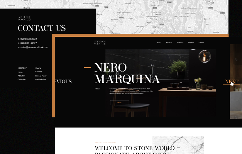
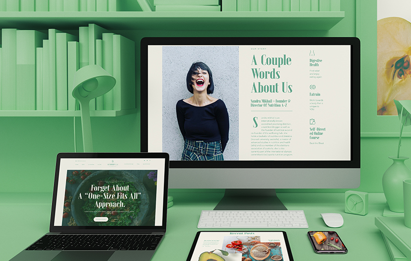
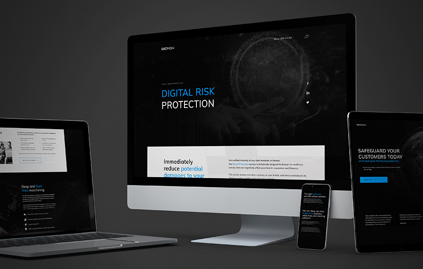
Client Portfolio of Studio Presto
Project Industry
- Other Industries - 66.7%
- Healthcare & Medical - 16.7%
- Advertising & Marketing - 16.7%
Major Industry Focus
Other Industries
Project Cost
- $0 to $10000 - 66.7%
- $10001 to $50000 - 33.3%
Common Project Cost
$0 to $10000
Project Timeline
- 1 to 25 Weeks - 83.3%
- 26 to 50 Weeks - 16.7%
Project Timeline
1 to 25 Weeks
Portfolios: 6

.jpg)

.jpg)
.jpg)

.jpg)