UX&UI and CRO services for eCommerce and Saas

Turum-burum is a UX/UI and CRO company with over 15 years of experience, primarily focused on eCommerce, SaaS, Web3, and B2B Tech projects. Turum-burum is the only Ukrainian company that has become a Google UX Partner and takes part in Google's Retail Development Programs in Ukraine.

We have worked with the top 30 eCommerce brands in Ukraine, experiencing 500K - 3M traffic per month, and completed more than 400 projects from Europe, the Middle East, Canada, Australia, and the USA. These projects include Web apps and Mobile apps. We are accustomed to handling high-traffic volumes for projects such as Samsung, Pandora, and Watsons, including complex dashboards and systems for logistics companies and CRMs. We can cope with projects of any size, starting with elegant marketing sites and ending with SaaS solutions for millions of users.

We are well-known in the UX/UI and CRO industry, having been speakers at conferences in Berlin and London, with our articles published in Smashing Magazine, Muzli, Hotjar, etc. The company has been listed in the rankings of the Top 100 Conversion Optimization Services and Top 100 User Experience Agencies according to The Manifest. We were also the organizers of the Online eCommerce Conference for Conversion Growth in collaboration with CXL, Baymard Institute, Optimizely, and Hotjar.

We don’t create one-time websites, as we believe that every business needs continuous improvements based on numbers and facts. We prefer a scientific approach to conversion rate optimization, drawing on our strong usability background, rather than relying on one-time common optimization tricks. We are not looking for clients but for partners for whom interface quality matters.

What we do
With the help of design solutions, we influence key website metrics to increase our clients’ revenue.

We provide the following services:

  • Usability audit 

We pinpoint interface flaws crucial for conversion based on the analytics, users' behavior, and key site metrics. 

  • Conversion rate optimization according to the ESR approach

The Evolutionary Site Redesign (ESR) is a gradual interface enhancement process that fixes critical mistakes without dramatically redesigning the website

  • UX/UI services 

Information and navigation structure, Customer Journey Mapping (CJM), dynamic and static prototyping, and the design of all website pages with various states (mobile and desktop). We specialize in mobile-first custom design solutions for a range of websites, including eCommerce, FinTech, company websites, SaaS, etc. Our UX/UI services extend to both Mobile Apps and Web Apps.

  • UX/UI for Shopify

We know all the limitations of the Shopify platform, so we can provide such services as UX/UI design for Shopify, Conversion rate optimization, and UX audit.

  • Product design

We have enough experience in creating designs from scratch for CRM systems, NFT platforms, FinTech solutions, etc. We know how to create a cost-effective MVP of uncompromised quality and invest gradually in its development.

Certifications/Compliance

ISO 27001
Ukraine Ukraine
Sumska Street, Kharkiv, Kharkiv 61023
+38 068 653 84 46
$50 - $99/hr
10 - 49
2009

Service Focus

Focus of Web Designing (UI/UX)
  • Website - 10%
  • E-commerce - 80%
  • Usability - 10%
Focus of Mobile App Development
  • iOS - iPhone - 50%
  • Android - 50%
Focus of Web Development
  • Wordpress - 60%
  • Drupal - 20%
  • Joomla - 20%

Industry Focus

  • E-commerce - 50%
  • Business Services - 10%
  • Financial & Payments - 10%
  • Healthcare & Medical - 10%
  • Retail - 10%
  • Other Industries - 10%

Client Focus

50% Small Business
35% Medium Business
15% Large Business

Review Analytics of Turum-burum

3
Total Reviews
5.0/5
Overall Rating
1
Recent Reviews

What Users Say

Turum-burum delivered high-quality design work with excellent documentation.
Anastasiia Chala
Anastasiia Chala , Content Marketing Officer @ Stormotion at Stormotion
We suggest their services to our customers since we checked their expertise on our own project.
Valeriia Donetskova
Valeriia Donetskova , Marketing Specialist at Inweb
Excellent partnership experience with Turum-burum agency, who has high skills in UX/UI design.
Kristina Aniutenko
Kristina Aniutenko , Marketing manager at Netpeak

What Users Like The Most

  • Their Figma documentation and design structure — it was clear, developer-friendly, and saved us a lot of time during implementation.
  • The UX/UI team's dedication to detail is remarkable, resulting in a final product that is both visually appealing and user-friendly. Their commitment to excellence is evident in every aspect of their work.
  • We are satisfied with the conditions of our cooperation and the openness of the partnership. It's a pleasure to work with such a professional team.

What Users Like The Least

  • Nothing stood out as a problem — everything went smoothly and met our expectations.
  • I can’t remember anything like that. I highly recommend this agency to anyone who wants to improve the user experience of their website.
  • We did not have any misunderstandings during the work. All at the highest level.

Detailed Reviews of Turum-burum

5.0 3 Reviews
  • All Services
  • Web Designing (UI/UX)
  • Mobile App Development
  • Relevance
  • Most Recent
  • Rating: high to low
  • Rating: low to high
Write a Review
Anastasiia Chala

Turum-burum delivered high-quality design work with excellent documentation.

Working with Turum-burum was a very positive experience. They provided clean, modern UI/UX design and were highly professional throughout the project. The Figma files were exceptionally well-organized and included detailed documentation, which made our job as developers much easier. We had very few questions during implementation, which saved us time and helped us stay on schedule. The final product met our client’s expectations, and we were happy with both the design process and the outcome.

What was the project name that you have worked with Turum-burum?

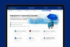
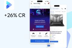
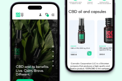
UI/UX Design for a Fitness Tracker Mobile App

What service was provided as part of the project?

Mobile App Development, Web Designing (UI/UX)

Describe your project in brief

We hired Turum-burum to design a fitness tracker app that we were developing for one of our clients. The goal was to create a user-friendly, modern interface and ensure the design handoff would be smooth for our developers.

What is it about the company that you appreciate the most?

Their Figma documentation and design structure — it was clear, developer-friendly, and saved us a lot of time during implementation.

What was it about the company that you didn't like which they should do better?

Nothing stood out as a problem — everything went smoothly and met our expectations.

Rating Breakdown

  • Quality
  • Schedule & Timing
  • Communication
  • Overall Rating

Project Detail

  • $10001 to $50000
  • Completed
  • Information Technology
Valeriia Donetskova

We suggest their services to our customers since we checked their expertise on our own project.

They conducted a usability audit of the site, and compiled a list of growth points, with recommendations for their improvement and examples of best practices. All hypotheses were prioritized according to the degree of criticality. As a result, we got a ready plan for improving the interface.
Turum-burum helps businesses by conducting research to understand their needs, audience, and competition. They also create wireframes and prototypes to visualize the layout and functionality of the website and design the interface with color schemes, typography, graphics, and overall aesthetics.

What was the project name that you have worked with Turum-burum?

UX audit for a marketing company website

What service was provided as part of the project?

Web Designing (UI/UX)

Describe your project in brief

Inweb is a digital marketing agency with 10 years of experience. We comprehensively promote business on the Internet and make our clients market leaders.

What is it about the company that you appreciate the most?

The UX/UI team's dedication to detail is remarkable, resulting in a final product that is both visually appealing and user-friendly. Their commitment to excellence is evident in every aspect of their work.

What was it about the company that you didn't like which they should do better?

I can’t remember anything like that. I highly recommend this agency to anyone who wants to improve the user experience of their website.

Rating Breakdown

  • Quality
  • Schedule & Timing
  • Communication
  • Overall Rating

Project Detail

  • $0 to $10000
  • Completed
  • Advertising & Marketing
Kristina Aniutenko

Excellent partnership experience with Turum-burum agency, who has high skills in UX/UI design.

Our company has been cooperating with the Turum-burum agency for many years. During this time, the team has shown itself as highly qualified specialists. We are confident in their skills and can safely recommend contacting them as a contractor.

What was the project name that you have worked with Turum-burum?

UX/UI services for several eCommerce clients

What service was provided as part of the project?

Web Designing (UI/UX)

Describe your project in brief

Our company is engaged in digital marketing services for eCommerce projects and other industries. We have been on the market since 2006 and have 3000+ projects in our portfolio.

What is it about the company that you appreciate the most?

We are satisfied with the conditions of our cooperation and the openness of the partnership. It's a pleasure to work with such a professional team.

What was it about the company that you didn't like which they should do better?

We did not have any misunderstandings during the work. All at the highest level.

Rating Breakdown

  • Quality
  • Schedule & Timing
  • Communication
  • Overall Rating

Project Detail

  • $10001 to $50000
  • In Progress

Client Portfolio of Turum-burum

Project Industry

  • Financial & Payments - 2.0%
  • E-commerce - 62.7%
  • Information Technology - 11.8%
  • Healthcare & Medical - 3.9%
  • Transportation & Logistics - 2.0%
  • Education - 2.0%
  • Food & Beverages - 3.9%
  • Automotive - 2.0%
  • Art, Entertainment & Music - 3.9%
  • Travel & Lifestyle - 2.0%
  • Real Estate - 2.0%
  • Retail - 2.0%

Major Industry Focus

E-commerce

Project Cost

  • Not Disclosed - 94.1%
  • $10001 to $50000 - 3.9%
  • $0 to $10000 - 2.0%

Common Project Cost

Not Disclosed

Project Timeline

  • 1 to 25 Weeks - 94.1%
  • 26 to 50 Weeks - 3.9%
  • 51 to 100 Weeks - 2.0%

Project Timeline

1 to 25 Weeks

Portfolios: 51

Parasol.ua

Parasol.ua

  • Parasol.ua screenshot 1
  • Parasol.ua screenshot 2
Not Disclosed
12 weeks
Financial & Payments

About the project:

Parasol.ua is a service that allows customers to compare offers from different insurance companies and take out car insurance, health insurance, and travel insurance policies. The platform aims to make the insurance process simple, easy and transparent for each user.

Task:

  • Improving the website interface.
  • Attracting new users and increasing the number of regular customers.

Results:

The usability audit allowed us to:

  • develop 63 detailed hypotheses for improving the website's key pages;
  • provide recommendations for project improvement and overall efficiency.‍

After the client implemented the improvements, we conducted supervision to ensure that the UX/UI solutions were implemented correctly to improve the usability of the site and increase conversion.

Youshouldbehair

Youshouldbehair

  • Youshouldbehair screenshot 1
  • Youshouldbehair screenshot 2
Not Disclosed
12 weeks
E-commerce

About the project:

Youshouldbehair (YSBH) is a US-based online boutique offering premium hair care, long-lasting extensions, and fashion-forward accessories. The brand was founded by Jay Cousar and built for women who treat hair care as self-care. It blends hair & fashion in a curated space where each product supports the customer's next confident look.

Main tasks of the project:

  • Improve website conversion rate and key KPIs;
  • Optimize the customer journey across all funnel stages;
  • Enhance mobile usability and engagement;
  • Increase customer loyalty and return visits.

Results:

During the 3-week CRO Package collaboration, we:

  • Performed a comprehensive UX audit;
  • Developed detailed prototypes for key website pages;
  • Delivered the roadmap of actionable UX improvements.‍

The Youshouldbehair team independently implemented the UI updates based on our recommendations, noticing an increase in sales and overall improvement in website performance following the implementation.

SmartMag

SmartMag

  • SmartMag screenshot 1
  • SmartMag screenshot 2
Not Disclosed
12 weeks
E-commerce

About the project:

SmartMag is an online store of technology and gadgets that started as a startup in 2014. Today, it is a well-known company with thousands of customers across Ukraine, its own pickup points and courier delivery in most regional centers.

Task: To create a modern, customer-oriented online store design, lay the foundation for its scaling, increase conversion and revenue, and strengthen the brand's position among the top players in the home appliances and electronics market in Ukraine.

Results
Within a month of launching the site on the new platform, the following results were achieved:

  • mobile traffic increased by 42%, mobile conversion by 69%, and page views per session by 96%.
  • overall conversion increased by 26%, revenue by 81%, and bounce rate by 69%, which is evidence of improved UX and effective traffic acquisition.

Crystal Clear Memories

Crystal Clear Memories

  • Crystal Clear Memories screenshot 1
  • Crystal Clear Memories screenshot 2
Not Disclosed
12 weeks
E-commerce

Crystal Clear Memories is a company that sells clients high-quality, custom-engraved crystal mementos with the LIVE PREVIEW™ patented feature — a core of the business and a truly unique thing.

Crystal Clear Memories approached Turum-burum with a request for increasing conversion rates on the homepage, product pages (PDPs), and product list.

Results:

We conducted a UX audit, validated key UX/UI hypotheses of the homepage improvements, and identified the winning design. 

Running A/B tests proved the effectiveness of the hypotheses provided by the Turum-burum agency, so Crystal Clear Memories decided to implement all the recommendations provided in the UX audit report (homepage, product page, and product list).

Lenovo

Lenovo

  • Lenovo screenshot 1
  • Lenovo screenshot 2
Not Disclosed
12 weeks
E-commerce

Lenovo is a global technology company, ranked 217th in the Fortune Global 500, with revenues of $62 billion. It has 77,000 employees worldwide who are focused on delivering “smarter technology for everyone.”

Task: Finalize the website so it not only serves a branding purpose but also starts selling.

Results:

Thanks to the UX audit and the implementation of Turum-burum's interface optimization recommendations, the conversion rate (CR) of Lenovo's website increased fourfold, the bounce rate decreased by 46%, and the exit rate decreased by 34%. We also configured the analytics and tagged events in more detail to give the company an up-to-the-minute picture of its performance.

CBD100

CBD100

  • CBD100 screenshot 1
  • CBD100 screenshot 2
Not Disclosed
12 weeks
E-commerce

CBD100 is a multi-brand online store in Ukraine that offers popular products with cannabidiol of its own production.

The main tasks of the project:

  • Preparing the website for traffic growth;
  • Broadcasting brand prestige through the interface;
  • Increase in trust and loyalty, audience awareness;
  • Optimization of the user journey.

Conducted usability audit, created prototypes and delivered them to the client team. Provided supervision to ensure that UX/UI solutions were implemented correctly to improve site usability and increase conversions. As a result of the changes made, the brand noted that:

  • The number of users increased 6 times;
  • Bounce rate decreased by 17%;
  • Session duration on mobile increased by 32%;
  • Exit rate from product pages decreased by 45%;
  • Session duration on product pages increased by 198%.
FlowerPot

FlowerPot

  • FlowerPot screenshot 1
  • FlowerPot screenshot 2
Not Disclosed
11 weeks
E-commerce

About the project:
FlowerPot is a mobile app for Android and iOS for selling flowers that differs from traditional stores and offers interesting and sometimes revolutionary solutions. 

Our task: To create a mobile application that would successfully present the company's services and allow users to quickly perform the target action - choose and buy flowers.

Results:
Thanks to close cooperation with the client and application of the best patterns of various web product types, we managed to develop a native design for the mobile application that successfully conveys the brand's values and benefits.

The result is a user-friendly application that combines the company's offline and online services, taking into account the needs of a wide target audience and business objectives.

CRM System Design

CRM System Design

  • CRM System Design screenshot 1
  • CRM System Design screenshot 2
Not Disclosed
11 weeks
Information Technology

About the Project:
Case of creating a new CRM system from scratch, developing the logic, structure, and UX/UI design of the product to compete with well-known systems in terms of price and functionality, without sacrificing usability.
The CRM was needed to centralize and streamline contact management across various branches, making it easier for managers to add new client details, leave comments, and initiate deals.

Our Task: Our task was to design the logic, structure, and UX/UI of a CRM system to streamline and unify contact management for the client's multiple branches. The system needed to be intuitive, visually appealing, and customizable to meet the client's needs.

Results:

  • We successfully developed a user-friendly and robust CRM system that met all the client's requirements.
  • To optimize the budget, we handed the project over to the client for independent design scaling and further development based on the UI guide developed by our designers.
Robinzon

Robinzon

  • Robinzon screenshot 1
  • Robinzon screenshot 2
Not Disclosed
12 weeks
E-commerce

About the project
Robinzon is a multi-category website selling goods for all types of tourism, leisure, and travel. It is the official distributor of Samsonite in Ukraine.

Task:
Create a website design that would become a tool for further business growth and scaling.

Results:
We created a customer-centric and mobile-friendly web product that meets the needs of both businesses and users by providing:

  • Simple and intuitive navigation;
  • A sense of belonging to their own community;
  • Advantageous presentation of the company's products;
  • Ability to scale in the future without significant time and financial investment.
Lumier

Lumier

  • Lumier screenshot 1
  • Lumier screenshot 2
Not Disclosed
11 weeks
E-commerce

About the project:
Lumier – is a Norway company that offers electrical equipment and lighting of premium quality at reasonable prices. The store has a broad target audience and provides its services to the B2B and B2C segments.
It is a family business that is relatively young, but can hardly be called a startup. The company’s owner Per Norman Nielsen has already set up several well-known brands connected with electronics. And now, with more than 40 years of experience, together with his son, he is working on a new entrepreneurial project – the Lumier store.

Our task was to:

  • Improve the website interface;
  • Attract new and retain customers;
  • Increase brand awareness;
  • Boost e-commerce conversion rate.

Results:
Thanks to high-quality UX audit and efficient cooperation with the client, we:

  • Defined the most critical usability mistakes that influenced the KPIs;
  • Were able to choose the most efficient redesign strategy for this particular case;
  • Developed a client-oriented interface with intuitive navigation;
  • Highlighted the benefits of the offered products;
  • Placed appropriate accents;
  • Provided essential information for making purchase decisions.
GreenChef

GreenChef

  • GreenChef screenshot 1
  • GreenChef screenshot 2
Not Disclosed
12 weeks
E-commerce

About the project:
Green Chef is a Ukrainian brand that produces and sells balanced nutrition products and rations based on plant-based ingredients.

Problem: The current website was no longer solving business problems, and the platform was not scalable.

Task:
The website should be clear, engaging, and accessible, like a conversation with your best friend.
We need to develop an effective sales tool that will allow to make a big boost.

Results
The results of comparing analytics data for 2 weeks before and after the site launch:

  • Micro-conversion from category listing to product page increased by 23% for products and 19% for rations;
  • User engagement on the homepage increased by 49,65%.
  • The average time spent on the site was increased by 13,17%.
NFTrends

NFTrends

  • NFTrends screenshot 1
  • NFTrends screenshot 2
Not Disclosed
9 weeks
Information Technology

Turum-burum's task was to create from scratch the user experience (UX) and user interface (UI) for the NFTrends platform and personal accounts, catering to four different user flows. The task was to design a user-friendly, aesthetically pleasing, and feature-rich interface that facilitates the creation of Digital Product Passports for luxury brands and artists, serving customers who invest in these pieces.

The challenge lay in crafting an interface that appeals to luxury brands, which often prefer a subdued tone, and the digital art crowd, which favors a brighter color palette.

The close collaboration of Turum-burum with NFTrends and Dysnix's Web3 developers resulted in the successful creation of a user-friendly platform for authenticating and ownership tracking of physical and digital items.

The final UX/UI design seamlessly covered all the requirements and conveyed the main idea of the project, bridging the gap for art and fashion enthusiasts with the latest technologies, and acquainting them with the transformative power of digitization.

NFTrends now stands alone as a pioneer in the digital and physical space, setting a new standard for authenticity and innovation from the ground up.

glo™

glo™

  • glo™ screenshot 1
  • glo™ screenshot 2
Not Disclosed
12 weeks
E-commerce

When working on the glo™ website optimization, our team focused on two major tasks:

  • Setting up data collection tools to get more precise analytics;
  • Detecting website’s usability mistakes based on improved analytics and providing recommendations for their elimination.

Within two months after the launch of the new website’s version, we got the following results:

  • Conversion rates for landing on product cards increased by 87%;
  • Conversion of users who viewed the glo™hyper x2 desktop device pages increased by 131%;
  • Conversion for new users increased by 22.31%.

The latter metric clearly proves that we managed to improve the website’s usability and accessibility, as new users have not yet got used to working with the website and navigate intuitively.

Samsung | Official website in Ukraine

Samsung | Official website in Ukraine

  • Samsung | Official website in Ukraine screenshot 1
  • Samsung | Official website in Ukraine screenshot 2
Not Disclosed
10 weeks
E-commerce

Samsung — world leader in the field of semiconductor production, telecommunications and digital media equipment, as well as in the field of digital convergence technologies:

  • Annual Revenue > $1.0B
  • Total Visits 746.2M per month
  • 206 offices in 68 countries

In the process of developing a new design for the site:

  • Researched the market of official Samsung equipment
  • Conducted a survey of the target audience
  • Transferred the user experience from offline to online
  • Mapped out a customer journey
  • Built a new interface according to the guidelines

So, we invite you to review the case study by following the link: 

https://www.behance.net/gallery/164325767/Samsung-Official-website-in-Ukraine

Polunichka

Polunichka

  • Polunichka screenshot 1
  • Polunichka screenshot 2
Not Disclosed
12 weeks
E-commerce

"Polunichka" is the most popular chain of intimate goods stores in Ukraine. Over 17 years in the market, the company has opened 65 physical stores in 20 cities across 16 regions of the country. 
The store's inventory includes over 10,000 products, a significant portion of which the chain sources directly from popular manufacturers in Europe, America, and Asia. 

By prioritizing mobile devices in the interface design, we achieved the following:

  • Ensured interface optimization for all types of devices.
  • Assisted the already well-known offline store in reaching mobile and online shoppers.
  • Increased brand recognition.
  • Developed intuitive navigation and quick order processing for customers.
  • Took care of the psychological comfort of website visitors.
  • Emphasized the brand's advantages over competitors.

As a result, after implementing the recommended design, the website's conversion rate increased by 100%: a 2.5-fold increase for new users and a 1.5-fold increase for returning users.

The Spy Store

The Spy Store

  • The Spy Store screenshot 1
  • The Spy Store screenshot 2
Not Disclosed
12 weeks
E-commerce

The Spy Store is a reputable Australian company that specializes in spy gear and services.

After the UX audit, the Turum-burum team made an inventory of more than 60 recommendations to optimize the conversion rate of The Spy Store. In close cooperation with the contractor, we defined the most critical usability mistakes and illuminated them thanks to evolutionary website redesign. 

Key KPIs changes after the introduction of new UX/UI solutions in 1 month:

  • The e-commerce conversion rate increased by 16%;
  • The proportion of mobile website visitors has enlarged;
  • The business conversion rate for returning customers has improved by 4%;
  • We traced a positive trend in converting new visitors into customers;
  • The number of items added to the cart in the mobile version has increased by 100% and by 39% in the desktop version;
  • The percentage of users adding items from the product card has grown by 80%;
  • The Average Revenue Per User (ARPU) has increased by 20%.
Healthis

Healthis

  • Healthis screenshot 1
  • Healthis screenshot 2
Not Disclosed
12 weeks
Healthcare & Medical

A brand-new design example of an online vitamins and supplements marketplace with numerous features that helped the brand stand out from competitors, thanks to its user-friendly interface.

The goal of the project is to develop a user-friendly and modern design for the marketplace, to emphasize the main conversion pages: catalog, product page, shopping cart, checkout, etc.

Our team of analysts and designers have worked hard in researching and designing interfaces to deliver effective results in project.

Spot.One

Spot.One

  • Spot.One screenshot 1
  • Spot.One screenshot 2
Not Disclosed
12 weeks
Information Technology

Blockchain SaaS product design

How we created a fresh dashboard design for the Spot.One API SaaS project seamlessly blending intuitive user experience with captivating visual aesthetics.

The dashboard serves as a valuable tool for blockchain software developers, providing insightful metrics on element usage, request volume, and request speed per second, aiding in the optimization and analysis of Spot.One API integration.

Empowering users with flexibility, the dashboard facilitates the seamless addition of new apps (tokens), enabling them to effortlessly harness the potential of the Spot.One API for their diverse range of applications.

The dashboard has also been thoughtfully designed to cater to mobile devices, allowing users to effortlessly access and manage their Spot.One API data on the go.

 Learn more by the link https://turumburum.com/cases/spot-one/

Logistics Management Software

Logistics Management Software

  • Logistics Management Software screenshot 1
  • Logistics Management Software screenshot 2
Not Disclosed
12 weeks
Transportation & Logistics

This mobile app and dashboard help users effortlessly order and purchase goods from other countries. It offers easy package management, real-time tracking, and convenient scheduling for pickups and deliveries. With secure payment options, users can seamlessly handle shipping fees within the app, ensuring a hassle-free experience.

We conducted extensive analytics, including collecting business requirements, conducting user interviews, and researching the target audience. Based on this research, we developed an optimal information structure, user flow, and prototypes. Guided by the customer's UX guide, we created the product design, resulting in a successful and tailored user experience.

Information architecture creation aims to make it easy for users to find what they’re looking for and understand how everything is connected.

The UI focuses on clear and intuitive navigation, allowing users to access the desired features and functionalities easily. It incorporates a visually appealing design with a clean and organized layout, ensuring that users can quickly understand and interact with the various elements of the app or website. We prioritized responsiveness, enabling a consistent and optimized experience across different devices and screen sizes.

Aspire

Aspire

  • Aspire screenshot 1
  • Aspire screenshot 2
Not Disclosed
12 weeks
Education

E-learning Platform Web App for iOS and Android UI/UX Design

Aspire is a global training provider based across the UK that specializes in accredited and bespoke training courses

The main task: Make a dashboard with which you can easily track your progress in different subjects, collect achievements, and plan your schedule. All your courses are in one place.

Learn more about the project by the link https://turumburum.com/cases/aspire/

Allmart

Allmart

  • Allmart screenshot 1
  • Allmart screenshot 2
Not Disclosed
11 weeks
E-commerce

Virtual marketplace Allmart.ua brings together thousands of buyers and sellers from all across Ukraine, offering a convenient way to quickly sell or find the necessary equipment with just a few clicks.

Website conversion optimization using the ESR approach:

  • Conducted a detailed UX audit of the project
  • Identified areas for interface improvement
  • Developed a plan to enhance performance indicators
  • Revamped the project's visual design based on recommendations
  • Addressed UX issues and errors.

As a result of these changes, the user experience was significantly improved, and the business goals were successfully achieved:

  • Page views for product listings increased by 27%
  • Purchase completions grew by 44%
  • Average revenue per user increased by 29%
  • The company's average revenue from purchases rose by 73%.
Gemini

Gemini

  • Gemini screenshot 1
  • Gemini screenshot 2
Not Disclosed
11 weeks
Food & Beverages

Gemini is a Ukrainian coffee and tea producer since 1996. The total number of site users is 29.3K per month.

Design of the new Gemini online store interface:

  • studied the user experience of choosing and buying coffee and renting equipment;
  • worked out interaction scenarios for both B2B and B2C audiences;
  • created an interface for solving business problems;
  • detailed the style and placed accents.

As a result, we got a solution that presents the company, conveys competitive advantages to the target audience and displays a line of goods and services.

World Of Comics

World Of Comics

  • World Of Comics screenshot 1
  • World Of Comics screenshot 2
Not Disclosed
11 weeks
E-commerce

The first chain in Ukraine of themed geek stores with more than 10,000 products.

The Turum-burum team succeeded in creating an online store design that:

  • Emphasizes the benefits of the products presented;
  • Gives the feeling of being part of a community;
  • Creates an emotional connection between the company and its customers.

We created a minimalist website design, developed custom images, placed the necessary accents, chose the right tone of voice, and got a cool-themed online store that fully meets the target audience's needs and fulfills the business objectives.

We achieved this result thanks to close communication with the client throughout the project, as well as the expertise of our specialists who are fans of geek culture.

Shabo

Shabo

  • Shabo screenshot 1
  • Shabo screenshot 2
Not Disclosed
11 weeks
Food & Beverages

Shabo is a Ukrainian wine company founded in 1946, one of the leaders in the Ukrainian wine industry. 

The previous website design did not meet the new business objectives and did not fully reflect all the features and additional services of the company. Therefore, Turum-Burum's main task was to develop a new concept and structure for the website to demonstrate all the company's advantages, reveal the brand features, and focus on wine sales through UX/UI solutions. After all, the range of wines is quite extensive, including both fine and budget wines.

Results of Shabo website redesign:

  • Developed both commercial and non-commercial pages of the site.
  • Optimized site navigation and customized filters.
  • Added upsell and cross-sale tools.
  • Structured the category page.
  • Developed and optimized the site's adaptive design.

The new Shabo website design has a much more modern and fresh look that better communicates the brand and improves the user experience. This concept allows the brand to better develop its own spirits ecosystem and build a loyal community of Shabo product connoisseurs through the website.

Dysnix

Dysnix

  • Dysnix screenshot 1
  • Dysnix screenshot 2
Not Disclosed
11 weeks
Information Technology

Dysnix is a Ukrainian IT company with over 8 years of international market experience that provides DevOps and DevSecOps services. Engineers at Dysnix have completed over 60 projects in Fintech, Web3, Medtech, advertising, and other industries. Dysnix has worked with Visa clients and contributed to Google product development.

We worked out the core pages of the site and thought up the accent elements of the UX/UI design. The main features of the website design include:

  • A structured and intuitive interface that allows users to easily find the necessary information about the company and its services.
  • The choice of colors and fonts match the company's vision and convey its technological nature.
  • Customized illustrations that help visually convey the importance of the products and services offered.

Special attention was paid to the blog page. The product is complex and for such products, a blog is an integral part. Thanks to effective cooperation with the client's team, the blog site looks informative and appealing. The blog has several main sections and collections of articles by topic, and there is a search function that allows users to quickly find specific topics and articles.

We achieved the goals set and created a design that not only helped Dysnix stand out from the competition, but also demonstrated new products and services in Web 3 in a clearer and more accessible format.

Divebooker

Divebooker

  • Divebooker screenshot 1
  • Divebooker screenshot 2
Not Disclosed
10 weeks
E-commerce

About the project:
Founded in Canada in 2014 Divebooker is a global Online Travel Agency for scuba diving.

Divebooker.com makes it easy to browse and compare diving opportunities all over the world, to help you plan and instantly book a perfect diving vacation.

Task: Create a bright and stylish interface design for a startup that will attract the attention of users, as well as meet modern booking service patterns and cover business tasks.

As a result, we increased conversion rate by 41.7% within 12 months.

View case study: https://turumburum.com/cases/divebooker/

Symbol

Symbol

  • Symbol screenshot 1
  • Symbol screenshot 2
Not Disclosed
6 weeks
E-commerce

Symbol is the official distributor of over 200 worldwide brands in Ukraine. The brand network is represented by 38 boutiques of the luxury segment and online store. 

As a result of redesigning the Symbol online store using the RSR approach, we managed to create an interface that made buying worldwide brands easier and smoother by doing the following:

  • Placed more focus on the uniqueness and status of the goods;
  • Optimized the navigation of the site;
  • Emphasized the level of service (such as free shipping, fitting, returns & exchanges, bonus programs, etc.) at different stages of the funnel;
  • Implemented new tools and features (such as the "Online fitting room", "Podium," and others) to simplify the process of searching for goods for the customer.

After the release, we faced a large number of factors that influenced the before-and-after results measurement. Still, a significant increase in the conversion rate was recorded both in seasonal and non-seasonal periods. For example, when comparing the organic traffic in the off-season period, the growth of the conversion rate was 76.34%.

View case study:
https://turumburum.com/cases/symbol/

Selzy

Selzy

  • Selzy screenshot 1
  • Selzy screenshot 2
Not Disclosed
12 weeks
Information Technology

Selzy is an easy-to-use email service. The team creates products that make professional email marketing easy and exciting.

Based on analytics and user behavior, we redesigned Ukrainian homepage, identified new growth points and ensured lead generation at the stage of first touch with the product.

As a result, the number of leads increased by 24%.

Check it in our portfolio: https://turumburum.com/cases/selzy/

Tilly Pig

Tilly Pig

  • Tilly Pig screenshot 1
  • Tilly Pig screenshot 2
Not Disclosed
6 weeks
E-commerce

Tilly Pig is a start-up company that produces porcelain piggy banks with a variety of prints. The company is partnering with Disney to create some very special Tilly Pig featuring favorite children characters.

Task: To develop a UX/UI design of the site from scratch to launch a new brand product on the market — Tilly Pig piggy bank. To demonstrate the main advantages of the product through its design interface:

  • Eco-friendly materials;
  • Cool prints with an official Disney license;
  • Beautiful and stylish design;
  • Educational Project.

As a result of our cooperation with Tilly Pig, we created an MVP (minimum viable product) with its own brand identity and custom illustrations ready to be launched on the market.

The design combined simplicity and lightness with brightness and functionality. Thanks to the UX/UI solutions, we emphasized all the product advantages, considered the target audience specifics, and communicated the start-up's social idea to the consumer.  

G&G online | E-commerce clothing store

G&G online | E-commerce clothing store

  • G&G online | E-commerce clothing store screenshot 1
  • G&G online | E-commerce clothing store screenshot 2
Not Disclosed
6 weeks
E-commerce

For over 18 years, "G&G Glamour" company has been giving Kazakh women the opportunity to feel beautiful, stylish, and always in trend. At present more than ten boutiques are represented in the two biggest cities of Kazakhstan: Almaty and Nur-Sultan

Blockchain API Service

Blockchain API Service

  • Blockchain API Service screenshot 1
  • Blockchain API Service screenshot 2
Not Disclosed
6 weeks
Information Technology

RPC Fast is a product that helps you to dive into WEB3 with the fastest geo-distributed high-available Blockchain API.

Project feature: Complex and quite diverse target audience — blockchain developers, startups, and large companies who need to deploy blockchain nodes.

Client requirements: Create stylistics which can stand out from the majority of websites in the current category. Come up with unique illustrations without using ordinary overused blockchain metaphors.

  • We have highlighted the blockchain technologies on the basis of which the product is running on.
  • We included testimonials to convince users that the product is trustworthy.
  • We emphasized the product's strengths with the help of the design team.
  • We highlighted the appropriate cases to use the blockchain. We paid users attention to the fact that the product supports official documentation of every blockchain.
  • We have chosen the most transparent calculation system and added a comparative table of packages.
  • We have even provided a calculator that will allow users to understand how much it will cost to use the product.
Orner

Orner

  • Orner screenshot 1
  • Orner screenshot 2
Not Disclosed
6 weeks
E-commerce

ORNER is a Ukrainian manufacturer of housewares, office accessories, and goods for home and for the soul. The brand has been on the market since 2013. Their products are popular both in Ukraine and abroad. The company creates unique concepts, designs, and illustrations through its own design department.

Our task was to conduct a usability audit to find points of growth to improve the efficiency of the project.
We provided the ESR service by fixing design flaws that affected the KPIs of the web store.

As a result of the ESR changes, we managed to create a user-friendly interface with all the crucial information well-structured. The web store has easy navigation, clear catalog categories, a structured product page, cart, and checkout that increases the key KPIs of the project.

The number of mobile transactions increased by 1.5 times. 10,000 more users reach the checkout page, that is, they complete the checkout, which has a positive effect on conversion.

Intertop

Intertop

  • Intertop screenshot 1
  • Intertop screenshot 2
Not Disclosed
100 weeks
E-commerce

Intertop: 114 stores in 25 Ukrainian cities, 3.5 million online visitors per month

After looking into the business and communication with the owners, we identified the main requirements:

  • Focus on the income growth
  • Quick implementation of UX/UI solutions
  • Testing and measuring of the results of the solutions
  • Risk minimization
  • Ongoing development of the project

This is why the ESR approach was chosen.

ESR (Evolutionary Site Redesign) is step-by-step interface improvement using CRO (conversion rate optimization) principles with the aim of boosting revenue. The main advantage of this approach is that all the changes are based on analytical data and are confirmed by A/B tests, which minimizes risks and makes investments in the interface insignificant (and recaptured in a short time).

In 2020, we redesigned main website page, optimized the search on the website, the process of reserving products, etc.

The results:

In 2020 conversion rate was increased by 55.4%, ARPU grew by 71.43%, checkout process conversion rate increased by 128%.

In 2021, we continued working with the project and increased the conversion by 10,5% more.

And we still have been working with Intertop.

Shiny & diski

Shiny & diski

  • Shiny & diski screenshot 1
  • Shiny & diski screenshot 2
Not Disclosed
12 weeks
Automotive

Shiny&diski - is  a flagship of the tire market of Ukraine. Network of representative offices in Kiev, Kharkiv, Lviv, Odessa and Dnipro. Official representative of Nokian, Michelin, Continental, Goodyear.

  • since 2012  on the market
  • 400 000 online visits per month

The objective: create a new website design for an online store of tires and wheels, which will allow the client to make a qualitative leap in business.

After collecting information  and analyzing analytics data, we proceeded to redesign the interface of the Shiny Diski online store using the RSR (Revolutionary Site Redesign) approach. Our main task in redesigning the interface was to focus on minimalism and functionality in order to cover all the needs of a wide target audience.

Veloplaneta

Veloplaneta

  • Veloplaneta screenshot 1
  • Veloplaneta screenshot 2
Not Disclosed
6 weeks
E-commerce

Veloplaneta is the leader in Ukraine for the sale of world-famous brands in the world of cycling  

In 2016, the company Turum-burum conducted a redesign of the Veloplaneta online store.
But in 2021, the company noticed a decline in conversion rate and decided to outsource  UX/UI services by hiring us.

Our tasks were: 

  • to analyze usability 
  • to find growth points 
  • to improve the efficiency of the project.

The work process consisted of three main stages:

  • Analysis of usability.  
  • Implementation of recommendations by Veloplaneta’s in-house team. 
  • Supervision of design implementation + consultation on other outstanding tasks regarding the interface.

Points of growth that have been worked out by us:

  • Improved navigation
  • Convenient filtering
  • Bonus program
  • Cross-sale tools

Result of the collaboration of teams between Turum-Burum and Veloplaneta:
The transaction rate in Mobile has increased by 33%
The average order value has risen  by 19.68%
Exits from checkout have decreased by 80%

Perfumer

Perfumer

  • Perfumer screenshot 1
  • Perfumer screenshot 2
Not Disclosed
10 weeks
E-commerce

Perfumer is the official dealer of perfumery products of TM "Reni" and the largest supplier of bottles in Ukraine.

Our task was to create an online store that could do the following: 

  • to conveniently place large wholesale orders quickly and be able to track or repeat them; 
  • each page would involve the user in an online purchase right on the website; 
  • the website would respond to brand positioning as a reliable business partner with quality products.

As a result of the analysis of web analytics data, Hotjar recordings and click maps, numerous issues in HTML coding and layout were identified. Most of the issues were identified in the adaptive version, so a decision was made to redesign the website following the mobile-first principle.

Interface solutions that were implemented:

  • Creating engaging entry points and structuring by means of custom elements of the homepage
  • Prioritization of filters and rational space management of the product list page
  • Block structure and accessible comprehensive information of the product card
  • Creating of the simple and understandable checkout

Result:
Thanks in part to the use of the RSR approach, we not only made the interface user-friendly, but also influenced the key indicators of the website:
The transaction rate increased by 23.97% on the desktop and by 43.42% on the mobile

Thule

Thule

  • Thule screenshot 1
  • Thule screenshot 2
Not Disclosed
12 weeks
E-commerce

Bagazhnik.uа — a company who sells car racks, backpacks, bags, suitcases, as well as prams (strollers). Official distributor of the Swedish company THULE in Ukraine since 2014.

Our tasks were:

  • scale and adapt the site for new product categories;
  • update the style of the site to suit the positioning of the company;
  • make it clear to users that they can also buy backpacks, prams and other goods on the site, not only cargo rooftop carriers that was implied with the name Bagazhnik.ua;
  • emphasize a competitive advantage - a high level of service and highly competent staff.

Thanks to the RSR method, we helped to adapt the site to take on new business tasks.

This allowed the company to:

  • scale          
  • boost its reputation           
  • improve the level of service           
  • increase the conversion rate            
  • divide the users into segments

Key design solutions that we have implemented for Bagazhnik.ua:

  • The home page makes an accent on the brand reputation.
  • Product list pages were customized for each category.
  • Product list for bags, backpacks and luggage
  • Portal page and product list page for strollers
  • Product card communicates competitive advantages
  • Checkout was made as simple as possible

Result:
In addition to creating a UX/UI site, we also created a front-end to implement everything in the interface as seamlessly as possible.
The site became fresher, more modern and in line with the reputation of the foreign manufacturer brand.

PhotoTune

PhotoTune

  • PhotoTune screenshot 1
  • PhotoTune screenshot 2
Not Disclosed
6 weeks
Art, Entertainment & Music

PhotoTune is an IOS-App with unlimited opportunities in photo editing without any special skills. 


The task was to show the project features. First you'll get more natural retouch than in other apps, 10-minutes ready guarantee and possibility to test without purchases.

Result

  • Focus on core benefits
  • Retouching options in the form of icons
  • Convenient coin payment system
  • Tracking order ready time
  • Sophisticated feedback system
  • Convenient personal profile 
Solh

Solh

  • Solh screenshot 1
  • Solh screenshot 2
Not Disclosed
5 weeks
E-commerce

Solh is a chain of offline and online stores in Ukraine, Russia and the Baltic countries. It is a premium women’s clothing brand that is known on the market since 2006. Our task was to improve the quality and efficiency of the online store operation, to create the style that would correspond to the company’s new positioning.

Since dramatic changes could entail more risks than benefits, we suggested choosing the ESR (Evolutionary Site Redesign) strategy and optimized the conversion of  the Solh online store.

We:

  • conducted redesign of the homepage
  • changed the structure of the content presentation on the product list page
  • paid particular attention to the page structure in mobile because of the low add-to-cart micro-conversion rate from the product card in the mobile version
  • implemented the key changes of the checkout page

Result:
The number of users who added the product to the shopping cart after viewing the product card increased by 128.06%: by 146.52% in mobile and by 28.78% in desktop.
The number of users who started the checkout process and completed it grew by 24.62%.

Turum-burum keeps actively developing the Sohl project and optimizing the conversion of their online store. 25% efficiency increase in checkout, and 128% increase in the cart are already there, and it's not the limit. On the whole, as a result of the ESR approach to the website redesign, the number of orders grew by 25%.

Techno Ezh

Techno Ezh

  • Techno Ezh screenshot 1
  • Techno Ezh screenshot 2
Not Disclosed
10 weeks
E-commerce

Techno Ezh is an international network of 100+ stores, 6 years in the TOP of Ukrainian companies in the segment of "portable electronics".

We conducted the comprehensive website redesign using RSR approach

Our project goals were:

  • Make a focus on selling Apple technology
  • Emphasize the main advantage of the company - the level of service
  • Make the interface as human-centered as possible

With the joint efforts of the Techno Ezh and Turum Burum team, we created a product that was released without a drop in conversion rate.


Compared to the one-month period before the release of the new site and the period after:
The number of users who added a product to the shopping cart increased by 41%
The number of users who reached the checkout page grew by 31%
Website conversion rate increased by 41.94%


We solved all three business goals and helped to consolidate an omnichannel approach when a client receives high-quality service both in physical stores and online.

Zlato

Zlato

  • Zlato screenshot 1
  • Zlato screenshot 2
Not Disclosed
12 weeks
E-commerce

Zlato is e-commerce jewelry retailer with 500K+ website visits per month

Turum-burum agency performed successful website redesign based on the RSR approach 

We have implemented these UI/UX solutions that helped communicate unique features of the company to the user and correct the main mistakes:

  • Thematic blocks “Special moments” were redesigned
  • A separate “Trends” block was created 
  • New navigation principles were created
  • The customer’s attention was shifted to the product
  • The product selection process was simplified
  • Custom icons, quick order tool, price tracking tool were added
  • New checkout page was simplified to the maximum, the information in the order form was structured and split into semantic blocks by means of visual accents
  • The operation of the search box and prompts appearing when the search query is entered, was improved
  • Another specific feature of the online store Zlato.ua is over 100 unique content pages.

Result:
The visit depth increased by 19%, and the average session durationby 11%.
The bounce rate among homepage desktop visitors decreased by 13%, the exit rate –  by 16%
The conversion rate for the users who started their path from the homepage increased by 14% in mobile and by 1.5% in desktop.
The average visit depth among the users using on-site search grew by 22%, and the transaction rate from search increased by 33%.
The number of users who moved to the Checkout page and completed the checkout increased by 83.69%

Dicentra

Dicentra

  • Dicentra screenshot 1
  • Dicentra screenshot 2
Not Disclosed
10 weeks
E-commerce

Dicentra is a floral atelier that has been on the market for over 10 years and receives 30 000 buds from all over the world daily.

Our task was to design an online store whose modern style would catch the user’s eye. Create an opportunity for easy business scaling to enable the implementation of ambitious ideas and plans.

We worked on the image components in an integrated manner – from branding the company cars to the cards that go with the flowers. Many elements and images were transferred from online to offline in order to stress the brand integrity.

Specific features of Dicentra project:

  • 3 languages, 4 currencies
  • Functionality of SEO filters
  • Customer-oriented delivery
  • Flexible scalable menu
  • Cross-selling and upselling tools

The new website style communicates the atmosphere of loft-like space and classy strictness, which is totally in line with the ambience of the showroom in Kiev.
Post-launch support dates: February 2020. Now the project is actively developing

Smart Extreme

Smart Extreme

  • Smart Extreme screenshot 1
  • Smart Extreme screenshot 2
Not Disclosed
6 weeks
Travel & Lifestyle

Smart Extreme is a global marketplace for searching and booking a kitesurfing, windsurfing, surfing and kayaking holidays online all over the world.

Our main goal was to create an easy to use and reliable booking system with a personal touch. Also, we needed to create a good-looking new logo.

What we did:

  • We’ve created a new logo that reflects the dynamics of emotions and drive
  • After we’ve researched the industry of the extreme water sports, we’ve came up with the three different views on this project.
  • The most place in the first screen is reserved for the search bar, since this is the main entry point.
  • We've used an unusual form for a photo at the second screen to emphasize the extreme side of the rest and to remind the user of it.
  • Site visitors are presented with verified the newest information about water center
  • Weather radar, wind and waves forecast for kiters, surfers, paragliders, pilots, sailors and everyone else.
Baku Electronics

Baku Electronics

  • Baku Electronics screenshot 1
  • Baku Electronics screenshot 2
Not Disclosed
10 weeks
E-commerce

Baku Electronics is known in Azerbaijan as one of the leaders in the area of electronics and home appliances: 25+ years on the market, 22 stores, over 60 brands. 

We conducted website redesign using Revolutionary site redesign approach and adjustment of business processes to online sales for a major retailer.

What we did:

  • Thanks to benchmarking we disassociated from our competitors and created the most convenient online store possible with the best functional solutions available on the market. 
  • Due to the coordination of information and navigation architecture, we implemented the “home improvement store” concept and laid potential for the development of new categories.
  • We equipped the website with banners and promo-blocks for announcing unique products and special offers. 
  • We simplified the process of online credit purchase, created the algorithm of calculating the interest payments, and placed emphasis on the convenience of credit or installment purchases, as an advantage of the company. 
  • We found solutions for attracting the young audience: from the focus on the credit purchase process to the placement of popular gadgets on the website pages. 
  • We provided the website with all the convenient tools for the blog so that the user could easily find all the necessary information on the product. 
  • We made the site multilingual taking into account the specific characteristics of the Azerbaijani market. 
  • We created such a structure that tracking and adjusting analytics etc. is easy and convenient.  
  • We created over 120 prototypes and 130 design pages.  

Result:

After the new design was released the number of orders was 5 times higher. At the same time, traffic increased by 2 times.

Thanks to such cooperation, Baku Electronics and Turum-burum managed to create comfortable conditions for choosing and purchasing products not only in the network of shops but also in the online store.

Denika

Denika

  • Denika screenshot 1
  • Denika screenshot 2
Not Disclosed
10 weeks
E-commerce

Denika is an expert in selling household appliances, 30,000+ products, 300,000+ online visits monthly

This case study is a classic example of the development of an e-commerce project in modern realities.

We have implemented the key changes in the website redesign using the RSR approach

  • original menu with accents individual filters for each category search that allows you to search for products by overlapping product names, 
  • SKUs and even by available characteristics functional product comparison updated style, logo and merch.  

Result: 
Increase in the transaction rate by 17.76% 
Then we continued our cooperation by the ESR approach, as a result of that conversion increased by 8.1%.

Dobovo

Dobovo

  • Dobovo screenshot 1
  • Dobovo screenshot 2
Not Disclosed
10 weeks
Real Estate

The website no longer met the requirements of a modern user and didn't fit the new tasks of the business. Thus we chose the RSR (Revolutionary Site Redesign) approach, guided by the mobile-first principle.

We collected analytics data, formed a complete picture of the business processes, outlined the business's strong points, as well as the existing problems and pains of the target audience, identified the main competitors, made a comparative analysis of the functionality and collected examples of the best practices. Technically, with the help of the RSR approach a new website was created from scratch based on the analysis of the existing project. Besides, we decided to work iteratively, that is, we split the whole project into blocks and set deadlines for each of them. Such a strategy allowed introducing corrections right in the course of the work.

What we achieved

We created a simple informative design for the rental service Dobovo, using the RSR approach. The interface of the new website performs the connective function between the user and the website, which is confirmed by the results of our work:

Over the testing period, the conversion rate on mobile increased by 12.6% for the whole project

The micro conversion rate on mobile (moving from the order page to order placement) increased by 35%

We keep improving the usability of the Dobovo website interface and are getting ready for improving the key metrics using the ESR approach.

Luxoptica

Luxoptica

  • Luxoptica screenshot 1
  • Luxoptica screenshot 2
  • Luxoptica screenshot 3
  • Luxoptica screenshot 4
$10001 to $50000
32 weeks
Healthcare & Medical

The All-Ukrainian Network Of Optical Stores

  • Main goal
    To rethink the concept and to create a cozy website combining shop and the ophtalmologist office
  • Solution
    We found the balance between the commercial part and the personal oculist function by creating the same quantity of shop and informational sections. Non-standart banner grid allows placing both advertisements and additional services on plain sight. We looked into impressive brandbook of the company and recreated  its corporate identity in the design.
Antoshka

Antoshka

  • Antoshka screenshot 1
  • Antoshka screenshot 2
Not Disclosed
10 weeks
E-commerce

Antoshka is a leading retailer in the market of children’s products for more than 20 years

In 2013 Turum-burum conducted the first successful redesign of online store Antoshka. However, by late 2016 the company’s business had considerably grown, which implied higher functionality requirements and a new development concept. Therefore, in 2019 the users got to see a new website design again. 

Having studied the collected analytics data and building on the expertise we had in working with online children’s stores, we implemented the key changes on the next pages of the website:

  • Product Card;
  • Shopping Cart;
  • Checkout.

Result:
The number of the desktop users who placed an order after viewing the product card increased by 45%, and that of mobile users – by 47%.
Conversion from the shopping cart to checkout increased by 31% in mobile and by 29% in desktop.
The number of mobile and desktop users who completed the order placement increased by 35% and 43% respectively.
Conversion rate of Antoshka online store increased by 36%.

RetouchMe

RetouchMe

  • RetouchMe screenshot 1
  • RetouchMe screenshot 2
  • RetouchMe screenshot 3
  • RetouchMe screenshot 4
$0 to $10000
5 weeks
Art, Entertainment & Music

Body and Face PhotoEditor fo Selfie

  • Main task
    Redesign interface and create new graphic, make the application more usable, attractive and modern.
  • Solution
    We work through the structure in detail, think deeply about the options for user iteraction with the application and useful chips. Designers adhere to the minimalist design and choose a bright color pallete for accents.
Pratik

Pratik

  • Pratik screenshot 1
  • Pratik screenshot 2
Not Disclosed
10 weeks
E-commerce

We conducted redesign of the website using RSR strategy, being guided by the mobile first principle. Our task was to design and develop a new online shoe store that can stand in one line with well-known brands. The site was supposed to be positioned as a young modern shoe brand with quality products at friendly prices.

Interface in detail

  • Top banner for announcing promotions
  • Additional entry points on the main page
  • Emphasis on the product on the product list page
  • Functionality of reserving the product
  • Quick Order function
  • Cross-selling and upselling techniques
  • Registration/authorization with a phone number
  • and other interface details for users' convenience.

Result
When the online shoe store Pratik was created, development and editing took 4 months, design - 1.5 months.


The conversion rate on desktop increased by 170.73%
The conversion rate on mobile increased by 33.33%
The conversion rate on tablet increased by 26.83%

Myaso

Myaso

  • Myaso screenshot 1
  • Myaso screenshot 2
  • Myaso screenshot 3
  • Myaso screenshot 4
$10001 to $50000
30 weeks
Retail
  1. Main Goal
    Create an online clothing store for young people
  2. Solution
    Because good clothes open all doors, we used images typical for streetwear, and fun elements. We made users able to shop quickly and easily no matter what type of device they have. We chose two main colors: a trademark red and black; made photos look old with the scratched textures and highlighted categories with “spray paint”. All the images are big, bright and captivating, they help users to immerse in the content
  3. Stylistics
    The design of the online store is a little savage, distinctive, it reminds about youth subcultures. Stylistics of the brand are supported by non-standard typographic: rough print, customized pictograms designed in the red and black color scheme
  4. Product cart
    Product card contains a gallery and a multifunctional window where users can choose the right size, leave or read a feedback, see the details and buy the product.