There are several factors behind an app that decides whether it will succeed or fail in the real world. One of the most critical but often ignored factors is the designing and user experience (UX) of the app.
This blog is aimed to help you figure out the most common UX fails that breakdown the mobile experience. Make sure to learn from the mistakes done by others and create a UX that would be loved and appreciated by the majority of your target audience.
Statistical Study on the Effects of Bad UX Design:
- Developers spend almost 50% of their time fixing UX issues, which could have been avoided if UX design and development were planned accurately.
- There are only 55% of companies which currently conducting any user experience testing.
- More than 70% of small business websites do not use the call to action buttons.
- Only 1% of your users will click on slider content.
- Strategic and intentional user experience has the potential to increase conversion rates by almost 400%.
- Businesses lose over 50% of their users just because their site is not mobile-friendly.
- Every 2 out of 3 minutes spent online are via a mobile device.
Does Your Site’s UX Suck?
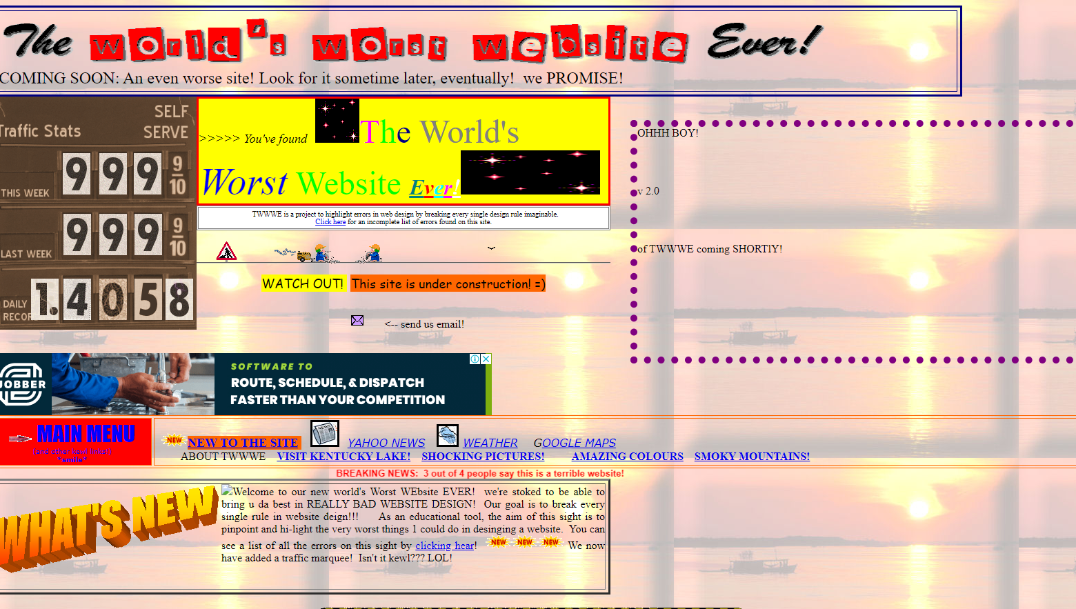
Image Source: The Worlds Worst Website Ever
Has this ever happened to you? You visited a site on your mobile or PC. However, the place was so difficult to operate that you gave up midway and went to another, better-designed site that gave you exactly what you were looking for.
Create a mobile application that offers the visitor exactly what they want within 5 seconds and further let them access the content without any hassle. The logic here is simple to understand but yet challenging to apply for the majority of web designers.
If you don’t give the best possible user experience to your site or app visitors, you’ll lose countless visitors, and several potential business leads over time. Now, it’s time to learn from bad UX examples, and UX fails, and create your business site and app with the best UX practices.
Remember that only good mobile UX can turn your users into customers. So, here are the most common UX fails that breaks the mobile experience for the users.
8 UX Fail that Break the Mobile Experience
-
Tiny Text Links
The tiny links are not a synonym for short URLs. Instead, it’s when the link in the site screen is very small to tap and access. Then you get stuck in the annoying loop of tapping the link to make it larger, then tap it to visit the link, but instead, it ends up shrinking the text to original size.
Everyone has gone through this annoying routine only to give up on the site and search for a better alternative. This UX design fail is not just limited to websites but also mobile apps.
The solution for this bad UX design is to create larger buttons with easy to navigate methods.
-
Your Users Can’t Find What They Want.
It is one of the most frustrating and common problems why sites lose visitors. In the goal of making the site as aesthetic as possible, the ease of access is compromised. By doing so, the users suffer as they get confused in navigating the site.
So, instead of dazzling the site visitors or app users with the glitz and glam of designing, maybe tone down a little by focusing more on the functionality and ease of access for the visitors.
The solution to this issue is to follow the usually accepted standards of designing instead of experimenting too much. There’s a reason why the majority of designers follow a standard format; because the users have become used to those formats.
Nobody wants to go through an elaborate tutorial just to learn how to navigate through your website or mobile app.
-
Gated Content is a Let-Down
Which is the most significant conflict that sites face with their content? If your website happens to have a beneficial, elaborate, and high ranking content that guarantees high traffic, then what would you like to have more from that particular link?
- To interlink them with other lesser ranking blogs of your site.
- Get more concentrated traffic that is your actual customer base.
- To get useful details of your target audience.
Point 1 is correct SEOwise and a usual practice that sites apply. The issue is with point 2 and 3. Many sites gate their content to achieve goals 2 and 3. Gating the material means to show the starting 20% of the content, and block the rest 80% with a small form to fill with their relevant personal information like name, email, contact info, etc.
Now, the conflict is that some sites believe that the gated content is not a good idea as a large number of users will leave seeing the form reducing the site traffic. On the other hand, some sites believe that even though the traffic will be less, but the readers that fill the form will be the right audience that the site is aiming for.
Which approach to go with is a personal choice to make by each site, but in the year 2019, the trend of closing off content and hiding your crucial asset is not appreciated. It’s the time of giving and growing together. If you have the best content, then you will get the best leads.
-
Forms Longer than the Spanish Inquisition
One of the prime reasons that companies lose millions of potential customers each year is their signup form. Take a look below and choose the best signup form according to you:
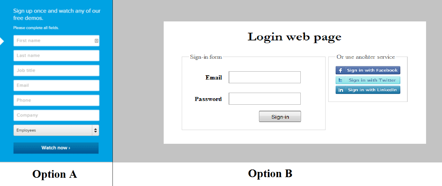
Although the option A is designed well but filling out 7 column form feels very tiresome. On the other hand, although the design of option B seems very minimal, filling up a 2 column form is always welcomed by the user. Also, there is a single click option to sign in with other social media accounts.
The image says it all. It’s best to keep your forms short and straightforward. Now, you may think that just an email id won’t help you know more about the users; you are right, but there is a way around. First, show value to your site visitors in your content. And when they get interested, ask for more information, with a promise to improve their experience with your site.
-
Mobile Users are Different than PC Users
Image Source: Wikipedia
Understand that the users coming to your site from a mobile device are different from the users that are visiting via a personal computer. What it means is that the PC users have a larger screen to work with; hence, they are more interested in reading the details of the content you are providing.
On the other hand, mobile users have a tiny screen to work with. So if you provide the site screen similar to the PC format, then they’ll see a lot of content on a small screen, which discourages them from keep on interacting with the site.
For instance, if you own a shopping site like Amazon, the PC users are here to learn in detail about the product you are selling. Hence, they want every nitty-gritty detail about the product.
On the contrary, mobile users are quite impulsive when online shopping. So, you must provide them only the critical information of the product that they are looking for so that they can scan less and order.
-
Too Much Tutorial, Very Less Working
Have you played the game Red Dead Redemption 2? It is one of the most complex, multi-controls matches of 2019. Even with a gazillion controls, people find it moderately easy to operate and play the game. The reason being that the tutorials appear only when it is relevant in the gameplay.
This same approach is to be followed by the UI/UX designers when building the page or app screen. Bombarding the user with several instructions at the very beginning of the site visit will only draw him/her away.
The solution is to keep the tutorials simple for your mobile app or unique website and keep informing about relevant features only when they need it. Also, make sure you don’t commit the exact opposite mistake of not giving any tutorial at all for your uniquely designed site or app.
-
Lack of Mobile Optimization
The mobile screens today are available in different sizes and forms. So, if your screen is only a single screen size optimized, then it is a huge problem waiting. It is an example of the classic form-over-functionality approach done by designers.
The designer builds the entire page to perfection as per the PC screen size, but in that effort, they forget (or ignore) to optimize the site for the mobile-view. Failing to optimize your app or website for different screen sizes is not just a UX fail, but an overall design fails, which is a taboo in 2019.
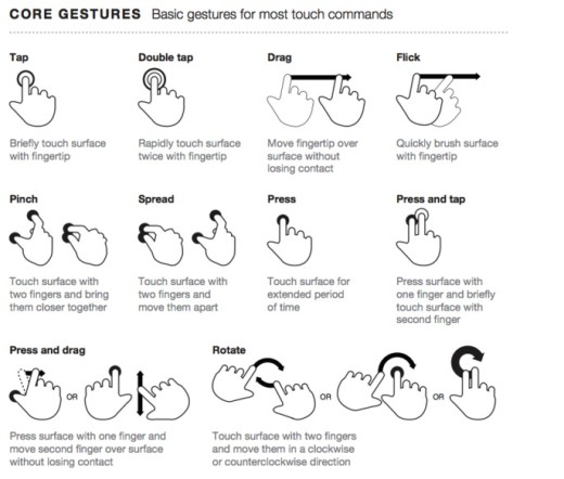
Image Source: LukeW
The solution for this design fails to learn about the various Google listed optimization options and choose the best one that suits your site needs. The mobile also offers several gestures to play with while developing your website or app; designers must try to incorporate them in their development.
Also, remember that creating a highly responsive page is not always the best idea. Sometimes the main focus is on fast loading and consistent experience across all devices, and a high-responsive design approach will always be a hindrance to these goals.
-
Issues with Dropdowns
A dropdown menu is for the ease of the users. But, it has happened several times that the dropdown menu of a site or app has confused the user and been the reason for abandonment.
Some sites make the mistake of making the dropdown menus superlong by cramming everything in one list. The other example of bad UX is that designers highlight the complete dropdown menu instead of highlighting only the once where mouse hovers. Such issues occur when people go with novice designers who are still learning about the trade just to save app development cost on designing.
One more improvement is to avoid menus where columns are well known and short lengthed. For example, typing dates or Pincode would be much faster than choosing from the list.
Some Other Common Bad UX Design Fails
-
Lacking Auto Suggests
Several designers and developers avoid taking the hard way and go on just to build plain columns for the forms. A better UX practice is to make additional efforts to build columns that have autosuggest feature, so as the user types in, they keep getting relevant suggestions.
-
Not Using Geo-Location Features
Geo-Location is a handy feature that only a few developers know how to use. Several developers believe that the GPS feature is only meant for transport based projects like on-demand taxi apps, movers and packers logistics app, or transport fleet management software.
It is a false assumption.
The GPS feature can be and should be used by any business app or website that is concerned with their user’s address (for research, survey, or delivery purposes). Your forms can become very easy to fill for your site visitors if their country, state, city, and zip code are already filled up using this feature.
-
Looking for Feedbacks? Go all the Way
Some sites ask for user feedback and then limit the characters to the column. This shows that the site only shows a half-hearted approach to get user feedback, and that also just out of courtesy.
Ideally, there should be no limit to the feedback column (or a large limit like 3000 characters). However, your feedback column should at least be longer than a tweet-length (Sarcasm Intended).
-
Don’t Inform the Obvious
Sometimes in the efforts of being too caring, companies start stating the obvious information that the users don’t need to be reminded of. For instance, if the user is pressing the sign-in page, then you don’t have to give a popup message stating that they’ll be redirected to the sign-in page.
It was an example of bad UX that Fitbit used to do. Such kind of actions can even give an idea to the users that your company thinks they are not smart enough to handle your app or website.
-
Save the Account, Not the Device
One of the biggest mistakes that several developers used to do in the earlier days was to relate all the user activity with the device which the user used to access the app.
So, in case the user loses the device or the device gets broken, they lose all their app data and points and rewards collected with the app.
The solution for this UX design mistake is to make the app save data based on the account sign in instead of the device. This way, whichever device the user logs in, all the data is provided there. It is a UX must-feature in today's time when people are changing their devices every six months or less.
-
When the App Says You Shall Not Pass
What is the most novice UX design mistake that a designer and developer can make? Connecting all the app screens to the home screen. A single press on the back button and you are on the home screen. Then the user has to start from the beginning to get to a particular page.
Another UI/UX fail; filling a long-form and pressing enter or go only to find out that the damn button doesn’t work. In some cases, the form resets, and now you have to fill the entire thing once more.
-
Multiple Buttons Serving the Same Purpose
If you are filling a form and see a “Save” button, “Save Address” button, and “Save & Exit” button, which one will you press? It is a standard error seen in local government websites. When there is a long-form to fill, they provide multiple save buttons, which can be confusing for users.
-
Lacking Relevant Button
Another issue exactly opposite of having multiple buttons is having none where needed. There have been some sites where there are no subscription/unsubscription buttons to press; this is worse than having various buttons.
Imagine that you are paying for some subscription using a site, and you added an extra zero to the amount. Now you are searching for the cancel button but can’t find one. That is a considerable UX design object that fails.
-
Broken Search Result
If you provide a search option in your site or app, make sure that the algorithm works correctly. There are several cases where the search result shows the same results, indifferent to the search query. This error occurs due to inaccurate coding or putting in error-ridden conditions.
-
Complex Password Requirements
Are you tired of coming up with new passwords with at least :
- One uppercase character
- One lowercase character
- A number
- A special character
- Minimum of 8-12 character length
- Not same as you last 5 passwords
- No portion of your email
And a lot more just for a single site or application. Then do all this once again for a new app or website.
Security of account is critical, but what would you do of security if the user leaves after seeing such complex password requirements. The solution here is to first secure the site or app from any kind of vulnerable attacks, and offer an additional security question with a simple password requirement.
A single question like your favorite superhero, or the middle name of your mother can increase the extra layer of security without much hassle to the users. Also, entering the password twice is a UX design mistake that can be simply resolved by adding a show password toggle button.
-
Links That Don’t Work
It is not a designer’s mistake, but it is still a bad UX example. The SEO people who are responsible for checking the final site page after publishing must check if there is a broken or missing link in the page and resolve it if found.
-
Hard to Read Texts
One of the UI/UX best practices is to make sure that the text in the app or site is readable in any case, device orientation, or color scheme. Illegible content is still one of the typical UX design mistakes that amateur designers and developers make.
The reason for such unreadable text could be the font, size, text color, background color, or some screen animation. Whatever be the case, the testers must check for all possible scenarios and make sure the content is entirely readable.
Make Sure To Follow Best UI/UX Practices
So, these were the top examples of bad UI/UX practices. Make sure to learn from these bad UX designs and avoid the mistakes that other sites have committed. Websites and apps with bad UX are also learning from their errors and improving.
Concentrate and work on these 8 primary UX fails and 12 smaller ones mentioned in this blog. Your mobile app UI/UX design would be perfect for your target users.