Our ability to capture data has also evolved significantly. Thanks to advances in cloud computing, we can now store massive datasets using sophisticated online platforms. We have more information than ever before and countless ways to analyze what we collect. Now, the challenge lies in sharing our findings with others in a way that is easy to understand. Our efforts to track and analyze data are useless if we cannot explain why information is meaningful.
Data Visualization
Data visualization has manifolded the human understanding of data and analytics with graphic representations. Effective data visualizations are attractive and
intuitive. They provide clarity and help your audience understand why they should care about the information being presented. Companies like Hubspot, Spotify, and Facebook have mastered data visualization and understand how to deliver visuals that are engaging and create significant value for end-users.
Data Visualization Best Practices
Designing great data visualizations is both an art and a science. You need to give the right amount of context while incorporating a balance of elements like colors and fonts. Here are some of the key design principles for creating beautiful and effective data visualizations for everyone.
Providing Clarity and Context
The first step to creating great visualizations is identifying the context for the data. This means understanding the type of data and figuring out the best display for it visually, which can be based on how clearly and comprehensively the data can be displayed. This includes the amount of data that can be presented, the spacing between the information, and the categories of data.
Making your data easy to digest can be difficult, especially if you use a large data set. Provide clarity by using chart titles and descriptions that tell people exactly what they are looking at. Chart titles are what frame the story of your data and give it purpose and meaning. Keep things simple and avoid using long titles that take up too much space or block out the chart. You can even add sorting to your visualizations to ensure that data is being presented in the right order.
Choose The Right Chart Type
Choosing the right chart type helps you tell a story with your data and connect with your audience. On the opposite side, selecting the wrong chart type can hinder all of your efforts by not easily and quickly conveying your message or data points. Your chart should reveal patterns and trends in a way that makes it easy for the end-user to understand the significance of the data set that they’re visualizing.
Bar charts (bar graph, column chart) are the most common approach to visualize amounts for different categories. The bar’s height or length is proportional to the values that they represent for each group. It is the easiest way to compare individual metrics side-by-side.
Line Charts show how a given value changes over continuous intervals. It is the easiest visualization for the human mind to observe trends over time, understand patterns in data, and quickly detect that something unusual happened. Multiple categories can be displayed on the same chart to compare the trends between different groups or products.
Heat Maps display quantitative values for two or more sets of categories. They are commonly used to visualize “hot spots” within data sets. Due to the compact nature of heat maps, they are often used with large sets of data.
Funnel Charts present the phases of a process. They quickly show the reduction of data in the sequence of steps. Funnel visualizations are an easy way to identify the bottlenecks in a workflow by ordering categories by stage. Because of this, Funnel Charts are typically used in sales, marketing, or a business context.
Pie charts present a total divided into categories by percentage. They are one of the simplest of all visualizations and therefore are best used with very small datasets.
Scatter plots can help when it comes to visualizing the relationship between two data sets. The dots in a scatter plot report not only the values of individual data points but also patterns when the data are taken as a whole.
Formatting & Accessibility
You can have great data, but if it’s not formatted correctly, your end users may not be able to interpret the data in a meaningful way. Seemingly small details like your layout, font types, and color schemes can make a huge difference. Following these best practices on formatting and accessibility are key to creating great data visualizations.
Layout and Formatting
When it comes to the functionality of your data visualizations, the main goal often becomes getting the key insights across quickly. The key to accomplishing this lies in the layout of your visualization. Keeping your layout organized and properly formatted is imperative to making sure your audience gets what they need without having to burn mental calories.
When it comes to the layout of your visualization, key information should be displayed on the top left of the screen. Most cultures read their written language from left to right and top to bottom, which means that people instinctively look at the upper-left position first.
Next, let’s discuss gridlines and labels. Gridlines give your audience a way to compare key thresholds. Without them, your mind has to draw an imaginary line to make those comparisons. Be careful not to overuse gridlines; too many can make your chart harder to read. Labels, on the other hand, enhance visual representation by displaying exact values. Labels are useful for static charts that don’t have hover states or tooltips enabled.
Font Types
Selecting the perfect text font for any given data visualization can be a tricky process. Data visualizations tend to be more engaging and perform better when the right fonts for text and numbers to go along with carefully curated color palettes. Selecting the wrong font type or family of fonts only makes it harder for your audience to understand key takeaways from your visualizations.
Font Sizes and Readability
While increasing the font size of a word may help emphasize an important point in your data, it’s not always the best route as it typically tends to overshadow the visuals. When selecting fonts, make sure it is easy for the audience to absorb words and sentences. This will increase the readability of your visualizations, making them more appealing.
Lining Figures
When it comes to data visualizations, numbers are a frequently occurring element in text and design. When presenting numbers in your data, you want to make sure they are uniform in height. Lining figures are one of the two styles of figures, with the other being old-style. Although old-style appears more elegant, lining figures are much easier to read as all digits are aligned top to bottom.
.jpg)
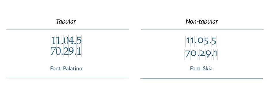
Tabular Figures
While it’s important to have numerical elements aligned in height, for other types of visualizations such as charts, tabular font figures are preferred when the numbers will be read in columns. Selecting a tabular font also ensures that numbers all maintain the same width despite any changes in character weight.
Color Schemes
When creating data visualizations, color schemes are one of the most important elements to creating effective charts and dashboards. Applying color to different parts of your visualization allows you to align the color with the purpose of your data. Well-chosen color palettes reduce the time it takes for the audience to digest and understand your data, making it easier to get your message across. Whether you are showing sequential, divergent, or categorical data, it is important to be strategic about your color choices.
Categorical data should be represented by colors that distinguish unique values or groups. Every category should be labeled with a different color.
Sequential data should be represented by smooth palettes with seamless color transitions. This helps represent metric data ordered low to high.
Divergent data should be represented by colors that indicate a quality change across a spectrum or threshold. Two-color schemes with a critical midpoint value are most effective.
Color Range & Brightness
Color palettes must have the right number of colors for the data represented. Different hues and saturations represent unique values or a specific data series that you want to distinguish for your audience. Those who want to display many different data categories might consider using a wide variety of hues to differentiate the data. Take care not to use highly saturated colors too frequently. Intense colors can obscure insights and confuse your audience.
Color palettes should also contain different brightness levels to help make your visualizations more accessible to those with a color deficiency. Variations in brightness can help differentiate elements when hues cannot.
There are many free online tools available that help you create beautiful color palettes for data visualizations.
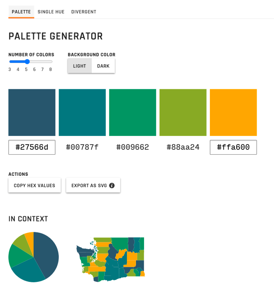
LearnUI’s Data Color Picker tool is incredibly intuitive and easy to use. The interface allows you to experiment with different color combinations for sequential, divergent, and categorical data. You can also change the background color of your screen to test hues against a darker background.
Responsive Design
As mobile becomes the platform of choice across every category, it’s imperative that you now design with mobile in mind from the beginning. Presenting data within the confines of a mobile screen can be challenging. Developers in every industry are still playing catch up to optimizing experiences for mobile. Data designers are not excluded from this, as we continue to try new ways of optimizing data and presenting complex information clearly on mobile devices. Following a few general rules, however, can create a better user experience and have a huge impact on your end-users.
Don’t Retrofit Desktop Data onto Mobile Designs
It’s the not-so-old adage of “Don’t copy and paste from desktop.” There’s a reason why websites and apps look more visually appealing (if designed well) on your mobile device versus on your desktop. A simple copy/paste of your desktop dashboard to your mobile app won’t cut it. Rather than creating a bar chart first for desktop, and then having to make each bar infinitely narrow to accommodate for a narrow screen, consider a different visualization altogether when optimizing for mobile design.
Take Advantage of the Benefits of Mobile
While mobile does have some limitations, there are impactful features, such as geolocation, to capitalize on. Utilizing geolocation tracking can give your users a more personalized data experience based on their location. You can also use landscape mode for presenting more data and capitalize on the notification and messaging systems for alerts.
Keep it Simple
Mobile users typically want to comprehend their data in seconds. Because mobile screens are so much smaller, it can be challenging to convey an entire trend on a little screen. Mobile users rely on their devices to connect them to personal data and experiences. Highlighting key indicators or data points make a big impact. For example, visualizations that display steps taken, the weather, or a navigated route directly relates to the user at any single point. Therefore, bold numbers that display a data point at one point in time, such as the temperature outside at one hour or calories burned after one workout, are effective.
Direct Attention
As you design your visualizations, keep in mind all the sensory elements mentioned, such as size, color, and fonts, to direct your audience’s attention to your data’s important details. Drawing the attention of your audience with conditional formatting, reference lines, highlight trends, and project forecasts will help to increase the time spent viewing your charts, leading to a better comprehension of the significance of your data.
Interactive Elements
Giving your audience the ability to dig deeper into metrics, trends, and insights is another way to direct attention to your data. Consider using elements such as tooltips, drill-downs, click-to-filter, and time interval widgets into your designs.
The Evolution of Data Visualization
In closing, the most important thing to remember when it comes to data visualizations is that they are ever-changing and evolving. Having the ability to optimize and tweak your designs in response to the changes around you will ensure you never get stuck in bad habits and that your visualizations will continue to be successful. It’s imperative that you consistently seek feedback on your design practices. By requesting regular input from your team and asking the right questions, you’ll be able to improve the layout, functionality, look, feel, and balance of KPIs to ensure optimum value at all times.
It is not possible for every business to look into all the intricacies. But, you cannot ignore the crucial aspects that can help your business achieve better RoI. The top data visualization companies take care of all the best practices and details to power your data. Contact the best one now!