What’s the best place to bury the dead body? – On the second page of Google.
Your website will literally become a dead body if you do not make it mobile–friendly.
If we take the website of any big brand into consideration, you’ll notice that those websites have more traffic and lesser bounce rates because they are more accessible via mobile. Some effective ways in which these brands ensure mobile-friendliness, for instance, is that their elements are not stacked one upon another and buttons are smaller making them easier to click. The point is, their website layout is mobile responsive or say mobile-friendly.
Needless to say, mobile responsiveness is the need of the hour as people prefer to open most websites on their mobile devices.

Source: Statista
Statista says that as of 2022, 6.5 billion people will own smartphones which will go up by several hundred million, to 7.6 billion by 2027. Hence, if unlike Google products, your website doesn’t open on mobile or other techno-toys, your survival can be in danger and even the man in a blue suit and red cape, who is an expert in tweaking the timeline, won’t able to save you.
Thus, in the article below, we have explained 11 easy and practical ways work upon website performance optimization with the help of web design companies.

1. Responsive Blueprint Is the First Step to Going Mobile
One of the Google products Google Maps started in 2005 and ever since it has been evolving. But they weren’t acclimatized to operating on smartphones. That was because its blueprints weren’t responsive. The reason being they lacked a touch screen.
It had the bare essentials for a mapping app and lacked the elegance of the modern interface. Still, it was ahead of its time in mobile cartography and leveraged Google's large database of business listings.
When Apple launched its first smartphone in 2007, that’s when Google Maps went mobile. Still, they were only operative in Blackberry, Palm Devices, and others. Finally, in 2012, they were Android and iOS integrated.

Source: googlesystem.blogspot.com
Thus, from the Google Maps case study, brands need to learn that they need to have responsive blueprints for various devices. Initially, Google maps were only desktop friendly and people searched for the places nearby as shown in the figure.
Hence, it is crucial to remember that you are not in 2007 but in 2023 where almost every one in three individuals has a smartphone. Thus, before thinking about adding the features make the budget for making the website device friendly.
Having a separate desktop website, mobile website, tablet website, or notebook website requires lots of maintenance and too much money needs to be invested in it. Rather a responsive website will manage itself on every device.
2. Website Loading Speed Matters the Most
Website speed is another thing that needs to be taken into consideration while creating a website. Slow website speed means losing a potential customer and losing a single customer is unaffordable. More than 40% of people leave if the website takes more than three seconds to load.
Hence, to deliver an impressive user experience for first-time visitors, a website should load fast every single time it is opened. For example, the world's most popular E-commerce websites like Amazon and Walmart say that when the load jumps from 1% to 4%, there is a sharp decline in conversion rate.
Think with Google says, “As page load time goes from one second to 10 seconds, the probability of a mobile site visitor bouncing increases 123%.”
Search Engines like Google, Yahoo, and Bing will direct shoppers and users to sites that load faster. They favor websites whose content loads faster on the above fold. Whatever they can see should load faster as compared to the rest of the page. What is important is their convenience and they might not even notice that the rest of the page isn’t loaded if they can see what is loaded.
One of the tips for faster website loading speed is to minimize the redirects. They take too much time in loading the page, especially when they are being loaded from mobile. Mobile users often use less reliable internet connections, which is why redirects are a huge turndown for them.
The ultimate goal of every business is conversions but no conversions happen if people do not choose to stick around and shop more. Unfortunately, more than 40% of website visitors do not return to poorly-loading websites.
3. Lighter Images Will Help Sustain the Website
Again, Google Maps is one of the best examples when it comes to uploading lighter images for mobile websites. By introducing sustainable ways to navigate maps, and using images to search for places, Google Maps gives you chance to upload images as well. When you do so, you’ll be presented with rules to upload images and the quality isn’t the priority, heaviness is, which is why Google Maps is thriving.

Source: street-view
If you’ll see the above picture, the above image is clear, and the image below is blurred. But these load within seconds of scrolling down. Now for a person browsing this blog, the clarity of the image below the fold isn’t necessary, but the because it loads faster, he/she will scroll through the blog.
Not only images, but Google Maps also keep updating and adapting to the trends, which include Street View Trekking – capturing the imagery of unusual places like the Grand Canyon. Along with images, they are into videos too, which help people navigate places of whatever neighborhood they are in. And last February, i.e., in 2022, they announced Live View.

Source: global localization
Despite constantly evolving and updating, and adding new technology, Google Maps haven’t stopped loading faster, whether on a desktop or mobile website. If anything, they have been acting more quickly with updates. Also, Google Maps have gone offline, and no internet connectivity is required.
4. Content Customization is the MVP of Responsiveness
While optimization website's performance, the brands don't need to keep the same content. As mentioned above, most people open the website on mobile, and they are accustomed to little content as compared to larger screens on the desktop. And heavier the content, the more time the website will take, to load.
Thus, mobile users need not be presented with embellished details. Just the gist of the content is enough to arouse their interest. Below mentioned are the screenshots of the desktop website and mobile site for Ceremony Coffee. It is a coffee brand that strives to provide stunning coffee to cafes and partnerships.
Looking at this eCommerce website helps customers purchase the product hassle-free. In the hero header, the slider is added to display amazing content. Furthermore, the presentation of the new arrivals also looks fresh and innovative. The animations add elegance to the design and it also comes with a stunning Instagram feed too.

Source: ceremonycoffee.com
What more do you need? It conveys everything that it needs to without clustering the mobile screens of people. This is the kind of website smartphone users prefers.
Having said that, the downside of customizing content is people lose trust, thinking it is a fake site. Thus, one of the biggest challenges is to create content that is relevant to the brand because, without it, people will lose faith in the brand.
Thus, customize the content of mobile as per requirement and do not mess up by taking too much creative liberty. If you are confused about how to tweak the content, play with colors and words without changing the meaning of the content. The colors are the keys to customizing the content according to the mobile website.
5. No–No to Pop-Ups That Annoy Customers
Whether you open the desktop site of Google Maps or mobile site, no sponsored ad will be seen. It is still acceptable when you accept sponsored advertisements from various brands, but they can sometimes be irritating. And it is specifically annoying when the person is operating the website on a mobile phone.
Usually, marketers don’t want anyone to miss their offers. So, they trigger a popup to appear as soon as visitors arrive on their website. Unfortunately, this has an adverse and negative effect on user experience and conversions.
Users will be annoyed if they’re confronted with a popup before they’ve even had a chance to digest the content on the website, which is the reason they came here in the first place. Instead, brands should delay the popups and trigger them at just the right moment. This will ensure they improve, rather than detract from, the user experience.
And it is necessary to remember that no pop-up is for everyone. Thus, even if you want to introduce pop–ups, make sure they hit it at the correct time and not when the audience is consuming the content. Or make sure they are subtle, like the image mentioned below.
The little purple button with a leaf on the down-right corner is a pop-up but doesn’t open unless the user clicks it. This is one of the lest discussed yet most important point for weebsite performance optimization.

Source: maybellstudio.com
This is the best way to ensure people respond to the pop-ups of subscriptions, offers, or discounts without actually irritating them. Brands should want customers to engage with them deeper for more extended periods of time, not leave them even before they have started.
6. Button/Switch Placements Can Make It or Break It
If you’ve seen Google Maps mobile site and website, they have different button placements. While on the website, the search bar is in the left-up corner, whereas on the mobile site, it covers the whole upper fold. These days, when people use mobile for everything, the desktop site of Google is only used by people to check the distance to and fro.
Google Maps of 2005 were designed for desktop sites whereas, in 2029, Google Maps Live is specifically designed for smartphone users. Again in 2022, when ChatGPT is a buzz, Google has introduced Google Maps Live, where viewers get Landmark, Location Sharing, and Accurate Pin.

Source: live-view-google-maps
If you think about the live feature, one might not be able to access it on laptops or desktops because those are hard to carry around. But smartphones are not; thus, Google decided to introduce it for phones in the form of an app. It might be hard for small businesses to get the apps created, which is why a mobile-responsive website is an answer to all queries.
7. Fonts Are Valuable to the Website Thriving on Written Content
According to Morphos, “Typography accounts for 95% of a website’s design. Many aspects, such as font choice, adequate length, and size of the text, as well as the hierarchy of the typographical layout, helps guide users through the site.”
Believe it or not but choosing the correct fonts for the website is not everyone’s cup of tea, but those who know the importance of fonts in the website are absolute market heroes. If you take the example of Mint which is an E–newspaper site, they have used the best fonts for their website as well as an app.
Also, if you check their mobile site, it looks clean and attractive. Unlike other newspaper apps, one doesn’t need to download the app to take complete advantage of this newspaper. Thus, when the website designers of India know how to do their job, they end up improving website's performance.

Source: livemint.com/budget
Fonts are said to be the backbone of the responsive website design, and they need to complement the brand and the background; otherwise, it will be a huge failure. Fonts not fitting the brand’s philosophy will not make coherent sense to the consumers. And they decide on readability, especially for the brands that thrive on written content.
8. Declutter the Actual Website and Design a New One
Sometimes, the original website design doesn’t work for mobile devices. Hence, it needs to be decluttered completely, only keeping the basics. Below mentioned are two figures of the mobile websites of universities – one on the left is the image of Yale University, and on the right is the image of Oregon State University.

Source: art.yale.edu

Source: oregonstate.edu
While Yale is the better and more reputed university, its website doesn’t say so. Thus, websites like this need spring cleaning. Remove unused elements, and everything needs to be in sync. The fonts should match the background, and the details should be precise. The readability of the website needs to be better too.
Here are a few tips for decluttering the website and optimizing its performance:
- Maintain a sense of uniformity throughout the website
- Select a subtle color palette. You can never go wrong with grey and black.
- Don’t use bold borders and lines
- Make some room for white space
- Adjust scaling and sizing of the elements
- Remove unnecessary embellishments
- Ask the customers before making it live
- Make it aesthetically pleasing
9. Testing Whether the Website is Mobile responsive is Must
Most brands make the mistake of not testing the website to be mobile responsive from time to time when they produce new content. And it all ends up looking chaotic and messy. Thus, it is a must to test the website's responsiveness. Also, when the website is tested for responsiveness, it will be tested for bugs and errors too.
No brand has the same kind of target audience, not even Tesla or Lamborghini. Different users use different devices, different kinds of internet connections, different OS, different hardware, different screen sizes, different browsers, etc. Thus, along with the need to create a responsive website design, it is necessary to test whether it is integrating perfectly with all devices or not.
Below mentioned is the perfect example of Dribbble which is a self-promoting social networking site for designers and illustrators. It integrates perfectly with every device because they have made sure no matter who opens this website on whatever device, they see a beautifully designed website with practical functionality.
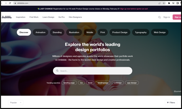

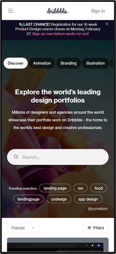
Source: dribbble.com
10. Focus On Scrolling as Mobile Sites Differ From Desktop
The scrolling, whether on desktop or mobile – is hugely different from each other. Desktops and Laptops have more comprehensive screens, whereas mobile screens are more diminutive. And people spend more time scrolling from phones since it is handier than other devices. Smartphones have touchscreen facilities which lead to more scrolling.
Content Marketers focus on long-form content to boost SEO. And if the website does not provide easy scrolling, users become victims of scrolling fatigue. They either become zombies and lose their focus on the content, or they ragefully quit the website for making it complex.
And while designers think it is okay to create the false bottom, it is not. It is not okay to think customers won’t be interested in what is written below the fold. While the area above the fold is your prime real estate, it should also provide evidence that there is still valuable content that can be accessed by scrolling.
Thus, it is a must for the brands to go above and beyond to make sure the mobile website scrolling of the brand is not tedious, chaotic, and exhausting.
Bonus: Giving Space to Links to Avoid Accidental Clicking
Many do not understand this, but the ones who are pro do, that it is necessary to keep the much-required distance between the links. Mobile screens are smaller, which is why space is smaller and congested. If two separate links are placed side by side, there is the possibility for the user to tap the wrong link and go to the wrong landing page.
Tapping the incorrect link might frustrate the user, and he would leave the website altogether, which will increase the website's bounce rate. Thus, it is vital to give enough breathing space to the links for website performance optimization.
Conclusion:
Every phone – be it Android or iPhone, has Google Maps, either default downloaded or externally downloaded from Playstore. People who do not use Google Maps use Google Maps too, if not in an app, then in the browser. Because Google Maps is not only helpful but works perfectly with every device. It has seen a massive amount of success because it stays updated with trends and keeps introducing new features every now and then, like GOOGLE LIVE.