"Your website is the center of your digital eco-system, like a brick and mortar location; the experience matters once a customer enters, just as much as the perception they have of you before they walk through the door." - Leland Dieno
A web design is a first impression for any website and hence the respective business. Whether running a blog, a business website, or an eCommerce website, your web design must be impeccable and attractive.
Many factors contribute to making a web design unique and easy to glide through. One such factor we will discuss in detail in this post is website navigation.
An undetachable and crucial part of an overall web design is website navigation which directs visitors to their desired page(s). Besides, web navigation elements in a web design make it easier for visitors to find what they are looking for without much hassle.
Some of the top web designers around the world consider poor website navigation to be the key reason for most website failures.
Website navigation, often neglected by amateur web designers, is a crucial element that can either make or break your website and business's first impression. Let's move ahead and learn more about web navigation and its importance.
A Brief Overview of Website Navigation
Research by Goodfirms shows that around 61.5% of web designers believe bad navigation is one of the major reasons visitors leave websites.
Website navigation is an element found in almost all websites, although the type and quality might differ from each of them.
As already mentioned, website navigation directs visitors to the desired page(s). It allows them to effortlessly get to the page they are looking for or gather the information they require from the website.
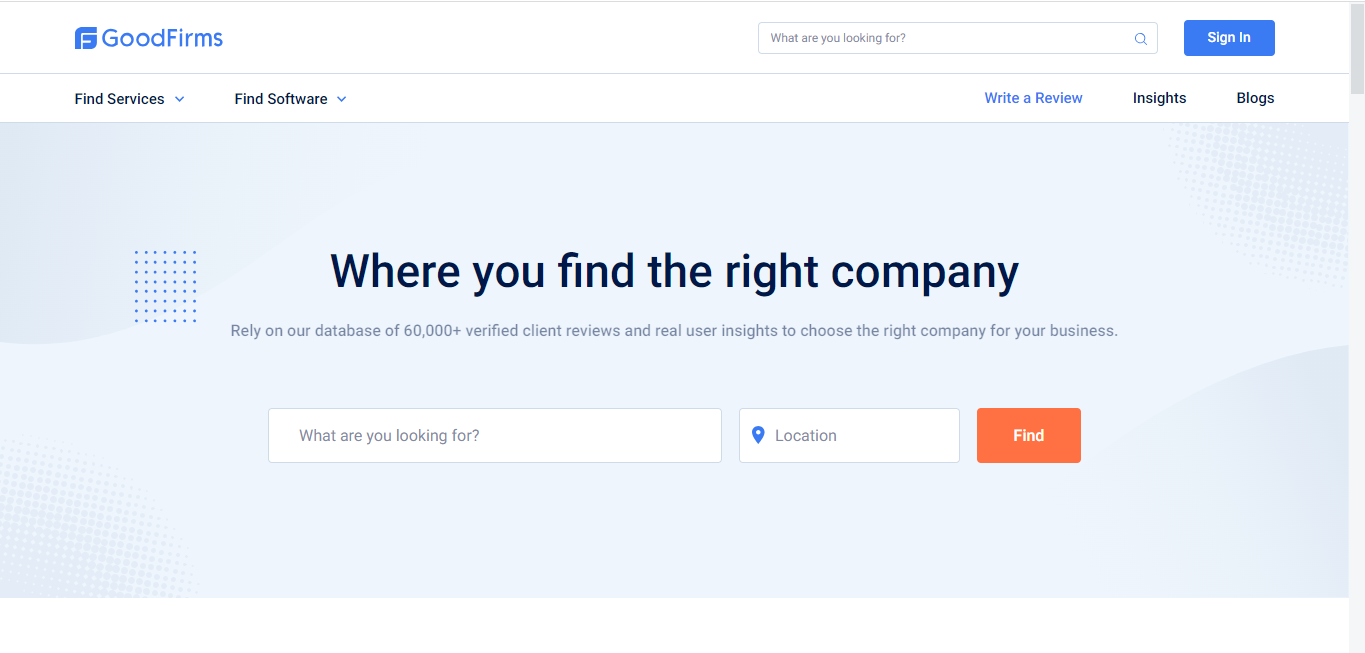
In the above example, all the buttons, such as Find Services, Find Software, Write a Review, and all other options placed in the same horizontal bar, are part of website navigation. There on the top-right end corner, you can see a search bar, one of the crucial elements of website navigation.
Why do these elements fall under website navigation?
Simply because all these elements directly take you to the service pages or any particular page you have been looking for. These elements, in a way, direct us to various pages of the website, thus making things easier for the visitor.
Types of Website Navigation
Website navigation can be found in multiple types and various positions. Let's discuss some of the most famous navigation types in leading websites worldwide.
#1 Horizontal Menu Bar
The horizontal menu bar is one of the most common web navigation types. The infographic below shows the horizontal bar navigation on a website.
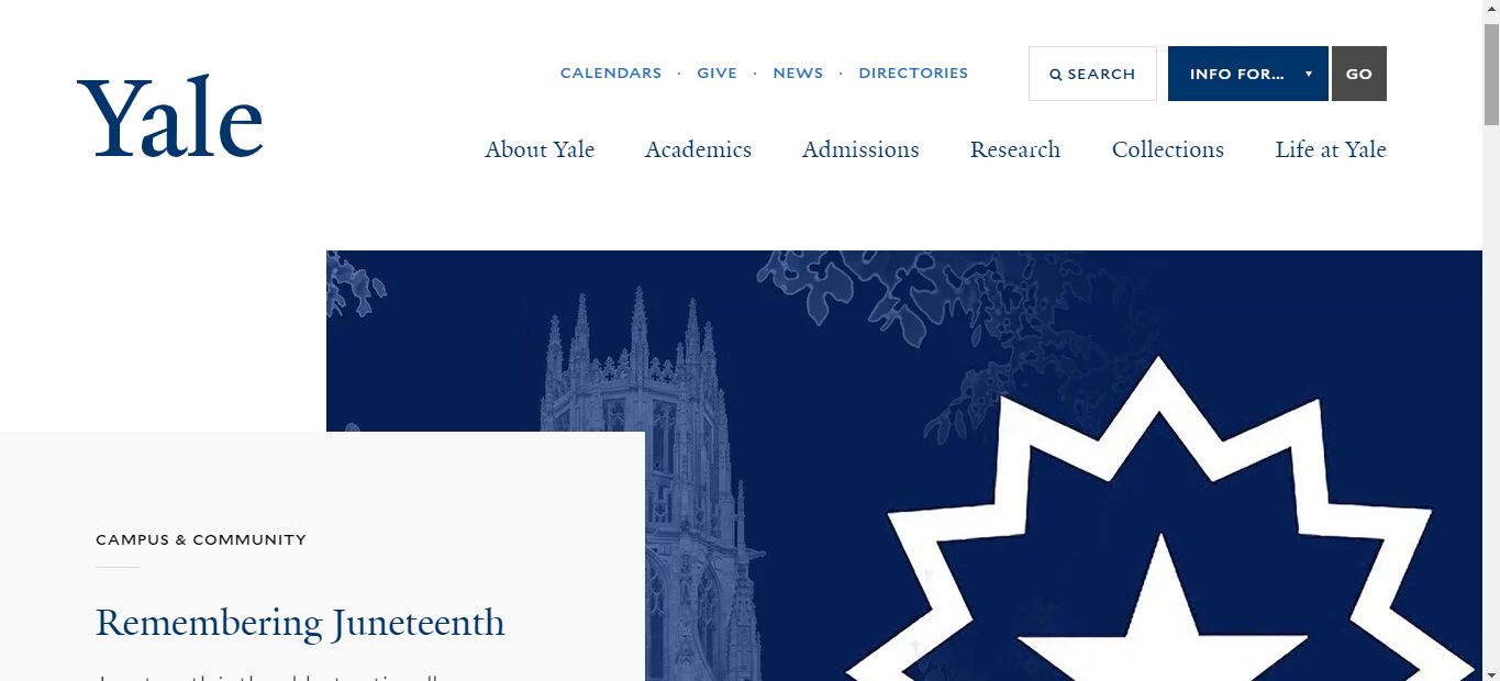
Source: Yale University
In the image, you can see that various options available on the website are lined horizontally, along with the most wanted navigational element, a search bar.
Horizontal bars can usually be found on the top of the website, where visitors can spot them easily.
#2 Vertical Sidebar Menu
A vertical sidebar is also one of the popular website navigation types. The infographic below shows a standard website with vertical navigation.
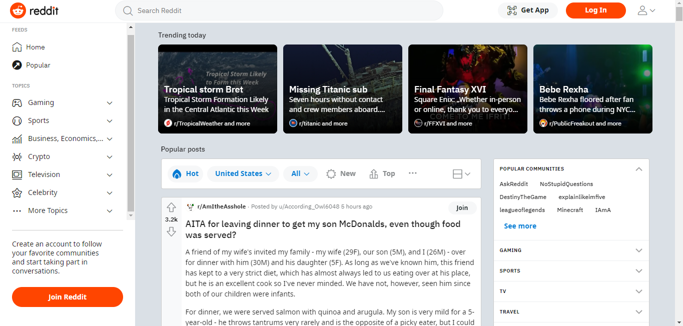
Source: Reddit
In this image, you can see most of the service page icons and available options, such as games, sports, crypto, etc., are placed vertically on the left end of the page.
One of the key advantages of this type of web navigation is that you can add more options or navigational links compared to the horizontal bar. The reason is that vertical or, say, down scrolling is more convenient than horizontal scrolling.
Don't you agree?
And therefore, due to the inconvenience posed by horizontal scrolling, adding too many menu options in the horizontal navigational bar is not recommendable.
#3 Hamburger Menu
The hamburger menu is one of the most inclusive website navigation and, at the same time, screenspace saving too. Let's look at the example below to understand what I just said.
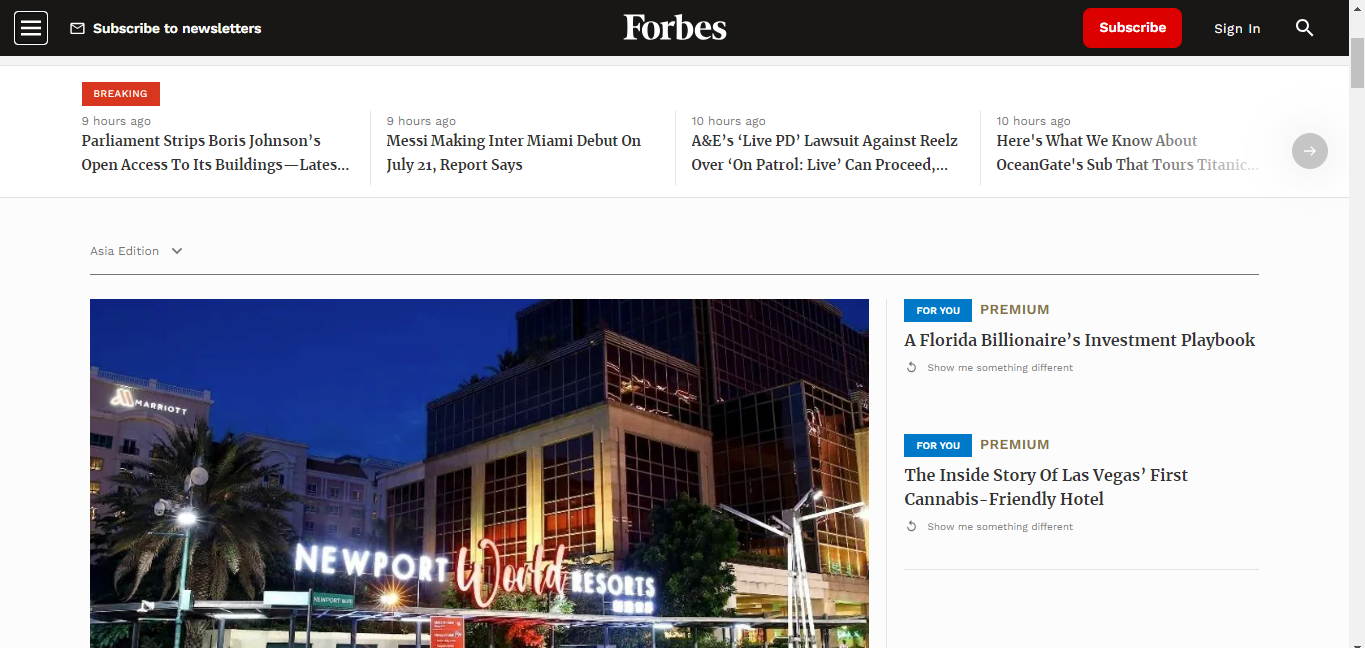
Source: Forbes
The hamburger menu is represented as three small parallel lines that most of you might have seen on websites. It is named hamburger because the three parallel lines are analogous to it, two lines represent bun, and the middle line is patty.
All of the options and page links are hidden under this tab. Once you tap it, all the items or options will appear for the visitor, as seen in the image below.
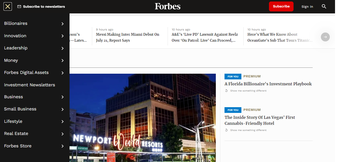
As mentioned, one of the big advantages of hamburger is that it does not occupy space on the screen and can be placed anywhere. But the same advantage poses a disadvantage too.
The disadvantage is such menus may sometimes go unnoticeable to visitors, or a visitor may not be able to access them because of a lack of knowledge. This could especially be true for older people.
#4 Footer Navigation
Footer navigation is again one of the most common yet essential navigation tools found at the bottom of every website. Nowadays, every website, no matter the business it represents, has footer navigation at the website's bottom.
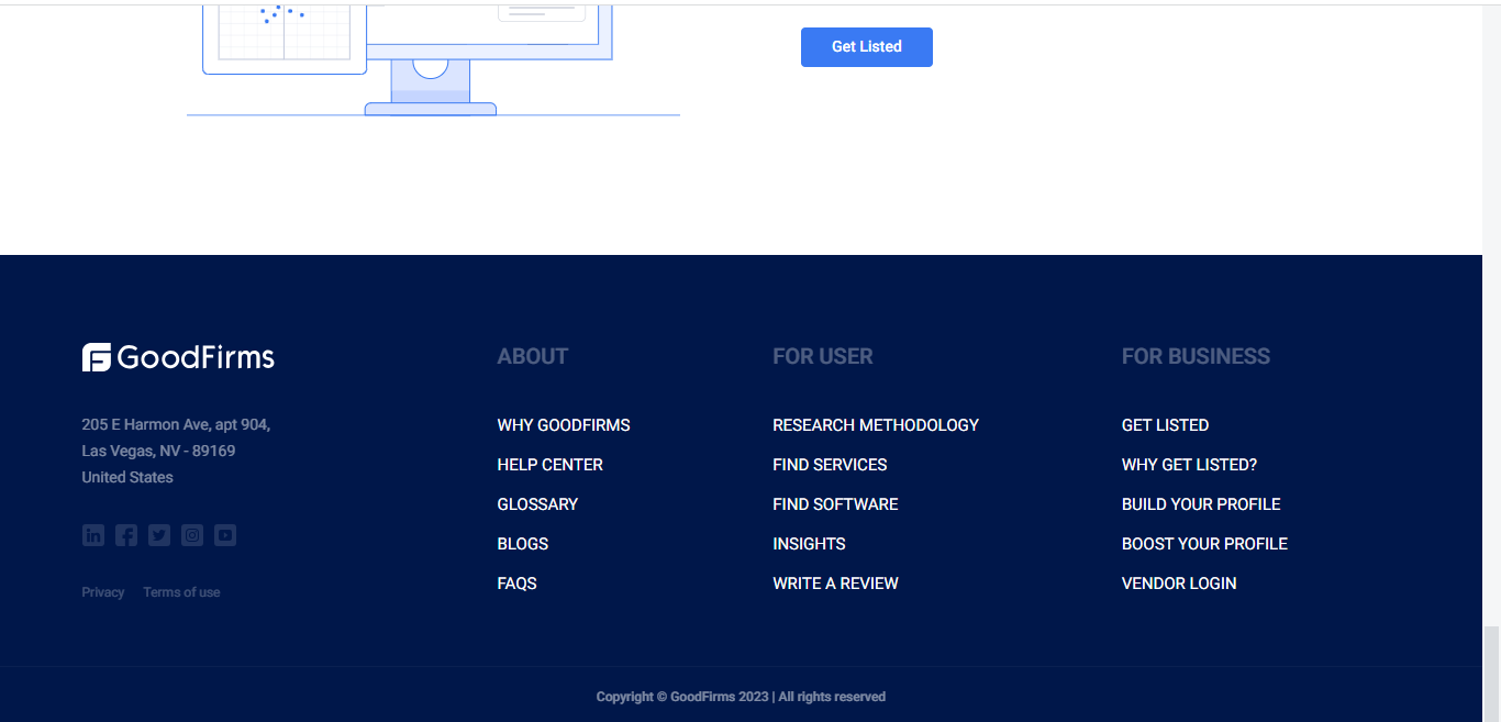
As can be seen from the example, the footer navigation, along with some important page links, consists of some quick links to some of the leading services of the website. Primarily it consists of tabs like about us, contact us, links to legal documentation, company address, and the feedback submission provision.
#5 Dropdown Menu
Dropdown menus are usually accompanied by other navigational menus, such as the horizontal or vertical sidebar.
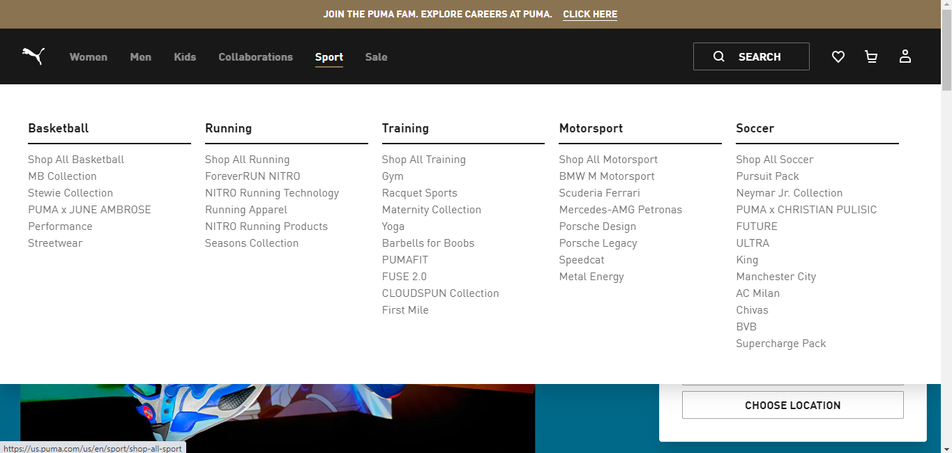
Source: Puma
From the example, you can see how dropdown menus look and where they are positioned. These dropdown menus are placed under the main category tabs, and when the tab is clicked, the whole dropdown menu opens up with all the relevant navigational links.
The image shows that when you press the "dash" tab, the menu opens with relevant links such as "add links." Dropdown menus are an excellent way of making horizontal bar menus house more navigational page links. Thereby making it more accessible and convenient for users to navigate the website's various pages.
Mixed Website Navigation Example
Mixed website navigation has become very popular with its presence on some of the leading websites worldwide. The best example of hybrid website navigation can be found on the official website of Youtube.
By mixed website navigation, I mean the presence of more than one type of web navigation on a website. The below image shows the main homepage of youtube, a perfect example of the presence of the three key web navigation types.
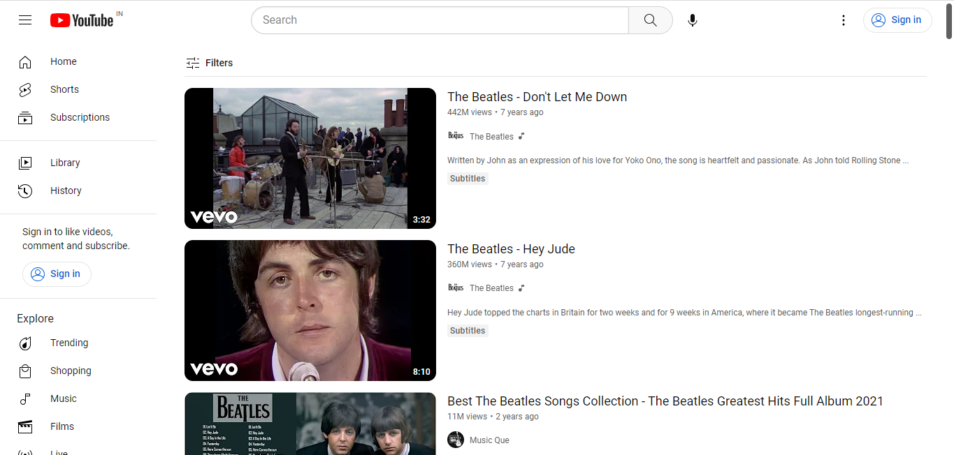
Source: Youtube
As you can see in the image above, the youtube homepage has got at least three principal web navigations; a horizontal bar, a vertical sidebar, and a hamburger menu.
Advantages of Robust Website Navigation
Now that we've learned almost all the types and key details about website navigation, let's know more about their advantages and necessity.
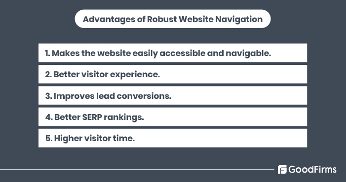
#1 Makes Websites Easily Accessible and Navigable
As we can gather from our discussion till now, we can easily conclude that web navigation is a crucial element for any website responsible for navigating the visitor to get his requirements met.
Without proper website navigation, it becomes difficult for visitors to get what they want without juggling. This makes them lose interest in the website and hence leave.
To ensure this doesn't happen with your website, you must have proper web navigation.
#2 Better Visitor Experience
It is imminent that if the visitor can derive what he needs from the website in minimal time and conveniently, their website experience will be good. We are always, even as humans, judged by our first impression, and the same way a website is judged by its web design, also known to be its first impression.
If your web design does not have a robust web navigation structure, it'll surely ruin your visitor's experience. Hence it is vital to have a proper web navigation structure that gives complete and appropriate direction to the visitors.
#3 Improves conversions
A website and its reputation highly affect its lead conversion rate. When visitors or, say, leads come on your website looking for any services, and if they can find the details about it and can book those services conveniently, then it is imminent that they'll visit again. This will further improve the visitor retention rate.
With a higher visitor retention rate, the lead conversion chances will also increase simultaneously; if you are a business selling services, more will be chances that visitors will book them.
#4 Quality Visitor Time
A robust website navigation highly improves the overall time spent by a visitor on your website. Quality navigation helps visitors find what they need quickly, as they can spot various helpful links just with a single glance at the homepage.
And if visitors find what they are looking for in record time, it is obvious that they will stay on the website and thereby spend more time on whatever they are looking for, be it information or booking a service.
Assume you are running a blogging page and discuss various topics ranging from science and technology to home and decor. You are doing everything right; your blogs are exceptional, but visitors do not stay for long.
One of the major reasons behind such happenings can possibly be poor web navigation. This happens because visitors might be unable to understand what your blog is all about and the genres it provides due to a lack of good web navigation.
If visitors find your web design pathless, they will leave without wasting a second. Hence to ensure that no visitor leaves the website and rather spends quality time, make sure the navigation is flawless and effortless.
#5 Better Search Engine Rankings
Good website navigation can significantly improve your visitor's overall experience with your website. A better visitor experience will lead to higher visitor time and conversion rates.
All of these parameters directly suggest search engines about the quality of your website. Thereby improving your search engine rankings.
Website Navigation Best Practices to Follow
There are certain practices that ensure a robust web navigation system and must be known and followed by every web designer. Let’s discuss some of the key practices that are considered a must for web designers to follow in order to create a robust website.
#1 Keep It Simple

Whoever said it said it right, simplicity is indeed the best policy. This principle sits right when we are talking about web design and also web navigation.
Web navigation in your web design needs to be inclusive but, at the same time, needs to be simple. Only add those navigational links and buttons that are enough and cover most parts of your website.
Adding excessive options in web navigation will make your website more complex, confusing, and difficult for users to navigate.
#2 Add a Search Bar Where It Can Be Spotted quickly
Search bars are one of web navigation's most basic but essential elements. It is rare not to find it on a website, although some websites still do not choose to add it and hence suffer significantly from low traffic.
Meanwhile, some websites with a search bar suffer from low traffic, too, due to poor visitor experience. One of the many reasons for poor visibility is the wrong positioning of the search bar, due to which visitors fail to notice it.
To avoid such issues, it is essential to place the search bar where it is very easy to spot at first glance. Top-right and top-center are considered the most employed and the best places to position a search bar.
#3 Choose Your Web Navigation Type Wisely
Many web designers use all of the five key web navigation types, while some use two or three together. Whereas some basic websites only have one type of website navigation.
Web designers must accurately figure out what kind of navigation and what types they will be working on before moving on to the designing phase. Some of the top websites worldwide use at least three different web navigation types, just as shown in the YouTube example, which has three web navigation types.
But not all websites need this many because the higher the number of elements you keep adding to your website, the more the overall development cost and complexity will be. Therefore to make a decent website, web designers need to put only those web navigation elements that are enough to accommodate all the key navigational links.
#4 Choose Self-Defining Menu Titles
The menu titles or, say, the title you give to the key options that you provide in navigational menus should be self-defining. By self-defining, I mean titles that are self-explanatory with regard to their submenus or the type of navigational links they contain.
For example, if you run an online gaming website, your titles on the web navigation bar must be crystalclear. Such as, if the menu takes you to board games, the menu title should be “board games” or something of that sort. If you want to create a menu that lists top games popular amongst visitors, then your title should be "Top Games."
Such a practice makes it easier for visitors to get their hands on the services they are looking for, thus improving their experience.
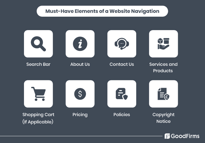
Essential Elements of a Website Navigation Bar
Wrapping Up
Website navigation is a crucial element of a website, no matter what type of business it represents and the nature of services it provides. Website navigation is entirely responsible for giving your visitors direction and providing a way to quickly use your services and the things they want from the website without much hassle.
In this post, we provided readers with key details on website navigation that they need to understand to know their importance. We discussed the five key types of web navigation used in websites around the world. We also discussed the advantages and challenges of web navigation and its use.
Web navigation for any website needs to be flawless, easily understandable, and accessible for visitors to stay and visit again. Hence for a better overall website experience and business reputation, it's essential not to neglect web navigation and design an impeccable, highly detailed, but simple web navigation.