Each Customer interaction with your business is purely based on your brand and its visual appeal. Good Web design is an effective aspect of any online business. Since the start of this year, many new trends have emerged within the web design industry. Be it the appearance, functionality, usability, interactivity, there are examples of website designs that are pushing the boundaries. And as you start analyzing some of the website designs, you’ll come across few aspects of website designs that can draw customers’ attention effortlessly.
This article will take you through 14 of the best website designs that can inspire you the most. The intention is to familiarize you with those key aspects that went behind their website design. Interestingly, you will realize that some of the best website design software solutions are capable of making website designing process easy, effortless and time-saving.
Let’s get started.
1. The Cool Club
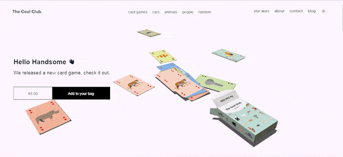
The key highlights of this website include rich micro-interactions, hover effects, and white space. While navigating through The Cool Club, people can easily click the card box to deal cards one by one. Moreover, when they move the cursor over the words on the navigation bar, the words will shake and wave correspondingly. All in all, The Cool Club is an interesting site with a lot of micro-interactions and considerable use of white spaces that grab the users’ attention.
Your takeaway:
The micro-interaction design is quite popular among UX/UI designers. If you’re looking forward to creating an interesting and compelling website, then, we highly recommend you to include rich micro-interactions in your website’s design, along with the effective use of white space.
2. ProofHub
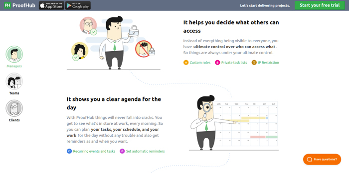
The key highlight of this website includes ‘clean’ design and ‘clear’ user experience. ProofHub’s website maintains a fresh and timeless look with a simple color scheme and basic typography. People can understand clearly what the site is all about within minutes of visiting. Even more importantly, the content of the website provides the exact information that the user is seeking, keeping them on the website longer.
Your takeaway:
Simpler designs are better. By using basic typography and the simplest design, you can maintain an appealing look for years to come.
3. Waaark
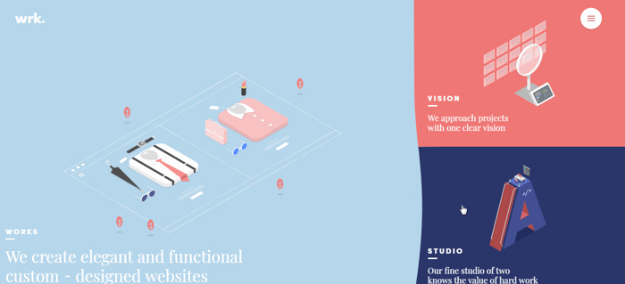
The key highlight of this website includes great fluid effects. Waaark website attracts and retains its users with the help of really cool fluid effects. The illustrated design style not only catches your eye—it takes your breath away.
Your takeaway:
Fluid effects are trending in web/app interface design, and it’s certainly worth adding to your UI design. So when you’re working on your next website design, focus on enhancing its visual appeal with some good fluid effects.
4. Bliss

The key highlights of this website include bright colors and fun graphics. Bliss’s overall design has a fresh, beautiful, and engaging feel that insists people to explore, engage, and buy. The color scheme and photography element (product images) of the website is a plus point.
Your takeaway:
Make color scheme and photography your favorite attributes in website designing. Play with bold colors that complement your brand’s vision. Use fun graphics and GIFs to make things more catchy.
5. Bon Bon Bon

The key highlight of this website includes responsiveness and decorative DIY styled look. The design is full of spirit and swagger. The customization and responsive design of Bon Bon Bon go beyond the template feel. It engages online customers through its creativity. For example, it provides an option called “Build a Box Box Box” in which people can select the confections of their choice, add them to the corrugated cardboard box, and get them delivered wherever they want.
Your takeaway:
For any e-commerce website design, try to showcase your creativity and engage online consumers. Create a design that is unique for your clientele. Keep it energetic and personable.
6. Skullcandy

The key highlight of this website includes color scheme and product photography. Skullcandy’s website comes to life with its unique colors and products. In addition to that, the ease of use and frictionless flow of the customer journey really makes Skullcandy stand out among the competition.
Your takeaway:
Focus on excellent photography and product presentation. Ensure that the design connects with your brand's story.
7. Apple

The key highlight of this website includes powerful product photography. The stunning product photos on Apple's website really stand out. The special lighting and literal whitespace draw your attention immediately to the product's sleek design - they almost make the products appear like they're going to jump out on the website. Those hyper-realistic, sensational photographs are taken from quirky angles to highlight the products are admirable. It's an interesting idea—especially if you have the time and money to invest.
Your takeaway:
“A picture is worth a thousand words”—and in the case of website designing, it can lead to a hundred conversations. Consider spending some time knowing about who is visiting your website and who is more likely to buy your product. Go by your offering and make sure that your customers see the same.
8. Feed
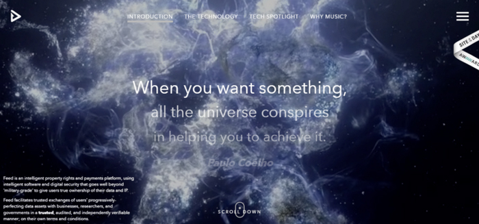
The key highlight of this website includes engaging experience and a creative blend of animation and video. Feedmusic.com is one of those websites that is built on an interesting concept and is using that fact quite well in its design. Feed is nothing like a typical website—It is a stunning website with an interesting combination of animation and video content. The website is really welcoming especially the navigation that doubles as a scroll progress bar. In all, Feed focuses on providing its visitors an engaging and interactive experience throughout.
Your takeaway:
Videos, full-screen moving images, scalable vector graphics (SVGs), sliders, hover effects, graphics interchange format (GIF) animations, etc.—there are so many elements that you can include in your site’s design. Just think about how you want your website to behave and how you want it to interact with your users and then pick the best elements to add to your design.
9. Harry's

The key highlight of this website includes its mobile responsive theme and a clean-shaven look. Harry’s, which was built using Shopify, shows impressive mobile performance with its clean, sleek design. It is an ideal example of how an e-commerce website should be designed—everything is clearly presented, easily dismissable, and most importantly, short.
Your takeaway:
A recently conducted study indicates that more than 80 percent of shoppers plan to make mobile purchases in the near future. Make sure that you use this insight to your advantage by investing in the latest mobile responsive themes.
10. Mikiya Kobayashi
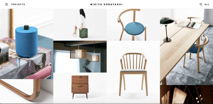
The key highlight of this website includes strong photography and subtle animations. Mikiya Kobayashi is a website of a product designer who showcases his work through a minimalistic portfolio. The website demonstrates international scalability in its design along with stunning photography and subtle animations that react to a user action.
Your takeaway:
The art of animation can be used for any website design, and people love it. But don’t make the mistake of including too many animated elements in your website design. Remember, if you choose to add something to your website (video, photo, text, or animation), make sure that it is fulfilling a purpose.
11. Crypton Trading

The key highlight of this website includes its tech-savvy feel. Crypton Trading is a prime example of a conversational user interface. The website is all about cryptocurrencies such as Bitcoin. The website is widely popular for its development and design. Even if you’re not a crypto fan, you will surely be amazed by the conventional UI and scroll-triggered animations of this website.
Your takeaway:
Animate your page with scrolls. And while doing so, make sure that your users are not experiencing slow page speeds due to overused scroll animations. In case you need help, you have plenty of website builders with strong animation features to choose from.
12. Femme and Fierce

The key highlight of this website includes cute micro-interactions and minigames. What interests people the most in Femme and Fierce’s website design is its playfulness. It seems like Femme & Fierce's web designers have spent a good amount of time and thoughts into bringing the website to life with the help of the simplest design and visually captivating animations. The user interface of the website is simple, bright, and bold – which perfectly fits the voice and tone of the brand.
Your takeaway:
Include UI animation and micro-interactions in your website design. Get the brand reflected clearly through the animated microinstructions on small, clickable elements of the website. Go for something a little different.
13. Sikkema

The key highlight of this website includes bright and vibrant colors. Sikkema’s website design uses high contrast and vibrant colors to represent the company brand better. Now more than ever, people are craving for boldness. Bright neon lights, metallics, and angular shapes are back in the designing game. Take a look at Sikkema’s website, and you will know why.
Your takeaway:
Soft tones and monotone have become too obvious these days. Try some new, warmer tones like purple, blue, golden yellow, and green. They will help you evoke emotions.
14. ETQ

The key highlight of this website includes minimalistic asymmetrical layouts. In ETQ's site, you will find a lot of free space for casual visual flow as there is no border around the product pictures. Moreover, the corners of the website are highlighted with the essential interface functions which free up a lot of space on the screen for the product.
Your takeaway:
Take a minimalistic approach to website designing (especially for e-commerce websites). Use simple, flat, color-based backgrounds with strong typography and compelling visuals of the products.
Expert tips
Make sure your entire website is responsive
The trend is that more and more people are using mobile phones more for browsing the web, which is why it is important to keep a website design responsive and mobile-friendly. And it’s not just about making your users happy, keeping your entire website responsive can also help you to position yourself higher in SERPs.
Remember, site speed is an absolute priority
If you’ve got even a few seconds of delay in your site’s load time, a lot of potential customers are expected to abandon their carts and leave your website. That is why it is important that you work on speeding up your website before doing anything else.
Pay attention to your navigation
Keep your navigation as simple as possible. Don’t have more than seven items on your menu. Easy navigation has all the possibilities of making your website to stay longer.
Just create a visual hierarchy
Wondering what’s so special about white space? Well, adding white space means higher engagement, more user interaction, better-looking pages, increased content legibility, and increased reader comprehension.
Say a thousand words with the right picture
Whether they’re photos, videos, GIFs, or drawings, people are more likely to get attracted on a page due to its visual content than any piece of text. That means you should try spending time incorporating great visuals into your website design.
Use the color theory to your advantage
You have more than 200 colors to choose from for your website. But don’t get too excited. To create a more engaging website design, pick one dominant color for your whole site, and then add complementary colors to create a perfect color scheme.
Use custom illustrations to reinforce your brand
Custom illustrations are an important part of website design. They can help you keep your visitors on your site, as well as serve as a great piece of decoration. Draw doodles, and illustrations to add to your website and you will thank us later.
To Conclude,
The best way to execute the above-mentioned tips and strategies can be to invest in an efficient web design software solution. Adobe Dreamweaver, Rapid Weaver, Webydo, Webflow are some of the most popular, and, best web design software solutions that can be of great use for all type of business set-ups.
We hope you enjoyed this article, and we are sure that you can take enough tips for your next website design process. However, if you have got some website designing tips or hacks that you feel like sharing with us, you are more than welcome to mention the same in the comments section! If you have used any website design software, you can even share your reviews with Goodfirms.


.jpg)
