Data visualization is a trending practice these days, as it allows users to get used to getting engaged with more organized information. With many marketers looking to find creative ways to tell stories that engage with users or to find ways to create viral content, data visualization is on the rise as a data-driven marketers dream tactic.
But marketers aren’t the only ones who love data visualization. Data-scientists, researchers, and ultimately even the end-users love data visualizations. A well organized and visually appealing content always can retain your existing audience, and create new ones too.
It all sums up to serving your idea in a comprehensible way – presenting complex data in a simpler way. Interestingly, you will agree that some of the best data visualization software can help you sail through the challenges well easily.
So what is data visualization?
Data visualization is all about transforming your raw statistical data into an easy to digest, beautifully designed piece of content. Whether it’s an interactive website, infographic, chart, or video - data visualization is changing the way we intake data. Reading and comprehending a research study is complex, and typically non-engaging. However, when you take a research study and transform it into a digestible, beautifully designed piece of content - suddenly you have a winning piece of content.
Whether you are the owner of a startup looking for new marketing tactics, an established business, or just a data-science fan-geek, these data visualization examples are sure to trigger inspiration for ways in which you can utilize data visualization in your professional or personal life.
We have compiled a list of twenty of the most eye-dropping data visualizations that we have found. Each of them come with the possibility of sending you into a long rabbit hole - so be warned. As data-visualization geeks ourselves, we won’t blame you if you suddenly lost a few hours of your day.
Check out the following 20 outstanding data visualization examples:
#1: Washington Post - Solar Eclipses Across the USA

Number one on our list comes to us from the Washington Post and astronomy fans. The 2017 solar eclipse was the first eclipse to travel from coast to coast over the US in over a century, and it was a spectacular event followed by the masses. So, The Washington Post created an interactive visualization showing the path of the 2017 eclipse around the world. The map doesn’t just showcase the 2017 eclipse; it also showcases all of the upcoming future eclipse paths until 2080.
In the interactive graph, you can see where, and, when certain eclipses will be seen around the world, and a lot of other neat features! For instance, you can even insert your date of birth to find out how many eclipses you have left to see in your lifetime.
Added bonus: If you’re an avid eclipse-viewer you can plan your travels around the biggest eclipses you’ll see in your lifetime. Need a reason to go to Spain or Canada next year? Find an eclipse to help you plead your case to your travel companions!
#2: Next America - Demographics of Americans
.png)
Speaking of your lifetime, have you ever wondered about the changing demographics in America? Pew Research Center put together an awe-inspiring, comprehensive, and massive dive into American demographic in the US. In this project, you will see things like interracial marriage trends, diversity, potential upcoming trends or predicted possible changes, and much more!
One thing to note is that after the 1950s with improvements made to our healthcare system, average life expectancy rising, and overall changes in the economy, you will see some dramatic shifts throughout time. How will life expectancy change in your lifetime?
#3: Flowing Data - Common Jobs by Age
.png)
Continuing along with time and your lifetime, have you ever wondered if your job is common for your age group? Flowing Data analyzed the top most common jobs for individuals based on age, in this online data-visualization that is not only fun to play with, but extremely thorough.
You can sort through and see what jobs lessen with age, what jobs are more common as per your age.
If you’re curious what the most common professions are, or how your career path aligns with the masses, this one is an excellent resource to check out. The website design and the factors that contribute to the overall visualization are so much appealing to the audience.
#4: Adventures in Mapping - Tornado Visualisation
Speaking of masses, do you live where the mass of tornadoes lie? This visualization will tell you! Adventures in Mapping analyzed the data from the last 50 years to put together a set of maps of the United States and where tornadoes typically occur, by month across the United States.
The site allows you to easily check whether you are more likely to see a tornado in any city. If you are wondering to see specifically about any particular city Michigan or, in Ohio, you can too. Find out where tornados happen most often at a glance with this unique take on data visualization.
So, do you live in the danger zone? One way to find out!
.png)
#5: Massage Tables Now - Massage Therapist Happiness Statistics
.png)
Completely unrelated to Tornadoes, but equally as fascinating for anyone interested in becoming a massage therapist, this visualization breaks down everything you’ve ever wondered about massage therapy.
Massage Tables Now website have come out with excellent data where they analyze the ins and outs of Massage Therapists happiness. The project takes into account the costs of schooling, salary, career opportunities, potential growth, and more!
Some of the other items that are analyzed through this study:
- How long it takes a Massage Therapist to get a job after graduation
- What fields/work environments are most common
- Whether Massage Therapists are using software to schedule appointments
- The negative effects of working as a Massage Therapist
- What common ailments happen as a result of working on your hands all day
- How common sexual misconduct happens during Massage Therapists career
- How Massage Therapists can respond in case of sexual misconduct
- And more!
If you’ve ever considered becoming a Massage Therapist, or if you know a Massage Therapist, this data-visualization is priceless!!
#6: Music Lab - Song Maker
.png)
Staying in line with the arts and holistic path of our previous visualization, this app is great for the music lover within you. While not a traditional example of data visualization, it is definitely one of the most playful and fun examples on this list.
Music Lab is an interactive online music maker. Not only is this fun to use and well designed, but it’s also a creative way to kill time for those musically inclined.
As an added bonus, you can save and record the compositions you compose in the tool!
If you’re a big fan of music, this one is a great tool to play with!
#7: NY Times - Lucali Pizza in Brooklyn
.png)
While this piece isn’t musical, it’s definitely food for the soul. A different take on visualization, this piece in the NYTimes is a great read embedded with videos. Watch Mark Iacono take us through the full process of creating authentic, Brooklyn pizza from scratch!
In this unique piece, you can watch in-page Gifs of Mark throughout his process. Watch as this New York chef creates pizzas from scratch to completion and see if you can get through the post without wanting some pizza in your life.
For any foodie out there, you’ll find yourself salivating at not only the imagery throughout the article - but the story is salivating in and of itself as it is detailed in picturesque fashion by the author of this piece. This piece will definitely leave you drooling.
#8: Art - Analyzing the Pallets of Colors in Major Artworks
 Sticking with the artistic, soul-fueling theme - Arthur Buxton created a diagram of the color palette used by Gauguin, Monet, and 8 other world-renowned artists into a beautiful and intriguing graphic that shows popular schemes.
This depiction is interesting because it allowed the creator to segment out themes of style changes in art history, and focus on the individual color schemes of the artists in general.
For anyone who loves the arts, this piece is full of intrigue and inspiration.
#9: Information is Beautiful - Alternative Medicine that Works

Switching from the arts to alternative medicine, this interactive graph is a great tool for finding alternative methods of healthcare.
If you’ve ever wondered the validity of the claims of any popular alternative methods, this interactive chart is everything you’ve ever wanted! They took the statistical data behind popular trends (Fish oil, essential oils, garlic, turmeric, and more) and ranked them by scientific validity, claims of success with individual methods, and you can even dive into individual supplements to learn more.
If you have a specific ailment, you can also easily sort by your ailment to find alternative health possibilities that have been proven to assist your ailment by others. This graph makes it easy to see what alternative medicine may be useful for a huge range of medical conditions!
Bonus Tip* You can also sort through the list of “debunked” alternative medicine too, and maybe strike a few off of your list.
#10: Flowing Data - A Day in the Life of the Average American
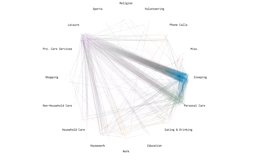 From alternative healthcare we are now taking you to a completely new topic - this visually appealing website talks about the life of an average American. Have you ever wondered how average a day in your life is compared to the average American? This excellent interactive infographic allows you to see and compare your routines with others.
Do you go to bed between at 10 pm? Then, the site stamps you as a part of the majority. Similarly, if you wake up between 6:30 am to 7:30 am, you are part of the majority again.
The graph will allow you to see how your day-to-day actions range in similarity with the average American in this beautiful project!
#11: Small Multiples - Hello Sun App
 Speaking of the sun, have you ever been in awe about how the sun rotates? The Hello Sun app was built as a live data visualization tool that works well right on your mobile. In the main dashboard, you can find the movement of the moon and the sun in cities all around the world. The stunning visualizations of the sun rising and following across different colour codes are fascinating to observe.
You can also insert exact GPS coordinates to your location so that you can see how the sun interacts where you live - wondering when the sun rises in your area? Are you Looking to start an immaculate herb-garden? This app is just the right one for you!
#12: Crazy Rich Asians - What Rich People Wear
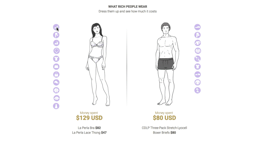
Crazy Rich Asians is yet another interactive and visually appealing page.
Bonus feature - This visualization also allows you to play dress-up with popular outfits and designers the ultra-rich are known to buy so that you can get an outsiders perspective to how much an outfit like the ones on the show truly cost the ultra rich.
The whole visualization is sticker-shock worthy and absolutely mind-boggling! The page is highly recommended if you are interested in economics or the lifestyles of the rich in general.
#13: Bloomberg - How America Uses its Land
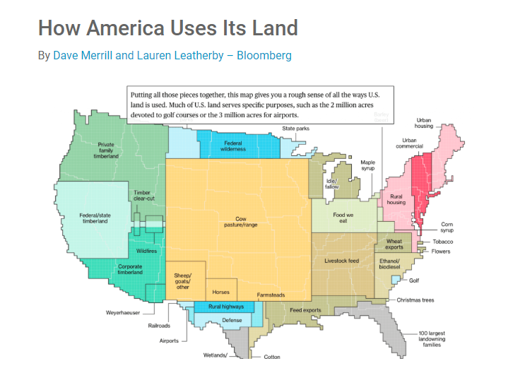
Moving from China back towards the USA in our thirteenth visualization...
Have you ever wondered how much of America is residential and how much commercial? Or maybe what parts of the country are pastures/farms versus residential areas? Or maybe how much land our national parks take up in the US?
This chart is for you! Find everything from where the four in five American’s live, to where the biggest metros in the USA are in this beautifully illustrated data visualization about America’s land. Where do you fit in America’s land?
#14: Behance - James Round - Lessons From Those We’ve Lost
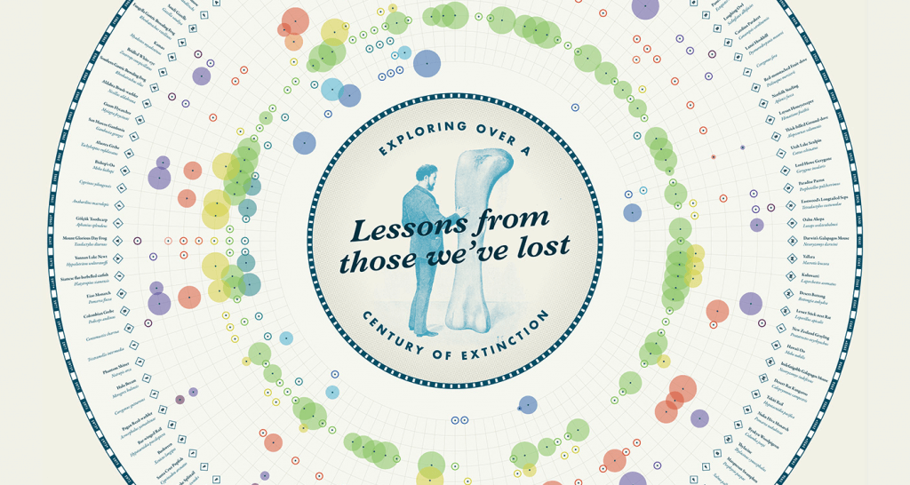 In our 14th top data visualization, we move from China & the USA onto examining the world as a whole. As Earth evolves, species die out. This visualization takes us through the species lost through time, where they were lost, and the catastrophes that caused their individual extinctions. You can see the upcoming threats to animals and reptiles.
#15: Jan Diehm + Amber Thomas – The Pudding - Women’s Pockets
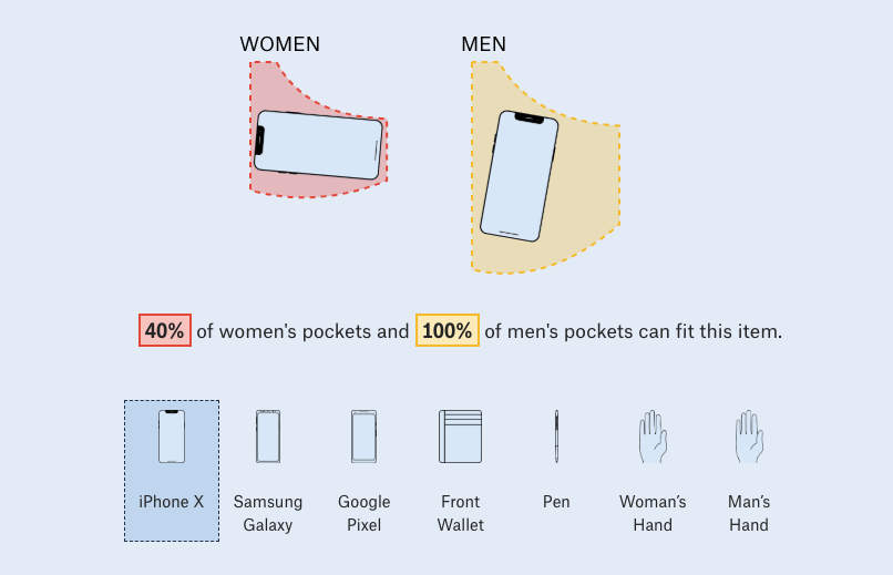
Completely unrelated to world demographics, we move on to analyzing women’s pockets in our 15th example. It’s no secret that women’s pockets are designed to be smaller than men’s pockets - but just how much smaller? In this animated visualization, you can find out what can fit into whose pocket.
You can also test regular objects against the average sizes to see if your over-sized smartphone does indeed or indeed not fit in a woman’s front pocket. The elements that the website has used to connect with the users are phenomenal. Noteworthy!
#16: The Guardian - How Americans Move Their Homeless
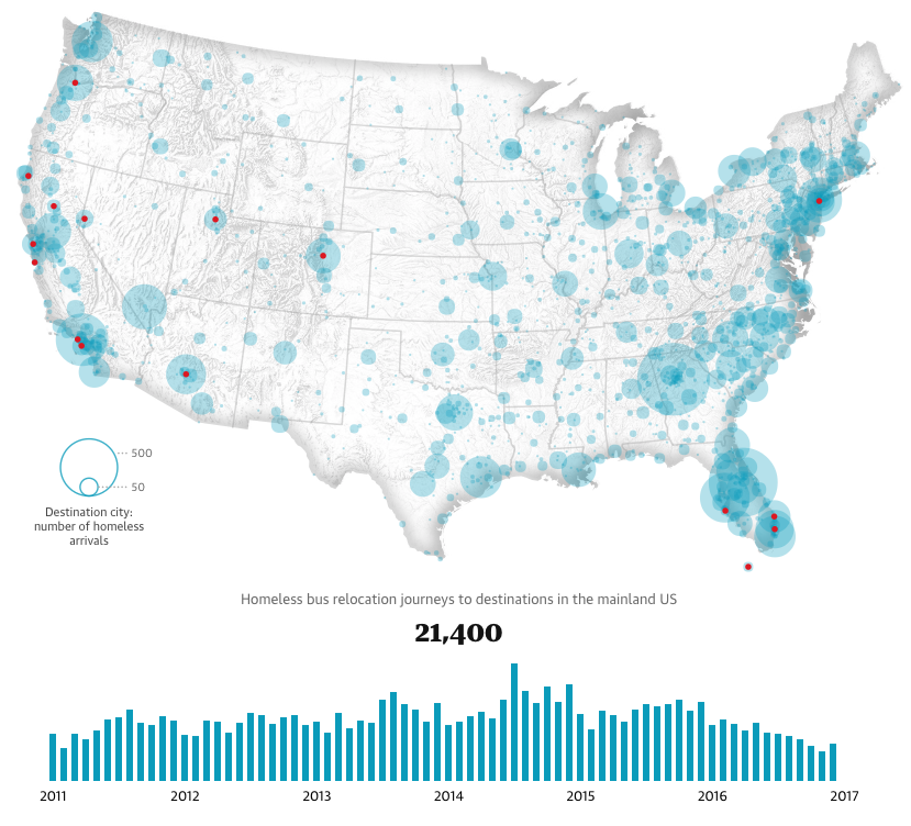
Moving on from women’s pockets, this data-visualization covers a more serious epidemic. You must be aware that many cities in America offer bus or plane tickets to the homeless population in their cities to relocate them to other cities? While this is not common knowledge, this is a common practice in America.
The Guardian site has been optimizing their site by carrying out various research study to check the traffic patterns of homeless movement across the US (and Worldwide) since 2011. While a lot of the findings are a bit different to relate as trends in the US, this piece provides awareness and insights to see how the US deals with homelessness, as well as where we can improve. This is a great app to give awareness to the homelessness epidemic, and hopefully, inspire solutions to the problem. We highly suggest taking a look!
#17: TasteAtlas - Food Around the World
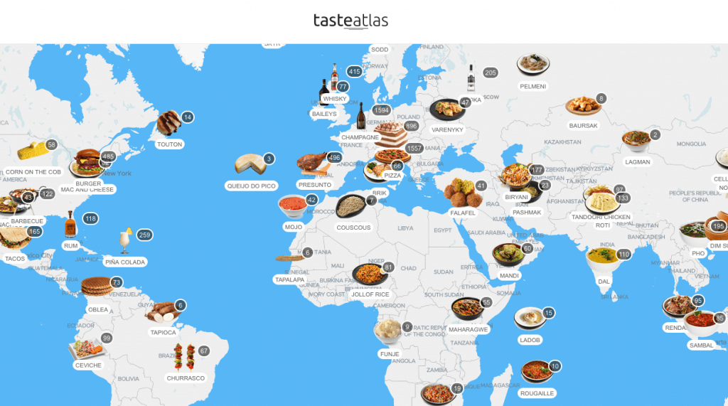 Shifting focus to a topic anyone who enjoys eating...
This site discusses food around the world.
If you are a foodie, or, you are simply curious about different flavors, drinks, and dishes around the world, then this one is for you. Find out what people eat and drink around the world, and discover the “must eat” foods of your next vacation.
Best of all, if you aren’t planning a trip soon, they have recipes too! So if you find a food that looks interesting and you want to try it, no problem! Whether it’s a Danish smorgasbord or African maafe, you can bring the tastes of the world straight to your family home. And what is cooler than that?
#18: TotalJobs - How Love Works
 Another topic that we all love is love.
Specifically, love in the workplace. Have you ever fallen in love with a coworker? You aren’t alone. In this data visualization, you can see how people fall in love with coworkers, how likely they are to stay in love, and everything you’ve ever wondered about colleague love.
This site will help you find out everything you’ve ever wanted to know about workplace romance in an expanded visualization. If you’ve fallen into the work-romance trap before, this visualization will fascinate you, and possibly enrage you, or possibly make you more proud of your decision.
#19: Our World in Data - The World as 100 People Over the Last Two Centuries
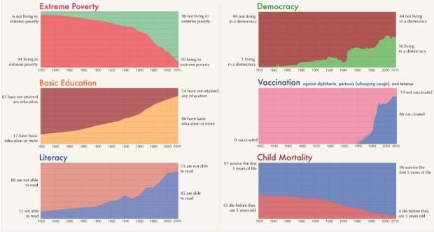
Reversing back to demographic data, this graph analyzes the world. If you took all the demographics of the world over the last two centuries, analyzed it, and shrunk the characteristics into just 100 people, what would you find? Well, Our World in Data did just that.
If you wish to get an overview of literacy, education, poverty, policy, etc., shrunk into a bite-sized portion, this visualization is ideal. Apart from being informative, it is also extremely fascinating to see where the data takes you. Where would you fit in the 100 people? It’s crazy to think that all people over the years can be categorized into just 100 people. Which one are you?
#20: Flowing Data - Just Another Day on Aerosol Earth
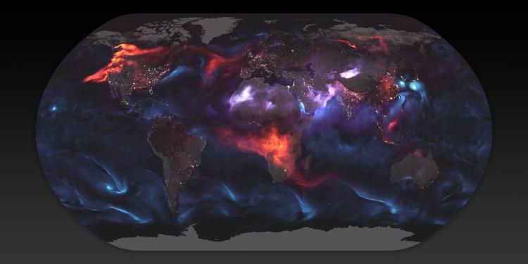
Our last example on the list takes a look at the earth and the gasses that surrounds it. This project shows you aerosol gasses around the world and what triggers them. Whether it’s a fire, carbon, salt or any other aerosol emitting gas, this graph lets you see how gasses interact with our planet.
Are you curious to understand how we as humans interact with our planet, or how natural disasters affect our planet - this graph is for you. Science fanatics will also get a kick out of seeing how gasses affect our world. The best part of this graph is definitely the use of color. The visuals in this project are fascinating, beautiful, and inspiring. Are you leaving an effect on our planet? Click on the link to find out.
All these are possible with different data visualization elements.
Conclusion
As marketers, data scientists, and analysts are creating more and more complex data-visualizations, it is exciting to see new ideas brought to life through a number of data visualizations elements.
Data visualization has the power to transform your idea into more meaningful interaction with your users. The power of persuasion is very high.
Are you looking to being creative with your data? Check out this list of some of the best data visualization software listed by Goodfirms. If you have tried any of the listed software, do not hesitate to share your reviews. If you wish to test a few software, you can try free and open source data visualization software.
We want to hear from you! What is your favorite data-visualization content example?