Key takeaways
- Since 2023, Google crawls only your mobile version; responsiveness is no longer optional.
- One responsive codebase means one URL, zero duplicate content, and all your SEO signals pointing in the same direction.
- 73% of visitors leave a non-responsive mobile site immediately. Responsive design removes every friction point that drives them away.
- A responsive navigation system helps both users find your content and Google's crawlers index it efficiently.
- Mobile-friendly share buttons and clean layouts increase social shares, which build inbound links and strengthen domain authority.
- Longer dwell time, more pages per session, and lower exit rates are both UX wins and SEO ranking signals; responsive design delivers all three.
- A single responsive URL eliminates the duplicate content risk that comes with maintaining separate mobile and desktop versions.
- Fluid responsive layouts adapt to foldable screens, wider displays, and whatever new device form factors come next; no rebuild required.
- Great responsive design is intentional at every level; the right UI/UX team turns a technically responsive site into one that ranks and converts.
The web design domain has never been short of ideas. Every year, top web design companies push their boundaries, adapt new tools and technologies, experiment with motion, interactivity, and layouts that feel native to the “multiple screens” visitors commonly use. And that last part, "multiple screens", is where things get interesting from an SEO point of view.
Think about your own day for a second. You probably checked something on your phone before getting out of bed. Maybe switched to a laptop mid-morning. Pulled out a tablet in the evening. This kind of multi-device behavior is now the norm, not the exception.
As per Goodfirms’ survey - AI SEO Statistics 2026, 81% of digital marketing professionals believe that Mobile-first, responsive design can drive search visibility.
Therefore, it's not just about content quality or backlinks anymore. How your site behaves on a 6-inch smartphone to a 34-inch monitor matters just as much.
Ready to make your website work on every screen and rank for it? Connect with top UI/UX design agencies on Goodfirms and get your responsive design project started.
So when phone makers keep releasing foldable displays, wider screens, and whatever comes next, responsive web designers can't just ask "does this look good?" They have to ask, "Does this hold up on every device someone might use?" And site owners have an even simpler question: is this good enough to rank?
Yes, the website should not only look perfect on every device. It should rank high in SERPs to help businesses attract visitors and convert them.
A website without SEO is like a car with no gas.– Paul Cookson
This is where responsive web design becomes an integral part of a successful SEO strategy.
So, yes, responsive website design is important to boost SEO rankings in the current times. Before we get into the different ways responsive design of your website can strengthen your SEO, let's gain a brief understanding of what responsive design is and its principles.
What is Responsive Web Design?
Responsive web design is a web design technique that helps your website automatically scale the size and content of your website to the device on which it is being viewed.
Unlike adaptive design, responsive web designers don’t have to create different versions of one website when it comes to creating a responsive website. Hence, responsive design is considered superior to the two, as it takes less time and effort to deliver better, quicker results.
In simple terms, responsive web designers have to create one design that is fluid and responsive, so whether you view the website on a smartphone or a laptop, the website will adapt to it and display the content as per the screen size and orientation. So mobile users won’t have to play the zoom-in, zoom-out game while scrolling through your website, and will be able to view and read the content without any extra effort on their part.
This approach to web design increases accessibility across devices without compromising the experience for any user. A well-built website feels just as natural on a phone as it does on a widescreen monitor, content loads cleanly, navigation stays intuitive, and nobody has to pinch-zoom their way through a page.
With Google’s mobile-first indexing, search engines primarily evaluate the mobile version of a website for ranking. This makes responsive design not just a UX enhancement but a direct SEO necessity.
Responsive website design is often confused with adaptive web design. But there is a difference. With adaptive web design, the site detects your device and serves a pre-built version made specifically for it, a fixed layout for desktop, a different one for tablet, and another for mobile. With responsive web design, there's just one fluid layout that reshapes itself to fit whatever screen it lands on. Same goal, very different approaches. Let’s have a look at the difference between these two design concepts and how they impact your SEO and user experience.
Adaptive Web Design V/S. Responsive Website Design
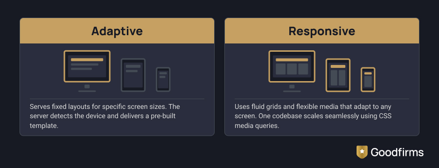
| Adaptive Web Design | Responsive Web Design |
| Separate template per device - Builds separate, fixed-width layouts for each device class, one for desktop, one for tablet, one for mobile. The server detects the device and loads the matching template. | Single template, adapts everywhere - Uses one flexible codebase that fluidly adapts to any screen size using CSS media queries, fluid grids, and scalable images, no device detection required. |
| Fixed breakpoints only - Snaps to preset widths — awkward on newer foldables or ultra-wide screens, it wasn't built for. | Fluid across every screen - Adapts seamlessly to phones, tablets, laptops, monitors, and any new form factor that comes next. |
| Higher maintenance load - Content updates must be replicated across every version, doubling the effort and the risk of errors. | One URL, consolidated SEO signals - All backlinks, crawl budget, and ranking signals stay on a single URL — no equity lost to duplicate pages. |
| Duplicate content risk - Multiple URLs for the same content can confuse Google's crawler and split your link equity. | Google's recommended approach - Explicitly preferred by Google for mobile-first indexing — has been the standard since their full 2023 rollout. |
| Faster initial load per device - Only loads assets relevant to that device, a small performance edge in specific scenarios. | Lower long-term cost - One codebase means one set of updates, one QA pass, and far less technical debt over time. |
Goodfirms’ Insight: Adaptive design has its place — but for most businesses, responsive design is the clear winner for SEO, maintenance, and future-proofing. One codebase, one URL, and Google's full endorsement.
Whenever we visit a website, the website's responsiveness is one of the most crucial factors affecting our user experience. Let's take a small example to understand how responsiveness affects user experience.
Imagine you are watching a movie on Netflix on your smartphone, and you get tired of sitting in one position for a long time, so you switch your position. Netflix will automatically adjust the screen to the switch in your position by detecting the movement of your smartphone to the dominant phone position setting of your device. How convenient! You didn't have to manually rotate the phone or the screen since the app did it for you!
Better yet, if you want to watch Netflix on a tablet or laptop without downloading the app, the experience holds up just as well, with a clean layout, easy navigation, and nothing broken or out of place. That consistency across devices doesn't happen by accident. It's the result of implementing the responsive website design technique.

(Source: Netflix)
Similarly, you too can create a responsive website to give your viewers a smooth online experience with your brand. So, let’s further expand our knowledge of responsive web design by knowing its principles.
Responsive Web Design Principles
In a responsive design, you can customize how content flows from one screen to another and the layout adapts to a different screen size. The elements of the website dynamically change to fit the width and breadth of the browser for an ideal viewing experience.
Therefore, to create a responsive web design, there are 3 main principles of web design that you have to be familiar with.
Fluid Grid System - You must have seen these measurements whenever streaming content online, 144p, 360p, 720p, 1080p, but what does it represent? The ‘p’ refers to the height dimensions of the image in pixels. It stands for ‘progressive scan’ and web designers use it to define the website in pixel sizes.
In print media, since the images were unmoving, the pixel sizes were absolute, but in responsive design, to make the website fluid, these values are relative sizes (like percentages) to adjust as per screen layout.
Fluid Images - Like water, fluid images take the shape of the screen or browser on which they are being viewed. Since responsive design uses fluid grids, the images will also have to be resized as per the layout. To avoid the hassle, designers can create a single image that can be scaled as per the screen size.
Media Queries - This functionality allows the designers to alter the layout of the website to best fit the device on which the website or web page is being viewed. The usual pattern that designers follow for allocating breakpoints in layout is by using a mobile-first approach, where they give priority to the mobile version first and scale up from there for tablet and desktop.
Think of a webpage showing articles. On a smartphone, a media query stacks them into one column for easy reading. On a tablet or laptop, the wider screen triggers a different instruction and shifts them into two columns side by side. Same content, same code — different rules per screen.
Now that we know how it works, here's why it's worth building into every website.
Why Responsive Web Design Matters for SEO Today?
Responsive design plays a crucial role in modern SEO due to mobile-first indexing, multi-device user behavior, and performance metrics like Core Web Vitals. A mobile-friendly website ensures better crawlability, improved user engagement, and stronger search visibility.
Mobile has already won the numbers game; according to StatCounter, over 55.94% of all global web traffic now comes from mobile devices. And since Google completed its mobile-first indexing rollout in 2023, your site's mobile version is the one being crawled, evaluated, and ranked.

That said, desktop isn't going anywhere. A significant chunk of browsing, especially research-heavy and purchase-decision moments, still happens on larger screens. Responsive web design sits right in the middle of all this, one website that serves every visitor well, regardless of what they're holding. Here are the reasons why responsive web design is your secret weapon for SEO.
Why Responsive Web Design Is Your Secret Weapon for SEO?
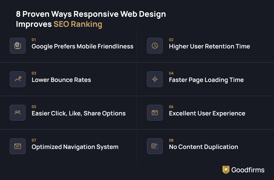
In a world where Google's algorithm is constantly evolving, responsive web design remains one of the most powerful — and often underestimated — tools in your SEO arsenal. It doesn't just make your site look good on every screen; it sends all the right signals to search engines that your website deserves to rank higher. Below are 8 proven ways responsive web design improves your SEO ranking, making it non-negotiable in today's smartphone-driven world.
Let’s elaborate on this.
1. Google Prefers Mobile Friendliness
Google prioritizes mobile-friendly websites through mobile-first indexing, meaning it primarily uses the mobile version of your site for indexing and ranking.
If you think about the logic and reason behind this decision, you will get to know that it’s because Google wants its users to be able to access authentic and quality information that actually creates value.
Google even mentions in its guidelines that, “While it's not required to have a mobile version of your pages to have your content included in Google's Search results, it is very strongly recommended.”
Key takeaway: After the 2023 algorithm update, Google is considering only the mobile version of your website for crawling and ranking. So, if your mobile site doesn’t include all the content that you have on your desktop site, there is a chance that your website rankings will drop extensively.
2. Higher User Retention Time
A responsive website does more than just fit the screen. It creates the right conditions for visitors to actually stick around.
Because the layout, text, and images automatically adjust to whatever device someone is using, designers can focus their energy on the details that make a site feel alive. Subtle micro-animations that respond to a user's scroll. A pop-up chatbot that surfaces helpful links exactly when a visitor seems stuck. Seasonal design touches that make a returning visitor feel like the site is current and maintained.
None of these features requires building separate versions for mobile and desktop. On a responsive site, you add it once, and it works everywhere. That means less time on maintenance and more time on the small touches that keep users engaged, coming back, and spending longer on each visit, all of which send positive retention signals to Google.
Key takeaway: The sites that retain users longest aren't always the most complex; they're the ones with a layout that feels considered on every screen. Responsive design gives designers the freedom to focus on the details that make visitors stay. That freedom shows up directly in engagement.
3. Lower Bounce Rates
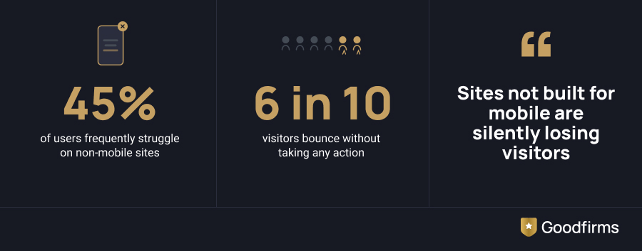
As per Hostinger's Web Design Statistics 2025, 45% of users frequently struggle on sites not built for mobile, causing nearly 6 in 10 visitors to bounce without taking any action.
When a website works well on every screen, people don't leave; they stay.
A non-responsive site frustrates mobile visitors instantly. Tiny text, sideways scrolling, buttons too small to tap accurately. The outcome? Most users abandon within seconds. Responsive design eliminates all of that friction. Text scales automatically, images resize cleanly, and navigation stays intuitive whether someone's on a phone or a laptop.
Responsive web design leads to longer sessions, more pages viewed per visit, and lower exit rates. Google treats dwell time as a behavioral signal when evaluating pages. A site that keeps people engaged longer doesn't just improve user experience; it directly strengthens your search rankings.
Key takeaway: Longer dwell time = positive ranking signal
4. Faster Page Loading Time
It is a no-brainer that a fast-loading website will perform better on search engines than a slow-loading website. The quicker your website loads, the more impressed your users will be, and if your content is up to standard, then they will likely prefer you over your competitors in their next search.
Responsive websites are mobile optimized and have a quicker loading time, which is a direct metric to improve your SEO. Many websites even forgo much flashier web design concepts to improve their page loading time to get a better search ranking.
A popular example of how responsive websites have faster loading times is the website of Adobe. Not only do they have a unique design, but their responsive imagery has several .jpg sources, indicating that different banner images will be loaded according to different screen types, resulting in faster loading times.
You can easily use Google Analytics tools or other responsiveness tests to assess the performance of your website and then reach out to top SEO companies that can help you improve the performance of your site.
Key takeaway: Faster Page Loading is a key metric in SEO, and a responsive website works in perfect tandem with this inordinately crucial SEO requirement.
5. Easier Click, Like, Share Options
Good content gets people through the door. Responsive design is what keeps them there long enough to act on it.
When a visitor can read your article comfortably on their phone, navigate your site without frustration, and tap a share button that actually works on a small screen, they share it. That share becomes visibility. That visibility becomes traffic. That traffic, when the experience is consistently good across every device, becomes conversions.
The connection between responsive design and social sharing is more direct than most site owners realize. A piece of content that renders beautifully on mobile is simply more likely to be shared from mobile, and with around 55.94% of browsing happening on phones, that matters enormously. Broken layouts, oversized images, and buttons too small to tap kill the impulse to share before it even forms.
For SEO, the ripple effect is significant. More shares mean more inbound links. More inbound links mean stronger domain authority. Stronger domain authority means better rankings. Responsive design doesn't just support this chain; it's one of the things that makes it possible in the first place.
Key takeaway: A great content that resonates with your target audience is the primary requisite of an SEO strategy, and a responsive website rightly delivers on this.
6. Excellent User Experience
Both Google and website owners share the same goal of keeping the users/ customers happy. Both parties also make extensive efforts to ensure the same.
Through a responsive design for your website, you are one step closer to achieving that goal. To reiterate, happy viewers are the most likely to convert into paying customers for all that your website has to offer.
The key point is to provide a good user experience to the visitors of your website by allowing room for feedback and working on it. You may design your website a certain way and think it gives the end user the best experience, but feedback from real end-users is essential to optimizing your website for the best results.
After all, a great user experience is another factor that is essential for SEO.
Given the level of globalization that we are living in, you can even delegate the task of creating a wonderful responsive web design to web designers in Austin, Texas, irrespective of your current location. They’ll do it for a relatively lower rate as opposed to designers in other states.
Key takeaway: The Moral: Excellent User Experience translates into higher conversion rates for your site. An obvious SEO metric that you could profit from by having a responsive site.
7. Optimized Navigation System
Nobody enjoys getting lost on a website. You land on a page looking for something specific, click what seems like the right link, end up somewhere irrelevant, and give up. That's not a content problem; that's a navigation problem. And on mobile, poor navigation is even less forgivable.
Responsive web design fixes this at the structural level. Menus that collapse cleanly into a hamburger icon on smaller screens. Tap targets spaced far enough apart that users don't accidentally hit the wrong link. Breadcrumb trails that keep visitors oriented, whether they're on a phone, tablet, or desktop. The navigation doesn't just shrink to fit; it rethinks itself for the device being used.
This matters for SEO as much as it does for users. A well-structured, responsive navigation system helps Google's crawlers move through your site just as efficiently as your visitors do. Internal links get followed. Important pages get indexed. Category structures get understood. A site that's easy to navigate isn't just pleasant to use; it's easier to rank.
Think about what a simple table of contents does for a long-form article. It tells the reader exactly what's on the page, lets them jump to what they need, and reduces the chance they leave out of impatience. That same logic scales across your entire site when your navigation is built responsively — every visitor, on every device, always knows where they are and where they can go next.
Key takeaway: The Moral: Optimize your navigation system with responsive web design to enrich user experience and SEO strategy at the same time.
8. No Content Duplication
The best part of having responsive web developers and web designers is the reduced effort. Not only is a responsive web design cost-effective, since you only have to maintain and pay to create one website version, it also helps reduce duplicate content that hinders your SEO.
A major pitfall of designing different versions of your website (mobile and desktop) is that you may end up reusing the same content, which will confuse Google’s algorithm as to which one to prioritize and end up hindering your website ranking in the search results.
Duplicate content is also liable to garner penalties from Google, but by using responsive design for your website, you can simply avoid the risk by creating one version of the website that is compatible with both mobile and desktop, or any other screen that the user may be using.
SEO and Responsive Design: A Website That Looks Better and Ranks Better
Numerous websites have trouble with SEO. People rely on Google to give them the most accurate information about their search topics in an atmosphere where the internet is dynamic and fast-paced.
As a result, Google has implemented numerous crawlers and algorithms that evaluate websites and their content according to their usefulness and legitimacy in order to provide its visitors with the best information possible.
In addition to the current SEO best practices, Google creates new algorithm updates every year in an effort to close any gaps that could lower the quality of the content for its consumers.
You won't even need to worry about every single small SEO update if you build a responsive website with regularly updated, high-quality content and a sound backlinking and internal linking strategy in place.
All the above points that highlight the benefits of a responsive website are also effective in improving website performance as well as SEO.
A great example of a responsive website is Slack. The menu option that is displayed on top of the page in the desktop version can be easily accessed by the hamburger menu in the mobile version.
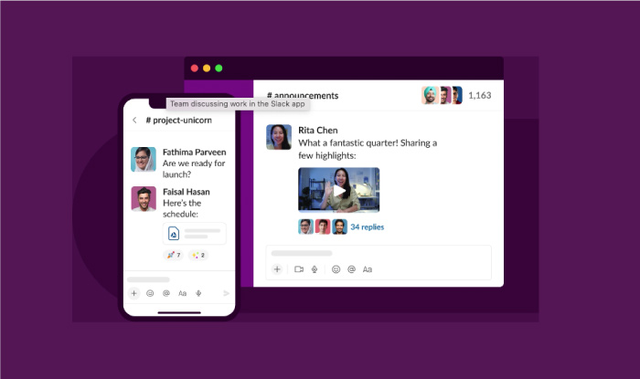
(Source: Slack)
Slack's responsive design works because every decision, from the hamburger menu to the mobile CTA placement, was clearly intentional. Building a responsive website the right way is a collaborative effort of top digital marketing agencies, with a team of professional web designers and SEO specialists.
Here, at Goodfirms, you can easily commission the best available talent for every part of your website design, right from the best logo design agencies to the top content marketing agencies for presenting your business in the most appealing way.
If you've been delaying going responsive, this article has laid out exactly what that delay is costing you in terms of rankings, bounce rates, load times, and user experience. Responsive web design isn't a cosmetic upgrade. In 2026, with Google evaluating your mobile version first, it's the foundation for your entire SEO strategy.