What does it mean to "design a website"? In a few words, we can say, "If not done correctly, it can freak you out."
Well, 2023 is not even three months away, and lots of deviations and changes are happening in the website development department. It is the need of the hour for a business to have a website to develop itself as a brand. But they need to keep in mind what people actually want to see and surf on their websites.
People are not interested in common websites anymore. Despite being aesthetically and navigationally pleasing, it needs to be user – attractive. Most brands have started working on it already and have hired the website designers that could assist them. And here is what website developers have been suggesting and helping brands do with their websites:
1. White Space
It is an interesting concept I have come across so far and will remain so in the future. Web Designers in India, as well as in other countries, now prefer to keep white space which is also known as negative space. As the name suggests, white space is a space that is kept blank. It is not necessarily white in color but whatever suits the aesthetics of the website.
As long as the area is kept empty, it is called "white space." Designers prefer to keep a little space on the website empty to let the content and design breathe. If a website is filled with sections and words and videos and images, then the user/scroller might get confused and might close it before expected. Hence, they keep this space to let the design sink into the user's mind.
This element is specifically essential when the website has bold colors. The best example of a website with white background is Macbook. They have made the perfect use of white space.

2. Dark Mode
Enabling Dark Mode is a new hip feature on the website. All social media websites and apps such as Facebook, YouTube, Google, etc use dark mode. The low light interface uses dark colors such as dark blue, grey, and black for the primary background to create minimalist design websites depicting power and elegance.
First, the dark mode can reduce eye strain, especially in low-light conditions. Second, it can make your content readable and more accessible to the eye. It also helps improve contrast and makes your content more legible. It happens because dark mode inverts the color scheme of a webpage, so the background is black and the text is white.
Who hasn’t heard about Tevgen? But let us observe its website for different reasons altogether. Having a dark mode makes it rich, classy, and engaging.

3. Social Media Integration
Everyone knows that social media integration is critical these days because people look up brands on social media first, and then they look them up on Google. There aren't many brands that aren't present on social media, which includes Twitter, Facebook, Instagram, Tumblr, Pinterest, Snapchat, and YouTube. Even TikTok is one of the hottest mediums to be on.
Hence, their integration on the website encourages users to check out their social media platforms and stay updated. When this is done, people are able to see what the brands are up to, how brands can help them, and how quality content will engage with them.
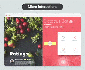
4. Micro – Interactions
Micro-interaction was not much of a tapped trend in 2022. For the unversed, the red dot one sees on Facebook when a new notification pops up is what micro-interactions is all about. Or when you refresh something, a plop sound rings in the background, which appeals to the website scroller. For example The Octopus Bar.
Otherwise, it is such a small thing to incorporate into the website, but it keeps the user on the website for a few more seconds, which counts.
You can integrate micro-interactions into your brand sites through scroll animations, chimes, and more. It is one of the most remarkable ways to create a more engaging and interactive experience. It will help the brand website's design stand out. Hence, it is a significant feature/trend to have.
5. More Videos and Images
Written content might not be outdated, but video and images are new and hip features of the website. With the rise of YouTube and TikTok and Instagram reels, videos have made the website more competitive and attractive. When the brand adds videos to the site, they create unique engagement points. Adding more videos to your website creates diversity on your page and breaks up the abundance of text on your site.
Videos cater well to the brand's on-the-go audience because they may not have time to read all the information on your site. However, they can watch a quick two-minute video and get all the necessary information. It provides brands with numerous opportunities to engage new leads and gain more exposure for their company.
6. Minimalism
Still, in 2022, people believe that more is better; again, it is invalid. Minimalism is good enough if done correctly. Minimalism is like curtseying, and it never goes out of style. If anything, this gesture makes a person even more gracious and attractive. Crowding the website doesn't make sense anymore. If you don’t believe us, see for yourself.

Nearly 85% of small businesses have been found crowding their websites with too many on-page elements, according to Goodfirms
Similarly, minimalism makes the website even more attractive. You can have a plain white background with a simple poster of your products, and you are good to go. One page website is enough with the combination of white space and minimal designs and colors.
It's easy to dive into detail and go in-depth with the content. But, it might end up overwhelming your audience, which will make them leave your website sooner than they are supposed to leave your website. The best thing to do is keep your design and information simple. Make all the information clear and space it out so it doesn't make your site appear overcrowded.
Blue Fox Studio is an example of minimal design. Click the website and see how they have made use of space and design.

7. Bold Colors
The year 2023 is the time to go bold because there is no time to play subtly and down. Just experiment with the colors and see what works out for you.
Mostly, when you see the color red, you think about brands like Netflix, Coca-Cola, H & M, and even Kellogg. Similarly, when you see the color purple, you think about brands like Cadbury, Hallmark, and even BTS boys. And the color combination of Black and Pink connects people to Black Pink Girl Band. Or like Codegoda.
Not just that, people tend to relate themselves to colors and combinations that catch their eyes and warm their hearts. Thus, you must link your brand to the color or combination of colors that will make your brand website unique. Thus, find your color, stick to it, and try using it in the most creative ways you can.

8. Mobile Responsiveness
Most people, and not just teenagers, are being scolded for keeping their heads on their phones for almost 8 hours of the day. So, why not take advantage of the opportunity handed to you? Not everyone opens their laptop and will browse your website. But they will always browse your website from their phone. Make the website mobile responsive, and you are done.
When people browse on mobile, they use both of their thumbs and only a few fingers to scroll, click, and navigate mobile sites. If they are following you on social media platforms, then they will click on the button that will lead them to your website from their phones themselves. It increases your responsibility to focus on adding and placing site elements where they are easy to access with a thumb.
For instance, a burger menu, the icon with three lines, is typically found on mobile sites. But the issue is that this menu is often at the top left-hand side of the site, which makes it challenging for the audience to access your menu. Thus, do not goof up and make the design perfect to be operated by mobile phones.
9. Voice Optimization/Language Integration
According to Tech Crunch, voice optimization is a $40 billion industry. The brands have started incorporating this feature already, and the year 2023 is not much different. The excellent search engine rankings help brands funnel more qualified traffic to the website. Hence, if you don’t rank highly, you likely won’t see much site traffic, and your beautifully designed website will go to waste. Thus, stay upgraded with the trends and incorporate what needs to be.
Another essential part of voice optimization is language integration. Not everyone who is going to use your brand can speak/understand English very well. Thus, you must integrate as many languages as you can into your website to reach a more significant number of people.
10. Incorporate Animations and GIPHY
Gone are the days when brands used stock images only. Now people have been experimenting with websites without being unprofessional. Thus, they incorporate Giphy and animations. Cartoons and motion cartoons are no joke anymore.
Not only do they help engage users and keep them on your pages longer, but they also add a unique design element that leads to a better user experience. Not only are more websites adopting animations in their content in the form of GIFs, but they're also utilizing animations on their home page, in calls to action, and more.
11. Optimize for Image Search
Sometimes it is hard to describe the product, but you know how it looks. Also, sometimes you do not have a name, but they are right in front of you, and you need to search for them. What to do in such cases? Well, a new feature has already been incorporated into the websites of many brands, and it is called Image Search.
If the customer wishes to buy something or learn about something, they just need to click on the picture and search for it over the internet. If you are an ecommerce website owner, then this is a must-have feature on your website.
12. Interactive Web Pages
This might not be an essential element to have on the website, but if it is there, it will create a different effect altogether. For example, if you see the phone's screen saver with a plain picture, it doesn't appeal to you as much as a screensaver with water droplets, dancing dandelions in the wind, or some cartoon moving forward; does.
Similarly, if your website has responding web pages, then it shall appeal to your customers more than a plain background. For example - Alexandre Rochet
Wrapping Up:
Mix all together, and you'll get what you call a perfectly designed state–of–the–art website.

Here are the reasons to hire web designers
If you want your website to be unique and attractive, then avoid these generic web design ideas and go bold. You can get your website designed in various cities of India, such as Mumbai, Delhi, Chennai, Bangalore, Pune, Ahmedabad, etc. Don't be afraid to take risks and go against the flow because that is where success lies.
Apart from dedicated web agencies, thousands of freelance web designers are also in India. To ease the pressure, they have curated a list of top web designers in Mumbai.