User Experience is a massive phenomenon in its own right. Today, it’s not at all okay when a designer says the product needs beautification if it is working efficiently. Earlier, users were not very interested in design experience, but with the passing time and advances in technology, they have started taking an interest. You will notice a drastic increase in user engagement rates if what you have designed succeeds in winning the UX points.
It’s easy for a designer to glean the information from the business analyst and sketch the flow of the idea. But will that design connect the client with the UI? Think… It’s equally essential for a designer to understand the requirements and for the client to reflect the message they want to convey.
And that’s why it is necessary to empathize, communicate, and convince the client.
→ Empathize: When you are discussing an application or website with the client you ensure that whatever the necessary points he is pinpointing are noted and executed in designing. After all, it’s not about on-time delivery of the solution, it’s about the connection a client has for his business and the idea he is conveying to you.
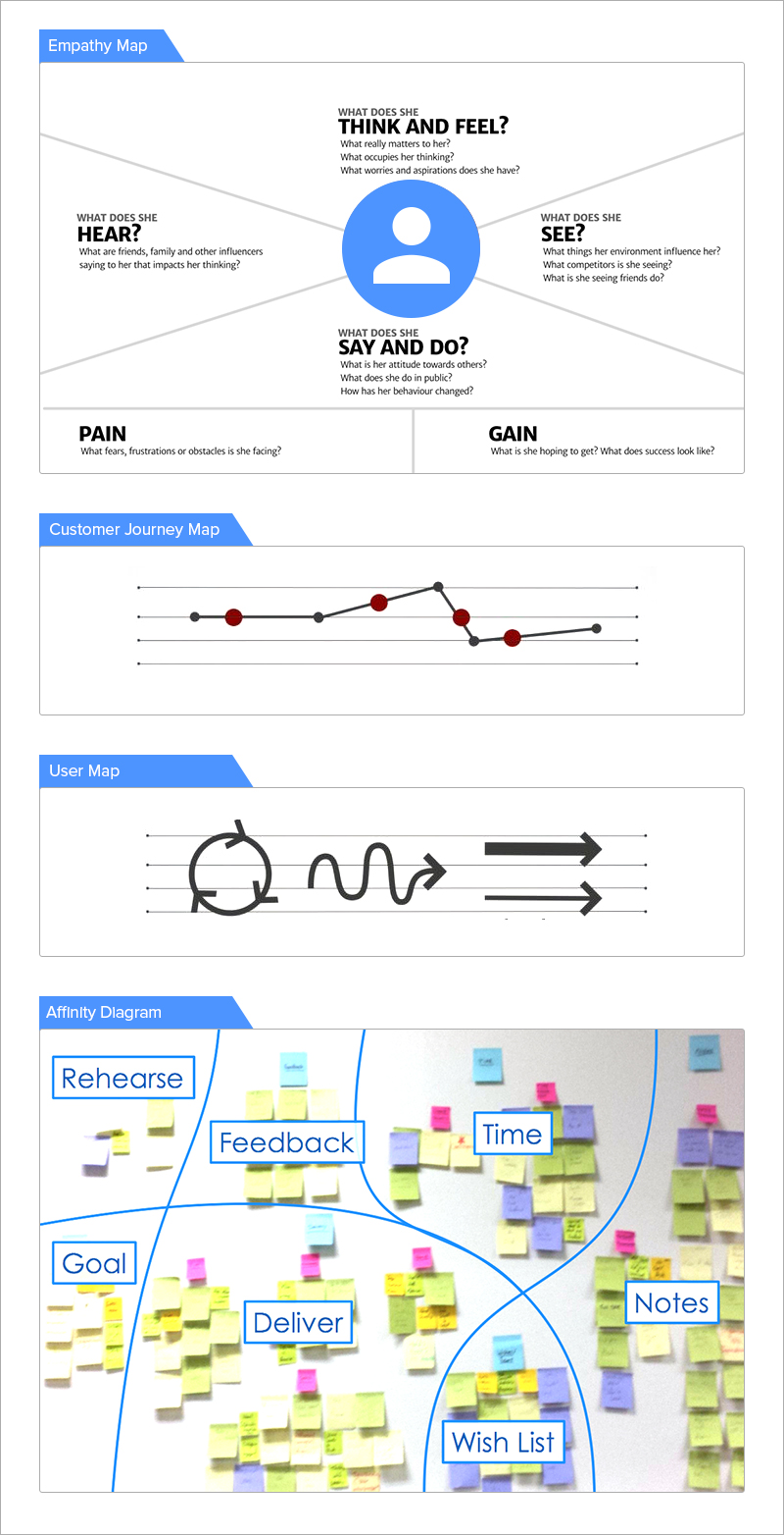
Various resources are available to help you empathize with and analyze the data you’ve gathered. These include empathy maps, UX persona canvas, user journey maps, affinity diagrams, and user maps.
Do this;
You can seek the help of your team to analyze the data you’ve gathered doing a deep research work.
Give everyone time to pen down their observations. Once you have all the observations in a sheet. Discuss them one by one which can help you to draw a rough map that connects all the dots the client is looking for. Here’s a look at the procedure of how you can analyze and understand your client’s requirements.
Conclusion;
This act of empathizing and understanding your clients help you to associate with the client’s mind and it becomes easy to innovate a beautiful user interface.
→ Communicate: It’s essential for you to be crystal clear on each and every point a client discusses while explaining the idea. For you, the questions are not only restricted to which color palette will you use, the type of fonts, the image resolution etcetera… It’s beyond that.
For you, it’s required to know the targeted audience, the importance of a website or application a client wants to develop and of course the message he wants to convey.
Do this;
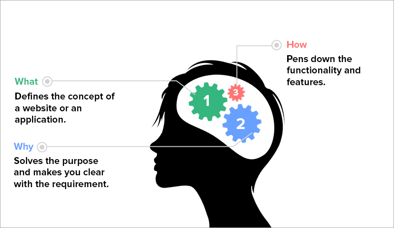
Efface your queries or doubts by asking questions WHAT, WHY AND HOW at first. This is the real mantra to carve your client’s mind and pull out the knowledge you are in need for.
Once you are clear with the concept you can easily draw an idea of who will be the targeted audience. For instance, if a client wants to design and develop a health app, you can scan the audience who are going to use it. Because today, a health app is used by everyone, from a kid to adult to old aged people. Therefore, such apps are designed considering everyone and not just a particular group of audience.
Conclusion;
This phase of communication lasts until the time you deliver your design to the client. Therefore, it’s better to prepare a proof of concept (POC) in prior and present it as the demo that contains a few annotations. It becomes easy for them to suggest changes (if required) and your final design gets an expert touch.
→ Convince: It would be a thriving moment when everyone sitting at the round table will believe on the research work you have done. Yes, it will be! The cases are rare when everyone agrees upon the conclusion you have drawn after doing in-depth analysis. You will always find a couple of sceptics who will never accede to what you have presented.
Even your teammates who were with you in this research work does not agree on certain points. In that case, you have to make each and every point clear discussing the pros and cons. Further, be lucid with the specific results and how important it is to fix certain issues instantly.
These things take place when what you present in front of the team is unique or the implementation requires more manpower and time.
Thus, to convince them you are required to evaluate strong outcomes with your research work. For that, you need to a) understand who will be the targeted audience as the previous phase, b) calculate the time required to implement the unique functionality.
Do this;
Sketch your research work in a short story format that is easily digestible. Focus on every major issue you find. Try to frame these issues with the solution in the form of visuals and present it in front of the participants.
Conclusion;
It’s difficult to convince your people because everyone has a different perception. But how you present the elements and convince them is what matters. The best technique to convince is video or visuals. Use these useful resources whenever you are asked to present your research work as doing so will not only widen the vision of your participants but will also bring out unique ideas to overcome the hassles and improve the user experience.
These were the three most important procedures to understand the perception and requirement of your client.
This blog is also inspired by the popular and best-selling book “The Design of Everyday Things” by Donald A Norman. The designer himself is a writer who believes in user-centric approach.
The book explains the designing principles using the instances of everyday things and why even an expert fails in delivering the best experience to his users.
Below are the important user-centric designing principles that help you in designing a perfect UI.
1. Visibility:
Visibility indicates the mapping between the intended actions and the actual operations. The UI should be designed in such a manner that helps users to operate the particular action and how it will respond.
If we are talking about visibility, the fonts play a major role. There is a set of fonts available but which will be appropriate for the design is a question to ponder upon.
Many professional designers use the device default fonts in the UI. For instance, Roboto for Android Apps and Helvetica for iOS app as the typography of both these fonts is eye-soothing.
There are other fonts as well on the list that look professional and improves the text readability.They are Myriad Pro, Futura, Lato, Lucida Gerande, Glyphicons Halflings and more.
Further, the color and the size should make the text visible for the users to read. Usually, it is observed that the minimum text size used in applications and website is 9 and 12 respectively which is too small to read. Here, the app experience loses its impact and users stop using the product.
Use the appropriate font family and size that helps users to read the text in bold.
Similarly, color is also the element you need to take care of. Black is the standard color used in apps. But there are various colors you can use that complement the background color. The only thing you need to take care of is it should not diminish the essence of the text and make the read easy.
The second element that adds to improving the UI visibility is the background color. Usually, designers prefer to use the background color that reflects the image of the sector the company falls in.
Let’s take the example of Snapchat. It’s a social app that offers the most enthralling features adding moments of joy, happiness, positivity, and zeal. The yellow color stimulates the same energy.
The third element is content. The app content is added to indicate users with the various actions. And, therefore, it’s required to be concise and opt for easy-to-understand words.
The fourth element is app icons. Not too big, not too small. The icons should be placed on the screens in their appropriate size and shape.
2. Understanding and Usability:
It’s essential for you to understand the utilization and duration of the app. Once that is clear you can easily design the layout that contains the necessary elements.
Let’s take an example of the popular app, Airbnb which falls under tours and local domain. The app is designed to help travel lovers plan a vacation destination with all the necessities required to make the stay memorable.
The app is implemented using tabs making the navigation easy for users. It consists of all the factors that contribute to the positive vibes one experiences after a quick glance at the images placed in different categories. It is well organized and neat allowing users to easily modify the filters and search the location of the destination via the map.
The app is the epitome of a seamless experience one can ever imagine. Because besides implementing all the features a user requires, the UI is neat, user-friendly, interactive and customized.
3. FeedBack:
Once the User Interface is designed, it’s required to test the design with the different age groups of users as everyone has a different viewpoint. It depends upon the app concept and which audience you are targeting.
Feedback is important to analyze what features or functionality a user is looking for the app and how the app experience should be. This step helps you to enhance the user experience and help you gain brownie points once the app gets launched.
Final Thoughts
In this era where everything ends up on mobile, the user experience plays a major role to make the user stay connected with the app for a long. You will find apps of similar concepts in abundance in the app store but what matters the most to users is a good experience.
If you are looking for any such help you can end your search for the mobile app designing companies at Goodfirms that best fit your needs.
Good Luck!!!


