BroHouse
Branding with purpose
BroHouse is an award-winning European branding and packaging agency based in Bucharest, Romania, helping ambitious brands grow through strategic clarity and distinctive visual identity systems. With over a decade of international experience, we specialise in brand strategy, naming, visual identity design, packaging systems, and brand storytelling - delivering commercially effective and culturally relevant brand experiences.
Our multidisciplinary approach blends strategic thinking with creative craftsmanship, supporting clients from early brand definition to full market launch and long-term brand evolution. We work with FMCG brands, startups, and established companies seeking differentiation, premium positioning, and scalable design systems.
BroHouse projects have been internationally recognized and featured on global design and branding platforms and publications. Our work has been published in international design books and curated design collections, while our founders are frequent speakers and contributors to industry events, including design conferences and TEDx-style talks focused on the future of branding and design.
As a boutique consultancy, we collaborate closely with visionary clients across Europe and beyond, delivering end-to-end brand solutions — from strategic audits and brand narratives to award-winning packaging and identity design. We believe strong brands are built through clarity, authenticity, and memorable storytelling - not just aesthetics.
 Romania
Detailed Reviews of BroHouse

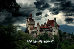
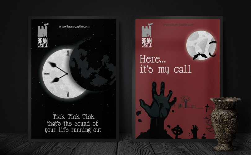
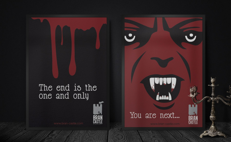
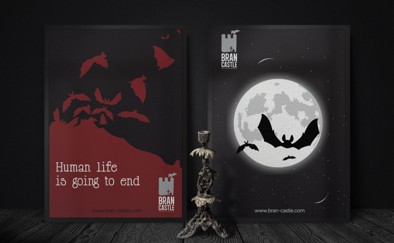
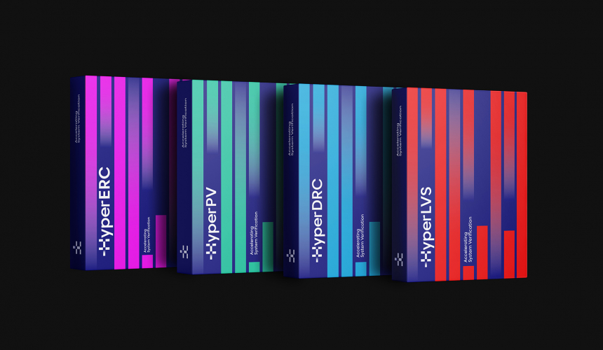
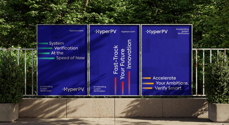
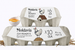
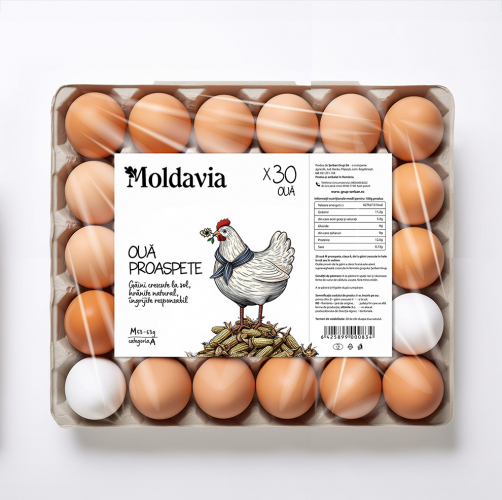
Client Portfolio of BroHouse
Project Industry
- Real Estate - 7.1%
- Travel & Lifestyle - 7.1%
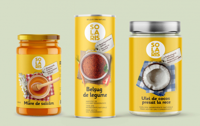
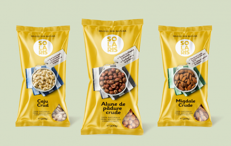
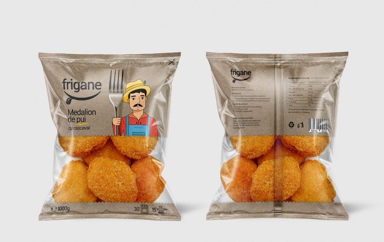
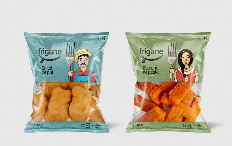
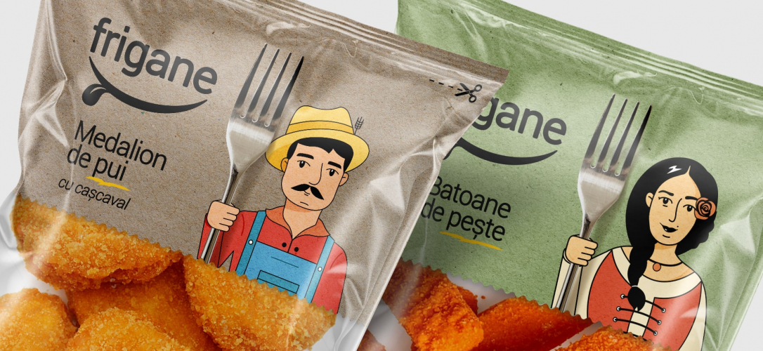
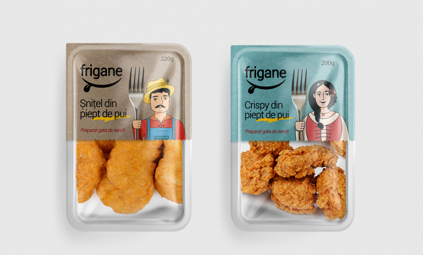
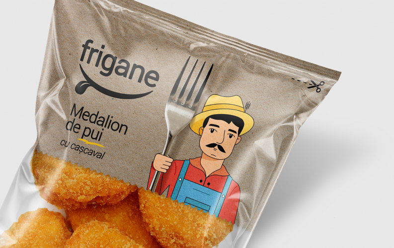
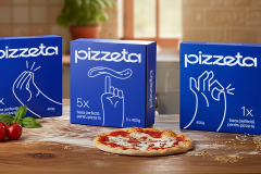
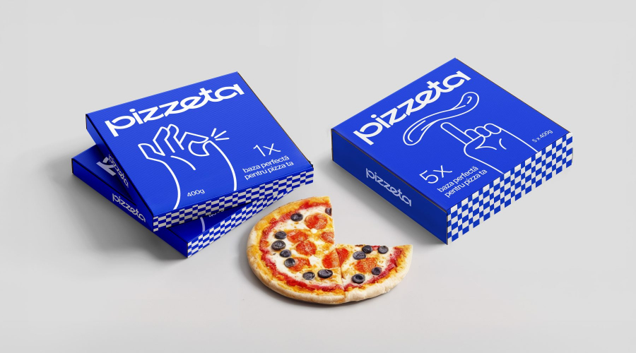
- Food & Beverages - 35.7%
- Healthcare & Medical - 14.3%
- Manufacturing - 7.1%
- Enterprise - 7.1%
- Transportation & Logistics - 7.1%
- Consumer Products - 7.1%
- Retail - 7.1%
Major Industry Focus
Project Cost
- $10001 to $50000 - 100.0%
Common Project Cost
Project Timeline
- 1 to 25 Weeks - 85.7%
- 26 to 50 Weeks - 14.3%
Project Timeline
Clients: 5
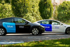
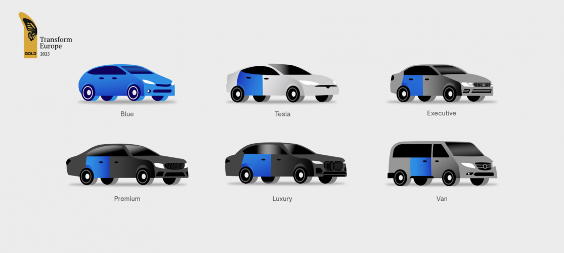
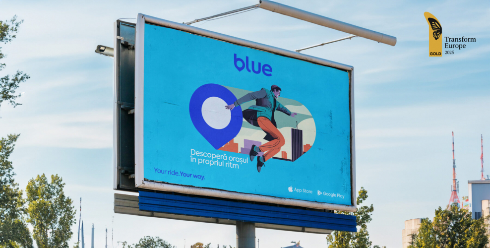
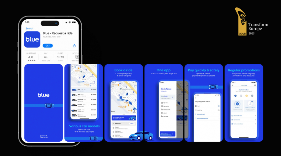
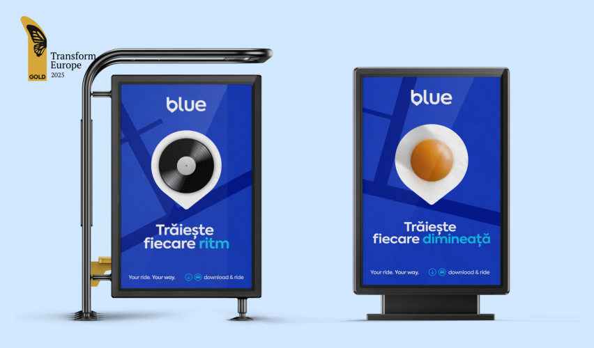
- Blue
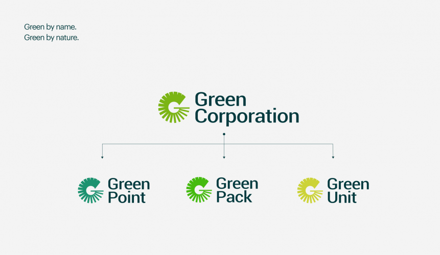
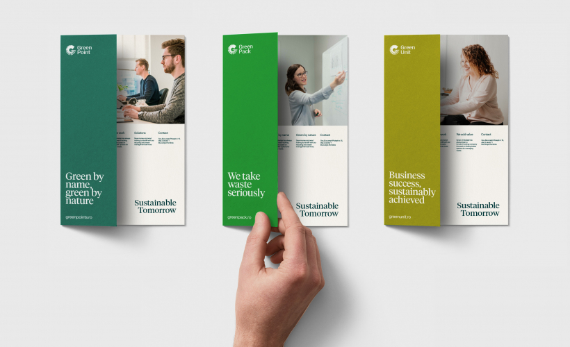
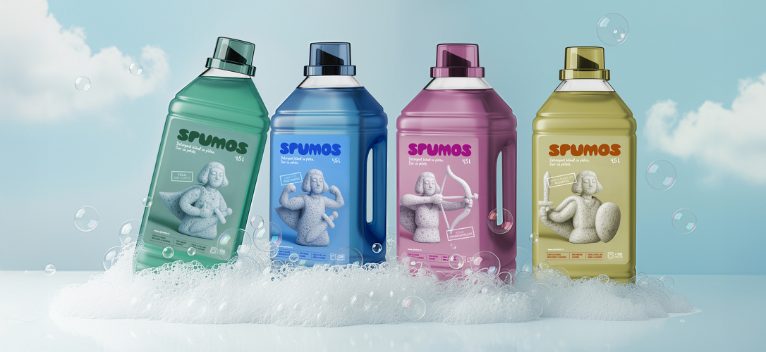
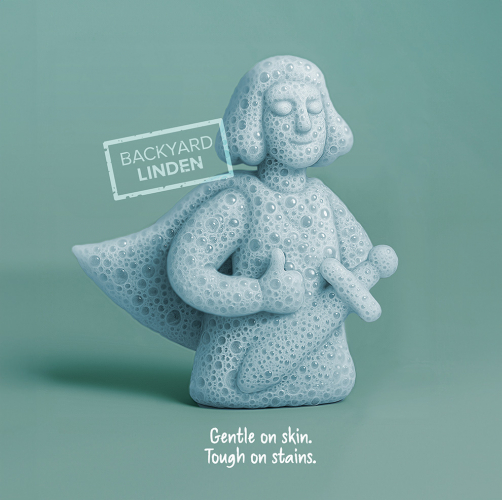
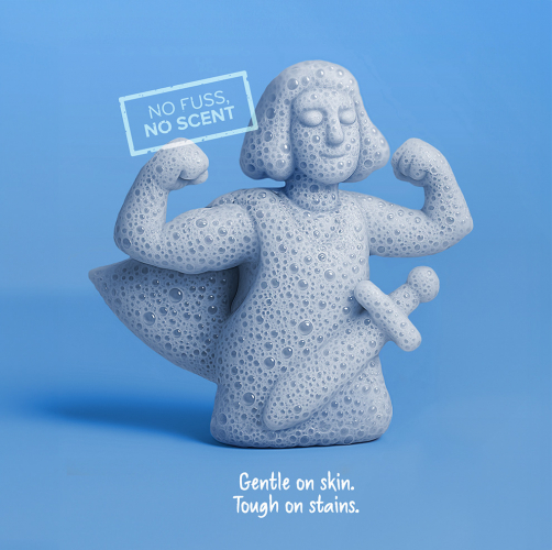
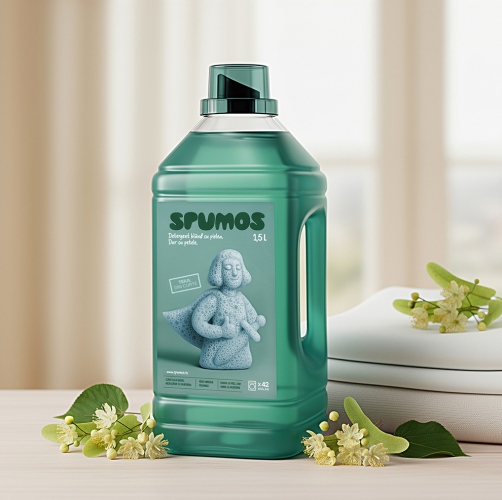
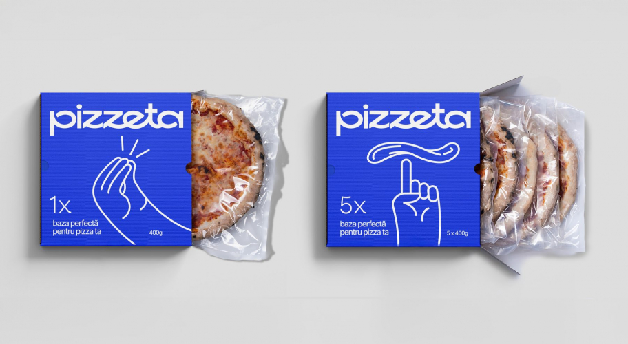
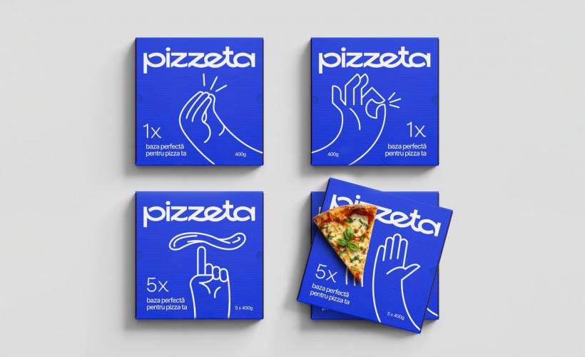
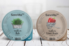
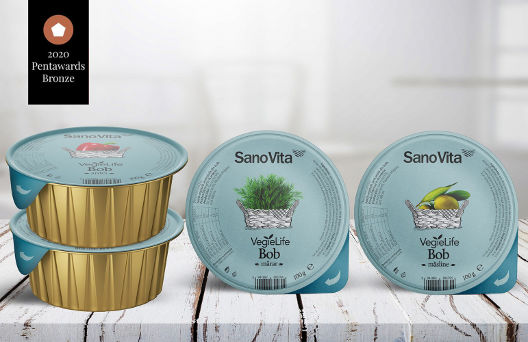
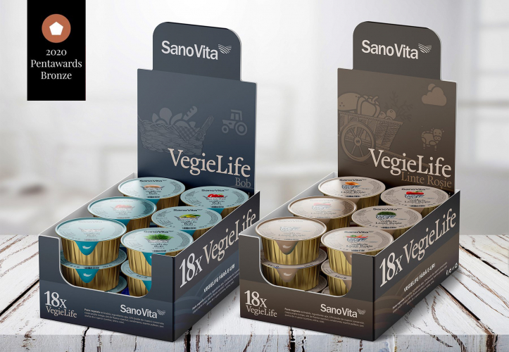
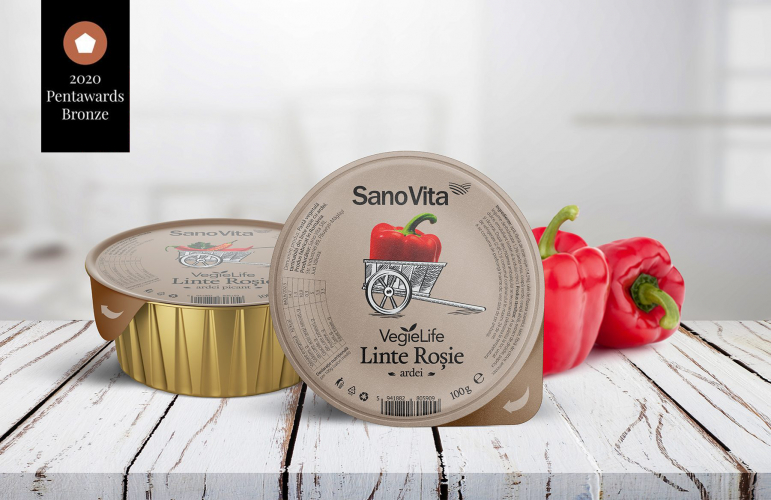
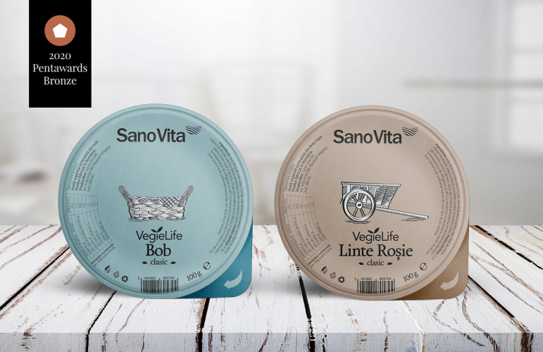
- Sanovita
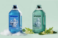
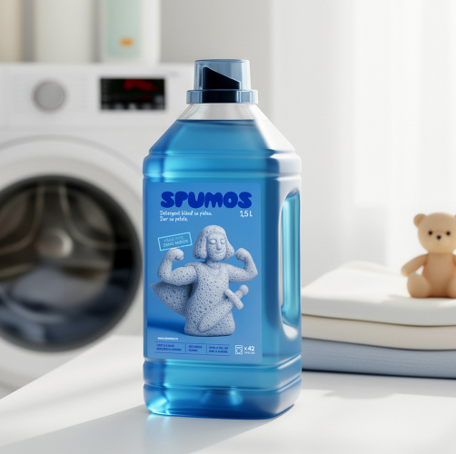
- Spumos
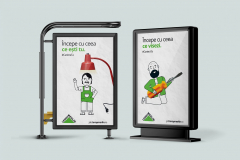
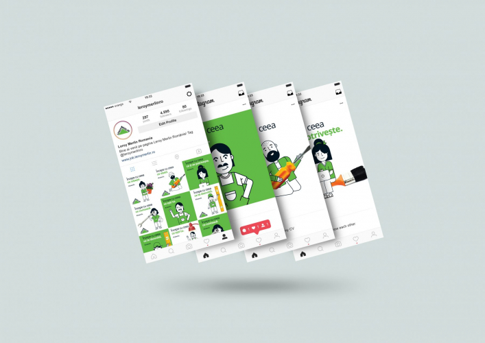
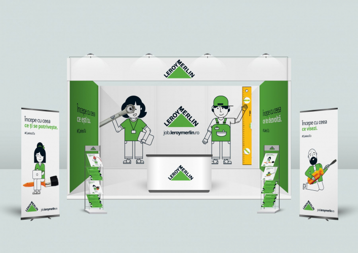
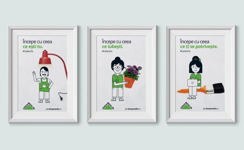
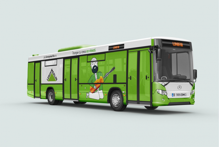
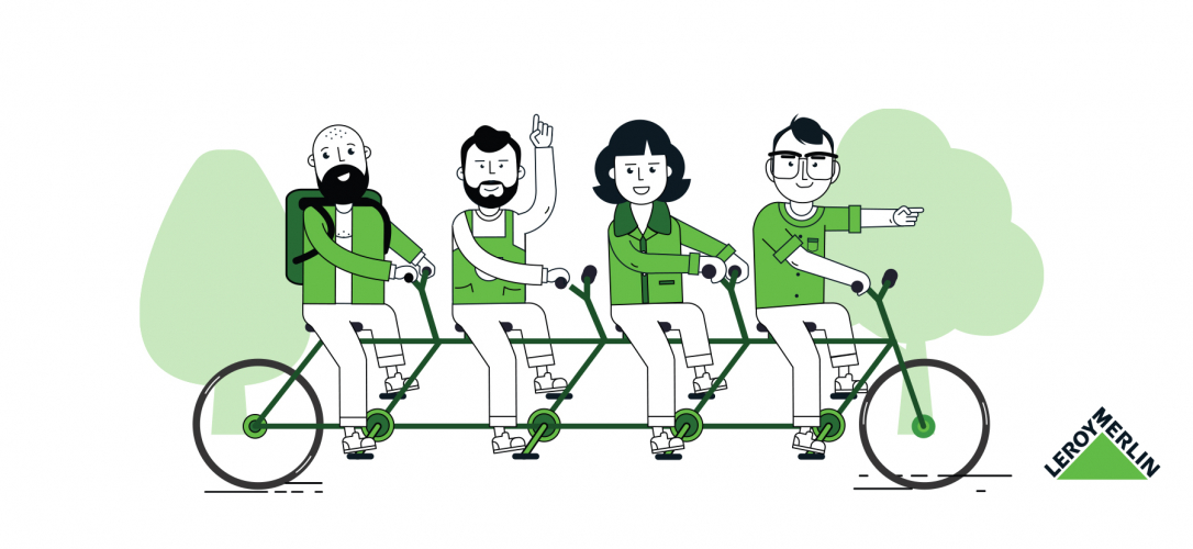
- Leroy merlin
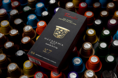
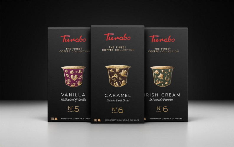
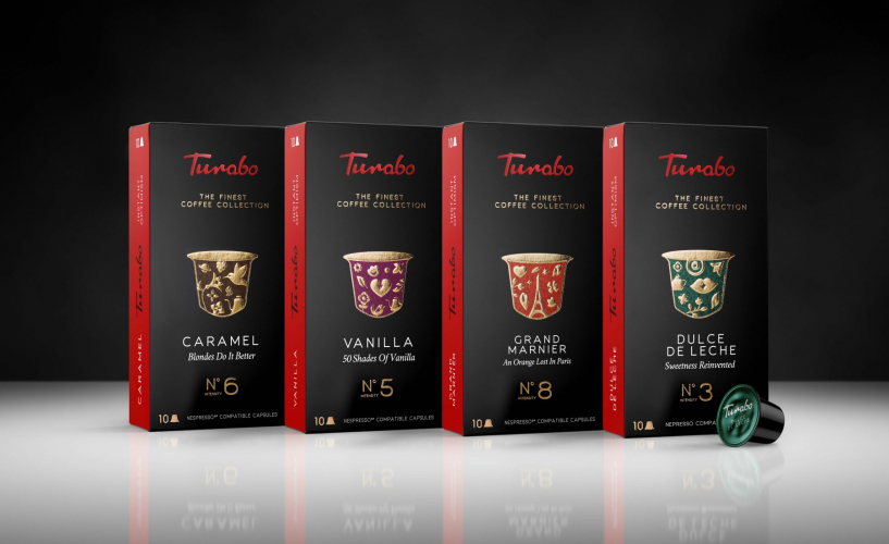
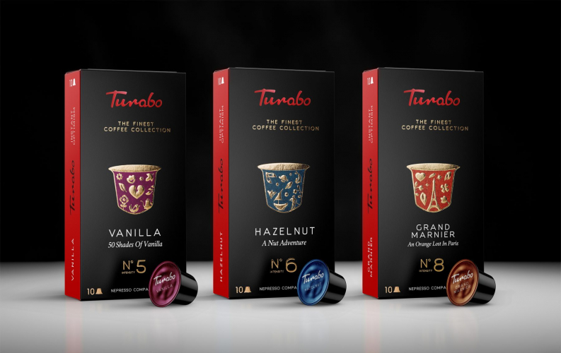
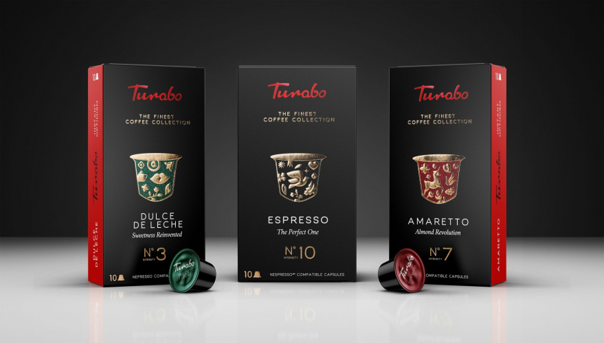
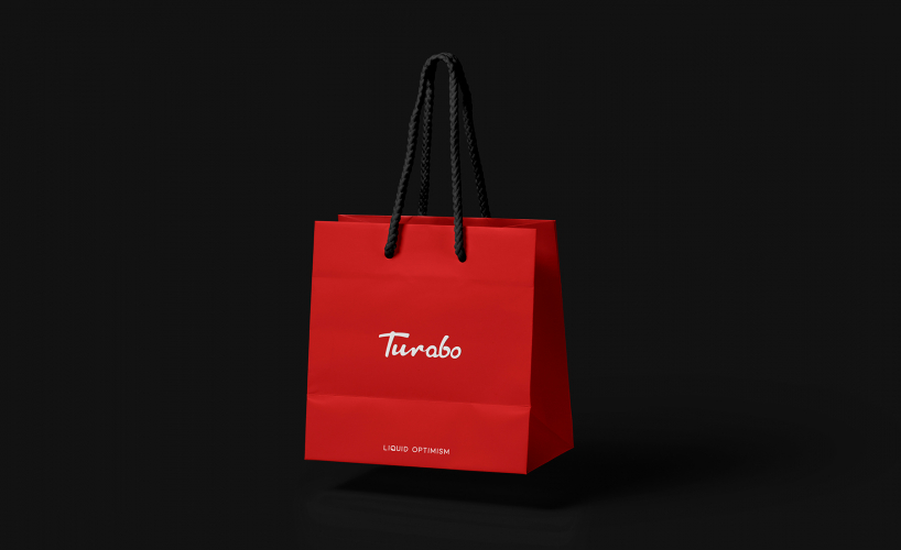
- Turabo
Portfolios: 14