From drawing visitors' attention to special offers to highlighting calls to action, from helping them identify clickable elements to engaging them with the content, a great web design is essential for every online business. Entrepreneurs need to keep track of all the latest web design trends to have a better interface and graphic design and craft incredible user experiences.
A website that wonderfully combines the elements - content, aesthetics, visibility, interaction, and usability - is the one that creates a positive and strong impression on the users. To achieve so, web designers work consistently on appearance (colors, typography, and images), layout (structure and categorization of information), and content, in some cases. But before this, a business needs to understand its target audience, adopt digital innovations, and define a vision of what they wish to achieve with their website.
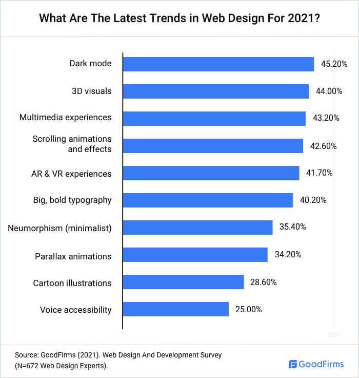
Goodfirms surveyed 672 web designers and experts to know the leading web design trends for 2021.
10 Latest Web Design Trends For 2021
Every business has different expectations for its website design. However, usability has a slightly higher priority than mere aesthetics. Some basic elements for every website remain almost the same, irrespective of its goal. Such as it must
- Be simple yet pleasing, responsive, and adaptive
- Not have extraneous information and functionalities that might confuse or distract users
- Suit the user group and go with the brand's image
45.2% of the surveyed web designers consider dark mode the most sought-after trend this year, followed by 44.0% preferring 3D visuals.
Here are the latest website design trends that will help think strategically, beyond the screen, into new realities.
1) Dark Mode
Dark mode came in the limelight with Windows Phone 7 in 2010. After verifying that dark mode saves battery life, Google added the feature to their Android OS in 2018. As mentioned earlier, 45.2% of the surveyed web designers pin their faith on dark mode.
What is Dark Mode?
While 'light mode' is the default setting for most apps and phones, dark mode is a supplemental mode. Here, muted-colored text, icons, and other UI elements are presented against a dark background. The dark mode is also known as light-on-dark, black mode, and night mode.
Major tech giants and popular domains - Google, Apple, Facebook, Twitter, YouTube, Reddit, WhatsApp - have actively adopted this mode.
Why Use Dark Mode?
Joe Sites, Senior Front-End Developer at Duckpin, has been a big fan and early adopter of dark mode. He says, "There are some reasons:
- Personally, the blacks and dark grays with white or light gray text are much easier on my eyes than a bright white background with black text.
- It can also impact the battery usage of mobile devices, which tends to be a concern for a lot of people.
- Having a darker interface is also more welcome for people suffering migraines, or people viewing the web in bed with the lights off."
Also, night mode helps websites to be properly assessed by people with various disabilities or impairments. For example, research shows that designs using dark text on a light background yield the best performance even for people with certain visual impairments such as astigmatisms.
Jude Lee, Software Architect and Expert at Digital.com, loves seeing the trends on dark mode. He says, "Long before it was a trend, I was already using browser extensions to view the site in dark mode for those that didn't offer it. The most recent adoption of this in a platform that received an excellent response was Github. The majority of developers prefer their code editors to be in dark mode, and when it finally came to GitHub, it was largely celebrated, and now it's a full feature past the beta stage."
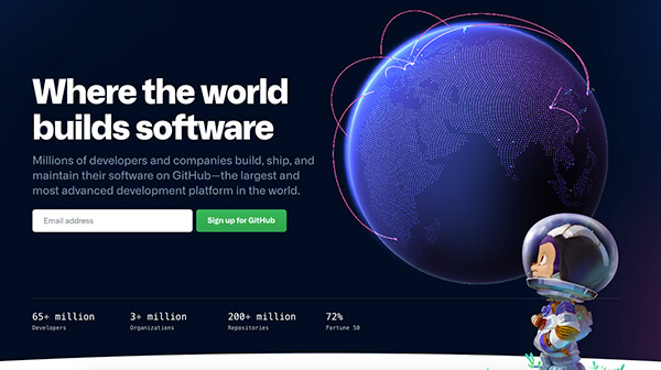
Source: GitHub
Points to Remember while Designing a Dark Theme
- Use dark gray as the primary surface color for components, rather than pure black as high contrast might be irritating.
- Use lighter tones (colors in the 200–50 range) instead of heavily saturated colors to have better readability on dark theme surfaces.
- Have a clear content hierarchy and emphasize crucial elements in the layout.
- Have proper contrast to avoid the design appearing dark and muddled or delivering a jarring visual experience.
2) 3D Visuals
3D visualization is the process of creating virtual models and renderings to explore, review and envision 3D designs. Various industries, ranging from gaming, engineering, architecture, media and entertainment, manufacturing, use this technology.
Advances in browser technology and numerous 3D rendering tools are revolutionizing the three-dimensional landscape. Web designers can now include far more interesting and realistic elements. 44.0% of the surveyed web designers even consider 3D visuals an enticing feature to create an impressive web presence.
Why is 3D Visualization Important?
- Brands can grab the user's attention by creating bright and diverse user interfaces, animated videos, illustrations, and advertising graphics.
- When designers add depth, realism, and novelty to the images, users can engage, entertain, and stay longer on a website, increasing the average session duration.
- Customers often hesitate in investing when they cannot see a product in real life. However, being able to see them in 3D inspires them to check out extra details. The enhanced sensory perception helps them in making informed decisions.
Sarah Wolterman, the Lead Designer at Knowmad Digital Marketing, believes in incorporating interactive design features in a website.
She says, "The B2B Community tends to be more cautious when it comes to web design trends, but some companies are launching sites with features designed to drive conversions. One of our most recent examples: Door Systems. Their Interactive Warehouse feature allows architects and project managers to visualize their industrial space and the placement of overhead doors in each building section."
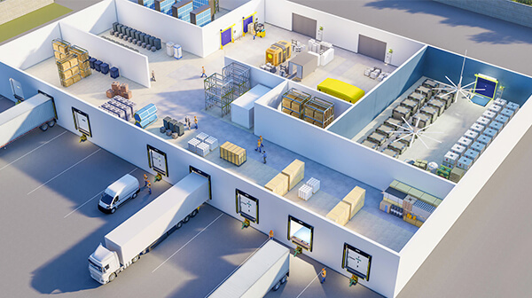
Source: Door Systems
3) Multimedia Experiences
These days, a website cannot merely survive on written, textual content. It has to incorporate several different media, such as images, infographics, videos, podcasts, and slideshows.
43.2% of web designers favor providing multimedia experiences to convey information engagingly.
Why is Multimedia Important?
Multimedia is essential to generate engagements, reactions, and shares.
- Multimedia serves different types of users with their choice of option to learn more about any company.
- A website looking like a wall of text can intimidate and overwhelm users. Multimedia helps break up the text, enabling them to go through the website at a slower pace.
- Users hover over the media, such as videos, for longer and with full attention. This works as a perfect opportunity for a brand to provide them more information about their business.
- Companies can add a call-to-action at the end of multimedia and generate more leads.
- Ultimately, companies can increase average session duration, reduce bounce rates, and improve the website's SERP rankings.
Points to Consider While Implementing Multimedia
However, while multimedia provides designers with more design options, it also requires disciplined implementation.
- User interfaces with unrestricted use of media can confuse the users instead of engaging them. Not every web page needs to bombard the user with unjustified multimedia. Having an ideal mix is the key.
- Including a permanently moving animation on a web page can make it difficult for users to concentrate on reading the text.
- Every media needs to have keyword-optimized metadata.
- Dynamic slideshows help keep the users' attention with a strong visual effect.
Emil Skandul is the Principal/Founder of Capitol Foundry, a design-driven web firm based in NYC. He likes to keep lists of the most compelling websites that they can use for inspiration.
Emil says, "Multimedia is a quick and efficient way to make users awed by design and technology." Giving an example of one such website, he says, "Rimac is a fast-growing supercar company based in Croatia and invested in by Porsche. It produces the technology for the next generation of electric vehicles. What makes their website work is the experience it provides in telling that story through videos, parallax animations, and more."
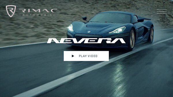
Source: Rimac Automobili
4) Scrolling Animations And Effects
Earlier, there was fixed background scrolling, where background elements were static while the rest of the components continued to scroll. With animation software and advanced prototyping tools, designers can make elements of a website emerge or move as the user navigates down a page. For instance, elements can appear from the side of the screen or scroll in from a different direction.
42.6% of the surveyed web designers prefer creating a dynamic scrolling web experience with scrolling animations and effects.
Scrolling Animations is quite beneficial because:
- Content that comes into view as users scroll is more eye-catching than a static one. It inspires users to stay for longer and scroll further.
- Visitors don't have to wait for the entire web page to load because scrolling animation allows individual elements to load whenever required. Designers can direct the user's attention to essential pieces first, like above-the-fold content, a form, CTA, or others based on the visitor's goals.
Points to Consider While using Scrolling Animation
- The effects don't need to occur whenever the user scrolls to a new section. For example, first, the text gets loaded, the user finishes reading, and then when they start scrolling, the animation is there to direct them further. This way, a web page engages the users and prevents them from becoming lost when navigating.
- Including a subtle scroll animation underneath a set of callouts provides novelty in a web design without compromising usability.
- Scroll animations with bold photography can be used to highlight brand values, projects, and team members.
- Scrolling can create a 3D experience, letting users zoom in / zoom out or even go inside an object.
- Designers must use scrolling in a manner that doesn't distract users from the target content or cause usability issues. There should not be too much motion and effects on the same page.
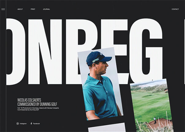
Source: Doonbeg—Golf Club
5) AR & VR Experiences
Unlike conventional user interfaces, virtual reality places the user inside an experience. It lets users immerse themselves in a completely fabricated, alternate universe. Here, they move and interact with the environment like they would in real life. On the other hand, AR allows users to see computer-generated images layered over the top of their actual surroundings.
Both AR and VR heavily complement each other in improving UX. They use technologies like headsets, goggles, digital projections, or smartphone screens.
41.7% of the surveyed web designers consider AR-VR essential in driving better experiences for end-users.
AR's most common use cases can be found in the eCommerce industry. When website owners provide real-time visualization of remote products, users can make informed purchases. For example, they can try on a pair of shoes, an outfit, a shade of make-up, or check how an article of furniture looks in their home.
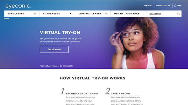
Source: eyeconic
Also, offering a way of controlling a computer via eye-tracking can be an excellent option for website accessibility. This option enables people with speech and language disabilities to type with their eyes and read the text aloud in a synthetic voice.
What Points to Consider While using AR & VR for Web Designing?
Even seasoned designers might often find designing for augmented and virtual reality to be intimidating. Here are some points to get started and keep going.
- First, designers need to understand what works and what doesn't from a UX/UI perspective. They must consider technical limitations and ensure that the hardware is helping the user experience, not hindering.
- Customers love to interact with applications or technology that is simple to access and use. High-effort and repetitive interactions might exhaust them, prompting them to give up.
- It is essential to determine that users can interact with which elements of an interface. This can be achieved by defining inputs and outputs. For example, one possible input is 'a swipe of the hand'. Designers also need to consider different input possibilities offered by different mobile devices.
- Output could be something like offering a three-dimensional model of a product for which customers can change colors or positions.
6) Big, Bold Typography
The major portion of a website is made up of typography, making the words and how they are represented an important aspect. Therefore, designers need to understand how to arrange a typeface (serif, sans serif, script, display) in various fonts, sizes, weights, and spacing.
Weights are often classified as - light, thin, medium, regular, bold, heavy, based on the thickness of the strokes making up the characters. In recent years, big, bold typography has surfaced as a prime consideration for improving the readability, conveying the intent and sentiment of the business online.
"40.2% of the surveyed web designers use big bold typography."
"Big and bold fonts are back for 2021, but this time they're taking on a more psychedelic feel reminiscent of the 70s. This trend has given us typefaces that drip down the page in a dreamy lava lamp splendor or that twist and spin around in a vivid display of neon colors, gradients, and heavy italics," says Kate Renda, Creative Digital Marketing Specialist at Cosmitto.
Kate adds, "With these borderline-trippy typefaces, you have to be careful when it comes to readability for web design, but when used thoughtfully, they work wonders at sparking a kind of mesmerizing joy."
Emilia Negoescu is a growth-driven designer at STOICA.CO. She believes that this trend is rapidly becoming a symbol of innovation, either geometric or organic.
Emilia says, "Looks like, in 2021, the classic typography will be reshaped into 3D. The ultra-realistic lettering that feels like you can reach in and touch will become a visual representation alongside animations, textures, and patterns.
As if there wasn't already enough chaos floating around the world, Chaos Typography will take 2021 by storm. The main idea behind it is a deconstruction of what we perceive as beautiful and useful. The lack of text and letter alignment, mix the order of letters and words, strong contrasts, big and sophisticated typeface. I think sometimes we need to break the rules, and this seems like a fun way to do it."
Emil Skandul gives an example of a website, Bianchi, that skillfully uses big, bold typography. He says, "If you're selling a bike, you better have a loud message that pushes forward. Emboldened typography gets the message out in the most obvious way - it is neither reserved nor tame in getting a visitor's attention. As brands compete for attention, bold typography allows brands to stand out clearer with that message."
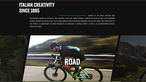
Source: Bianchi
7) Neumorphism (Minimalist)
Neumorphism combines background colors, gradients, shapes, highlights, and shadows to attain a soft, extruded plastic look and almost 3D styling. Designers have aesthetic freedom here, where they can add a physical element to the flat UI paradigm.
35.4% of web designers use neumorphism to create a soft visual that is consistent and easy on the eyes.
"Neumorphism is the lovechild of skeuomorphism and material design. You know neumorphism when you see it. As it's often defined by rounded edges on cards, both dark and light shadows, background colors that are very similar to the foreground colors, and more," says Payge H. Kerman, President at Wink Digital.
Payge adds, "Some examples of these elements in practice are typically in apps that are designed to be ultra-streamlined and rather futuristic. Neumorphism is not a great choice for sites that are driving hard CTAs."
Apart from CTA issues, designers need to keep specific points in mind when working on neumorphic designs.
- Neumorphism works with a narrow margin of colors and contrast, so even the slightest deviation in saturation can render the entire raised effect fail to deliver.
- As a button is a key UI component in any interface, it must be very noticeable and change the states when users interact with it. Again, this is problematic because of very few color ranges.
- Visually impaired users might have accessibility issues, with crucial things disappearing into the background. Even the users with low-quality screens might miss small details in the design because of the subtle differences in shade that set elements and components apart.
Payge presents her outlook on how neumorphism became so popular despite having a bit limited use cases. She says, "Every year, the web design community sees shifts in trends that are modeled after many societal changes. My opinion is, web trends have moved to reflect the social trends moving towards minimalism in life. Users have gotten more accustomed to minimalism in design, less flashiness, and less pushiness towards purchases. This trend allows users to have less visual clutter, and more autonomy in decisions."
Source: Outcrowd
Combining neumorphism with good typography and higher contrast elements is a smart way to keep UI design accessible and user-friendly.
Daniel Whitmore, Head of Design at CIPHR, expects to see more and more websites adopt a minimalist approach to design. He believes partly this is driven by evolving style preferences, but a significant influence for web design is Google's core web vitals update, planned for this year.
Daniel says, "This update from Google will place greater emphasis on speed and usability of a webpage, with a particular focus on access via mobile devices, something a minimalist style is well suited to. This might also mean having to remove any plug-ins that were nice-to-haves, serving modern image file formats at scalable sizes, and compressing imagery to reduce page loading times."
8) Parallax Animations
Different visual elements, background, and foreground designs move at various speeds in this design technique. Some parts might move slower, others faster, while a few might remain standstill. Combined with 2D scrolling, this concept creates the fake illusion of depth, distance, and dimensionality throughout a web page.
The parallax effect has been used for a long time for different mediums. Such as in classic video games like Super Mario and animated movies like Disney's Snow White and the Seven Dwarfs.
34.2% of web designers use parallax to encourage users to scroll through the entire design. Along the way, they can place the highlighted call to action.
"Parallax animation is the huge web trend we will continue to witness in 2021. The web animations are getting complex with the separation of page elements into foreground and background extremes, creating a parallax effect," says Caroline Lee, Co-Founder of CocoSign.
Caroline adds, "Why is this trend popular?
- It helps web pages look real and surreal, with the effect of objects near the viewer appearing to move faster than those far away.
- It transforms the computer screen into something closer to a theater stage with the aid of depth created using foreground and background, with the added benefit of immersion."
Source: Tran Mau Tri Tam
Harriet Chan, Co-founder & Marketing Director at CocoFinder, gives a few tips to enhance the website's overall appearance. She says, "Do remember to -
- Adopt a minimal amount of parallax movements on the screen.
- Restrict the parallax effect within a short coverage area.
- Reduce the parallax effects within an optimal range.
- Include an option to turn on or off by the user.
- Insert the parallax effects precisely, which does not distract or prevent the user from completing the crucial tasks."
Harriet believes that in 2021, one can expect some refinement in implementing this effect. She says, "People with vestibular disorders will find it hard to observe this animation for longer. A Depth illusion results in dizziness in them. The designers had taken some extra efforts to embed the parallax animations with minimal effect, and overcome its harmful consequences precisely."
Some points to keep in mind for parallax animation are -
- Parallax, being too niche, does not work that well for content-heavy websites or huge websites.
- Less tech-savvy users may find parallax web design overly complicated and frustrating to find information.
- Older browsers like Internet Explorer 8 may have difficulty rendering parallax design and scrolling.
9) Cartoon Illustrations
Websites can often be pale, dull, or rigid, which they don't need to be. Web designers nowadays can use hand-drawn illustrations, doodles, character illustrations, or scenic illustrations to turn an ordinary site into a unique one. That too, without compromising minimalism. A fun and friendly website succeeds in retaining visitors' interest and memory of the experience for longer.
28.6% of web designers love using cartoon illustrations to showcase their creative prowess.
"Illustrations have become an essential part of our visual design language at Pumpkin as pet insurance is still something a lot of consumers don't really understand," says Julia Sosa, Head of Experience & Design at Pumpkin Pet Insurance.
Julia explains, "There are a lot of confusing concepts or even 'scary' scenarios (e.g., pet emergencies and illnesses) that are hard to communicate with just a few words or photography. This is where illustration can be really powerful - you can communicate something quickly without having to be too literal. So many brand websites have complex products to explain, illustration makes it easier for consumers to understand a concept – how something works or how something can benefit them."
Joe Terrell, Founder of Drifted, says, "As far as web trends go, crypto organization sites have some of the trendiest websites as they have thousands of developers and coders leaping at the chance to lend their skills. For instance, here is Ethereum's website. It has a great design, dark mode (top right), and cartoon graphics."
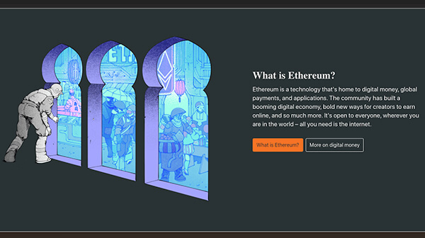
Source: Ethereum
10) Voice Accessibility
With phones, home assistants, speakers, and other voice-enabled devices becoming part of everyday lives, voice accessibility is developing rapidly. People consider voice assistants to be smarter, faster, and easier to perform everyday activities. However, for situations involving money, they still prefer what they already know and trust.
The popularity of voice assistants has propelled big brands, such as Amazon, Bank of America, and Flipkart, to add voice assistants to their websites' and apps' primary modes of communication. Voice accessibility is beneficial for people with physical disabilities, chronic conditions (such as repetitive stress injuries (RSI)), and learning and cognitive disabilities.
25.0% of web designers consider voice accessibility a trend necessary for easing or elevating the customer experience.
"Voice search is a huge trend and businesses need to optimize their websites accordingly, with search phrases that are specifically targeted to voice search. Because these searches often focus on local queries, it can provide an edge to small businesses that serve a tight-knit community. Restaurants are a great example of this," says Rex Freiberger, CEO of License to Vape.
Rex believes that voice accessibility isn't just about search. He says, "That may be how people find your site, but what if they still want to interact through voice once they're on it? Many sites are offering voice navigation and simple voice commands to do things like scroll through pages. This can create a more streamlined experience for users on a mobile device and provides accessibility options for those who may not have the motor skills needed to navigate a site manually."
Sebastian Schaeffer, CTO/Co-Founder of dofollow.io, points out two reasons behind voice accessibility being considered as a foundational web design trend right now. He says, "The first has to do with the new Web Content Accessibility Guidelines (WCAG 3.0) that set out to improve digital inclusion across the web and reward sites that make an effort."
Citing the second reason, Sebastian says, "Right now more than half of searches done online are voice searches. This is why web designers are touting features like increased conversational language for content, optimizing for rich answers and more long-tail keywords."
Conclusion
Whether it is about growing an eCommerce business or increasing the number of leads, a web design that is in tune with the upcoming trends provides a one-of-a-kind experience and helps the company grow.
Heavy, bold fonts are on-trend, making the viewer instantly aware of the message. Also, there will be more saturated colors and three-dimensional designs, animated transitions between the landing pages. Even though it is a common conception that symmetric layout does well in establishing order and stability, designers today do not shy away from adopting asymmetrical layouts and create visually balanced websites.
Furthermore, modern websites embrace neumorphism (minimalist), parallax animations, scrolling animations, and cartoon illustrations and become more fun and dynamic. Features such as voice accessibility and AR/VR experiences increase overall website accessibility for physically disabled people. The ultimate trend is to blend the real world and the digital world in a way that your website looks, feels, and works at its best on various devices.
About The Web Design And Development Survey
Goodfirms surveyed 672 web design experts worldwide to know web design trends for 2021.
We sincerely thank our Research Partners for helping us garner the participants.
The survey respondents belong to various socio-economic geographies such as the United States (37.8%), India (19.3%), Ukraine (8.6%), Canada (3.9%), and Others (30.4%).
The participants were various sizes of web companies - 35.1% of Small Firms (1-10 employees), 63.4% of Medium Firms (11-500 employees), and 1.5% of Large Firms (500+ employees).
* For any queries, drop an email to [email protected]
- 3 Media Web
- 4Geeks Technologies, Inc.
- A Dying Art Company, Ltd
- ABAMobile
- Absolute Digital
- Accnee Technologies
- Ace Infoway
- Ace SEO Consulting
- Addact Technologies
- AddWebSolution
- Adelmo Technology
- ADGLOB INFOSYSTEM PVT LTD
- Adoriasoft
- Adsum Originator LLP
- Afritech Media
- Agicent App Company
- Agyepong, Inc. Marketing Agency
- Akestech Infotech Pvt Ltd
- ALLYEXIA LLC
- Almond Solutions
- Alone Media LLP
- AMgrade
- Angle2
- App Maisters Inc
- Appco Software
- APPCODERZ
- Appentus Technologies
- Appsord
- Appther Mobility Technologies Pvt Ltd
- Appus Studio
- Appworks Technologies Pvt Ltd
- aQb Solutions Private Limited
- Arcas Web Design
- Aristek Systems LTD
- Arsmoon
- Artezio
- Artiology
- Artistic Bird
- Ateam soft solutions
- Avgi Solutions
- Axisbits
- Babel Agency
- Baker Web Solutions
- BAM Studio
- BigRedes
- Bits Orchestra
- Bizcope
- Blink Digital Consulting
- BM Digital Utilization LLP
- Bootsgrid Private Limited
- Boss SEO San Francisco
- BrainBox Apps
- Brand N Digital
- BrandGeko Digital Agency
- BrandLume
- BrandTOM
- Brave Factor
- BugendaiTech
- Carapace Technologies
- Carbon Creative
- Carefree Web Design
- Ceemi Agency
- Claw Studios
- Clio Websites
- Cloudnebula I.T. Services Limited
- Code Web
- Code&Care LLC
- CodeAegis Private Limited
- CodeFencers Pvt. Ltd.
- COG Digital
- Cool Digital Solutions
- Creative Discovery
- Creative Solutions Co. Ltd
- Crunch
- Cubix
- Cyber Infrastructure Inc.
- Cyber Infrastructure Pvt Ltd
- Cynoteck Technology Solutions Pvt ltd
- DaBrian Marketing Group
- Danavero Inc.
- DarkLion Studio
- Dashbouquet Development
- David Kranker Creative
- Dbuzzz
- DECODE
- Deep Blue
- Deetail
- Detecvision Technologies Pvt. Ltd.
- Dev Opus Pvt Ltd
- Digiadlab
- Digiroads
- Digital Eel, Inc.
- Digital Jugglers
- Digital Logic
- Digital Shout
- DigitalDesign.NYC
- Digitalhound Ltd
- Digitalke
- Digitizal
- Divami Design Labs
- Dodwell Solutions Limited
- Dot Angle
- Dot IT
- Duckpin
- Dunice
- E Salahkar
- Eastern Peak
- echoinnovate IT
- eGooty
- Elecsis
- Elite Graphix
- Emote Digital
- Envision Digital
- eSEOspace
- ESK Solutions
- Ethernity
- Evolved Toaster
- Exalture Software Labs Pvt Ltd
- Exemplary Marketing
- extertest
- Exult Cyber Solution Pvt. Ltd.
- Eyelash Technologies
- FewerClicks Software
- Filez
- Fingent Global
- Firebrain Solutions
- FiveDotTwelve
- Flap Marketing
- FordSolution
- Foreignerds, Inc.
- Fortnight Studio
- Fox Techies
- Ganesha Webtech Solutionz
- Genetech Solutions
- GEO Softech
- Geogo Technologies
- getyoteam solution llp
- Gleecus TechLabs
- GLM Media
- Graffitopaints
- Grazitti Interactive
- Greenice
- Grey Chain Technology Private Limited
- Growider Media LLP
- GTMPlus
- Gurzu Inc
- Hardcastle GIS
- Hawking Design
- Hexamer Solutions
- HTMLPanda
- Huboxt
- Hustle Free Solutions
- I Solution Microsystems Private Limited
- iCore Software Systems
- ICTS Custom Software
- Ideators
- ImageX
- Imagint Information Technology
- ImpulseByte Private Limited
- InAppo
- Indus Net Technologies
- INETWORK Middle East
- iNFOTYKE
- Innomize Tech
- Innoventix Solutions
- Insercorp LTD
- Integrity Infoway
- Intersog
- ISS Art
- IT Master Soft
- Janovis Infotech
- Jellyfish Tech
- K2 Analytics INC.
- Kmphitech LLP
- KPITENG
- KR. Laboratories
- Lantern Digital
- Lazy Ants
- Lepshey
- Life Web & Design
- Lift Digital Marketing
- Linnify
- Liventus
- Logidots
- Logmate Logistics
- Magik Digital
- MakeING
- Mantra Labs Pvt. Ltd.
- MANTTHAN WEB SOLUTIONS LLP
- Maocular Tech Expert
- Marketing Deck
- MastakStudio
- Maze
- MCSAM
- Mediavandals
- Melsoft
- Mightily
- Miquido
- Naira Infotech
- Napollo Software Design LLC
- NC Softtech
- Ncoresoft Technologies
- Neovibe
- Nestor Bird
- Networking Bizz Digital
- Neu Notion
- Newman Web Solutions
- Nextbrain Canada Inc
- Nexus Software Systems
- Nivahata Technologies Private Limited
- NumeroEins Software Private Limited
- Octos global.com
- Oflox
- On The Maps Digital Marketing
- One Eleven Web Design
- OnTID Soft Ltd
- OpenGeeksLab
- Optimized Webmedia Marketing
- OS Digital World
- Outrankco Pte Ltd
- Page Traffic Inc
- Pallaton Technologies
- Panx Project
- Parachute Design Group Inc.
- Parvati And Sons
- PBB design
- Pengreen Design
- Penprints
- Perpetio
- PNM Group
- Premad Software Solutions Pvt Ltd
- Prologic Technologies
- Promatics Technologies Pvt ltd
- Quromtech Technology Pvt.Ltd
- Radiant Elephant
- Rambhapuri Technologies and Services Pvt Ltd
- Relia Software
- ReliablePSD LLC
- Render Results
- RentaTeam
- RNS IT Solutions
- RNS Sfotware Solutions Pvt Ltd
- RNS Solutions
- RW Infotech Pvt Ltd
- SA Intellect Solutions
- Sannacode
- Scrum Digital LLC
- Sdreatech Private Limited
- Semantica Digital
- Semaphore Mobile
- SenSeo
- SEO Monolith
- Seven Dynamic
- Sevna Infotech
- Sibers
- Skywell Software
- Slogfy
- Smashing Infolabs Pvt. Ltd.
- soflytic technologies
- Solve IT
- Sosene Software
- Speedwell
- Stafflancer
- Starfish Web Design Philippines
- Steelkiwi
- Stymeta Technologies
- Successive Technologies
- SumatoSoft
- SunArc Technologies Pvt. Ltd.
- Sustancia X
- Taaglio Consulting
- Tech Creatives
- TechDilation Pty ltd
- TechnoLyte
- Technosys IT Management Pvt. Ltd.
- Technource
- Technovisor
- TechScooper
- Techxide
- The Mega Agency
- Thinksprout Infotech
- Top Notch Web Designs
- Totalsoftware Latinoamerica
- Triare IT
- Trigma
- Trimwebsolutions
- Triple Option Web Design & Digital Marketing
- Trophy developers Uganda
- Troy Web Consulting
- TUYA Digital
- Ucodesoft Solutions Pvt Ltd.
- UKAD
- UMW Media
- Unico Connect
- Unit Space
- upwelling
- Ushyaku Software Solutions LLP
- Variance InfoTech Pvt Ltd
- Vcana Global Inc.
- Vencent Systems Private Limited
- Venum Agency
- Vihaan digital marketing
- VinsDzinerArt
- Vipra Business
- Vorealis Software
- VT Labs
- Webbingstone
- WebCastle Media
- Webchefz Infotech Pvt Ltd
- Webential
- Webfusion Solutions Private Limited
- Webinnovators Technologies
- WebMob Applications
- WebnBot LLP
- WebNet Creatives
- Webpinn
- Websoles Strategic Digital Solutions
- WebTrack Studio
- Webwooter
- WeSoftYou
- Whidegroup
- Wickerten Exzellenz
- Wild Creek Web Studio Pvt Ltd
- Wolfate
- Wordwizard Services
- World SEO Services
- Xanthus Software Solutions
- Yield Interactive
- York Business Solutions
- Zestminds
- Zoewebs Sdn Bhd
- Zuccotech LLC