While a well-designed website can work wonders for the business, bad websites can be equally disastrous. It is difficult to state the loss in numbers due to a bad website design but in general it will damage the credibility of the business, make it look like the business is not updated with the latest trends in the industry, and most importantly cost business the much needed loyal customers. A bad website can derail the best efforts of the marketing team. Ultimately, resulting in a loss of time, effort, and money. All of this will then definitely become a challenge for SMBs to manage and recover from.
To avoid ending up in such a situation, it is essential to know the common website mistakes. Goodfirms surveyed 672 web designers to discuss web design mistakes and listed down some bad web design examples.
7 Web Design Mistakes to Avoid in 2021
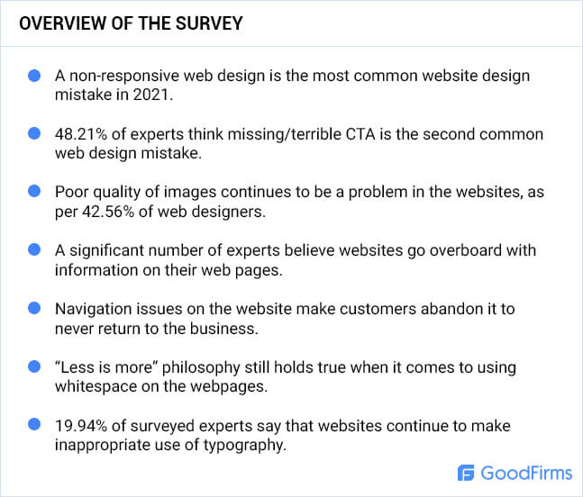
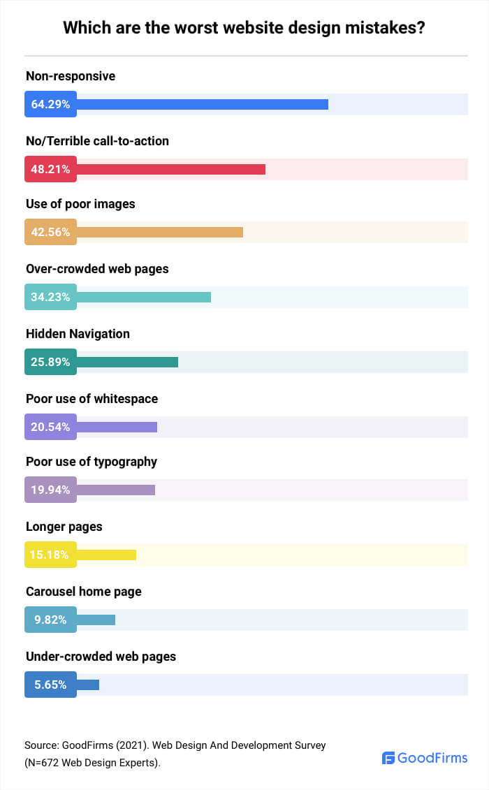
A flawless website design is an absolute necessity for any online business. Starting right from user experience and digital marketing to sales conversions, and SEO results, every stage will need an optimap web design. Lack of optimum website design will result in fewer perks in all these areas. The top three mistakes that can hurt a business are creating non-responsive websites, missing call-to-action/terrible CTA, and using poor quality images.
1. Not Creating a Responsive Web Design
Irrespective of how well a website performs on a desktop, if it doesn’t work seamlessly across multiple devices, then a business is losing out on a lot of revenue. That’s because the website is not offering the convenience that customers are looking for in online shopping.
Generally, businesses make a website that is not friendly to mobile users. Ashish H Thakkar, the Founder of Jimmy Thakkar, states “Most SMBs believe that if a website looks good on all browsers then it is responsive. A responsive website should not only look good on all browsers but it should be mobile friendly as well.”
Ashish suggests, “SMBs need to clarify it with their website designer that they require a responsive website design(RWD) and not a website that just “looks decent” on all devices. If one is unsure about the status of their website then they can always confirm it using the mobile-friendly testing tools.”
Businesses should ensure to take a mobile-first approach. But more recently, businesses are making mistakes by limiting their website to mobile use only.
Daniela Baker, the Community Manager at CreditDonkey, explains, “This boxed mentality stemmed from depending too much on the magic of smartphones. SMB's depend on technological advancements and reliability of gadgets to do the job for them. For example, reading small letters on non-responsive websites is claimed to be easy to cure. You just have to flip your mobile from portrait to landscape, then voila, everything becomes easier to read. Usually, this trick works, but most of the time, it doesn’t. SMB’s should have a strong bias for action in their websites.”
A responsive website works well on any kind of device - desktop, mobile, tablet, smart speaker etc - a user is on. If a website is non responsive to multiple devices, business is missing out on the following benefits:
- Traffic from mobile users
- Lower website maintenance costs
- Seamless user experience to website visitors
- Higher rank in search engine results page
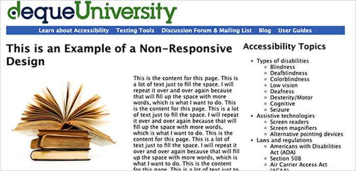
Examples of Bad Websites that are Non-Responsive
Deque University - On visiting the website from a smartphone, the browser window gets smaller but the page layout does not change. It is impossible to read the text without scrolling to the right side.
2. Not Adding a Call-To-Action or Using a Terrible One
Terrible or missing call to action is the second common web design mistake that businesses make, say 48.21% of surveyed experts. Websites are a means to make the visitors traverse through the sales funnel and go from the prospects’ stage to a customers’ stage.
Now, every website has a goal that they want to achieve. It could be either leading the visitors to make a purchase, read a blog, or inquire about the services. Lack of a CTA means the visitors don’t go through the sales funnel strategically. Ultimately, it means missing out on important conversion opportunities.
A Senior Designer at Three29, Hailey Rabdau explains the reason behind businesses committing the mistake of putting few call-to-actions or not adding one at all.
She said, “In the case of too few call-to-actions, we have to acknowledge that the hardest thing in sales is asking for the sale. The hesitation to repeat a CTA stems from that sentiment. We don’t want to be annoying or ‘salesy’.
In the case of no CTA’s? One of the most difficult things to do is to see your work objectively. When business owners are designing sites without the help of experts, they often feel they know exactly how they work and that it’s obvious that the user will find their way to conversion, but they won’t.”
Apart from the thought of not wanting to appear as too pushy, there is a different possible explanation too of small business owners committing this mistake in hindsight. Stella from Stellar VA Services shares what can be the cause of forgetting to put a CTA.
In Stella’s words, “I see many sites where this information is only found on the contact page. Most web designers are not marketing people so they may overlook functional design aspects. And if the SMB owner is doing the work themselves, I strongly believe it’s a case of overwhelm where important details get skipped in an effort to get it done.”
As CTAs are the ones that will get website conversions, it is necessary to highlight them. It is suggested to place them in a way that is visible to the visitors without having to scroll further. Most importantly, CTAs should be as clear as a day. Some tips to design CTAs for boosting the website’s conversion rate are:
- Name the buttons short & precise
- Experiment with colors
- Find out the right spot
- Put creative skills to use
- Add animations & effects
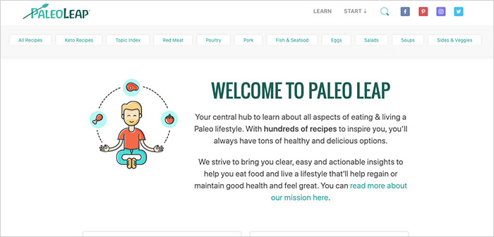
Examples of Bad Websites with Terrible/ No CTA
Paleo Leap - The website has dozens of CTAs on the homepage which makes it confusing for the users about where to start. Moreover, the call-to-actions are hardly noticeable. They bend in the white background.
3. Not Using Quality Images
Low-quality images are a sure-shot way to let down the customers or website visitors, according to 42.56% of experts. SMBs should not forget that visuals have more impact than text. So, poor quality of images means an increase in bounce rate as the website will be perceived as unprofessional.
Ted Liu, Founder & CEO of Just SEO, highlights the two common reasons for SMBs to use poor images or ignore the issue altogether.
“They think their content is good enough to negate their mistake.
For SMBs that knowingly make this mistake, a very common reason might be that they overestimate their copy. They go with poor images because they believe that whatever they’ve written is so good that it will make people ignore the low-quality images they come with.
They don’t know how much of an impact this will make.
There are still companies out there that see images simply as things to fill their website. They don’t think of images as a big deal in their business strategy, so they do not spend time perfecting them,” said Ted.
Jessica Watson, CEO & Creative Director at Points North Studio, offers some additional insights, “The reality is that several SMBs are in love with their images, even if they are not high quality.. They don't always have the outsider perspective to understand how an image could be hindering their online presence instead of elevating it.
On the contrary, some of these SMBs are also not easily persuaded when it comes to investing in a professional photo shoot for their brand. In these situations, creative studios (or inhouse designers) are caught in a vicious cycle of trying to work around photography barriers while still delivering quality design.”
Images on a website should be relevant, of high quality, and educate the visitors about the products/services that the brand offers. In fact, images should be enough to convey the message without visitors having to read the description or content on the page.
Examples of Bad Websites with Poor Images
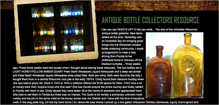
Mrbottles.com - It is a well-known website among bottle collecting enthusiasts. A user would certainly expect something from an online hub that tells everything one needs to know about their bottle collection but in reality, the website is disappointing. The website has poor-quality images of happy bottle owners on rotation.
4. Cluttering the Web Pages
Sometimes, SMBs are so eager for customers to know about their business that they go overboard with the content. As per 34.23% of surveyed respondents, this is one of the common web design mistakes that small businesses make. It is essential to know the difference between offering useful information and just dumping content on a webpage.
People will not read content on websites like they read books. They will just scan the content on web pages, and try to find the relevant information. If there is too much content, then the website will look cluttered and also make it difficult for the visitors to find what they are looking for.
The Director of Operations at Force by Mojio, Daivat Dholakia, says that small businesses often use overcrowded web pages because “they are mistaken about the purpose of a webpage and how websites should be laid out. They are desperate to attract customers, so they cram as much information on every single page as possible - as if every page were the only one a customer would see! In reality, even on landing pages, having the best information is much more important than having a lot of information. Overcrowded web pages also result from keyword stuffing by business owners or marketers without sophisticated SEO knowledge.”
Small and medium businesses are often running on a strict budget. As a result, it is no surprise that employees or business owners try to don different hats while working. Greg Birch, the Senior SEO Specialist from Store Space, elaborates, “Small business owners often overcrowd web pages because they are tackling their digital marketing efforts themselves. Maybe their experience is in operating a business, not digital marketing, so they don’t know how to properly layout a site. Or maybe they don’t want to/can’t hire someone to work on it, so they can only spend a small amount of time working on their site themselves.
SMBs may try to include every aspect of their business on their home page or on just a couple of pages on their site, thinking that it will prove sufficient. The potential cost of this mistake is that you may miss out on customers by not answering their questions quickly. Plus, your local search rankings may suffer as well. For example, when people search for businesses “near me,” a business with better site layout, topic coverage, usability, etc. will often outrank businesses that don’t have well-considered sites,” said Greg.
In order to make it easier for visitors to find the required information, keep the content crisp. It is even better if a web page has headlines, images, and bullet points to make the content easier to scan. By doing so, SMBs get an additional benefit too. Google reads headlines/subtitles before the paragraphs. Keyword-rich headlines will go a long way in boosting the search engine rank.
Examples of Bad Websites with Over Crowded Web Pages
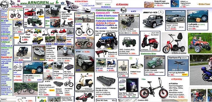
Arngren.net - This website is a perfect example of overcrowded web pages. The website contains listings with no particular structure to them. Moreover, they are not divided into categories either. The listings just fit together like a jigsaw puzzle.
5. Not Making the Navigation Easily Accessible
In the age of having access to almost everything at your fingertips, if visitors face issues in navigating through the site, they will abandon it immediately to never return. Proper website navigation will enable visitors to move from one page to another without any hassles. If a website has issues with the navigation itself, then people will not be able to discover the content. No content discovery means no conversions.
In spite of navigation being a crucial part of any website’s success, hidden navigation is one of the common web design mistakes that SMBs make in the opinion of 25.89% of experts.
Sometimes SMBs hide navigation to cover up the other complications in their website. However, doing so only leads to a loss for the business.
Bill Joseph, Owner of Frontier Blades, explains, “Some businesses opt out of integrating a visible search bar or choose to maintain a hidden search bar to prevent customers from discovering cheaper alternatives to their desired product. Additionally, businesses may dismiss the idea of having a visible and fixed search bar within their website to circumvent page speed issues or technical complications with their website's theme. Not implementing a constantly visible search bar hinders the consumers' ability to navigate a business's catalog to find the desired product or related product(s). When a customer is unable to locate the product they are searching for, they are less likely to make a purchase from your business.”
While some SMBs do it on purpose. Stefan Chekanov, a CEO of Brosix, points out, “I feel there is a huge pressure on businesses to stand out from the others so they try to achieve this with all kinds of tactics. A unique website design is one of them and they often want to make people engage with the website more, so they hide the navigation. This way, they hope to increase the time spent on the website and actually have a distinct look at their website.
In my experience, this can’t be further from the truth. It doesn’t matter how beautiful or unique a website is - if it’s not functional, people won’t stay.”
Follow the best practices for website navigation stated below:
- Position the navigation bar so it is easily found
- The navigation bar should be placed at the same position on every page
- Place the most important things at the beginning & end of the list. Everything else in the middle.
- Be specific in the navigation bar
- Minimize the navigation links
- Recommend next step of action
Examples of Bad Websites with Hidden Navigation
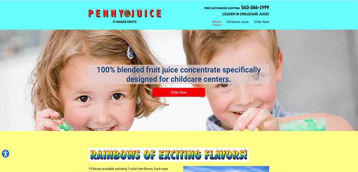
Pennyjuice.com - The website has a page that asks “Who is Penny Juice?” but the gaudy colors make it impossible to find any explanation. Adding to that is the lack of navigation on the website to find out anything more.
6. Not Making the Optimum Use of Whitespace
In web design terms, white space is the space between columns, margins, images, texts, and other elements. Designers leave this space untouched to smoothen things and make the web page more elegant. Proper use of whitespace reflects sophistication as it is a way to organize the elements on a web page and drive users’ attention to certain elements.
Today, users prefer websites that are light, and all over enjoyable as compared to websites with a lot of ads and content. Even designers have started believing in the “less is more” philosophy and it has paid off too.
However, SMBs need to keep in mind that there is no one-size-fits-all approach to using whitespace. There is no concept of too much or too little white space either. It’s all about the efficient use of white space.
Despite the significant importance of white space in web design, 20.54% of surveyed experts say that poor use of white space continues to be a common web design mistake.
A decent number of advertisements on a website never harm anyone when they are clearly separated from the content. But unfortunately, not every website is able to achieve that. The Manager of Tiger Supplies, Felix Mabery, brings to light this issue which leads to improper use of white space by the SMBs.
Felix said, “Most sites make money from advert spaces other than actually selling products and services. Web designers set up too many ads that the visitor is unable to tell the difference exactly between content and ads. The visitor needs to actually look for content or parts of the article and this becomes frustrating.”
SMBs should answer the below-mentioned questions while determining the use of white space on a page:
- Does the page have a direction?
- Will the visitors know where to go?
- Are CTAs properly visible?
- Does the content keep readers on the page?
- Is the website’s bounce rate high?
- Does the design appear to be bland & uninspired?
Some of the best websites use whitespace effectively to mark a separation and highlight what’s the most important on a page. For proper use of whitespace, the content on a website should never span the width of the website. Images can be full-width but never the content. 12-17 words is an optimum number with whitespace on both sides and above and below each content section too.
Examples of Bad Websites with Improper Use of Whitespace
American Axle & Manufacturing - Overall, the website feels modern enough but other than that there is a lot of unnecessary white space. As a result, it appears that the website lacks value and impact.

7. Not Using Typography in an Optimum Manner
Typography has a direct impact on the speed and comfort at which a visitor can go through the website’s content. Yet, 19.94% of surveyed experts believe poor use of typography is a common web design mistake by SMBs.
But it is also important to remember that typography is an umbrella term and includes a whole lot of things. Out of all the things included in typography, choosing the wrong fonts and font sizes is one of the most common mistakes made by designers. It is no surprise that when a text is difficult to read on a website, visitors will lose interest.
While typography is best left to experts, there are a few things that small business owners can keep in mind while designing their websites. The minimum font size must be 16px. It should be more in the case of pages with substantial content. For instance, blog posts. It is recommended that fonts on blog pages should be larger than the other pages on the website as it becomes easier for visitors to read.
Furthermore, unless an expert in designing the website, it is better to stick with 2-3 fonts. Generally, sans serif fonts and a serif font work perfectly well together. For titles or headlines, there is always a scope to use fun or bold font.
Following are some ways to avoid typographical mistakes on websites:
- Select a clear font for the website
- Using too many types of fonts will only cause confusion
- Don’t use conflicting fonts
- Do not minimize the spacing between characters
- Use limited text colors. Avoid using blue for content text as it is generally used for hyperlinks
Examples of Bad Websites with Improper Use of Typography
MyUS - The typography used on this website is varied in shapes and sizes and that too at every level. Again, bad typography means everything looks confusing and cluttered. Also, the problem with search engine crawlers not being able to index the important content.

Conclusion
Taking into account and rectifying all these website design mistakes may appear to be an overwhelming problem but that’s not the case. They are easy to avoid as well as fix. Identifying these web design mistakes is the hardest part. Avoiding these common mistakes doesn’t guarantee that it is not a bad website. But it will definitely convert a good website into a great one.
Some of the common mistakes that SMBs make are overcrowded web pages, missing or terrible call-to-action, creating a non-responsive website, and using poor quality images. SMBs may be working on a budget but it is necessary to understand that designing a website is an expert’s job. If a website is designed and created just for the sake of doing it, then it will cost the business much more than money. Hence, it is always better to hire a professional website designer for a perfect website.

About the Web Design And Development Survey
Goodfirms surveyed 672 web designers to understand the common web design mistakes that businesses continue to make in 2021.
We sincerely thank our Research Partners for helping us garner participants for the survey and offering their valuable responses.
The survey participants were from around the globe but mostly from the United States (37.8%), India (19.3%), Ukraine (8.6%), and Canada (3.9%).
The respondents belonged to various sizes of companies - Small businesses (2.1% of freelancers and 33% of 2-10 employees), Medium businesses (62.5% of 11-250 employees and 0.9% of 251-500 employees), and Large businesses (1.2% of 501-1000 employees and 0.3% of 1000+ employees).
* For any queries, drop an email to [email protected]
- 3 Media Web
- 4Geeks Technologies, Inc.
- A Dying Art Company, Ltd
- ABAMobile
- Absolute Digital
- Accnee Technologies
- Ace Infoway
- Ace SEO Consulting
- Addact Technologies
- AddWebSolution
- Adelmo Technology
- ADGLOB INFOSYSTEM PVT LTD
- Adoriasoft
- Adsum Originator LLP
- Afritech Media
- Agicent App Company
- Agyepong, Inc. Marketing Agency
- Akestech Infotech Pvt Ltd
- ALLYEXIA LLC
- Almond Solutions
- Alone Media LLP
- AMgrade
- Angle2
- App Maisters Inc
- Appco Software
- APPCODERZ
- Appentus Technologies
- Appsord
- Appther Mobility Technologies Pvt Ltd
- Appus Studio
- Appworks Technologies Pvt Ltd
- aQb Solutions Private Limited
- Arcas Web Design
- Aristek Systems LTD
- Arsmoon
- Artezio
- Artiology
- Artistic Bird
- Ateam soft solutions
- Avgi Solutions
- Axisbits
- Babel Agency
- Baker Web Solutions
- BAM Studio
- BigRedes
- Bits Orchestra
- Bizcope
- Blink Digital Consulting
- BM Digital Utilization LLP
- Bootsgrid Private Limited
- Boss SEO San Francisco
- BrainBox Apps
- Brand N Digital
- BrandGeko Digital Agency
- BrandLume
- BrandTOM
- Brave Factor
- BugendaiTech
- Carapace Technologies
- Carbon Creative
- Carefree Web Design
- Ceemi Agency
- Claw Studios
- Clio Websites
- Cloudnebula I.T. Services Limited
- Code Web
- Code&Care LLC
- CodeAegis Private Limited
- CodeFencers Pvt. Ltd.
- COG Digital
- Cool Digital Solutions
- Creative Discovery
- Creative Solutions Co. Ltd
- Crunch
- Cubix
- Cyber Infrastructure Inc.
- Cyber Infrastructure Pvt Ltd
- Cynoteck Technology Solutions Pvt ltd
- DaBrian Marketing Group
- Danavero Inc.
- DarkLion Studio
- Dashbouquet Development
- David Kranker Creative
- Dbuzzz
- DECODE
- Deep Blue
- Deetail
- Detecvision Technologies Pvt. Ltd.
- Dev Opus Pvt Ltd
- Digiadlab
- Digiroads
- Digital Eel, Inc.
- Digital Jugglers
- Digital Logic
- Digital Shout
- DigitalDesign.NYC
- Digitalhound Ltd
- Digitalke
- Digitizal
- Divami Design Labs
- Dodwell Solutions Limited
- Dot Angle
- Dot IT
- Duckpin
- Dunice
- E Salahkar
- Eastern Peak
- echoinnovate IT
- eGooty
- Elecsis
- Elite Graphix
- Emote Digital
- Envision Digital
- eSEOspace
- ESK Solutions
- Ethernity
- Evolved Toaster
- Exalture Software Labs Pvt Ltd
- Exemplary Marketing
- extertest
- Exult Cyber Solution Pvt. Ltd.
- Eyelash Technologies
- FewerClicks Software
- Filez
- Fingent Global
- Firebrain Solutions
- FiveDotTwelve
- Flap Marketing
- FordSolution
- Foreignerds, Inc.
- Fortnight Studio
- Fox Techies
- Ganesha Webtech Solutionz
- Genetech Solutions
- GEO Softech
- Geogo Technologies
- getyoteam solution llp
- Gleecus TechLabs
- GLM Media
- Graffitopaints
- Grazitti Interactive
- Greenice
- Grey Chain Technology Private Limited
- Growider Media LLP
- GTMPlus
- Gurzu Inc
- Hardcastle GIS
- Hawking Design
- Hexamer Solutions
- HTMLPanda
- Huboxt
- Hustle Free Solutions
- I Solution Microsystems Private Limited
- iCore Software Systems
- ICTS Custom Software
- Ideators
- ImageX
- Imagint Information Technology
- ImpulseByte Private Limited
- InAppo
- Indus Net Technologies
- INETWORK Middle East
- iNFOTYKE
- Innomize Tech
- Innoventix Solutions
- Insercorp LTD
- Integrity Infoway
- Intersog
- ISS Art
- IT Master Soft
- Janovis Infotech
- Jellyfish Tech
- K2 Analytics INC.
- Kmphitech LLP
- KPITENG
- KR. Laboratories
- Lantern Digital
- Lazy Ants
- Lepshey
- Life Web & Design
- Lift Digital Marketing
- Linnify
- Liventus
- Logidots
- Logmate Logistics
- Magik Digital
- MakeING
- Mantra Labs Pvt. Ltd.
- MANTTHAN WEB SOLUTIONS LLP
- Maocular Tech Expert
- Marketing Deck
- MastakStudio
- Maze
- MCSAM
- Mediavandals
- Melsoft
- Mightily
- Miquido
- Naira Infotech
- Napollo Software Design LLC
- NC Softtech
- Ncoresoft Technologies
- Neovibe
- Nestor Bird
- Networking Bizz Digital
- Neu Notion
- Newman Web Solutions
- Nextbrain Canada Inc
- Nexus Software Systems
- Nivahata Technologies Private Limited
- NumeroEins Software Private Limited
- Octos global.com
- Oflox
- On The Maps Digital Marketing
- One Eleven Web Design
- OnTID Soft Ltd
- OpenGeeksLab
- Optimized Webmedia Marketing
- OS Digital World
- Outrankco Pte Ltd
- Page Traffic Inc
- Pallaton Technologies
- Panx Project
- Parachute Design Group Inc.
- Parvati And Sons
- PBB design
- Pengreen Design
- Penprints
- Perpetio
- PNM Group
- Premad Software Solutions Pvt Ltd
- Prologic Technologies
- Promatics Technologies Pvt ltd
- Quromtech Technology Pvt.Ltd
- Radiant Elephant
- Rambhapuri Technologies and Services Pvt Ltd
- Relia Software
- ReliablePSD LLC
- Render Results
- RentaTeam
- RNS IT Solutions
- RNS Sfotware Solutions Pvt Ltd
- RNS Solutions
- RW Infotech Pvt Ltd
- SA Intellect Solutions
- Sannacode
- Scrum Digital LLC
- Sdreatech Private Limited
- Semantica Digital
- Semaphore Mobile
- SenSeo
- SEO Monolith
- Seven Dynamic
- Sevna Infotech
- Sibers
- Skywell Software
- Slogfy
- Smashing Infolabs Pvt. Ltd.
- soflytic technologies
- Solve IT
- Sosene Software
- Speedwell
- Stafflancer
- Starfish Web Design Philippines
- Steelkiwi
- Stymeta Technologies
- Successive Technologies
- SumatoSoft
- SunArc Technologies Pvt. Ltd.
- Sustancia X
- Taaglio Consulting
- Tech Creatives
- TechDilation Pty ltd
- TechnoLyte
- Technosys IT Management Pvt. Ltd.
- Technource
- Technovisor
- TechScooper
- Techxide
- The Mega Agency
- Thinksprout Infotech
- Top Notch Web Designs
- Totalsoftware Latinoamerica
- Triare IT
- Trigma
- Trimwebsolutions
- Triple Option Web Design & Digital Marketing
- Trophy developers Uganda
- Troy Web Consulting
- TUYA Digital
- Ucodesoft Solutions Pvt Ltd.
- UKAD
- UMW Media
- Unico Connect
- Unit Space
- upwelling
- Ushyaku Software Solutions LLP
- Variance InfoTech Pvt Ltd
- Vcana Global Inc.
- Vencent Systems Private Limited
- Venum Agency
- Vihaan digital marketing
- VinsDzinerArt
- Vipra Business
- Vorealis Software
- VT Labs
- Webbingstone
- WebCastle Media
- Webchefz Infotech Pvt Ltd
- Webential
- Webfusion Solutions Private Limited
- Webinnovators Technologies
- WebMob Applications
- WebnBot LLP
- WebNet Creatives
- Webpinn
- Websoles Strategic Digital Solutions
- WebTrack Studio
- Webwooter
- WeSoftYou
- Whidegroup
- Wickerten Exzellenz
- Wild Creek Web Studio Pvt Ltd
- Wolfate
- Wordwizard Services
- World SEO Services
- Xanthus Software Solutions
- Yield Interactive
- York Business Solutions
- Zestminds
- Zoewebs Sdn Bhd
- Zuccotech LLC