Quick summary: Familiarity in Product design and Marketing matters.Neurologically speaking, our brains are subconsciously wired to act automatically when exposed to familiar objects, be they apps, websites, logos, or anything else we are continually exposed to. Designers and marketers can use users’ subconscious thoughts and actions by basing new product design and marketing campaigns on familiar UI and UX rather than trying something wholly novel or next-level.
Let me start with a story to explain the above point!
‘What the Hell is water?’
"There were these two young fish swimming along, and they happen to meet an older fish swimming the other way, who nods at them and says, 'Morning, boys. How's the water?' And the two young fish swim on for a bit. Then eventually one of them looks over at the other and goes, 'What the hell is water?'"
- Power of Familiarity from novelist, essayist, and university professor David Foster Wallace.
According to Foster, "water" symbolizes unconscious choices and invisible decisions that people make day in and day out—choices that become visible only when they consider them seriously.
The point Foster is trying to make here is that fish are so familiar with their aquatic surroundings that they lose their individuality. In short, fish and water are the same things. Likewise, some identify so strongly with particular apps and websites that they feel one. For them, Familiarity Breeds Comfort. However, no matter what, if changes have to be made on the design front, then an incremental approach is the safest bet.
The bottom line is that familiarity in UI design is the magical principle that app developers and web designers need to seriously consider if they wish to guarantee a satisfying user experience. For one, it reduces the cognitive load for the user, helping them identify with the product more easily.
The Principle of Familiarity
The Principle of Familiarity (or the mere-exposure effect) is rooted in social psychology. It simply means people prefer certain things because they have been exposed to them over and over again.
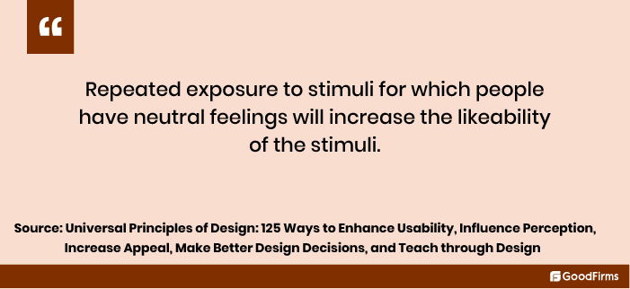
The principle can be applied to many things, including paintings, pictures of faces, sounds, geometric figures, Chinese characters, and more. The more a person is exposed to any of these things, the more that person is inclined to like those things. In the case of humans, the more a person sees another person, the more likable that person becomes.
German physicist, philosopher, and experimental psychologist Gustav Fechner was one of the earliest researchers on the exposure subject. However, Polish-born American social psychologist Robert Zajonc was considered a serious researcher.
Experiment 1
For example, to prove that repeated exposure to stimuli enhanced individual moods, Zajonc, and his team conducted several experiments. In one of the experiments, the team exposed some Chinese ideographs to two sets of people to understand their general mood and how repeated exposure played to the psychology of humans and prompted them to feel positive and even drawn to the exposed thing.
As per the experiment, one set of people was exposed to 5 ideographs, five times each in random order. However, the other group was exposed to 25 different ideographs only once. All the exposure lasted for about 4 minutes. Participants who were given repeated exposure to the five ideographs were in a better mood than those exposed to 25.
Experiment 2
In another experiment conducted by the University of Michigan and Michigan State, researchers released an ad in the school’s newspapers comprising several Turkish or Turkish-sounding words such as kadirga, saricik, biwonjni, and iktitaf. Some words were shown once or twice; others were shown nearly 25 times.
When strange-looking ads ended, researchers sent questionnaires asking the readers whether the words gave positive or negative vibes. The frequently shown words had a positive effect over those shown only once or twice.
So, to reiterate what I said earlier, visitors are addicted to familiarity. In other words, they are too preoccupied to care about your product design. Their goal is all that matters to them. So, only a familiar look and feel in a design that induces cognitive ease and familiarity will help them achieve their goal.
Furthermore, familiarity is one surefire way to prompt users to return to you again and again. In other words, it aids in building customer loyalty and retention. So, no matter what, make your logo design, illustrations, and even print designs, anything and everything related to design profoundly centered around familiarity.
Here are 3 Ways Businesses can Harness the Principle of Familiarity in Product Design
#1. Use the “You Me, Same Same” Design Approach
Make your site, in other words, same-to-same as other great sites in your niche.
I know! I know! This tip came down like a hammer upon you, given that redesign is the norm and websites don’t think twice about it.
But then get this: Visitors spend time on other websites and apps. This means they are already familiar with popular patterns, interactions, and rules. So, if your site or app’s UI differs from theirs, they’ll feel uncomfortable and bounce off to other sites.
This is not to say that you should copy the exact design of another app or site. All I am saying is study the popular UI patterns being used so as to make informed design decisions for your app or website.
The best part? You’ll be able to leverage the knowledge users have gained over the years by offering a familiar user interface.
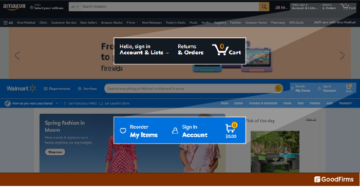
Case Study: Amazon and Walmart
Consider e-commerce websites such as Amazon and Walmart and look at the placement of their shopping carts. Both sites have their carts placed at the top right corner, which helps you figure out what you’re about to purchase. Likewise, if you are designing the user interface of any e-commerce site, consider placing the cart and other UI features in a similar position.
Here are a few more UX/UI tips that will help you frame a familiar interface:
- Make the layout similar to other websites and apps
- Features should be placed in keeping with the other websites and apps
- Checkout processes should match other websites and apps
Plus, the look and feel of Call-to-Action buttons should be the same across pages in your website. If you look at the CTA buttons on Goodfirms pages, all are blue. In short, the CTA color and design remain uniform regardless of which page you visit.
Benefits of Using Familiarity in Website and App Design
There are several benefits to using a familiar design:
Zero learning curve: The users can start using the product or website immediately without scratching their heads because they are familiar with the interface.
Better User Retention: With the learning curve almost absent, it’s easier for the user to complete the task at hand. This means she’ll stick around longer than competitors into radical redesigning.
Better Usage Speed: With the product or service being familiar to the user, it reduces cognitive strain speeding up its usage in return.
Advantage Senior Citizens: A simple, similar UI will help the senior users relate to the new product effortlessly. Young users could take to new designs without much ado compared to old users.
Advantage Designers: If the designers are supposed to copy, for want of a better word, their life becomes simpler as they need to just go by the existing design pattern. This speeds up the design process and helps create products that offer seamless experiences to the users.
Think about it! How we feel at home using chat, Google, social media, and e-commerce apps simply because of their over-familiar interfaces?
#2. Use Task-oriented Rather than Design-Oriented Approach
According to nngroup it’s the designers who are tired of their UI, looking at it day in and day out, which almost amounts to 1000 hours of exposure in a couple of years, while a visitor spends just about 2-3 minutes on a website on a daily basis. This comes to roughly about 30 exposure hours in two years. In fact, it’s said that loyal customers spend less than 5 hours on a site each year.
With visitors spending so little time on websites, redesigning seems a sheer waste of time and effort. Plus, as mentioned before, when users are visiting your site, their total focus is on the task at hand. Which means they hardly analyze or admire your design. So, if they are able to complete their task at hand using a familiar UI, that’s the best thing that can happen to them.
Remember: Users hate change, and they'll not like when you move anything around or even if you reduce their ability to do what they always do. If you are designing your website to give it a fresh look, you are undoubtedly working against yourself.
#3. Use Elephant Redesigning (Iterative) Approach
If you can't help redesign your website because the leads are low or because your website needs to be mobile responsive, choose an elephant redesigning approach instead of an aggressive one.
Yes, you read that right: Elephant redesigning approach (I made up that one for this blog). We’ve all heard the cliche: “How do you eat an elephant? One bite at a time.”
Likewise, redesigns should be undertaken in small iterative steps. It’s not about sudden overhauls overnight.
The dot-com crash survivors Amazon, eBay, Dell, Google, Yahoo, and CNN for instance adopted an iterative approach to website redesign rather than opting for an out-and-out radical redesign on their respective sites. The subtle changes made over a while will be easy on the eyes of the users.
Case study: eBay
Did you know the eBay site had a yellow background before?
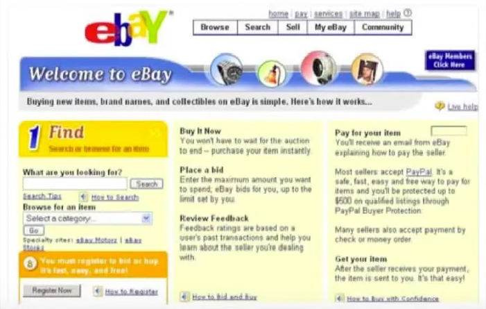
The company insiders then decided to change it: from yellow to white. However, after receiving criticism from visitors, they were forced to return to their original color, yellow, at least for the time being.
Then, the story goes that the think tank devised a plan. They conjured a code that incrementally changed the site's color from yellow to white—one shade lighter daily.
One fine day, the website was white, and visitors didn't notice it. Which meant there wasn't any backlash, either.
My point? If you plan to do something radical with the app or web design, take an elephant redesigning approach. Simply put, familiarity gradually built won't result in usual resistance.
What’s more, sometime back, eBay redesigned the forms which people mainly used for posting items for sale. These pages were important from eBay’s perspective because these forms were used no fewer than 1,00,000 times weekly.
Knowing from their previous experience that radical changes won’t bode well with the users, the team thought of an ingenious approach to phasing out the forms. The team first made a working version of the new pages with a previewing feature and a link to the existing seller’s page.
The previewing feature allowed users to make the new forms their default only if they liked it. Now, based on the number of users who chose the new forms they could measure the success rate of the new design.
Case Study Digg
Not many may have heard of the Digg platform. But then, it was quite a popular platform, more famous than Reddit. Now did the name or the logo ring a bell?
![]()
Yes, both Digg and Reddit were running their businesses side-by-side, delivering the most buzz-worthy stories available on the internet. But Digg was far more popular than Reddit.
And then, Digg did the unthinkable.
Digg upended its UI inside-out. The users were caught unawares. They were unable to use the platform as they used to do previously. Frustrated and upset with the sudden change in UI, the users migrated to Reddit in colossal numbers.
Tips to Harness the Principle of Familiarity in Marketing
#4. Use Push Notifications in Perfect Doses
Ads are expensive. Notifications are inexpensive, and they serve as a gentle reminder to users that your app exists, encouraging them to use it. However, there is a catch: annoying notifications. So, make sure your notifications are relevant to the user's needs and do not annoy them.
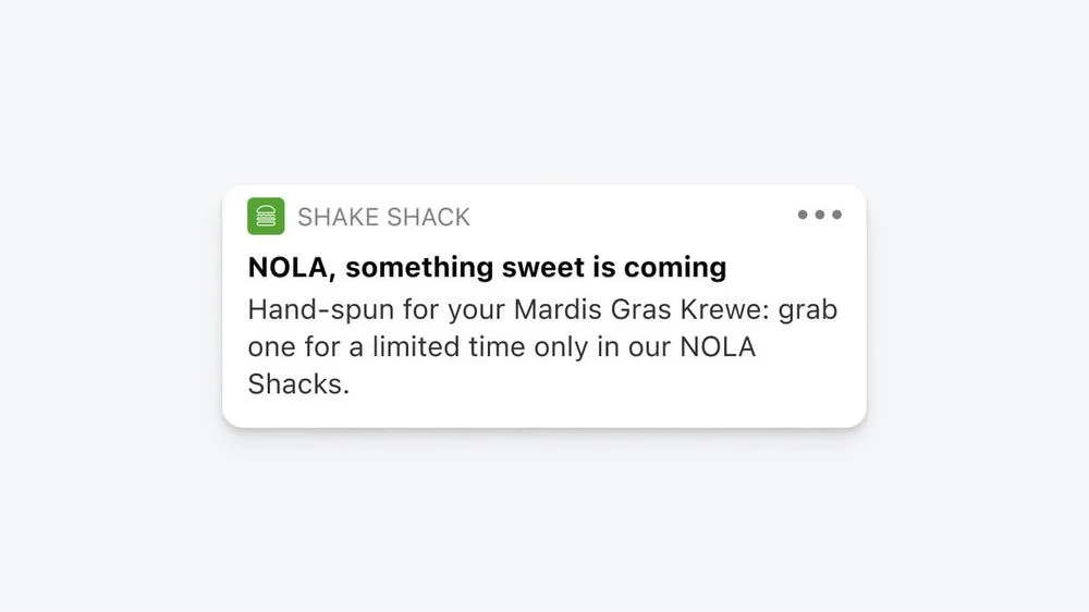
Shake Shack, the fast food app, excels at notifications. The app notifies users about new product launches in a personalized and localized way using classic marketing psychology. Here’s an example of an intimate notification the company sent out to New Orleans residents for the launch of a drink. Here ‘NOLA’ stands for ‘New Orleans.’
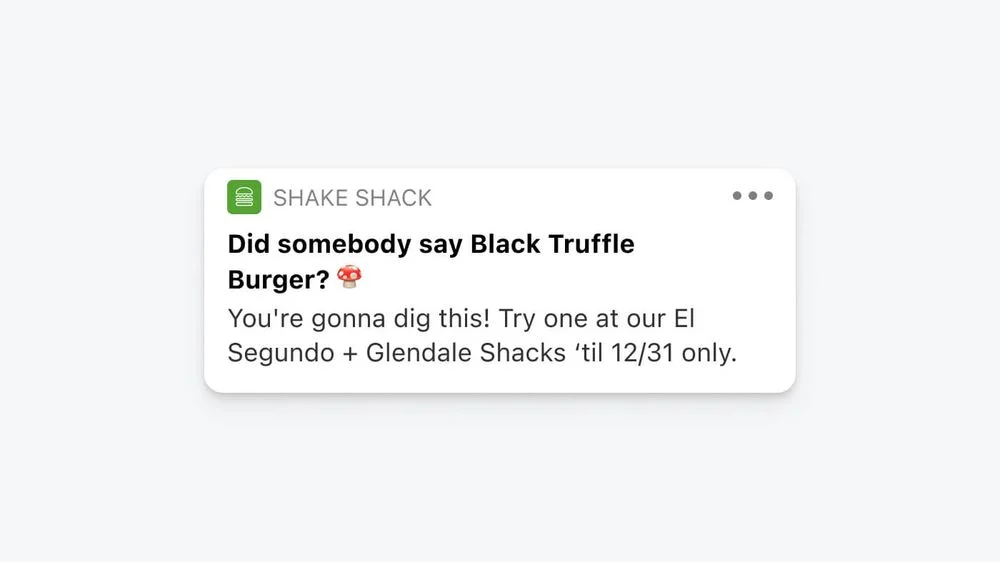
In another ‘new product’ notification, the company uses a question in the headline to attract user attention. The product, ‘Black Truffle Burger,’ is introduced in a very informal, colloquial manner using an engaging question that’s totally in keeping with the brand's tone.
#5. Use Ad Retargeting
This much I know: most visitors are not re-visitors. They are here to browse your site and leave.
But then, rest assured; you can gain them back, if not all of them, with a retargeting campaign. As the name implies, retargeting ads repeatedly expose your brand to customers. And once the visitor becomes familiar with the brand, there is a high chance of her becoming a customer.
How come? If you look at ads, the click-through rate is 0.07%, while retargeted ads enjoy a 0.7% click-through rate. Additionally, there’s a nearly 70 percent chance that retargeted visitors might convert into customers.
Why? Because Retargeting ad elements are informed by Familiarity Principle. And these elements are based on historical precedence, trial and error, and domain knowledge.
Sure enough, other factors could directly affect the conversion ratio; however, one of them is unarguably is exposure effect. Visitors continually exposed to your product or service are more likely to take a liking to it and become loyal customers in the long run. Period.
#6. Use Social Media Platforms Repeatedly
When you are up against the top guns in your business with deep pockets, the surefire way to beat them at their game is through energy, effort, and creativity. Posting your USP twice a day on Facebook and Twitter won't cut it. One needs to go over and beyond when using social media platforms, says Grant Cardone in his book, "10X Rule: The Only Difference Between Success and Failure."
Cardone mentions that he used to tweet his free sales and motivational courses almost 48 times on Twitter. I repeat, 48 times a day. Yes, when the norm was to tweet twice daily, Cardone did it every half an hour.
According to Cardone, CEOs usually face backlash for this overdose, including customer complaints. Instead, he got emails and posts that admired his massive activity level and even got compliments for his willingness to provide people with free sales and motivational information.
Concurring with Cardone's marketing philosophy is the "Rule of 7" in marketing, which says that customers need to hear from brands at least 7 times before they purchase anything from them. But then, don’t forget, the Rule of 7 was coined in the 1930s; this is 2023, so how many times more do you think you need to market your brand—25, 50, 100 times?
While growing your business, you need to keep showing up over and over again and make it known to the visitors that you are here for the long haul.
#7. Use Only Quality Interactions
While showing up matters, how you show up matters just as much.
To put it simply, what you say matters. People can smell spammy sales pitches 10 feet away.
So, think twice before flooding customers with tweets, emails, notifications, and more. It might backfire if your sole focus is on quantity rather than quality interactions.
So, how do you ensure you engage with your customers only with quality stuff?
Simple. First, determine your target audience's wants, then bombard them with only relevant stuff.
In Cardone's case, the 'free factor' caught the audience's attention. They had nothing to lose if they signed up for his courses.
Case Study: Target Corporation
Target, an American retail behemoth, wanted to ensure only high-quality customer interactions, so it used DATA to carry out its strategy. And, as you already know, data comprises personal info about the customers, which in turn aids in the developing of familiar relationships.
Target kept a massive data warehouse, which assisted them in developing an identification code for each shopper. The company executives used the code and predictive analytics to send customers personalized pitches based on their previous purchasing habits.
For instance, the Target statisticians figured the family had kids at home if they bought cereal and popsicles. So the company would mail milk coupons to them along with school supplies, chocolate packets, and other goodies.
The bottom line is if building brand familiarity is on your agenda, then stick to quality, engaging interactions only. And this is where data can help.
#8. Use the Power of Social Proofs
84% of the customers trust social proof.
So there's no point screaming out from the rooftops about how great your product or service is because customers will never listen to you. They instead listen to people who have already tried and tested your product out.
The term ‘Social Proofs’ was first introduced by the famous author Robert Cialdini in his bestseller, Influence: The Psychology of Persuasion. It says people prefer to follow other people's guidelines when making purchase decisions.
Social proofs are more important than ever, given the acceleration in online shopping. It was too easy to tell the quality of the products at a brick-and-mortar store. However, in the case of a website, though it may cover all the telling features and benefits of your product, nothing would appeal to them but social proof in the form of testimonials.
My point: It's always better to rope in someone to speak for your brand. This is where social proof in the form of customer testimonials can help.
In short, social proof should be a non-negotiable part of your marketing strategy if you want your online brand to survive, much less thrive.
So how do you take advantage of social proof?
Here are a few ways to try it out.
i) Get customer testimonials - Keep your customers speaking about your brand on videos. Potential buyers feel more confident about their purchases when they know other buyers had a satisfying experience.
ii) Add trust icons - of businesses using your product, of publications featuring your product, and of companies you're associated with.
iii )Rope in micro- Influencers- And get them to talk about your company. Their positiveness and familiarity with your brand will rub off on their followers.
#9. Use Video Magic
There are several stories about startups writing handwritten thank-you notes to customers or, for that matter, calling them up personally to get direct feedback about their products. But the truth is, such human connections, and that too on a one-to-one basis, aren’t sustainable in the long run when the company is on the growth path.
On the other hand, it’s equally important for businesses to maintain a personal touch with their customers. This is where videos can help. Videos aid in explaining products or services with total clarity and emotion. Plus, it’s easier to connect with the viewer’s humanity through videos. The best part? Only one video is required to secure the base with tens of thousands of customers.
Case Study: Zendesk
When Zendesk people found out that were search queries for the keyword ‘Zendesk alternative,’ they decided their brand should also rank there.
So, what did the Zendesk think tank do? They launched a band for their brand. You read that right: they formed a rock band called “Zendesk Alternative” in their full consciousness.
Totally aware that those searching for Zendesk alternatives were aware of their business but were noncustomers or unhappy customers, the company decided to promote a friendly version of their brand without stepping into anyone’s shoes. The idea was to win back its lost customer base, and if not atleast their product would go viral because of its cool quotient.
Thus Zendesk Alternative was born as an out-of-luck Seattle-based rock band.
When other companies were busy making videos about why they were best in the market and why their customers shouldn’t ever think of alternatives, Zendesk took the road less traveled by showcasing the creative, imaginative side.
They were trying to emphasize through this video that brands are not always about price or features. They are equally concerned about how customers feel about their brand and look for ways to build a personal bond with them.
Familiarity in Product Design and Marketing is the Secret Sauce to Building Customer Loyalty
These days, the buzzwords are change and innovation. For obvious reasons, the status quo is despised. However, old is gold when it comes to product design and marketing. People may become confused if you keep changing your product UI. So, if you can generate enough traffic and leads, stick to your familiar UI. Also, keep hammering home your brand's presence through non-annoying push notifications, social proofs, videos, and repeated postings on social media platforms, among other things.
Over to you now
How do you propose to use Familiarity in Product Design and Marketing and Print Design campaigns?