Legion Brand Lab
Building breakthrough brands
Legion is Perth's leading branding agency specialising in brand strategy, identity design, and creative communication. We help businesses discover untapped opportunities—your brand's unique white space—where you can lead and grow. Combining deep commercial insight with creative innovation, we craft strategies aligned with your goals to drive sustainable growth and market leadership. Our services span three key areas: Strategy, Identity, and Activation, ensuring your brand not only stands out but excels in the market.
 Australia
4 Southport Street, West Leederville,
Perth,
Western Australia
6007
+61423965234
NA
2 - 9
2021
Detailed Reviews of Legion Brand Lab

Client Portfolio of Legion Brand Lab
Project Industry
- Healthcare & Medical - 33.3%
- Insurance - 33.3%
- Information Technology - 33.3%
Major Industry Focus
Healthcare & Medical
Project Cost
- Not Disclosed - 100.0%
Common Project Cost
Not Disclosed
Project Timeline
- Not Disclosed - 100.0%
Project Timeline
Not Disclosed
Clients: 7
- Auto & General
- Telesure Investment Holdings
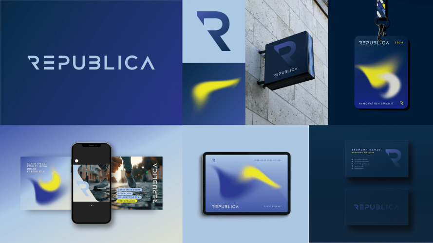
- Republica
- Damos
- Durex
- Dial Direct
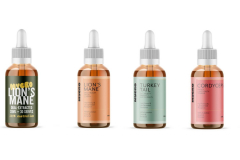
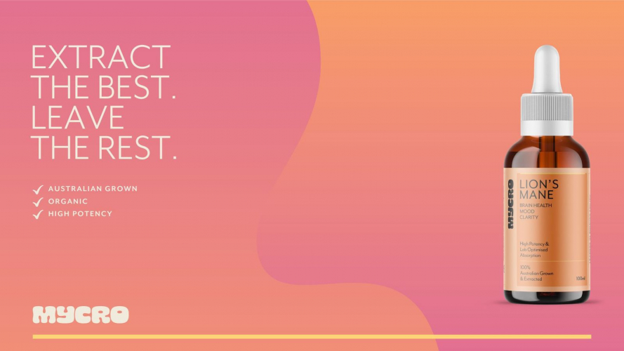
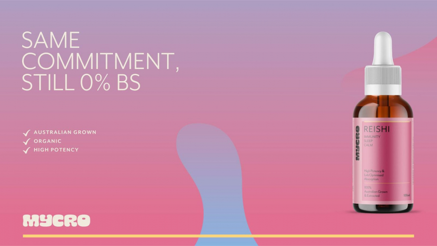
- MYCRO
Portfolios: 3