Branding agency

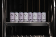
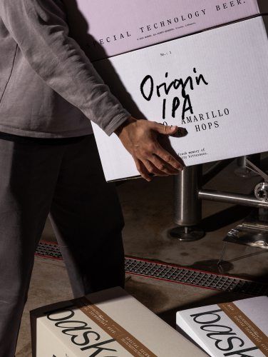
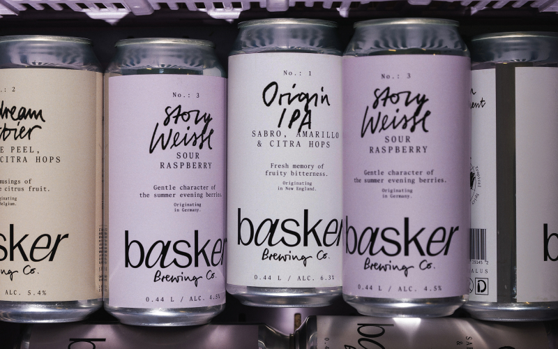
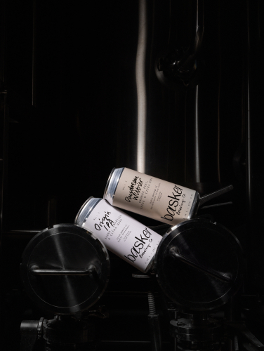
andstudio is a graphic design and branding agency that transforms ideas into impactful brand experiences. With a bold approach to strategy, design, and innovation, the studio specializes in crafting brand identities, digital platforms, and creative concepts that connect with audiences and drive results. Rooted in curiosity and collaboration, .andstudio partners with businesses across industries to deliver solutions that are visually striking, strategically sound, and culturally relevant. By blending creativity with a clear vision, .andstudio helps brands find their unique voice and thrive in an ever-evolving world.

Lithuania Lithuania
Raugyklos g. 21, Vilnius, Vilnius 01110
+37061310101
$100 - $149/hr
10 - 49
2017

Service Focus

Focus of Web Design
  • Logo Design - 25%
  • Graphic Design - 25%
  • Packaging Design - 25%
  • Motion Graphics Design - 25%

Industry Focus

  • Business Services - 35%
  • Information Technology - 35%
  • Education - 30%

Client Focus

50% Small Business
40% Medium Business
10% Large Business

Detailed Reviews of andstudio

No Review
No reviews submitted yet.
Be the first one to review

Client Portfolio of andstudio

Project Industry

  • Food & Beverages - 50.0%
  • Art, Entertainment & Music - 50.0%

Major Industry Focus

Food & Beverages

Project Cost

  • $10001 to $50000 - 100.0%

Common Project Cost

$10001 to $50000

Project Timeline

  • 1 to 25 Weeks - 100.0%

Project Timeline

1 to 25 Weeks

Clients: 3

  • Ikea
  • Nordvpn
  • boredpanda

Portfolios: 2

Basker Beer Brand

Basker Beer Brand

  • Basker Beer Brand screenshot 1
  • Basker Beer Brand screenshot 2
  • Basker Beer Brand screenshot 3
  • Basker Beer Brand screenshot 4
  • Basker Beer Brand screenshot 5
$10001 to $50000
5 weeks
Food & Beverages

ABOUT THE PROJECT

Basker - a small family business turned “beer engineers” that seeks to bring deep knowledge and detailed precision to the craft beer market. With individual happiness and the peacefulness it brings as the foundation of their creative direction, Basker offers an opportunity to escape from the noisy craft beer landscape.

CLIENT NEEDS

It’s easy to get overwhelmed by the variety of colors and tastes when glancing at the shelves of craft beer. Most products seem to compete with elaborate illustrations and intense contrasts, creating visual noise for potential customers. Elements of humor are often present, connecting to peculiar and sometimes underdeveloped flavor profiles, as well as folk symbols or historical motifs representing the long-standing tradition of beer brewing. Overly focused on the visual aspect, these designs often relegate the beer itself, its history, and the subtleties of its flavor palette to the background.

DESIGN VALUE

This is how Basker came to life—a beer that invites everyone to become a beer discoverer. The name, derived from the English verb “to bask in something,” conveys a sense of pleasure and peacefulness, which is reflected both in the taste and the subtle design. The visual identity emphasizes the personal connection between the maker and the consumer—hand-drawn taste palettes symbolize the brewer’s wish to share knowledge and quality with others. Amidst the bold and loud labels of competitors, Basker stands out with its clear and understated packaging colors, such as ivory and lilac. The product’s name and technical details, presented in black font, take center stage, capturing the taster’s attention. A unified product system provides an opportunity to explore different flavors under a single, cohesive identity—Basker.

Vilnius Film Festival

Vilnius Film Festival

  • Vilnius Film Festival screenshot 1
  • Vilnius Film Festival screenshot 2
  • Vilnius Film Festival screenshot 3
  • Vilnius Film Festival screenshot 4
  • Vilnius Film Festival screenshot 5
$10001 to $50000
6 weeks
Art, Entertainment & Music

ABOUT THE PROJECT

Kino Pavasaris has been considered for 30 years as a cultural touchstone in Lithuania, bringing world-class cinema to an intellectually engaged audience. Reaching its third decade, the festival was inspired to rethink its identity, evolving from a seasonal event into a year-round cultural platform. The goal was to expand beyond traditional cinema spaces and become a consistent force in Lithuanian film culture, offering audiences, creators, and industry professionals an open and transformative cinematic experience at any time of the year. 

CLIENT NEEDS

As Kino Pavasaris expanded beyond traditional cinema spaces into digital platforms and everyday screens, it required a flexible yet recognizable visual identity that could seamlessly adapt to different formats. A key aspect of this transformation was the introduction of a visual categorization system, designed to help audiences navigate the festival’s diverse film selection while maintaining an emotional connection to cinema. This new identity also needed to integrate cohesively across all festival materials—from big-screen animations and citywide posters to digital banners and volunteer branding—ensuring a unified and lasting brand presence.

DESIGN VALUE

The rebrand positioned Kino Pavasaris as a cinema discovery platform, where film is always within reach. At its core, the eye-shaped logo embodies the festival’s promise of "eye-opening cinema" - its animation reinforces this, revealing additional graphic elements as the eye opens, mirroring how cinema expands perception. The color system categorizes films while capturing the emotional imprint of cinema itself - each color is taken from real movie frames, seen as if through half-closed eyes, blending together like a lingering memory. Just as a great film leaves behind not a single moment but a lasting feeling, these colors evoke the way cinema stays with us beyond the screen. The combination of serif and minimalist typefaces creates a refined contrast that enhances clarity across all platforms, maintaining a balance between visual character and readability. This rebrand marks the beginning of a cohesive visual identity—one that will no longer change annually but will remain consistent, reinforcing the festival’s place in the cultural landscape. A system built for longevity strengthens recognition, deepens audience connection, and ensures Kino Pavasaris remains a defining presence in Lithuanian cinema. The impact was immediate: within days of the festival’s announcement, ticket sales surged, underscoring the power of a unified and lasting brand.The impact was immediate: within days of the festival’s announcement, ticket sales surged, underscoring the power of a unified and lasting brand. As this year's festival came to a close, a record 130,000 visitors were celebrated, marking a significant increase from last year's 105,408.