Atekla Studio

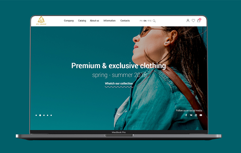
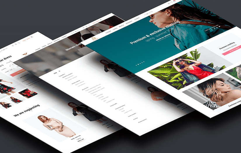
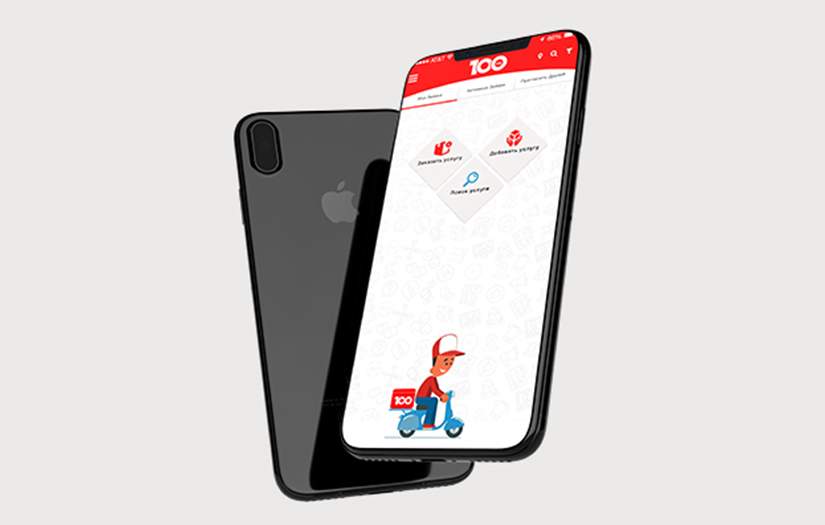
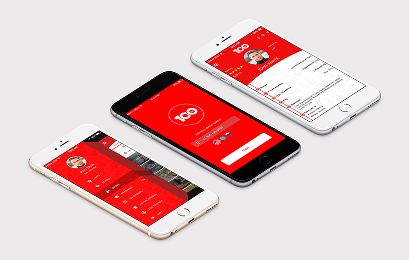
Get a competitive advantage in the digital world

5.0 1 Review
Visit website
Write a Review
Verified Profile

We are an online digital agency that employs top-notch specialists from around the globe. Our business model prioritizes the decentralization of our key resources to provide great value propositions to our clients no matter their budget. Our goal is to accelerate your business and brand development with modern solutions that encompass digital web design, online marketing, and web development.


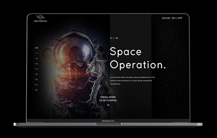
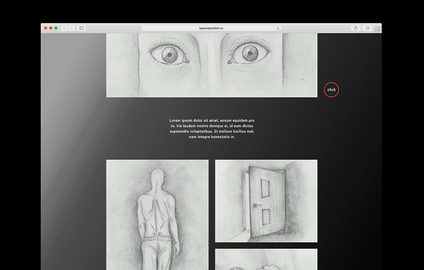
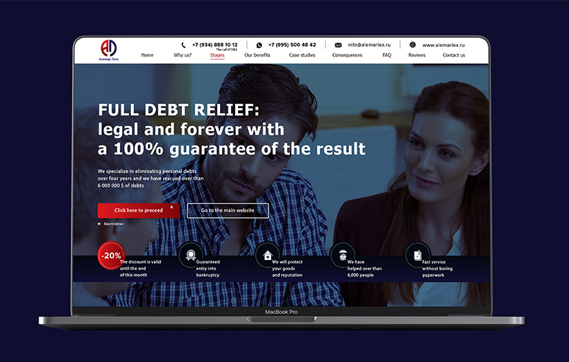
Check out our case studies here: https://atekla.com/case/


Contact us today and make sure to use the code "DesignRush" for a 15% discount on any of our services.

$25 - $49/hr
2 - 9
2018
Locations
United Kingdom
98 Barons Keep, Gliddon Road, London, London W14 9AX
+447734236137

Focus Areas

Service Focus

50%
20%
20%
10%
  • Web Development
  • Web Designing (UI/UX)
  • Digital Marketing
  • App Designing (UI/UX)

Client Focus

100%
  • Small Business

Industry Focus

20%
20%
20%
40%
  • Startups
  • Enterprise
  • Business Services

Atekla Studio Clients & Portfolios

Space Operation
View Portfolio
Space Operation
  • Space Operation screenshot 1
  • Space Operation screenshot 2
  • Space Operation screenshot 3
Not Disclosed
3 weeks
Media

Space Operation was one of our most extraordinary projects. An interactive landing page with a fantastic story about two astronauts.

Our web studio has decided to take that unique and non-commercial project without a second thought because all of our designers and programmers had a very big interest in this work.

This website includes sketch illustrations performed by using a graphite pencil and bright, colorful works performed with the help of watercolors. Breathtaking story with unique illustrations is accompanied by amazing effects created by our developers.

Website colors and its style, idea, and illustrations remind about the universe, it's fantastic space, and infinity. A deep color palette with illustrations and music accompaniment allows people to dive into a mystique and adventurous atmosphere.

Such projects and interactive websites can be considered as a unique work. The whole story was divided into specific chapters and the interactive interface helps to navigate between them very easily. Also, a trendy parallax animation is used on this website for a bigger "WOW!" effect.

Besides the website, our designer has generated a logo for this very special project. Circle as an idea of a globe with a curve line that crosses the circle, meaning life beyond the borders of the earth, the infinity of the universe and the world.

Alemar Lex
View Portfolio
Alemar Lex
  • Alemar Lex  screenshot 1
  • Alemar Lex  screenshot 2
  • Alemar Lex  screenshot 3
  • Alemar Lex  screenshot 4
$0 to $10000
9 weeks
Legal & Compliance

When we were developing this website for the law company, we have adhered to the official tone in the color scheme of design and focused on maximum clarity of services for potential clients. That is why the visitor will spend a minimum amount of time on this website to get all the necessary information needed.

The website provides a full range of services. The visitor can get acquainted with the real reviews of existing customers of the company to make sure that Alemar Lex will be able to solve their problems by 100%.

The “Questions” block helps to find the answers to the most common questions that a potential client may have. The Blog contains unique copyright articles about the legal topics from the Alemar Lex's specialists.

Our web-studio has developed a separate landing page for Alemar Lex. The landing has been developed in the same scenario as the main website. Instead of creating a standard description of the services, we have developed a concept for turning all of the visitors into the potential customers of the company by the high conversion rate. We have shown the main advantages over the competitors and described in detail the stages of debt relief. Also, we have provided information about the benefits that a client will receive from the implementation of this service.

We have explained the benefits that you can get after the debts relief and what might happen to you if you will do no actions to solve this problem. The “FAQ” block was developed on the landing page to help the users to find the right answers and the "Customer review" block helps to get more trust.

In conclusion, we did a series of work aimed to transform an offline business into online business and we made a huge leap in increasing the traffic.

Farina Group
View Portfolio
Farina Group
  • Farina Group screenshot 1
  • Farina Group screenshot 2
  • Farina Group screenshot 3
$0 to $10000
4 weeks
Manufacturing

Farina Group is engaged in the wholesale supply of high-quality products throughout the Russian Federation. Farina Group has contacted us to create a new, modern and informative website for them.

The basic concept in creating the design of this website is to convey the purity and environmental friendliness of the company's products.

Each block of the website is focused on the specific goals: demonstration of the delivered products, information about the sales regions, list of the key customers, company's product turnover, customer reviews, contacts.

We have developed the website on CMS WordPress as it is the most intuitive administration system today. Our experts have created a spectacular and easy animation for user interaction.

This is how we have created a modern, informative and concise landing page for the agricultural company "Farina Group"

Neon Sport
View Portfolio
Neon Sport
  • Neon Sport screenshot 1
  • Neon Sport screenshot 2
  • Neon Sport screenshot 3
  • Neon Sport screenshot 4
$0 to $10000
8 weeks
E-commerce

NeonSport is the company that owns a sports equipment store with a different variety of exercise simulators, from running tracks to gym clippers. They have contacted us with a request to create an e-commerce website which is specialized in sports products and training devices, in order to increase their sales.

After a detailed analysis of the company's competitors and all of the advantages of NeonSport, our web-designer began the creation of the future e-commerce website layout.

Our designer has decided to use a discreet palette of blue and white as the chosen color palette represents a soothing atmosphere without making a user's eyes getting tired while watching the web pages.

When our designer has finished with the design of the website, we have passed the design layout to the programmer so he could develop a full-fledged working website.

For the client's comfort, we put the store's working hours, contact information as well as the phone call request on the website. The website is using the CMS OpenCart which allows to easily update the products in the catalog and to make a different variety of other changes on the website.

The programmer has placed the cart on the website in order to easily select the wished products, as well as a smart calculator that helps to compare several products with each other to choose the best one. Also, our developer has added different varieties of payment methods. The website has a section with news and articles, which helps to promote the website by using SEO (Search Engine Optimization). To achieve the customer's trust and loyalty, a page with real reviews of the satisfied customers has been added.

Nicole Laboratory
View Portfolio
Nicole Laboratory
  • Nicole Laboratory  screenshot 1
  • Nicole Laboratory  screenshot 2
  • Nicole Laboratory  screenshot 3
  • Nicole Laboratory  screenshot 4
$0 to $10000
8 weeks
Healthcare & Medical

Nicole Laboratory has contacted us to develop a new design for their website. They also needed a design for a new e-commerce website and a landing page to raise the sales of their bio-products.

Our main task was to create a modern and convenient interface to increase conversion and sales of the company. We have conducted an analysis of the cosmetic business and examined the competitors to identify their strengths and weaknesses. We came up with a conclusion that the design of all 3 websites must reflect the ecology and pureness of the products.

While developing the designs for the corporate and e-commerce website, we have placed a great emphasis on user convenience. Even at the prototyping stage, we arranged all of the elements in the way that a user could easily purchase the goods he needed or find the necessary information.

We always adapt our designs for desktop, tablet, and mobile devices. In addition, we managed to keep the interface clean not only on large monitors but also on mobile devices.

By using the company's corporate colors, we were able to convey the essence and philosophy of the brand. Now Nicole Laboratory can proudly conquer the digital market and attract new customers to its products.

RMES & MCPIR
View Portfolio
RMES & MCPIR
  • RMES & MCPIR screenshot 1
  • RMES & MCPIR screenshot 2
$0 to $10000
3 weeks
Education

RMES & MCPIR have contacted us to us for a selling landing page design with the aim of special male audience involvement.

The main idea of this conference is to help men in their personal growth, their own business formatting and relationship building with women. Our web studio task was to visually demonstrate the benefits which this conference participants get. Also, we needed to show the events, special guests and speakers.

Raspberry-purple gradient and white color represent the basic colors of the website. The Purple represents stability, confidence, and success. The contrast of the raspberry color creates a harmonious combination which makes potential client eye pleased.

Furthermore, the chart with all of the possible tickets purchase options for this event is provided on this website. Each man can decide and choose by his own what kind of conference-type is better for him, conference attendance or online participation.

Yuna
View Portfolio
Yuna
  • Yuna screenshot 1
  • Yuna screenshot 2
$0 to $10000
4 weeks
Education

Yuna is engaged in education in the field of linguistics. They have contacted us for help in creating a unique website - Yuna School of the Korean language.

The design of the website is made in bright and cheerful colors, which gives a full association with modern Korean culture. Our designer decided to abandon the classic symbols of Asian culture, such as dragons and fans, since we wanted to focus on the modern culture of Korea. Wave patterns with polka dots also help to create an association with something carefree, simple, fun and joyful and evoking only the positive emotions. We have used pastel colors, which allows clients not to be distracted from the important information on the website.

The website for Yuna School is a turnkey landing on the engine of CMS MODX. The main purpose of this website is selling the course program for interested users who want to learn the Korean language. The information on the website allows people to become better acquainted with this school and the layout contributes to an increase in conversion on the website in order to attract more potential clients.

At the last stage of development, the programmer has created a high-quality animation, which made the website more vivid and vibrant.

Knom
View Portfolio
Knom
  • Knom screenshot 1
  • Knom screenshot 2
$0 to $10000
8 weeks
Industrial

KNOM is the company that is engaged in the construction of frame houses on special technology bases, different classical fixed formwork, and monolithic fills. The task was to create a unique, completely new turnkey website that could fully show what this company is making and why it is quality. Our work has included such stages as analyzing the market of construction companies, prototyping the layouts, website design, programming, adapting the website for mobile devices of various sizes and integrating the entire website into the WordPress control system.

Our designing team has discussed all of the wishes and nuances of the work and they have created a prototype for the future website design layout.

The website is made in the style of minimalism, with the addition of colorful and vivid photos that help to visually understand what this company can provide. The website uses the brand colors of the company, which are white, green and orange.

The website provides a catalog of houses of various complexity with various technologies of construction and configurations. A potential owner of a new home can choose the equipment he needs, for example, exterior trim options or replacement of the foundation.

The calculator specially designed by our programmer allows the user to calculate the exact cost of the whole house, depending on the equipment he chose.

The website provides a lot of useful information that allows the customer to become better acquainted with the products of the company.

US Parts
View Portfolio
US Parts
  • US Parts  screenshot 1
  • US Parts  screenshot 2
  • US Parts  screenshot 3
$10001 to $50000
30 weeks
Automotive

The company Us-Parts, which sells auto parts from American, European and Korean cars in the city of Moscow needed a new turnkey e-commerce website for better sales. After listening to all of their requests and needs, our web-designer began to create a layout design for the future website.

The final design of the website looks very classic and user-friendly. The designer decided to use calm and soft colors. The website’s palette is consists of yellow in ocher, a deep blue and vanilla white.

After creating a unique and memorable design, the work was passed into the hands of our programmer who has turned the designer's idea into reality.

After creating a unique and memorable design, the work was passed into the hands of our programmer who has turned the designer's idea into reality. 
Our client has wished the design to resemble the feel of freedom with the sunset while conveying the American atmosphere. 

CMS (Content Management System) Bitrix was chosen to create this website. Full synchronization with 1C. Placement of several catalogs with the spare parts of different directions. The high degree of protection against hacking and DDoS; Ease of management and content of the website. The website contains a catalog of spare parts developed directly by Us-Parts. This catalog is optimal for the Russian market.

In addition to the catalog, Us-Parts has integrated a general classification for all of the brands and models. Our programmer has developed a complete system of selection of spare parts, taking into account the brands and models of the cars. In addition, the spare parts search by VIN number was developed. If the client could not find a necessary part, he can use the “selection by VIN” form and the managers will select the spare part at the best price and terms.

Ramex
View Portfolio
Ramex
  • Ramex  screenshot 1
  • Ramex  screenshot 2
  • Ramex  screenshot 3
$0 to $10000
4 weeks
E-commerce

Our web-studio has developed a design of an e-commerce website for a Latvian company called Ramex, which is engaged in the construction of fences, pillars, and various amenities. This company is engaged in the installation and provision of the well-being of turnkey houses, from scratch to complete delivery of the project.

We have analyzed the competitors of a similar niche in Latvia to find the cos and pros and also, we have highlighted all of the positive aspects and advantages of Ramex. After that, our web-designer has started to create sketches of the future website design. The main colors of the design theme are white, orange and blue. The harmonious combination of pastel shades looks very discreetly, which helps a potential client to not be distracted from the product located on the website.

The convenient interface is perfectly combined with a user-friendly design. In addition to an extensive catalog of the products on the website, our designer didn't forget to design a cart for the products and a cost calculator for greater customer convenience.

The interface created for this website was created with the focus to contribute more potential customers to increase conversion and sales. We have planned the whole logistics on the website to bring our client outstanding selling results.

In order for the client to feel all of the advantages of fast and high-quality feedback, the opportunity to receive a callback for consultation was added.

As a result of the work, our team has developed a high-quality, modern and selling design, pleasing not only the owner of the website but also hundreds of happy and satisfied customers.

RAC
View Portfolio
RAC
  • RAC screenshot 1
  • RAC screenshot 2
$0 to $10000
3 weeks
Other Industries

The "RAC" company has contacted us for creating a new turnkey landing page for them. "RAC" company or Recruiters Assistance Committee is a company that helps young recruiters to get a military ID legally.

We have discussed all of the nuances and client's wishes in the working process and after we have started to develop a unique future website design.

Our web-studio has created a unique, beautiful brand color scheme for the company. The chosen basic colors are navy blue, white and a red gradient. The red gradient symbolizes passion, perseverance, diligence and combating. All of the characteristics which are associated with military skills.
 

After creating a brand new website layout, our programmers have started the development process, as well as an adaptation for mobile devices.

This turnkey website was created on the CMS (Content management system) - MODX. The feedback from the customers, the advantages of the company, an interesting video on the website, contrary counter - all of these elements have positively affected the website's conversion, led the new leads involvement and respectively bigger sales.

ITC Market
View Portfolio
ITC Market
  • ITC Market  screenshot 1
  • ITC Market  screenshot 2
$0 to $10000
3 weeks
E-commerce

ITC Market is the company which is dealing with luxury clothing, perfume, accessories, and cosmetics. ITC company is engaged with the international financial holding and dealing with prestige cottage villages building company in the Moscow region as those companies were established by the same founder.

Our web-studio perfectly knows how important it is to have a high-quality design in order to increase a website's conversion and sales. Our aim was to create a laconic and stylish website design that will whelp the potential clients to keep their attention on the brand's products.

We have analyzed all of the client's requests and all of the company's advantages to take the task on and start the developing of the future design.

We decided to use a minimalistic white background and bright, contrast photographs on the website. The focus on the photographs is used in order to make the user experience more smooth and satisfying.

100 Services
View Portfolio
100 Services
  • 100 Services screenshot 1
  • 100 Services screenshot 2
$0 to $10000
2 weeks
Business Services

Our client asked us to create a design and UI/UX interface for a new mobile platform in Kazakhstan.

The application called “100 services” is a unique tool for searching for various specialists in all kinds of services. 
Furthermore, this application gives people an opportunity to earn on the provision of their own services. From massage to repair work or renting unique transports.

Our team had the task to make the most user-friendly interface so that the client could easily interact with it, and as a result, get a positive experience by using the application. 

In the “100 services” mobile application there are a lot of different functions, for example, the users can chat among themselves through a specially built-in application's messenger.

Post
View Portfolio
Post
  • Post screenshot 1
  • Post screenshot 2
  • Post screenshot 3
$0 to $10000
2 weeks
Telecommunication

Our web studio was approached by a company engaged in the development of smart intercoms. This company needed a mobile version of the application for special, smart intercoms.

The basic colors of the app were orange and white. A mixture of red and yellow colors create a bright combination. In psychology, orange is associated with positive emotions and joy, while white is associated with minimalism and

simplicity. This color combination has a positive effect on the perception of the application and its contents.

The application has an easy-to-use interface that helps you to comfortably navigate through the pages of this mobile application. The interface has all the most important features that a potential client may need. Home page, chat with the operator, if there are any technical requests, call a specialist option, a payment place, as well as notifications.

Atekla Studio Reviews

5.0 1 Reviews
  • All Services
  • Relevance
  • Most Recent
  • Rating: high to low
  • Rating: low to high
Write a Review
Vadims Svarcburgs

The best!

Rating Breakdown

  • Quality
  • Schedule & Timing
  • Communication
  • Overall Rating

Project Detail

$0 to $10000

Share it on

Review Summary

Atekla studio has provided an excellent service for me and really helped to increase the sales of my business through an outstanding website. Quality work and friendly service are what I would highlight the most. Definitely recommend this team of specialists if you need a quality website, design or online promotion.

What service was provided as part of the project?

Web Development, Web Designing (UI/UX), E-commerce Development