CREATIVE AGENCY SERVICES

baseTOP is a creative team that helps SaaS companies turn complex products into experiences people understand and enjoy. We create SaaS explainer videos that simplify your message through strong storytelling, cinematic visuals, and clean animation that supports sign ups.

We also design UI and UX in Figma for apps, landing pages, and SaaS platforms. Our focus is clarity, flow, and conversion so the product feels easy from the first click.

If you need a website, we build high performing sites in Webflow, WordPress, and custom builds, designed to scale with your brand.

From startups to established tech teams, we have helped 1000+ businesses grow through design, motion, and strategy. We do not just make things look good. We make them work.

Bangladesh Bangladesh
House 69, Road 17/A, Block E, Banani, Dhaka, Bangladesh., Dhaka, Dhaka 1213
01332533427
< $25/hr
2 - 9
2022

Service Focus

Focus of Web Development
  • Wordpress - 40%
  • HTML5 - 20%
  • CSS - 40%
Focus of Software Development
  • PHP - 20%
  • Javascript - 30%
  • Laravel - 30%
  • ReactJS - 20%
Focus of Web Design
  • Website - 25%
  • Landing Page - 25%
  • E-commerce - 25%
  • User Experience - 25%
Focus of Digital Marketing
  • Video Production - 100%
Focus of Mobile App Development
  • iOS - iPhone - 10%
  • Android - 20%
  • Hybrid - 30%
  • Flutter - 20%
  • React Native - 20%
Focus of E-commerce Development
  • Shopify - 50%
  • WooCommerce - 50%

baseTOP's exceptional Maintenance & Support services give clients a considerable advantage over the competition.

Client Focus

70% Small Business
30% Medium Business

Detailed Reviews of baseTOP

No Review
No reviews submitted yet.
Be the first one to review

Client Portfolio of baseTOP

Project Industry

  • Real Estate - 16.7%
  • Information Technology - 83.3%

Major Industry Focus

Information Technology

Project Cost

  • $0 to $10000 - 100.0%

Common Project Cost

$0 to $10000

Project Timeline

  • 1 to 25 Weeks - 100.0%

Project Timeline

1 to 25 Weeks

Clients: 4

  • Green Central
  • Elco Cables
  • Akij Bashir
  • Lubana

Portfolios: 6

UI/UX Designer | Real Estate CRM Dashboard Case Study | Figma

UI/UX Designer | Real Estate CRM Dashboard Case Study | Figma

  • UI/UX Designer | Real Estate CRM Dashboard Case Study | Figma screenshot 1
  • UI/UX Designer | Real Estate CRM Dashboard Case Study | Figma screenshot 2
  • UI/UX Designer | Real Estate CRM Dashboard Case Study | Figma screenshot 3
  • UI/UX Designer | Real Estate CRM Dashboard Case Study | Figma screenshot 4
$0 to $10000
4 weeks
Real Estate

UI/UX Designer | Real Estate CRM Dashboard Case Study | Figma

Livento is a modern real estate CRM dashboard designed to help agents, brokers, and agencies manage leads, property listings, client relationships, and sales activity from one centralized platform. The goal of this case study was to design a clean, enterprise ready SaaS dashboard that improves daily workflow speed, reduces data overload, and keeps key actions and insights easy to access.

As a UI/UX Designer in the real estate and CRM niche, I delivered a complete dashboard UI/UX case study built in Figma. The work covers the core product experience, including the analytics dashboard, lead pipeline and lead management, property listing and management screens, transactions, calendar scheduling, and supporting CRM UI patterns. The dashboard was designed with strong hierarchy using KPI cards, charts, tables, and activity summaries so users can track performance, follow ups, and pipeline status at a glance.

Lead management was designed for clarity and speed, with readable lists, quick actions, and clear status indicators to support the full lifecycle from new lead to closed deal. The property module uses a clean card based layout with image previews, pricing, and location details to make browsing and comparison fast. Calendar and scheduling screens support visits, reminders, and task style planning, helping teams stay consistent with follow ups and client communication.

Built in Figma, Livento uses a scalable component system with reusable patterns for navigation, cards, tables, filters, forms, modals, and status chips. Auto Layout and consistent spacing rules were applied to maintain a cohesive interface across multiple modules, while branded UI styling and iconography keep the product professional and trustworthy.

This project demonstrates a product focused approach to CRM dashboard design, delivering a clean real estate workflow experience that improves usability, supports faster decision making, and provides a strong foundation for future feature expansion through a reusable design system.

UI/UX Designer | Travel Booking App Case Study | Figma

UI/UX Designer | Travel Booking App Case Study | Figma

  • UI/UX Designer | Travel Booking App Case Study | Figma screenshot 1
  • UI/UX Designer | Travel Booking App Case Study | Figma screenshot 2
  • UI/UX Designer | Travel Booking App Case Study | Figma screenshot 3
  • UI/UX Designer | Travel Booking App Case Study | Figma screenshot 4
$0 to $10000
3 weeks
Information Technology

UI/UX Designer | Travel Booking App Case Study | Figma

Navaro is a modern travel booking mobile app concept designed to help users discover destinations, compare options, and complete bookings with a smooth, trustworthy experience. The goal of this case study was to design an end to end booking journey that feels simple and conversion focused, while still handling real travel complexity such as pricing, dates, reviews, services, and payment steps.

As a UI/UX Designer in the travel niche, I delivered a complete mobile app UI/UX case study built in Figma. The work covers onboarding and authentication, destination discovery, search and filters, listing screens, destination details, booking steps, payment checkout, and profile management. The interface was designed with clean visual hierarchy, readable typography, and clear call to action placement to reduce decision fatigue and keep users confident from browsing to confirmation.

The booking flow was structured into clear steps including selection, date picking, review booking, payment method, and success states. Detail pages were designed to show essential information in one place, such as price, ratings, key services, gallery previews, and map location, helping users decide faster without scrolling through clutter. Checkout and payment screens were designed with trust focused layouts, transparent totals, and clear confirmation moments to reduce drop offs.

Built in Figma, the UI uses a scalable component approach with consistent patterns for cards, buttons, forms, navigation, and system states. I also created an interactive prototype to demonstrate key journeys and screen transitions, making the product flow easy to understand for stakeholders and developers.

This project reflects a product focused approach to mobile travel UX, delivering a clean, modern booking experience that improves clarity, increases confidence at checkout, and supports future expansion through a reusable design system.

UI/UX Designer | LMS Dashboard Case Study | Figma - Synaptix

UI/UX Designer | LMS Dashboard Case Study | Figma - Synaptix

  • UI/UX Designer | LMS Dashboard Case Study | Figma - Synaptix screenshot 1
  • UI/UX Designer | LMS Dashboard Case Study | Figma - Synaptix screenshot 2
  • UI/UX Designer | LMS Dashboard Case Study | Figma - Synaptix screenshot 3
  • UI/UX Designer | LMS Dashboard Case Study | Figma - Synaptix screenshot 4
$0 to $10000
4 weeks
Information Technology

UI/UX Designer | LMS Dashboard Case Study | Figma

Synaptix is a modern LMS dashboard designed to support educators, students, and administrators through a clean SaaS learning management experience. The goal of this case study was to design a scalable dashboard system that feels easy to navigate, reduces complexity, and presents learning data in a clear, structured way for daily use.

As a UI/UX Designer in the edtech niche, I delivered a complete LMS dashboard UI/UX case study built in Figma. The work covers the core dashboard experience, including analytics and reporting, course management, student and teacher modules, certificates, resource library, chat and communication, app pages with calendar style planning, and authentication flows. Each module was designed with a strong information hierarchy so users can understand what matters at a glance and move between sections without confusion.

The dashboard design focuses on clarity and speed, using KPI cards, charts, tables, and organized content blocks to surface performance insights quickly. Data heavy screens were kept readable through clean spacing, consistent typography, and predictable table patterns with search, filters, and quick actions. Navigation was designed to feel familiar and efficient, supporting smooth switching between modules while maintaining context and orientation.

Built in Figma, Synaptix uses a scalable component system with reusable patterns for sidebar navigation, cards, forms, table layouts, filters, modals, and UI states. Auto Layout and consistent spacing rules were applied to keep the interface aligned and easy to expand. An interactive prototype was created to demonstrate key user journeys such as exploring courses, checking analytics, browsing resources, and using chat features.

This project showcases a product focused approach to LMS dashboard design, delivering a clean, enterprise ready UI that improves onboarding, supports daily operations, and provides a strong foundation for future growth through a reusable design system.

Motion Designer | B2B SaaS Product Portfolio | UI Walkthrough Series | After Effects

Motion Designer | B2B SaaS Product Portfolio | UI Walkthrough Series | After Effects

  • Motion Designer | B2B SaaS Product Portfolio | UI Walkthrough Series | After Effects screenshot 1
  • Motion Designer | B2B SaaS Product Portfolio | UI Walkthrough Series | After Effects screenshot 2
  • Motion Designer | B2B SaaS Product Portfolio | UI Walkthrough Series | After Effects screenshot 3
  • Motion Designer | B2B SaaS Product Portfolio | UI Walkthrough Series | After Effects screenshot 4
  • Motion Designer | B2B SaaS Product Portfolio | UI Walkthrough Series | After Effects screenshot 5
$0 to $10000
2 weeks
Information Technology

Motion Designer | B2B SaaS Product Portfolio | UI Walkthrough Series | After Effects

RosterGrid is a B2B SaaS product, and this project was created as an 8 part animated portfolio to present the platform in a clear, engaging, and professional way. The goal was to simplify complex workflows through motion design and UI focused storytelling, so enterprise viewers can understand the product faster and feel confident about its value. The final series was built to support multiple use cases including product onboarding, sales demos, internal training, and SaaS marketing content.

As a Motion Designer focused on SaaS product videos, I produced a complete animated portfolio series using After Effects. The work includes explainer style storytelling, smooth UI walkthrough animations, feature highlight motion, and clean transitions that guide attention through key actions inside the platform. Each part was designed to work as a standalone piece while still feeling consistent as a full set, with unified pacing, typography, layout, and branded motion language across all eight videos.

The UI walkthrough scenes were treated like real user flows, using focus movement, zoom framing, callouts, and controlled timing to keep the interface readable and easy to follow. Motion graphics were used to support clarity, not distraction, keeping the visual style minimal and modern to match a premium B2B SaaS audience. From intro scenes to closing frames, the series maintains a polished presentation that strengthens product understanding and improves how the platform is communicated.

Built in Adobe After Effects, the project uses a consistent motion system that can be reused for future product updates and marketing needs. The outcome is a versatile animated portfolio that improves product clarity, supports stronger onboarding, and provides reusable assets for presentations, launch campaigns, explainer ads, and social media reels.

Motion Designer | AI Recruitment SaaS Explainer Video | UI Walkthrough | After Effects

Motion Designer | AI Recruitment SaaS Explainer Video | UI Walkthrough | After Effects

  • Motion Designer | AI Recruitment SaaS Explainer Video | UI Walkthrough | After Effects screenshot 1
  • Motion Designer | AI Recruitment SaaS Explainer Video | UI Walkthrough | After Effects screenshot 2
  • Motion Designer | AI Recruitment SaaS Explainer Video | UI Walkthrough | After Effects screenshot 3
  • Motion Designer | AI Recruitment SaaS Explainer Video | UI Walkthrough | After Effects screenshot 4
$0 to $10000
1 week
Information Technology

Motion Designer | AI Recruitment SaaS Explainer Video | UI Walkthrough | After Effects

AiNGEL is an AI powered recruitment platform designed to streamline hiring through smarter workflows and faster decision making. This project was created as a short 60 second SaaS explainer video to introduce the product, highlight its key features, and show how the platform works in a simple, professional way. The goal was to deliver a clean onboarding style product video that feels clear for first time viewers while also performing well as a B2B marketing asset for website placement, sales outreach, and LinkedIn promotion.

As a Motion Designer focused on SaaS product videos, I planned and produced the full explainer using Adobe After Effects. The video combines minimal 2D motion graphics with UI focused animation to guide attention through the product experience. Instead of relying on static screens, the UI walkthrough was animated with smooth transitions, screen motion, focus movement, and clear feature highlight moments so viewers can understand the workflow quickly without feeling overwhelmed.

The visual direction was intentionally clean and modern to match a premium B2B audience. Motion design was used to improve clarity, not add noise, with consistent typography, spacing, and branded transitions from the logo intro to the final call to action. Feature highlights were structured to communicate benefits and value, helping the platform feel trustworthy and easy to adopt.

Built in After Effects, the final deliverable works as a SaaS onboarding video, product demo style explainer, and LinkedIn friendly marketing video. The result is a versatile 60 second asset that improves product clarity, strengthens first impressions, and supports conversion by making AiNGEL’s AI recruitment process easy to understand within seconds.

E-Hive - Animated explainer video web app 2D Animation

E-Hive - Animated explainer video web app 2D Animation

  • E-Hive - Animated explainer video web app 2D Animation screenshot 1
  • E-Hive - Animated explainer video web app 2D Animation screenshot 2
  • E-Hive - Animated explainer video web app 2D Animation screenshot 3
  • E-Hive - Animated explainer video web app 2D Animation screenshot 4
  • E-Hive - Animated explainer video web app 2D Animation screenshot 5
$0 to $10000
1 week
Information Technology

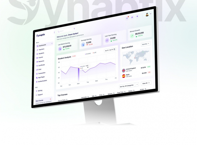
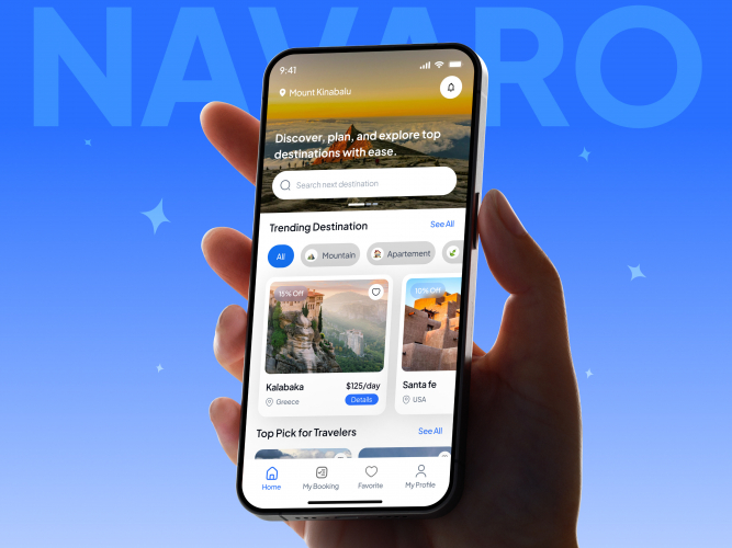
E Hive is a smart SaaS web application built to help students, teachers, and professionals connect, learn, and grow their careers through one modern digital platform. Many people struggle to choose the right direction, present their skills properly, and find real guidance from experienced mentors. E Hive solves this by working as a digital career hub where users can build profiles, explore job paths, and connect with mentors globally, making career development simpler, faster, and more accessible.

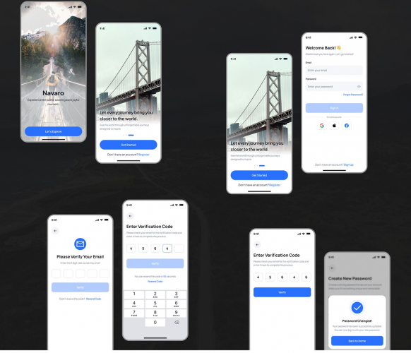
We created an animated explainer video for E Hive that combines 2D animation with real app UI to explain the platform in a simple and engaging way. The objective was to introduce the product clearly for first time viewers while still showing enough real product experience to build trust. Instead of using only static screenshots, we used smooth screen motion and clean transitions to guide the audience through the platform journey like a real user walkthrough.

The video was designed to feel easy to understand, visually modern, and marketing ready across multiple platforms. To achieve that, we blended storytelling driven 2D motion graphics with real interface scenes so viewers can instantly understand what E Hive does and how it works. This hybrid style makes the explainer both informative and attention grabbing, which is especially important for SaaS products where clarity and speed matter.

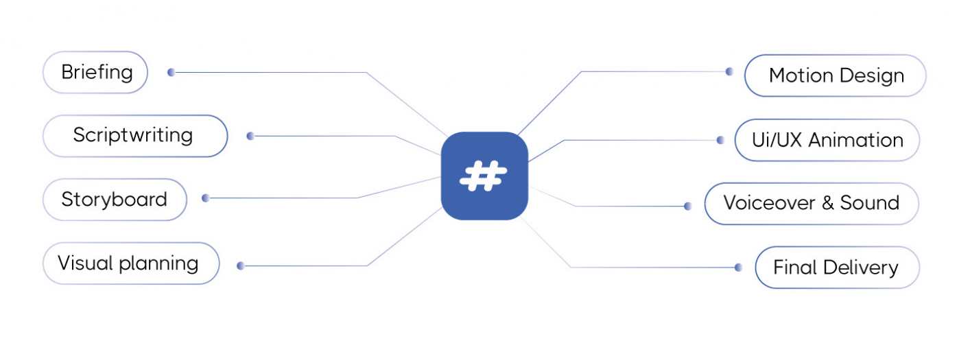
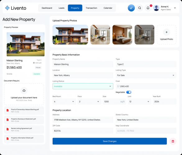
Every element of the animation was produced in After Effects, including the UI walkthroughs, interface transitions, and feature highlight scenes. We animated app screen motion to make the experience feel dynamic and interactive. Key sections of the UI were emphasized through animated callouts, zoom and focus movement, and clean motion graphics that naturally direct attention to important features without overwhelming the viewer.

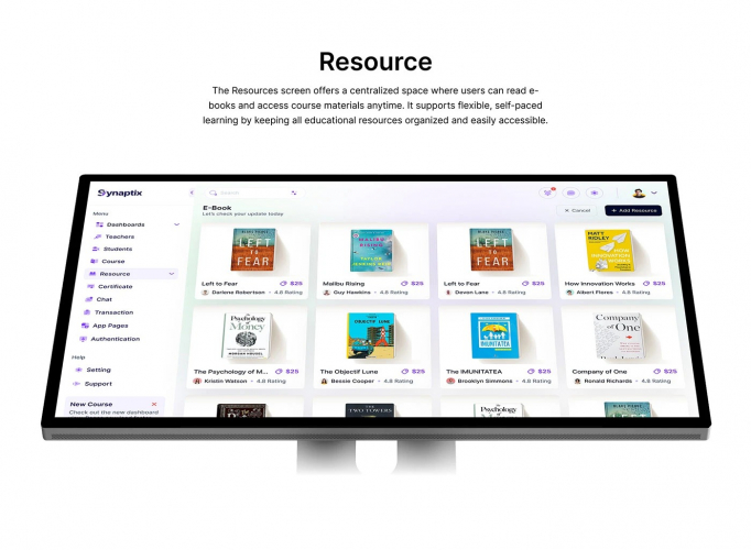
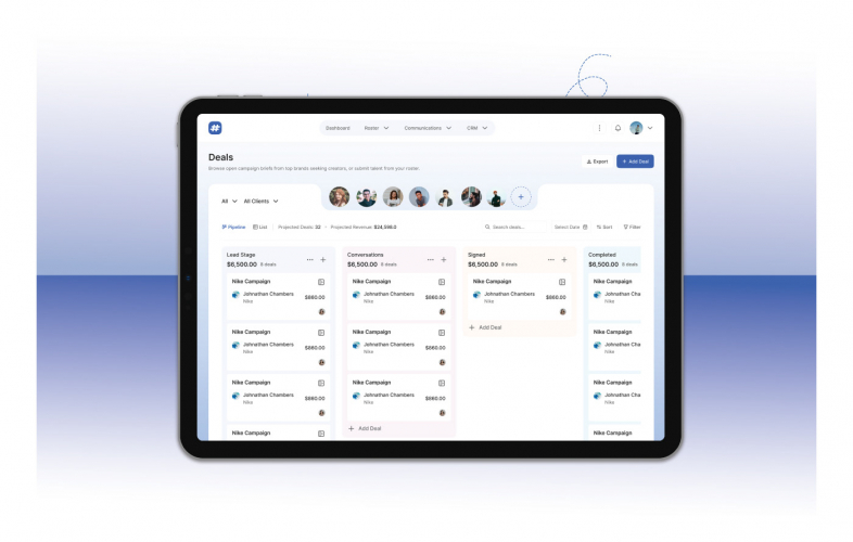
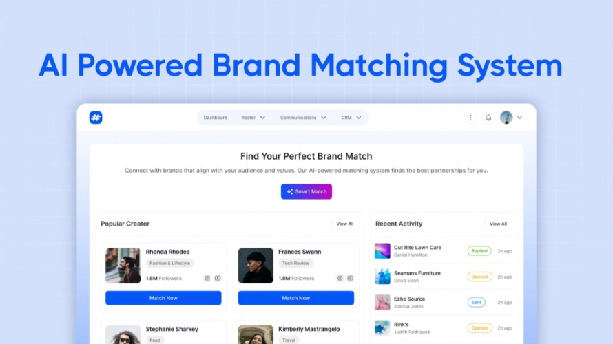
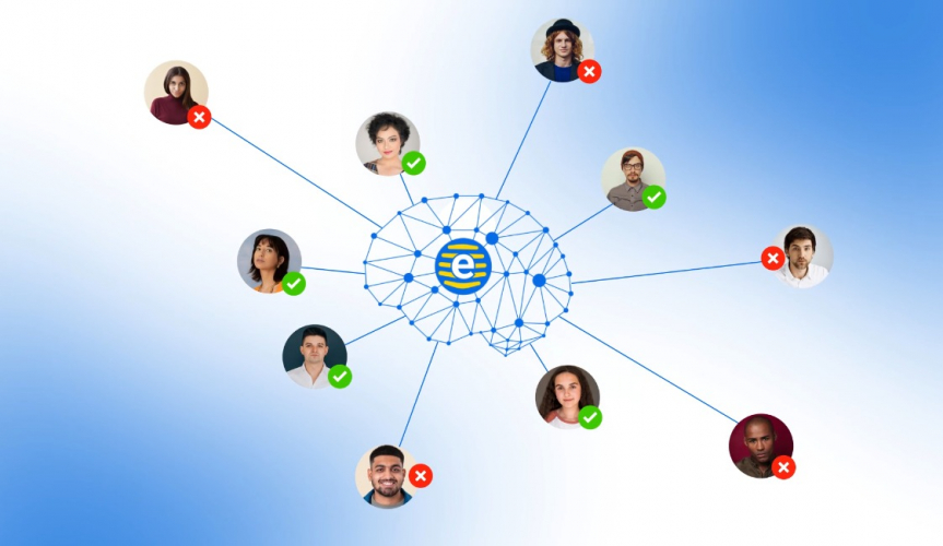
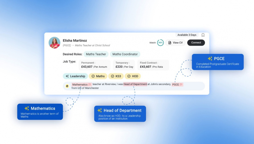
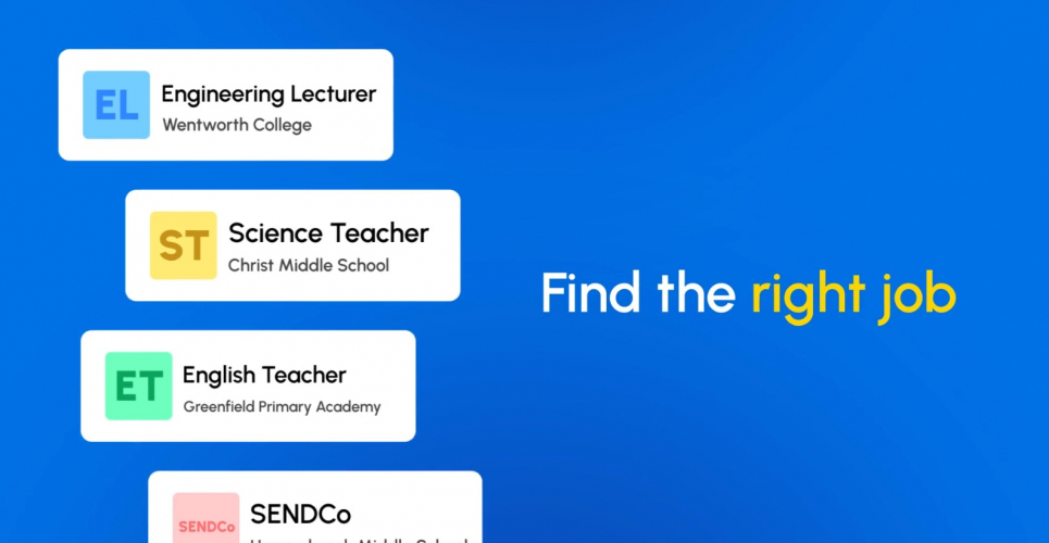
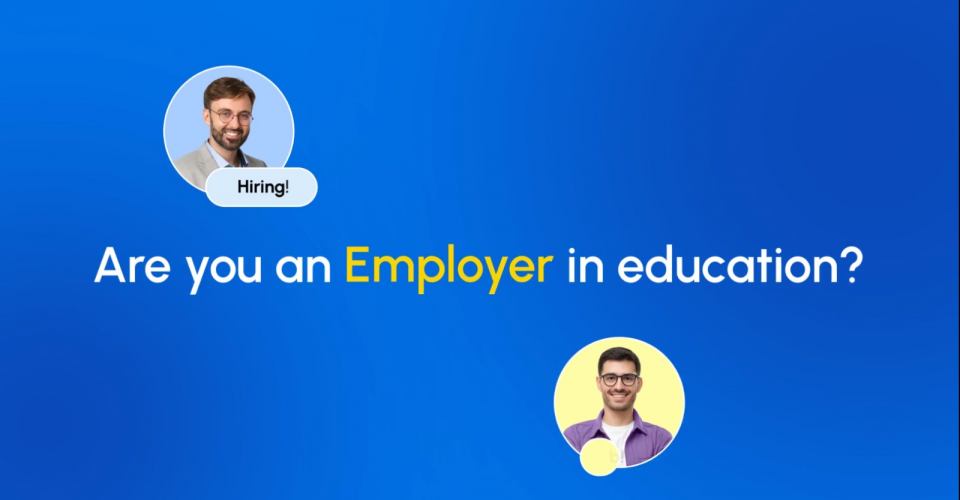
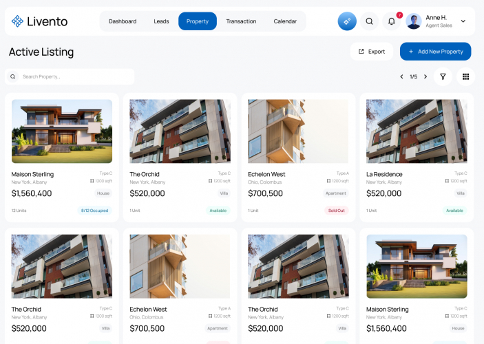
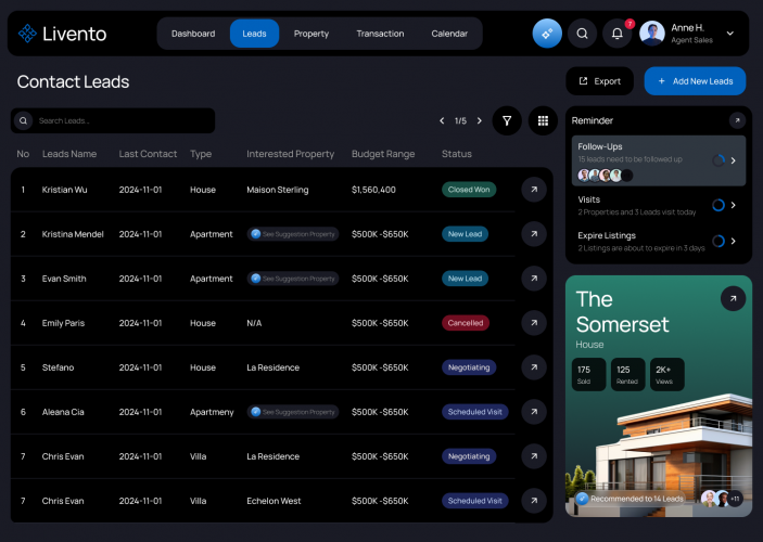
The video includes feature highlight animation, app demo video sections, and product explainer scenes built to communicate benefits rather than just list features. The profile building flow is shown as a way for users to present skills and goals more clearly. The career exploration sections are presented as a guided way to understand job paths and opportunities. The mentorship segments focus on connection, access, and growth, showing how users can learn from mentors worldwide and build stronger career confidence through support and networking.

This explainer was created with real world launch and marketing use in mind. It works perfectly on a website landing page where visitors need a quick product understanding, and it also adapts well for social media content where short, engaging visuals drive attention. Because it includes real UI, it is also highly suitable for Play Store preview placement and product listing videos, helping users understand the app quickly and encouraging downloads.

Overall, the final video positions E Hive as a modern career platform for education and work life, delivered through clean 2D motion graphics and authentic UI animation. By combining real product visuals with After Effects animation, we delivered a professional SaaS explainer that is clear, engaging, and ready for launch videos, social media campaigns, and store preview use.