Brand New Day
A strategic branding and creative design agency
We’re a creative brand design agency; building you the brand that reflects everything you’re about. We’ve developed our skills throughout many years of collective experience, working across wide ranging industry sectors for Asian and international clients.
Our team of highly skilled creatives and designers are ready to take on any challenge thrown our way – that’s precisely what we thrive on. At Brand New Day Asia we start by listening, then asking the right questions before building a brand programme that will give your brand its best business advantage.
We’re happy go the extra mile to really get to know you and understand your business and key markets, before we develop unique strategies, brand stories and creative ideas that will leave a lasting impression.
 Thailand
Service Focus
Industry Focus
- Banking - 22%
- Food & Beverages - 22%
- Financial & Payments - 20%
- Healthcare & Medical - 6%
- Hospitality - 6%
- Telecommunication - 6%
- Manufacturing - 6%
- Startups - 6%
- Oil & Energy - 6%
Client Focus
Detailed Reviews of Brand New Day

Client Portfolio of Brand New Day
Project Industry
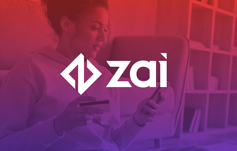
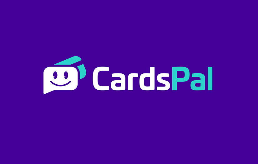
- Financial & Payments - 16.7%
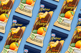
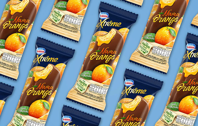
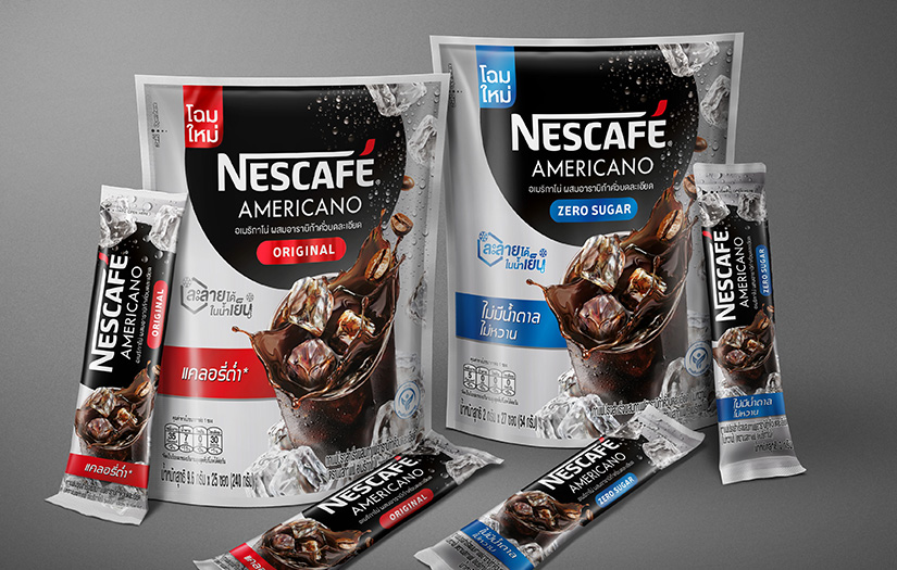
- Food & Beverages - 50.0%
- Real Estate - 8.3%
- Healthcare & Medical - 8.3%
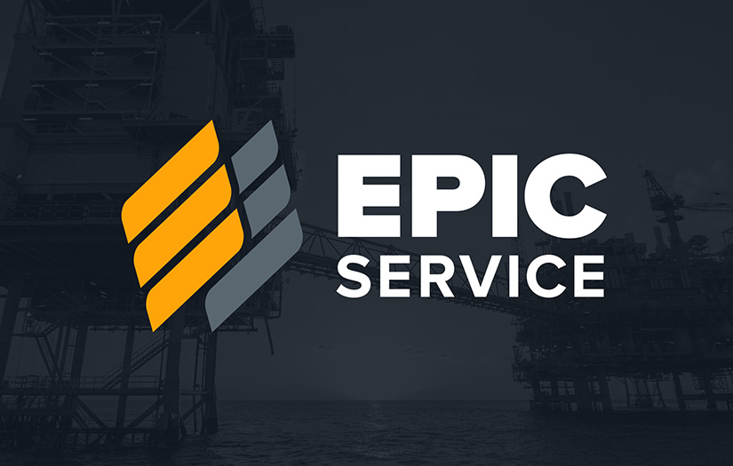
- Oil & Energy - 8.3%
- Insurance - 8.3%
Major Industry Focus
Project Cost
- Not Disclosed - 100.0%
Common Project Cost
Project Timeline
- 1 to 25 Weeks - 100.0%
Project Timeline
Portfolios: 12