Bykreator Studio
Your integrated creative team, on demand
Bykreator Studio is an integrated digital agency based in Novi Sad, Serbia, specializing in Webflow web design, branding, SEO, and digital marketing. We operate as an internal creative team for businesses in Serbia, the EU, and the US—eliminating the coordination chaos of managing multiple vendors. One conversation, full production, high-end execution across branding, web development, content strategy, and marketing. We don't just deliver projects; we become part of what our clients are building.
 Serbia
Rumenacki put 57u,
Novi Sad,
Vojvodina
21000
063 8903241
$50 - $99/hr
2 - 9
2024
Why Bykreator Studio?
- One team for everything, no vendor chaos
- No coordination headaches, just results
- Integrated team that owns the outcome
Service Focus
Industry Focus
- Hospitality - 18%
- Business Services - 17%
- Advertising & Marketing - 13%
- Consumer Products - 13%
- Information Technology - 13%
- Designing - 13%
- Real Estate - 13%
Client Focus
75% Small Business
5% Large Business
20% Medium Business
AI Tools & Purpose
We use Claude to boost team productivity.
Detailed Reviews of Bykreator Studio

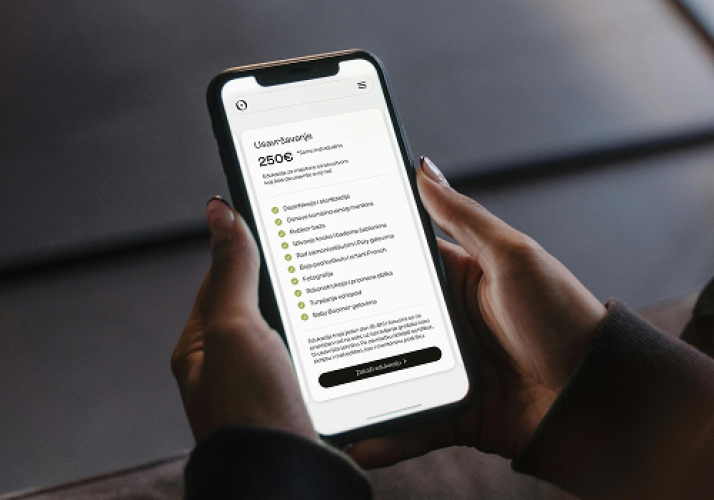
Client Portfolio of Bykreator Studio
Project Industry
- Manufacturing - 25.0%
- E-commerce - 25.0%
- Agriculture - 25.0%
- Business Services - 25.0%
Major Industry Focus
Manufacturing
Project Cost
- $0 to $10000 - 75.0%
- $10001 to $50000 - 25.0%
Common Project Cost
$0 to $10000
Project Timeline
- Not Disclosed - 25.0%
- 1 to 25 Weeks - 75.0%
Project Timeline
1 to 25 Weeks
Clients: 4
- Triad Vacation Rentals
- Heroic Rankings
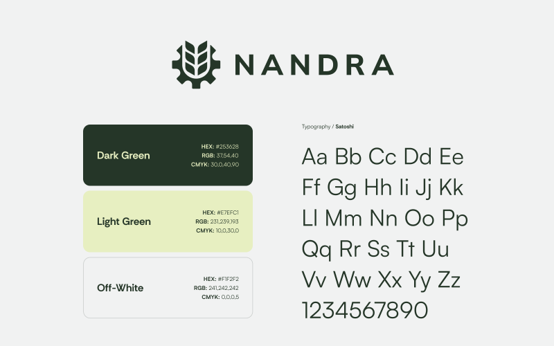
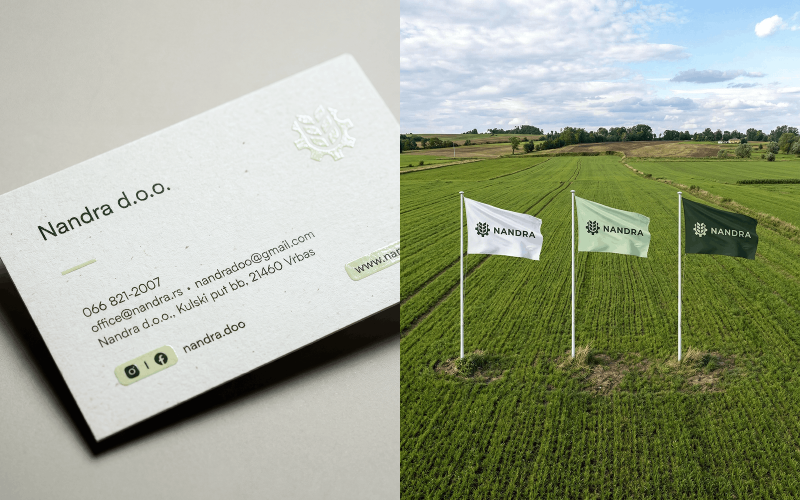
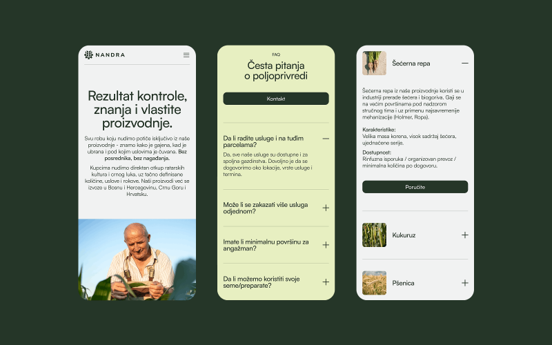
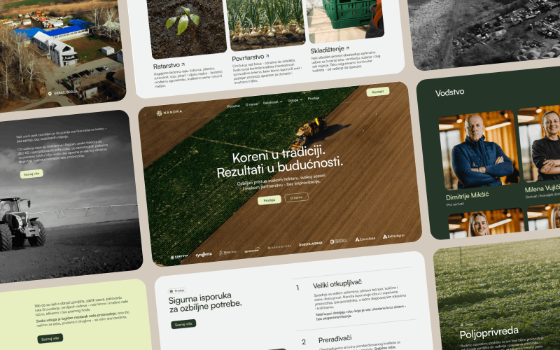
- Nandra
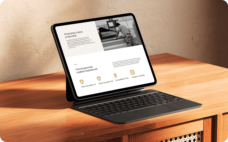
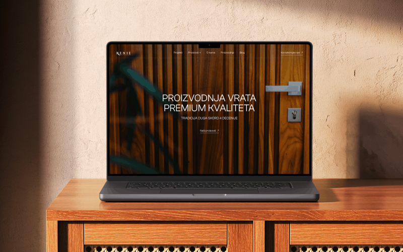
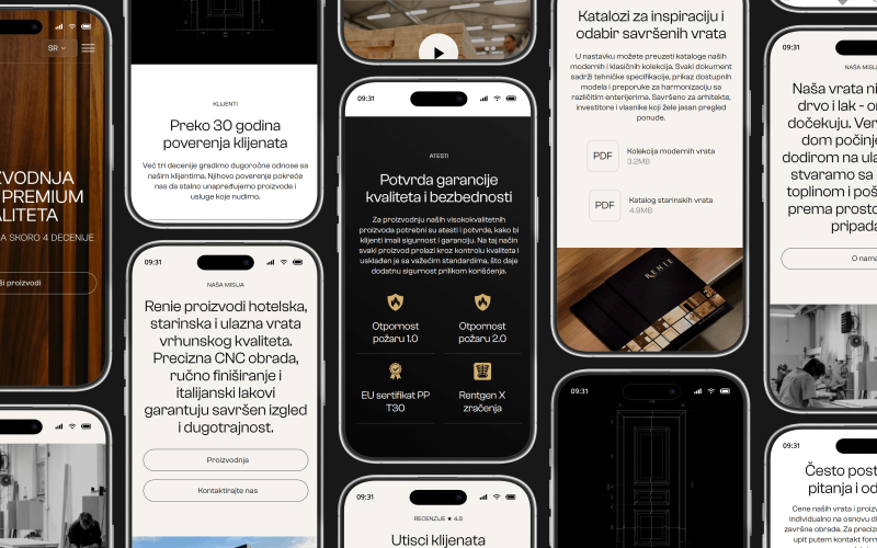
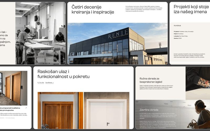
- Renie
Portfolios: 4