Branding Studio

Creatoons is a Brand Strategy Studio that is enthusiastic about work and optimistic about the world!

We work on building insights into purpose and Brand Strategy, Brand Design, and product portfolio strategy. We have also delivered some kick-ass campaigns, and while we're proud of what we've achieved, we're even more excited about what's to come.

From building strategies that help your businesses grow to implementing them and reaching out to the right customer base, we work on the 360 degree of branding and marketing. For us, achieving your vision is the only mission.

Our bucket of services are

Brand Strategy - Brand Positioning, Brand Personality, Brand Differentiation, Voice and Tone, Brand Promise, Naming/ Nomenclature, Messaging, Narrative and Story

Brand Design - Identity Design, Visual Strategy, Visual Elements, Iconography, Illustrations, Branded Collaterals and Brand Guidebook

Brand Building - UX/UI, Packaging Design, Photography, Advertisements, Campaign Marketing, Social Media Marketing, Campaign Marketing.

Having a strong understanding of consumer behaviour, we tap into human psychology to create brands that leave a lasting impression. 

India India
C-201, THE FIRST, behind Itc Narmada, I I M, Vastrapur, Ahmedabad, Gujarat , Ahmedabad, Gujarat 380015
9408758746
India India
C-201, THE FIRST, behind Itc Narmada, I I M, Vastrapur, Ahmedabad, Gujarat , 380015
9408758746
NA
10 - 49
2020

Service Focus

Focus of Web Designing (UI/UX)
  • Website - 10%
  • Ecommerce - 10%
  • Logo Design - 10%
  • Digital Design - 10%
  • Graphic Design - 15%
  • Product Design - 10%
  • Packaging Design - 15%
  • Print Design - 5%
  • Illustration - 10%
  • Motion Graphics Design - 5%
Focus of E-commerce Development
  • Shopify - 50%
  • Adobe Commerce - 50%
Focus of Digital Marketing
  • SEO Services - 10%
  • Social Media Marketing - 20%
  • Branding - 20%
  • Market Research - 25%
  • Media Planning & Buying - 10%
  • Influencer Marketing - 15%
Focus of Advertising
  • Outdoor Advertising - 30%
  • Online Advertising - 30%
  • Creative Agencies - 10%
  • Naming - 30%

Creatoons's exceptional Direct Marketing services give clients a considerable advantage over the competition.

Creatoons's exceptional Other Services services give clients a considerable advantage over the competition.

Industry Focus

  • Advertising & Marketing - 40%
  • Designing - 30%
  • E-commerce - 30%

Client Focus

50% Small Business
40% Medium Business
10% Large Business

Detailed Reviews of Creatoons

No Review
No reviews submitted yet.
Be the first one to review

Client Portfolio of Creatoons

Project Industry

  • Retail - 20.0%
  • Consumer Products - 60.0%
  • Food & Beverages - 20.0%

Major Industry Focus

Consumer Products

Project Cost

  • Not Disclosed - 100.0%

Common Project Cost

Not Disclosed

Project Timeline

  • Not Disclosed - 100.0%

Project Timeline

Not Disclosed

Portfolios: 5

OneGreen

OneGreen

  • OneGreen screenshot 1
  • OneGreen screenshot 2
Not Disclosed
Not Disclosed
Retail

OneGreen: Scripting, Production, Shooting & Editing

Deciding to make healthier choices? Easy. 

Sticking to those choices? Tough. 


We’ve often seen people promising themselves to go green. Pick products that are not just good for their bodies but for the planet too. But, more often than that, we have seen people struggle to keep up with those choices. 

Onegreen identified this gap and decided to do something about it. How? Well, by bringing together major brands from across diverse industries that provided healthy, organic, and clean solutions to deal with everyday needs. But, there was a small challenge. While Onegreen was set on its mission to solve the tough task of helping people stick to their healthier choices, they weren’t able to reach more people and spread the word.


And so, we stepped in. Here’s what we did to create awareness and position Onegreen as one solution. For everything green. For everyone wanting to go green.
 

AWARENESS CAMPAIGN: GET. SET. GO (GREEN). 

To drive awareness, we worked on a digital film which reinstated the fact that “Har cheez ka healthy solution One green pe milega”. 


The film not only highlights the pain points but offers the solution in a way that sticks with the viewer. Like they would like to stick to their healthy choices. 


From scripting to production, from shooting to editing, the Creatoons team managed it all.

ASSURANCE CAMPAIGN: THE SURETY OF QUALITY

Once people started talking about Onegreen, we took on the task of spreading the message about how “Onegreen” is synonymous with “assurance.” Through a well-scripted digital film, team Creatoons instilled the belief that
“Jab ek healthy lifestyle aap apnaay,
Toh false claims ke jhaal mein naa aayein,
Aur Onegreen pe safe and assured products aap paayein!”

Spicta

Spicta

  • Spicta screenshot 1
  • Spicta screenshot 2
  • Spicta screenshot 3
Not Disclosed
Not Disclosed
Consumer Products

Spicta: Brand Refresh, Strategy, Packaging & Shoot

Beep. Beep. Beep. Off goes your morning alarm. But, you’re lazy. So, you give in to the “bas 5 minutes auuurrrr!” feeling. And well, hit snooze. 


Beep. Beep. Beep. Off it goes again, leaving you with no choice. So, while your mind is still at rest, your body is now awake. You pull yourself up and drag yourself to the washroom. You open your bathroom cabinet, grab your toothbrush and apply the toothpaste that you have been using for God only knows how long now. Then, you start brushing your teeth. Mindlessly. Because remember? Your mind is still at rest, no?


While oral care routines can be mundane, Spicta wanted to change the game! 

But, there were some challenges. Intrigued? Read on to know how we partnered with Spicta and took the oral healthcare industry by storm with some “oh-so-real”  flavours and FUN!

CHALLENGE? ACCEPTED!

We began our quest. To find the problems. Yes, problems. Because, without knowing the pain points, how are we supposed to find pain-relief solutions, right? And so began our rebranding journey! 

"Advertising people who ignore research are as dangerous as generals who ignore decodes of enemy signals. – David Ogilvy

He said, we listened. We went all out and started building a strategy.

The entire research process helped us find the gaps. And we took charge to fill them with utmost attention to detail.

Take the world and paint it fresh

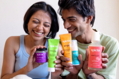
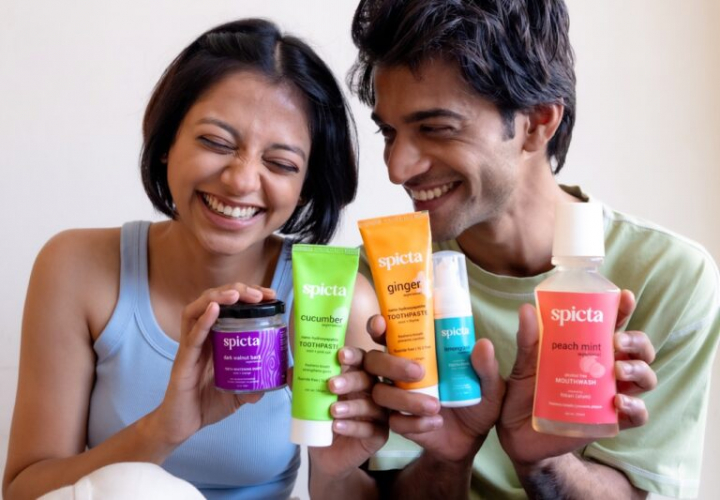
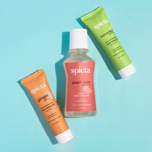
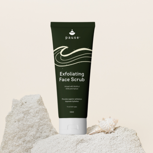
We ditched the regular white-blue-red colour palette and decided to hit refresh (no pun intended) on the packaging. So, we chose to go with shades that instantly lift your mood, have never been used before by oral healthcare brands, and make the simple act of brushing your teeth a lot more fun. 

Given the uniqueness of Spicta’s all-new chosen colour palette, it catches eyeballs and urges the customer to make a switch and start taking their oral health as seriously as they take their skin health. It also pushes people to explore the product range beyond the regular toothpaste and mouthwash, and make their oral healthcare choices more mindfully.

Making the experience count
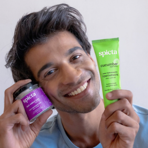
Customers were really becoming fond of the many flavours offered by Spicta. Why so? Because apart from being fluoride and SLS-free, Spicta product range truly embodies the goodness of nature as it is infused with ingredients like ginger, cucumber, lemongrass and so much more. What’s great about this? These ingredients make for an unforgettable and refreshing experience, that the users don’t just remember, but want to keep coming back to.

So, here’s how we brought that experience to life through the packaging. Since our audience was willing to give new flavours a chance, we decided to highlight each flavour including cucumber, peach mint, ginger, lemongrass, and dark walnut bark, through not just appeasing fonts as those of the product category, but also through subtle illustrations that would instantly register in the minds of the buyers. What’s more? We skipped the word “flavour” and went ahead with the word “experience” because that is what Spicta represents at the end of the day. Oh, and at the start of it too! 

As most oral healthcare products fail to be what they’re claiming, we decided to be completely open about our philosophy and choice of ingredients right from the beginning. Therefore, mentioning that all Spicta products are fluoride and SLS free on all our products was a very well thought-out process, since it does not just reassure the user of Spicta being a safe choice, but also the right one. 


TOOTH BE TOLD


All our efforts to brush off the mindless choosing of oral healthcare products paid off! Here’s what happened: The new colour palette charmed the existing users AND attracted a new group of oral hygiene enthusiasts. People were willing to say goodbye to their old toothpastes and pick one that does not just make them feel fresh but leaves their mouth with a fun flavour to enjoy. They didn’t have any second thoughts before setting a new oral healthcare regime, and picked Spicta products off the store racks almost immediately. And mind you, also mindfully!

Ultrapop

Ultrapop

  • Ultrapop screenshot 1
  • Ultrapop screenshot 2
  • Ultrapop screenshot 3
  • Ultrapop screenshot 4
Not Disclosed
Not Disclosed
Food & Beverages

Ultrapop: Brand Experience Design, Spatial Design

When they said “Baap baap hota hai!” they weren’t lying. Because UltraPOP is literally the father of all POPcorn innovations out there. From bringing you drool-worthy flavours to providing you with a non-fried munching option that is good for your gut, it makes for the perfect snack for all you snacks out there! 


So, when we got a chance to help them make their booth pop out, we started jumping up and down just like those tiny ready-to-burst kernels!

UNDERSTANDING CORN-SUMER BEHAVIOUR 

It is a known consumer behaviour insight that when someone sees an open kiosk, the chances of people dropping by increase as compared to when someone comes across a closed one. Why? This is mainly because open booths seem to be more welcoming. The products are clearly visible which unknowingly gives out the message “Hey come in, check me out!” So, the chances of potential customers dropping in, strolling casually, and ultimately turning into loyal companions are greater. 

So, how exactly did we leverage this insight? Read on! 

FROM CORN-VERSATION TO DESIGN 

Everything about Ultrapop screams fun, so we knew exactly what needed to be done! 

We started by understanding the venue. Since it was a music festival, it meant people would be wandering about, with food in their hands of course. And what’s the most munchable, easy-to-carry product that doesn’t need a second thought before purchasing? You’re right. Everyone’s absolute favourite – POPCORN! So, leveraging the open ground area, we started having corn-versations around designing a booth that’s both; huge enough to spot from afar, and attractive enough to make the customers want to get in and check out all the yummy things that Ultrapop has to offer. 


And hence, began the final design. Keeping the brand identity in mind, we started by placing a huuuuuge tub of popcorn, colourful and bright, right in the centre of the booth. To grab eyeballs. And taste buds. Then, on either side of the tub, we allocated ample space to showcase the ultimate Ultrapop range. Now, to make it all the more exciting, we designed the booth to accommodate more engaging activities like a spinning wheel and photobooth, which allowed visitors to win prizes, making it an instant attraction and reason for visit.

RESULTS? CORN-STANT ENGAGEMENT 

As the booth provided enough space for people to move around, they popped in and out as they pleased and tried the delicious range of popcorn flavours at their ease. They played, enjoyed, clicked pictures, and went home with some amazing Ultrapop merchandise that they would cherish forever. Therefore, the booth did not just see enough footfalls offline, but with people clicking pictures and uploading them on Instagram, it also drove digital engagement.

Pause

Pause

  • Pause screenshot 1
  • Pause screenshot 2
  • Pause screenshot 3
  • Pause screenshot 4
Not Disclosed
Not Disclosed
Consumer Products

Pause: Rebranding, Brand Strategy & Packaging

The ‘care’ in skincare had started taking a backseat. With people blindly following trends and social media recommendations, there was a dearth of a skincare brand that actually wanted you to STOP AND REFLECT. And so, emerged Pause – a skincare range that embodies mindful and gentle self-care routines.


When it comes to skincare, Pause is on a mission. To help you understand your skin better, heal it, and give it the care it so rightfully deserves. And Pause wants to do it by spreading the right knowledge about all things skincare. 


So we defined the brand archetype as Sage. As it is all for mindful skincare over uninformed, reckless buying.

Keeping this in mind, we designed a logo depicting a sage sitting cross-legged to promote calmness, mindfulness, and insightfulness. With the hands of the sage together in front, it also forms the pause icon that ultimately promotes the brand philosophy to TAKE A PAUSE.


Have you ever wondered why being outdoors makes you feel calmer than being indoors? Because that is when you can connect with nature in more ways than one. That is when your thoughts get more space to move freely. That is when you can actually STOP AND REFLECT.

Renee

Renee

  • Renee screenshot 1
  • Renee screenshot 2
  • Renee screenshot 3
  • Renee screenshot 4
Not Disclosed
Not Disclosed
Consumer Products

Renee: Naming, Copywriting, Designing, Messaging


RENÉE Cosmetics is here to help you embrace your inner superstar. How do they pull this off? By offering a stunning range of well designed, high-quality, cruelty-free products that scream “I’m not just part of the standard—I set it.”


RENÉE doesn’t just enhance your style—it gives your confidence a real kick.


Marketing for RENÉE was just like giving yourself a full glam makeover – endlessly fun and full of possibilities. At Creatoons, we made sure every post, story, and reel contoured RENÉE’s charm. Our social media strategies were as precise as their PRO HD eyeliner, ensuring RENÉE’s message was highlighted every time.

Instagram stories? Oh, we had those popping like a beauty blogger’s blush. Our feed content was curated to perfection, showcasing RENÉE’s bold, timeless beauty with every swipe.


Our photoshoots for RENÉE Cosmetics turned up the glamour dial. We lit up their products like they were stars on stage and styled each shot to perfection. The result? Scroll-Stopping Visuals that make you want to reach out and try their products yourself.

So, while RENÉE Cosmetics helps you flaunt your fabulous self, we at Creatoons make sure everyone knows about it, one stroke of perfection at a time. Ready to redefine your brand? With Creatoons, your strategy is about to get a serious upgrade—no filter needed!