
Daccel
Selling websites and digital solutions
We are not afraid to push the boundaries and try new approaches, aiming to improve, achieve new results, seeing challenges as opportunities for growth and learning.
Our clients are our partners, with whom we build long-term relationships based on trust and mutual respect. We believe that the key to successful partnership is open communication, transparency, and shared goals.
 Serbia
Featured Companies
Service Focus
Industry Focus
- Other - 100%
Client Focus
Detailed Reviews of Daccel

Client Portfolio of Daccel
Project Industry
- Manufacturing - 8.6%
- Consumer Products - 2.9%
- Business Services - 2.9%
- Travel & Lifestyle - 11.4%
- Other Industries - 31.4%
- Healthcare & Medical - 8.6%
- Legal & Compliance - 2.9%
- Food & Beverages - 5.7%
- Retail - 2.9%
- Banking - 2.9%
- Financial & Payments - 2.9%
- Automotive - 2.9%
- E-commerce - 11.4%
- Real Estate - 2.9%
Major Industry Focus
Project Cost
- Not Disclosed - 8.6%
- $0 to $10000 - 91.4%
Common Project Cost
Project Timeline
- Not Disclosed - 8.6%
- 1 to 25 Weeks - 91.4%
Project Timeline
Clients: 6
- Maintenance of the Ponimau website
- Maintenance of the Davines website
- Business Site K1 Medicine
- Online store for RB Home
- Business site Vazuza Love
- Landing Page Joy Home
Portfolios: 35
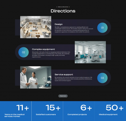
Business Site Klimatekhnika
About what
This case study is dedicated to the development of a modern and user-friendly website for "Klimatekhnika," a company engaged in the production of ventilation equipment. The main goal of the project was to create a simple and intuitive website that effectively showcases the company's products and is convenient for the target audience.
Problem
"Klimatekhnika" previously did not have its own website, which significantly complicated interactions with clients and potential customers. The absence of an online platform made it difficult to present products, receive orders, and provide information about the technical specifications of the products. Hence, there was a need to create a modern website that would become a convenient and effective tool for interacting with the target audience.
Target
The goal of the project was to create a new website that should be as simple and functional as possible, without unnecessary information and complex elements. The site should provide easy access to information about the manufacturing equipment offered by the company and allow users to easily find and order the required products. An important aspect was also the design in dark tones with white text, providing 3D models of machines, and interactive elements to enhance the user experience.
What was done
Analytics
In the analysis phase, our team conducted an in-depth analysis of the company’s needs and its target audience. Interviews were conducted with company representatives to clarify requirements and expectations. Based on the information received, key goals and objectives of the project were formulated. We also analyzed competitors’ websites and gathered best practices in design and functionality for similar resources.
Site development
In the website development phase, we began designing using the graphic editor Figma. According to the client’s requirements, a dark background with white text was chosen. We developed a responsive design that displays correctly on various devices, creating seven different adaptive versions.
Special attention was given to the homepage, where 3D models of the machines, created in Blender, were placed. Hovering over each machine displayed the products it manufactures, and clicking on a product took the user to the specific product’s page.
Product pages were designed to allow users to study all technical specifications in detail, view photos, and order the product. Contact information with modal windows containing an interactive map of the company’s office and factory was placed in the header and footer of the site. A “Blog” section was also added, redirecting visitors to a separate client site.
The footer of the site included a QR code directing users to the company’s Telegram channel for further communication. The site was developed using HTML, CSS, JS, and the WordPress platform, ensuring flexibility and ease of content management.
The website development project for “Klimatekhnika” resulted in a modern and user-friendly resource that meets all client requirements. The new site provides simple and intuitive access to information about the company’s products and simplifies the equipment ordering process. Unique interactive elements and 3D models of machines make the site attractive and functional, enhancing interaction with the target audience and increasing customer satisfaction.
Maintenance of the Davines website
About what
This case study is dedicated to the technical support of the website for Davines, an Italian manufacturer of premium professional hair cosmetics. As part of our collaboration with the company, our agency performs a wide range of tasks related to the maintenance, updating, and development of their current website, which is built on the WordPress platform.
Problem
Davines faced the need for constant technical support and updates to their website. Due to the active growth of the business and regular marketing campaigns, there arose a necessity for promptly handling various tasks related to adding new content, integrating third-party services, and maintaining site functionality. For this, a reliable and professional team was required to quickly and efficiently solve the tasks at hand.
Target
The goal of the project was to ensure the stable and efficient operation of the Davines website through regular technical support. Our task was to promptly perform various tasks, from creating and adding new products to integrating the site with external services and coding email newsletters. Special attention was given to creating new pages with unique functionality, ensuring the proper operation of analytical tools, and maintaining the site's information up to date.
What was done
Analytics
During the analysis phase, our team audited the current state of the site and its functionality. We analyzed the company’s needs, identified key growth areas, and areas requiring improvement. Processes were established for quick and efficient responses to the company’s requests.
Site Maintenance
In the site maintenance phase, our team has already completed numerous tasks aimed at improving functionality, integrating with external services, and keeping content up to date. We regularly added new products to the site, ensuring their correct display and availability to users. Pages for new collections were coded according to provided designs and adapted for desktop and mobile devices, enhancing the user experience.
Special attention was given to integrating the site with external services: we ensured the correct operation of Yandex Metrica for collecting order data and integrated the site with the Bitrix24 CRM system through the WooCommerce plugin, allowing orders to be automatically directed into the sales funnel. As part of marketing campaigns, we regularly coded email newsletters in the Sendsay service, ensuring they adhered to the company’s brand style and marketing goals.
Additionally, a calendar was integrated into the site to add schedules for upcoming master classes, helping clients stay informed about all events. During promotions and sales, prices for all products were updated to keep information current and attract buyers.
The collaboration between Davines and our agency ensures the stable and efficient functioning of the site. Regularly performing various tasks and promptly responding to client requests contribute to improving the user experience and keeping the site’s information current. Thanks to our efforts, the Davines site is a reliable tool for promoting their products and interacting with clients, meeting the high-quality standards the company adheres to.
Maintenance of the Ponimau website
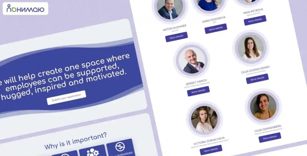
About what
This case study discusses the technical support of the website for "Ponimayu," a company that provides a corporate wellness platform with employee support programs. Our agency handles various tasks to improve the functionality and usability of the site, built on the WordPress CMS.
Problem
"Ponimayu" approached our agency for technical support of their website. The platform required regular updates, the addition of new functionalities, and the resolution of ongoing technical issues to ensure stable operation and meet the needs of corporate clients. Prior to contacting us, the company faced difficulties in maintaining and developing the site, which slowed the implementation of new features and reduced the efficiency of the resource.
Target
The goal of our collaboration with "Ponimayu" was to provide reliable and prompt technical support for their website. We aimed to enhance the platform's functionality, implement necessary tools to improve user convenience, and ensure the stable operation of the resource. Special attention was given to integrating new services and plugins, as well as developing unique components to meet the client's needs.
What was done
Analytics
During the analysis phase, our team conducted an audit of the current state of the site and its functionality. We examined the company’s needs and identified key areas for improvement. An analysis of existing plugins and components was carried out to determine their effectiveness and potential for optimization. We also reviewed the client’s requests for new functionalities, which allowed us to create a clear action plan for subsequent development and implementation of necessary solutions.
Site Maintenance
In the site maintenance phase, our team completed numerous tasks aimed at enhancing functionality and integrating new features. One of the primary tasks was adding a second domain for redirecting traffic from advertising campaigns, which enabled more effective attraction of new users. We also created a component for sending user requests to a specified email, improving client interaction with the service and increasing the responsiveness to inquiries.
For the convenience of site administrators, we installed a plugin that displays test form submissions in the admin panel, simplifying the monitoring and management of received information. A significant task was the creation of a unique testing tool based on Elementor. This tool allowed the client to independently create and configure various types of tests, expanding the platform’s functional capabilities and enhancing the user experience.
The collaboration between “Ponimayu” and our agency ensures the stable and efficient functioning of the site. Quick response to requests, completion of various tasks, and the addition of new functionalities improve the user experience and enhance the platform’s efficiency. Our efforts make the “Ponimayu” website a reliable tool for supporting the employees of corporate clients, meeting high standards of quality and convenience.
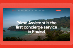
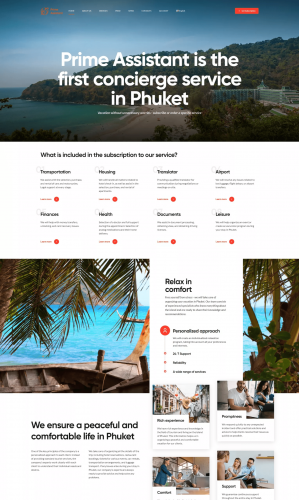
Business Site Prime Assistant
This case examines the successful implementation of a project to create a website for the Prime Assistant company, specializing in providing a wide range of services for a comfortable stay in Phuket.
Challenge
Prime Assistant was faced with a lack of web presence, which prevented them from effectively presenting their services in the online environment. Without having its own website, the company lost the opportunity to attract new customers and inform about its capabilities.
Analytics
At the stage of a thorough analysis of the scope of activity of the Prime Assistant company, namely the tourism market, certain steps were taken to identify current trends and characteristics of consumer demand. The results confirmed that modern tourists show significant interest in personalized concierge services, including personalized tours and comprehensive assistance in resolving legal issues.rnrnThe main requirements and preferences of the target audience were clearly identified. The analysis confirmed that the ease of using online services for ordering services, as well as the promptness of resolving emerging issues, are highly appreciated. These parameters become key factors for attracting and retaining customers.rnrnIn addition, during the review of competitors’ activities, the strengths and weaknesses of their online presence were highlighted. We noticed that competitors successfully implement loyalty programs for regular customers, which attracts increased attention from the audience.
Site development
Based on the results of extensive analytics, a strategic plan was developed for the Prime Assistant website, focused on highlighting unique and personalized experiences. A strategic decision was made to focus on the use of interactive tools, including easy navigation and intuitive functionality for selecting services. To emphasize the individuality and preferences of tourists, a unique website design was developed. Bright and colorful elements reflect the holiday atmosphere in Phuket, and demonstration images of the area and services provided were also integrated to create a unique visual experience. The use of well-chosen icons on various elements of the text complemented the site, serving as an example of the successful implementation of infographics to give the text a structured look. Particular attention was paid to ensuring the website’s responsiveness, which ensures its ease of use on a variety of devices, including smartphones and tablets. Nowadays, this aspect is considered a prerequisite for a successful presence in the Internet space.rnrnAs part of the development, elements of interaction with users were also created and integrated. Convenient subscription and application forms have been added to speed up the interaction process. A personal account with chat functions, which allows for prompt communication with the company and the ability to send and receive documents online. And the presence of a button to switch from the Russian-language version of the site to the English-language version expands the possibilities of receiving applications and attracting users from different parts of the world.
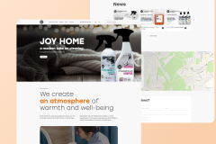
Landing Page Joy Home
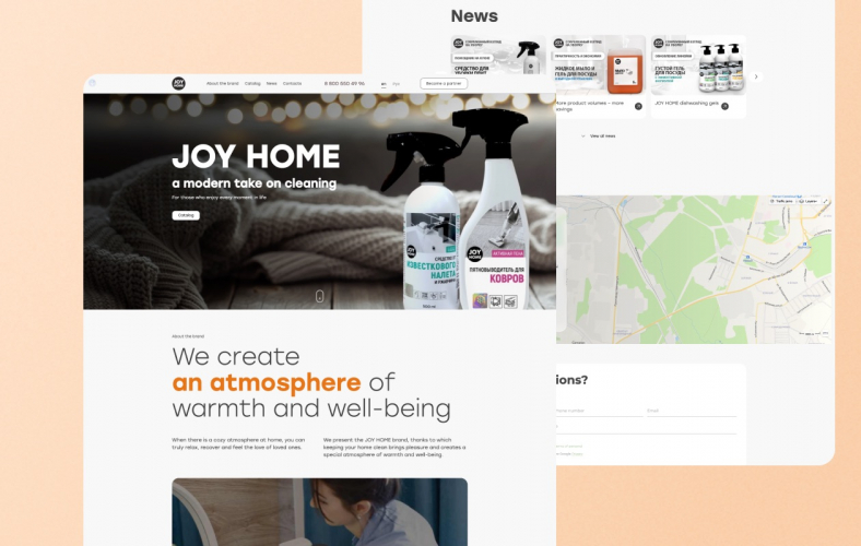
This case is dedicated to the process of developing a landing page for the JOY HOME brand, a manufacturer of household products for the home focused on comfort, style and environmental safety.
Challenge
JOY HOME, belonging to the upper-average segment of its industry, was faced with the need to strengthen its online presence and effectively promote its products. The main problem was the lack of a convenient tool to demonstrate the uniqueness of the brand and products in the online environment.
Analytics
The analysis began with a deep understanding of the JOY HOME brand, its values and goals. This included studying product design, unique formulations and sustainability principles. It was revealed that the brand focuses on modern minimalism and effective recipes. These aspects were included in the landing page design and content strategy.rnrnStudying the online presence of competitors allowed us to identify successful practices that could be adapted for JOY HOME. The elements of interactivity used by competitors to attract the attention of visitors were identified. An important step was to carefully study the customer’s requirements. Particular attention was paid to minimalism, easy navigation, and the concept of “caring for the planet” in creating the landing page. These requirements became the basis for the design and development of the site.
Site development
Taking into account the analysis of the brand and customer requirements, a unique design was developed. The monochrome color palette with the addition of accent bright light colors in the text and product covers emphasized modernity and associations with warmth and safety. The design reflects the brand’s style using minimalist elements. The logical structure of the one-page site is created to highlight the key aspects of the brand. A special section News has been allocated to attract the attention of visitors. The navigation is designed to smoothly lead the user from one block to another, maintaining interest and ease of perception of information. Interactive elements have been added, such as video content and a user-friendly product card interface. They create an engaging experience for visitors and stimulate interaction. rnIntegrated feedback forms, newsletter subscriptions, language switching to attract an international audience. Landing has become not only an informative, but also a functional tool for customers, allowing them to easily contact the brand and place orders.
Business Site Firestop3S
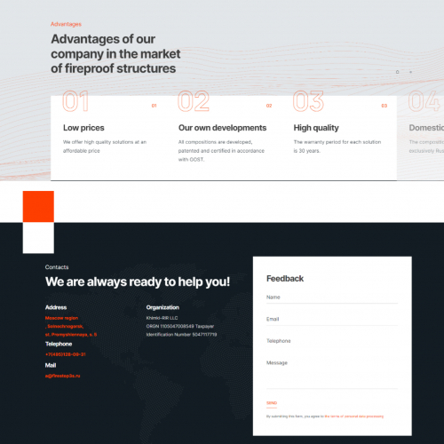
This case is dedicated to the process of reimagining the web presence of Firestop-3S, a company specializing in fire protection solutions. We will discuss the upgrade of their existing website, the creation of a modern design, improvements in usability, and compatibility with various devices.
Challenge
The company had an outdated website that did not meet modern design and functionality requirements. Without considering new technologies and user demands, the website could not effectively showcase Firestop-3S products and support customer interest.
Analytics
The analytics phase of the project for Firestop-3S involved researching the fire protection solutions industry and consumer behavior. In the initial stage, an analysis of current trends in fire protection technologies, identification of key market players, and assessment of their strategies were conducted. By scrutinizing competitors’ activities, successful practices and shortcomings were identified, helping to avoid common mistakes.
An important aspect was studying consumer demand. Surveys and reviews were conducted to understand which characteristics of fire protection compounds were more valuable to customers. It was revealed that consumers actively seek comprehensive solutions and are more inclined to trust domestically sourced raw materials.
Another aspect of analytics was the exploration of competitors’ existing web spaces. Analyzing their websites revealed that many focus on visual appeal and navigation simplicity, elements incorporated in the further development of the site.
Site development
During the website development phase for Firestop-3S, it was decided to completely overhaul the structure and design. One of the key goals was to create a modern and informative web space reflecting the professionalism and reliability of the company. The structure was designed to make product information easily accessible, featuring an intuitive menu with sections like “Products,” “About Us,” and “Contact.” Brief descriptions of industries and products were added for quick understanding.
Creating the user interface involved working on the color palette, fonts, and element placement. Analysis revealed that many competitors use warm colors on their sites, creating associations with safety and comfort. Using this information, a color scheme incorporating shades of orange and red was chosen during development to create a positive brand perception and subconsciously associate with fire protection.
To enhance visual appeal, animations and graphic elements were added. This included smooth transitions between sections, visual effects on mouse hover for information retrieval, and animated elements for products, completed works, and the company’s history on the timeline. Feedback forms were integrated, offering options to request a callback, seek consultation, and “Learn More” buttons with animated transitions for convenient navigation. The use of such elements on the homepage and product pages aimed to retain visitors’ attention and make their stay on the site more engaging.
Integration of video materials showcasing the usage and production processes of fire protection compounds, along with graphics demonstrating advanced technologies, was employed to reinforce the perception of the company’s quality and innovation. A video tour of the production facilities with detailed descriptions of the stages of fire protection compound creation was placed on the homepage.
Content creation involved developing unique texts about the products, their advantages, and application methods. The process included writing usage case studies in real scenarios, complementing the website with attention-grabbing information for potential customers.
Maintenance of the Davines website
This case study is dedicated to the technical support of the website for Davines, an Italian manufacturer of premium professional hair cosmetics. As part of our collaboration with the company, our agency performs a wide range of tasks related to the maintenance, updating, and development of their current website, which is built on the WordPress platform.
Challenge
Davines faced the need for constant technical support and updates to their website. Due to the active growth of the business and regular marketing campaigns, there arose a necessity for promptly handling various tasks related to adding new content, integrating third-party services, and maintaining site functionality. For this, a reliable and professional team was required to quickly and efficiently solve the tasks at hand.
Analytics
During the analysis phase, our team audited the current state of the site and its functionality. We analyzed the company’s needs, identified key growth areas, and areas requiring improvement. Processes were established for quick and efficient responses to the company’s requests.
Site Maintenance
In the site maintenance phase, our team has already completed numerous tasks aimed at improving functionality, integrating with external services, and keeping content up to date. We regularly added new products to the site, ensuring their correct display and availability to users. Pages for new collections were coded according to provided designs and adapted for desktop and mobile devices, enhancing the user experience.
Special attention was given to integrating the site with external services: we ensured the correct operation of Yandex Metrica for collecting order data and integrated the site with the Bitrix24 CRM system through the WooCommerce plugin, allowing orders to be automatically directed into the sales funnel. As part of marketing campaigns, we regularly coded email newsletters in the Sendsay service, ensuring they adhered to the company’s brand style and marketing goals.
Additionally, a calendar was integrated into the site to add schedules for upcoming master classes, helping clients stay informed about all events. During promotions and sales, prices for all products were updated to keep information current and attract buyers.
The collaboration between Davines and our agency ensures the stable and efficient functioning of the site. Regularly performing various tasks and promptly responding to client requests contribute to improving the user experience and keeping the site’s information current. Thanks to our efforts, the Davines site is a reliable tool for promoting their products and interacting with clients, meeting the high-quality standards the company adheres to.
Maintenance of the Ponimau website
This case study discusses the technical support of the website for "Ponimayu," a company that provides a corporate wellness platform with employee support programs. Our agency handles various tasks to improve the functionality and usability of the site, built on the WordPress CMS.
Challenge
"Ponimayu" approached our agency for technical support of their website. The platform required regular updates, the addition of new functionalities, and the resolution of ongoing technical issues to ensure stable operation and meet the needs of corporate clients. Prior to contacting us, the company faced difficulties in maintaining and developing the site, which slowed the implementation of new features and reduced the efficiency of the resource.
Analytics
During the analysis phase, our team conducted an audit of the current state of the site and its functionality. We examined the company’s needs and identified key areas for improvement. An analysis of existing plugins and components was carried out to determine their effectiveness and potential for optimization. We also reviewed the client’s requests for new functionalities, which allowed us to create a clear action plan for subsequent development and implementation of necessary solutions.
Site Maintenance
In the site maintenance phase, our team completed numerous tasks aimed at enhancing functionality and integrating new features. One of the primary tasks was adding a second domain for redirecting traffic from advertising campaigns, which enabled more effective attraction of new users. We also created a component for sending user requests to a specified email, improving client interaction with the service and increasing the responsiveness to inquiries.
For the convenience of site administrators, we installed a plugin that displays test form submissions in the admin panel, simplifying the monitoring and management of received information. A significant task was the creation of a unique testing tool based on Elementor. This tool allowed the client to independently create and configure various types of tests, expanding the platform’s functional capabilities and enhancing the user experience.
The collaboration between “Ponimayu” and our agency ensures the stable and efficient functioning of the site. Quick response to requests, completion of various tasks, and the addition of new functionalities improve the user experience and enhance the platform’s efficiency. Our efforts make the “Ponimayu” website a reliable tool for supporting the employees of corporate clients, meeting high standards of quality and convenience.
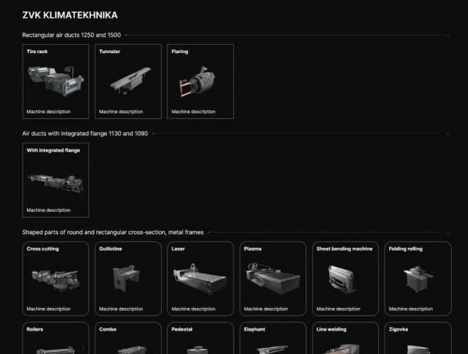
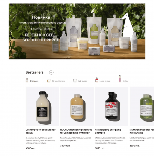
Business Site Klimatekhnika
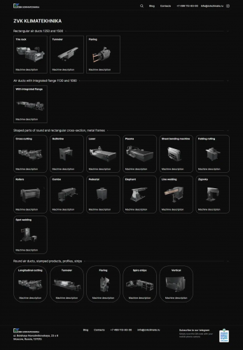
This case study is dedicated to the development of a modern and user-friendly website for "Klimatekhnika," a company engaged in the production of ventilation equipment. The main goal of the project was to create a simple and intuitive website that effectively showcases the company's products and is convenient for the target audience.
Challenge
"Klimatekhnika" previously did not have its own website, which significantly complicated interactions with clients and potential customers. The absence of an online platform made it difficult to present products, receive orders, and provide information about the technical specifications of the products. Hence, there was a need to create a modern website that would become a convenient and effective tool for interacting with the target audience.
Analytics
In the analysis phase, our team conducted an in-depth analysis of the company’s needs and its target audience. Interviews were conducted with company representatives to clarify requirements and expectations. Based on the information received, key goals and objectives of the project were formulated. We also analyzed competitors’ websites and gathered best practices in design and functionality for similar resources.
Site development
In the website development phase, we began designing using the graphic editor Figma. According to the client’s requirements, a dark background with white text was chosen. We developed a responsive design that displays correctly on various devices, creating seven different adaptive versions.
Special attention was given to the homepage, where 3D models of the machines, created in Blender, were placed. Hovering over each machine displayed the products it manufactures, and clicking on a product took the user to the specific product’s page.
Product pages were designed to allow users to study all technical specifications in detail, view photos, and order the product. Contact information with modal windows containing an interactive map of the company’s office and factory was placed in the header and footer of the site. A “Blog” section was also added, redirecting visitors to a separate client site.
The footer of the site included a QR code directing users to the company’s Telegram channel for further communication. The site was developed using HTML, CSS, JS, and the WordPress platform, ensuring flexibility and ease of content management.
The website development project for “Klimatekhnika” resulted in a modern and user-friendly resource that meets all client requirements. The new site provides simple and intuitive access to information about the company’s products and simplifies the equipment ordering process. Unique interactive elements and 3D models of machines make the site attractive and functional, enhancing interaction with the target audience and increasing customer satisfaction.
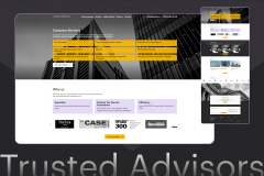
Redesign and improvement of the business site for the company Trustedadvisors
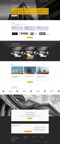
In this article we will look at the process of redesigning and improving the current website of the company Trustedadvisors, which provides services in the field of auditing and consulting activities.
Problem
The company's website had a number of problems: the lack of a complete list of services and their descriptions, the absence of important sections such as News, Cases, Partners, etc., which help promote the site in search results and inspire user trust, as well as outdated design.
Analytics
In the process of researching the auditing and consulting industry, we conducted an extensive analysis of the company’s current website, target audience and competitors’ websites to identify elements that help potential clients better understand the company and make an informed decision about cooperation.
Our research has confirmed that for clients of companies in this area, important: a clear representation of the team’s qualifications, their experience and specialization, a detailed description of the services offered, real examples of successful projects and reviews from satisfied clients confirming the company’s reputation, the presence of all necessary licenses and certificates to provide professional services, as well as current industry news and publications demonstrating the company’s knowledge in the area.
In parallel with the analysis of the area, we worked on the semantic core of the company in order to take into account the structure of the services page and all the key phrases when filling the site.
Site development
The next step was to update the design and develop new pages, according to the Terms of Reference, taking into account comments from an SEO specialist. While working on the site visual, we held meetings with the customer’s team to take into account wishes at all stages. It was decided to add dark colors to the site design for contrast. On the other hand, bright yellow was chosen as an accent color. To give a fashionable, but at the same time business style, we used a black and white filter and a “glass” filter with reflective sunlight for photographs.
After working on the design, our team began the technical implementation of the site. The site would be developed on the CMS WordPress. We changed the style of the site according to the layouts and developed new pages.
Since during the analysis of the customer’s website and competitors’ sites we formed a semantic core, while the site was being developed, a team of SEO specialists was optimizing external and internal factors for promoting the resource.
After filling the site with content, we were connected modules that improved the functionality of the site, for example, a feedback module, a caching plugin, and others.
Tested the web resource on various devices and browsers, as well as corrected errors and shortcomings.
Business Site K1 Medicine
This case study is dedicated to the development of a modern website for "K1 Medicine," a part of the Russian investment and construction holding K1. The company specializes in equipping healthcare facilities with equipment, providing medical technologies to construction sites, and offering warranty and post-warranty maintenance of the equipment. The main task of the project was to create a convenient and functional website that would effectively showcase the company's activities, completed projects, and medical products.
Challenge
"K1 Medicine" approached our agency with the task of developing a new website because the existing site failed to effectively present information and did not provide the necessary level of user interaction. The main problem was the need to structure information about the company's activities, completed projects, and medical products, as well as to add a new "Products" section where users could easily find and order the necessary items.
Analytics
In the analysis phase, our team conducted a comprehensive review of the existing company website and identified the main issues hindering effective user interaction. We gathered all necessary information about the company, including descriptions of its activities, completed projects, and medical products. Competitors were analyzed to understand the best practices in the industry and apply them to the project. We also conducted a series of interviews with company representatives to gain a deeper understanding of their needs and expectations for the new site.
Site development
In this phase, our team developed a new website design that reflects the corporate style of “K1 Medicine” and aligns with modern trends. We created easy navigation, ensuring quick access to information about the company’s activities, completed projects, and products. Special attention was given to the “Products” section, where items were categorized for ease of search and order.
The design featured a modern interface with an emphasis on visual appeal and usability. A key element of the homepage was a video banner that grabs users’ attention and highlights the company’s key offerings.
The “Products” section was designed with special attention to detail: items were categorized to simplify search and ordering. A filter function was added for quick product searches by various parameters.
The site was developed on the WordPress platform, providing flexibility and ease of content management. To implement the functionality, we used modern web development technologies such as HTML, CSS, and JavaScript, allowing for a responsive design that displays correctly on all devices—from desktop computers to mobile phones.
Various WordPress plugins were integrated to enhance functionality and user convenience. For example, the WooCommerce plugin was used to implement the online store, allowing easy management of the product catalog and order processing. Plugins for creating multi-level menus and interactive elements were used to improve site navigation and structure.
Additionally, a news section was added, enabling the company to regularly publish updates and articles, maintaining information relevance and improving SEO. All materials and content provided by the client were thoroughly revised and optimized for web publication.
The project of creating a new website for “K1 Medicine” was a successful step in developing their online presence and strengthening their market position. We managed to create a modern, functional, and user-friendly website that fully meets the client’s requirements and addresses their customers’ needs.
Business Site Bytplast
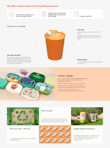
This case is dedicated to the creation of a modern website for Bytplast, a Russian manufacturer of plastic products for home and children. The main focus was on improving the site's usability, ensuring quick and easy access to information and the product catalog, and adapting the site for various devices.
Challenge
"Bytplast" faced the need to modernize its old website. The site did not meet modern usability and design standards, was difficult to use on mobile devices, and had navigation issues within the product catalog. The company aimed to enhance the presentation of its extensive product line, consisting of over 1,100 items, and make the information accessible and understandable for users.
Analytics
In the analysis phase, our team conducted comprehensive research to understand the company’s current needs and determine the optimal solutions.
We studied the behavior of potential users to understand their needs and expectations. Competitor research helped identify best practices in product presentation and user experience. Competitor analysis showed that clear and intuitive catalog navigation significantly improves the user experience. We took this into account when developing the structure of the new site.
We gathered all necessary information about the company’s products, including descriptions, photos, and texts. This content was revised and adapted for the new design. Product photos were updated and optimized for the web to improve visual perception and page load speed. Collecting and analyzing existing content helped us understand how best to structure the information on the new site.
We conducted UX research to identify the main needs and preferences of users. This included analyzing user behavior, creating user scenarios, and conducting interviews with potential customers. Testing showed that users value simplicity and quick access to the information they need. Therefore, we prioritized developing convenient and intuitive navigation and filter systems for the catalog.
Site development
In the development phase, our team took the following key steps to create the new site:
1. Unique Design Development. We created a new, modern website design that reflects the “Bytplast” brand and products. The design was developed in the Figma editor and took into account all aspects of the company’s corporate identity. The color palette, including orange and light gray colors, and visual elements were chosen to match the company’s corporate style while creating a fresh and attractive look for the site. The design included the use of large product images, minimalist icons, and convenient navigation buttons.
2. Responsive Design Creation. We developed seven responsive versions of the site for various devices, ensuring correct display and usability on all platforms. Carefully crafted design elements, such as menus and buttons, were adapted for convenient use on both desktop computers and mobile devices. Responsive design ensures that users can easily browse the site regardless of whether they use a computer, tablet, or smartphone.
3. Catalog Functionality Development. We implemented catalog filter functionality so that users could easily find the necessary products. The catalog was organized by categories, brands, and product lines. Implementing filters by parameters such as line, brand, and product type significantly simplified the process of finding the desired product. Filters were designed so that users could quickly sort products and find exactly what they need.
4. 3D Animation Implementation. A unique feature of the project was 3D animation, allowing users to rotate a virtual cup with a design that the company can provide. Interactive 3D animation demonstrates the possibilities of product customization and attracts users’ attention, making the interaction with the site more engaging and informative.
5. Bitrix 1C Integration. The site was developed on the Bitrix 1C platform, ensuring convenient content and functionality management. Integration with Bitrix 1C allows “Bytplast” to easily update the product catalog and manage the site without needing to contact developers. This solution also ensures high performance and site security.
As a result, the new “Bytplast” website became a modern and functional tool, contributing to improved user experience, increased customer loyalty, and strengthening the company’s market position. The development process included solving complex design, layout, and programming tasks on the 1C platform.
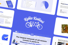
Website of the Kuti Katai rental service
In this article we will look at the process of developing a website for the Kuti Katai company, which provides rental equipment for entertainment, including winter and summer activities. The company also offers rope parks and services for organizing holidays. The project included a complete update of the site design, development of a system for switching site content for different types of seasons, as well as various integrations.
Challenge
One of the main problems of the Kuchi Katai company was the need to reflect all the possibilities of available entertainment in the parks on the website, according to a specific season. And also set up a connection between the site and the internal systems of companies. To solve these problems, our team conducted numerous meetings and discussions with the customer, as well as analysis of the area to fully understand their needs and requirements.
Analytics
Through extensive research into the leisure and entertainment industry in which Kuti Katai operates, we conducted extensive analysis to identify current trends and specific customer needs. Our research has confirmed that modern park visitors show significant interest in the variety of entertainment and recreational opportunities in the park. We have clearly identified the main requirements and preferences of our target audience. Our research has shown that clients highly value the relevance of information about park services, high-quality service and prompt resolution of emerging issues. These aspects are considered fundamental to attracting and retaining customers. When studying the activities of our competitors, we identified both their strengths and weaknesses in their online presence. We drew attention to the successful implementation of loyalty programs by competitors to attract the attention of their audience.
Site development
Website development for the Kuti Katai project was one of the key stages of our work. Our team took upon itself the task of completely updating the website design so that it would best reflect all the capabilities of the company. After carefully studying the Terms of Reference, we began to develop a unique design. One of the main tasks was to think through the logic of displaying different seasons on one site, so that the content would be adjusted to the current season. As a result of long discussions with the customer, our team proposed using a switch in the site header, which allows you to easily switch between the winter and summer versions of the site. When switching, not only the color scheme changes, but also the content so that users receive the most relevant information. After agreeing on the layout, we began developing the site itself. We chose the popular WordPress platform for convenient content management. An important aspect of the site was the ability to display park points on a map. To do this, we used integration with the 1C system, which allows you to manage park points (turn on and off) directly from 1C. Also, goods that can be rented are unloaded and managed from the 1C system. For the convenience of users, we have created a Personal Account where they can be verified by phone number. In addition, we have integrated with the Bitrix24 platform to ensure effective management of client requests and tasks. As a result of our work on developing a website for the Kuti Katai project, we have created a unique and functional web resource that displays all the company’s capabilities and provides ease of use for clients.
Online store for RB Home
This case is dedicated to the successful creation of a modern corporate catalog website for the company RB Home. The goal of the project was to provide customers with a unique opportunity to purchase premium interior products through an intuitive and colorful online portal. It was important to reflect the company’s service - Design Project, which is provided by the company on favorable terms. And also tell designers, businesses and partners about cooperation with RB Home.
Challenge
The RB Home company has a virtual space for the presentation, exclusively, of lighting and electrical products. The inability to present other categories of goods, services and terms of interaction with customers has become a significant obstacle to the company’s development in the modern market.
Analytics
During the analytics phase, our team conducted comprehensive research aimed at understanding the unique needs and goals of RB Home. We sought to identify the core characteristics and values of the brand, as well as best practices in the premium home furnishings industry. We’ve scrutinized the websites of premium interiors and design brands to highlight the key elements of successful online platforms. Analyzing the catalog structure and customer interactions on competitor sites allowed us to identify effective product presentation methods. We held discussions with the RB Home team and identified the unique features of their brand in order to tailor the site design to match the corporate identity. Having learned that RB Home emphasizes the understated and elegant design of its products, we integrated the corresponding color schemes and structure of elements into the visual design of the site. We analyzed user experience on sites similar to the company to identify pros and cons in navigation and functionality. The study found that the convenience of a personal account is a key factor in attracting interior designers. We took this into account when developing the functionality of the personal account. Taking into account the results of the analytics, at the site development stage steps were taken to create a unique and functional web platform for RB Home.
Site development
Our designers created a visual design that reflects the style and aesthetics of the brand. We ensured the site’s attractiveness through the use of high-quality product images and harmonious color schemes. The integration of beige and brown shades into the website design elements emphasized the premium nature of the products. Marketing elements added zest to the site design, both visually and functionally. The choice of the Bitrix platform ensured ease of content and functionality management, giving the RB Home team flexibility in managing the site. Integration with Bitrix ensures fast order processing and updating of the product catalog. A personal account with individual functions for ordinary users and designers was developed. This included the ability to create articles and interact with 3D models of products. Designers can easily publish their projects and interact with clients through their personal account, creating a unique brand experience. Integration of the site with AmoCRM will allow the company to quickly process every order and every request from the site. The addition of quizzes and landing pages further focused attention on the product and attracted various categories of customers. Quiz quizzes such as Find Your Style have created engaging content and increased engagement with site visitors. We have ensured that the site is displayed correctly on all devices, which allows customers to conveniently use the site on tablets and smartphones. The adaptive design of the RB Home website ensures equally convenient interaction with the platform on any device.
Business site for a tour operator on the Kola Peninsula TUNDRA HOUSE
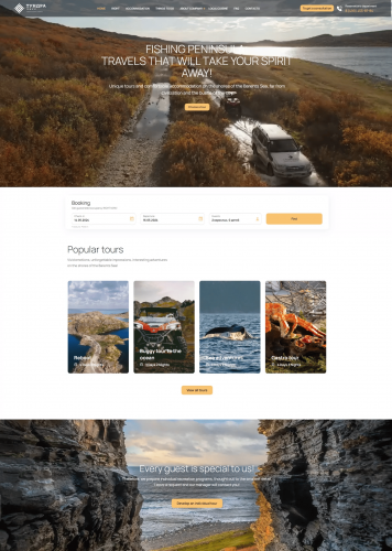
The article describes the case of creating a new website for the Kola Peninsula tour operator Tundra House, describing in detail the problems of the previous website, the goals set, the results of analytics and the process of developing a new website.
Challenge
Tour operator Tundra House's old website had a stylistically outdated design and confusing structure, making it difficult for users, especially new ones, to navigate. This could lead to a poor user experience, lost potential customers, and reduced conversions.
Analytics
To create a new website, we conducted a detailed analysis of the Tundra House website. This included studying the design and structure of the site, content, functionality, as well as competitor sites. The results showed that site visitors are primarily interested in the ability to quickly and easily book a tour or ask a question, as well as: detailed information about various tours, including routes, schedule, cost, level of difficulty and photographs of attractions of the Kola Peninsula; information about additional services such as transfer, meals, accommodation and insurance; reviews of previous clients about tours and services; detailed information about the tour operator, its experience and qualifications; useful tips and recommendations for travelers visiting the Kola Peninsula (for example, a list of necessary equipment, safety tips, etc.). After collecting and analyzing all the data, we developed a structure for the new site and took into account best practices on the design and accessibility of the site to ensure convenience and attractiveness for users. In addition, during the review of competitors’ activities, the strengths and weaknesses of sites in this area were highlighted. It is noticeable that competitors focus on bright and interesting photo and video content, which most attracts travelers.
Site development
Based on the analytical results, a plan was developed for the implementation of the TUNDRA HOUSE company website, focused on highlighting the individual capabilities of each tourist. A strategic decision was made to focus on the use of interactive tools, including easy navigation and intuitive functionality for selecting services.To emphasize the individuality and preferences of tourists, a unique website design was developed. Bright and colorful photos and videos were integrated, reflecting the atmosphere of recreation on the Kola Peninsula to create a unique visual impression. The use of well-chosen icons on various elements of the text complemented the site, serving as an example of the successful implementation of infographics in order to give the text a structured look. Particular attention was paid to ensuring the adaptability of the site, which ensures its ease of use on various devices, including smartphones and tablets. Nowadays, this aspect is considered a prerequisite for a successful presence in the Internet space. As part of the development, elements of interaction with users were also created and integrated. Convenient subscription and application forms were added to speed up the interaction process. Also, the site was integrated with various services: Bitrix 24, TravelLine, Calltouch, for the convenience of working with company applications.Thus, the new website for the tour operator Tundra House was developed taking into account the needs of users, modern technologies and company goals, which made it possible to improve the user experience and efficiency of interaction with customers.
Promotion
To effectively track statistics and analyze user behavior on the TUNDRA HOUS website, we have set up tracking goals. This will provide valuable information about traffic, interaction with various elements of the site and conversion.
UpMarket – a modern online supermarket
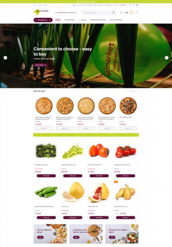
This case examines the process of developing a website for Upmarket, a modern supermarket, whose goal was to redesign, provide new functionality and improve convenience for customers.
Challenge
UpMarket was faced with the need to update its website, which did not fully meet modern requirements. The main problem was the limited functionality of the existing website, the inconvenience of the user interface and the inability to order products for delivery online.
Analytics
The analytics phase of website development for UpMarket was key to understanding the current state and defining a strategy for a successful design. In the first stage, our team conducted a thorough research of the company’s existing website. We analyzed every aspect, from the user interface to the content structure. We conducted an in-depth analysis of the current UpMarket website, identifying its strengths and weaknesses. User experience problems were identified, such as inconvenient navigation and ineffective structure. An important step was the analysis of the company’s requirements. We held meetings with UpMarket representatives and identified their expectations and strategic goals. The company expressed a desire to improve the ability to order products for delivery and create personal accounts for users. Analysis of competitor sites helped us identify best practices in the industry and highlight features that could attract customers. For example, we have identified successful solutions in organizing online orders and the structure of personal accounts.
Site development
The website development phase for UpMarket focused on creating a modern, functional and attractive web space that met all identified requirements. A custom design was developed that reflected the style and values of the brand. The color palette takes into account warm shades that create an atmosphere of comfort and taste, and also adds bright colors for such important elements as the “Order delivery” buttons, promotions and offers, subscription to the newsletter and ordering feedback. A logical website structure has been created, ensuring a simple and intuitive navigation. Thus, brighter buttons were added for quick access to sections and improved user experience. A full-fledged user account was introduced, where customers can store information about orders and set their preferences. All content has been optimized for search engines, taking into account the identified keywords. Meta tags, unique content were added and images were optimized for all standards of a modern website. Before launch, the website was thoroughly tested on various devices and browsers, the online order functionality was checked on various devices to ensure its correct operation and correct display all elements in the mobile and tablet versions and ease of site navigation.
Business site Vazuza Love
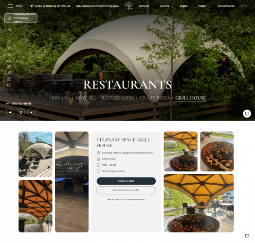
Our team was developing a new website for the Vazuza Love project - a glamping safari on the Vazuza Reservoir. This is an interesting and complex case, which included the creation of a unique design, the development of a tool for a random or refined selection of entertainment for guests, as well as the integration of a custom interactive map and various services. Let's take a closer look at the development process.
Challenge
The company's problem was that the previous site did not have enough information about glamping opportunities, and there was also no convenient system for choosing entertainment for guests. In addition, the site design required updating and modernization.
Analytics
At the stage of a thorough analysis of the Vazuza Love company’s field of activity, namely recreation and leisure, certain steps were taken to identify current trends and characteristics of consumer demand. The results obtained confirmed that modern guests of recreation centers show significant interest in the variety of entertainment and recreation opportunities on the territory of the base. The basic requirements and preferences of the target audience were clearly defined. The analysis confirmed that the simplicity of the complete organization of a short-term vacation, excellent service, as well as the efficiency of resolving emerging issues are highly appreciated. These parameters become key factors for attracting and retaining customers.rnIn addition, during the review of competitors’ activities, the strengths and weaknesses of their online presence were highlighted. It is noticeable that competitors are successfully implementing loyalty programs for regular customers, which causes increased attention from the audience. During the analysis of the company’s scope of activity, our team studied the detailed technical specifications in video format from the customer. Our designers proposed additional solutions aimed at improving navigation, ease of perception of information and the overall aesthetics of the site.
Site development
The website development phase was an important stage, including the solution of a number of complex tasks in implementing the layout design, design layout and programming on the WordPress platform. After successfully agreeing on the overall layout design concept, our team created a design for more than 15 pages of the future web resource. These layouts included not only basic page elements, but also additional components such as pop-ups, search bar functionality, burger menus, and responsive versions for various devices, including tablets and phones. An important task was to offer a convenient tool for selecting entertainment for glamping guests – a kaleidoscope. Our team proposed 4 different options for the type and operation of the tool. After interviewing potential site users, a choice was made in favor of one of the options. During a lengthy discussion, the layout was agreed upon and transferred to development. The site was developed on the WordPress platform, and the layout was carried out using HTML and CSS. The kaleidoscope was implemented using JS. For quick booking of guest accommodation, the Bnovo service has been integrated. For prompt interaction between site users and Vazuza Love, the Umnico chat is integrated. After complete development, we began filling the site with content provided by the customer. Then the testing phase began. Our team checked all functional elements, feedback forms and transitions between pages, and the operation of integrated services. ReCAPTCHA was enabled to protect the site. Yandex. Metrica is connected to collect statistics. The first release of the website was successfully presented to the customer. rnrnThe customer’s comments were taken into account, and after the final release the project was approved and transferred, completing the website development stage for the company Vazuza Love. In the process of developing the site, we worked closely with the customer, constantly coordinating each stage of the work. This allowed us to create a website that meets all the client’s requirements and wishes. As a result, a convenient and functional website was developed, which became the calling card of the Vazuza Love project and an important tool for attracting guests.
Promotion
To effectively track statistics and analyze user behavior on the Vazuza Love website, we have set up tracking goals. This will provide valuable information about traffic, interaction with various elements of the site and conversion.
Business Site Ceiling Maker Pro
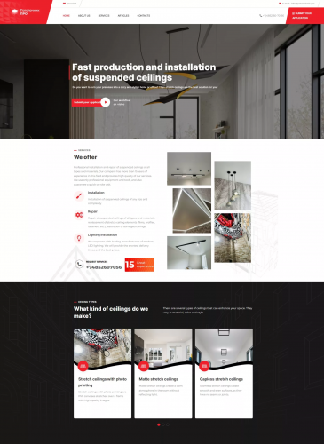
This case describes the process of developing and successfully launching a website for the Ceiling Pro company, specializing in the installation and repair of suspended ceilings.
Challenge
The Ceiling Pro company was faced with the lack of its own online resource, which led to missed opportunities to attract customers via the Internet. Lack of company information online reduced visibility and competitiveness.
Analytics
Having started the development process for the Ceiling Pro company, our team conducted an in-depth analysis of the installation and repair of suspended ceilings. The main trends in the industry were identified, such as increased interest in environmentally friendly materials and innovative technologies in this area. An increased demand for illuminated ceilings and the use of modern design solutions were discovered. By analyzing market research data, the target audience and its desires and interests were identified. Among potential clients, one can highlight a preference for high quality services, as well as attention to design and modern trends in the field of suspended ceilings. An analysis of the web presence and strategies of competitors in this area was carried out. Based on the example of discovering that some competitors successfully attract customers with loyalty programs and promotions, it was decided to implement on the Polotochnik website a promotional offer when passing a quiz to quickly collect data from the client and receive a new application. Using the example of discovering that a competitor lacks a detailed description of the technologies used When installing ceilings, it was decided to focus on the Services section, providing detailed information about the materials used and installation methods.
Site development
Based on the results of the analysis, we have developed unique and informative content representing the Ceiling Pro company. Photographs and videos were organized to best demonstrate the high quality of work performed. The design team created a visual design for the site that combines the company’s style with the preferences of the target audience. The design includes animated elements that added interactivity and improved the visual experience. Optimized distribution of information on the site makes the services offered easier to perceive and understand. The Articles section has been added to regularly update content, which facilitates promotion through search engines. In order to provide users with the most convenient format for interaction with the company, feedback and application forms have been developed, providing a quick and easy way of communication, and Venyoo chat has also been connected. Interactive site elements have been implemented to enhance visitor engagement and retention. As part of the technical implementation, modern solutions were selected for optimal performance and fast response of the website. An adaptive design has also been developed, which ensures convenient use of the site on all devices.
Business Site RTP
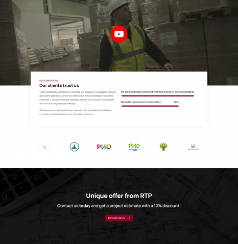
This case examines the process of a complete overhaul of the web presence for "RTP," a company specializing in providing services in the field of fire safety. Throughout the case, we will delve into the detailed steps to be taken to create an effective and contemporary website, capable of not only capturing the attention of the target audience but also enhancing the company's competitiveness in its industry.
Challenge
The current website was overloaded with textual information that no longer accurately reflected the company's offerings. The content lacked structure, and pricing information was absent for specific services, causing difficulties in engaging with potential clients. The clients themselves acknowledged that the website was initially designed with a focus on SEO, resulting in a visual presentation that fell short of expectations.
Analytics
To carry out a successful redesign of the “RTP” web resource in the field of fire safety, a comprehensive analysis was conducted. The analytical research encompassed a thorough review of current trends in the industry, a forecast of demand for fire safety services, and a detailed analysis of competitors, highlighting their strengths and weaknesses.
During the analysis of market trends, it was discovered that consumers currently show active interest in innovative solutions in the field of fire safety. They highly value the outstanding quality of services provided within reasonable financial constraints, a variety of approaches to problem-solving, and the presence of relevant certifications confirming the right to operate in the field of fire safety. These factors were taken into consideration in conceptualizing the new website, including updating graphic content, revising pricing information, adding relevant certifications from the Ministry of Emergency Situations, and reviewing texts to enhance the effectiveness of reaching the target audience.
Site development
The update of the “RTP” internet resource encompasses not only the enhancement of the visual aspect but also the creation of a functional and structured online space. This space features a user-friendly interface, organized information about the provided services, and a simple website navigation system. Based on a competitor analysis considering their strengths and weaknesses, a corporate website covering all aspects of “RTP” activities in the field of fire safety was developed.
One of the key changes involved the implementation of an improved color palette aimed at capturing users’ attention. A burgundy-white color scheme was chosen, considering its association with the concept of fire safety. Burgundy, as a shade of red, is traditionally associated with fire extinguishers, firefighting tools, and other elements related to fire safety. This choice of color palette was made to reinforce the visual identification of the company’s scope of work on the website and to evoke associations with reliability and safety.
Additionally, the previous version of the website contained outdated and unappealing content, which was replaced with modern and individually formatted text. This step aimed to refresh the informational content, providing a more current and structured representation of the offered services. Attention to detail in text distribution creates a positive impression of interacting with the website. The update contributed to achieving harmony between textual and visual content, enhancing the overall user experience.
An important change was the integration of feedback forms, facilitating the interaction of potential clients with company representatives. This provides a convenient way for visitors to obtain necessary information and ask questions, thereby elevating the level of service and the efficiency of customer interaction.
Promo Site SladenKo
The case describes the process of creating and optimizing a web resource for the SladenKo company, specializing in the production and sale of confectionery products. During the case, we will look at what steps need to be taken to create an effective website that will attract more customers and increase the company's sales.
Challenge
The main problem that the SladenKo company faced was the lack of a web resource. This meant that the company was unable to attract potential customers via the Internet and provide them with information about its production facilities and products. In addition, the company was unable to compete with other players in the confectionery market.
Analytics
To analyze the market, a research analysis was carried out, including an analysis of current trends and forecasts of demand for products, an analysis of key competitors and their strategies, an analysis of the behavior of the target audience and their preferences in choosing products.
Using this data, it was determined that many potential customers today are looking for new products to bring into their stores, while appreciating quality, variety of flavors and attractive packaging designs. Competitors are strong and have their own customer base, but with certain differences SladenKo can offer something new and unique.
Another key point was to analyze the offers of the B2B market, as well as supplies from other manufacturers. A study was conducted of potential partners, their requirements and interests in products, which made it possible to determine general trends in the market and adapt to the preferences of partner companies
Site development
To develop a website for the SladenKo company, the main target audience was taken into account: consumers (B2C) and purchasing department specialists (B2B), for whom a visual presentation of the project was developed.
The SladenKo website was designed to meet the needs of two audience groups, simplify the process of finding the necessary information and interest users with product descriptions and interactive functions.
Promotion
To promote the SladenKo company website, a number of effective marketing tools were used. One of the main methods was the use of animation, which made it possible to attract attention and involve site visitors in an interactive journey through the culinary world of SladenKo products. This increased conversion and increased the time users spent on the site, which had a positive impact on sales.
In addition, to expand sales channels, an advertising campaign was launched, which made it possible to attract a large number of new customers through various advertising platforms on the Internet and social networks. Thus, the SladenKo company was able to increase its customer pool, achieve greater audience coverage, and also increase overall sales volumes.
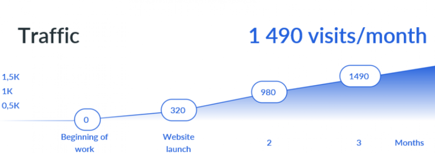
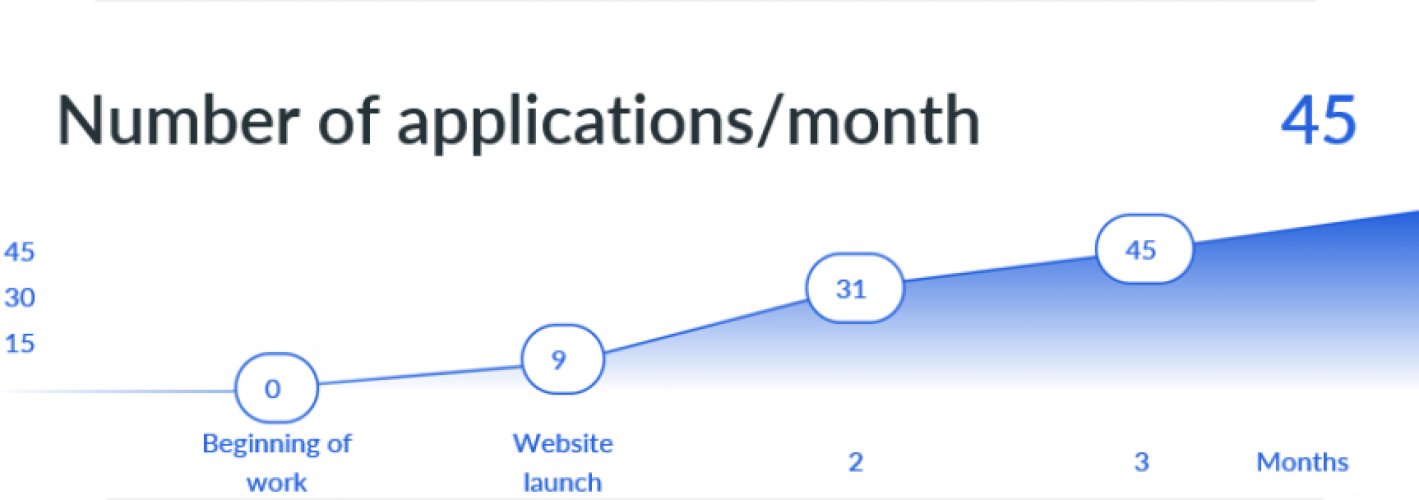
As a result, thanks to the use of various marketing strategies, including the use of animation, an advertising campaign and expansion of sales channels, SladenKo successfully promoted its website and increased its customer base, which led to an increase in sales and strengthened its position in the market:
- Failures – no more than 18%
- Average time on site – 2:17
- Conversion to application – 3.1%
- Average number of applications per month – 45
Business Site Boltzavod
The Boltzavod company is a leading manufacturer of metal products with successful experience in retail sales through an online store. However, in an effort to further develop and strengthen its position in the market, it decided to expand its business in the B2B segment.
Challenge
The Boltzavod company was faced with a significant problem - the lack of a special web resource for corporate clients in the B2B segment. This led to the inability to effectively interact with large customers and the loss of a significant volume of potential transactions.
Analytics
Our team was faced with the task of creating a web space for the Boltzavod company in order to attract clients in the B2B sphere and offer products in the field of metal products production. To achieve this goal, a thorough market analysis was carried out and a marketing strategy was drawn up.
The market analysis included studying competitors, analyzing demand for metal products, researching consumer preferences, and assessing the company’s current online presence. This made it possible to identify the key advantages of Boltzavod and highlight the main areas that should be focused on when creating a website.
Site development
Taking into account the results of the analysis, a corporate website was developed that stood out with its unique design and functionality. The main attention was paid to the description of the equipment used and the company’s services offered.
The site contained information about a wide range of Boltzavod products, including detailed technical specifications and photographs. Information about the company, its history, mission and values was also presented.
However, the site was not limited to just informative content. It was possible to communicate with company representatives through special feedback forms. This made it easy for potential clients to get the information they needed and ask questions.
Promotion
The final stage was setting up analytics to track traffic and user behavior on the site. This allowed the company to evaluate the effectiveness of its web presence and make adjustments to its marketing strategy.
To attract customers in the B2B segment, advertising campaigns were launched in Yandex.Direct. The advertising was designed taking into account the keywords and phrases most in demand in the industry. This helped attract the attention of potential customers and increase traffic on the Boltzavod website.
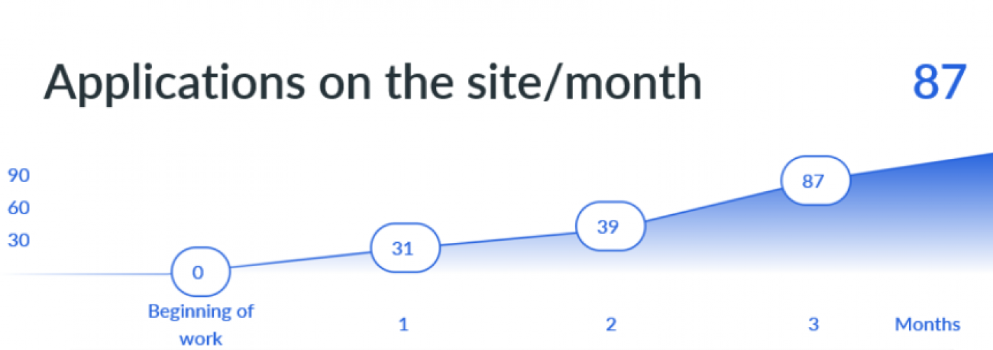
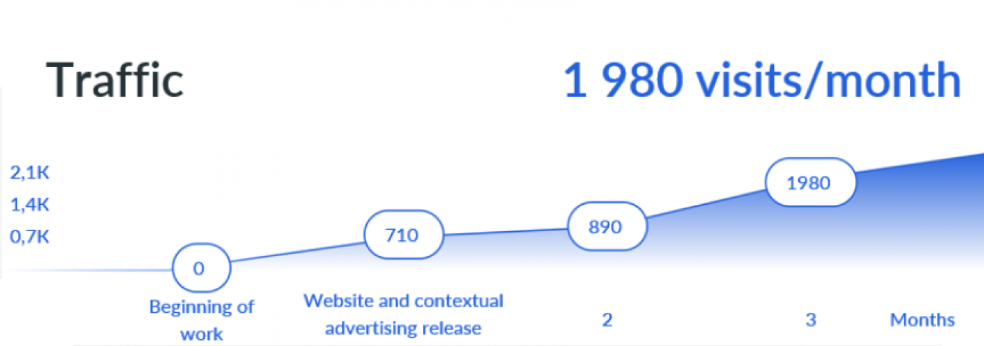
Thus, with the help of effective promotion tools, the company was able to significantly improve its visibility, attract new customers and strengthen its position in the market:
- Failures on the site – up to 15%
- Time on site – 2:20
- Conversion on the site 4.4% per application
- Average number of requests per month – 87
Business Site Aistera
This case describes a complete website update and marketing strategy for a zero-cycle construction company. The case will consider the tasks that the project team faced, namely, increasing sales and attracting new customers, as well as ways to solve them.
Challenge
The main problem was an outdated website that did not meet modern requirements, was inconvenient to use, which could create a negative impression among potential customers and reduce sales efficiency. In turn, the outdated marketing strategy did not allow the company to increase the number of customers and did not represent the company well in the market.
Analytics
Before developing a new website and marketing strategy, an audit of the current resources of the Aistera company and an analysis of the construction services market was carried out. This made it possible to identify the strengths and weaknesses of the company, as well as to identify the potential for improvement. As part of the competitor analysis, successful examples of other companies in the industry, their marketing strategies and strengths were studied.
Site development
Further, the development of a new corporate site-catalog for the company Aistera began. Work was carried out on the design and layout of the site, the creation of informative and selling texts, as well as site optimization for search engines. The site was integrated with the CRM system, which made it possible to conveniently manage applications and customer requests.
Promotion
The next step was to introduce a new marketing strategy, which included a set of tools to promote Aistera on the market. An advertising campaign was launched, which included contextual and targeted advertising on various sites, which helped to attract new customers. An SEO project was launched that optimized the company’s website for search engines, increasing its visibility and attractiveness to potential customers. SMM strategies have also been introduced to increase popularity and attract new customers through social networks.
Thanks to these stages of work, Aistera was able to significantly improve its position in the construction services market. The new site has become more convenient and informative for customers, and the new marketing strategy has helped to achieve a significant increase in sales and attract new customers through various channels:
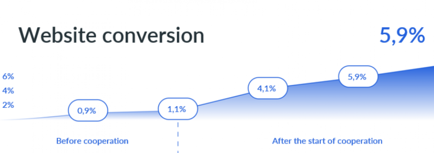
- Conversion on the site 5.9% to the application
- The cost of the application is about 21,84 €
- Average check — 855 €
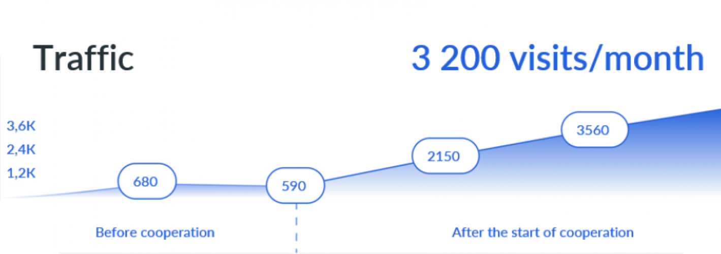
- Average number of applications per month – 210
Business Site Language Lab
Case about the development and promotion of a corporate website for the Language Lab interpreting center. The case describes the process of creating and successfully positioning a website in order to attract new customers and improve the quality of services provided.
Challenge
The main problem that Language Lab faced was the lack of its own website. Without a proper online presence, the company could not achieve maximum reach of its target audience and promote its services.
Analytics
At the stage of Market and competitor analysis, a study of the interpreting market was carried out, potential customers were studied, and an analysis of competitors in this area was carried out. The main requirements of customers were identified, as well as their preferences in choosing services. This data was used to develop a sales strategy and create a website.
Site development
Further, the website of the Language Lab company was developed taking into account the requirements of customers and the results of market analysis. It was built on a modern CMS, with fast loading speeds and was adapted to work on mobile devices. Particular attention was paid to improving the user experience and ease of navigation on the site.
In addition, at this stage, the site was integrated with the Bitrix24 CRM system. The system was set up to automatically process requests from customers and quickly respond to them. Employees were trained to work with the CRM system, as well as training in processing applications on the website and by phone.
Promotion
Then an advertising campaign was launched, which included comprehensive measures to attract customers. They included contextual advertising, social media promotion, search engine optimization, email newsletters, as well as promotions and offers. Each advertising campaign was tracked using a CRM system, which made it possible to analyze and optimize the sales process.
Thus, thanks to an integrated approach to solving the problem, Language Lab has achieved its main goal – to digitize the sales process and attract more new customers through the website and advertising companies. Processes have been streamlined, application processing times have been reduced and the company’s revenues have increased significantly.
- Failures on the site – up to 18%
- Time on site – 3:58
- Conversion on the site 4.7% to the application
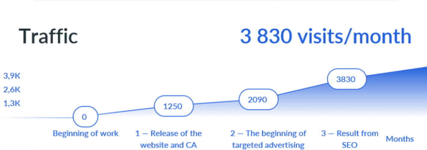
- Average number of calls per month – 180
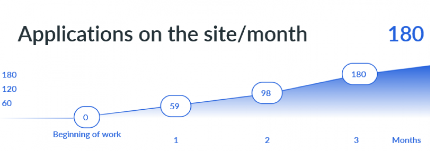
Business Site Bricks Project
The case describes the process of creating and promoting a web resource for a company engaged in the design and engineering of buildings and structures. During the development of the site, the following stages were carried out: analysis of the goals and needs of the customer, development of design, functionality and content of the site, testing and launch of the project, as well as SEO optimization and promotion.
Challenge
The main problem faced by the architectural bureau Bricks Project was the lack of a web resource, which made it difficult to attract and retain customers in a highly competitive environment. Due to the lack of a website, the company could not demonstrate its projects and services to potential buyers.
Analytics
Before starting the development of the site for the Bricks Project, a market analysis was carried out in order to understand what requirements need to be taken into account. First of all, the marketing strategy and structure of the future site were thought out. A team of specialists analyzed competitors’ websites, highlighted their advantages and disadvantages, and studied the interests and preferences of the potential audience.
Site development
Based on the marketing strategy, a convenient site structure and navigation was developed, as well as a unique design that best met the needs of customers and the customer. Further, the development of the resource was directly carried out with an emphasis on the Services and Portfolio sections. In the Services section, all the services provided were described in detail with prices and contact details. The Portfolio section presents the work of the company with a detailed description of each project and photographs.
Promotion
Website promotion is an important stage of its successful functioning. To promote the previously created corporate website, the following steps were taken. First of all, SEO optimization methods were used to improve the position of the site in search results. The specialists analyzed the content of the site and made the necessary changes to optimize it for search queries. Competitor analysis was also carried out, which helped to identify the most effective promotion methods. As part of this stage, work would also be carried out with the content and internal structure of the site to improve its quality.
The final stage was the implementation of a marketing strategy – the launch of advertising in Yandex.Direct. Key queries were highlighted and ads were generated that were optimized for maximum efficiency. Test campaigns were run to determine the most effective ad options. Advertising appeared on the pages of search engines and on advertising platforms, which led to an increase in visitors to the site and an increase in potential customers.
Thus, with the help of effective promotion tools, the company was able to significantly improve its visibility, attract new customers and strengthen its position in the market:
- Failures on the site – up to 14%
- Time on site – 5:07
- Conversion on the site 2.6% to the application
- Average number of calls per month – 49
Business Site Evolve Partners

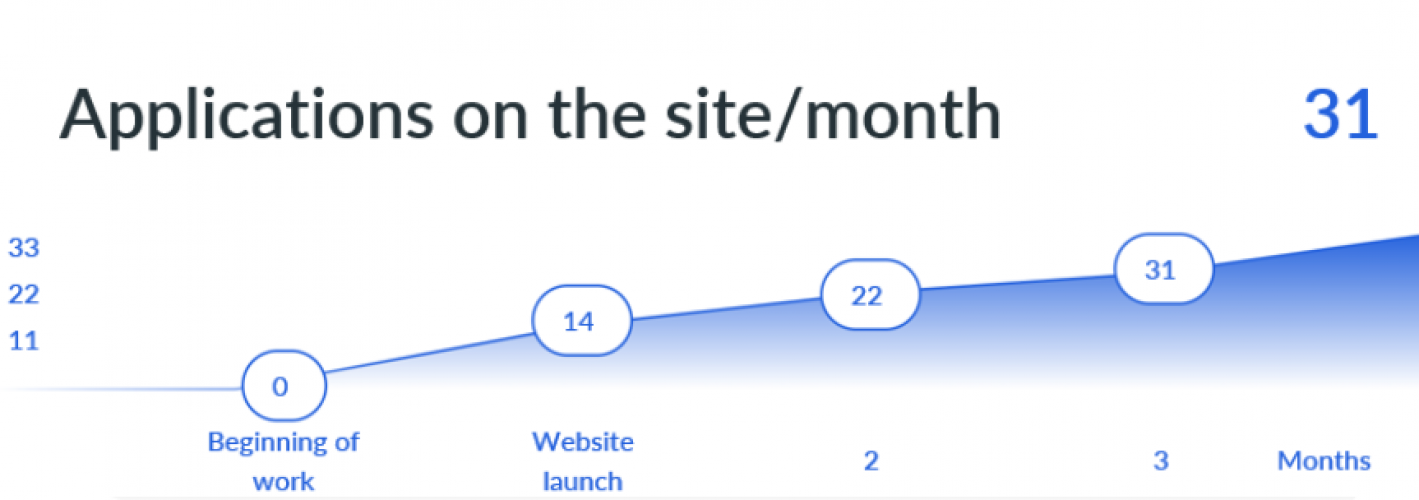
The case describes the development and promotion of a corporate website for Evolve Partners, which specializes in providing services in the field of M&A, describes the process of creating and promoting a website based on the requirements and goals of the company.
Challenge
The main problem faced by Evolve Partners was that the lack of a corporate website prevented it from attracting new customers and expanding its customer base. In today's business environment, where many transactions and communications take place online, not having a website has meant losing significant market share and missing opportunities for business growth.
Analytics & Site development
For the successful development of the site for Evolve Partners, a thorough analysis of the market and the specifics of the M&A industry was carried out. One of the main characteristics of the industry is a small amount of traffic, but high bills, which requires a special strategy to attract and retain customers.
Since the creation of the site was a key element of the company’s strategy to increase the client base, it was decided to focus on presenting the company and demonstrating its expertise and capabilities through case studies. For this, detailed work was carried out to select and analyze cases that best reflected the company’s successful experience in M&A and could serve as the basis for promoting its services on the website.
In the process of market analysis, the most effective and modern methods of website design and promotion were identified, taking into account the uniqueness and specifics of the Evolve Partners business. In addition, monitoring of competitors and market trends was carried out, which made it possible to create a site that meets the latest standards of web design and functionality.
As a result of the analysis and development of the site, a unique online platform was created that allows the company to present its services and experience, attract new customers, work on establishing connections with the existing audience and strengthen its position in the M&A market.
Promotion
Several channels were chosen for effective website promotion, but the main one was Yandex.Direct search advertising. A thorough adjustment of the advertising account was carried out, which included the selection of keywords, writing ads and selecting the target audience.
One of the key tasks in the promotion of the site was to attract new customers and increase brand awareness of the company. To achieve this goal, a series of advertising campaigns were carried out, targeting different segments of the target audience. These tools allowed to reach a wider audience and increase the number of clicks to the site.
The result of successful promotion was an increase in traffic on the site, an increase in the number of requests for consultation and strengthening the position of the company’s brand in the M&A market. Using search advertising Yandex. Direct and other promotion tools allowed the company to quickly achieve results and improve its performance in online marketing:
- Failures on the site – up to 19%
- Time on site – 3:26
- Conversion on the site 4.6% to the application
- Average number of calls per month – 31
Landing Page Vesperfin Stock
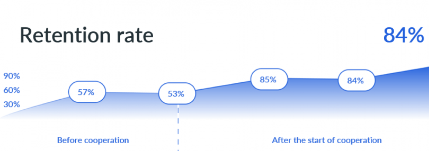
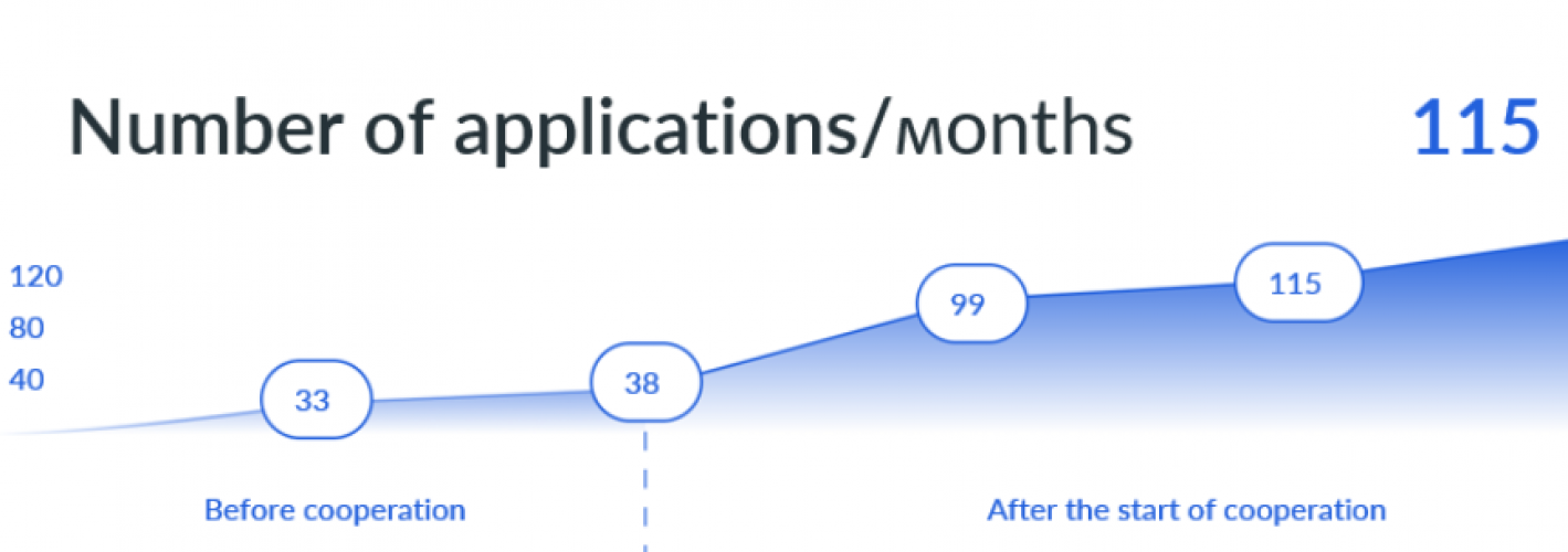
The case describes the process of creating an effective landing site for a company that reviews the stock market - Vesperfin Stock. The site should help the company attract new customers and increase overall awareness.
Challenge
The main problem that Vesperfin Stock faced was the lack of a website to attract new customers and increase subscribers in their telegram channel. In the current environment where competition in the stock market reviews market is high, it is essential to have an effective online resource to grab the attention of potential clients.
Analytics
In order to understand the strengths and weaknesses of the service offered by Vesperfin Stock and determine its advantages in the market, the product was analyzed and compared with similar services offered by competitors in the financial investment market.
Comprehensive information about Vesperfin Stock and its services was collected. The advantages and disadvantages of the services provided, the overall promotion strategy and the analysis of potential customers were also analyzed.
Site development
Based on the analysis of the market and competitors, as well as the needs of the target audience, a team of developers and marketers developed a landing page for Vesperfin Stock.
The landing page was developed taking into account the current requirements and trends in web design and marketing, as well as using modern web analytics tools. Particular attention was paid to the design, which had to be convenient, informative and attractive to the target audience.
In the content part, a high-quality text description of the services provided was developed, which clearly and easily explains the main advantages of the company and the benefits of using the services.
Promotion
To maximize the attraction of the target audience to the landing of Vesperfin Stock, various marketing tools were used. In particular, contextual advertising in search engines (including contextual advertising on Yandex Direct) and targeted advertising in Telegram were used for promotion.
Contextual advertising helped to attract more potential customers through search engines using keywords and ads related to the company’s services. Targeted advertising in Telegram made it possible to effectively set up advertising campaigns to collect contacts and attract new subscribers.
Work was carried out to optimize advertising campaigns for the effective use of the advertising budget and increase the conversion on the landing page. One of the main achievements of such promotion is an increase in the number of visitors to the site, as well as an increase in the number of applications and inquiries from potential customers.
Thus, with the help of effective promotion tools, the company was able to significantly improve its visibility, attract new customers and strengthen its position in the market:
- Conversion to the application – 4.3%
- The cost of the application is 12,15 €
- Average number of applications per month – 115
- Percentage of subscription renewal – 84%
Landing Page Master TMS
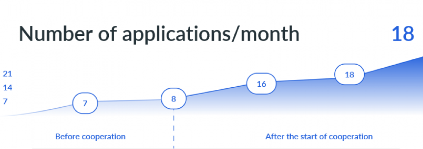
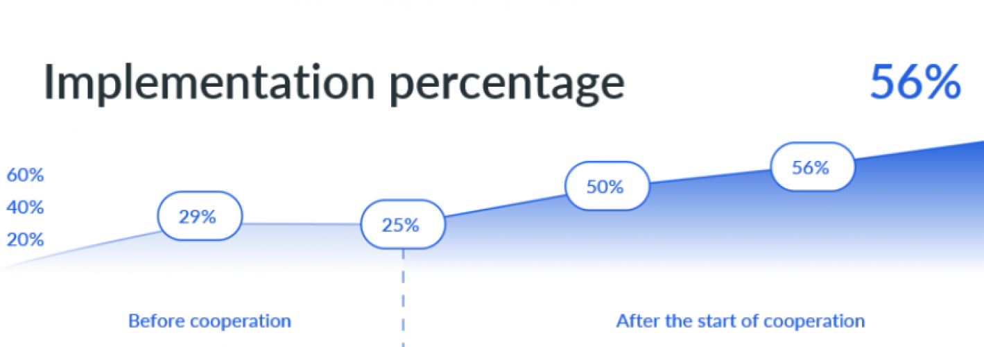
This case is dedicated to the development and promotion of a landing page for the Master TMS company, which specializes in organizing long-haul FTL cargo transportation. In the course of solving this problem, we will focus not only on creating a user-friendly interface and attractive design, but also on maximizing the conversion of visitors into customers.
Challenge
The main problem of this case is that Master TMS seeks to attract new users to its cloud SaaS platform, but encounters difficulties in its promotion.
Analytics
In order to effectively develop a strategy for attracting new users to the Master TMS cloud SaaS platform, we conducted a thorough analysis of the market in which it plans to launch.
During the analysis, we identified the main competitors of the company, studied their advantages and disadvantages, identified the needs and preferences of the target audience, as well as studied market trends and predicted changes in the industry.
In addition, we also analyzed keywords and user queries related to FTL trunk transportation to determine which queries are most in demand and how effective the current search marketing strategy is.
Site development
Based on the analysis of the market, competitors and target audience of Master TMS, we started developing a landing page.
To achieve the most effective conversion of visitors into customers, we paid attention not only to the design, but also to the content of the page. We have identified the most important benefits and features of our product and presented them on the landing page in an effective and compelling format. In addition, forms were developed to collect contact information and attract new customers.
To improve the usability of the interface, we conducted user testing, identified the most important design elements and successfully integrated them into our landing page.
Promotion
To effectively promote the Master TMS website, we used a comprehensive set of tools, with an emphasis on contextual advertising.
As part of our marketing strategy, we analyzed keywords and user queries related to FTL trunk transportation and identified the most popular queries. We then created ads that grab the attention of the target audience and optimized them for the most effective keywords.
For the most accurate positioning of promotional materials, we used contextual advertising, optimizing thematic campaigns based on the needs and preferences of the audience.
Thus, with the help of effective promotion tools, the company was able to significantly improve its visibility, attract new customers and strengthen its position in the market:
- Conversion to the application – 4.7%
- The cost of the application is 21,84 €
- Average number of applications per month – 18
- Percentage of implementation – 56%
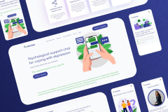
Landing Page Ponimayu
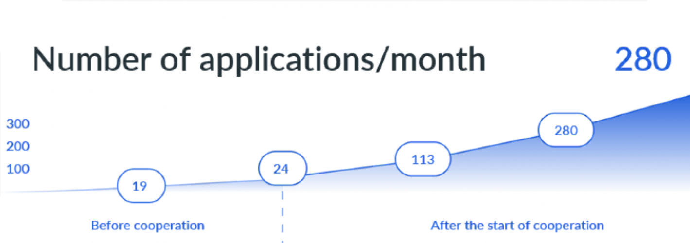
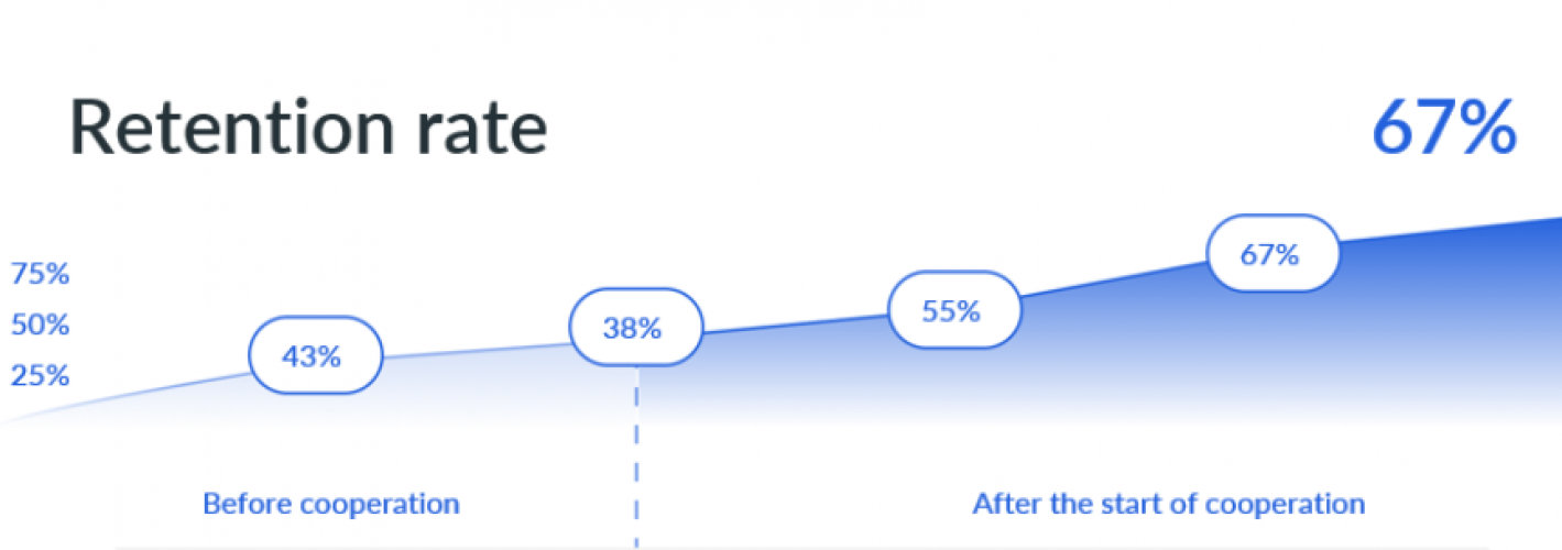
The case describes the process of creating and optimizing a landing page for a company providing psychological assistance services via chat. Also, as part of the case, methods for analyzing and optimizing web analytics to improve the quality of traffic to the site, as well as approaches to improving user experience on the landing page, will be considered.
Challenge
One of the main problems of the company Ponimayu was the lack of its own web resource, where customers could get acquainted with the services and get more detailed information about the proposed chat consultations. Without a website, the company was limited in its ability to acquire new customers through online channels.
Analytics
For the successful launch of the product, the company conducted a market and product analysis to assess the demand for chat counseling services in the field of psychological assistance and identify the competitive advantages of their company in the market. Trends and consumer profile as well as the competitive environment were studied, including an analysis of the performance of existing psychological counseling and therapeutic services available in the region. In addition, an assessment was made of the audience in the online segment and their preferences in purchasing services via the Internet.
Site development
The company’s website was developed and launched based on the market and product analysis carried out to meet the needs of the target audience of chat consultation services in the field of psychological support.
The site was implemented convenient and intuitive navigation, which ensured ease of use of services. To increase credibility and trust, the site provided detailed information about the company and specialists, professional qualities and certifications.
Promotion
To promote the site, we used an integrated approach that included a set of tools with an emphasis on contextual and targeted advertising. One of the most effective tools was a contextual advertising campaign that included YAN. The keywords for the advertisements have been carefully selected and optimized based on the results of market analysis and the behavior of our customers. This helped to attract a large number of potential customers, increase website traffic and improve lead conversions.
However, we were not limited to contextual advertising and also used targeted advertising, especially on the Telegram platform. We identified the most relevant audiences and created advertisements that were targeted to these user groups. Thanks to this, we were able to better convey information to the target audience, increase brand awareness and get more potential customers.
Thus, with the help of effective promotion tools, the company was able to significantly improve its visibility, attract new customers and strengthen its position in the market:
- Conversion to the application – 6.3%
- The cost of the application is up to 6,65 €
- Average number of applications per month – 280
- Subscription renewal percentage – 67%
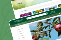
Online Store Eco Pitomnik
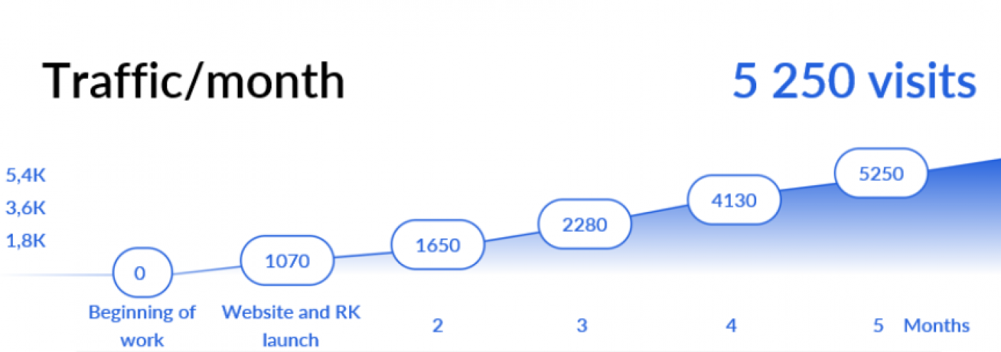
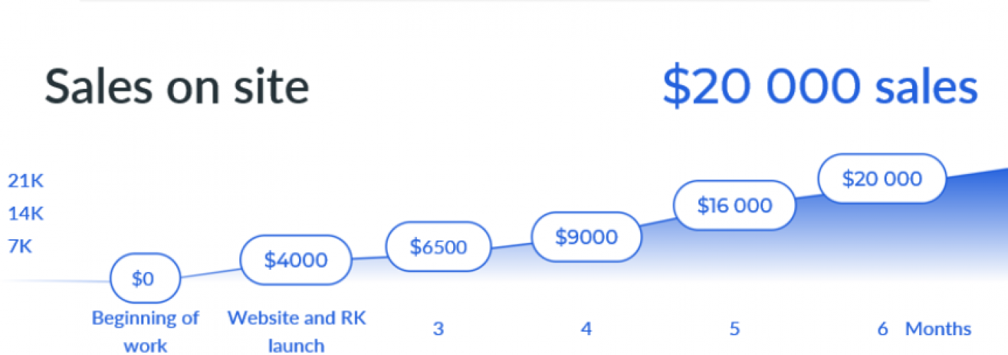
This case is devoted to the creation and development of the online store Eco-Pitomnik, which specializes in the sale of garden plants in the online segment in the B2C format. Within the framework of the case, key aspects of creating a high-quality Internet resource are considered: market competitiveness analysis, selection of the optimal platform for website hosting, development of functional and technical requirements, creation of a product catalog, and much more.
Challenge
The main problem of Eco-Pitomnik was the lack of its own online resource, which made it difficult to advance in the online market segment. Having a quality website is an important indicator for B2C companies. The absence of a website negatively affected the company's reputation, which, in turn, could lead to the loss of potential customers and competition in the market.
Analytics & Site development
Several stages of work were carried out to analyze and develop the site of the company Eco-Pitomnik. After creating the Terms of Reference, the development team began to design and develop the interface of the online store, taking into account all the functionality and requirements.
As a result of this work, a high-quality online store was created that meets all the requirements. It included a built-in CRM system and was ready for successful promotion and development.
Promotion
For the successful promotion of the Eco-Pitomnik online store, a number of measures were taken in the field of marketing and advertising. First of all, advertising campaigns were launched, as well as targeted advertising on social networks and other resources. This allowed us to attract more potential customers to the site and increase traffic.
Further, to improve the visibility of the site, internal and external SEO-optimization was carried out. Internal optimization included changing the text and multimedia content of the site, describing meta tags and page titles, taking into account keywords and phrases. External optimization was associated with the promotion of the site through the link mass, improving the position of the site in search results, as well as promotion through social networks.
Thus, with the help of effective promotion tools, the company was able to significantly improve its visibility, attract new customers and strengthen its position in the market:
- Conversion on the site 2.5% in sales
- Average check – 142 €
- Average number of sales per month – 130
- The amount of sales per season – 42 250 €
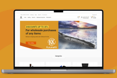
Online store KurumaKit
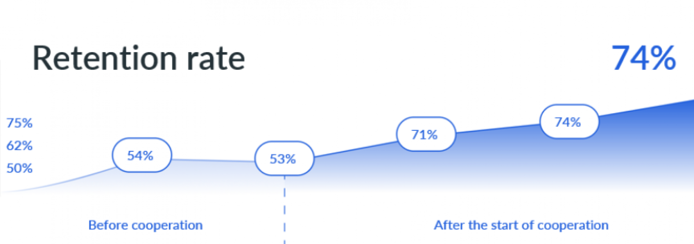

This case describes a project to develop a portal for a wholesale supplier of accessories and spare parts for passenger cars under the KurumaKit trademark in order to automate the processing of applications and reduce company costs.
Challenge
The problem faced by the online store KurumaKit was that the company was not sufficiently automated, which led to a decrease in the efficiency of operations and an increase in the load on store employees. In particular, the company experienced slow order processing, errors in ordering, low accuracy in inventory accounting and inventory control, and stress associated with the need to manually perform routine operations.
Analytics
To analyze business processes, a thorough audit of the current order and inventory management system was carried out, which made it possible to identify the main problems in the operation of the KurumaKit online store. Based on the data obtained, an automation solution was proposed, which included the development of an online store website with automated order management and inventory management systems.
This solution significantly reduced order processing time, improved inventory accuracy, and increased customer loyalty through faster and more accurate order fulfillment and order status notifications. The automated order management system also allows you to quickly set up reports and analyze order data to improve business processes and make the right decisions in the future.
Development
After analyzing the needs of customers and evaluating current processes, it was decided to develop a portal to improve the company’s business processes and improve the quality of customer service. Based on the information collected, the main requirements for the portal were determined, which included automatic calculation of discounts, personal account, workflow and CRM.
To meet these requirements, a portal was developed. An intuitive and easy-to-use system for automatically calculating discounts was created, which made it possible to increase the level of customer loyalty and reduce the burden on company employees. A personal account (PA) was also put into operation for the convenience and speed of obtaining information about orders, current discounts and account balance.
To automate the workflow between clients and the company, an e-mail system was implemented that allows you to send and receive electronic documents in one click, while maintaining the full history of correspondence and the integrity of documents.
The CRM system was implemented to optimize the customer contact management process and improve the quality of service. It allows you to automatically capture all customer requests and add them to a single database, which simplifies coordination within the company and allows you to monitor and improve the level of service in real time.
Thus, all the decisions made during the development of the portal allowed to improve the company’s business processes, increase the efficiency of operations and improve the quality of customer service:
- Average time to process an application – reduced by 5 times;
- Return buyer (Retention rate) – an increase of 40%
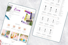
Online store Keratin House
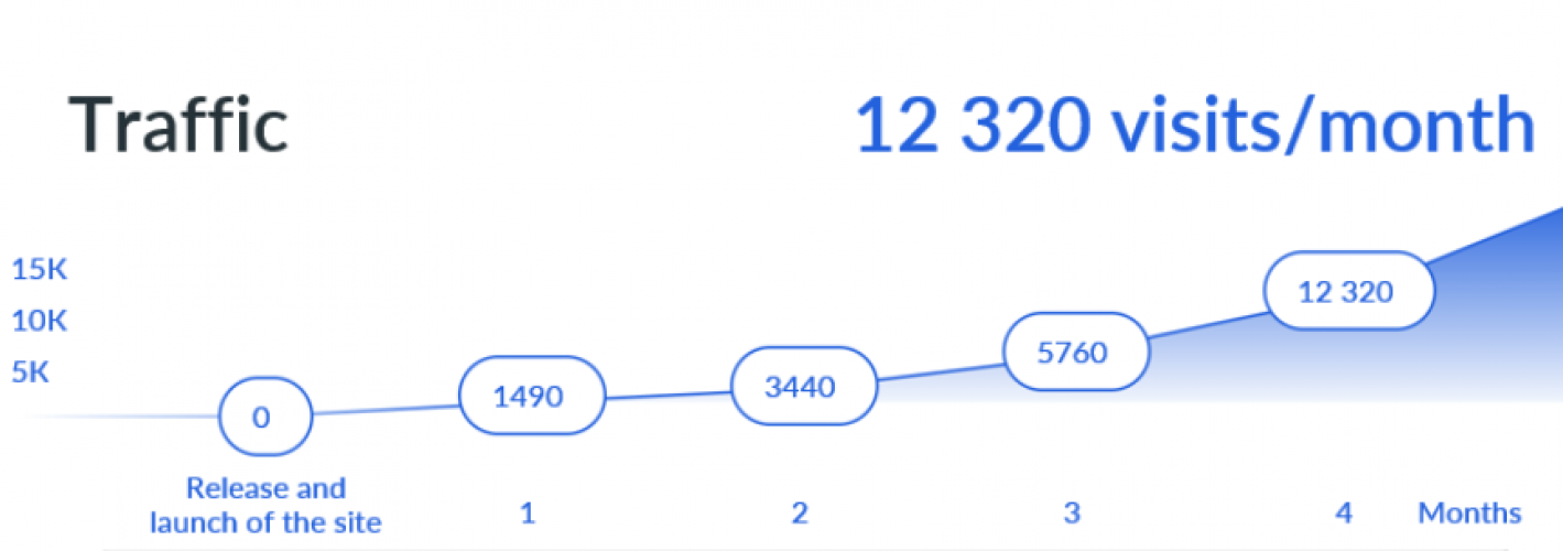
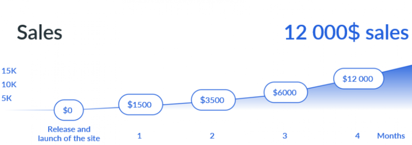
The case describes a project related to the creation and promotion of the Keratin House online store. The Keratin House online store offers a wide range of professional hair cosmetics specializing in keratin straightening.
Challenge
The company faced an important problem - the lack of an online presence and the lack of the ability to sell their products via the Internet. In an environment where more and more people prefer to shop online, the lack of an online store becomes a serious disadvantage for any company.
Analytics
Before starting the online store development project, a comprehensive market analysis of this sector was carried out. The features of the functioning of existing cosmetics stores were analyzed and an assessment was made of their success. The success of competitors in the field of keratin straightening was also studied and an analysis of their main advantages was carried out.
Based on the data obtained as a result of the study, a detailed business plan was created, which included a description of the main stages of project development, key activities to promote the store and improve its profitability, as well as a long-term development strategy. Market analysis allowed us to determine the most effective methods of communication with customers and set product pricing, which was an important step in the development of a competitive professional hair cosmetics store in the keratin straightening industry.
Site development
As part of the project, site layouts were created and the design solution and content were approved. The main task was to create a convenient and intuitive interface that would allow potential customers to find the necessary goods quickly and without wasting time.
The functional elements necessary for the operation of the online store were also developed and implemented, including the integration of payment systems and the installation of an order accounting system. One of the most important elements of the site was the Personal Account, which is aimed at ensuring maximum convenience for customers when placing orders and paying for goods. As part of the development of the site, its adaptive and fast display on all devices was also ensured.
Promotion
To increase awareness and promote the site, various marketing strategies are integrated, including the launch of advertising campaigns. The most effective platforms and tools for advertising were chosen, which made it possible to attract new visitors and users to the site on a daily basis.
Advertising campaigns were launched on social networks, contextual advertising sites and search engines. Also, measures were taken to optimize the content of the site for search robots – SEO. This allowed us to increase traffic to the site and improve its promotion in search engines, which in turn increased the conversion and revenue of the store.
Thus, with the help of effective promotion tools, the company was able to significantly improve its visibility, attract new customers and strengthen its position in the market:
- Website conversion 4.2% to sales
- Average check – 22 €
- Average number of sales per month – 520
- The average cost of an application is 4 €
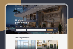
Business site Fine Living
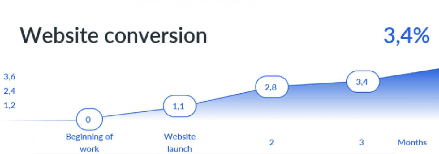
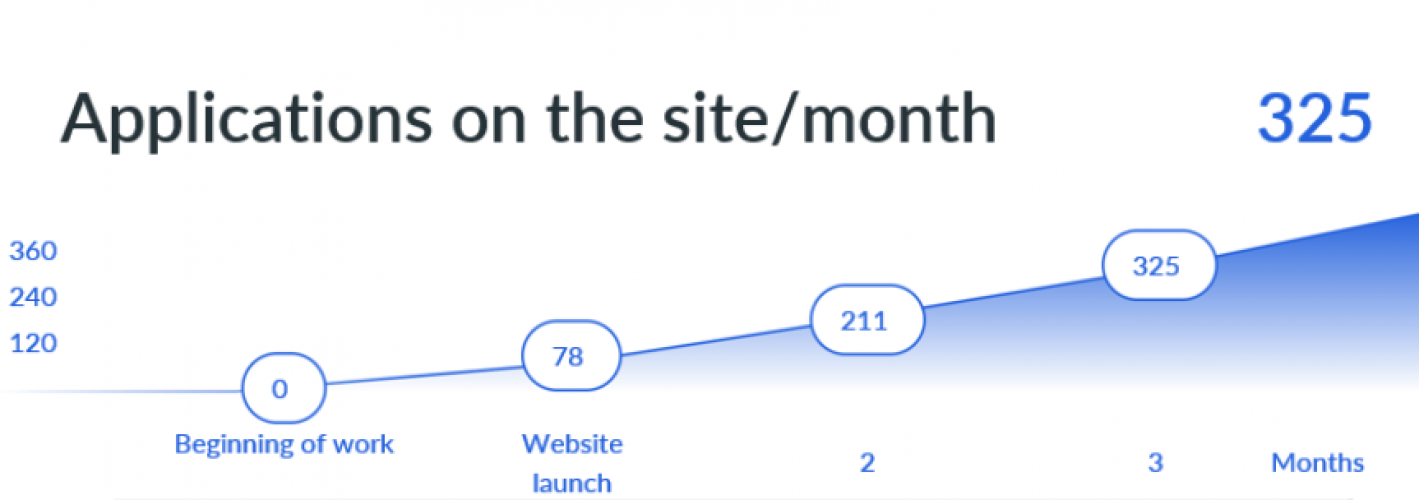
Development and launch of a corporate website for a real estate agency in Dubai - "Fine Living".
Challenge
The company did not have its own corporate website. This created a number of challenges, such as limited outreach to potential clients, a lack of opportunities to showcase their services and real estate offerings in an effective and aesthetic format, and challenges in building and maintaining a corporate image online.
Analytics
First of all, we started to study the peculiarities of the local market of real estate agencies in Dubai. The needs and interests of potential customers were analyzed, as well as the main competitors in this area, their offers and marketing strategies.
Based on the received data, the overall plan for the development of Fine Living agency was formed, which included positioning, defining a unique offer for clients and long-term plans to expand its presence in the market.
Site development
After defining the development strategy, the team moved on to developing a corporate website for the Fine Living agency. The online platform provided for the presentation by owners and buyers of various types of real estate available in Dubai. Accordingly, the site had to provide a complete catalog of objects, taking into account all the features of the property and the requirements of potential customers.
For this, a convenient user interface was introduced, with the ability to filter by parameters such as area, price, type of property and other key characteristics. In the card of each object, in addition to a detailed description, there were high-quality photographs.
Considerable attention was paid to the creation of individual CTA forms (Call to Action), which stimulated site users to be active and converted them into potential customers.
Promotion
After completing the development of a corporate website for the Fine Living agency, the team focused on its successful promotion in order to attract potential customers and expand the client base. As a first step, official social media accounts such as Facebook and Instagram were created for the agency, enabling it to reach a wide audience and bring awareness to the subject of real estate in the region.
In addition to accounts in social networks, it was decided to use contextual advertising using YAN (Yandex advertising network) and targeted advertising on Instagram and Facebook platforms. Setting up contextual advertising attracted visitors to the site for relevant queries, while targeted advertising campaigns allowed the team to address the maximum target audiences based on their interests, demographics and other key parameters.
Thus, with the help of effective promotion tools, the company was able to significantly improve its visibility, attract new customers and strengthen its position in the market:
- Conversion on the site 3.4% to the application
- Average check – 505 000 €
- Average number of applications per month – 325
- The average cost of an application is 9 €
Online store “ZakazVSad”
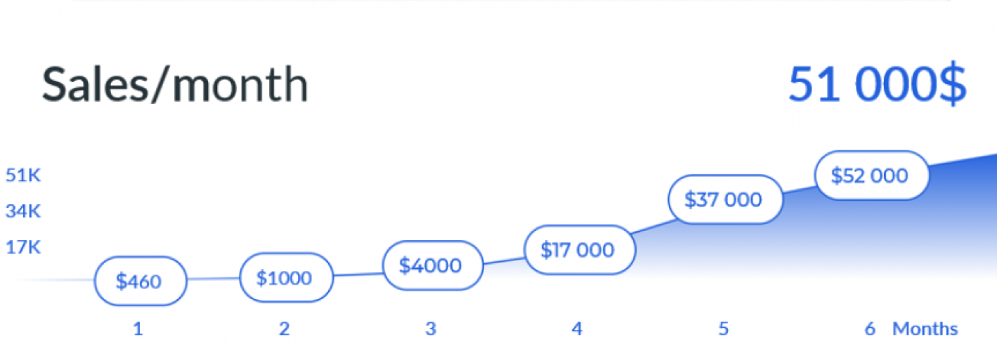
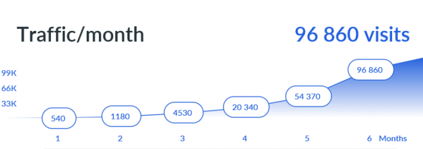
The ZakazVSad company successfully applied its business model in the offline sphere, selling plant seedlings for gardeners and landscape design enthusiasts. In order to expand its customer base and increase sales, the company decided to create and promote its online store.
Challenge
The company had a successful offline business, but limited geographically and by the size of its customer base. Under these conditions, the need to modernize and adapt the business to market requirements, through entering online sales, in order to increase coverage and increase sales, has become obvious.
Analytics
As part of the development of an online store, first a technical task was drawn up, the analysis of which resulted in the definition of the key requirements and functionality necessary for the successful implementation of the resource.
Site development
Taking into account the specifics of the industry, in the process of creating the store, integrations were made with the 1C system for effective accounting and management of goods turnover, with transport companies for fast and reliable delivery of orders, and with acquiring services to ensure the safety and ease of accepting payments from customers.
Promotion
To promote the online store, a comprehensive SEO optimization was carried out, including internal and external processing of the resource. Internal optimization included improving the site structure, optimizing meta tags, titles and text content to increase the relevance of pages to search queries. External optimization is aimed at working with the link profile of the store, increasing the authority of the domain and creating valuable content to attract new users and partners.
In addition, e-mail newsletters were set up to maintain active interaction with the existing audience. These mailings contained useful information about upcoming promotions, new products and useful tips.
Thus, with the help of effective promotion tools, the ZakazVSad online store was able to significantly improve its visibility, attract new customers and strengthen its position in the market:
- Website conversion 2.8% in sale
- Average check – 26,30 €
- Average number of sales per month – 1,510
- The amount of sales per season – 163300 €
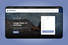
Booking service Strela-M
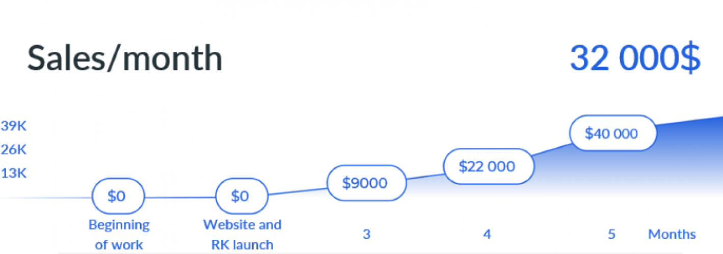
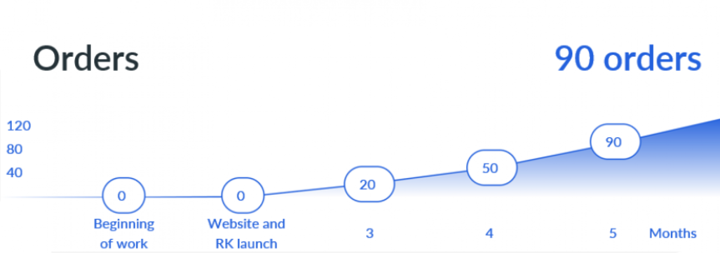
The company "Strela-M" is engaged in the provision of equipment for rent. To ensure maximum utilization of the fleet and increase the efficiency of resource use, the company needs to develop an automated portal for renting equipment. The case considers the process of developing and implementing this portal, as well as assessing its impact on the company's work.
Challenge
In the face of growing competition in the rental market, it is important for companies to quickly provide their services to customers and ensure the efficient use of their fleet. The lack of a centralized system for fleet and customer management results in underutilized or underutilized vehicles and complex booking processes. Also, there is a decrease in the level of customer service due to an inconvenient and costly service process, which negatively affects the company's reputation.
Analytics
In the course of designing and developing a service for renting equipment, the first stage was a thorough study of the customer’s business processes and designing the mechanics of the service. This made it possible to think over the key services necessary to ensure ease of use and optimal functionality: a showcase with available equipment, a booking system, a personal account with the possibility of document management for tenants and landlords, as well as integration with acquiring to simplify and secure payments.
Site development and Promotion
After identifying the key services and their functionality, the second stage involved the development of the website itself, taking into account all the agreed requirements.
Further, a comprehensive advertising campaign was developed and implemented to promote the service. It included setting up and launching online advertising aimed at attracting potential tenants and expanding the customer base.
Thus, thanks to a competent advertising strategy, we got the following result:
- Conversion on the site 8.4% to the application
- The cost of the application is about 18,04 €
- Average rental period – 36 hours
- Average number of orders per month – 90
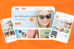
E-commerce Optics NEXT
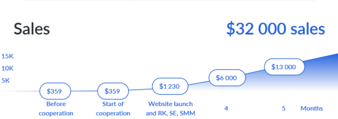
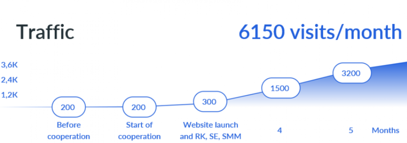
Analytics
To complete the task and develop an optimal strategy for promoting the Optika NEXT online store, the team first conducted a detailed audit of the available resources and previously implemented marketing activities. This analysis revealed weaknesses and decisive factors that contributed to poor sales results. Based on the information received, the specialists developed a new comprehensive promotion plan, which included identifying the strengths of the company’s activities, establishing target audiences and creating effective directions for marketing efforts to increase sales and improve the breadth and depth of interaction with customers.
Site development
After the analysis and preparation of a new promotion plan, the team began to develop the Optika NEXT online store. The site structure was developed, the menu and product categories were optimized to simplify the process of searching and choosing suitable products. Integration of a convenient shopping cart and a secure payment system, ensuring the reliability and protection of user data.
Promotion
As part of this work, a quiz was created with the aim of attracting customers to offline points of sale, increasing engagement and facilitating conversions in the long term.
Various areas were included in the direct implementation of the new promotion strategy, such as advertising campaigns, content optimization for search engines (SEO) and the expansion of the company’s activity in social media (SMM). The integrated application of these areas allowed us to maximize the reach of the audience and increase sales, realizing the main goal of the project – ensuring sustainable business growth.
Thus, thanks to a competent advertising strategy and thoughtful SEO optimization, we got the following result:
- Website conversion 5.2% to sales
- The cost of the application is about 4,75 €
- Average check – 71,20 €
- Average number of sales per month – 170