Espina Studio
Storytellers, Brand Designers, Shopify Experts
We Believe that communication is key to understanding the world that we live in.
We create memorable and impactful experiences based on profound analysis, strategic vision, empathy, and new narratives that challenge our daily routine.
We understand the importance of a well executed design, as well as cohesive and provocative communication that aligns itself with any type of project.
We communicate values through strategic vision, creating authentic relationships between our clients, consumers, us, and the world.
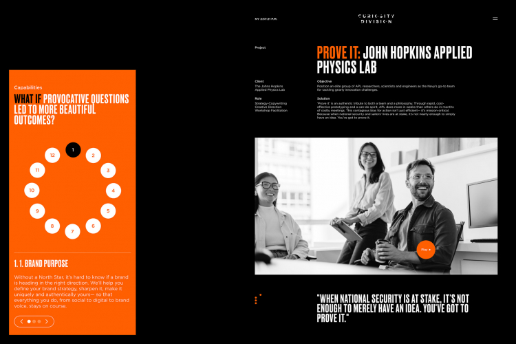
Creativity
We use creativity streams to offer focused, fresh solutions our clients do not expect from a regular agency
Strategy
You set the goal, and we offer a comprehensive array of creative or practical paths to achieve it.
Art Direction
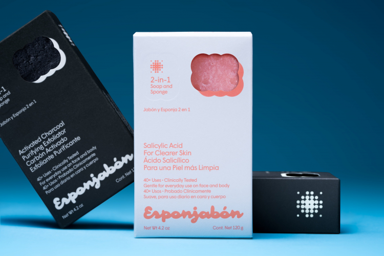
Design is our passion, and we make sure everything we offer is of the highest standard.
Software Development
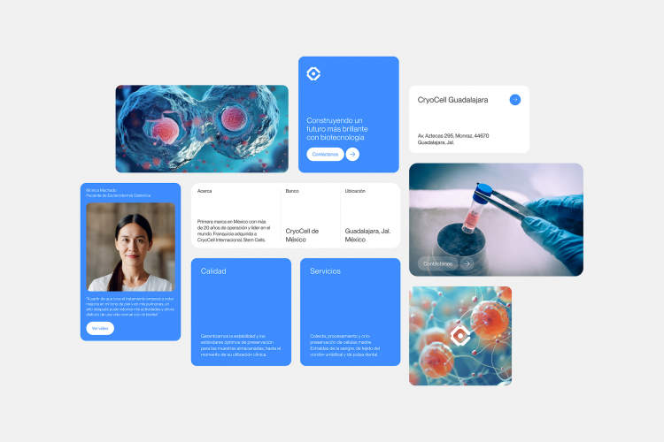
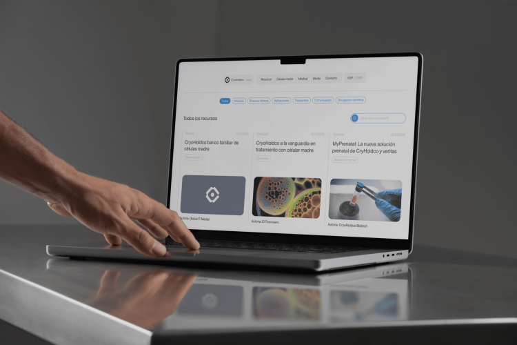
We understand the importance of software in today’s economy and leave no stone unturned to offer visually rich, seamless experiences to meet today’s consumer expectations.

 Mexico
Detailed Reviews of Espina Studio

Client Portfolio of Espina Studio
Project Industry
- Retail - 16.7%
- Healthcare & Medical - 33.3%
- Other Industries - 16.7%
- Automotive - 16.7%
- Consumer Products - 16.7%
Major Industry Focus
Project Cost
- Not Disclosed - 100.0%
Common Project Cost
Project Timeline
- Not Disclosed - 100.0%
Project Timeline
Clients: 6
- Pernod Ricard
- Pepe Palermo
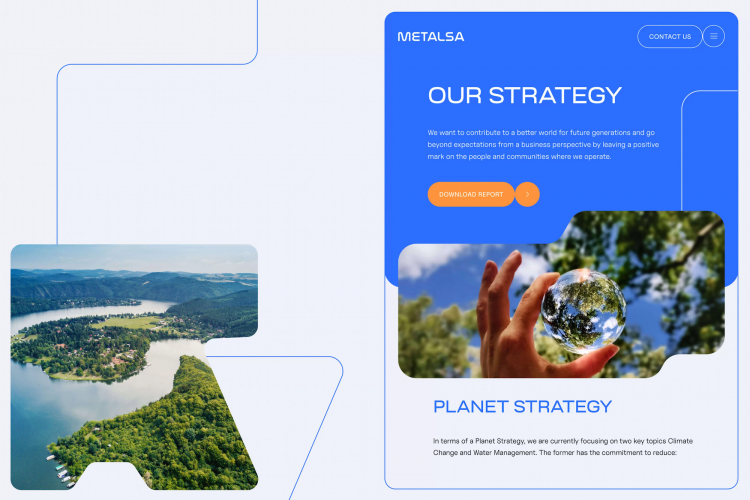
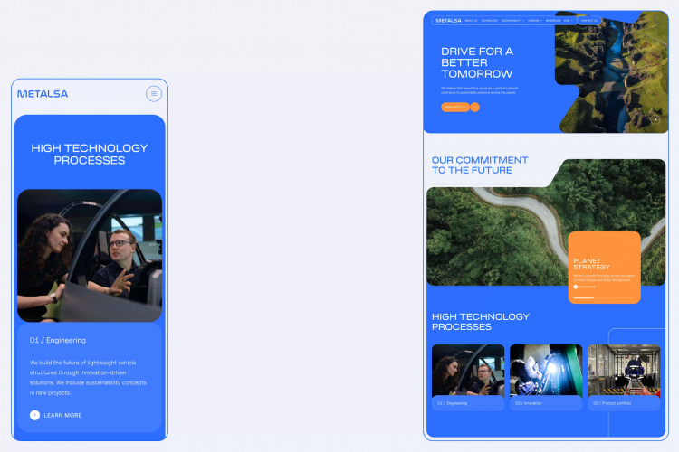
- Metalsa
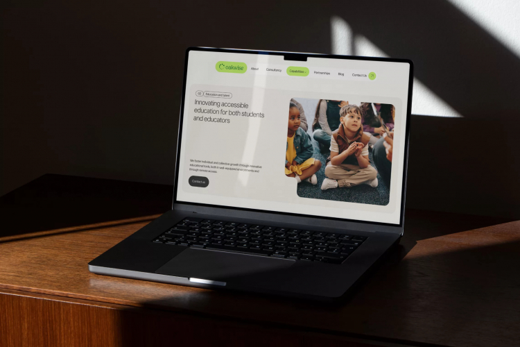
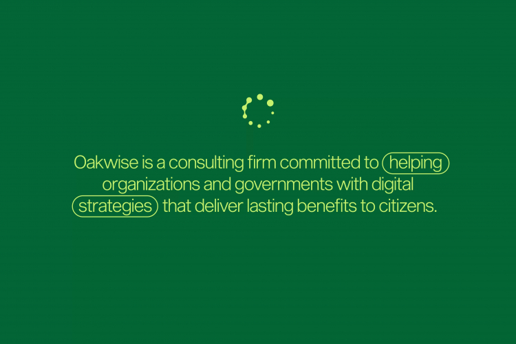
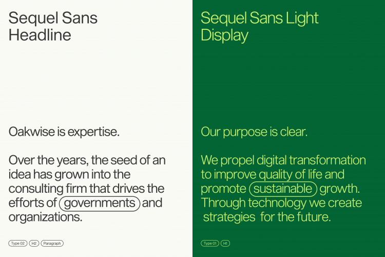
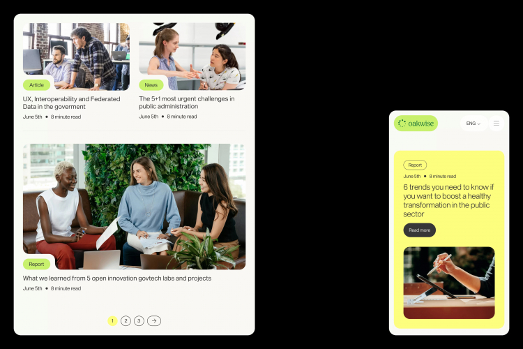
- Oakwise
- La Garfield
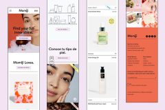
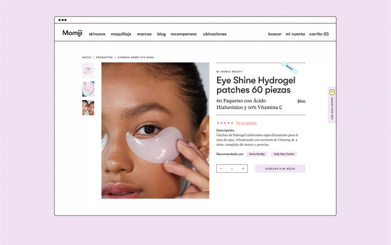
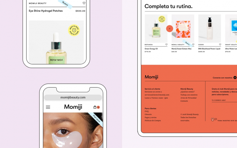
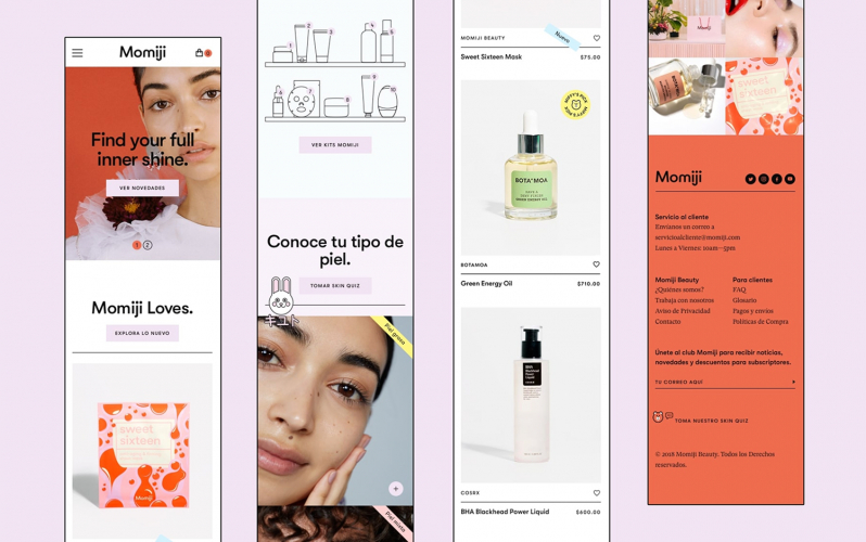
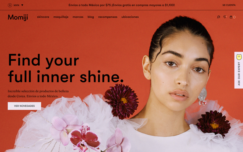
- Momiji
Portfolios: 6