Multia Design
BuIlding Brands, Designing Experiences
We are a global, award-winning brand and design consultancy driven by a single goal - to harness the power of design to shape beautiful experiences, add value to our clients' business by telling their stories to the world in the most creative ways and connect brands to their people, drive impact and foster success.
 India
India
Bavdhan - mumbai pune express way,
Pune,
Maharashtra
411021
$50 - $99/hr
50 - 249
2012
Service Focus
Industry Focus
- Startups - 30%
- Financial & Payments - 20%
- Healthcare & Medical - 20%
- Hospitality - 10%
- Real Estate - 10%
- Food & Beverages - 10%
Detailed Reviews of Multia Design

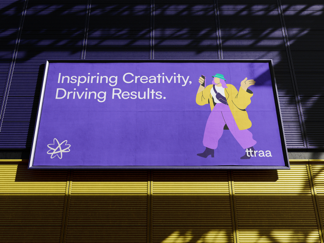
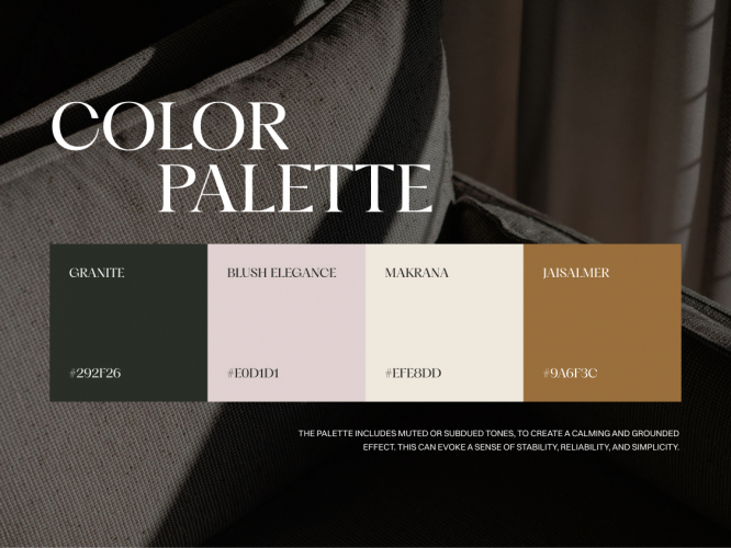
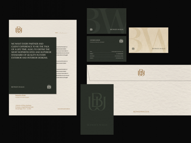
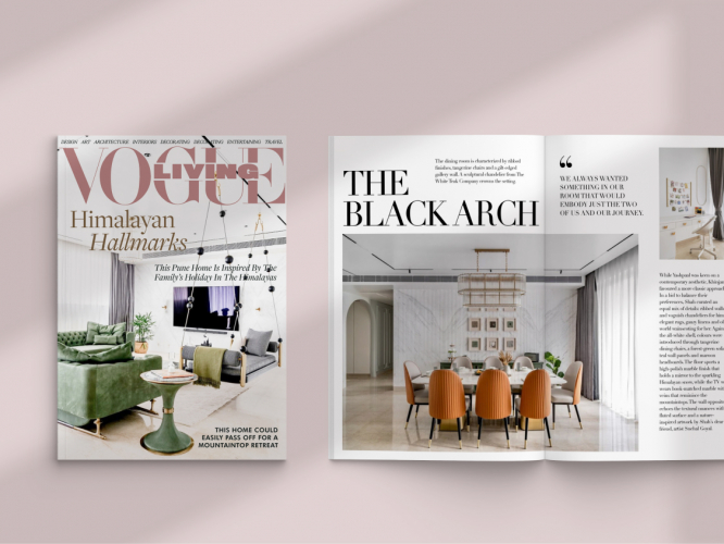
Client Portfolio of Multia Design
Project Industry
- E-commerce - 8.3%
- Information Technology - 8.3%
- Hospitality - 8.3%
- Food & Beverages - 8.3%
- Oil & Energy - 25.0%
- Business Services - 8.3%
- Financial & Payments - 8.3%
- Industrial - 8.3%
- Advertising & Marketing - 8.3%
- Real Estate - 8.3%
Major Industry Focus
Oil & Energy
Project Cost
- $0 to $10000 - 75.0%
- $10001 to $50000 - 25.0%
Common Project Cost
$0 to $10000
Project Timeline
- Not Disclosed - 16.7%
- 1 to 25 Weeks - 83.3%
Project Timeline
1 to 25 Weeks
Clients: 12
- Radix
- WWF
- Shopify
- Mahindra
- AXA
- Kalyani Group
- Air Asia
- Bajaj Finserv
- Interglobe
- Volkswagen
- Chargebee
- Cipla
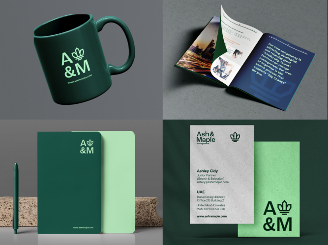
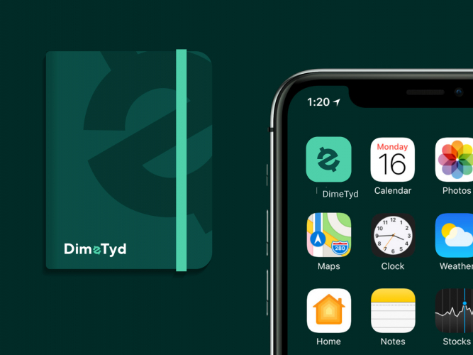
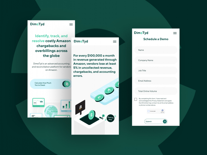
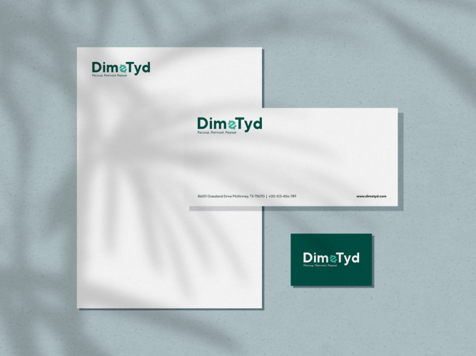
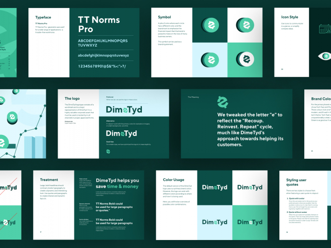
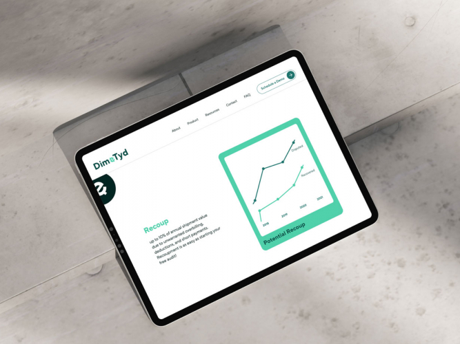
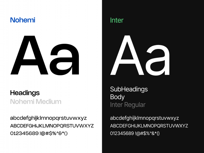
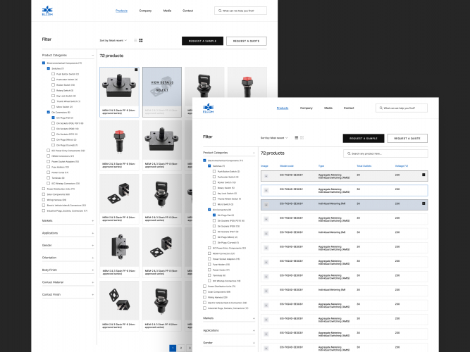
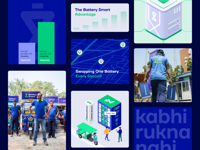
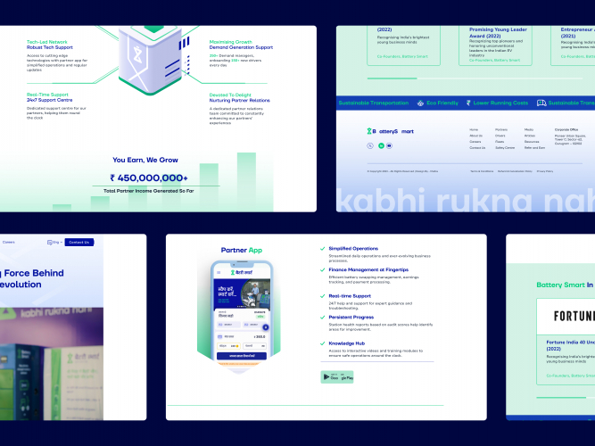
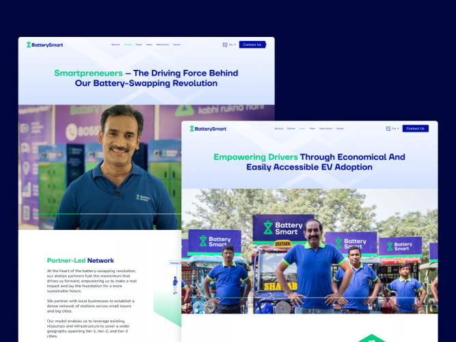
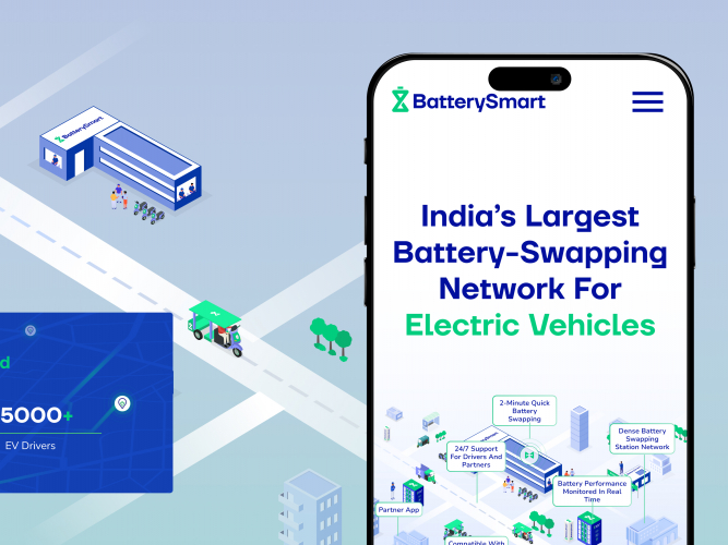
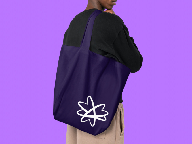
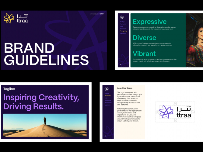
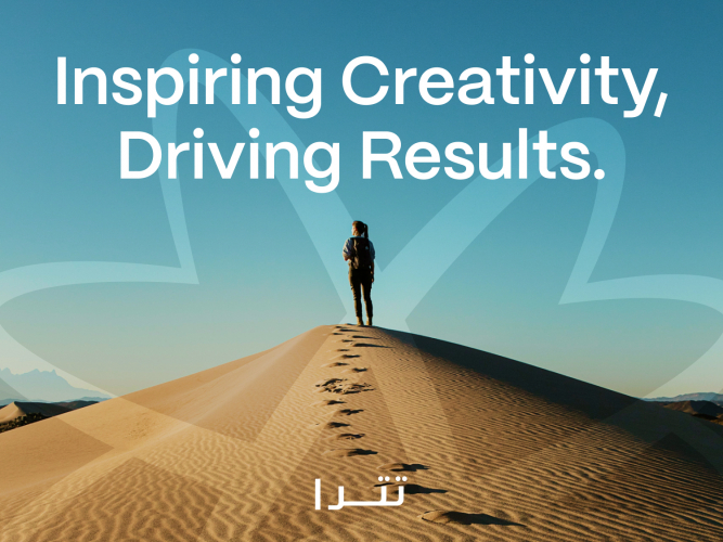
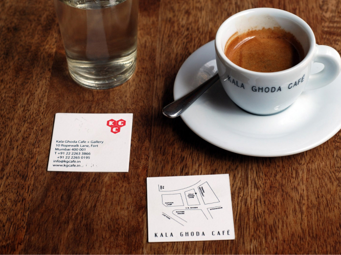
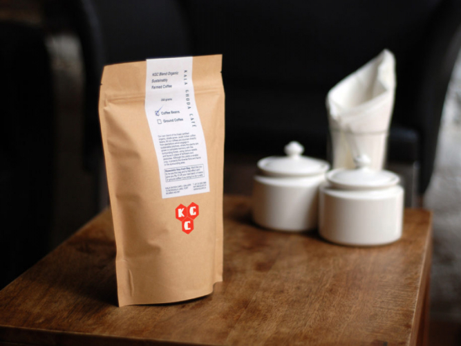
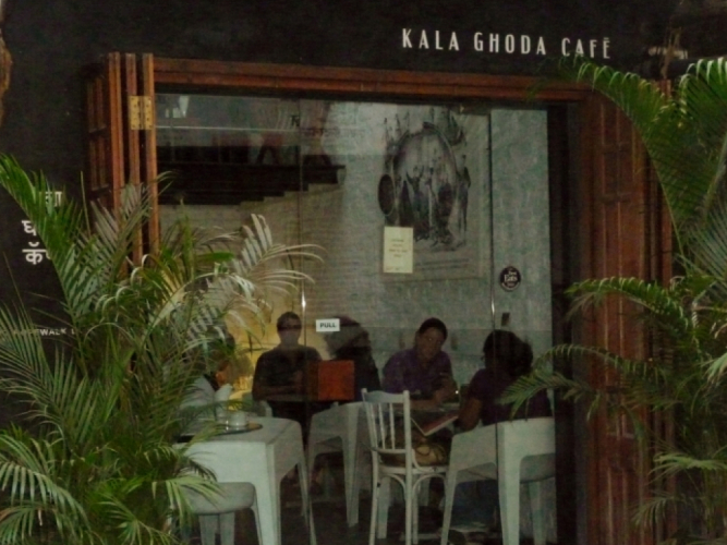
Portfolios: 12


.jpg)