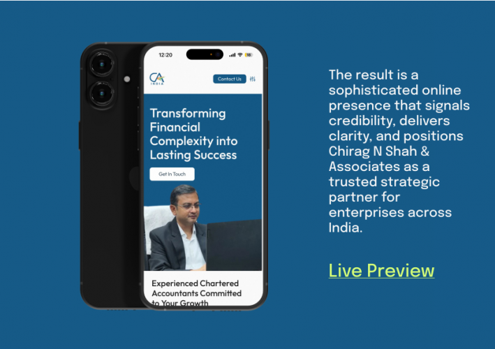
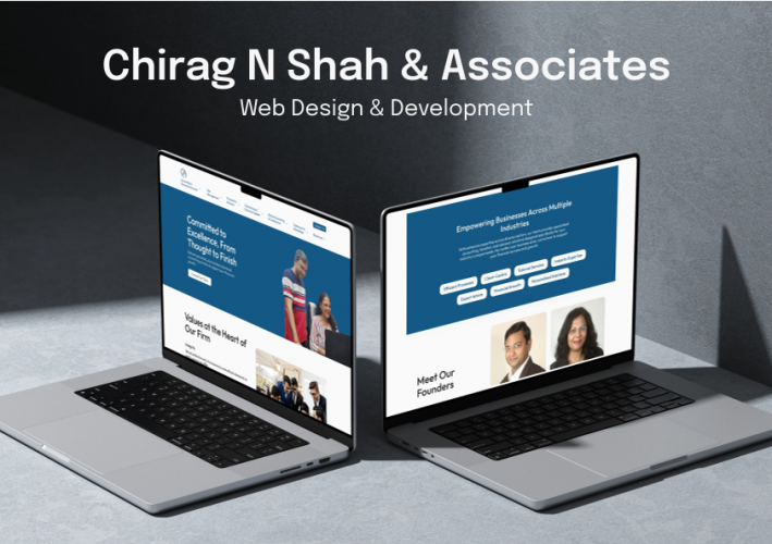
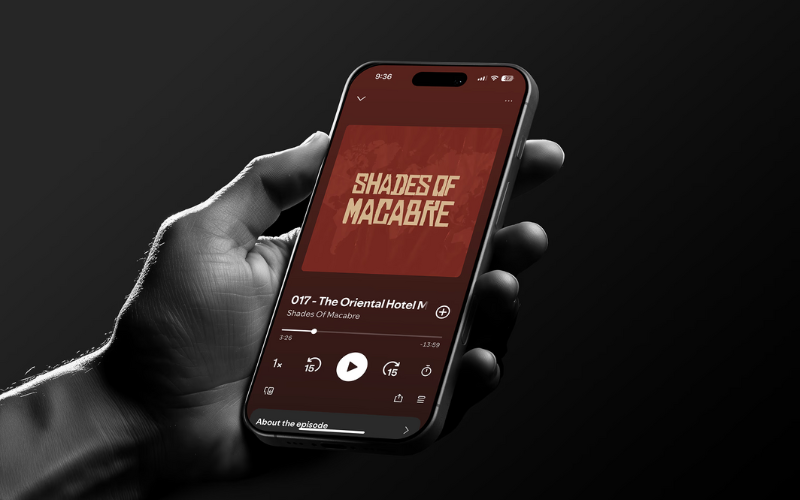
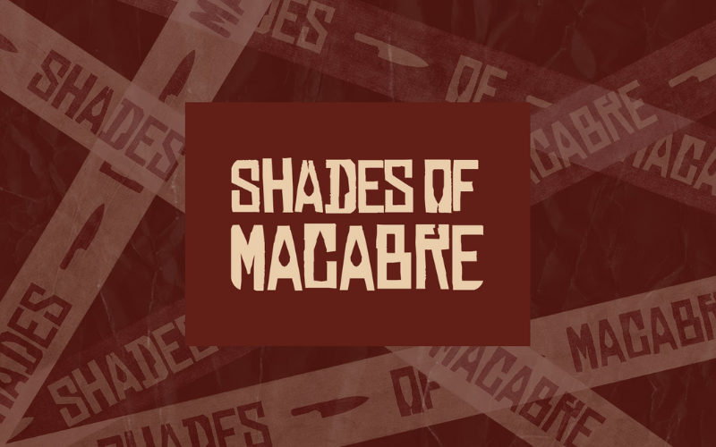
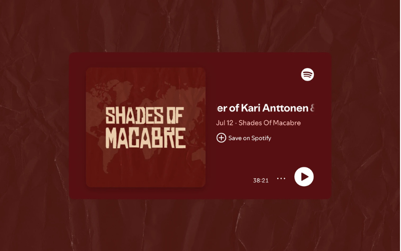
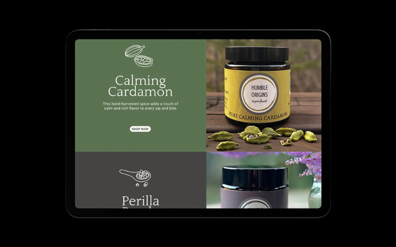
Creating Creatives Creatively

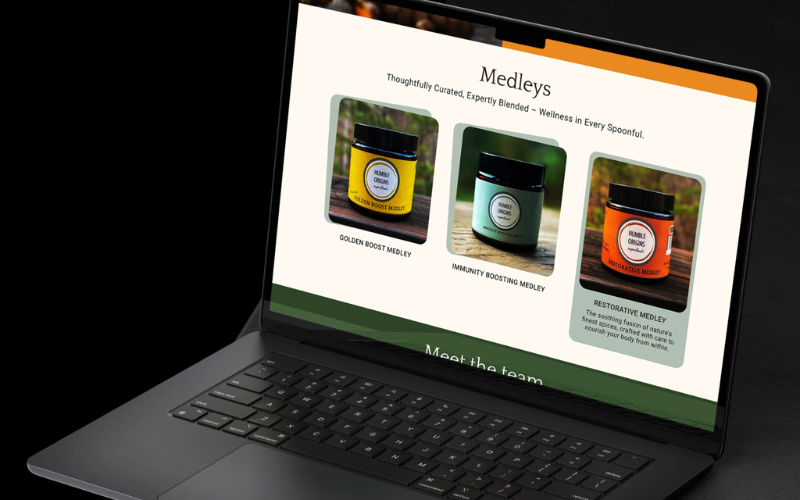
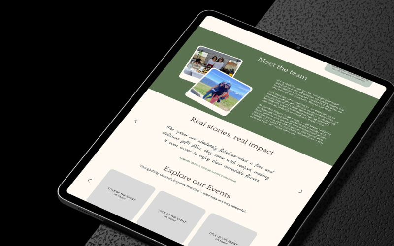
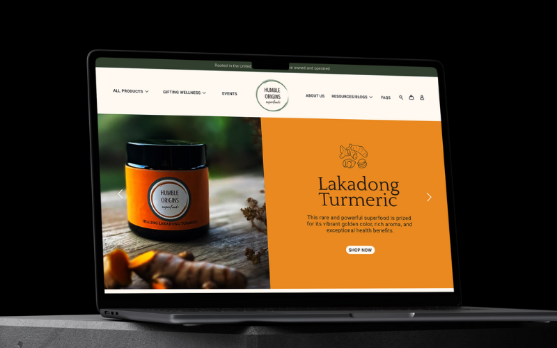
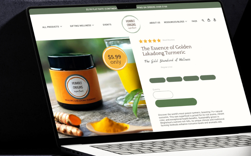
At Oofbeat, we infuse soul into design, transforming brands into memorable experiences. As a multidisciplinary creative studio, we specialize in brand identity, web design and development, and digital marketing. Our approach is rooted in storytelling, ensuring each brand we craft resonates authentically with its audience.

Our Services:

  • Brand Identity: From logos to tone of voice, we shape how your brand looks, sounds, and feels.

  • Web Design & Development: We build websites that are not only visually appealing but also user-friendly and responsive.

  • Digital Marketing: Our strategies encompass content marketing, SEO, social media campaigns, and more to amplify your brand's reach.

Our portfolio spans diverse industries, including tech, beauty, finance, food, and health, reflecting our versatility and commitment to excellence. We believe in collaborative creation, ensuring that every project is a true reflection of our client's vision.

Let's Bring Your Ideas to Life

Ready to embark on a creative journey? Reach out to us at [email protected] or visit our website at oofbeat.framer.ai to explore our work and discover how we can elevate your brand.

Partner Programs

Shopify Partner
United Kingdom United Kingdom
Eltham Street, , London, London SE09
< $25/hr
2 - 9
2025

Service Focus

Focus of Web Development
  • Wordpress - 25%
  • HTML5 - 25%
  • CSS - 25%
  • CSS3 - 25%
Focus of Web Designing (UI/UX)
  • Website - 15%
  • Landing Page - 15%
  • Ecommerce - 10%
  • Logo Design - 15%
  • User Experience - 5%
  • Digital Design - 15%
  • Graphic Design - 15%
  • Product Design - 2%
  • Packaging Design - 2%
  • Print Design - 2%
  • Illustration - 2%
  • Motion Graphics Design - 2%
Focus of E-commerce Development
  • Shopify - 100%
Focus of Digital Marketing
  • Social Media Marketing - 50%
  • Branding - 50%

Industry Focus

  • Other - 100%

Client Focus

90% Small Business
10% Medium Business

Detailed Reviews of oofbeat

5.0 1 Review
  • All Services
  • Web Development
  • Relevance
  • Most Recent
  • Rating: high to low
  • Rating: low to high
Write a Review
CA Hetal Shah

An outstanding collaboration that resulted in a polished, high-performing website exceeding our expectations.

I am extremely pleased with the website Oofbeat has created for us. From the initial stages, their team demonstrated a clear understanding of our vision and business requirements. They went beyond the standard delivery, crafting a site that’s not only visually striking but also functionally sound and optimized for performance. Their attention to detail, from layout and structure to SEO and user interface, was meticulous. The team was professional, creative, and highly communicative throughout the project. It was evident that they genuinely cared about the outcome and took great pride in their work.

What was the project name that you have worked with oofbeat?

Exceptional Web Design and Development Partner

What service was provided as part of the project?

Web Development, Web Designing (UI/UX), Digital Marketing

Describe your project in brief

Complete design and development of a custom website, including SEO optimization, layout planning, and brand-aligned visual design.

What is it about the company that you appreciate the most?

Attention to detail, design quality, alignment with business goals, and professionalism throughout the project.

What was it about the company that you didn't like which they should do better?

N/A

Rating Breakdown

  • Quality
  • Schedule & Timing
  • Communication
  • Overall Rating

Project Detail

  • Completed
  • Business Services

Client Portfolio of oofbeat

Project Industry

  • Education - 33.3%
  • Art, Entertainment & Music - 33.3%
  • Consumer Products - 33.3%

Major Industry Focus

Education

Project Cost

  • $0 to $10000 - 100.0%

Common Project Cost

$0 to $10000

Project Timeline

  • Not Disclosed - 66.7%
  • 1 to 25 Weeks - 33.3%

Project Timeline

Not Disclosed

Portfolios: 3

Brochure Design - Institute of Design, Nirma University

Brochure Design - Institute of Design, Nirma University

  • Brochure Design - Institute of Design, Nirma University screenshot 1
  • Brochure Design - Institute of Design, Nirma University screenshot 2
  • Brochure Design - Institute of Design, Nirma University screenshot 3
  • Brochure Design - Institute of Design, Nirma University screenshot 4
  • Brochure Design - Institute of Design, Nirma University screenshot 5
$0 to $10000
3 weeks
Education

Project Overview
The Institute of Design at Nirma University (IDNU) required a vibrant and engaging brochure that would resonate with prospective students and their parents during the university’s annual Open Day. The objective was to showcase the curriculum, academic modules, and the lived experiences of IDNU’s student community through a well-crafted visual and editorial narrative.

We were enVisual Language:
The color palette was based on the primary colors — red, blue, and yellow — with secondary tones created from their combinations. This not only introduced vibrancy and contrast but subtly referenced the foundational principles of design education. A custom icon on the cover, made of dots and dashes, served as a playful nod to design metaphors and cleverly spelled "IDNU" in Morse code — a layered tribute to design fundamentals.trusted with the end-to-end creative execution — from curating supplied content and conducting additional photography to designing a compelling brochure layout that captured the spirit of the design school.

Project Scope:

  • Content Curation & Visual Storyboarding
  • On-Campus Photography & Asset Integration
  • Brochure Layout Design & Print Preparation
  • Visual Identity Elements & Iconography

Design Approach
Rather than simply presenting academic information, the design aimed to immerse readers in the studio culture and everyday life at IDNU. Using playful, process-driven layouts inspired by student projects, we built a narrative that felt energetic and authentic — intuitive for students, yet informative for parents

Typography:
We paired Noto Serif for headings (evoking an academic, stylized tone) with Helvetica for body text — a clean, legible typeface that balanced the expressive visuals and enhanced readability across all sections.

Through thoughtful layout design, content storytelling, and a nuanced visual language, we helped IDNU communicate its educational ethos and student journey in a format that was both informative and emotionally engaging

Shades of Macabre

Shades of Macabre

  • Shades of Macabre screenshot 1
  • Shades of Macabre screenshot 2
  • Shades of Macabre screenshot 3
  • Shades of Macabre screenshot 4
  • Shades of Macabre screenshot 5
$0 to $10000
Ongoing
Art, Entertainment & Music

Project Overview: 
Shades of Macabre is a true crime podcast that explores the unsettling, the obscure, and the deeply disturbing stories hidden in the darker corners of history and society. Every episode takes listeners on a journey through real-world horrors — from cold cases and unsolved mysteries to infamous killers and historical atrocities.

Our role was to create a powerful, story-driven visual identity that captured the podcast’s dark, investigative nature without falling into typical cliché horror tropes. From the name to the logo system, our work helped define the brand’s presence and set the stage for growth across streaming platforms and social channels.

Project Scope:

  • Brand Naming & Positioning
  • Primary & Secondary Logo Design
  • Visual Identity System & Colour Palette
  • Social & Podcast Cover Artwork Design

Design Approach:
The visual identity leans into bold, uneasy forms inspired by true crime’s raw and unsettling nature. The primary logo uses distressed typography with sharp edges and irregular cuts, reflecting the fractured and chaotic essence of the stories being told. Subtle hints — like the knife motifs and tape-inspired backgrounds — suggest criminality and investigation without resorting to overt visuals.

A versatile secondary logo (SOM) was also developed for flexible use across podcast artwork, thumbnails, merchandise, and social media, ensuring consistency across all brand touchpoints.

Visual Language:
The colour palette draws from deep burgundy and muted bone tones to evoke the feeling of aged case files, bloodstains, and forensic archives. Paired with textured backgrounds reminiscent of wrinkled evidence bags or crime scene tape, this palette sets a sombre, immersive mood.

Ongoing Growth Support:
We continue to shape Shades of Macabre as it expands into new formats and channels, providing ongoing creative support across:

  • Social media visual assets
  • Podcast cover refreshes and seasonal design updates
  • Merchandising concepts and packaging design
  • Episode promotional graphics and templates

Through a deeply considered brand identity and scalable design system, Shades of Macabre now has a distinctive, instantly recognisable presence — helping the show carve its space in the crowded true crime landscape.

Humble Origins Superfoods

Humble Origins Superfoods

  • Humble Origins Superfoods screenshot 1
  • Humble Origins Superfoods screenshot 2
  • Humble Origins Superfoods screenshot 3
  • Humble Origins Superfoods screenshot 4
  • Humble Origins Superfoods screenshot 5
$0 to $10000
Ongoing
Consumer Products

Project Overview:
Humble Origins Superfoods is a conscious wellness brand focused on purity, provenance, and traditional farming practices. They offer rare, nutrient-rich superfoods such as Lakadong Turmeric, Makhir Ginger, Perilla Seeds, and other indigenous spices directly from source to shelf.

We collaborated with Humble Origins Superfoods to craft a compelling brand narrative and build a digital presence that aligns with their mission. From developing a distinct visual identity to creating a performance-driven, SEO-optimized e-commerce website, our work helped position the brand for long-term success in India’s wellness and organic food space.

Project Scope:

  • Brand Strategy & Visual Identity Design
  • Custom Website UI/UX & Full-Stack Development
  • SEO Architecture & Mobile Optimization
  • Content Design & E-commerce Integration

Design Approach:
The visual identity was built around the brand’s core values — purity, tradition, and storytelling. Drawing inspiration from the rich landscapes and culture of Meghalaya, we crafted a clean, natural aesthetic. The Shopify storefront was designed for simplicity and clarity, enabling conscious consumers to explore products, learn about them, and make informed purchases easily.

Visual Language:
The color palette draws from earthy turmeric tones, forest greens, and natural neutrals, creating a harmonious balance between tradition and modern usability.

Technical Build:
We developed the e-commerce platform on Shopify, using a fully custom-designed theme tailored to the brand’s visual identity and content strategy. Key features include:

  • Product Subscriptions for recurring wellness needs
  • Wholesale Pricing Integration for bulk buyers and resellers
  • Custom Product Pages with detailed storytelling and health benefits
  • Speed Optimization and mobile-first responsive design
  • SEO Architecture to improve organic discoverability

Ongoing Growth Support:
We continue to support Humble Origins Superfoods with performance marketing strategies, including:

  • Targeted Email Campaigns for customer retention and education
  • Paid Advertising across social media and search platforms
  • On-Site Conversion Optimization and analytics tracking

Through a thoughtful blend of design, smart tech integration, and ongoing digital strategy, we are helping Humble Origins grow into a globally recognized wellness brand.