About the Project
Silk Road Foundation is a nonprofit organization dedicated to building a supportive community for migrants from CIS countries, primarily Uzbekistan, in New York. The foundation helps individuals adapt to a new society, providing essential support in employment, cultural integration, and professional development.
Beyond adaptation services, Silk Road Foundation offers career guidance lectures, cultural activities, and direct aid to vulnerable community members, including material, medical, and psychological assistance. The organization plays a crucial role in ensuring migrants feel welcomed, empowered, and equipped to navigate their new environment.
The Challenge
At the beginning of 2024, Silk Road Foundation approached us with a request to redefine their brand identity. The primary goal was to create a bold and trustworthy image that would attract more investors and patrons willing to support the foundation’s initiatives — both financially and morally.
A key aspect of this transformation was developing a seamless digital ecosystem. We designed a modern, user-friendly platform that not only provides comprehensive information about the foundation’s work but also allows users to:
- easily request assistance.
- stay updated on current events.
- discover upcoming initiatives and news.
More than just a website, the platform became a hub for the Silk Road community, reinforcing the foundation’s mission of care and support. Designed with both beneficiaries and potential investors in mind, it ensures a transparent, intuitive, and inspiring interaction with the organization.
How We Transformed the Silk Road Foundation’s Visual Identity
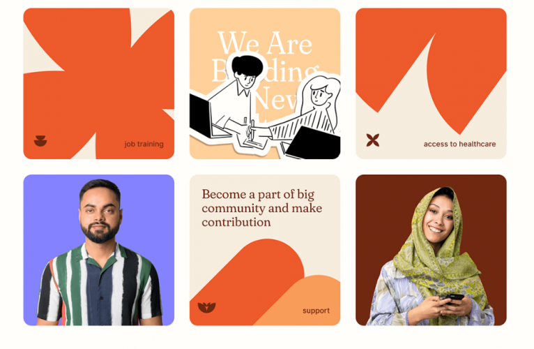
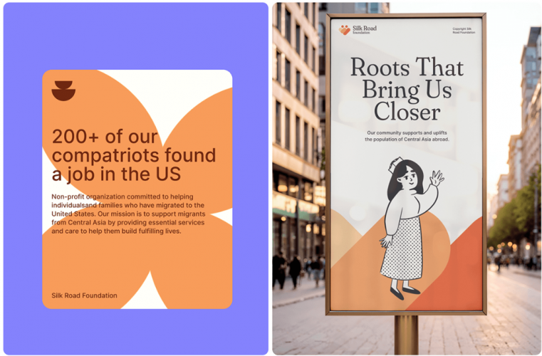
As part of the project, we focused on enhancing the brand’s visual identity, ensuring it felt more welcoming, warm, and relatable to the target audience. Our approach included a comprehensive rebranding, a modern website redesign, and the development of a visual communication style that reflects the foundation’s mission and cultural values.
Every aspect of the new identity was carefully crafted to embody the organization’s core principles: support, respect, care, and warmth. We built the brand’s new look around three key elements:
1. Friendly Illustrations in Line Art Style
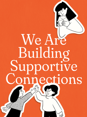
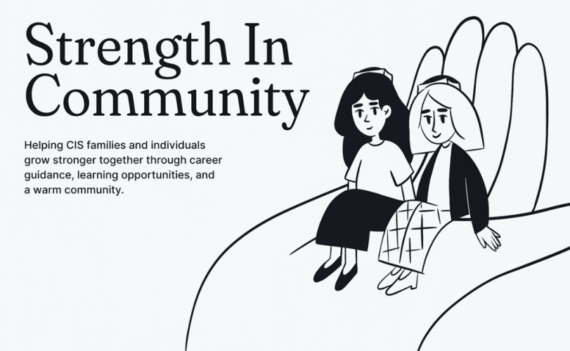
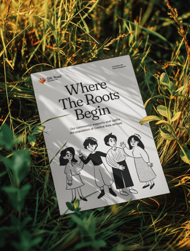
To create a warm and accessible visual identity, we introduced minimalist line-art illustrations. These simple, friendly drawings depict people smiling, sitting together, or interacting — reinforcing the foundation’s values of support, care, and unity. The clean, uncluttered style keeps the design modern and engaging.
2. Cultural Elements That Resonate with the Audience
Our designers incorporated traditional symbols that evoke a sense of home for the foundation’s audience. Elements like Uzbek skullcaps (tubeteikas), patterned clothing, and kites establish a visual connection to Uzbek culture. These details add authenticity and help migrants feel a sense of belonging, reinforcing the foundation’s mission of cultural and social integration.
3. Shapes and Colors That Reflect Cultural Identity
We used soft geometric shapes such as arcs, rounded lines, and abstract elements to create a dynamic yet harmonious style. These forms are reminiscent of natural patterns and traditional ornaments found in CIS cultures, particularly Uzbekistan. They add a sense of familiarity, making the design feel closer to home.
For the color palette, we selected warm, earthy tones—orange, beige, and terracotta — associated with warmth, care, and support. These hues create a welcoming atmosphere, while contrasting accents in white and dark brown highlight key elements, ensuring clarity and visual appeal. When combined with real-life photography and friendly illustrations, these elements create a positive, trustworthy brand image that captures attention and fosters emotional connection.
Refining the Logo
We reimagined the logo while maintaining its recognizability and brand heritage. The new version features two human figures at the center, symbolizing unity, support, and togetherness. Their silhouettes form a heart shape, reinforcing the foundation’s core values of care and community.
A New Brand Message: “Where the Roots Begin”
We also updated the foundation’s communication style, making it more warm and supportive. The new slogan, “Where the Roots Begin,” directly connects to the Silk Road Foundation’s name and mission, symbolizing a fresh start for those seeking a new home. It conveys a powerful message:
This foundation helps you adapt, and our community becomes your new home — no matter how far you are from your homeland.
The Impact of Our Work
The new approach revitalized the brand, making it feel warmer, more modern, and emotionally engaging. The redesigned website became a powerful communication tool, offering comprehensive information about the foundation’s activities, events, and initiatives. Most importantly, it now effectively fulfills its primary goal — attracting investors and supporters to sustain and expand the foundation’s mission.


.png)
.png)
.png)
