CEO at Armitage Labs OÜ
Posted 1 month ago
Seamless and inspiring collaboration that brought our brand to life in a way no other agency could.
From start to finish, Qream was highly creative, responsive, and collaborative. They guided us through multiple brand concepts, helped us articulate our unique personality, and turned it into a cohesive system that works across product and marketing. The design team was flexible, open to feedback, and quick to adapt, ensuring that every piece of feedback was considered. The result is truly amazing as we have a brand that feels bold, playful, yet reliable, exactly what we needed to stand out.
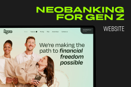
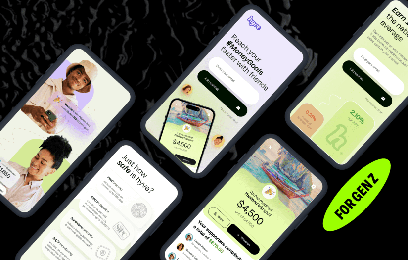
What was the project name that you have worked with Qream?
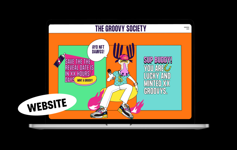
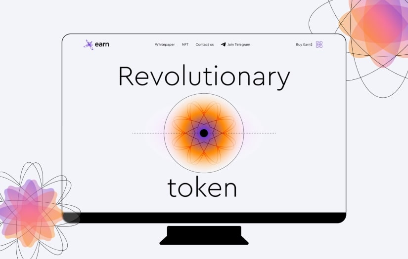
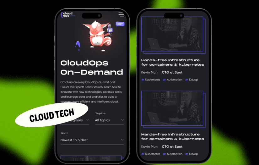
Creem
What service was provided as part of the project?
Web Design, Digital Marketing
Describe your project in brief
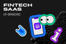
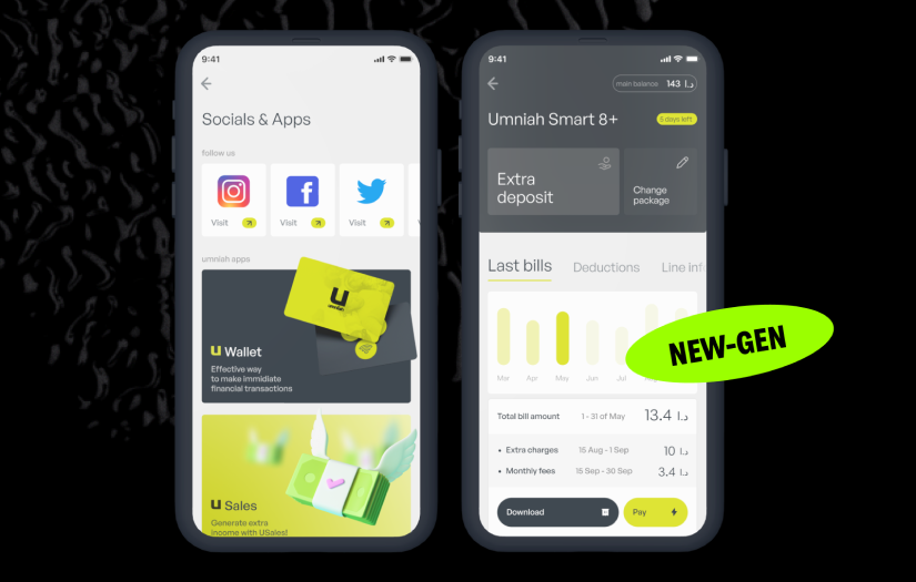
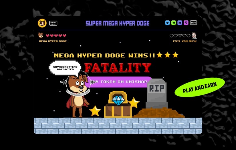
Qream helped us build a one-of-a-kind brand that immediately stands out in the fintech world. They translated our vision into a whole creative universe, complete with mascot, icons, and visuals, giving the Creem brand a personality that feels alive and human while remaining professional and trustworthy.
What is it about the company that you appreciate the most?
What impressed me was their ability to combine design thinking and a touch of rebellion to create a brand that is memorable and outstanding. They pushed creative boundaries while keeping the brand usable and professional.
What was it about the company that you didn't like which they should do better?
I can’t find any weaknesses, as I truly enjoyed the collaboration. Every step was smooth, and feedback was implemented fast!
Rating Breakdown
- Quality
- Schedule & Timing
- Communication
- Overall Rating
Project Detail
- $10001 to $50000
- Completed
- Financial & Payments
.jpg)
.jpg)
.jpg)


.jpg)