Modern Design for Your Brand

Since 2014, we've been creating designs that tell your brand story and help you achieve your goals. We work with startups and established companies in a variety of industries. We specialize in Branding, Packaging, Illustration, and Web Design.

United States United States
112 Union Street, Albany, New York 12866
5189150235
$50 - $99/hr
2 - 9
2014

Service Focus

Focus of Web Development
  • Wordpress - 50%
  • HTML - 50%
Focus of Web Designing (UI/UX)
  • Website - 10%
  • Landing Page - 1%
  • Ecommerce - 1%
  • Corporate - 1%
  • Logo Design - 20%
  • Usability - 1%
  • User Experience - 5%
  • Graphic Design - 10%
  • Packaging Design - 41%
  • Illustration - 10%
  • Adobe Illustrator - 40%
  • Adobe InDesign - 20%
  • Photoshop - 30%
  • Sketch - 10%
Focus of Digital Marketing
  • SEO Services - 10%
  • Content Marketing - 10%
  • Branding - 70%
  • Market Research - 10%
Focus of Advertising
  • Outdoor Advertising - 10%
  • Online Advertising - 30%
  • Creative Agencies - 60%

Industry Focus

  • Food & Beverages - 60%
  • Startups - 20%
  • Healthcare & Medical - 10%
  • Enterprise - 5%
  • Agriculture - 5%

Client Focus

68% Small Business
32% Medium Business

Detailed Reviews of SOT B&D Branding Agency

No Review
No reviews submitted yet.
Be the first one to review

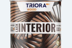
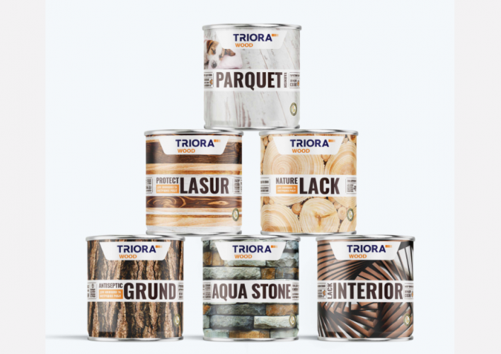
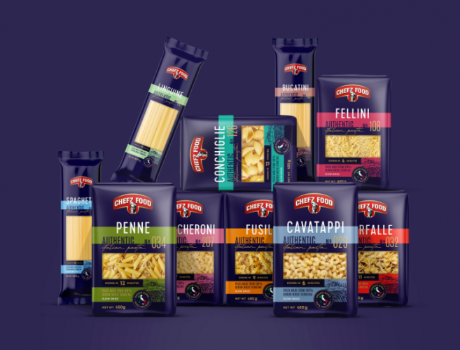
Client Portfolio of SOT B&D Branding Agency

Project Industry

  • Retail - 80.0%
  • Food & Beverages - 20.0%

Major Industry Focus

Retail

Project Cost

  • Not Disclosed - 100.0%

Common Project Cost

Not Disclosed

Project Timeline

  • Not Disclosed - 100.0%

Project Timeline

Not Disclosed

Portfolios: 5

ZIP IE LLC

ZIP IE LLC

  • ZIP IE LLC screenshot 1
Not Disclosed
Not Disclosed
Retail

While working on the new line of paint and varnish products of TRIORA WOOD trademark it was possible to preserve the integrity of brand perception, create logical identification schemes within the line, and visually separate from other trademarks of the company.

All the information the consumer wants to know about the product is presented on the packaging in a clear and concise form. The advantages of the new products are intelligently emphasized using a system of fonts and pictograms. For each product, a different infographic was developed using illustrations to communicate the benefits, warnings, conditions of use, and recommendations in a modern way. The overall color scheme became deeper and more expressive, making it easier for the consumer to identify and distinguish the product in the line and stand out among competitors. The main dominant feature of the packaging is a textured photograph of stone, wood or wood products. The overall minimalistic design helped to emphasize the premium quality of the products.

Chefz Food

Chefz Food

  • Chefz Food screenshot 1
Not Disclosed
Not Disclosed
Food & Beverages

The project aimed to create a unique brand that would appeal to the main target audience and attract a new, younger audience. The task was to incorporate the image of traditional pasta-making methods and modern challenges and innovations into the visual identity and packaging design. This design should stand out in the competitive market of pasta products not just because of its aesthetics, but also because it embodies the brand's core values and attractiveness.

The visual identity of Chefz Food is characterized by vibrant colors and clear zoning. The color palette includes a deep blue color that unifies all elements in the packaging design into a cohesive whole. Bold and bright shades of orange, coral, purple, green, and blue effectively distinguish the product on the shelf, help differentiate individual items in the product line, and stand out favorably against competitors.

JUDINSTRÖM Brasser

JUDINSTRÖM Brasser

  • JUDINSTRÖM Brasser screenshot 1
Not Disclosed
Not Disclosed
Retail

The Judinström brand was created from scratch with the aim of entering the beer market in Canada and elevating the status of a local brewery from Montreal. Additionally, the goal was to cultivate a specific beer consumption culture and introduce consumers to different beer styles.

The task included creating a logo, visual elements, and packaging design for craft beer using Scandinavian motifs, but in a modern interpretation. For these purposes, a new logo was developed, and a key image was created, centered around a recognizable stylized character. Subsequently, the packaging was conceptualized and illustrated to evoke the atmosphere of Scandinavian countries.

UNA LUNA

UNA LUNA

  • UNA LUNA screenshot 1
Not Disclosed
Not Disclosed
Retail

Una Luna’s latest collection of chocolates is truly something special. Each piece of heavenly confection is infused with a unique liqueur blend, carefully encased in a thin sugar casing, and then dipped in Italian dark chocolate. With flavors ranging from horseradish tincture and honey to raspberry, orange, and cranberry, this collection offers something to tantalize every taste bud.  

Alcoholic candies are most often made based on liquor. This is a strong drink that is infused with fragrant herbs, seeds, and fruits and with the addition of essential oils. Candies with alcohol have a subtle aroma and a spicy aftertaste. The packaging design is inspired by the combination of new flavors and colors. Each flavor is abstractly represented in the form of unexpected strokes and brush strokes – a real work of art.

We deviated from the customary practice of conveying taste through the image of ingredients on the package. We decided to convey not the taste as such, but the energy behind each flavor. For example, in Khrenovukha, the taste of horseradish tincture with honey and lemon was conveyed in a swirl of green-blue-yellow strokes. Malynıvka, a tincture on raspberries, bloomed with bright pink strokes. Tsytrynıvka tincture on oranges – bursting with bright hot oranges. Jyravlynıvka tincture on cranberries – scattered in a firework of blue-red splashes.

D'CARAMEL

D'CARAMEL

  • D'CARAMEL screenshot 1
  • D'CARAMEL screenshot 2
Not Disclosed
Not Disclosed
Retail

In developing the brand for D'CARAMEL Pariserie, we drew inspiration from innovative desserts and pastries that the new brand represents. A pastel color palette was utilized in the design to emphasize the product's beauty. For the development of the signature pattern, we drew inspiration from real desserts. Additionally, we incorporated the symbol of the state of Texas – the bluebonnet flower – into the pattern. This symbol not only reflects the location but also adds depth and significance to the brand.