Studio East
Digital marketing for real results
Studio East is a full-service digital marketing agency without the fluff. Whatever you need, we’ll make it happen. Our suite of services includes insights, strategy, design, branding, copywriting, content, advertising and more. Our work is driven by a blend of bespoke research, hard data and impactful creativity to help your brand smash targets and outperform competitors.
 United Kingdom
41-43 Chalton Street,
London,
London
NW1 1JD
+353 87 673 5834
NA
10 - 49
2023
Detailed Reviews of Studio East

Client Portfolio of Studio East
Project Industry
- Consumer Products - 25.0%
- Information Technology - 25.0%
- Healthcare & Medical - 25.0%
- Travel & Lifestyle - 12.5%
- Real Estate - 12.5%
Major Industry Focus
Consumer Products
Project Cost
- Not Disclosed - 100.0%
Common Project Cost
Not Disclosed
Project Timeline
- Not Disclosed - 100.0%
Project Timeline
Not Disclosed
Clients: 5
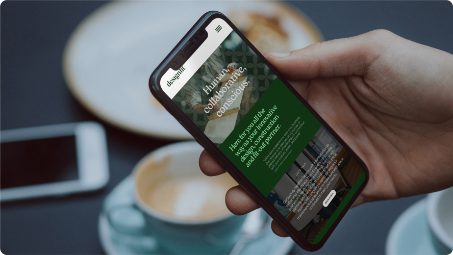
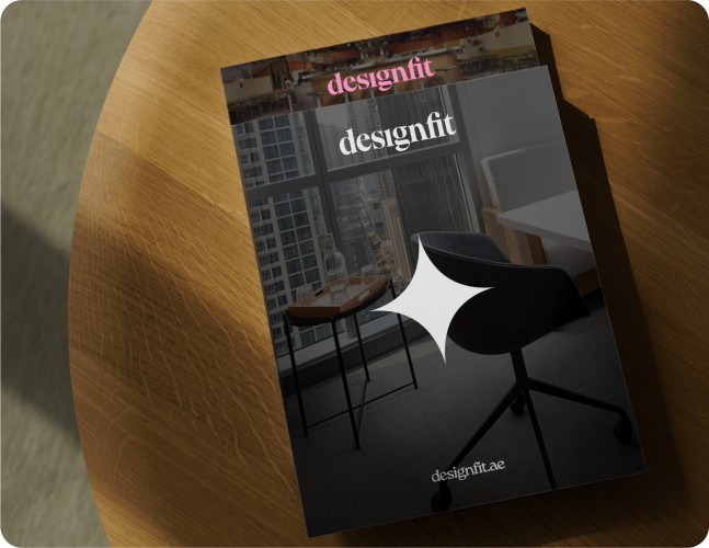
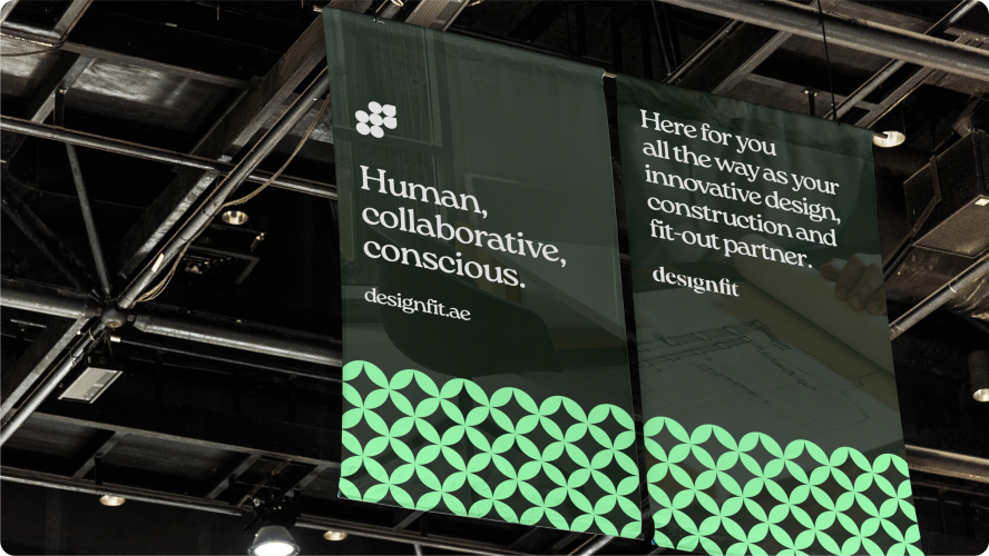
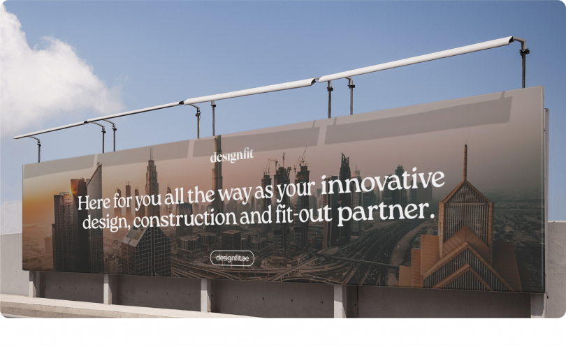
- Designfit
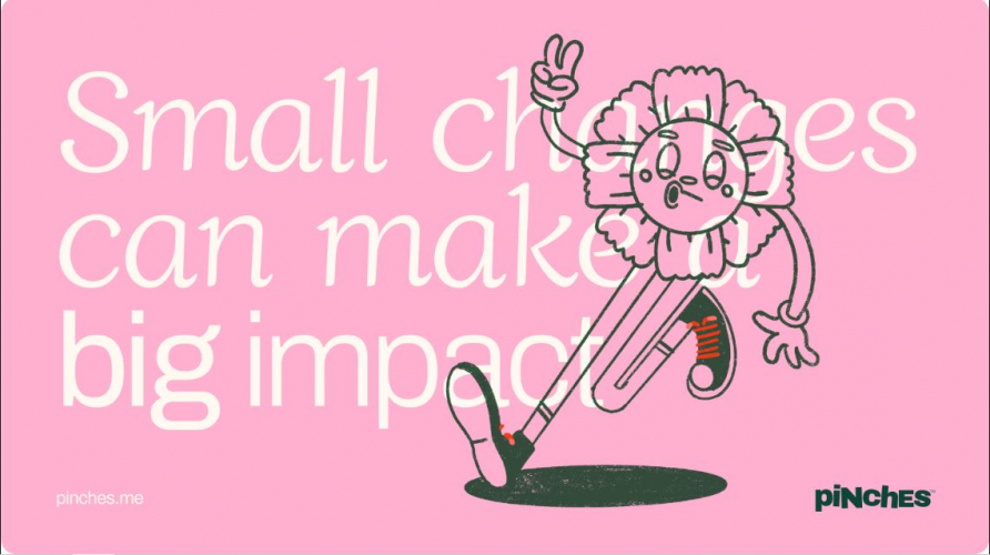
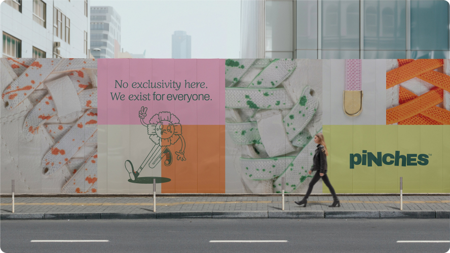
- Pinches
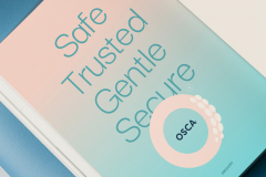
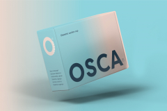
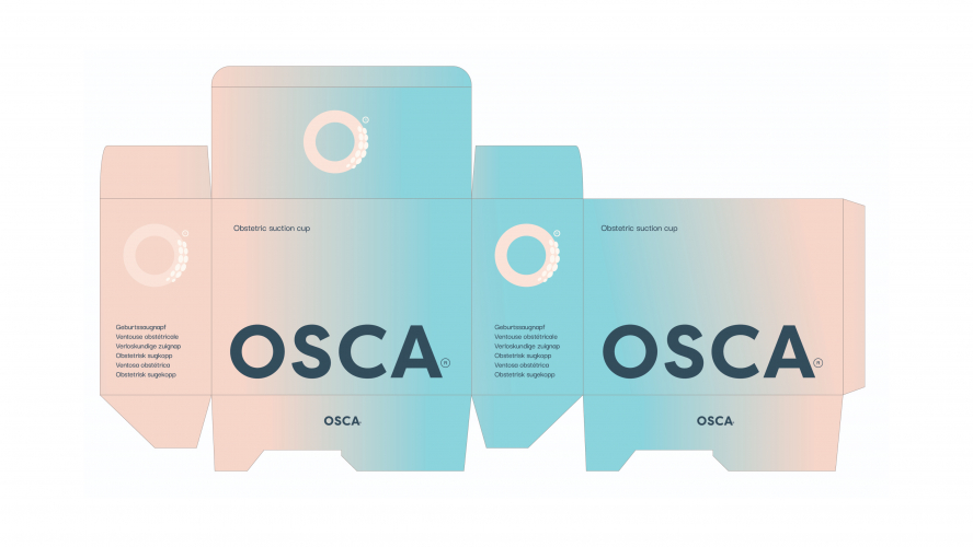
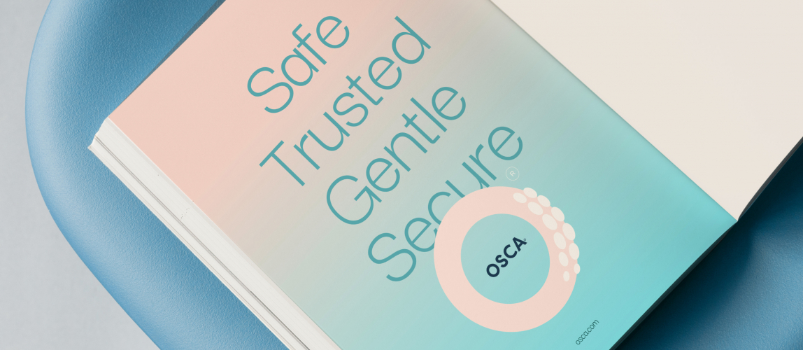
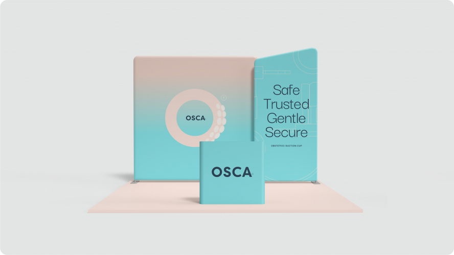
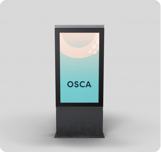
- OSCA
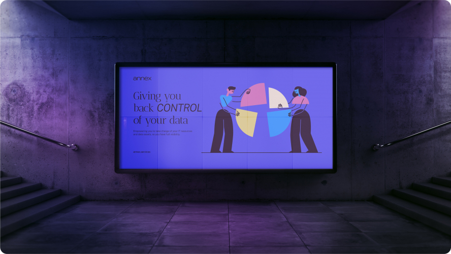
- Annex
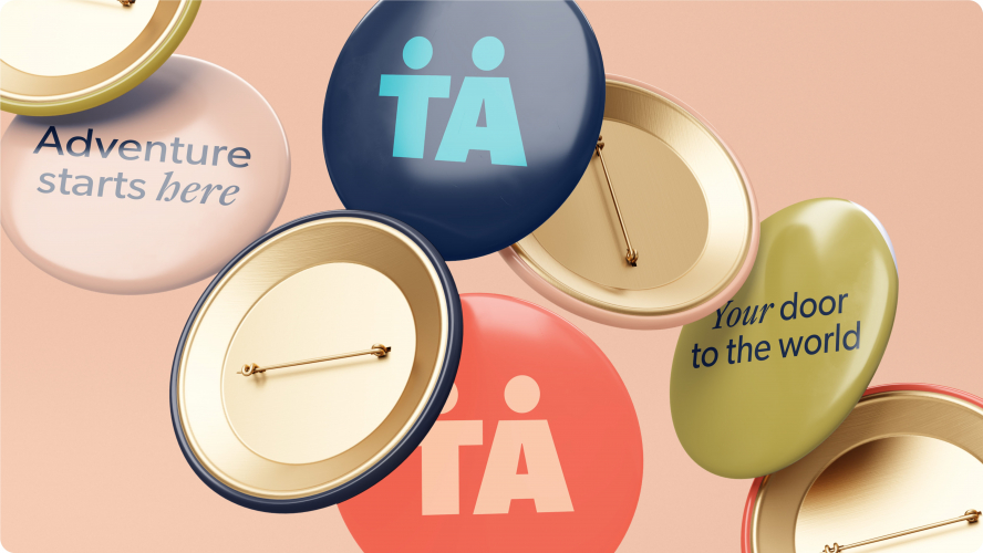
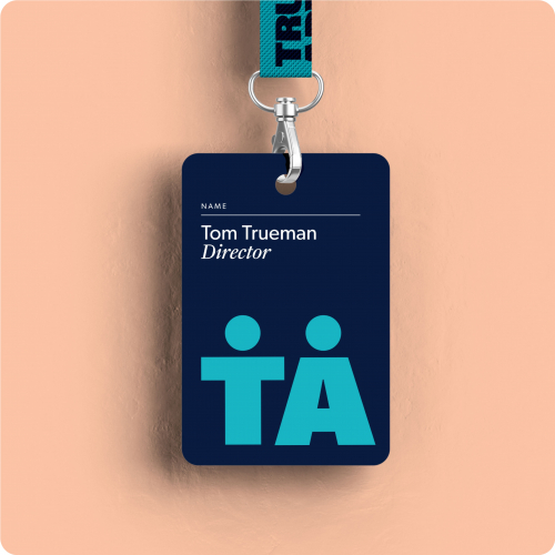
- True Adventure
Portfolios: 8