


Verified via email/call

Penny, Founder & CEO at Penny's Serendipity House
Posted 3 weeks ago
Effortless
Loved working with 10turtle!
Jigna is a professional, very experienced, quick and takes great pride at what she does.
Will be returning for my future projects.
Jigna is a professional, very experienced, quick and takes great pride at what she does.
Will be returning for my future projects.
What was the project name that you have worked with ten turtle?
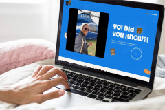
The Serendipity Agenda
What service was provided as part of the project?
Web Design
Describe your project in brief
Jigna and her company 10turtle, have been wonderful, quick and easy to work with.
My book looks so beautiful and exactly how I imagined it, if not better!
Would 100% recommend them!
What is it about the company that you appreciate the most?
Accuracy
What was it about the company that you didn't like which they should do better?
Can't think of any
Rating Breakdown
- Quality
- Schedule & Timing
- Communication
- Overall Rating
Project Detail
- $0 to $10000
- Completed
- Travel & Lifestyle