Are you considering a radical redesign of your website in 2026? Then don't.
Why?
Well, because users typically have preconceived notions as to how your website operates. So, when you redesign your website, the users will have to relearn the site’s new structure, increasing bounce rates in return.
To put this more concretely, frequent site visitors use your site automatically, unconsciously, and unthinkably, thanks to the design principle called familiarity. In other words, users generally internalize a website’s user interface to the point that they quickly silence a large portion of their brain and only use the basal ganglia (a part of our brain where the most memories are stored) to browse your site.
So, suddenly, one fine day, if you radically redesign your site from the inside out, users might not take it positively because they need to put their brains back to work.
Consequence:Loss of users. Increased bounce rates. (Remember the Digg platform)
Don’t get me wrong! I am not entirely against redesign!
Incidentally, Goodfirms’ website underwent a high-level overhaul. Significant changes were made in the development, design, visuals, and copy departments, and it’s not without good reason.
According to company insiders, several new competitors were breathing down our neck. Hence, a full-throttle overhaul seemed the need of the hour. And there could be no two ways about it, according to Goodfirms’ web developers and designers. So, yes, website redesigning could prove a game-changer for your business, for it might set right the dysfunctional parts of your website. (If website redesigning is on the cards in 2024, check out our latest survey on web development costs to get valuable insights about the new market estimates.)
My point? If your business is facing heat in the market in terms of traffic, leads, revenues, and increased bounce rates, then no matter what, a full-throttle redesign should be on your radar.
Goodfirms survey perfectly echoes our above analysis as it clearly states that websites need to opt for redesign when their conversion rates are low and the bounce rates are high.

That said, a website refresh would be good enough if you plan to give your site a fresh look. For the unversed, a website refresh differs from a website redesign.
How is it different? Read along to find the difference.
Website Redesign VS Website Refresh
A website redesign and a website refresh are mutually exclusive. While redesigning involves radical changes and is an incredibly complex exercise, a website refresh is simple and effortless.
How?

In the case of a redesign, the website developers and designers are part of a high-level, resource-intensive exercise and typically invest 45-90 days in the project. Code, copy, structure, visuals—everything on the website is up for change.
In fact, pages get restructured UX-wise, making way for new modules, new functionalities, and a new CMS, plus the information architecture receives an update. And mind you, all this happens hand-in-hand and goes live simultaneously.
On the other hand, the site's core structure and functionality stay the same in the event of a refresh. The designer fiddles with minor things such as introducing new colors or typography to the site, contact information, and some tiny UX tweaks. That's about it!
The primary objective behind a website overhaul or redesign is to grow revenue, manage bounce rates, and enhance the overall user experience. In contrast, a website refresh is done for refresh's sake, or we could say, it lends the site a fresh look and feel.
My point? If your website could be doing better in terms of traffic, leads, conversions, and bounce rates, you should choose a redesign over a refresh. Or else, a refresh would be good enough.
Still trying to figure out whether to choose website redesign or website refresh? Let’s dive into the following points to help you arrive at a decision.
Full-fledged Website Redesigning Should be on the Cards in the Following Cases
It’s no exaggeration to say that a website redesign is the best way forward when a site’s core structure and functionality require a complete overhaul. In the following cases, a website needs a complete overhaul.
1. If Your Site Isn’t Mobile Responsive #
I cannot stress the importance of having a mobile-responsive website enough. A whopping 92.3% of internet users are using mobile phones for browsing. This means people access websites more on mobile devices than on desktops.
To add to that, Google indexes mobile-first sites over desktop ones. So, it’s more important now than ever for websites to be mobile-friendly.
Consider Goodfirms: A Perfect Example of a Mobile Responsive Site
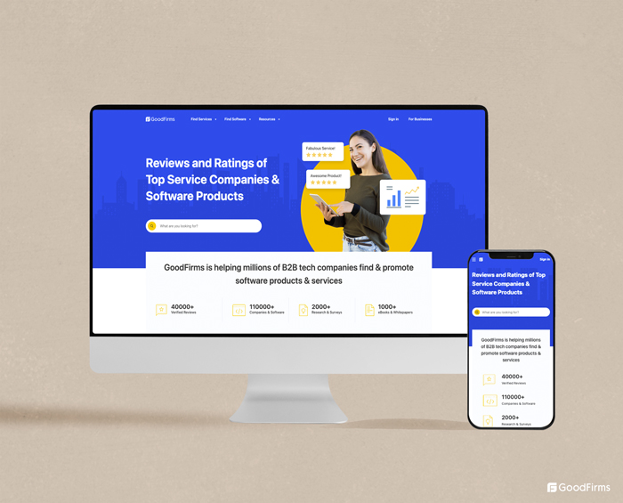
So, as you can see from the above, the layout of our desktop site is very different from our mobile version. Our website layout is absolutely in tune with the mobile specs. The drop-down menus—Find Services, Find Software, and Resources—that you can view on our desktop version get hidden behind the hamburger menu (the three lines in the top left corner) in the mobile version, lending our mobile version a neat and clean look.
Plus, the button on our mobile site is optimized for tapping, not to mention the content is short and snackable.
The practical takeaway here is that your mobile website should be simple. Once you know your website’s usability on mobile, you can offer users a more positive website experience.
For a clear idea of how to make your website mobile friendly, check out our recent article, “11 Ways to Make Your Website Faster and More Responsive.” The elaborate article is sure to set you on the right mobile-responsive path. If not, you can outsource your web development requirements to companies listed on Goodfirms. (Web developers from Australia could prove to be a good starting point for your business as the country boasts of nearly 8600 web developers who invest about 42 hours per week.)
2. If Your Website Isn’t Responsive on all Devices #
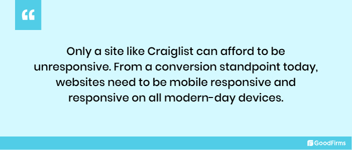
As it turns out, Craigslist, one of the most highly trafficked websites in the world, still swears by its ultra-basic and bare-bones design approach. In fact, for years, the company has been playing safe, defying design trends to be in tune with the familiarity principle. In other words, the basic design is part of their brand image, making the site memorable and instantly recognizable.
However, the site’s status-quo approach in terms of design has rendered it unresponsive on most devices, although its mobile site works well.
My point? Only a site like Craiglist can afford to be unresponsive. From a conversion standpoint today, websites need to be mobile responsive and responsive on all modern-day devices.
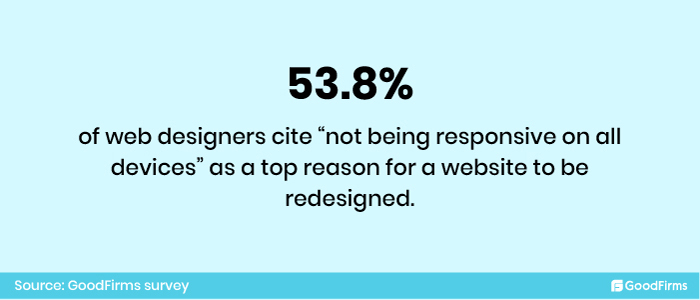
53.8% of web designers cite “not being responsive on all devices” as a top reason for a website to be redesigned. (Goodfirms survey)
Technology is evolving at breakneck speed, and our customers are undoubtedly catching up with them. This means businesses must keep up and engage them wherever they are.
Here are a Few Tips to Make your Website Responsive on all Devices:
Proper placement of CTA buttons: Site users interact with your site via CTA buttons. In a desktop version, they may appear in the first or second fold of your website or in pop-up forms. In the case of mobile sites, however, you can hide them behind the hamburger button. The clickable buttons should be at least 48 pixels in height.
Use SVG Graphics over PNGs and JPGs: SVG files can be scaled, unlike JPGs and PNGs. The scaling ensures an excellent browsing experience for users on all devices. More importantly, they’ll help your site load faster.
Use Different Image Resolutions for Different Devices: Upload different image resolutions for different devices. Desktop websites may need 1200-pixel images, while mobile websites may require 400 pixels. Using the larger resolution may cause problems with page speed.
Rethink about Typography: Fonts that look great on your desktop may not sit well with your mobile site. And the opposite is also true. So, the basic rule is to use a 16-point body type for both the website and mobile. Avoid ultra-slim fonts on mobile.
Make the Most of Device Features: Unlike mobile phones, a desktop is not primarly used for calling purposes. So, the ‘chat now’ CTA can be replaced with ‘call now’ on mobiles. Similarly, see which CTAs will require replacement on your mobile site.
Last but not least, use Google’s Mobile-Friendly test tool to check your site’s performance on different devices and browsers besides your own mobile devices.
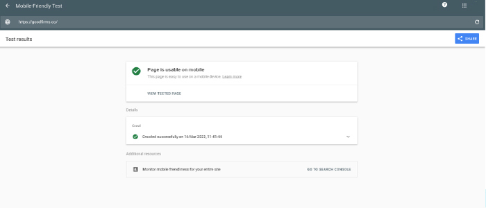
Testing Goodfirms.co performance on mobile devices using Google’s Mobile-Friendly Test Tool
3. If Your Competitors Are Crushing You #
There's more to competitor research than meets the eye. If you are groping in the dark, and need clarification on your next step, check out what your competitor is doing and get started. Nope, it's not copying the competitors blindly. In fact, it's about making informed decisions.
Some questions you can ask yourself to see how you compare to your competitors are:
- Is your competitor's website and user interface better?
- Is their website loading faster?
- Are they more visible on Google?
- On digital channels, how do users interact with competitors?
Finding answers to the above questions will help you understand your audience better and align your efforts in the right direction.
4. If Your Site’s Navigation is Confusing to the User #
Site navigation shouldn’t be something that web developers experiment with. Why? It’s because users expect the navigation to be simple, intuitive, and consistent with their expectations. (Remember: Familiarity principle.)
Any experimentation will result in users leaving. In fact, the site navigation should be so designed that the information jumps out at the user when they come looking for it.
Consider ZARA - An Example of Confusing Navigation

Zara’s website has the look and feel of an online magazine, which makes it visually appealing. But don’t you think they’re compromising the shopping cart feature by focusing on the look and feel? As far as my understanding goes, the goal of a website is to get users to buy things from its site, which is not happening in ZARA’s case. Small text and the navigation menu hidden behind the hamburger button are confusing to the buyer as they cannot immediately decide what action to take next, and the CTA button is missing. The user journey on their mobile app is no different.
Tips to Rectify Navigation Issues on Your Website:
- The navigation menu should always be horizontal at the top of the site. Positioning it anywhere else would make things difficult for the user.
- Generic labels, such as "Who We Are," "What We Do," "Products, and "Services" in the navigation bar, are a complete no. Instead, your labels should speak for themselves and indicate products/services.
- Drop-down menus put off users because they cannot click on anything like that. Being non-intuitive forces them to pick and choose. However, according to usability studies, mega drop-down menus are an exception and perform well.
- Listing too many items on your homepage means diluting the link juice. In other words, you pass down less authority and trust to the inner pages. Fewer items represent more authority and trust in the inside pages and more link juice.
- The principle of primacy and recency states that attention and retention are highest at the beginning and end. So the essential items should be placed first in the navigation bar, followed by the least necessary items, and then again the most critical items (contact info) at the end.
- Avoid button-based navigation as it takes time to load, is not search-engine friendly, and is not easier to update.
If you follow the navigation tips mentioned above, you won't need to redesign your website.
5. If Your Site Does Not Follow ACCESSIBILITY Guidelines #
An accessible website is one that anyone, irrespective of their disabilities, can use.
This means that when we design a site, we must consider several types of cognitive and physical disabilities to make the site easier to access for those suffering from these conditions.
Here are a Few Tips for Developing an Accessible Site:
- Add keyboard-friendly navigation: This is important because many assistive technologies only use keyboard navigation. A mouse can be assistive in this regard. The WebAIM keyboard accessibility design guide can help come up with keyboard-friendly navigation.
- Add High-contrast colors: Low-contrast colors blend the text with the background. On the other hand, high-contrast colors such as black and yellow make the text stand out and improve visual accessibility. You can try Contrast Checker when selecting your site’s color palette.
- Add Alt Text for Images: Alternative text that describes your images allows the visually impaired user to understand the context of the image using assistive technologies such as dictation software. Plus, Alt text enables your pictures to pop up in searches.
- Add Heading Hierarchies to Structure the Text: Heading hierarchies help break content into smaller sections, making them easier to read, and aid those using assistive technologies to browse the contents of your page.
- Add Captions and Transcripts to Videos: Adding captions or transcripts to the videos makes it easier for the deaf or those with hearing difficulties to understand the content. Closed transcripts make it easier to consume content without relying on visual imagery or audio alone.
Considering user disabilities and impairments while redesigning your website will guarantee a better user experience for those accessing the site.
Website Refresh should be On the Cards in the Following Cases
As mentioned above, unlike website redesign, website refresh doesn’t have to do anything with the core architecture of the website. You can think of it as part of the ongoing website maintenance businesses undertake to keep their sites fresh.
1. If Your Website Increases Users’ Cognitive Load #
Whenever a user visits the website, she processes and stores the information in her working memory and, therefore, prefers that the information be simple and straightforward. But then,, what if she finds the information highly complicated and overwhelming? In that case, it implies the website is increasing the user's cognitive load (mental effort), which could prompt the user to leave the site.
Sure thing, cognitive load is an integral part of processing information; however, web developers, designers, and content strategists should do their best to ensure they are minimizing users' cognitive load and not maximizing it.
Here are 3 ways to reduce the cognitive load of the website according to nngroup:
- Avoid redundant links, irrelevant images, and meaningless typography.
- Leverage existing mental models while structuring your website's UI and UX, as users use their past experiences while browsing other sites. Using familiar labels and layouts reduces the amount of learning required on your site.
- Suppose anything in your design makes the user invest more mental effort, such as an extended text that forces them to remember information or make a decision in such cases the information should be replaced with a picture or a smart default.
2. If Your Website Doesn’t Accurately Reflect your Brand Story #
It’s not uncommon for businesses to shift their focus area. Companies continue to fiddle with their focus gears in response to rising opportunities. A shift in focus could also imply a pivot in product offerings and even a shift in the target audience. Your website must reflect all these changes and correctly position you within the marketplace.
And even if your products/services or the target market haven’t changed, it’s critical to continually evaluate whether your organization’s story is consistent with your vision, mission, and values.
Here are a Few Tips to Make your Brand Story Reflect in your Web Design:
- Know what you stand for and how you plan to express it.
- Less about company speak and more about how you plan to address customer concerns
- Speak more about your values and how focussed you are on building customer relationships
- Keep the brand story brief and to the point. Extra words and extra length may seem like a drag.
- Use Social Proofs- leverage testimonials, case studies, and customer stories.
- Share interactive and downloadable content in the form of educational resources, blogs, videos, and more in keeping with your story.
- Give a clear call to action, as users need specific prompts to take action. Just scripting and displaying won’t help.
3. If Your Website Lacks in User Engagement #
When a visitor lands on your website, they’d want to engage with your brand. In fact, they’d prefer to interact with your brand one-on-one. The lack of it could turn off visitors.
One of the surefire ways to improve user engagement on your site is to use social media plugins. Using social plugins and social comments integrates social media experiences with the site. Besides social media, look for a newer and more innovative way to increase engagement on your site.
Here are a Few More Tips to Make your Website Engaging :
- Offer real-time assistance via chat and even video chats
- Use AI bots to accelerate website engagement
- Provide live assistance with co-browsing & video chat
- Key messaging should be direct and simple
- Give prominence to social proofs
- Prioritize Call to Action (CTAs)
- Personalize your communication
- Run contests
- Launch offers & discounts
- Segment visitors for targeted communication
4. If Your Website’s Loading Speed is Not Good Enough #
It goes without saying: Website speed directly affects the user experience and, at the same time, influences keyword rankings.
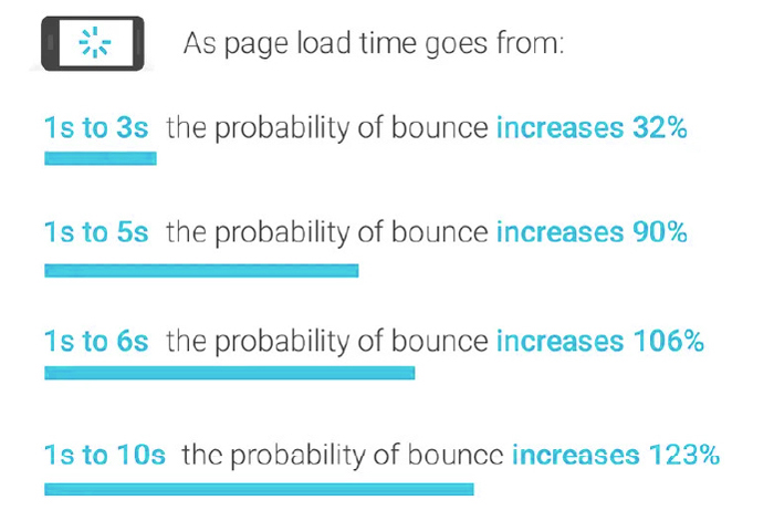
Source: thinkwithgoogle
As you can see from above, nearly 32% of the visitors will leave the site if it does not load within 3 seconds. Almost 90% of visitors will bounce if your website doesn’t load within 5 seconds. The point being every second matters when it comes to website’s page loading speed. So, no matter what, you need to increase your page loading speed if survival is on your mind.
So, now the question is: how to accelerate your website loading speed? The tips shared below will show you the way forward.
Here are a Few Tips to Ensure Good Website Speed :
Opt for a Performance-optimized Hosting Solution: Cheap hosting means poor performance, as you will end up sharing your resources with more websites and on an overloaded server. Performance-focused hosting solutions offer speed and are not into shared hosting.
Optimize heavy images: Reducing image file sizes helps page load more quickly. There are several WordPress plugins that’ll automatically compress and optimize heavy images. If WordPress is not your CMS, try tinypng.com, which can help reduce image size from 25% to 80%.
Take Care of Redirects: Redirects on your website are not ideal if you are focusing on website speed. Every time a page is redirected elsewhere, it extends the HTTP request and response process.
Cache Web Pages: Caching speeds up your web pages. As copies of your site's files are stored, it minimizes the server’s work to generate and serve a web page to a visitor's browser.
Browser caching: Browser caching also enhances page loading speeds. This technique enables the browser to store a variety of information, including stylesheets, images, and JavaScript files, in the visitor’s local browser, speeding up your website page load times in subsequent visits.
Minify CSS, JavaScript, and HTML: Minifying your CSS, JavaScript, and HTML code means removing unnecessary spaces, characters, comments, and more to reduce the file size of pages.
Use Content Delivery Network (CDN): A Content Delivery Network (CDN) comprises a network of servers that speeds up page loading. To achieve this, it hosts and delivers copies of your site's static content from servers across the globe.
Also, verify the download speed of the fonts. Plus, if videos are a must, update your backend, which aids in faster uploading of videos. Remember: Website speed and user experience are far more important than content.
According to research, when the page load time increases by 100 ms, the conversion rate drops by 1%. To avoid such drops, website owners can conduct two speed tests. The first test should be done on a real-time basis to identify slow-loading pages, and the second type of test should be done weekly or monthly. This will help you have better control over conversion rates.
5. If Your Customers Cannot Comfortably Track the Item/Info they are Looking For #
Customer experience makes or breaks a website. 88 percent of your visitors will only revisit your site if you offer them a good user experience the first time.
Despite knowing how critical customer experience is for a company’s survival, the fact is businesses learn about poor user experience only when customers complain. Until then, the companies will be in the dark, and the damage will be done. That’s why businesses must leave their ivory towers and engage with customers in their trenches.
Understand Customer Requirements by Asking Them These Questions:
- Did they find the item/info that you were looking for on our website?
- Was it easy to locate the item/info?
- Was it easy to find more information?
- Was there anything that they didn’t like or anything missing?
- Were they able to complete the intended action?
Based on customer feedback, you could identify and address their concerns. You can even compare the feedback to website analytics data to nail negative patterns in poor customer experiences. Plus, figure out whether the customers are completing the action or abandoning it halfway through. Are they spending more time on certain pages than others? All of these actions can give you details on whether your website requires a redesign or not.
6. If Your Site Focuses More on Product-marketing Over Storytelling #
Product marketing based on data is sacrilege. Why? Because people do not easily relate to numbers in the same way that they do to stories. Stories build emotional bonds with the audience, which translates into sales.
The bottom line is that your product will only resonate with your target audience if you elicit an emotional response through a story. A dry, dull, data-driven product marketing will only backfire. Product data wrapped in a story is what captivates the audience’s attention. No, you don’t have to take my word for it.
According to cognitive psychologist Jerome Bruner, a fact wrapped in a story is 22 times more likely to be remembered than a plain fact. More than hard facts and data, stories help users grasp the gist of your product quickly. More importantly, it contributes to developing commonality and understanding between you and your client. What’s more, it would help you differentiate yourself from the competition, as most product companies prefer a direct product marketing approach over storytelling.

So How do you Combine Data + Story to Instill Confidence in Users about your Product:
- In the first phase of the buyer's journey, you can convince your CEO to write the company’s foundation story in the form of a bylined article. This can be followed by customer testimonials in the form of case studies, videos, and all. Plus, brand stories can be shared on your website.
- In the second and third stages, you can use how-to guides, videos, landing pages, email marketing, and more.
Most successful brands use the right mix of storytelling and technical product marketing to sell their products.
7. If Your Site Does Not Frequently Update Content #
Website content is what draws visitors to your site. Which means you need to keep updating your content frequently.
Now how to update your website content continuously?
- One, keep adding new product videos and product images
- Two, update blogs continually
If the content is not updated continuously on your website, it will come across as laid back and lazy, and even search engines will stop noticing your site. So, no matter what, keep your content flag flying high in all situations through frequent updations.
8. If Your Site Enforces Compulsory Registration During Checkout #
Placing your “create an account” button right up front on the checkout page is in poor taste. Most e-commerce sites make this mistake - asking users to register before they check out. Potential customers see this as an impediment and avoid the site.
This means sites must be highly cautious when designing these pages because forcing them to register on your site upset them, causing them to abandon their carts.
The M&S website gets it wrong by prompting customers to create an account immediately.
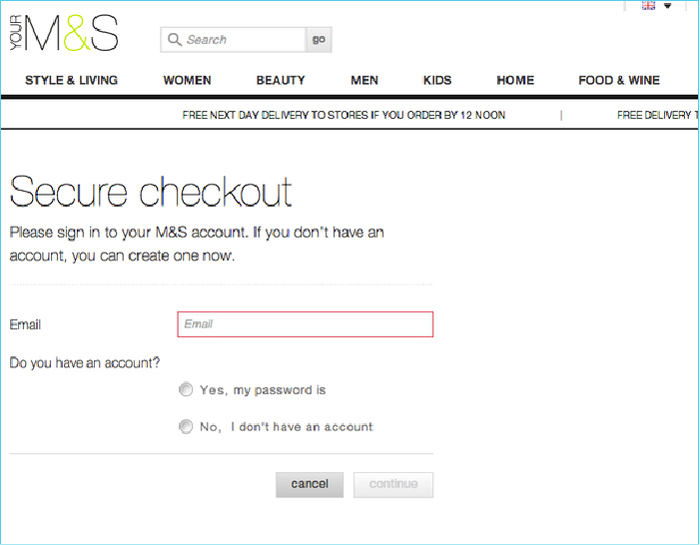
So, what are your options? Yes, instead of forcing customers to register, offer 'guest checkout.' If collecting customer information is critical, instead of placing the 'create an account' button at the top of the checkout page, intertwine it with other detail requirements later in the checkout process.
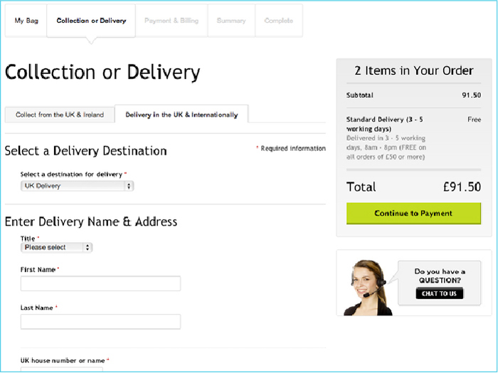
House of Fraser gets it right by overseeing the account creation process. Unlike M&M, the fashion company introduces the account creation process later in the checkout process, giving customers the impression that they are making progress. The progress bar also contributes to the overall impression.
The site visitors should have the freedom to make a choice and thereby make their experience with your site as pleasant as possible.
9. If There Are Broken Links #
A dead link is highly frustrating for a user, which makes regular checks for dead links critical. So, if you are not doing it, your website’s credibility will become questionable.
Regular inspections will help you to take immediate action to rectify 404 errors or broken links.
Looking for and removing broken links should be one of the best web development practices that websites should religiously follow because failure to do so can hurt your search engine rankings as well.
In fact, there are tools available that will help automate the process of finding and fixing broken links. WordPress sites use plugins for link monitoring, and they are so well-engineered that when broken links are discovered, the site owner receives an email.
10. If Your Site Does Not Display Complete Contact Details #
Visitors to your website will want to know your complete contact details more so, if they have liked your products or services and wish to contact you.
However, if your contact information is missing and you haven’t provided any address or phone number, users will start doubting your site’s credibility.
This means your site needs to be refreshed such that it offers complete contact information, including a phone number, address, and even information about social media handles.
Website Refresh is Moving the Needle, while Website Redesign Proposes a Total Turnaround
Control what you can and ignore everything else, they say. So, if high bounce rates, lack of leads, and conversions are bothering you, then think of redesigning your website. And, of course, redesign is quite beneficial from an SEO standpoint.
For low site speed, cognitive load, broken links, content updates, better user engagement, the retelling of the brand story, and more, a simple refresh will do. And, yes, the refresh should be taken seriously as it helps you stay new in the eyes of the customers.
What’s your take on Website Refresh Vs. Website Redesign? And have I missed out on any critical points? Let us know!